

If you're an avid follower of the latest Studio McGee projects, then its recent project named The Oaks is no doubt serving you plenty of modern rustic decorating inspiration.
The San Antonio, Texas home proves to us all how modern buildings can feel just as rich and character-filled as heritage homes, thanks to Shea McGee's (the design studio's co-founder) eye for curating layered and relaxed interiors, not least through the timeless color palette.
From the carefully selected wall colors to the use of wallpaper, the room color ideas are the perfect backdrop for this neutral home, as uncovered in the design studio's Oaks Project Paint Guide. Below, we've rounded up the specific paint shades used throughout this modern-meets-rustic home, from Benjamin Moore, Sherwin-Williams, and more.
1. Futon, Sherwin-Williams

Sherwin-Williams' Futon is a soft off-white paint that was used as the main color throughout the home. Providing a clean backdrop, as seen in this living space, this gentle hue works as a blank canvas for the home's decor while bringing enough warmth to feel welcoming.
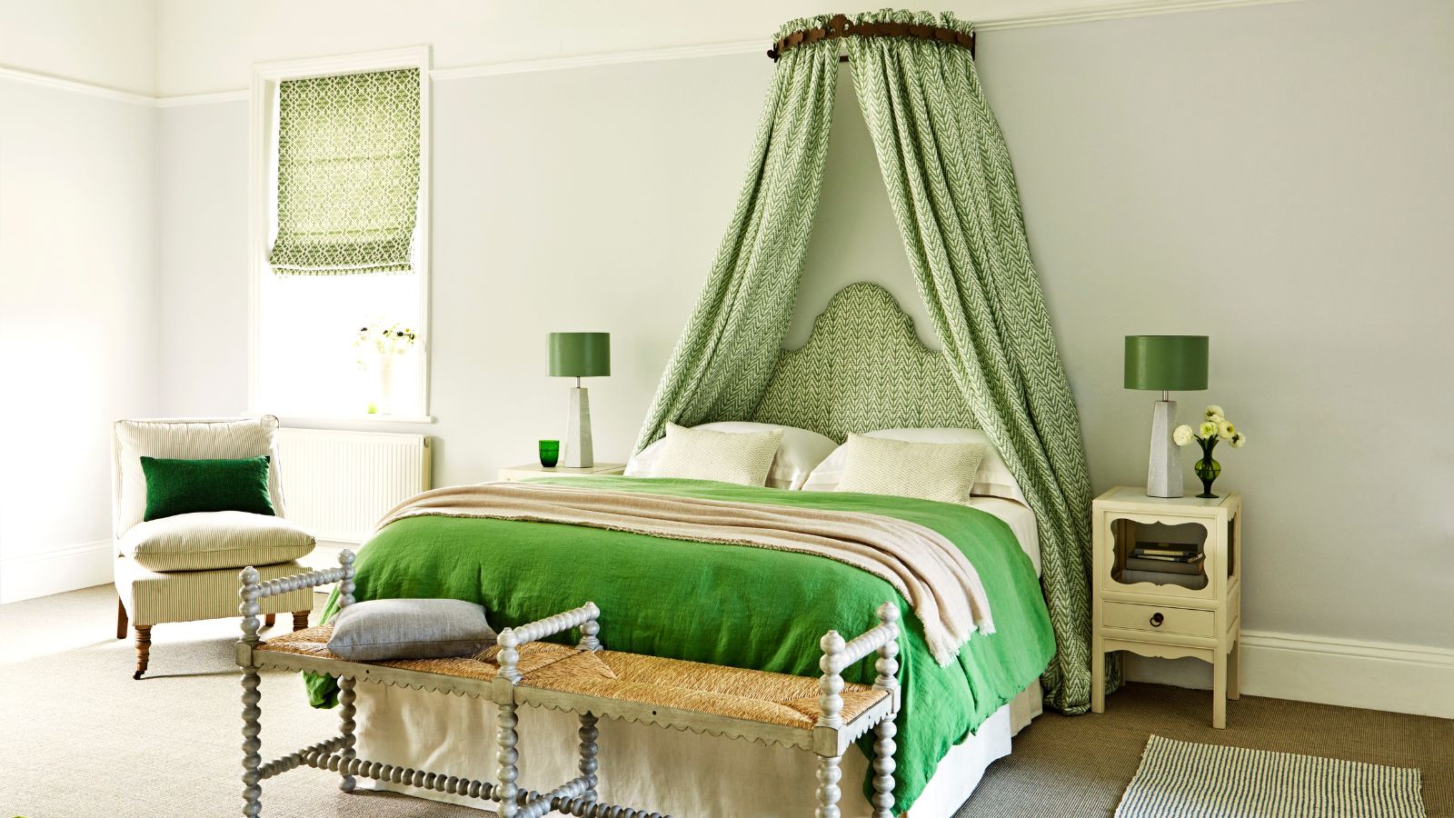
2. Kobai, Schumacher

In the primary bedroom, a neutral wallpaper was used to add interest. The design is called 'Kobai Panel' in the color 'Neutral' from Schumacher. This is an effective way of adding a sense of texture to the room's neutral color scheme while enhancing its calming feel.
'We wrapped the entire bedroom in a mural wallpaper. It’s the perfect complement to the wood tones in this space,' Shea McGee says in the Studio McGee blog post.
3. Natural Linen, Sherwin-Williams

Sherwin-Williams' Natural Linen is a light beige paint that was used on the bathroom cabinets in this bathroom suite. Subtly warming, this paint color feels a lot less harsh than white paint while still allowing the room to feel light and airy.
4. Cocoa Whip, Sherwin-Williams

Another Sherwin-Williams shade to feature in The Oaks Project is Cocoa Whip, a soft brown paint that was used across the mudroom's storage cabinets. This earthy brown feels perfectly aligned with the latest color trends, which favor warming browns as a 'new neutral'. Here, it adds more depth to the lighter neutral tones that feature throughout the home.
5. White Dove, Benjamin Moore

Benjamin Moore's White Dove is an incredibly popular white paint that feels fresh and undisturbed. In The Oaks Project, it was used across the cabinets in this modern rustic laundry room, but there are many other ways to decorate with White Dove, a go-to for many designers.
6. Rock Bottom, Sherwin-Williams

Moving onto dark paints, Sherwin-Williams' Rock Bottom is a dark gray-green paint that feels moody and sophisticated. In this space named the home's 'morning room', Rock Bottom was used to color drench the space, creating a cozy and snug feel.
This paint color falls into the category of in-between colors that have seen lots of appeal in recent months, adding more interest and depth than traditional, straight-down-the-middle hues.
7. Rockport Gray, Benjamin Moore

Lastly, Benjamin Moore's Rockport Gray is a mid-gray paint that doesn't feel too cold as is often the risk with gray paints. Here, it was used on the walls, adding just enough depth to help it feel cozy, perfect for a relaxing room like this.
Which of these paint colors is your favorite? From light neutrals to darker tones, each of these shades feels timeless, pairing well with many interior design styles, from modern to traditional.
-
 I'm an expert vacuum tester, and no, you really don't need a mattress vacuum – here's what to use instead
Before investing in a new gadget, the tried-and-true methods still work
-
 Charli XCX's front door color 'feels deliberate, and almost calculated' – estate experts say it carries authority (but it comes with a warning)
The singer's sophisticated front door color gives a 'psychological head start' to sellers, but it has a potentially unlucky downside

