These are the overrated paint colors designers say could date your home
Because even the most loved shade's reign must come to an end eventually
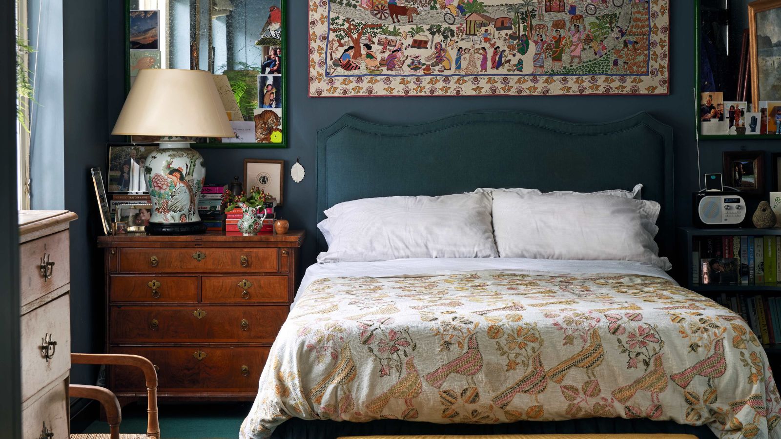

Color trends come and go so quickly, changing with the seasons, the moods, the fashion trends, the cultural references, it can be hard to keep up. But then there are those steadfast colors that survive throughout the changes, the ones that we see over and over again. Most call them classic, but are some of them in fact just the safe choice, are they in fact overrated?
The color choices we make in our homes are potentially the most important. Colors are what we notice first about a room, they set the tone, so ensuring you pick a scheme that's a reflection of your style whilst also being on trend, whilst also standing the test of time is not simple.
So we asked designers to let us know those overrated color trends that might appear timeless on paper, but are in fact on the way out and could potentially date your home, so you can at least take some shades out of the running.
5 overrated paint colors to avoid
While we will never totally shun a shade, colors are so personal to both a person and a house, there are those colors that we are just a bit tired of seeing - the colors that are constantly getting rebranded and packaged as something new to suit changing interior design trends. After a while, using these colors can begin to look dated and uninspired.
1. Gray
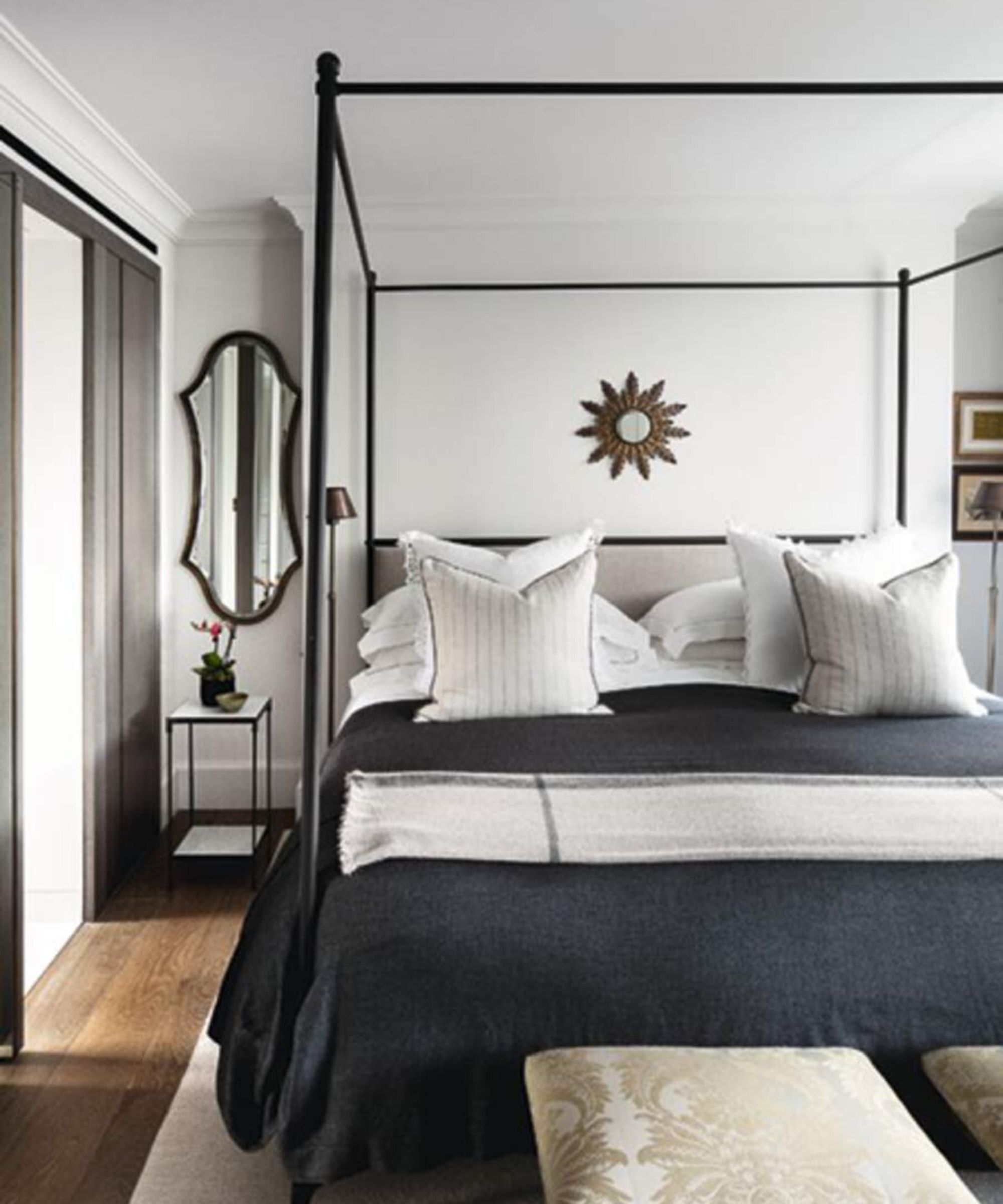
A few years ago, seeing gray as an overrated paint would have been a surprise. But we all know that the love for decorating with grey is dwindling.
'Gray has undeniably been a dominant trend in interior design for quite some time, and while it offers several advantages, we feel that it can be overrated when used excessively. You are still seeing it everywhere- upholstery, bedding, paint, tile, gray wood tones, and more. Gray can lack warmth and feel cold when not done correctly. Too much of it feels cold and flat, and lacks personalization.' explains designer Jennifer Davis.
Of course, gray is not off the cards altogether, it's those colder, blue-toned greys that can date your home. So many trends are focused on warm color schemes, creating spaces that feel inviting, and grays can do this. Just choose a warmer gray with a beige undertone and layer it with other warm neutrals for an updated way to decorate with this classic shade.
Jennifer fell in love with design at a young age and has been working in the industry for over 25 years. She has developed an eye for detail and a talent for creating timeless designs. Jennifer offers a balance of creativity and forward-thinking with a structured, organized, and detailed mentality. Jennifer is driven by her deep passion for design while curating an exceptional client journey, ensuring pure delight from the very beginning to the end.
2. Navy Blue
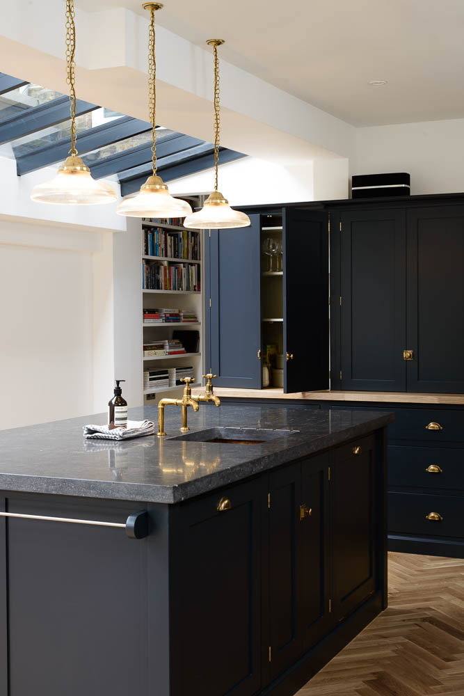
'It’s navy blue for me,' says designer Artem Kropovinsky. 'A longstanding darling in our design repertoire, has had its fair share of the limelight. As we evolve in our craft, there's an urge to delve deeper into the color spectrum: there are nuanced shades and palettes that await exploration. While navy will always have its place, diversifying our color choices can infuse fresh energy and perspective into our spaces.'
Again, like gray it's the coolness of this shade that's putting it on the out. A navy blue kitchen was what everyone wanted five or so years ago, but is navy blue now outdated? Well not exactly, navy blue is a classic shade but we are seeing a shift away from brighter navies to more deep, exciting blues that have more of a richness to them. Pair this kind of very dark navy with gold hardware, lots of texture, and dark woods - that's the way to do a navy kitchen right now
3. Brilliant White
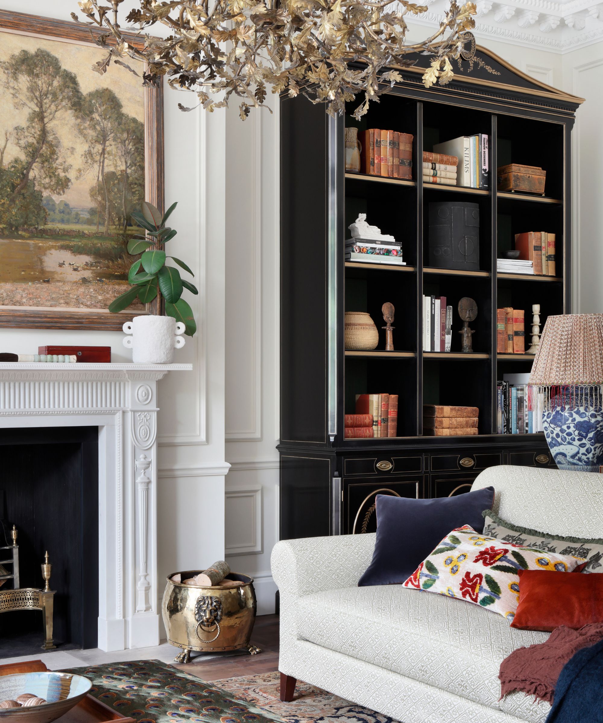
'Brilliant white just doesn't give much to a space. With so many softer, more interesting versions of white, why go for something so flat?' says Jennifer Ebert, Digital Editor at Homes & Gardens. 'White walls can date a room, appearing cold and stark and yes it can help lighten and space, making it feel bigger and brighter, but a warm off-white paint can do that too, and it's these warmer whites that work so much better with current trends.'
A true white can work in the right circumstances, for example in very minimalist rooms. But unless you do want to lean into the starker nature of white, in order not too look bland and dated, white needs to be given some warmth and depth so try using it as a base to layer up warmer tones like beiges, creams, and browns.

Jen is the Editor (Digital) of Homes & Gardens. Before starting this position, she had completed various interior design courses at KLC Design School, as well as working across Ideal Home, LivingEtc, 25 Beautiful Homes and Country Homes & Interiors as an interiors writer.
4. Red
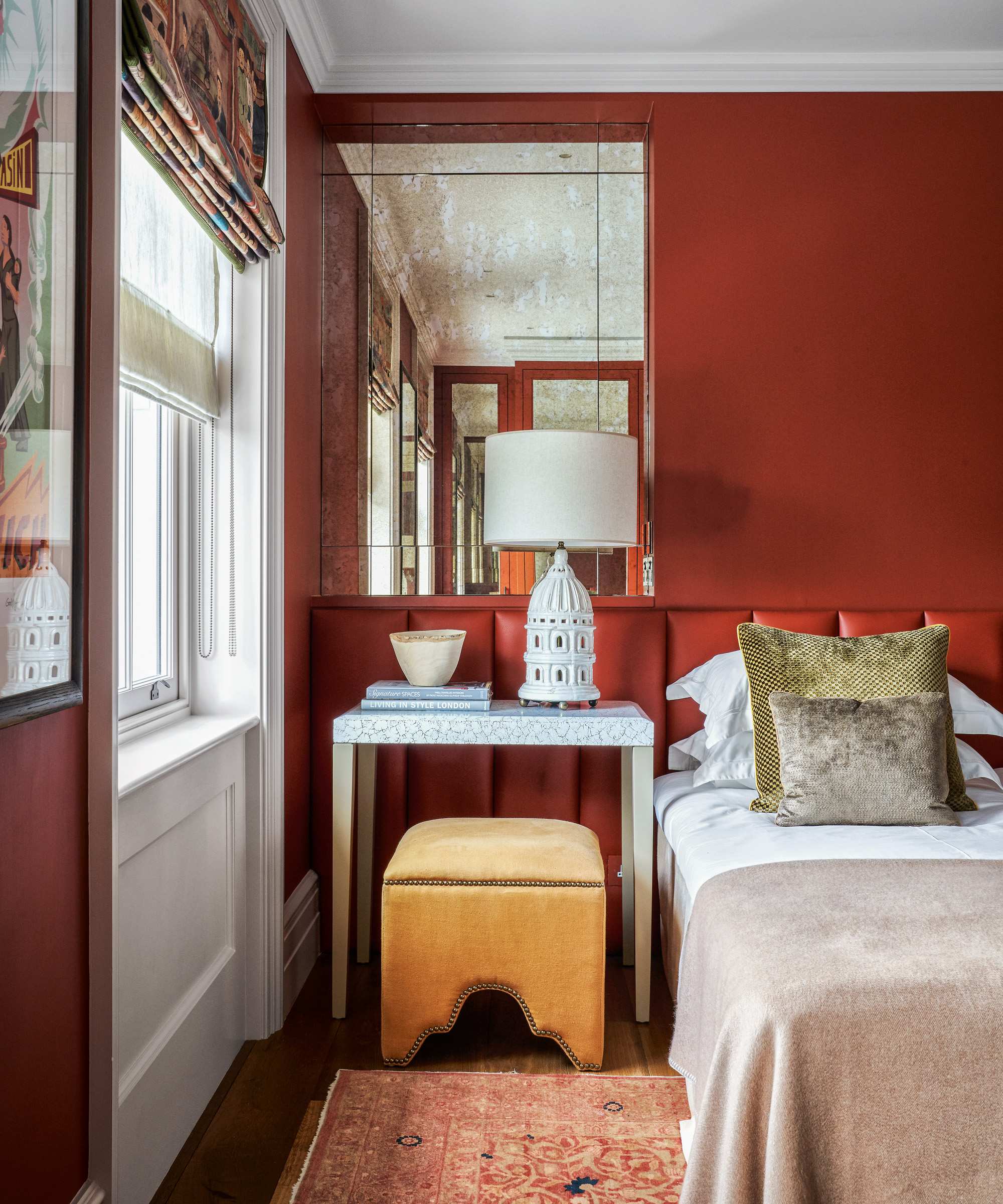
'Particularly in the mid-west and southern states, a red dining room is ubiquitous. While there are definitely times when nothing else will do, that bold ketchup red really dates a space. Try a moody blue or green instead for a similar vibe done in a more modern way.' suggested Bethany Adams.
Decorating with red can look incredible if you do it right, but Bethany's right, it can really date a room. It's tricky to pick the perfect red because it's so about the space and the style you want to create, but in general, avoid those primary reds and opt for something with depth. A matte, rich deep red can create such gorgeous spaces, so don't shy away from this color just be considered with the shades you choose and how you use it.
Decorating with these overrated, frequently used colors does run the risk of dating your home. As designers point out there's a reason these shades once-loved shades seem to be on the out, mostly that they have just been overused and trends are changing in favor of new shades.
However, that's not to say these colors can't still work, they are classics and really even as our love of them wains, they will always be around in some form or another, it's just about picking the right tone, pairing them with other shades and adapting them to work with current design trends.
Sign up to the Homes & Gardens newsletter
Design expertise in your inbox – from inspiring decorating ideas and beautiful celebrity homes to practical gardening advice and shopping round-ups.

I am the Head of Interiors at Homes & Gardens. I started off in the world of journalism in fashion and luxury travel and then landed my first interiors role at Real Homes and have been in the world of interior design ever since. Prior to my role at H&G I was the digital editor at Livingetc, from which I took a sabbatical to travel in my self-converted van (not as glamorous as decorating a home, but very satisfying). A year later, and with lots of technical DIY lessons learned I am back to writing and editing, sometimes even from the comfort of my home on wheels.
-
 I've spent over 200 hours testing vacuums and swear by my two Dysons – this is how I properly clean a Dyson vacuum filter for longer-lasting appliances
Your Dyson vacuum will last much longer and clean at its best
By Dan Fauzi Published
-
 Bethenny Frankel calls this $695 machine the 'Rolls-Royce Cullinan of coffee' – it's a must-have luxury buy for iced-coffee lovers this springtime
The Real Housewife swears by a luxurious machine that makes nitro cold brew, cold brew, and cold espresso at the touch of a button – here's why it's worth it
By Sophie Edwards Published