Outdated storage trends – 5 overdone looks that designers like to avoid, and here's why you should too
Is your storage dating your design? We spoke to a few of our favorite interiors people to find out how to add storage with style, and what to avoid
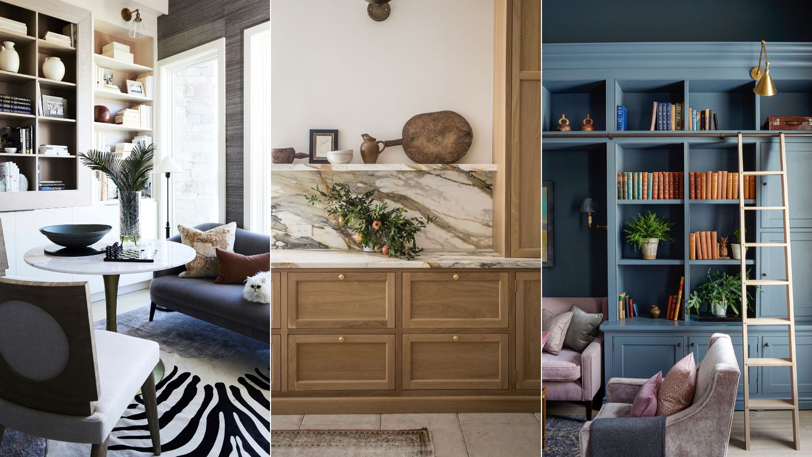

It is all too easy to forget to factor in beautiful storage. Yet, if you leave this essential element as a last-minute addition, you could be doing the harmony – and usefulness – of your home more harm than good.
There is a multitude of interior design elements to consider when you're redecorating and redesigning your home, but few are as important as your chosen storage ideas. Hardworking and good-looking storage ideas don't just have the power to upgrade a space with personality and create a long-lasting impression; they can also make a room look more luxurious and refined, which is a big win when you're decorating on a smaller budget.
If you want to make a home look expensive, it is important to think cleverly about storage solutions. Here, designers, decorators, and experts reveal how to approach choosing the best storage to restore calm, as well as the outdated storage trends to leave behind.
Outdated storage trends
When it comes to choosing the right storage, almost anything goes, but our panel of experts advises approaching the following outdated storage trends with caution, for fear you could be dating your design.
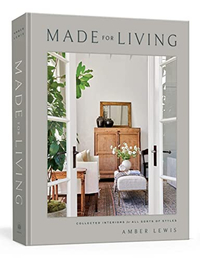
Made for Living: Collected Interiors for All Sorts of Styles, Amber Lewis | From $24.58 at Amazon
This national best-seller is a success for a reason: within the pages, interior designer Amber Lewis shares her most revered design secrets and expert know-how.
1. Freestanding storage that looks awkward
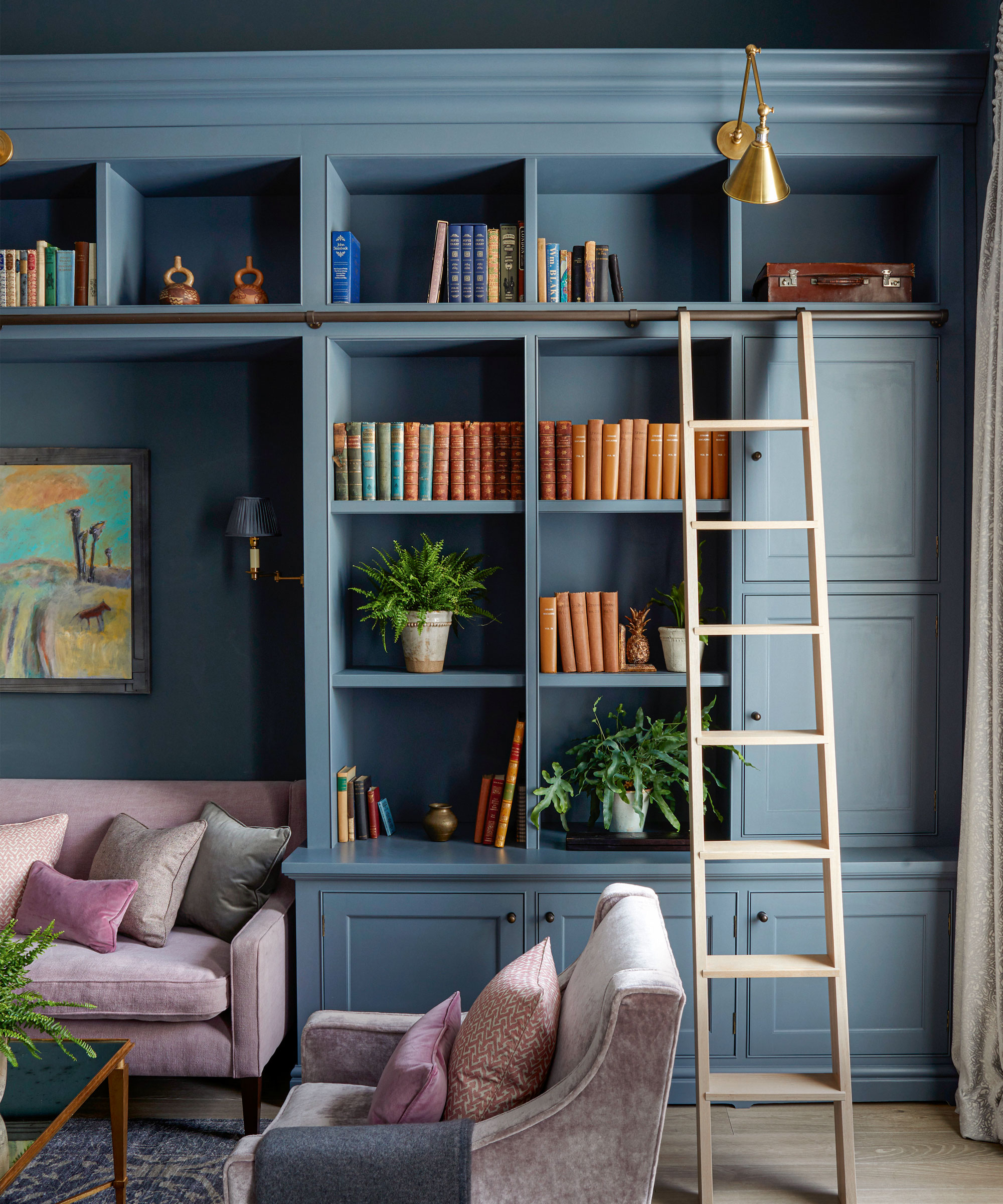
Freestanding storage, when chosen with care, can indeed look beautiful, but more often than not, freestanding can look a little out of place or temporary. Instead, consider investing in bespoke joinery where possible.
This beautiful wall of bespoke joinery painted in a moody hue is hugely characterful and provides plenty of open and closed storage. The finishing touch was the lighting. Without the right lighting, it could end up looking almost black during the evenings, so a blend of wall and overhead lighting was needed to create the right balance of atmosphere and practicality. ‘We used a deep smoky colour on the walls and joinery of this north-facing space’ says Emma Sims-Hilditch, founder and creative director for Sims Hilditch. ‘The aim was to embrace the darkness of this space, transforming it into a moody and cosy haven. Soft wall and overhead lighting add to the ambience.’
2. Storage that doesn't harmonize with the whole room
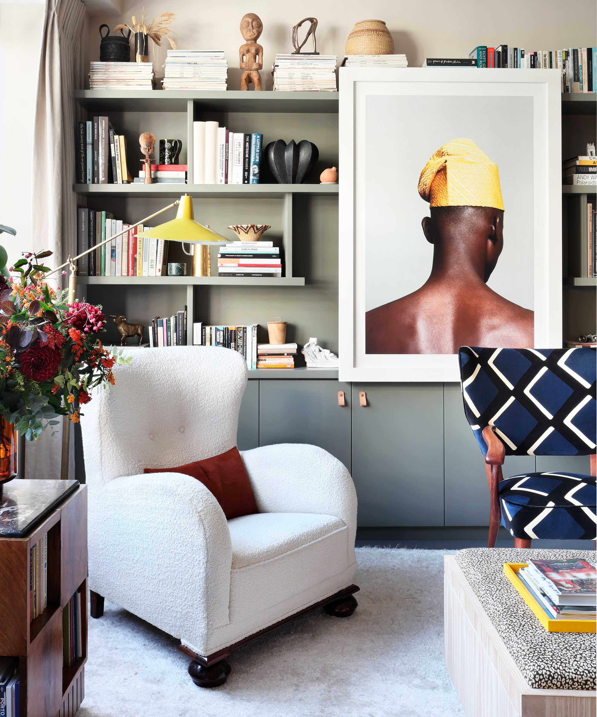
Small rooms often fall victim to storage and furniture that looks out of place. When it comes to conjuring the most storage space in a small living room, be careful about furniture choices. Having too many pieces that have solid bodies will clearly provide space to store things but the risk that runs is that the visual look of the room will be compromised and rendered smaller. Be sure to have a balance of pieces that have legs or are lifted off the floor alongside any more boxy structures.
Interior designer Lucy Cunningham adds: ‘To maximize storage in smaller rooms, consider incorporating joineries such as built-in units with shelving and cupboards.’
Here, designer Sophie Ashby doesn't shy away from going big with her storage. A row of built-ins, painted in a standout color scheme, provides the focal point. You may not agree, but the smallest rooms in our homes are often the most delightful to design and decorate.
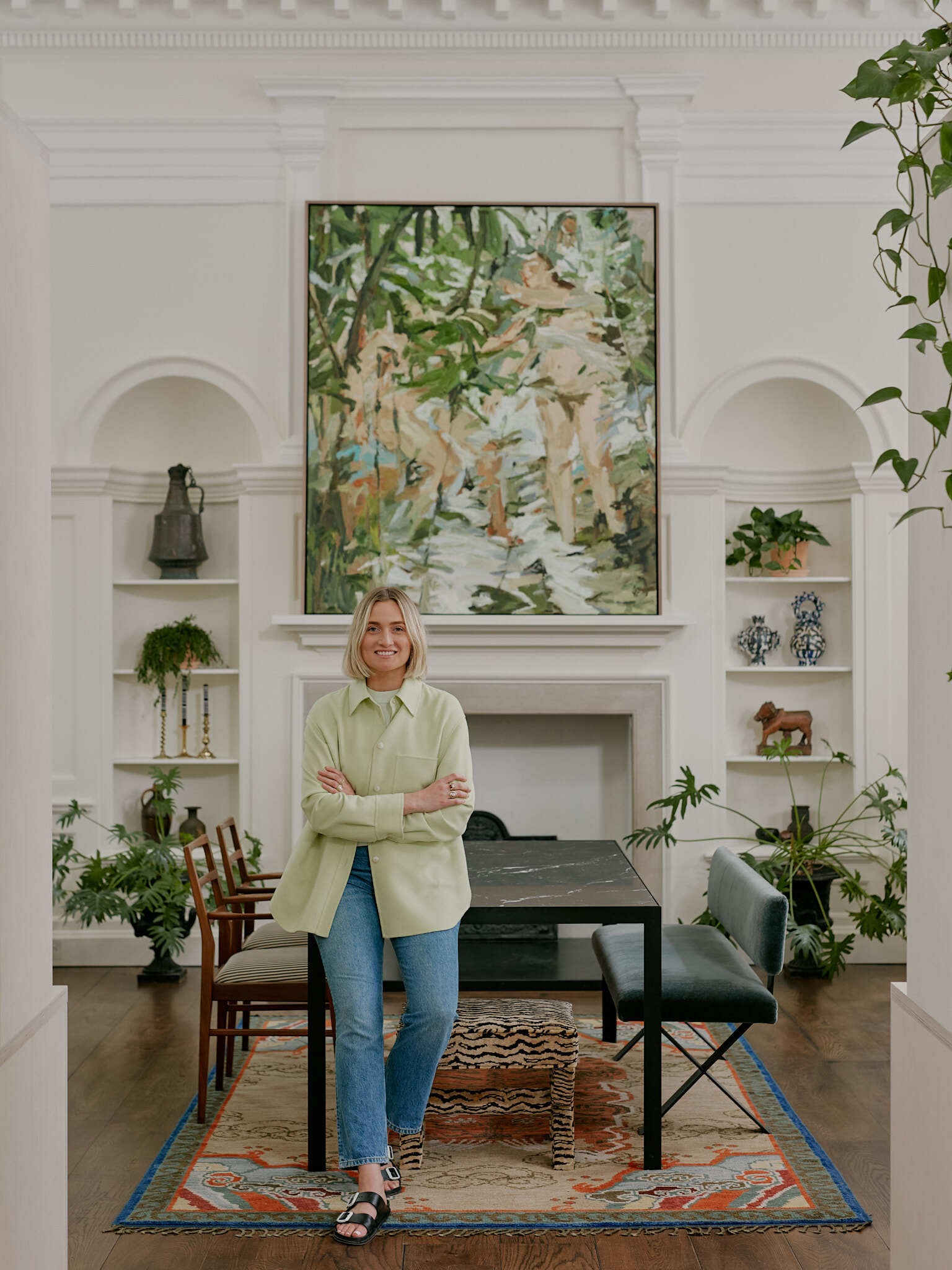
Sophie Ashby is the founder and creative director of Studio Ashby. Having studied interior design at the famous Parsons, The New School in Manhattan, Sophie honed her skills over the years with strong mentorship.
Ashby's aim is to bring authenticity and thought to each project, not only in the selection of furniture, lighting, and art but in its use of a natural palette of materials and textures.
3. Using materials that have fallen out of favor
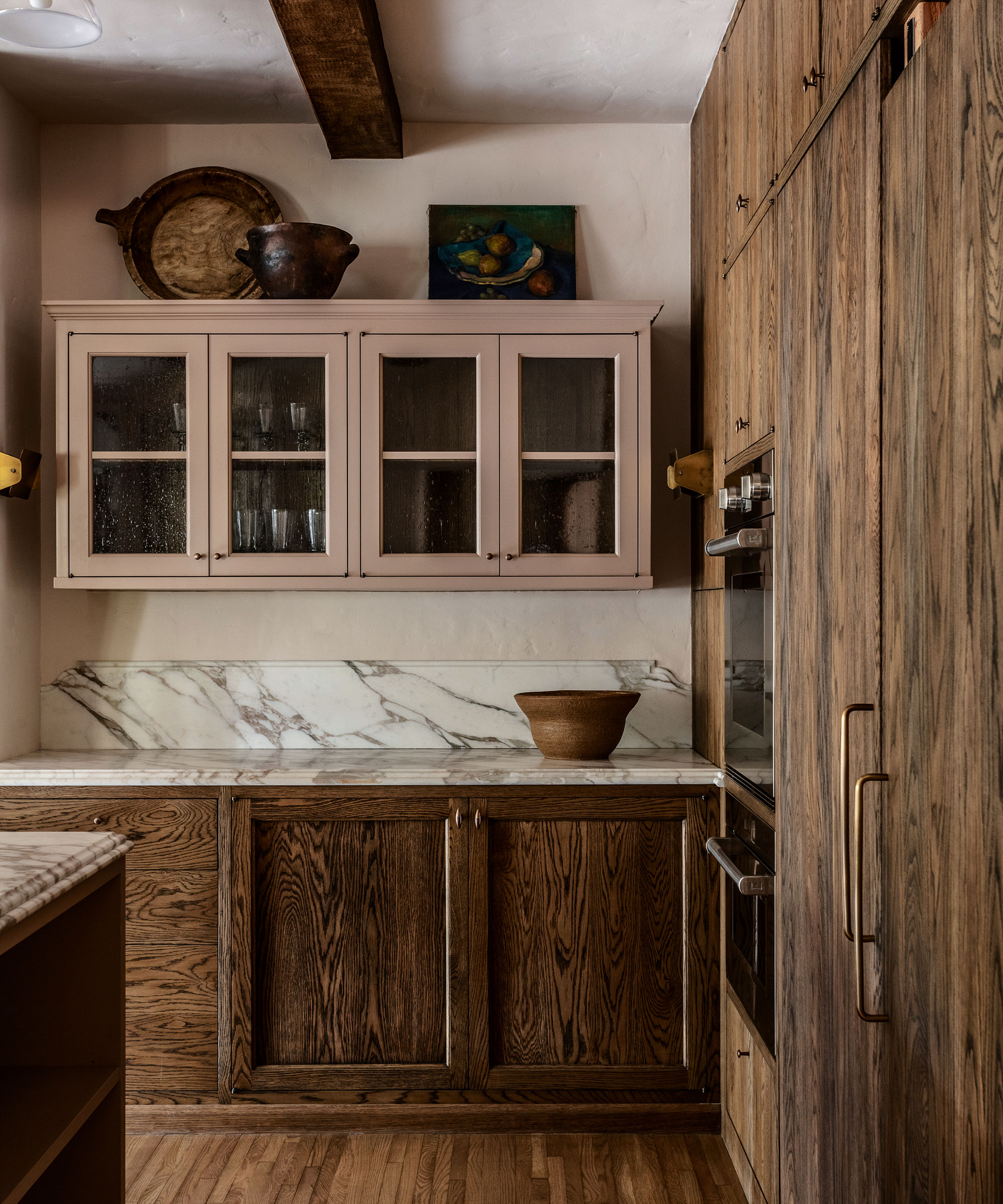
With a move towards sustainability and craftsmanship, we are starting to see less and less mass-produced, plastic furniture and accessories on store shelves. Embrace tactility, says interior designer, Colin King. 'The knots on a plank of oak, the grooves on natural stone – the rustic nature of these natural materials are what excites my fingertips and also my mind. Surfaces are sentiments of sorts, capable of stirring an emotion or conjuring a memory.'
Thankfully, recent trends have shown a shift towards curating more sustainable, soulful spaces. 'If in doubt, be bold and bespoke,' advises Tiffany Duggan, founder, and director of Studio Duggan. 'Clients hardly ever regret investing in one-of-a-kind pieces of furniture. Think of your space as a carefully curated Aladdin’s cave of treasures, with each piece of furniture and joinery even more fascinating than the last.'
4. Storage that doesn't incorporate existing layouts and architecture
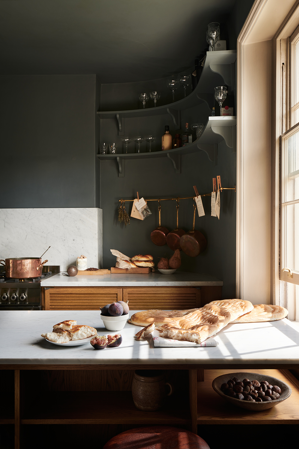
The best storage ideas should co-exist beautifully with the rest of your room. That is not to say it shouldn't stand out, but it should harmonize and most importantly, be useful.
Here, unusually shaped rooms do not have to stand in the way of efficient kitchen layouts. A bespoke design that works with the shape of the room can create opportunities to add in necessary storage. This deVOL kitchen accentuates the property’s original curved walls and low windows while still incorporating plenty of practical kitchen storage space. ‘The curved wall has bespoke shelves and a brass rail, giving this area a special feel,’ says Helen Parker, creative director at deVOL.
5. Purely practical storage that doesn't shine
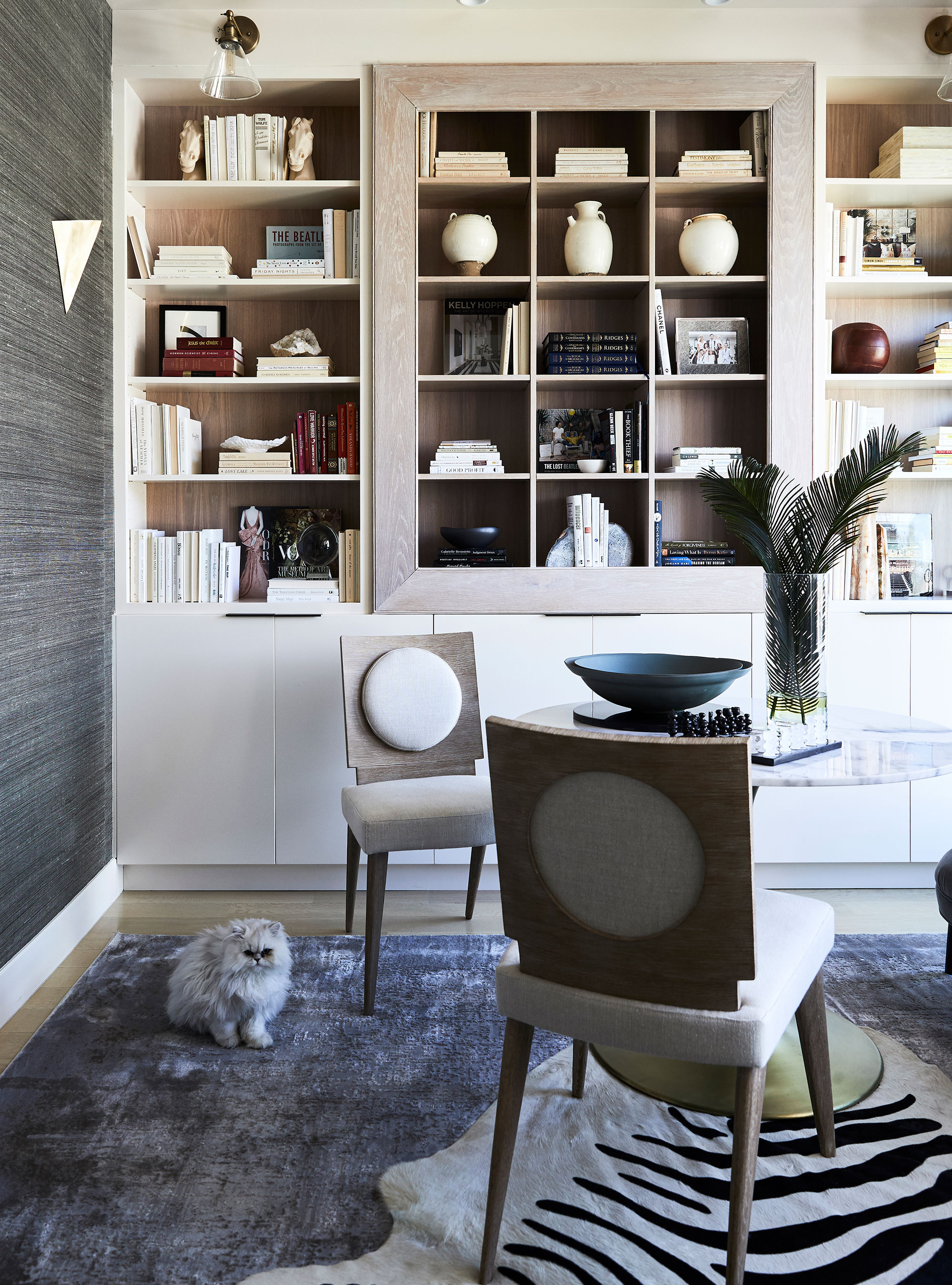
First and foremost, storage should be functional. It should serve the purpose of providing you with a solution to store objects. However, that doesn't mean it should not look good, or enhance the beauty and architecture of the home.
If there is a nook or a niche in a room, use it. ‘Make awkward corners a point of interest,’ says Jessica Bennett of Alice Lane Interiors. ‘Don’t be afraid to make your display or book storage a focal point either. Sometimes the most useful feature in your home can also be the most beautiful if you put it at the forefront of your design'
Be sure to light the shelving or bookcase area, too, as this will ensure it becomes something of a decorative focal point for the eyes. ‘This can be done in a number of ways,’ says Sally Storey, creative director of John Cullen Lighting. ‘Highlight specific items with a miniature spotlight or using a linear LED strip concealed within the depth of the shelf for an even glow at the front of the shelf or at the back for a dramatic backlight effect.

Jessica started her creative journey at Utah State University. Her studies there led to her work in an ad agency as an art director but building her home brought back her earliest passion: interior design and trends.
Sign up to the Homes & Gardens newsletter
Design expertise in your inbox – from inspiring decorating ideas and beautiful celebrity homes to practical gardening advice and shopping round-ups.

Jennifer is the Digital Editor at Homes & Gardens. Having worked in the interiors industry for several years in both the US and UK, spanning many publications, she now hones her digital prowess on the 'best interiors website' in the world. Multi-skilled, Jennifer has worked in PR and marketing and occasionally dabbles in the social media, commercial, and the e-commerce space. Over the years, she has written about every area of the home, from compiling houses designed by some of the best interior designers in the world to sourcing celebrity homes, reviewing appliances, and even writing a few news stories or two.
-
 Courtney Love's historic loft combines rock star luxury with raw New York bones – it's on the market for almost $9.5 million
The singer's former SoHo home features exposed brick walls, original wooden columns, a gas fireplace, and high ceilings – take the tour
By Hannah Ziegler
-
 Triangular shaped garden ideas – landscape designers share 9 ingenious ways to redesign your corner plot
Expert tips for planning, planting and finessing a triangular shaped plot, so you can savour the space year round
By Jill Morgan
