5 outdated dining room trends designers warn to avoid
Dining room trends come and go but these are the ones designers say should stay gone
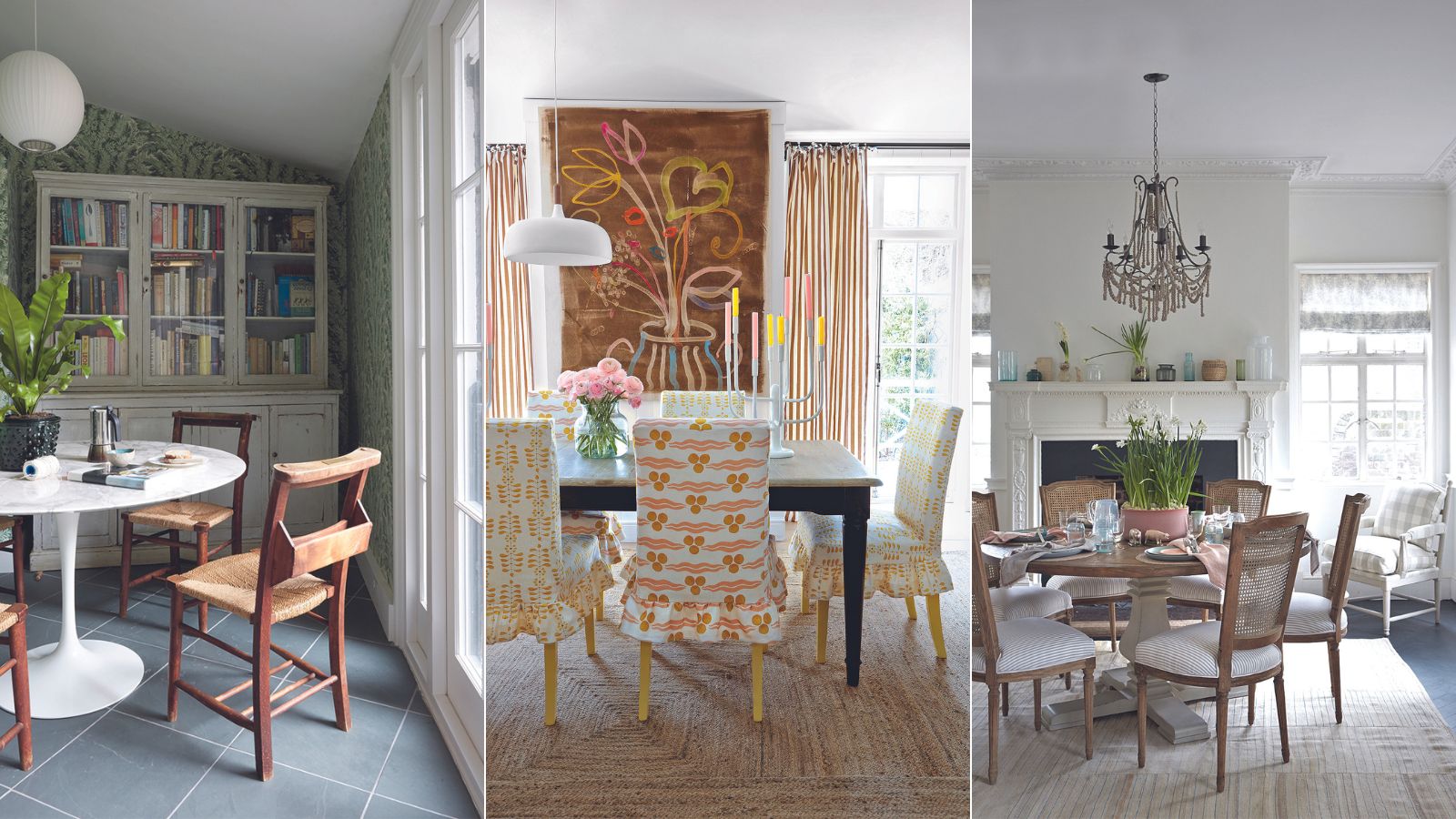

When it comes to styling a dining space, things can be quite structured. There's a lot to fit in the space, and it is traditionally a rather formal room, so you can feel a bit limited in what you can create with the space. In fact, dining rooms might be one of the trickiest rooms to decorate in a way that reflects personal style and works hard as a practical space. Due to the fact these rooms usually only get used for occasions, they can easily look a bit stuffy and impersonal.
However, we have seen plenty of gorgeous, character-filled dining rooms that do manage to create this balance between personal and practical, and a lot of it comes down to ensuring the space doesn't follow too many of those traditional and now outdated dining room rules.
We spoke with designers about which of these rules and trends we should just be ignoring when it comes to designing a dining room.
5 outdated dining room trends to avoid
Similar to kitchen trends, dining room trends are slightly slower moving than the rest of the rooms. There is less flexibility with these spaces, and perhaps less opportunity to be as experimental with the decor as say in a living room or a bedroom.
That does mean a lot of 'go to' approaches for dining room decor are outdated, and they are facing a bit of a bad press right now as to whether or not they are useful rooms to have in a modern home. We say yes – if you design them to suit your lifestyle and steer clear of the outdated dining room trends that are making these spaces less useable.
1. Going too formal
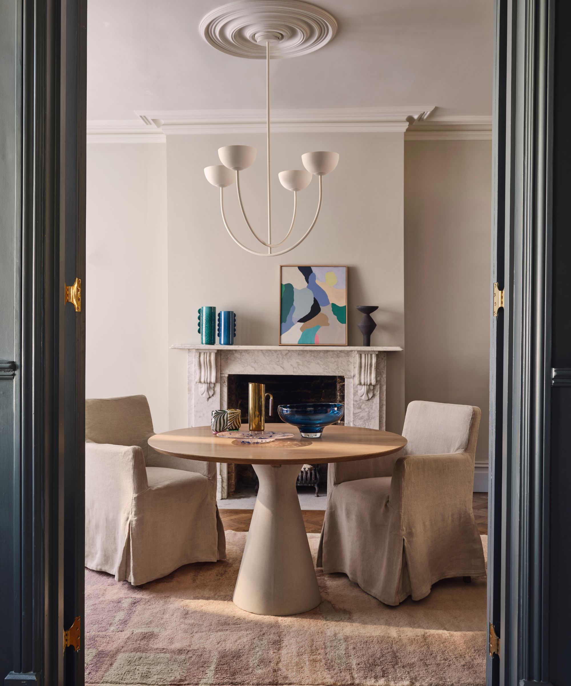
A lot of the backlash we have seen against dining rooms recently is not so much that they are redundant, but they are redundant in their traditional, very formal form.
'I try not to let trends dictate my design philosophy too much one way or the other, but I think the idea that your dining room be overtly formal is definitely on its way out,' explains designer Kathy Kuo. 'Your dining area, whether that's a standalone room, a nook, or just a designated part of your kitchen, should feel warm and welcoming and like it's the perfect place for gathering in a lighthearted way. Letting go of formality and stuffiness is the first step in transforming your dining room into a place to make memories!'
Designer Cherie Lee agrees that antiquated approaches to a dining room are what will instantly date them. 'Clients are largely looking to create more informal dining spaces that are less isolated and more connected to the rest of the home. Even where space is plentiful clients like to integrate the dining experience into the wider context of the home so that the space can be enjoyed, even when it's not in use rather than have it shut away and used only on high days and holidays.'
'When a more conventional set up is required that looks to separate the dining space, we often incorporate a significant glazed element to the dining room, double doors or even a fixed panel of glass so that the dining room remains separate and zoned off, yet light can still travel through the area, and sidelines allow the space to give the home more spacious proportions.'
Kathy Kuo is a celebrated interior designer and international guru within the home and lifestyle space. She has 20+ years of experience in the design industry.
2. Matching your dining room furniture
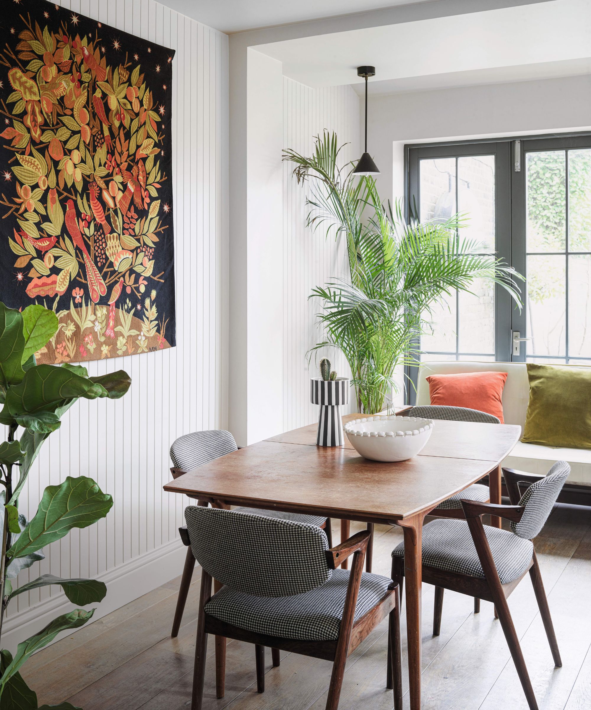
'One trend that's distinctly on the wane is the insistence that all dining room pieces must perfectly match,' says designer Dara Huang. 'We're moving away from the uniformity of identical chairs and tables towards embracing diversity and contrast. Today, it's about creating an eclectic, yet harmonious dining experience. Mixing and matching chairs, experimenting with various textures, and incorporating contrasting accent pieces have become the new norm.'
The debate of whether your dining room furniture should match is a hot one right now, and it's again linked to that shift away from a formal dining room. Mixing furniture gives more scope to bring in variety and character and takes away that very structured look a dining room can often have.
'Over the past few years, the dining room decor has seen significant shifts in trends. The traditional uniform aesthetic, characterized by matching furniture suites and diminutive chandeliers, has been replaced with a more eclectic approach. Today, the trend is towards mixing and matching furniture styles, enhancing the uniqueness and vibrancy of the dining space,' adds Kati Curtis.
'The once-popular white walls and stuffy chair rails are giving way to bold colors and creative dining room wallpapers and murals. Patterned wallpapers have gained significant traction, adding texture and depth to walls and reflecting the personal style of the homeowner. These changes suggest a movement towards personalization, transforming dining rooms from mere eating spaces to intimate sanctuaries that bear the homeowner's unique taste and creativity.'
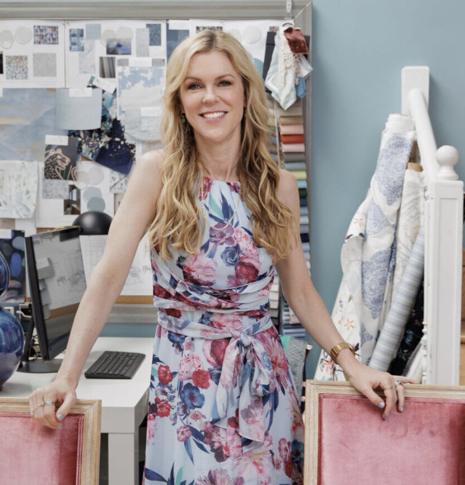
Kati Curtis is the founder of Kati Curtis Design, an design firm based in New York City specializing in classic design with a global influence. Kati founded the studio in 2005 after 12 years of working with international architecture and engineering firms.
3. Oversized dining tables
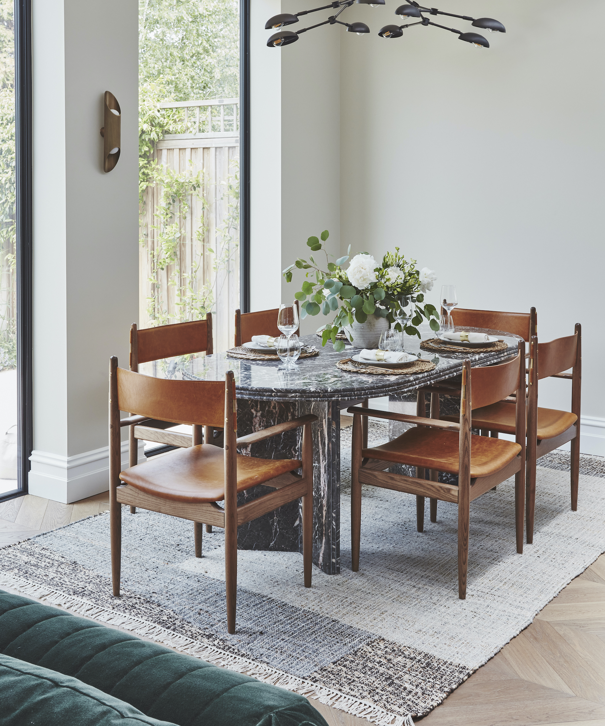
'A dining room trend that I think really dates a space is massive, imposing dining tables. Instead, choose more flexible and intimate seating arrangements,' suggests Artem Kropovinsky.
Picture a traditional dining room and you do picture a huge (usually glistening mahogany) dining table just dominating the center of the room. It makes it almost impossible to have any space or flexibility to do anything else with the space. It also makes it far less likely for you to use it on a more regular basis. Ditch the idea that you need a table that seats 20 and opt for something realistic for your family. You can always choose an extendable design if you do need something larger on the occasion.
Although we have seen some instances of it working really well, a dark mahogany dining room can instantly make the space look stuffy and dated. For this kind of furniture, you really need the room and the light.

Founder of NYC-based interior design firm, Arsight, Artem Kropovinsky has a decade of extensive global design experience, connecting a cohesive, collaborative team of passionate professionals, who work on interior projects in the U.S. and worldwide.
4. Choosing totally open plan
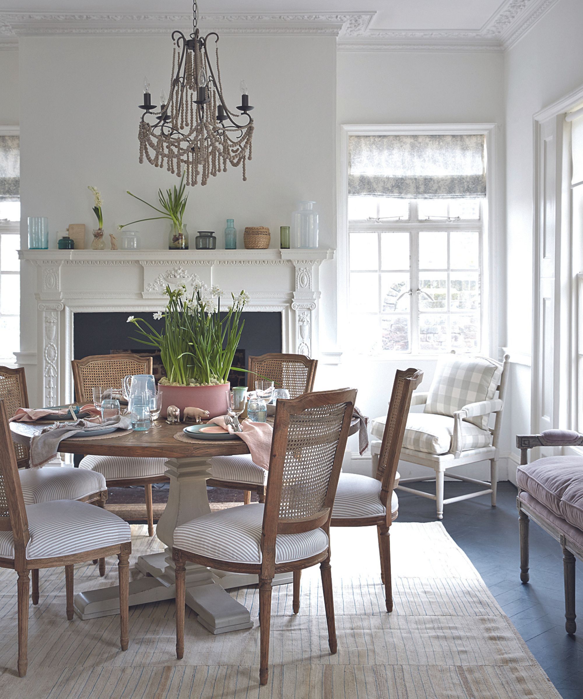
For all the talk of how outdated separate, formal dining rooms can be, this is a really interesting point. In general, we have seen a dip in open plan layouts, which were once the go-to for any modern home or renovation – the fewer walls the better seemed to be the mantra. But there is this shift in interior design trends away from this everything all in one room approach, to more traditional floorplans.
'The biggest outdated trend I’m seeing in dining rooms right now is the open plan. Once a symbol of modern living, the appeal of a spacious area that combines the kitchen, dining, and living space into one has diminished over time,' explains Kati Curtis. 'Since Covid when everyone was working, living and eating at home, people have begun to value privacy and separation, leading to a decline in the popularity of open-concept designs.'
'This shift from open-concept designs back to more compartmentalized living mirrors the layout of classic prewar apartments. These older structures, built before World War II, often feature separate, distinct rooms for cooking, dining, and living. They were designed this way to accommodate the domestic needs of the time, offering privacy and distinct spaces for different activities. As modern homeowners rediscover the benefits of this traditional layout, it's causing a resurgence in the popularity of these prewar design concepts, which I love.'
5. An overuse of hutches
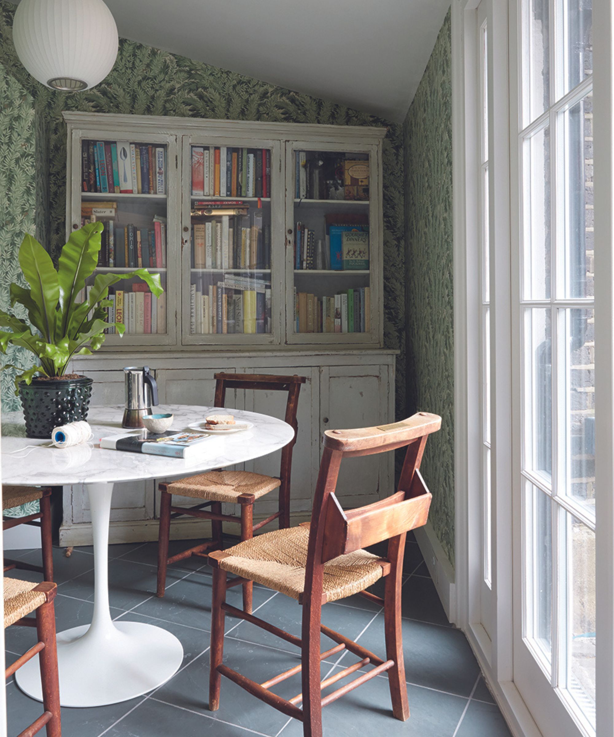
Hutches and buffets are synonymous with more formal dining rooms, but despite their popularity, they are a trend that can really date the space. They can work in a more farmhouse-style dining room if you want that space to display crockery, but really in a modern home they can be a bit redundant and end up just adding bulk and clutter.
Instead, stick to a sleeker sideboard if you want a surface to add some decor and display glassware then add a large print above to ground the furniture for a more fuss-free look. Or instead of crockery, bring books into the dining room to make it feel more relaxed and living room-like. And if you do like the look of crockery on display, wall mounting plates are making a surprising comeback and can totally work in the right space.
Dining rooms are undoubtedly tricky rooms to design and decorate but they can be a joy since they are rooms mostly used on occasion, you can be more experimental and have more fun with colors and patterns. Just don't get dragged down by those traditional dining room approaches to what they should look like, what pieces of furniture they must include, and how they should or shouldn't be used.
If we treat them like these separate, saved-for-events spaces, they will become more and more redundant, which seems like such a waste when a dining room can be such a relaxed and sociable space.
Sign up to the Homes & Gardens newsletter
Design expertise in your inbox – from inspiring decorating ideas and beautiful celebrity homes to practical gardening advice and shopping round-ups.

I am the Head of Interiors at Homes & Gardens. I started off in the world of journalism in fashion and luxury travel and then landed my first interiors role at Real Homes and have been in the world of interior design ever since. Prior to my role at H&G I was the digital editor at Livingetc, from which I took a sabbatical to travel in my self-converted van (not as glamorous as decorating a home, but very satisfying). A year later, and with lots of technical DIY lessons learned I am back to writing and editing, sometimes even from the comfort of my home on wheels.
-
 Drew Barrymore's striped sofa is her most elegant design to date – it oozes East Hampton elegance in time for summer 2025 (and is under $384)
This subtly striped linen sofa anchors any living room while feeling light and casual – it looks so much more expensive than its price tag
By Megan Slack
-
 Bryce Dallas Howard's bedroom is the most creative, social space in her entire home – she uses 'conversational seating' to create a multifunctional 'salon'
The actress's bedroom doubles as a home office thanks to its clever layout and furnishings, proving that this area is much more than a sleep space
By Hannah Ziegler