6 outdated decorating rules worth breaking, according to interior designers
Designers and decorating experts are throwing out the rule book to make way for fresh and modern looks. Here's what you need to know
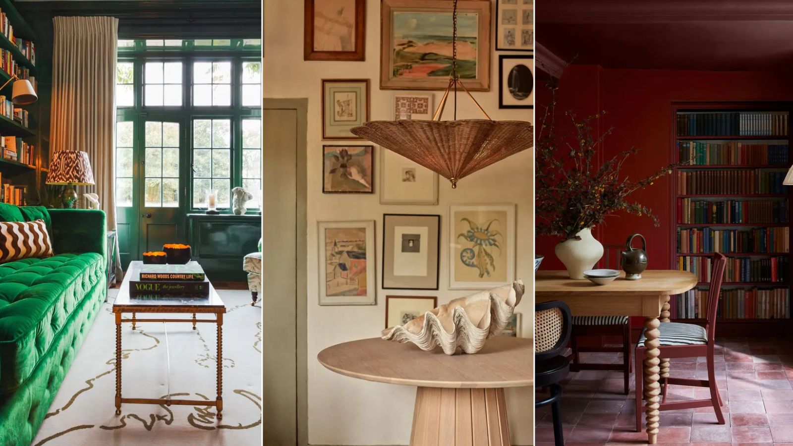
The interior design industry is similar to the fashion industry in many ways. Catwalks and showrooms prepare us for the new season, with an ebb and flow of new collections, colors and trends.
Just like in fashion, every so often there is a major shift. From swapping high heels for trainers in the workplace, to choosing wide-leg jeans after years of the skinny, some changes are more than fleeting trends – they are era-defining design choices.
There are key shifts happening in the world of interior design trends. And we have a feeling they're going to determine how we decorate for years to come.
We've spoken to interior designers and industry experts to reveal what long-standing, core design rules they are now breaking. And how this will pave the way for a new era of design...
1. Make every room as light and bright as possible
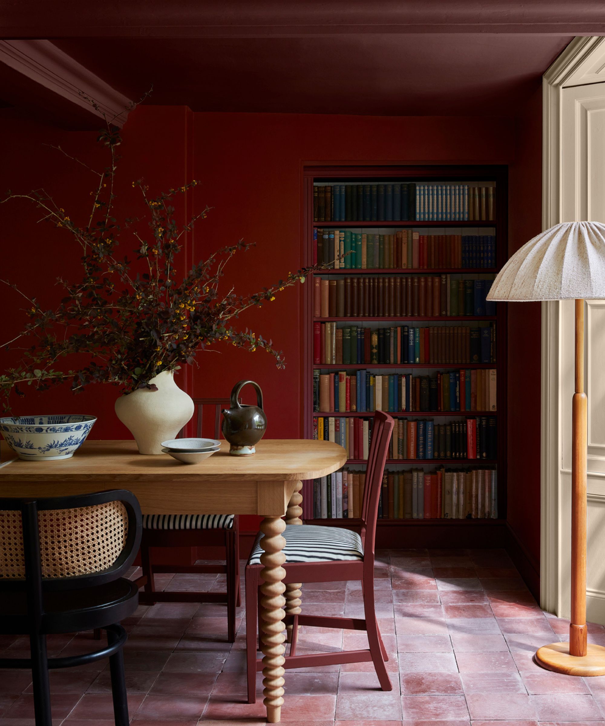
For a long time, we've been uniformly advised to lighten and brighten every room, to make it feel as open and airy as possible. And while this is a great idea for many rooms, some spaces will benefit more from embracing the dark side.
'A common rule you often see when it comes to painting your home is to avoid using dark shades in a small room, and while that may be the case sometimes, it’s one rule I’d like to see more homeowners breaking,' says Emily Kantz, color marketing manager at Sherwin-Williams.
'One of the most common misconceptions is that small, dark spaces need light, bright colors to make them appear larger or more open,' says Jena Quinn, one of the founders at Studio QD. 'Contrary to this belief, leaning into the natural coziness of a dark space by using rich, deep hues can actually create a more inviting and sumptuous environment.'
'Dark walls and accents add depth and sophistication, transforming what may have been seen as a limitation into an opportunity for warmth and luxury,' adds Jena. 'Don’t fight the darkness – embrace it, and watch how it elevates the entire room.'
'Using dark colors in a smaller room can actually create a beautiful and dramatic space when used wisely,' says Emily. 'I love using bold and dark colors in guest bathrooms. It’s a room that’s safe for experimenting and lets your guests catch a glimpse of a more dramatic personality, without it affecting the entire home.'
2. Your furniture must match
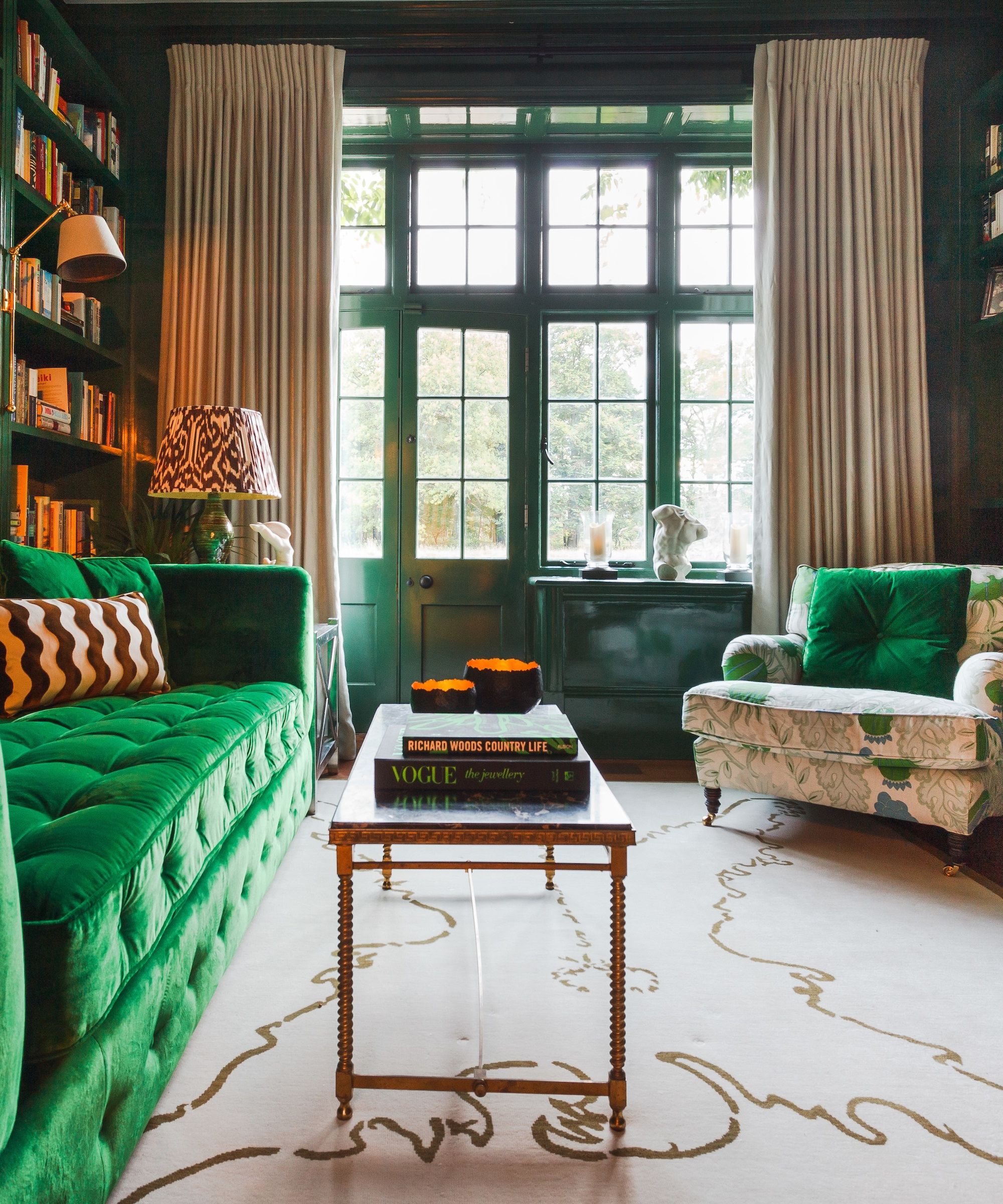
While it used to be advised that choosing complete matching furniture sets was the best route to a luxurious, and intentionally designed space, this is no longer the case.
'It is a myth that only matching sets create a cohesive look; spaces benefit from variety and character,' says Victoria Fletcher, senior buyer at Garden Trading.
'Often clients can be nervous about how to mix furniture, erring on choosing a sofa and matching armchairs to be on the safe side,' says Caroline Milns, head of interior design at Zulufish. 'Yet a room feels much more dynamic when the eye can perceive each piece as an individual moment.'
'This doesn’t mean each piece has to be in a clashingly different pattern or color, you can create a characterful space with pared-back tones, simply by mixing up the materiality and age,' Caroline continues. 'Combining vintage finds with contemporary pieces is a great way to deliver aesthetic appeal.'
'For me, a room should tell a story, one that is visually engaging. A curated selection of furniture, artwork, and accessories is essential in delivering a space that feels welcoming and interesting,' Caroline adds.
In this living room, the green button-backed sofa is combined with a patterned cream armchair, and each piece holds its own in the room, creating focal points whilst complimenting each other.
3. Choose one style and stick to it
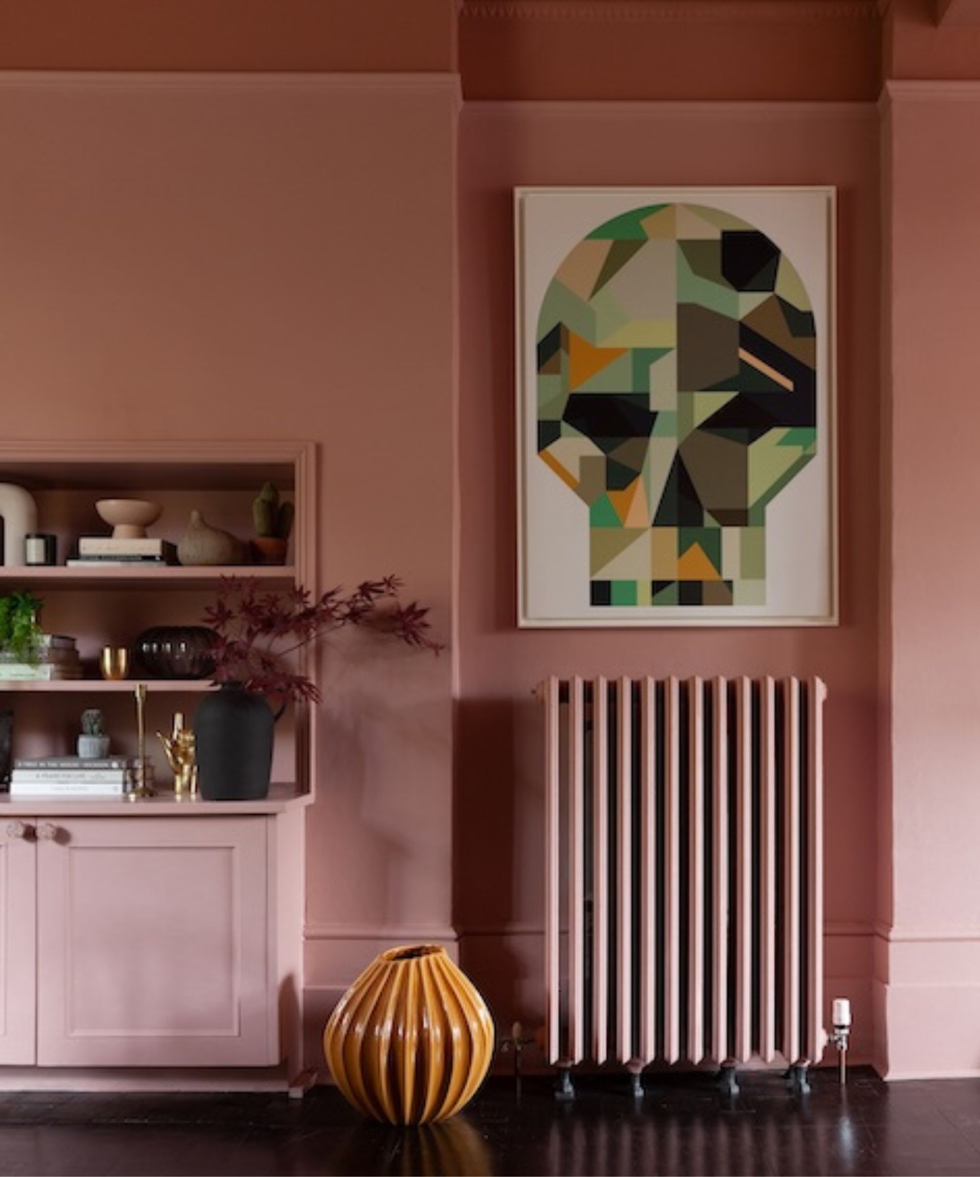
The idea of a 'Scandi style bedroom,' 'mid-century style living room' or 'industrial style kitchen' was once considered the place to start when designing a room scheme, so that you could ensure all your chosen pieces would fit into this theme. This is now a rule to very much break, as decorating and styling is more fluid and carefree.
'Don’t be afraid to mix old and new styles. Blending vintage or antique pieces with modern elements can add depth and interest to a space,' says Jo Plant, head of design at Pooky.
In this space, the Victorian-style, cast-iron column radiator sits beneath a contemporary geometric art print, creating a clear style contrast that's eclectic and fun.
4. Be consistent with scale
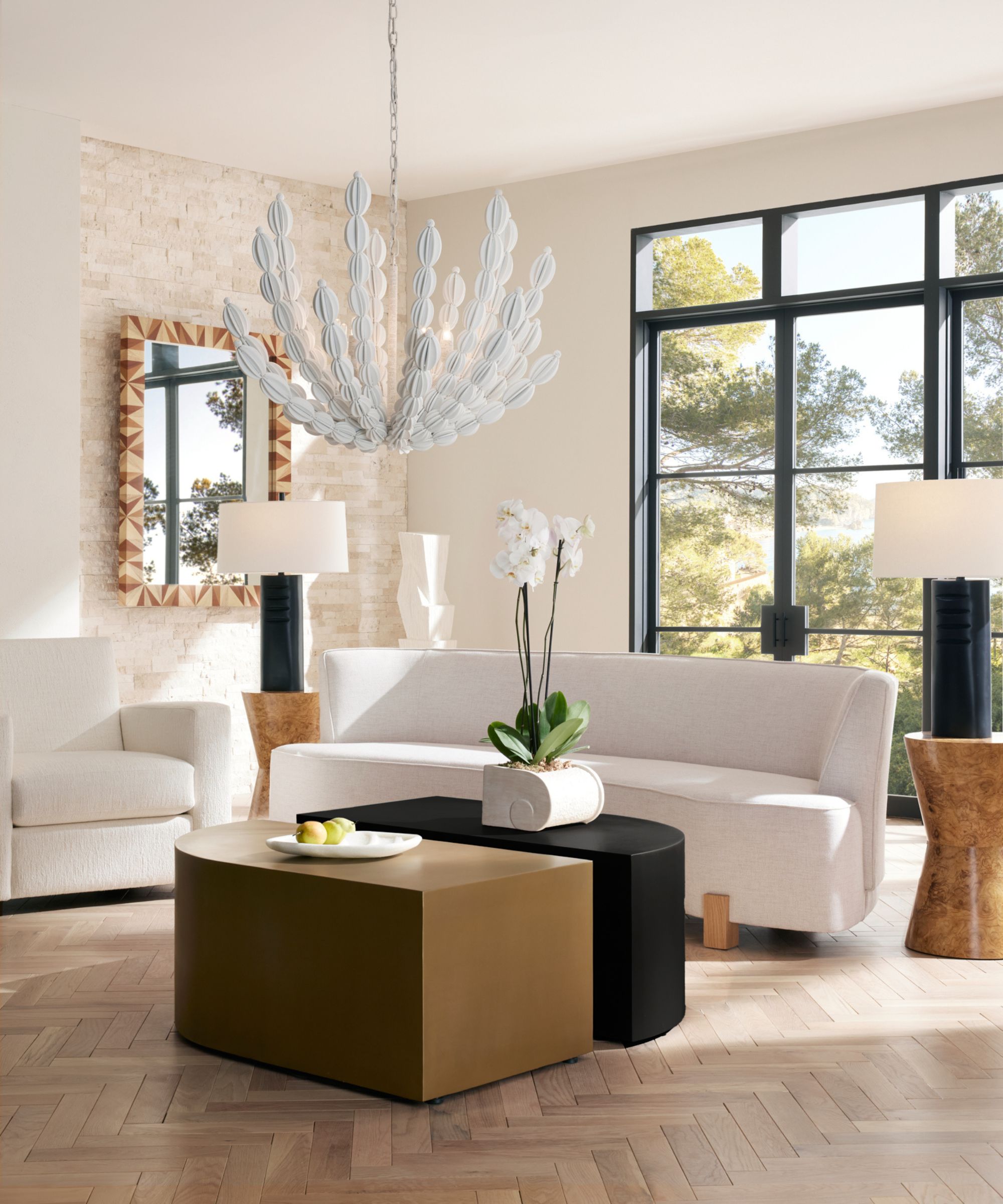
A basic design principle is to be consistent with scale. This means keeping all the proportions of your pieces the same and proportionate to one another.
Playing with scale in interior design, however, can work to create a focal point, draw attention to certain features, and create a high-end look.
'It’s common advice to not play with scale, but it is yet another opportunity to enhance a room. Large pieces can actually make small spaces feel bigger. In open-plan areas, oversized lighting helps define the space,' says Jo.
Here, the oversized architectural pendant lamp, as well as the oversized table lamps work to bring definition to this living area for a space that feels refined and curated.
'When using pared back tones, you can create character simply by mixing up the scale of pieces,' says Caroline.
In the above monochrome scheme, the large table lamps on relatively small side tables make them appear almost like statues, adding to the feeling of grandeur and elegance in the room.
5. Hang artwork at eye level
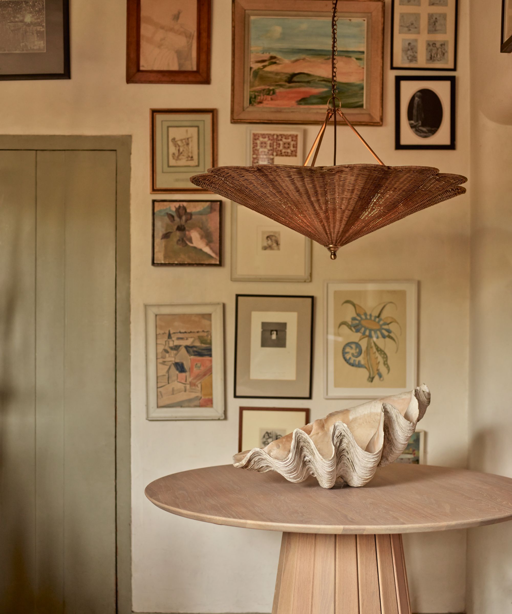
It has been engrained, consciously or unconsciously, into many of us, that artwork must be positioned at eye level when standing up. Breaking this rule is an easy way to create a more fun and contemporary feeling space.
'An outdated notion is that artwork must always be hung at eye level,' says says Lauren Gilbert-Thorpe, creative director at Lauren Gilbert-Thorpe Interiors. 'Why not have some fun and play with height? Arranging art at varying levels can create a more dynamic and visually interesting gallery wall. Or leaning larger pieces against a wall or displaying them on shelves can add a relaxed yet curated feel to your space,' adds Lauren.
Consider where you'll most likely be positioned when looking at the artwork. If it's sitting at a dining table, could you take your gallery wall lower, so you and your guests can get a close-up view of your favorite pieces whilst sitting down to dinner? Or, could you make the most of your high ceilings by adorning your walls with artwork all the way up to the top?
This is a great way to form a more creative, experimental home that feels unique and personal.
6. Don't use wallpaper in the kitchen
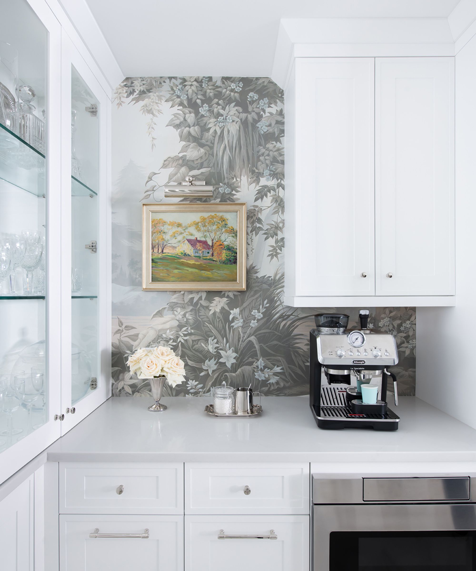
Wallpaper has long been considered a no-go for kitchens, mostly due to the fact that the paper is at risk of splashes and irreparable stains.
But, thanks to modern technology, this is a rule that designers are so pleased to break. 'Wallpaper is back in a big way, and one of my favorite design rules to break is “no wallpaper in the kitchen,"' says Shani Core, of Shani Core Interiors.
'New wallpaper fabrication technology using cleanable materials means that wallpaper can go in any room and may be used in place of a typical tile or stone, as a backsplash as I did here,' she says.
In the above kitchen, the wallpaper makes the space feel more like a pleasant room to relax in, rather than simply a place to cook. If you've already chosen your wallpaper and it's not specially formulated for the kitchen, simply paint a protective sealant over your design and you'll be good to go.
In interior design, rules are made to be broken. In fact some of the best spaces are created by ignoring those old-school rules we all probably follow intuitively. Do what works best for you and your space, even if that means going against playing it safe.
Sign up to the Homes & Gardens newsletter
Design expertise in your inbox – from inspiring decorating ideas and beautiful celebrity homes to practical gardening advice and shopping round-ups.
-
 The biggest curtain trends to follow in 2025 – 8 key looks to shop that will instantly elevate your rooms
These are the colors, styles, and materials to embrace in your windows this year if you want desirable drapes, plus our favorite places to shop the trends
By Lilith Hudson
-
 Reese Witherspoon upgraded a small corner into a cozy reading nook – designers say you can replicate her 'ultimate little escape' (from $18)
'It’s all about comfort, calm, and just the right amount of cozy': You only need three things to follow Reese's example – and it's not only for book lovers
By Megan Slack