I live in a broken-plan apartment – these are all the open-plan layouts I have tried and regretted
Lesson number one: the couch never belongs in the center of the room


When you move into a new home, there's always much excitement about choosing furniture, picking out colors, deciding on rugs, curtains, mirrors, etc. But for me, I couldn't wait to get into the space and play around with the open-plan layout.
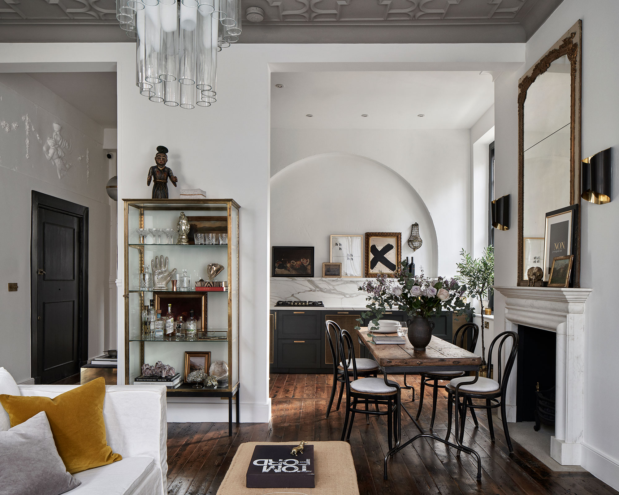
My apartment is that strange middle ground between not quite being open plan, and not quite being a collection of separate rooms. The entryway runs into the large living room (which also needed to double as a dining room and a workspace) and then the kitchen leads on from that through a large open archway. A broken-plan living room is the best way to describe it.
My task was to turn the pretty big, main living room into a multifunctional, hardworking space that still felt open, light, and not too full of stuff. Safe to say it was no mean feat, and I have reconfigured that room so many times. I have also made many mistakes when it comes to open-plan layouts. So, so you can all avoid dragging your furniture around only to find something really doesn't work, I thought I would share what layouts really didn't work for me, and what open-plan living room ideas did end up a success.
1. Breaking up sight lines

By that I mean, do not put your couch in the middle of the room. When I viewed my apartment, this was actually the setup. The sofa faced away from the walkway into the kitchen and towards the fireplace, creating what felt more like two separate rooms than an open-plan space. And it worked. With their sofa and what they needed from the room, it created a cozy living room and the couch acted as the perfect divider between the space.
When I tried the same configuration with my couch, which was much smaller and low-slung than that of the previous owners, to try and make the large living room feel cozier. It looked like I had just moved in and was deciding where to put the sofa (this was the case but not the vibe I was after). The second you walked in the room your eyeline was blocked by the bulk of the sofa and it created this awkward walkway behind.
So tip number one, keep a layout in a broken or open plan room as visually easy to take in as possible. Constantly step back and look at your layout, and check if any piece of furniture is standing out or breaking up the room. If you are going to float living room furniture, ensure you have enough room to do so. Walkways around all the pieces should feel easy and natural, and you shouldn't have to squeeze past furniture to move around the space.
2. Being too open with the layout

This was the approach I tried after the 'zoning' didn't really work. Everything went against the walls, with a sea of floor and a huge area rug in the middle. In terms of making the room look bigger, it did the job, but everything felt a bit disjointed. The TV felt miles from the couch and the dining room table felt off - like it was encroaching on the living room rather than being a seamless part of the multifunctional space.
Design expertise in your inbox – from inspiring decorating ideas and beautiful celebrity homes to practical gardening advice and shopping round-ups.
The walls were really crowded and the floor space in the center was totally empty. 'While it might seem intuitive to push furniture against walls to create more floor space, this can actually make conversations feel disconnected,' says designer Kati Curtis. 'Try arranging furniture in a way that encourages interaction and conversation, the furniture doesn’t have to (and shouldn’t) touch the walls.'
'One mistake is having furniture against the walls which creates a void in the middle of the space and the room becomes too open' agrees Tom Rutt, founder of TR Studios. 'It's really key to zone areas so that the room feels balanced and so that there are focal points across the space. You can use furniture to delineate an area, lighting, and also rugs are a great way to do this, for example, zoning a seating area and also zoning a dining area.'
Agreed. Furniture should have some breathing room, especially in an open-plan space where you are likely to have quite a lot to fit in you want there to be plenty of negative space rather than one solid bulk of furniture crowding all the walls.

Tom Rutt has worked in the offices of Norman Foster and Michaelis Boyd before founding TR Studios in 2015.
3. Not paying attention to natural pathways

One huge tip I would love to have had before I started planning my open-plan living room layout would be really consider how you are going to move around the space. Think of different scenarios, such as where you need to walk to get from the kitchen to the dining table, from the couch to the TV console, from the entryway to, well anywhere. You want to avoid blocking these natural pathways and ensure there's plenty of room to move around the space in an as efficient way as possible.
As Kati says, 'Open floor plans can be alluring, especially for their ability to create a sense of spaciousness and encourage social interaction within the home. However, common mistakes can often compromise the perceived benefits of this design. The absence of clearly defined spaces and clear walkways can make furniture placement and room organization difficult.'
I would go as far as to say before committing to any layout, just suss out the space for a day or two. Go about your routine and see how you use the space and where you are drawn to for certain tasks.

Kati Curtis is an interior designer based in New York City specializing in classic design with global twist. Kati founded Kati Curtis Design in 2005 after 12 years of working with international architecture and engineering firms. She is a Certified Interior Designer (CID), and a Leadership in Energy and Efficient Design Accredited Professional (LEED AP).
4. Not using rugs to zone instead of furniture

There are currently two rugs in my open-plan space, one sits under the dining table, and one sits under the living room furniture and this for me was the answer to dividing the living room. My space wasn't big enough to divide the room with furniture, but rugs take up less space both physically and visually but do have that same, wall-creating effect.
'Area rugs work wonders in open-plan spaces,' agrees Jennifer Ebert, editor of homesandgardens.com. 'They can help to zone a broken plan living room without adding the visual bulk that furniture would. I would recommend either using the same rugs in different sizes or shapes throughout the space or choosing two rugs that still have a link, maybe in the colors or the material.'
And always ensure that some of your furniture sits on top of the rugs, this will further help create those rooms within rooms. You want to avoid a rug that floats in the middle of the room, with this awkward gap of a few inches surrounding the edge.
FAQs
What is the best layout for an open plan space?
This totally depends on the size and shape of the space, plus what it needs to include. General advice is to always create zones within the room, subtly dividing it up based on purpose. If your room is large enough, and you can still easily move around the space, furniture is a good way to do this - use pieces a bit like walls to create pathways through the space that separate different areas. Rugs work well for this too.
Be sure to also pick a focal point of the room and allow that to dictate your layout. That might be the TV, a feature wall, or a fireplace, this will give your layout a bit of structure despite probably having lots of different functions going on.
Does furniture have to match in an open plan layout?
No. In fact, I would consider this another open-plan mistake to avoid. You want the room to have character for one, and also choosing slightly different styles for different parts of the room can create those zones we have talked so much about. However, you still want to space to feel cohesive, so create a link between those styles, whether it's a color a finish, or a piece of furniture that runs between the two areas.
The freedom and flexibility that an open plan room allows means there are endless mistakes to be made, but each mistake means you learn a lesson and you can quickly start to discover what doesn't work for you. I'd recommend planning ahead as much as possible before setting a layout, deciding what the room needs to provide, how you ideally want the space to work and feel, and then planning your layouts based on those. Furniture is moveable so just keep switching it up until you find the right fit.

I am the Head of Interiors at Homes & Gardens. I started off in the world of journalism in fashion and luxury travel and then landed my first interiors role at Real Homes and have been in the world of interior design ever since. Prior to my role at H&G I was the digital editor at Livingetc, from which I took a sabbatical to travel in my self-converted van (not as glamorous as decorating a home, but very satisfying). A year later, and with lots of technical DIY lessons learned I am back to writing and editing, sometimes even from the comfort of my home on wheels.