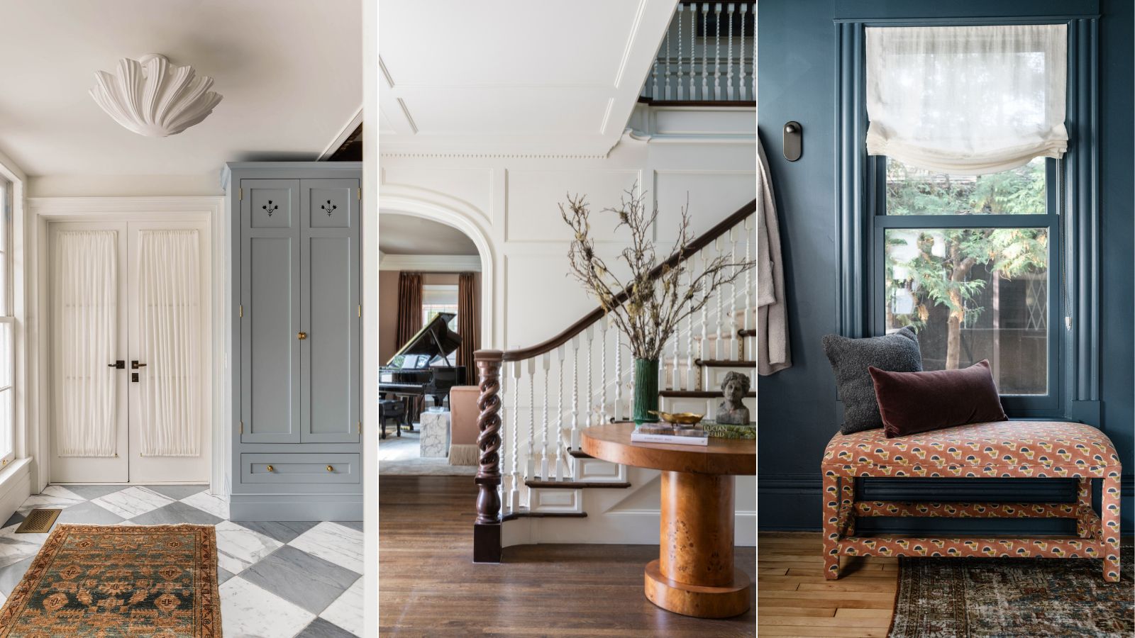
I've just made my entryway open plan, here are the 6 design rules interior designers advised me to stick to
As the first impression of your home, leading onto each further space, its important to get this right. Here's how

Recently I made the big, bold, and brave decision to take down the walls and doorway surrounding my staircase to create an open entryway. The positives outweighed the hard labor: more natural light, a great sense of flow, and a more welcoming first impression as you entered the home. But there was something I neglected to consider.
You see, what I failed to realize is that by doing this, I have actually now joined my entryway, staircase, dining room, and upstairs landing in one (hopefully) happy union. This means that every design decision I make in each of these spaces – from color schemes to flooring to print and pattern – affects the next space, and so on and so forth.
Lucky for me, I have interior designers at my disposal to advise me on the design rules for an open entryway. So I asked them for their biggest tips and hacks to enhance the decor, flow, and function of an open-plan entrance in a way that not only impresses guests but fosters a sense of cohesion between each space. If you too are struggling with making design decisions for your open entryway and want to avoid making entryway mistakes, here's what they had to say.
6 Design Rules For An Open Entryway
An open entryway is a great design choice that acts as both a functional and aesthetic bridge between the outdoors and the interior of your home. It's proving a popular choice for home renovators as it can help make even the smallest of spaces feel more expansive.
However, it's essential to follow the expert's advice when designing an entryway to make sure the space is both practical and pretty. Here, interior designers emphasize the importance of creating a look that harmonizes with the rest of your home, while also serving as a distinct welcoming area – a tricky balance. These are their 6 expert-led design rules for an open entryway.
1. Be consistent with your design
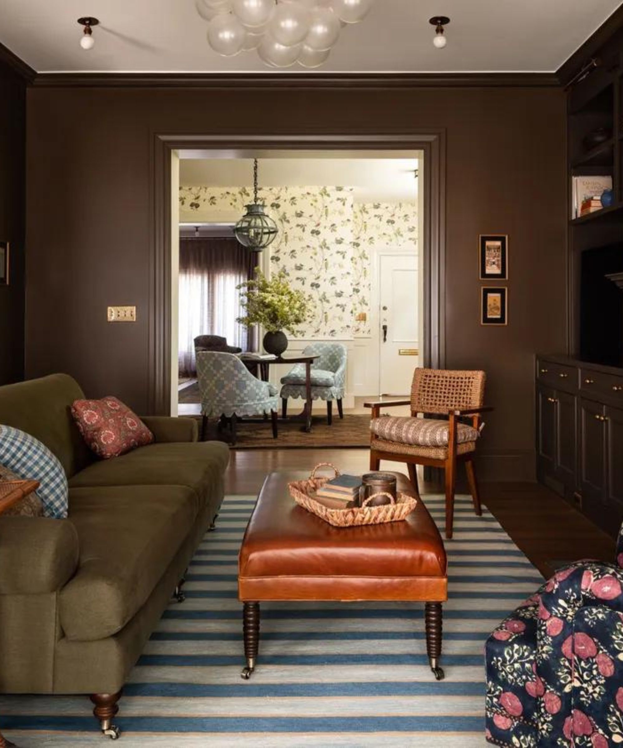
It sounds obvious, but consistency in design elements, such as flooring, color schemes, and lighting, is the key to achieving a seamless transition from the entryway to the adjoining rooms.
For example, while I was merrily ordering denim-y, mid-toned ocean-blue paint testers to try for my dining room, it hit me that this hue now has to work for the staircase and hallway too as they all lead into the dining space, without any doorways or obvious 'breakpoints'. Extending beyond just colors; furniture, lighting, and decorative accents are all key pieces that should align with your home’s style to help create a seamless transition from the entryway to other areas.
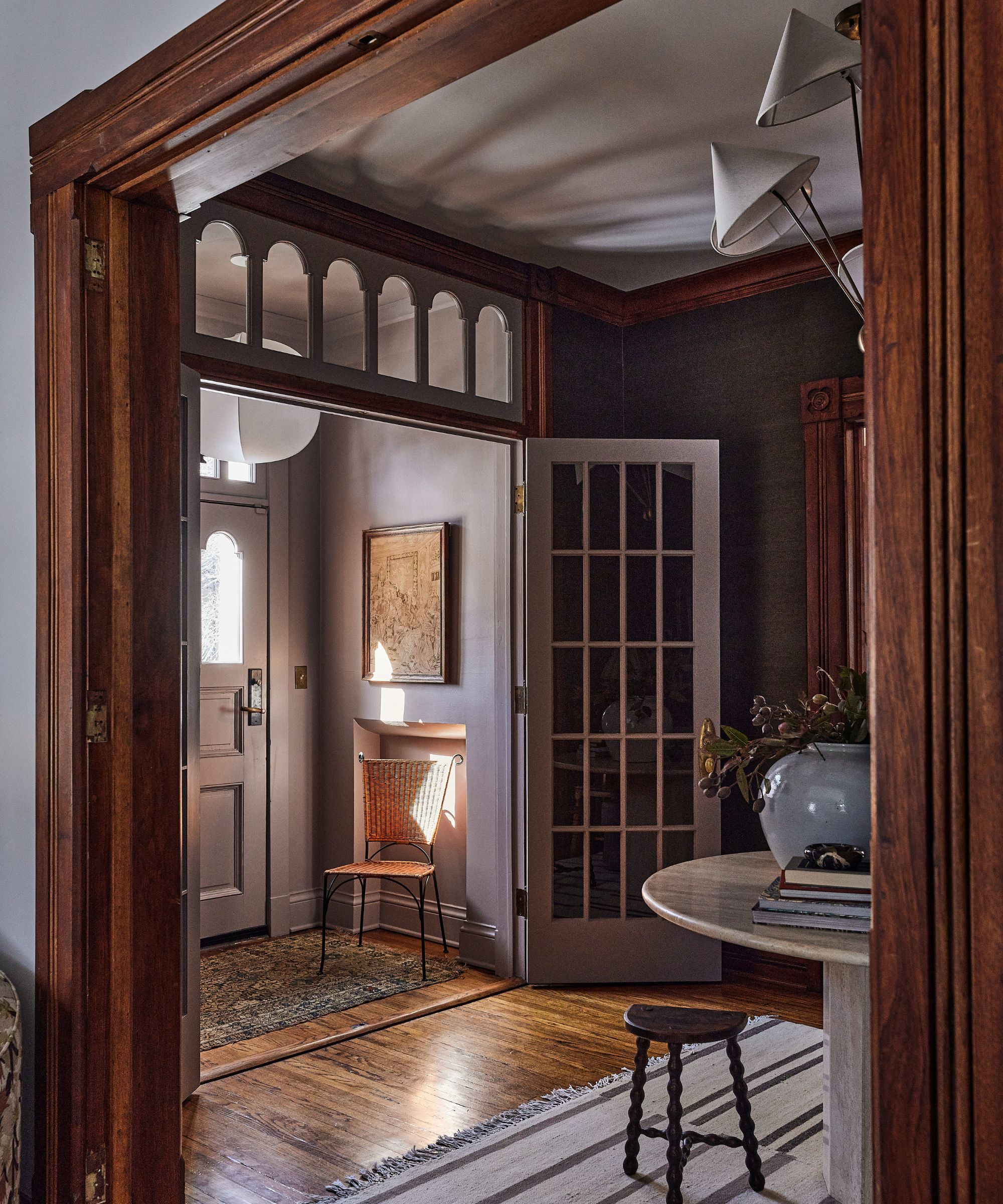
In the space seen above, designed by the beloved Heidi Caillier, the entryway has been wallpapered in a whimsical vine leaf print which reflects the green of the couch in the snug. Similarly, the blue tones are also echoed in both spaces thanks to the chairs surrounding the entry table, and the blue striped rug and accessories in the adjacent, chocolate brown sitting room.
2. Set the tone for the entire home
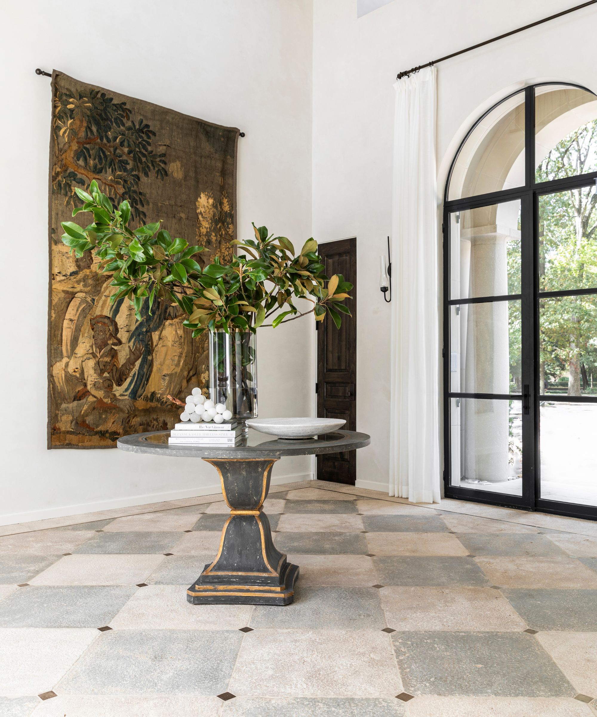
Your entryway should act as a preview of what’s to come and make a lasting impression. Which, for me, is why I'm feeling the pressure to make good decisions here.
'I love to design open entryways that set the tone and mood for the home,' agrees interior designer Marie Flanigan. 'The entryway sets the tone for the entire home, making a strong first impression with its inviting and cohesive design. By thoughtfully curating this space, you establish a welcoming atmosphere that reflects the home's overall aesthetic and character.'
For instance, if your home features a modern aesthetic with clean lines and a neutral palette, your entryway should mirror these elements.
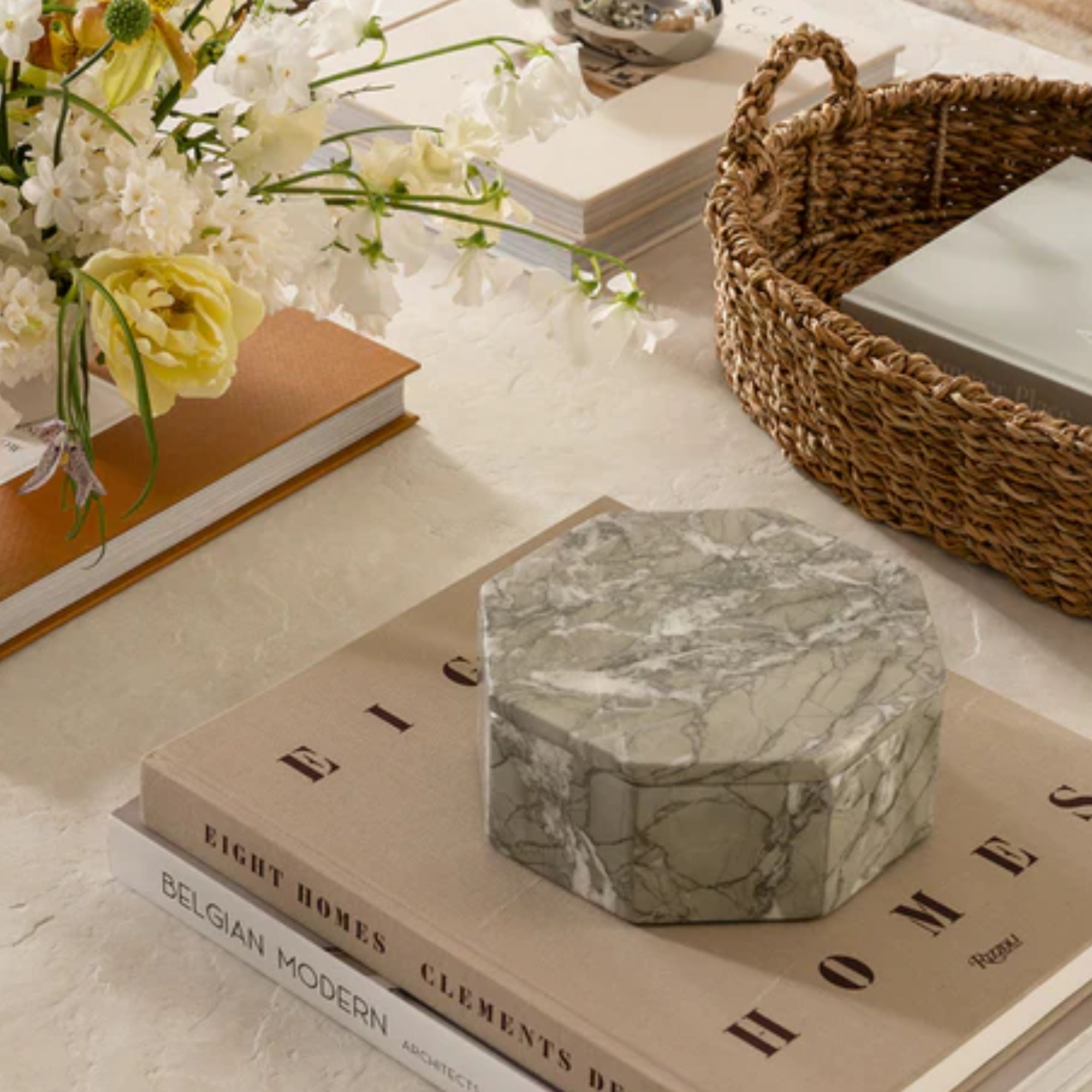
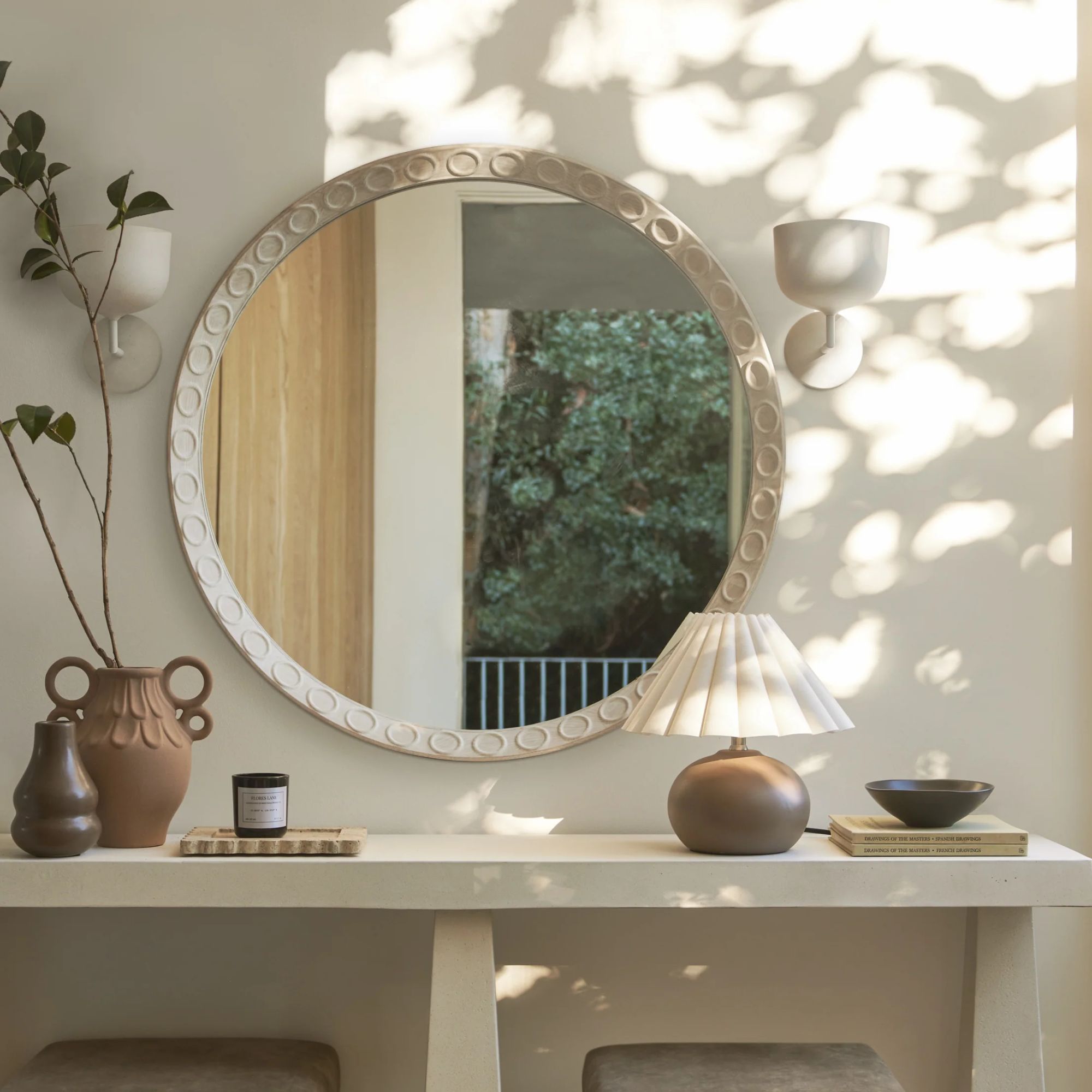
'For these large open spaces, consider a beautifully styled table as the focal point or even a stunning light fixture. For table styling, I often use books, ceramics, florals, branches, and artwork to create a seamless transition from the exterior into the home,' Marie advises. By thoughtfully selecting these key elements, you can ensure that your entryway sets a cohesive and stylish tone for your entire home.
3. Create distinctive vignettes
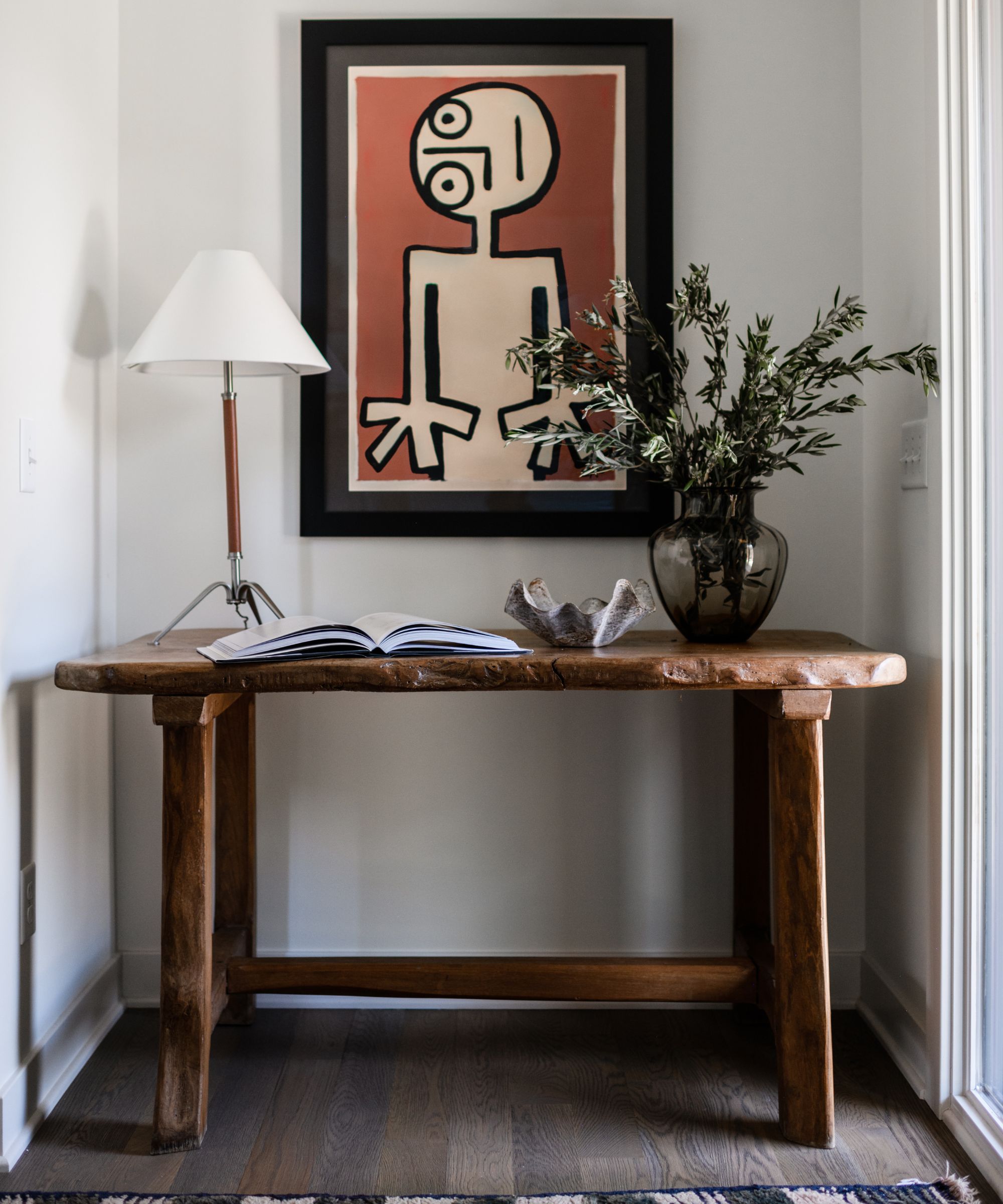
'The key to success with an open entryway is creating distinctive vignettes throughout the space,' suggests designer Kathy Kuo. In case you're wondering, what is a vignette? Vignettes are small, curated displays that can highlight your personal style and provide focal points within a space. They can tell a story and give guests a glimpse into your home's character.
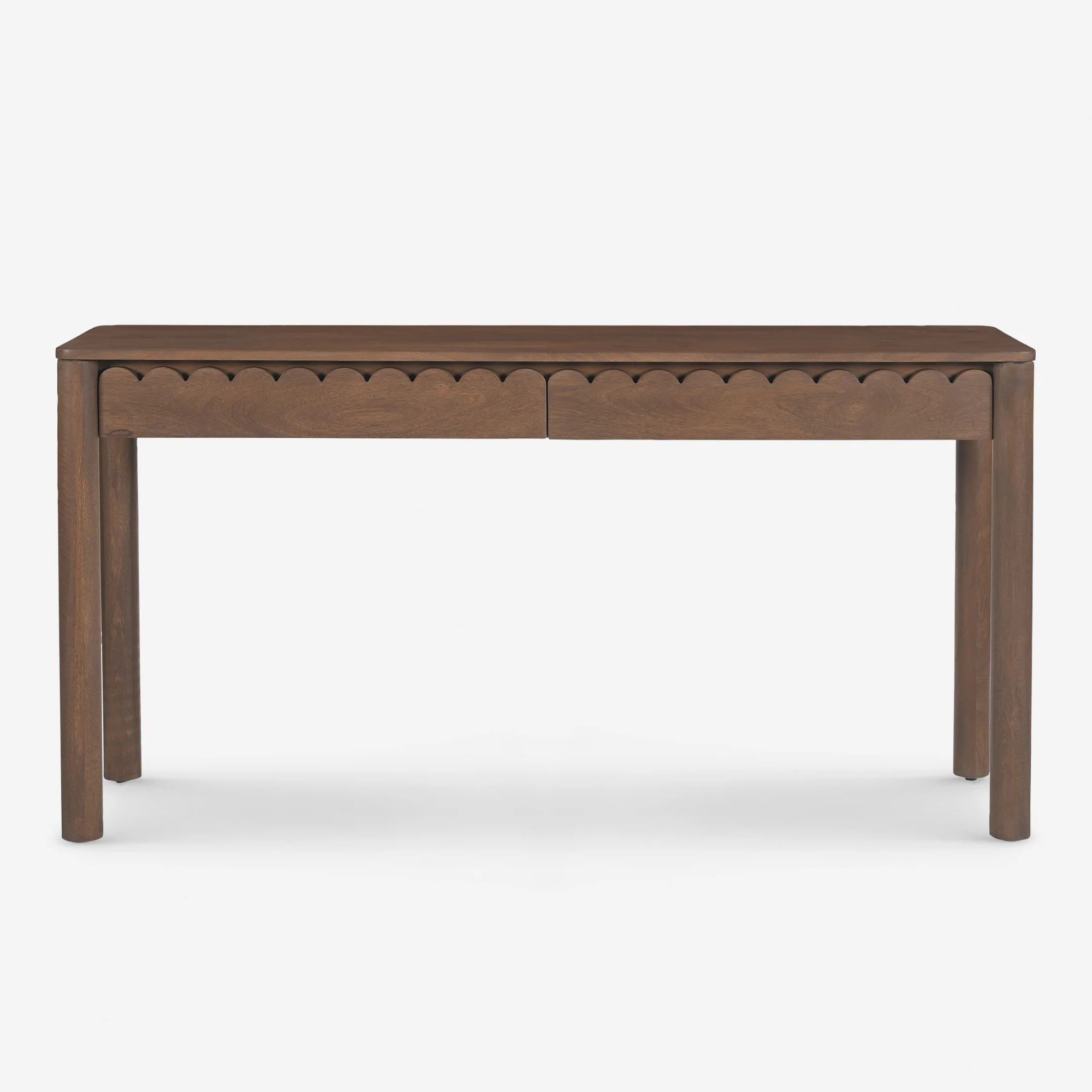
To start, consider incorporating a console table as the centerpiece of your vignette and building it up with artwork, mirrors, vases, candles, and framed photos. And don't overlook stylish storage solutions such as decorative catch-all bowls for keys or baskets for mail and stray hair ties. One tip tip for choosing entryway furniture? 'Consider scale and make sure you don't feel lost in space by sizing furniture and accessories correctly,' suggests Sarah Latham of Latham Interiors.
'Entryway pieces like benches, console tables, sets of coat hooks on the wall, and shoe racks are all going to help create structure and a sense of utility that will make it clear there are defined boundaries for the entryway, even if it's part of a larger open-concept space,' Kathy explains.
4. Conceal your clutter
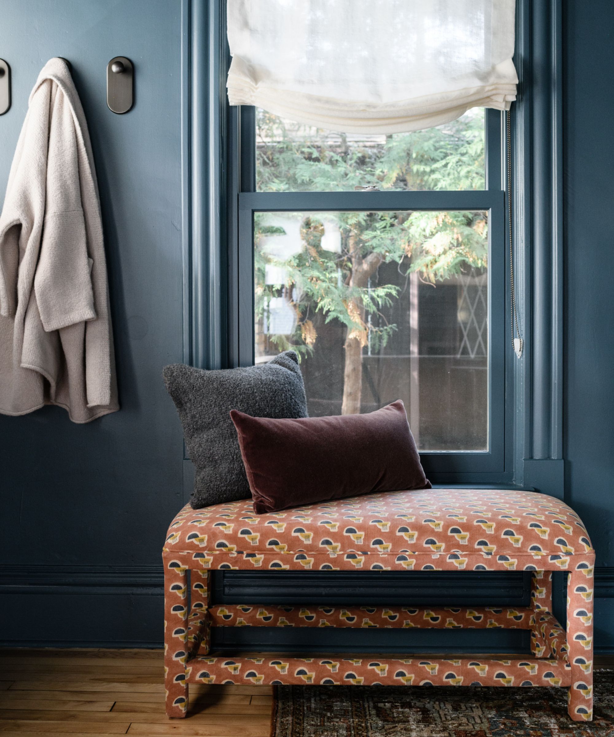
A clutter-free entryway will not only look more appealing but also enhances the functionality of the space, particularly if it is open-plan. An organized entryway sets the tone for the rest of the home, so it should be both beautiful and practical, without the distraction of clutter.
I'm opting to build out under-the-stairs storage and a boot room-style bench area for putting on shoes, reminiscent of the space above designed by Yond Interiors. 'We always try to create a sense of place and space when there is an open concept space,' says Julia Miller, founder of Yond Interiors. 'So for us, that means using furniture, hooks, art, etc. to anchor the space. We also like to hide as much entryway clutter, so having a console piece with closed storage is always ideal.'
A storage bench is a great addition to any entryway as it combines seating with hidden storage, helping to keep the space clean and organized. Don't overlook vertical options, hooks, shelves, and cabinets keep items off the floor and easily accessible. Finally, give yourself some smaller places to hide loose items like baskets and bins.
5. Create zones with rugs
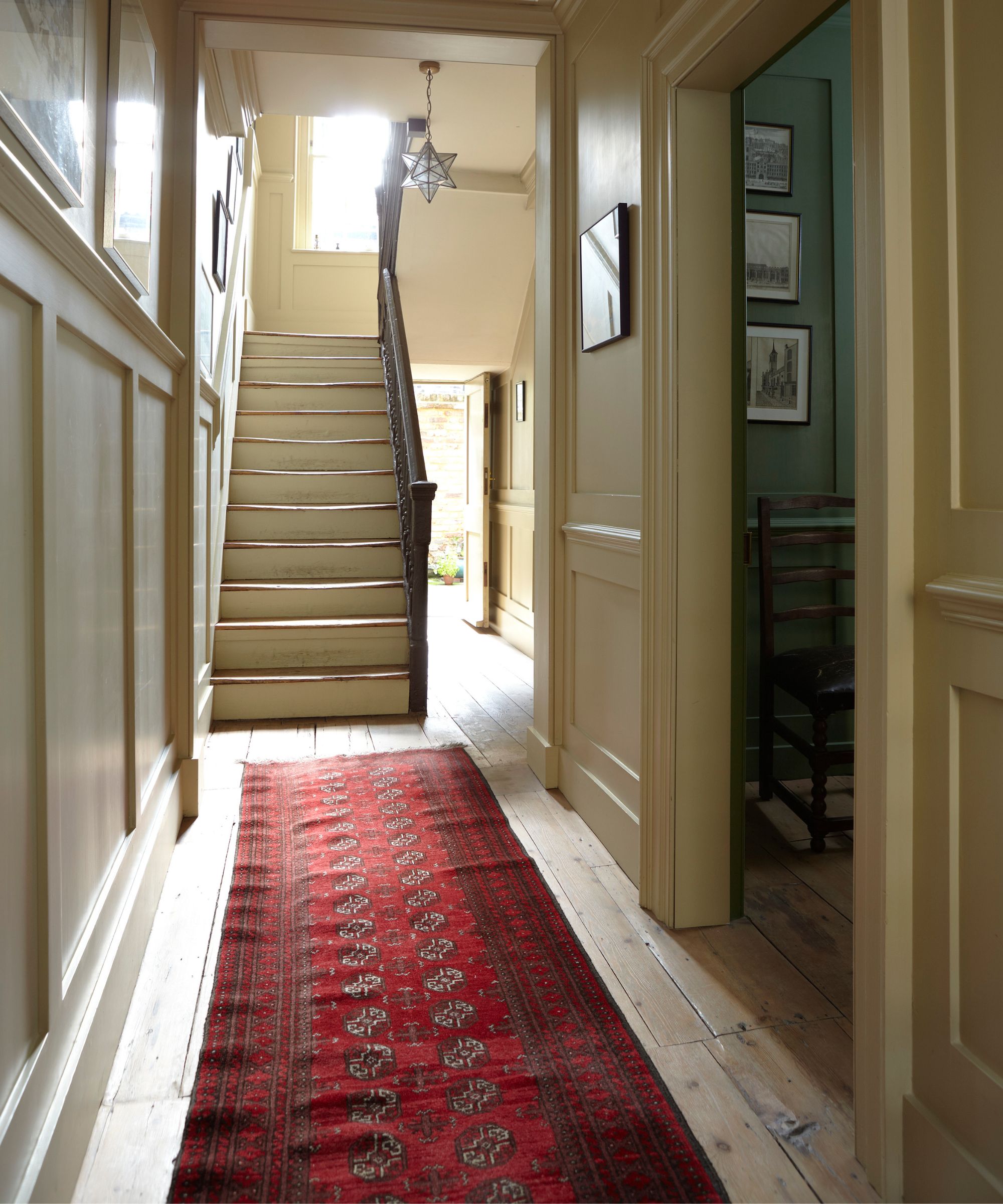
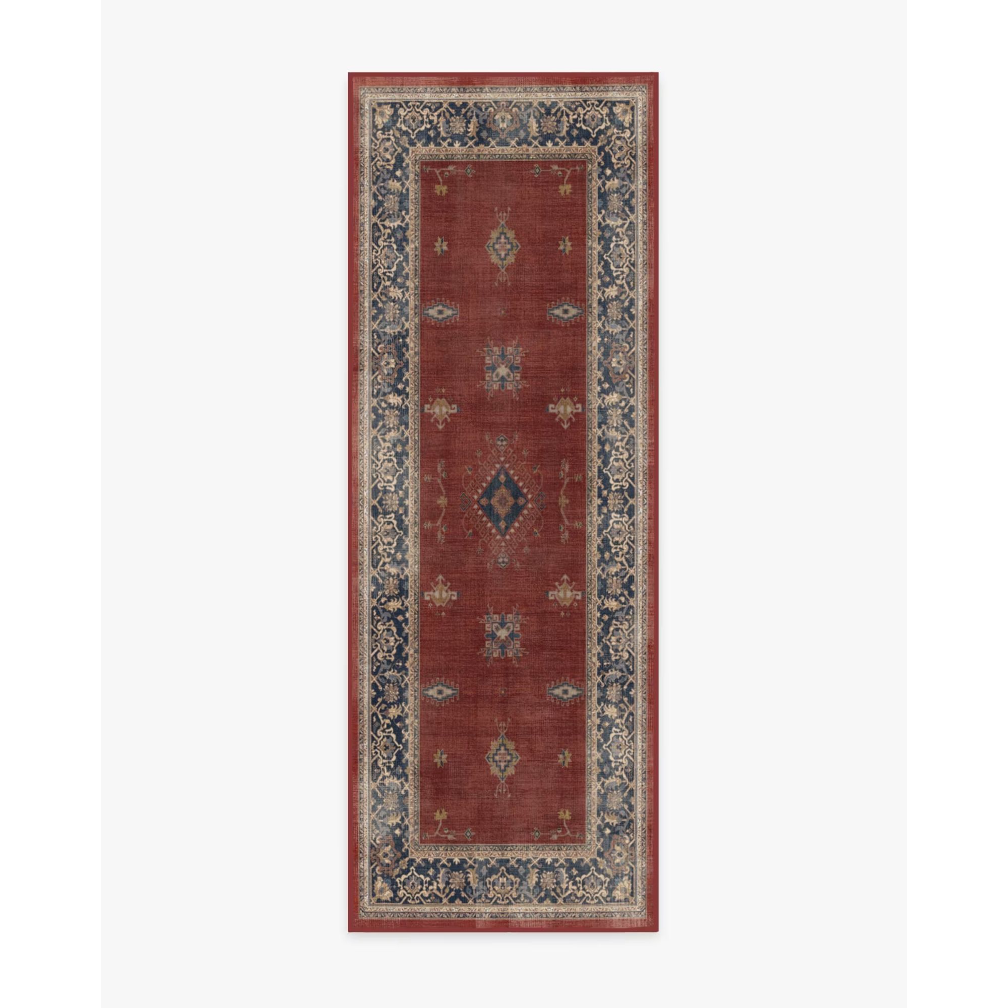
Rugs are a simple yet effective (and designer favorite) way to ground a space and establish distinct zones. They add texture, color, and warmth, making the entryway feel more inviting while helping to delineate the entryway from the rest of the living space, creating a visual boundary that can make the expanse feel more intentional.
'A design rule I always keep in mind is a properly sized rug to ground the space,' says Shelby Van Daley of Daley Home. 'It should be one step from the entry door and ideally, your rug will be 1 foot from all walls in your entryway,' Shelby advises.
Select a rug that is proportionate to your entryway. It should be large enough to accommodate foot traffic but not so large that it overwhelms the space. A runner rug, like in the space above, can be an excellent choice for a narrow entryway. I especially love the butter yellow walls paired with an unexpected red rug.
'Go for a proper rug to create a visual boundary to the room,' adds Heather Peterson, Heather Peterson Design. 'I like vintage wool options in a stronger pattern as they're very forgiving with all the traffic!'
6. Add personality
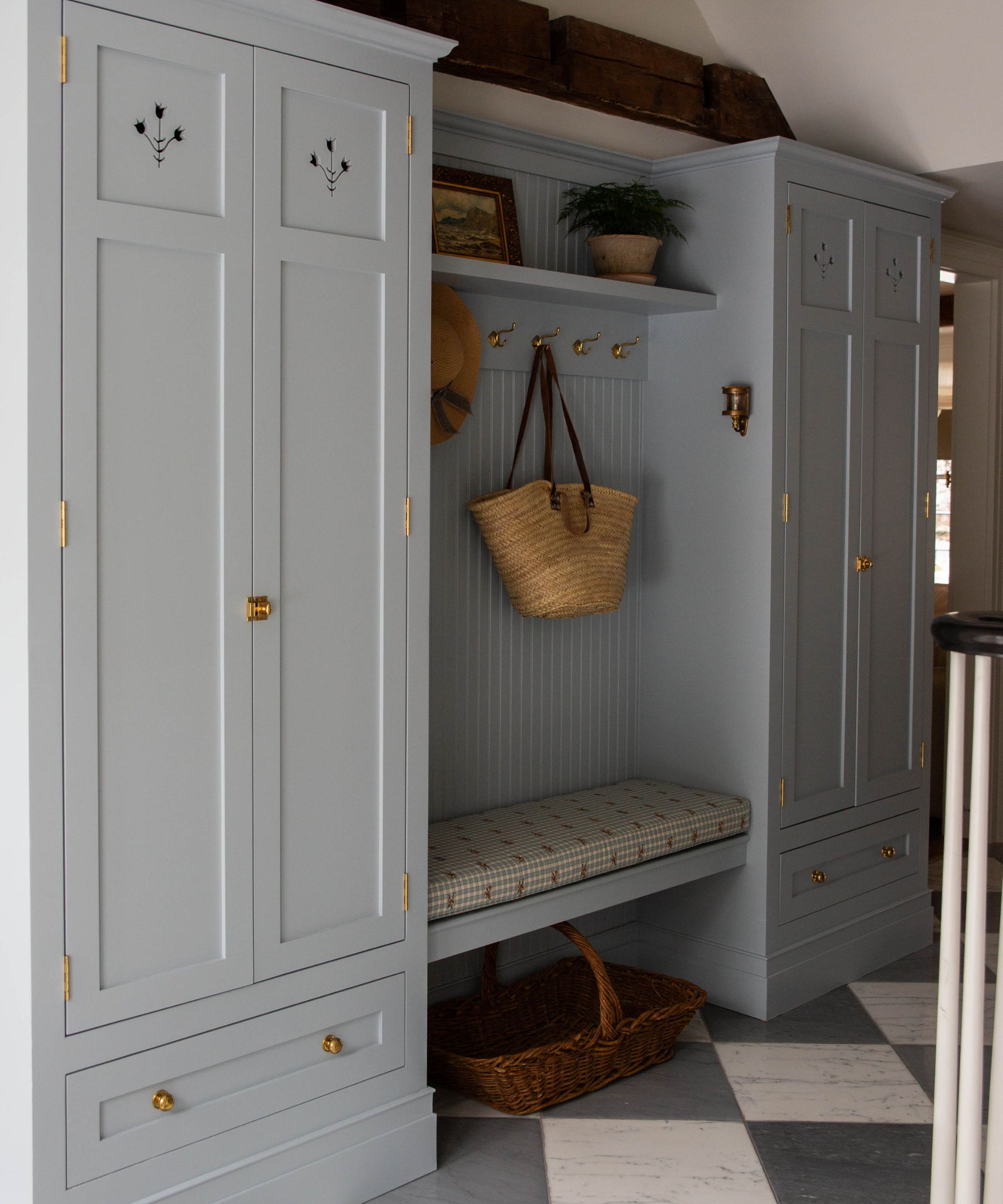
One final note: Your entryway is the perfect place to showcase your personality, it's the first thing guests see when they enter your home, so it should tell a story about who you are.
'An entryway is a place to make a statement, whether it is your utility room where function meets design, or the front of your house where it is your guest's first impression,' says interior designer Carley Summers.
'I always suggest adding your personality into an entry through pieces and symbols that express who you are, like this tulip in this entry cabinet [seen above],' says Carley. 'The owners loved Amsterdam, and the tulip is a symbol of that region. If you are wanting to bring the outside in, I suggest wallpaper with florals and greenery to add that special touch. And I always love to add flowers or a plant no matter what!'
'Also, don't forget the art; with an entry that is open to the rest of your home, you want to treat it like another room, not just a utilitarian pass-through,' suggests Heather Peterson. 'Make your accessories work for you: a footed bowl for keys, a pretty tray for mail. If it's got to be in sight, it might as well be pretty.'
The key really to all open-plan spaces is to ensure you have clear, designated and expertly designed zones. Whether you do that with color, vignettes, storage, or rugs (or all of the above!) you can transform your open entryway into a welcoming and practical space.
Whether you’re welcoming visitors or simply coming home after a long day, a well-designed entryway sets the tone for the entire home, making every entrance a delightful experience.
Sign up to the Homes & Gardens newsletter
Design expertise in your inbox – from inspiring decorating ideas and beautiful celebrity homes to practical gardening advice and shopping round-ups.

Charlotte is the style and trends editor at Homes and Gardens and has been with the team since Christmas 2023. Following a 5 year career in Fashion, she has worked at many women's glossy magazines including Grazia, Stylist, and Hello!, and as Interiors Editor for British heritage department store Liberty. Her role at H&G fuses her love of style with her passion for interior design, and she is currently undergoing her second home renovation - you can follow her journey over on @olbyhome
-
 5 things professional cleaners always do to overcome a cleaning roadblock – they're surefire ways to feel 'motivated and clear-headed' experts say
Get your cleaning schedule back on track
By Ottilie Blackhall
-
 Martha Stewart used this vintage-style pan to make cute bunny cakes for Easter – it's a real heirloom piece (and only $40 now)
It's not Easter without bunny-themed baked goods, and Martha set a precedent with a novel cake pan – it's American-made and has exceptional durability
By Megan Slack
