5 neutral palettes that always work – color experts share their favorite combinations
Discover the neutral palettes color experts say are the best for creating a timeless scheme

Design expertise in your inbox – from inspiring decorating ideas and beautiful celebrity homes to practical gardening advice and shopping round-ups.
You are now subscribed
Your newsletter sign-up was successful
Want to add more newsletters?
Neutrals are a decorating staple. Hugely versatile and easy to pair with bolder colors, they are the go-to shades for those looking to create calming and timeless interiors or provide a subtle foundation for brighter accents.
While they are often regarded as the safe option, settling on the right neutral shades for a room is not always as straightforward as it might seem as there’s a vast spectrum of shades available from crisp whites and cool grays to creams, beige, taupe and brown, not to mention the myriad tones in between.
If you’re thinking of decorating with neutrals you’re in the right place as we’ve consulted the experts to discover the neutral palettes that always work alongside their favorite shades for creating timeless spaces.
Article continues below5 neutral palettes that always work
If you're looking to create a timeless space you can't go wrong with a neutral palette. From myriad off-whites to beige and taupe, through to charcoal greys and deep chocolate browns, neutral tones are wonderful for using together to create interiors with depth and interest that will stand the test of time.
However, with so much choice, knowing the right shades to use together can be baffling. Generally speaking, working with different tones within the same color family, or with the same undertones, is a great way to create a harmonious scheme.
To help give you confidence with your room color scheme we asked the experts to share their go-to neutral shades for timeless decorating and have used the advice to compile a shortlist of the five neutral palettes that always work.
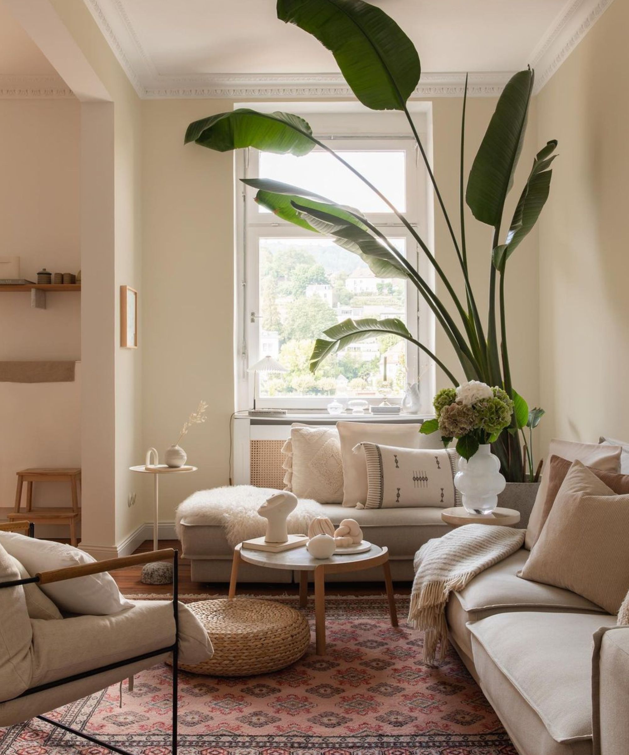
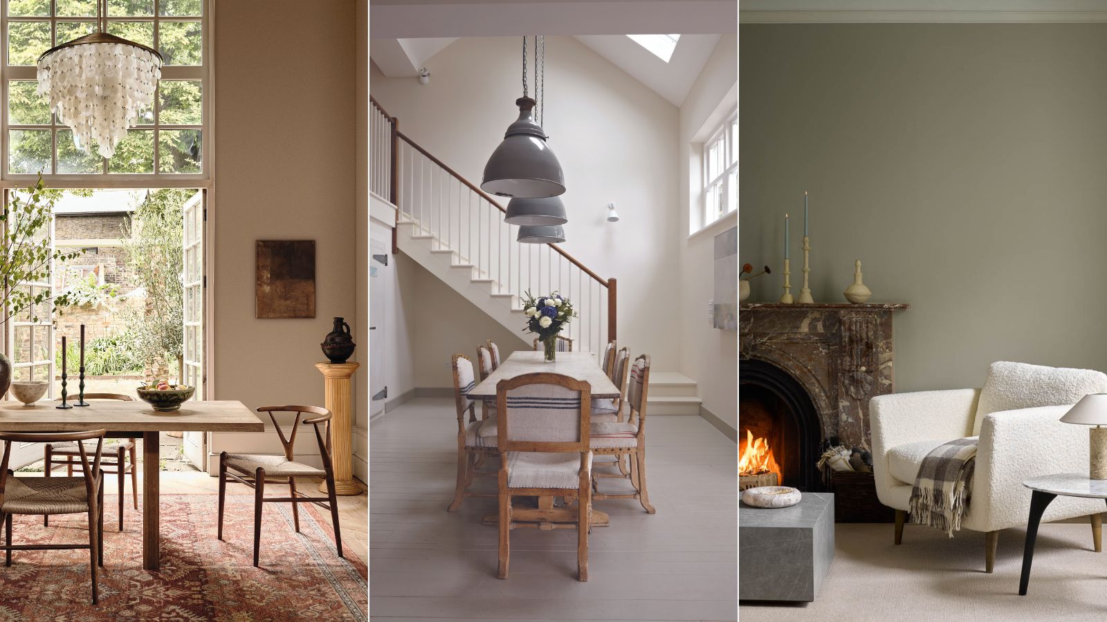
While neutrals generally have enduring appeal, it's worth taking a look which neutral colors are on trend alongside wider color trends before starting a project. Currently, warm neutrals are overtaking cool grays as the sought-after shades for relaxed, liveable spaces.
Design expertise in your inbox – from inspiring decorating ideas and beautiful celebrity homes to practical gardening advice and shopping round-ups.
'A warm, neutral palette will give you total decorating confidence as it will work with all room directions and differing levels of sunlight,' says Tash Bradley, Lick’s director of interior design and color psychologist.
1. Layer warm off-whites for a classic look
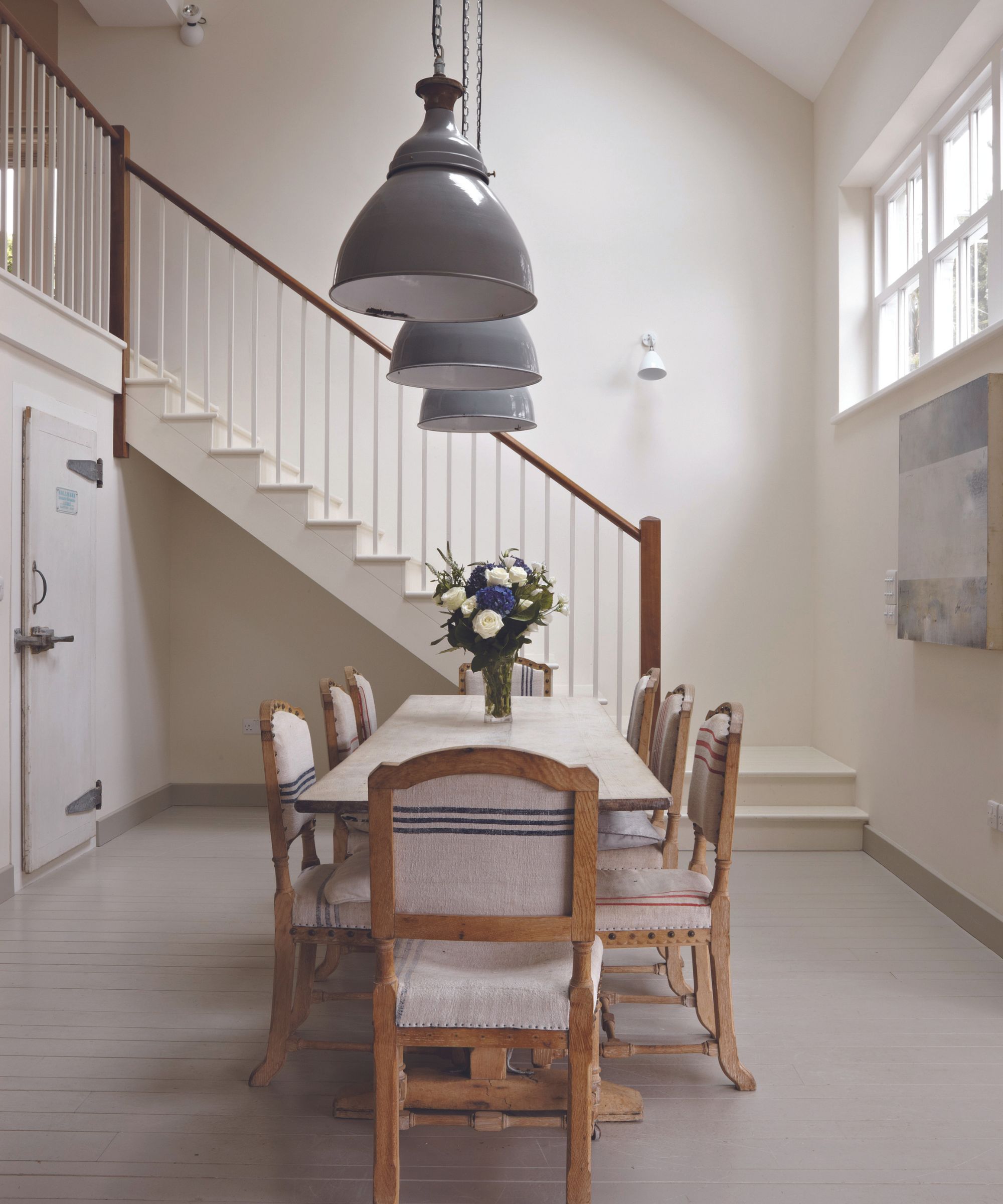
Decorating with white is a failsafe way to create bright and fresh interiors, plus it creates a versatile backdrop for layering color through furniture, fabrics, homewares and accessories. Decorating with pure brilliant white can be effective if you’re looking to create a super contemporary space, however, usually off-whites and tonal variations with subtle hints of different pigments are more effective in creating liveable and comfortable interiors. Layering a selection of subtly different tones that sit within the same color family is an easy way to create depth and harmony within a white room scheme.
‘If sticking to the classic route of neutrals, we at Farrow & Ball have grouped them into six tonal families and I always return to our traditional neutral palette of Slipper Satin, Lime White, Off White and Old White,' says Patrick O'Donnell, brand Ambassador at Farrow & Ball. 'The latter two are my favorites, they have this lovely underlying green note that is enlivened by a dose of yellow. Both are wonderfully sophisticated and very easy to layer with bolder colors, either in paint or textiles. Try Old White on kitchen cabinetry and Slipper Satin on walls, ceiling and trim for a gentle, harmonious scheme.’
2. Embrace timeless gray and white
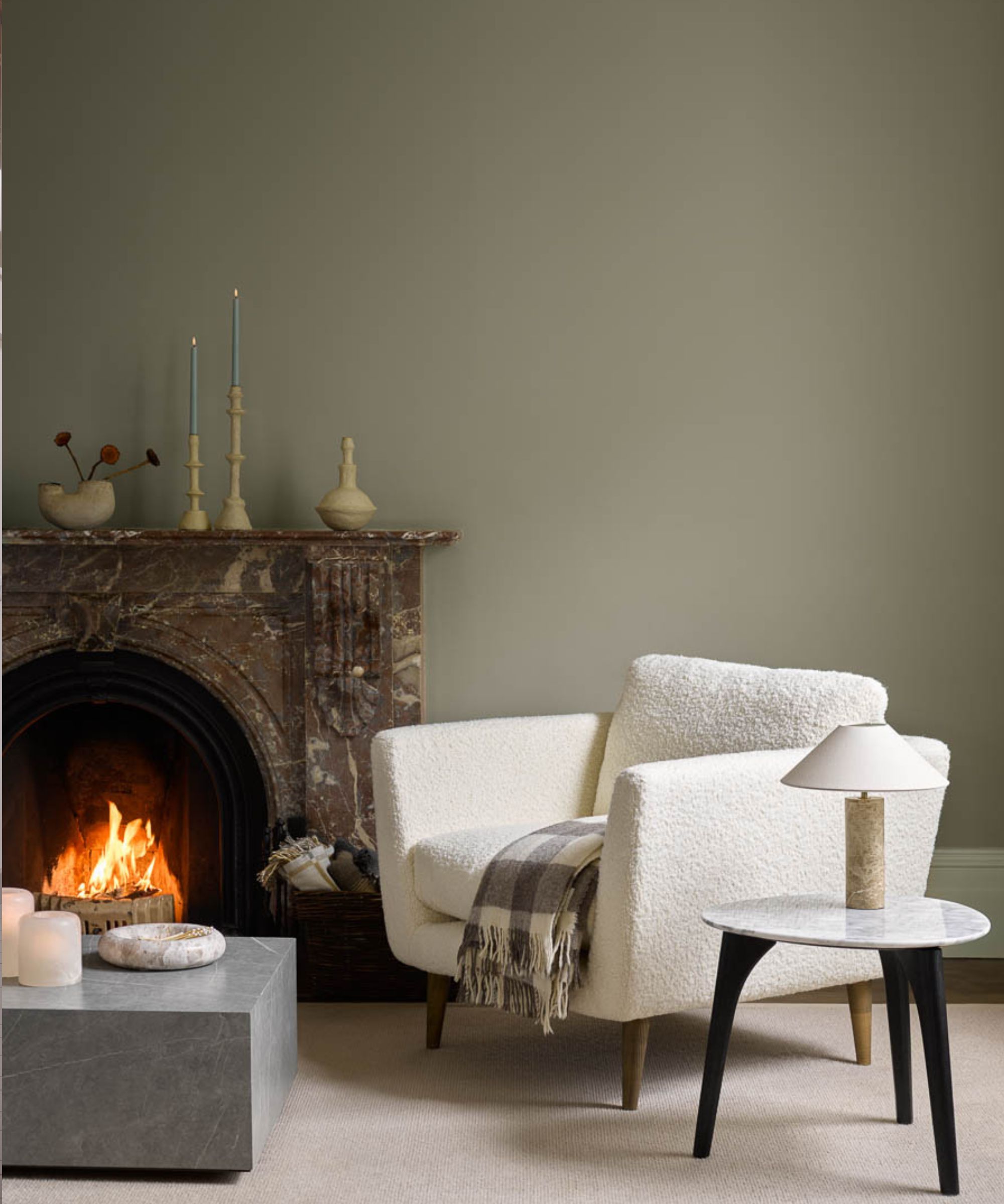
According to Benjamin Moore’s director of marketing (International) Helen Shaw, you can’t go wrong with gray and white. Ranging from cool icy tones to deep steely hues and earthy green shades, decorating with gray remains popular with those looking for a little more depth and atmosphere than that found in white and off-white neutral spaces. Green and moody grays are particularly on trend - pair them with white to let them shine but take care choosing your whites advises Helen Shaw.
‘Gray harmonizes well with almost every other hue, this versatility gives good reason for its popularity,’ says Helen Shaw. ‘A barely-there gray with a crisp white will create a timeless look and keep a room feeling bright and airy. However, not all white shades are going to work with any gray shade, as a rule of thumb pair warmer whites with warmer grays, and cool-toned grays with purer whites.’
‘A moody gray green such as Hazy Skies, as pictured in this gray and white living room, is a color with mysterious depth that will always intrigue. Elevate this captivating base color that’s timelessly stylish with layers of texture - dark woods, tactile bouclé textiles and sleek stone surfaces such as marble and quartz. Opting for a trim in a different color to the gray walls provides contrast and highlights the woodwork. A fresh white paint such as Sebring White works beautifully with this, offering clean contrast and a bright outline.’

Helen Shaw is part of Benjamin Moore's UK division. Color expert and international marketing director, Helen and her husband Craig are founders of Shaw Paints, acquired by Benjamin Moore in 2020.
3. Pair beige with warm whites
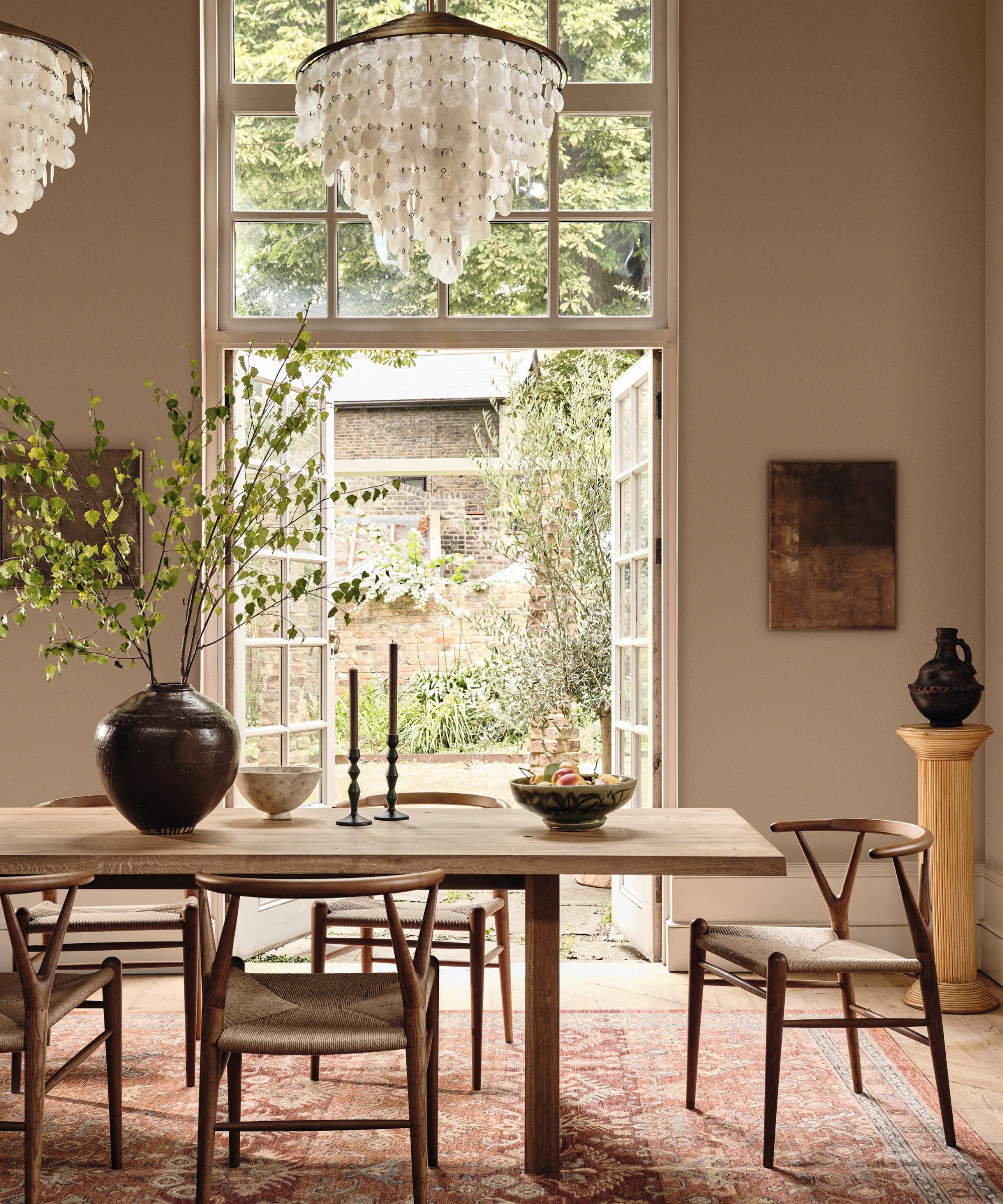
Beige and stoney neutrals continue to be popular with those looking to create spaces that are bright and airy yet warm and comforting. Cold whites and grays with hints of blue can leave spaces feeling stark and unwelcoming but, with their warm undertones of ochre and brown, beige and stoney tones are guaranteed to bring a welcoming atmosphere, perfect for living rooms.
‘Beige is a surprisingly versatile color that can work in a huge variety of spaces due to its reassuring and grounding qualities. Beige has natural associations with the earth, and can provide a cozy, warm, and assured feeling to your space,' says Tash Bradley, director of interior design and color psychologist at Lick.
'Lick’s Beige 02 is a soft beige with yellow and grey undertones, reminiscent of the elegant, rustic interiors of Soho Farmhouse. Beige 02 is an extremely cocooning color and will make a room feel restful and calm, especially when paired with a complimentary white with warm undertones, such as Lick White 05, which is creamy and comforting.’
‘If you want to embrace an earthy neutral look but enjoy using white to bounce sunlight around your space, think about pairing white walls, such as uplifting Lick White 03, with grounding beiges or taupes in your furnishings and accessories. You can also bring in warmth through richer wood tones, textured stones with organic markings like marble, and brass finishes.’
For more inspiration on decorating with beige be sure to check out our dedicated feature and our gallery of beige room ideas.

Director of interior design and color psychologist at home décor brand Lick, Tash Bradley uses her expertise in color psychology and theory to help people around the world find the colors that will positively impact their spaces, lifestyle and wellbeing.
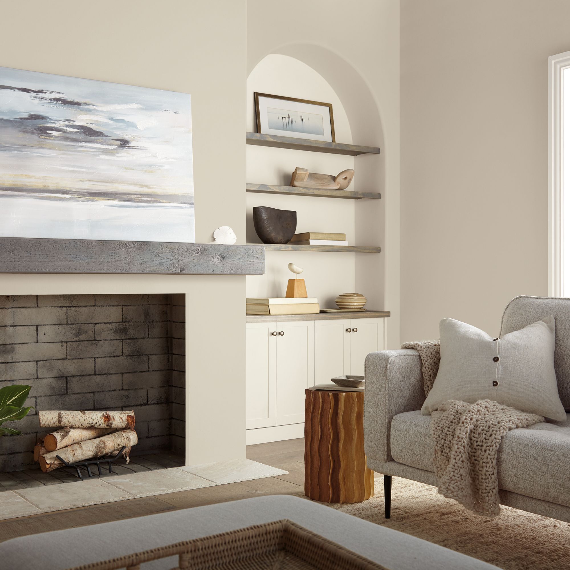
Cara Newhart, brand ambassador at Behr agrees that decorating with beige is a wonderful choice when it comes to achieving timeless spaces. ‘I love warm neutrals – they have an earthy and welcoming feel and help spaces feel light and bright without being too stark white. Some of my favorite paint colors are Even Better Beige and Blank Canvas by Behr, they work perfectly with almost any accent color and can be used together for perfect contrast – think a warm cozy beige wall with crisp and fresh white trim.’
4. Go for browns with creamy whites
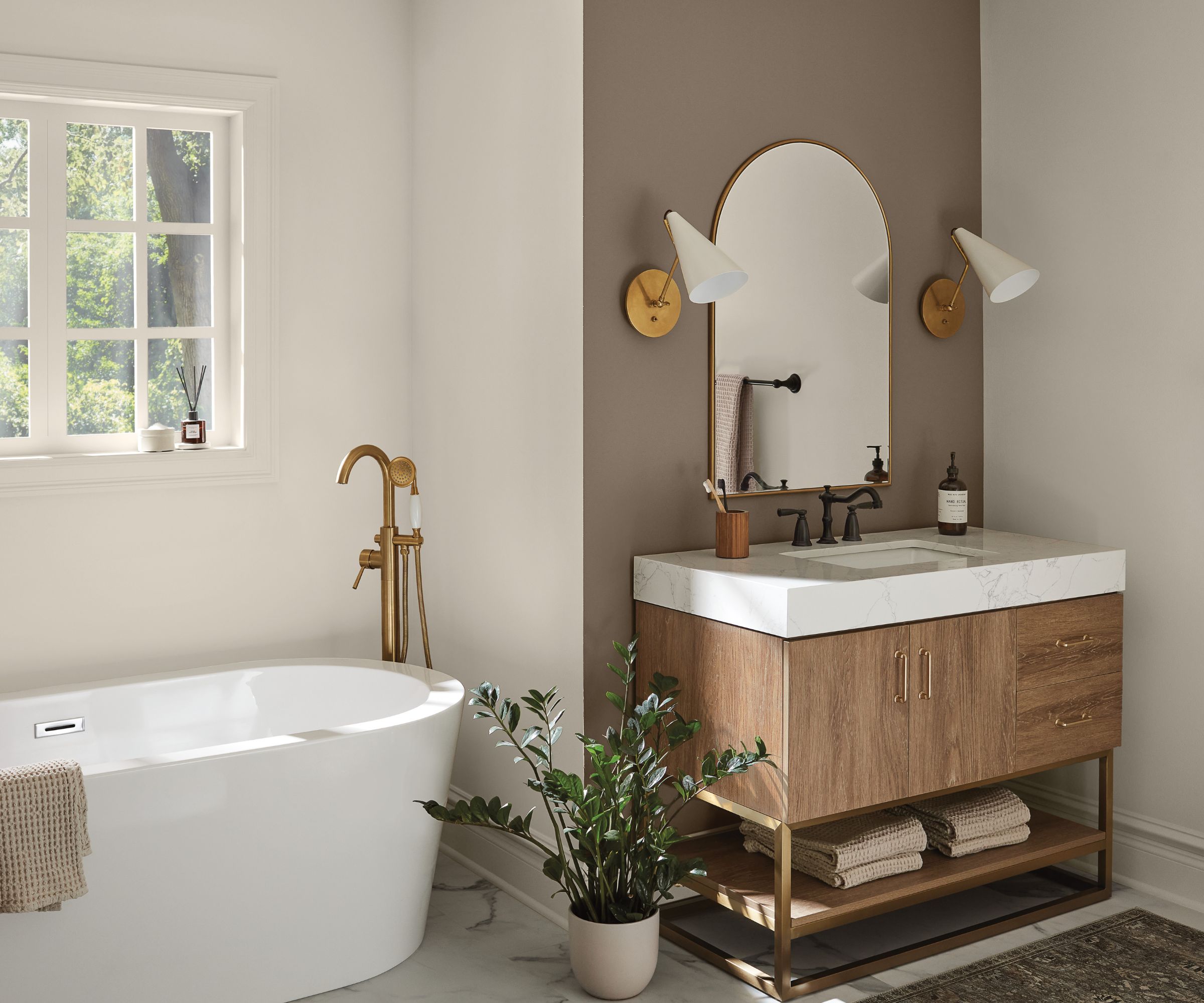
Browns are growing in popularity as color trends move towards more earthy, comforting tones. For Emily Kantz, color marketing manager at Sherwin Williams, brown and warm white is a failsafe combination. ‘One of my favorite neutral color combinations is a creamy warm white, such as Shoji White, and a stone brown like Foothills. This duo creates a minimal but welcoming environment, making it the perfect balance between warm and modern,’ says Emily Kantz.
‘Alongside these tones, I recommend adding wooden accents, fresh cut flowers or green plants and natural fiber rugs for a relaxing space. Since this combination truly creates the ultimate respite and escape – I love using it in bathrooms because it’s often an overlooked room that has the potential to be transformed from bland to stunning. These colors will make it look like a spa-like room!'
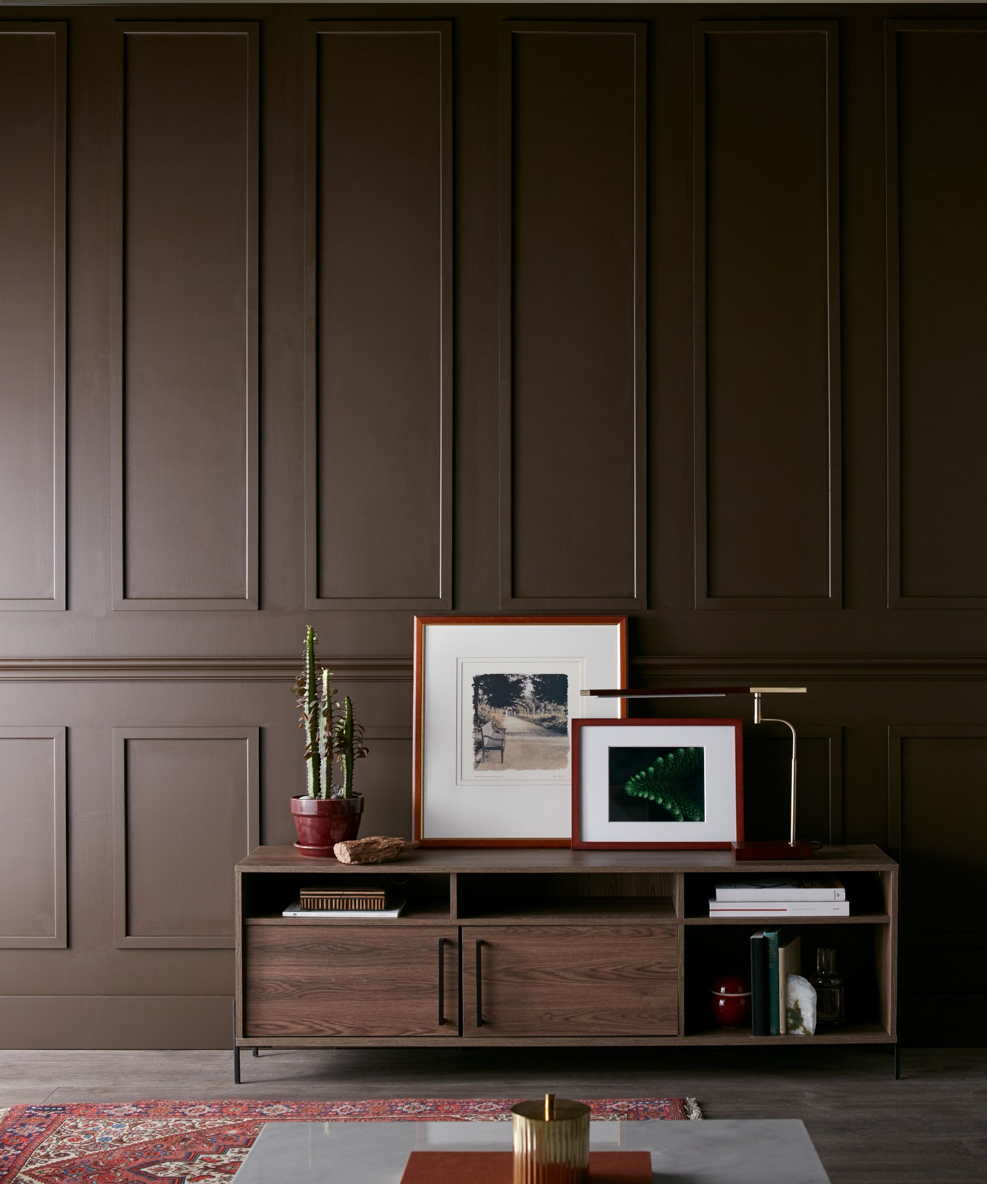
Deeper browns and neutrals are also growing in popularity and make a wonderful choice if you’re after a more moody look. ‘Neutrals with brown and golden undertones are trending right now,’ says Cara Newhart, brand ambassador at Behr. ‘ I’m seeing a lot of neutral palettes with more mid-tones and darker colors to create contrast and depth vs just lighter tones that usually convey an airy look.’
‘I’m seeing mid-tones like Grizzly and darker tones like deep browns like Espresso Beans or balanced blacks like Cracked Pepper by Behr. These dark and mid-tone colors create lots of personality and depth without having to risk going big and bold with bright colors that don’t feel livable for everyday spaces.’
Thinking about decorating with brown? Check out our dedicated feature for advice and inspiration.
5. Team warm plaster pink tones with pinky neutrals
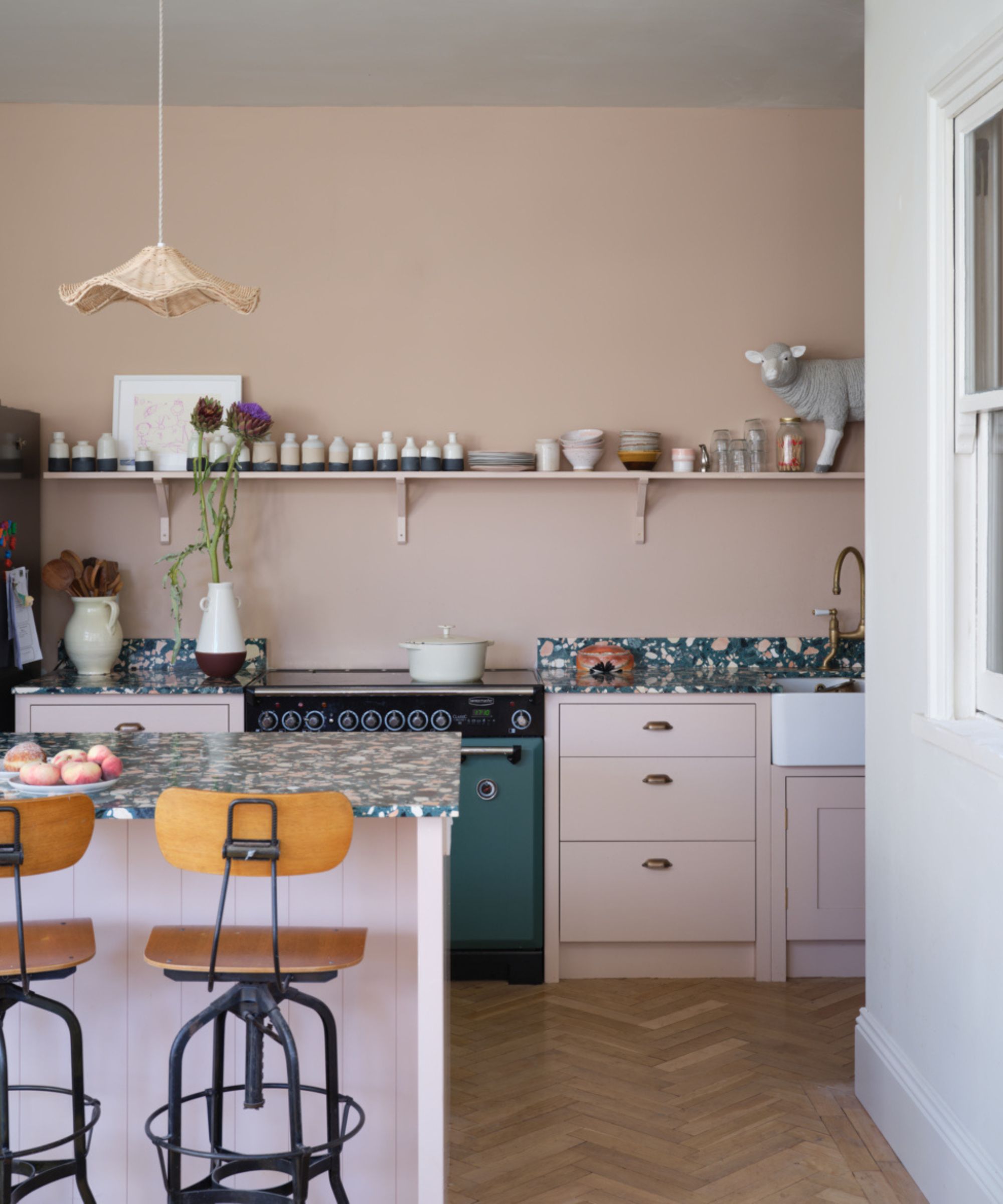
Today many interior designers are turning to ‘new neutrals’ for their projects - these are colors not traditionally classed as neutral, but which can pair with almost any color and used in the same way as the traditional neutral tones of white, grey and beige. In particular, we’re seeing plaster pinks and earthy greens often being described as ‘new neutrals’ and embraced by interior designers for their versatile and grounding properties.
‘Most of us think of a neutral as an ‘off’ white, something with a little more character that leans towards pale grays or brown-ish whites. However, colors can be neutrals too, especially our classic Setting Plaster, the warmest of earthy pinks,’ explains Patrick O'Donnell, brand ambassador at Farrow & Ball. ‘This color is brilliant at bringing delicate warmth to a poorly lit space or ‘bleaches’ out rather beautifully in a bright and sunny room, so has true versatility in its uses!’
Tash Bradley has also noticed the trend towards plaster pinks. ‘Warm, neutral palettes are becoming increasingly popular as we lean into colors with pink or yellow undertones which create a welcoming feeling within our homes. In fact, Pink is one of the most versatile colors, termed a ‘new neutral’, says Lick’s director of interior design and color psychologist. ‘It works in any room, can be paired with most colors, and looks great with a natural floor.'
When it comes to neutral palettes that always work, generally color experts are observing that we’re decorating with more earthy neutrals with yellow, brown and pink undertones over cooler neutral tones. Warm off-whites, beige, stoney neutrals and brown are all proving popular for creating welcoming and timeless spaces, especially when paired with warm whites.
Gray room ideas still have their place, but generally green and moody greys are taking the lead over cool icy tones. New neutrals like plaster pink are also coming to the fore and are often replacing traditional neutral tones as the go-to blank canvas for decorating with.

Pippa is a contributor to Homes & Gardens. A graduate of Art History and formerly Style Editor at Period Living, she is passionate about architecture, creating decorating content, interior styling and writing about craft and historic homes. She enjoys searching out beautiful images and the latest trends to share with the Homes & Gardens audience. A keen gardener, when she’s not writing, you’ll find her growing flowers on her yard for styling projects.