

As interior design trends steer towards the eclectic, more and more designers are embracing unconventional combinations, bringing together the old and new.
Harnessing transitional decorating ideas, interior designer Nate Berkus has proven his love for the past and the present in his most recent project by showcasing his ability to blend two contrasting design styles. Nate has ticked both the quiet luxury and eclectic vintage boxes, creating a cultivated home that perfectly balances old-money aesthetic with characterful charm.
Named The Katharine, the new project proves that mixing and matching is a classic design method. The apartment's thoughtful contents show that it truly is possible to create a welcoming space with a more minimal mindset.
The Katherine is Nate's first large-scale residential project and the building is located he own stomping ground, Greenwich Village. It's an old 7-storey building, pre-war in fact, that's been tastefully restored by BKSK Architects.
We are sure Nate will share more content on The Katherine soon, but these are the three key design lessons we are taking away from this first sneak preview.
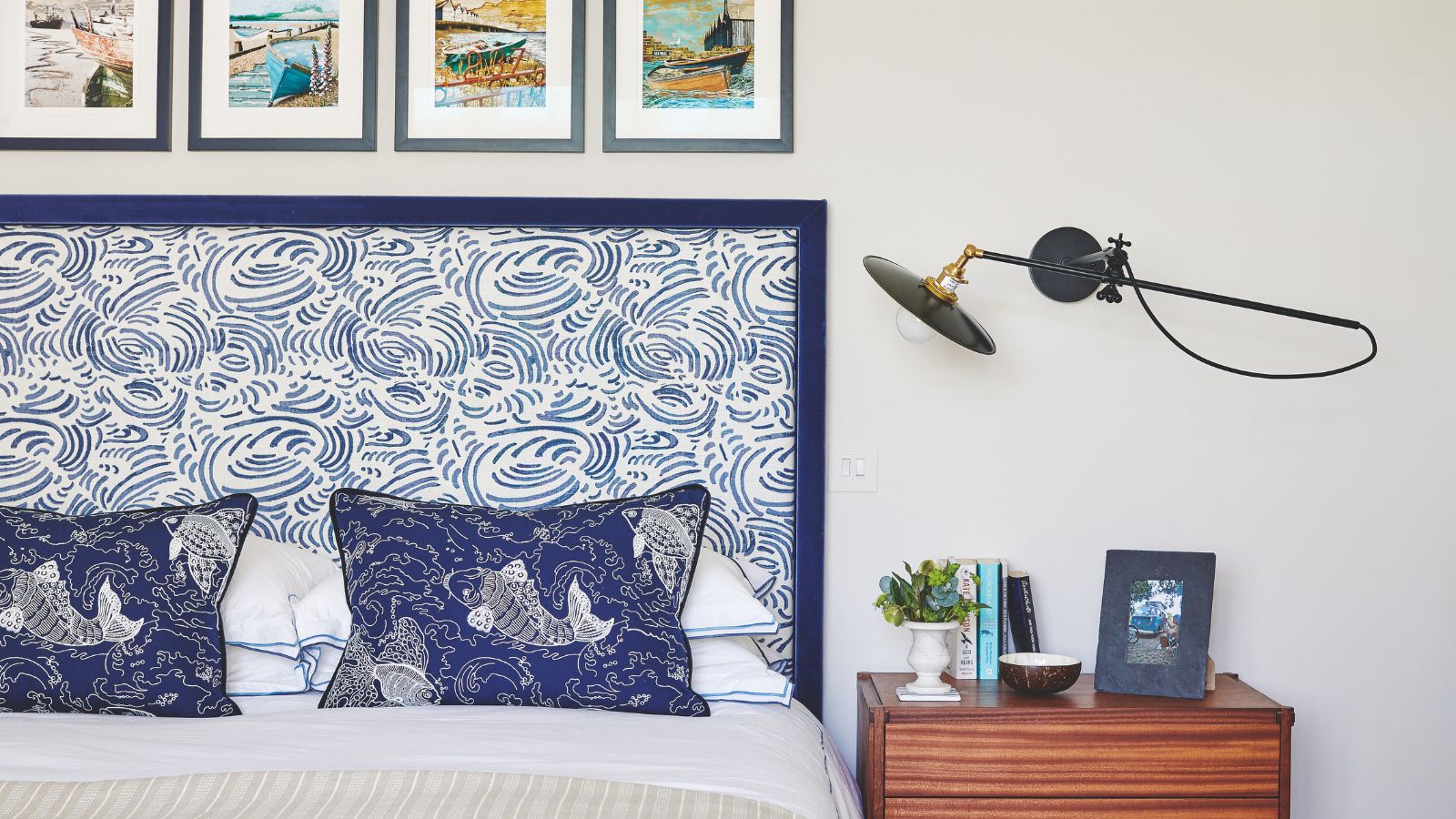
1. Mix elegant antique finds with luxurious contemporary pieces
Nate has shown us how to mix traditional and modern design effortlessly in this project by incorporating luxurious modern furniture with more delicate and ornate antique furniture.
Note that he's also decorated with antiques by scattering small trinkets on shelves and empty surfaces and installing vintage lighting. Following one common thread, he has featured an array of metallic accents throughout the project that bring life to the space and make it feel unified and cohesive.
2. Play with different shapes and lines
Acknowledging furniture trends, he's featured a range of contemporary styles throughout the apartment from the furry low-slung armchairs in the living room to the sleek burl wood desk in the office.
We can't help but notice the real mix of shapes that beautifully contrast with the fine lines and intricacies of the antique pieces. To tie it all together, Nate has stuck to a warm minimal palette by decorating with neutrals, allowing the more ornate vintage pieces to shine.
3. Layer up textures
Nate's consideration of texture is something that runs through every room in the project. He's carefully layered fabrics and finishes, all doing their job of adding variety to each room. A great example is the consistent decorating with marble used throughout the space, adding to the luxury of The Katharine project.
There's definitely a variety of textures and styles but Nate has made the design feel cohesive, with each room conveying a similar story.
Shop the look

Burl wood is super on trend so it makes sense that Nate has featured this stylish material throughout the design. Sleek and contemporary, this console table is the perfect entryway accessory that would look best styled with a vase, stack of vintage books, and trinket tray.

Marble always makes a home feel elevated. This round table is much like the one featured in the living room of the project with its sleek round top and intricate iron base.

Nate has scattered gold accents throughout the project to ensure each room feels cohesive and connected. You'll notice an ornate gold mirror hanging in the bathroom that truly makes a statement, much like this antique-style mirror by Regina Andrew.

You must confirm your public display name before commenting
Please logout and then login again, you will then be prompted to enter your display name.
-
 'Big results before you know it' – Experts urge you to use the ‘Take Away 10’ method for simple decluttering with zero decision fatigue
It can cut hundreds of items from your home in just a few weeks
-
 Kevin Bacon and Kyra Sedgwick's rustic kitchen island is stunning, but controversial – designers say you can get the look without the hassle
A popular material finds an unorthodox home in the couple's kitchen, but experts disagree on whether it should be used – here's how to do it instead

