'Accent walls show a lack of commitment' – Nate Berkus on choosing the best paint colors for open-plan spaces
The designer has strong views on what paint colors you should – and shouldn't – use in open layouts
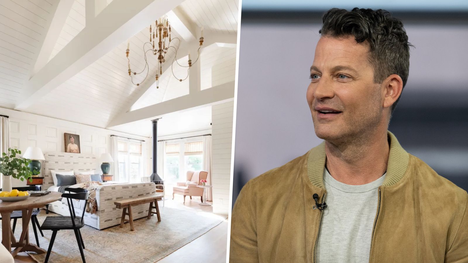

Choosing the right paint colors for rooms often requires much thought and deliberation, especially when dealing with open-plan spaces.
With no clear boundary between different sections within open plan layouts, you'll often wonder what the best approach to decorating with paint colors is: can you use multiple shades throughout the space, and if so, how?
Luckily, interior design maestro Nate Berkus is well aware of the obstacles faced when choosing room color ideas in open-plan spaces and took to Instagram to weigh in with his views. In short, Nate's not a fan of accent walls in these social spaces, instead advising a more restricted approach with neutral paint ideas for a balanced and liveable look.
A post shared by Nate Berkus (@nateberkus)
A photo posted by on
In homes with clearly defined, separate rooms, you can create different color schemes in each of them: if you want to go bold and bright with your living room color ideas, this doesn't need to be the case for kitchen color ideas, for example. However, knowing how to begin and end colors isn't so obvious in open-plan spaces. 'So the problem... is that when you have an open space, how do you start and stop a paint color?' says Nate in the Instagram video.
According to Nate, the solution to this interior design hurdle is to stick to neutral hues and carry one color across all walls. He's not a fan of accent walls in open-plan spaces, suggesting a cohesive approach to color is more effective.
'I think that accent walls show a lack of commitment, and I think it's very difficult to actually do a bold color in an open floor plan,' Nate continues in the video.
'Keep your ceilings white, and I think you have to pick one shade, one tone – it could be pale blue, it could be light yellow – preferably it’ll be more like an Alabaster, for the rest of the walls around you.'
Sign up to the Homes & Gardens newsletter
Design expertise in your inbox – from inspiring decorating ideas and beautiful celebrity homes to practical gardening advice and shopping round-ups.
'It's sort of the deal that you have to make with yourself when you select a home that has an open floor plan.'

Nate's approach of sticking to neutral tones ensures awkward cut-offs between bold paint colors and lighter hues are avoided, which can often be the case with accent walls. Instead, soft neutral hues will result in a cohesive look, aiding the flow throughout the various zones, much like in this bedroom within an open-plan apartment designed by Marie Flanigan Interiors.
While there's often much debate around ceiling ideas and what colors they should be, color experts agree with Nate's suggestion of painting them white. 'Ceilings are a much-neglected aspect of the home, often an afterthought, however, they play an important part in the feel of a room,' says Helen Shaw, Director of Color Marketing at Benjamin Moore. 'A fresh white paint works beautifully with all colors and is often a default.'
However, that's not to say color drenching can't also work in open-plan spaces, so long as you stick to decorating with neutrals. Colors like Sherwin-Williams' Alabaster, which Nate suggests above, are subtle enough to be carried across the ceiling, while bolder hues would likely overpower open-plan layouts.
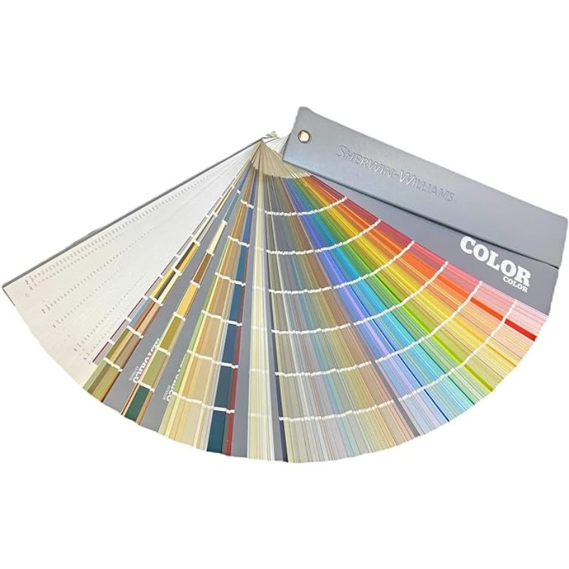
In addition to the highly popular Alabaster, there are plenty of other Sherwin-Williams neutral paints here to suit your open-plan space.
For more expert ideas, take a look at our open-plan living room ideas which will help you ensure these social spaces are the most practical and stylish they can be – from clever furniture layouts to lighting ideas.

Emily is a freelance interior design writer based in Scotland. Prior to going freelance in the spring of 2025, Emily was Homes & Gardens’ Paint & Color Editor, covering all things color across interiors and home decor for the Homes & Gardens website. Having gained specific expertise in this area, Emily is well-versed in writing about the latest color trends and is passionate about helping homeowners understand the importance of color psychology in home design. Her own interior design style reflects the simplicity of mid-century design and she loves sourcing vintage furniture finds for her tenement flat.
-
 Martha Stewart's tips for arranging daffodils are unbelievably simple and effective – it's the only flower advice you need this springtime
Martha shows us that we can create gorgeous bouquets of this seasonal flower by simply trimming the stems and placing them in specific vases
By Hannah Ziegler Published
-
 Designers share how to make your outdoor living room look more expensive – and the affordable products to get you there
From layered lighting to luxe-looking textiles, these simple swaps made all the difference
By Charlotte Olby Published
-
 Where do interior designers buy window treatments? The tried and tested stores to add to your list
This month's Decorator's Address Book focuses on window treatments – these are the stores designers use for their projects time and time again
By Hebe Hatton Published
-
 'Coastal elegance' is the end-of-summer trend to know about – designer Kathy Kuo shares how she creates the effortless look
Relaxed living meets luxurious design – here's how she introduces this elevated style to interiors
By Molly Malsom Published
-
 Looking to elevate your rental without losing your deposit? Benjamin Moore's new paint initiative has you covered (and it includes free paint)
This month, the paint brand is offering complimentary white paint to revert rental decor upon lease-end
By Emily Moorman Published
-
 What color is espresso? Designers weigh in on this on-trend, moody neutral and share how to decorate with it
Here's why designers can't get enough of this sophisticated new neutral
By Emily Moorman Published
-
 5 of the best colors to decorate with in August 2024, as suggested by designers and color experts
Summery hues with a hint of the autumnal months to come, designers love these colors for August
By Emily Moorman Published
-
 Ruggable has launched a new color-centric rug collection with Pantone – 'designed to inspire creativity'
Designed to realize the mood-boosting effects of color, these rugs reflect the essence of dopamine decor
By Emily Moorman Published
-
 This is how to 'properly decorate a beach house' if you're bored of typical coastal design, says TikTok's favorite interior designer
TikTok's Taylor Simon schools us on how to avoid coastal cliches with her guide or what to do and what to avoid when decorating a beach house
By Charlotte Olby Published
-
 This once-dated couch color is making a comeback – designers share all on how to bring this retro style into 2024
Camel-colored couches are often associated with retro design, but designers love them in modern homes
By Emily Moorman Published