Nate Berkus and Jeremiah Brent's dining room is a masterclass in transitional style – and the perfect space for family gatherings
Nate Berkus shared a snap of his and Jeremiah Brent's family dining room, and there's so much to love about the warm, welcoming space


Nate Berkus is one of interior design's biggest names for a reason – time and time again, he curates spaces that are full of character, charm, and a tasteful mix of old and new.
When any designer brings a design element or piece of furniture into their own home, it's safe to say they've given it a stamp of approval. So, when Nate shows off his family's home – which he shares with just-announced Queer Eye star Jeremiah Brent – on social media, we pay extra attention.
Recently, the world-renowned designer took to Instagram to share his dining room – and the space is a masterclass in his interior design style. Though it's a stunning example of transitional style, the room means so much more than a collection of lovely furniture to Nate. This is what we love about the space.
A post shared by Nate Berkus (@nateberkus)
A photo posted by on
In the photo's caption, Nate shares that the dining room table is the place where his family eats meals, where his kids do homework, where they host gatherings and so much more: 'So full of incredible life moments, big and small. For me, this is what design is about.'
The heartfelt attention to detail Nate brings to every project shows in this space especially. With a warm, inviting color palette, lush textures, and stunning city views, the dining room feels like it belongs to a family – and not a picture-perfect showroom – while still delivering on high-end design.
With a comfort-forward, built-in booth decked out in plush, striped cushions on one side of the table, the seating arrangement looks oh-so-cozy. And its juxtaposition against a full wall of antique-style tile mirrors makes for a bold statement that pulls the room together. Sophisticated brown leather armchairs line the other side of the table, tying into the space's modern organic color scheme.

Since Nate’s first appearance on The Oprah Winfrey Show in 2002, he has become one of the world’s most recognizable interior designers. He has authored two New York Times bestselling books and stars alongside his husband, Jeremiah Brent, in HGTV's Nate & Jeremiah Home Project.
A post shared by Nate Berkus (@nateberkus)
A photo posted by on
Framing the seating area are two built-in, floor-to-ceiling cabinets holding all the hosting essentials, and a meshed cover provides a clean look while still allowing easy access. Plus, the cabinetry's paint color blends with the New York City apartment's historic ceiling trim – an intricate detail that adds so much character to the space. Herringbone-pattern hardwood flooring grounds the room, too, offering the perfect dose of warmth and charm.
Sign up to the Homes & Gardens newsletter
Design expertise in your inbox – from inspiring decorating ideas and beautiful celebrity homes to practical gardening advice and shopping round-ups.
The lighting in this room is unsurprisingly well-considered, and clearly layered for a cozy, moody atmosphere. With a sculptural overhead fixture and two mirrored sconces framing the bench, the family is able to eat in a well-lit space without being overwhelmed by harsh overheads. A small, unique table lamp adorns the dining table as well, along with a serving bowl and ornate salt and pepper shakers.

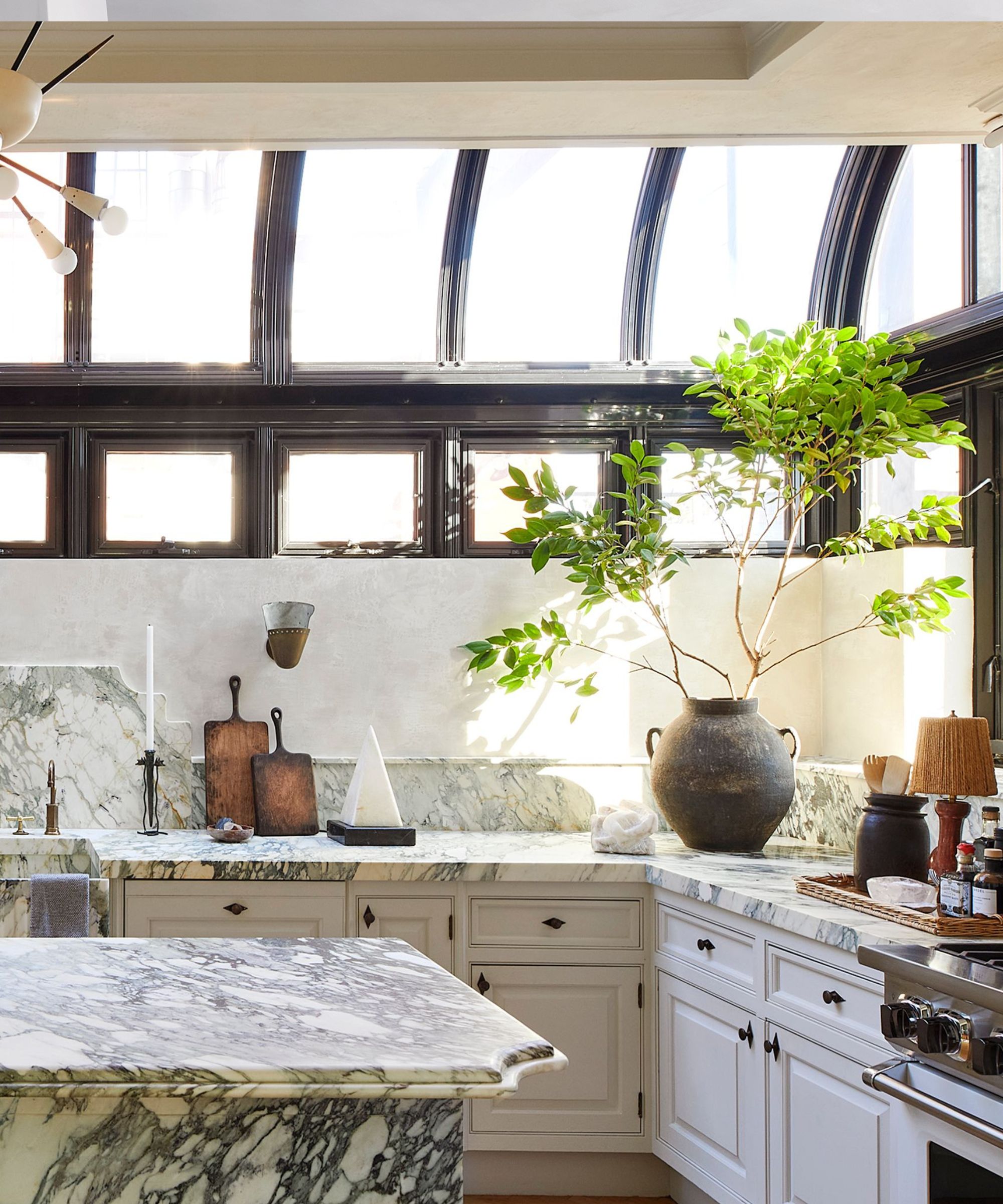
The dining room layout blends into a living room area, with floor-to-ceiling views of New York City, plus a cozy boucle chair. A modern dresser and antique gold mirror round out the space, sandwiched between tall picture windows. And perhaps our favorite part of the space is its flow into Nate and Jeremiah's kitchen – another of their rooms we admire. A faint reflection of the marble-clad, bright and airy kitchen can be seen in the wall of mirrors and can be found through an expansive doorway.
This dining room is a clear representation of Nate's timeless, transitional design, and there's so much to love – from its high ceilings and city views to carefully chosen pieces of furniture, no detail was overlooked. And as if that wasn't enough, this dining room hosts family meals and daily conversation. We can't help but agree with Nate on this one – this really is what design is about.

Abby was the Interior Design News Editor at Homes & Gardens and is now studying for her Master's degree in Journalism at City University, London. Prior to joining our team, she worked with Better Homes & Gardens, where she wrote and edited content about home decor, gardening tips, food news, and more. She studied Journalism and English Literature at New York University and moved to London to pursue her love of writing in 2023.
-
 7 expert-approved painting hacks to minimize clean up – to make an already exhausting task easier
Avoid a backbreaking clean-up after your next painting project with advice from the professionals
By Chiana Dickson
-
 Gwyneth Paltrow's quiet luxury kitchen is so beautiful, we almost overlooked her ultra-smart cabinets – they make the use of 'every inch' of storage space
The Goop founder makes use of dead space in her kitchen with customized cabinetry that reaches to the ceiling, providing ample storage
By Hannah Ziegler