I'm an interior designer – and this is how I design my clients' rooms with art in mind
Colors, textures and personality all play a part
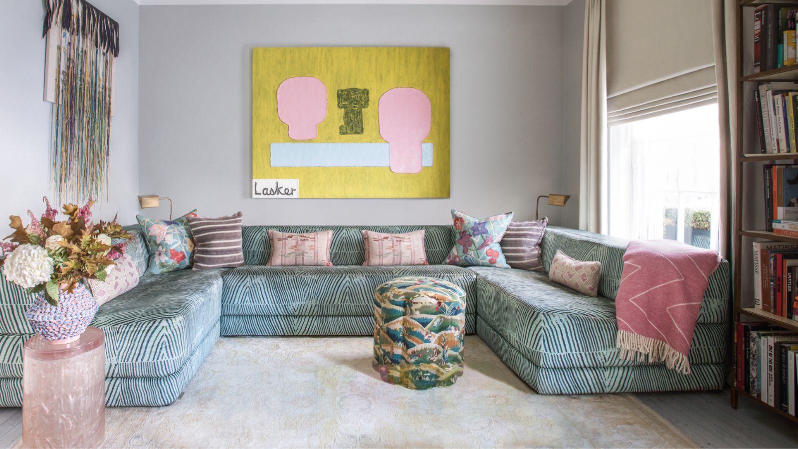
The desire to live with art is prevalent. Once only reserved to the elite, the demand for living with contemporary pieces made of our time is reflected in the many fairs and websites dedicated to collecting.
That is wonderful. Culture and history are told through art. These pieces are valuable and bring pleasure.
How to live and decorate with art, and create balance with the other objects in the home is a fortunate challenge to have.

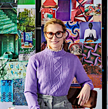
Natalie Tredgett is an interior designer known for her inimitable use of color in combination with distinctive artworks. Natalie encourages her clients to express their own creativity within the projects she creates with them – a Natalie Tredgett designed space is a clear representation of the client with her unique perspective running through it. Natalie founded her studio in 2012 having established herself under design guru Nicky Haslam. She trained in Interior Design at KLC, has an MBA from the University of Edinburgh, holds a Bachelor of Art from the University of Western Ontario and has a background in management consultancy. Natalie Tredgett Design has recently moved to a new studio in the heart of Notting Hill, London.
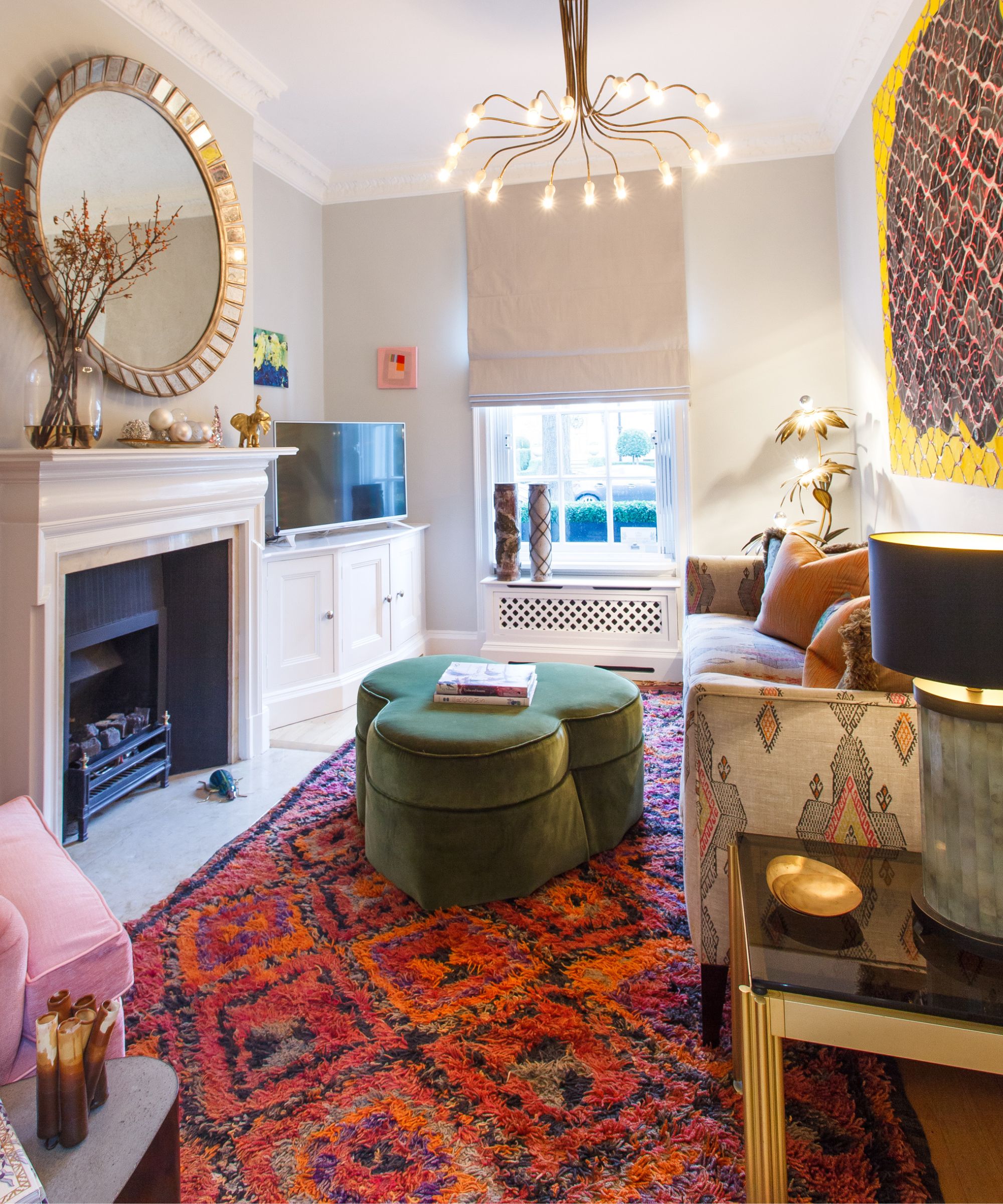
The key is to create a balance so that each piece has a sense to breathe and not outshine each other. To think about the work’s position and where you want to draw your eye, I always focus on art being able to echo, reinforce and add to the energy of a room. It’s a balancing act where no competition is created between the items and purposely placed. I call this design with purpose.
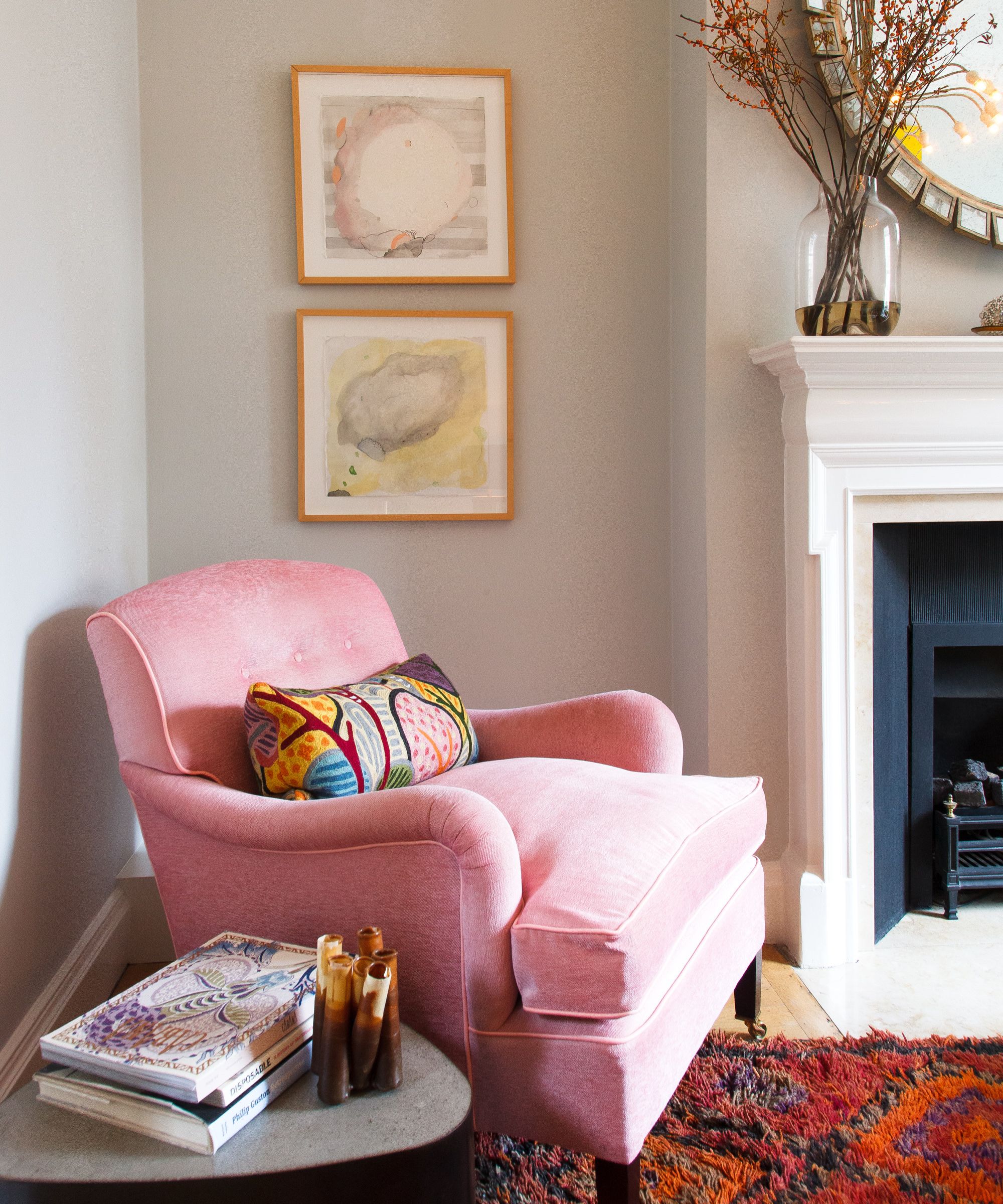
Creating balance with purpose
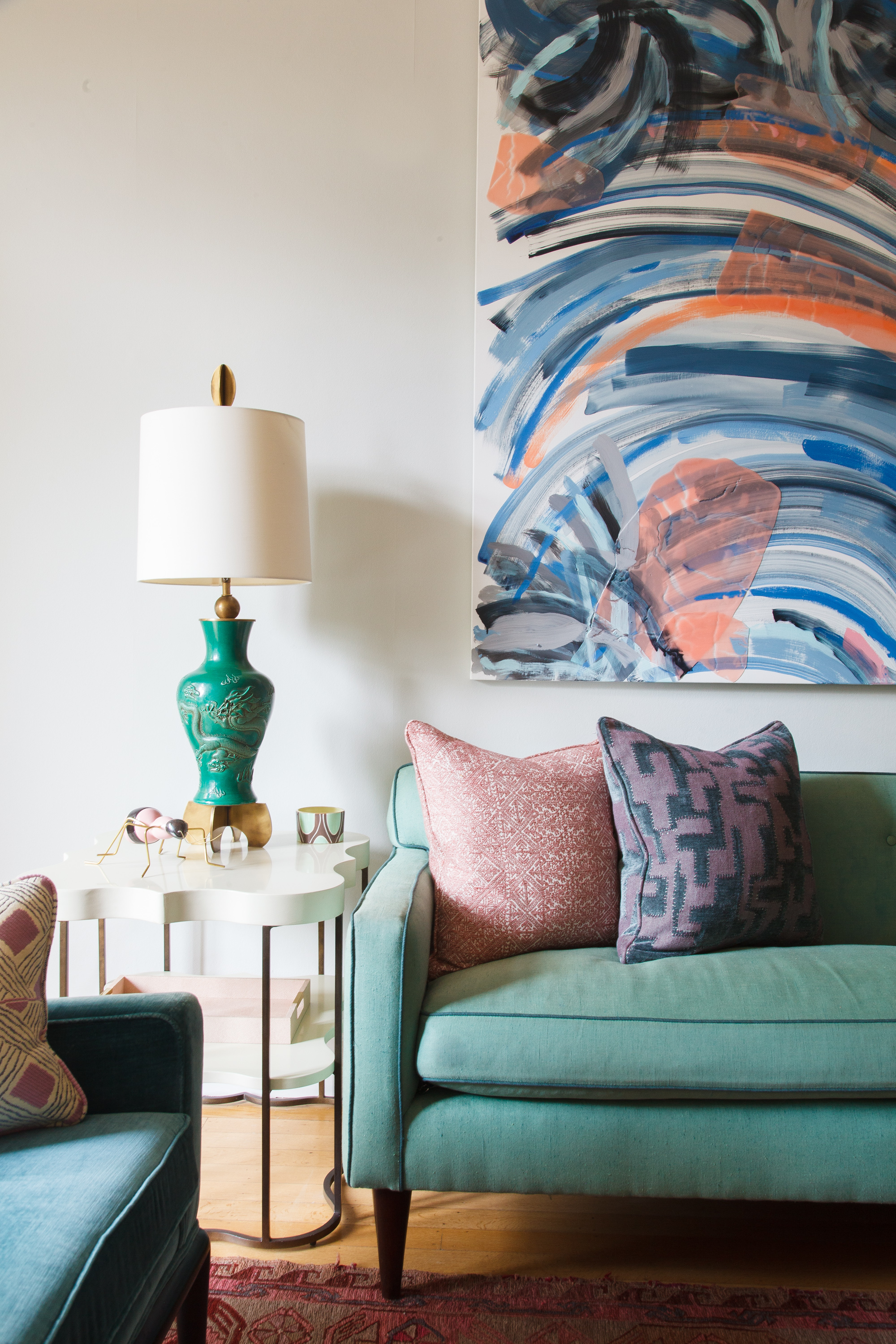
I am often asked ‘should I match my room to my art?’ The answer is not really. The concept is to contemplate how to make it all work in balance without obviously matching your room to your art and vice versa.
Consider a complementary color palette to your art. Take the opportunity to build upon a wider use of colors. Start with colors that are in harmony with the art, then add some that contrast. Try not to match but pick color families instead. I often like to look at paint charts which show varying shades of a color. I also look to nature to see how a palette with a variety of the color works naturally.
Another idea is to select fabric that has a multitude of colors that work with the art. I then consider how complex the artwork is. I like to add contrast such as choosing calm textures and patterns if the art is complex and vice versa. That way the room or the art are not upstaging one another. Each has its place – its purpose.
Objects to collect and commission
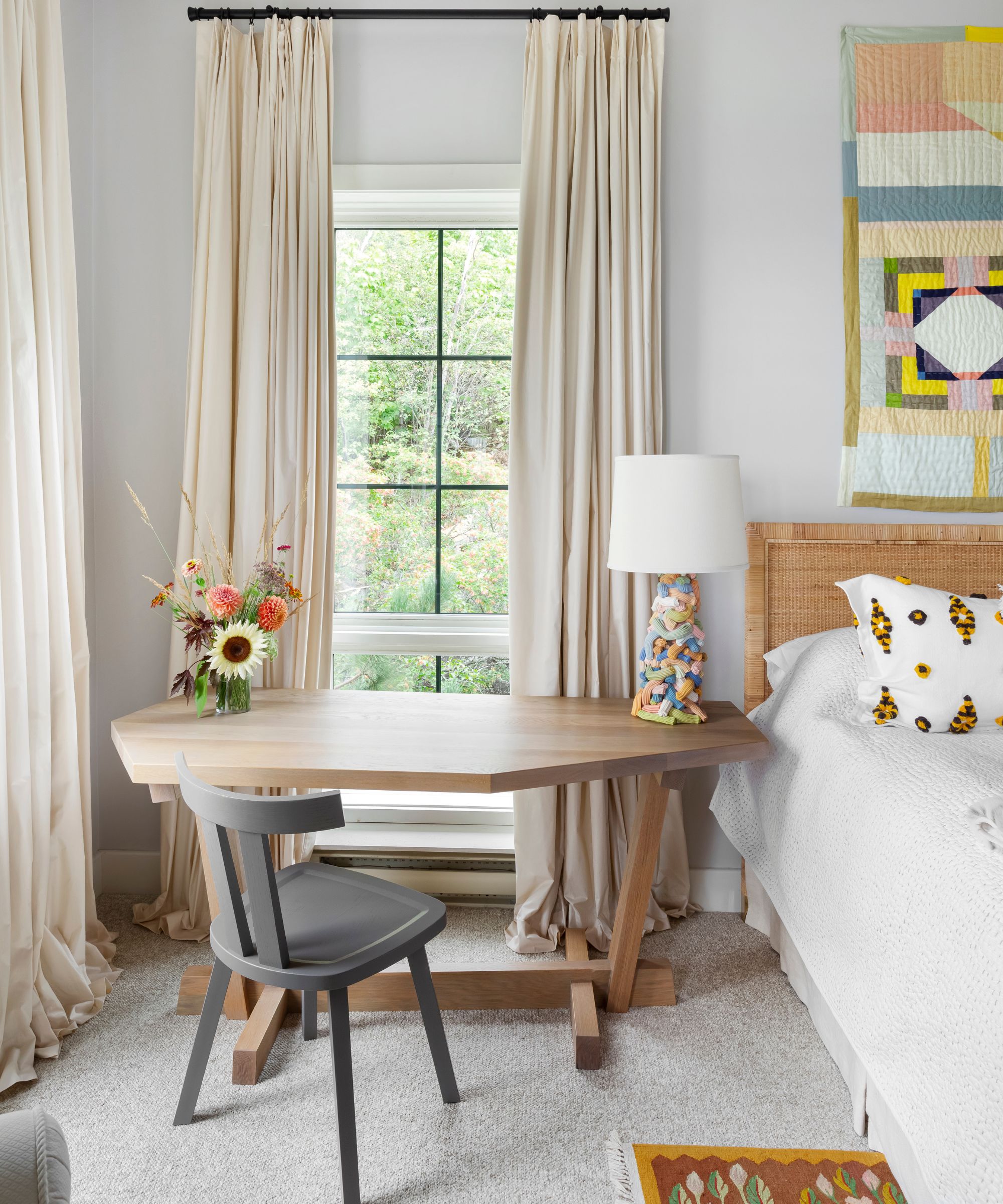
With the opportunity to live with beautifully designed functional objects, the art we choose to bring into our homes bring personality, happiness, and enjoyment to our spaces. Instagram and fairs have widened access. We can go further and reach out to have pieces commissioned.
I encourage looking at objects artists make and working with the maker to create special pieces for your home. The objective is to create something that resonates with you – that you cherish.
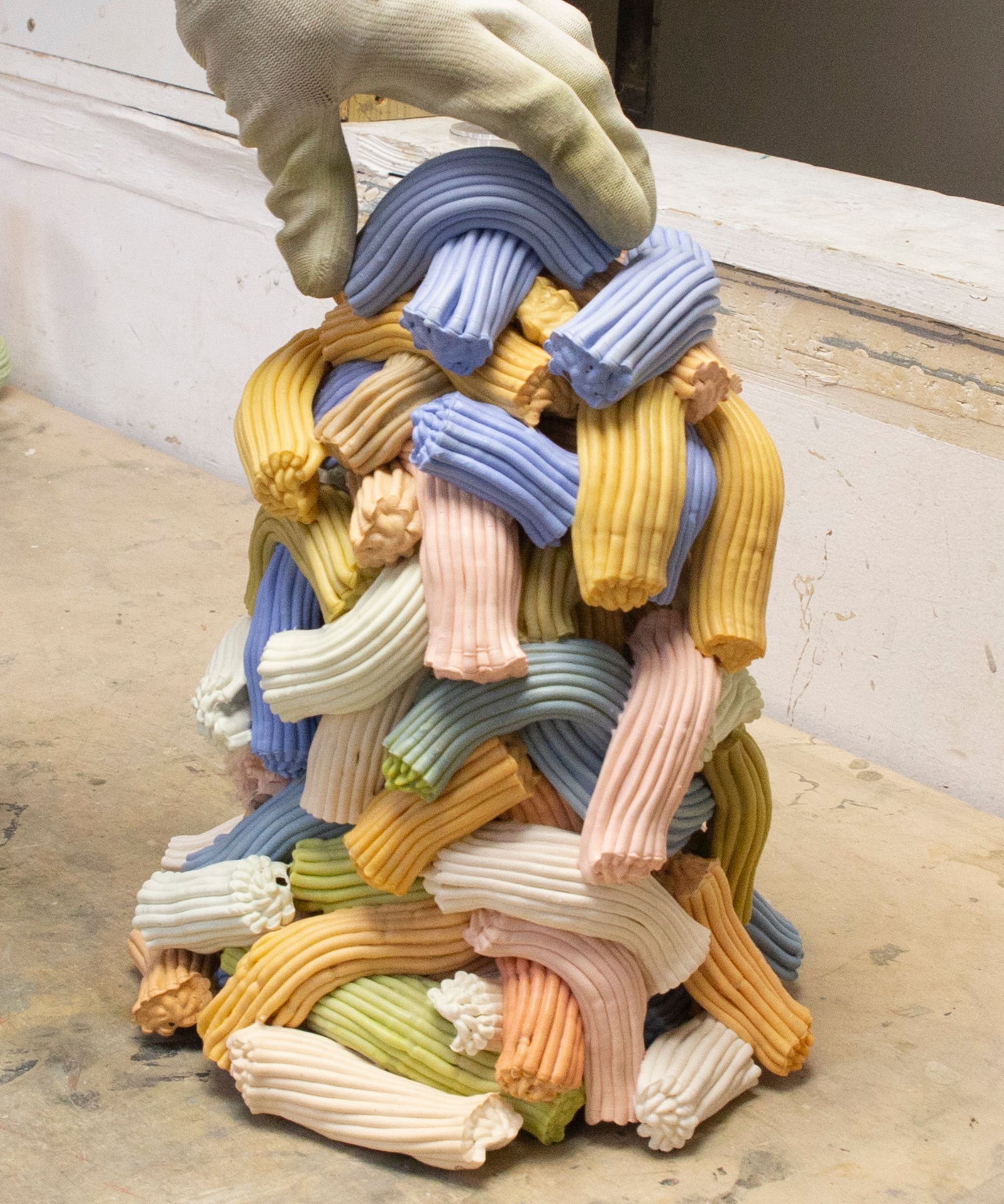
In this example (above and below), I worked with James Shaw, who upscales plastics to make objects for the home. Together, we created lamps for this room. I confirmed the desired size and offered a color palette. James created the layering of colors in a shape we had agreed to. The base was then wired for purpose.
The room now has a unique artist piece which brings personality, is cherished and enjoyed.
It's in the layering
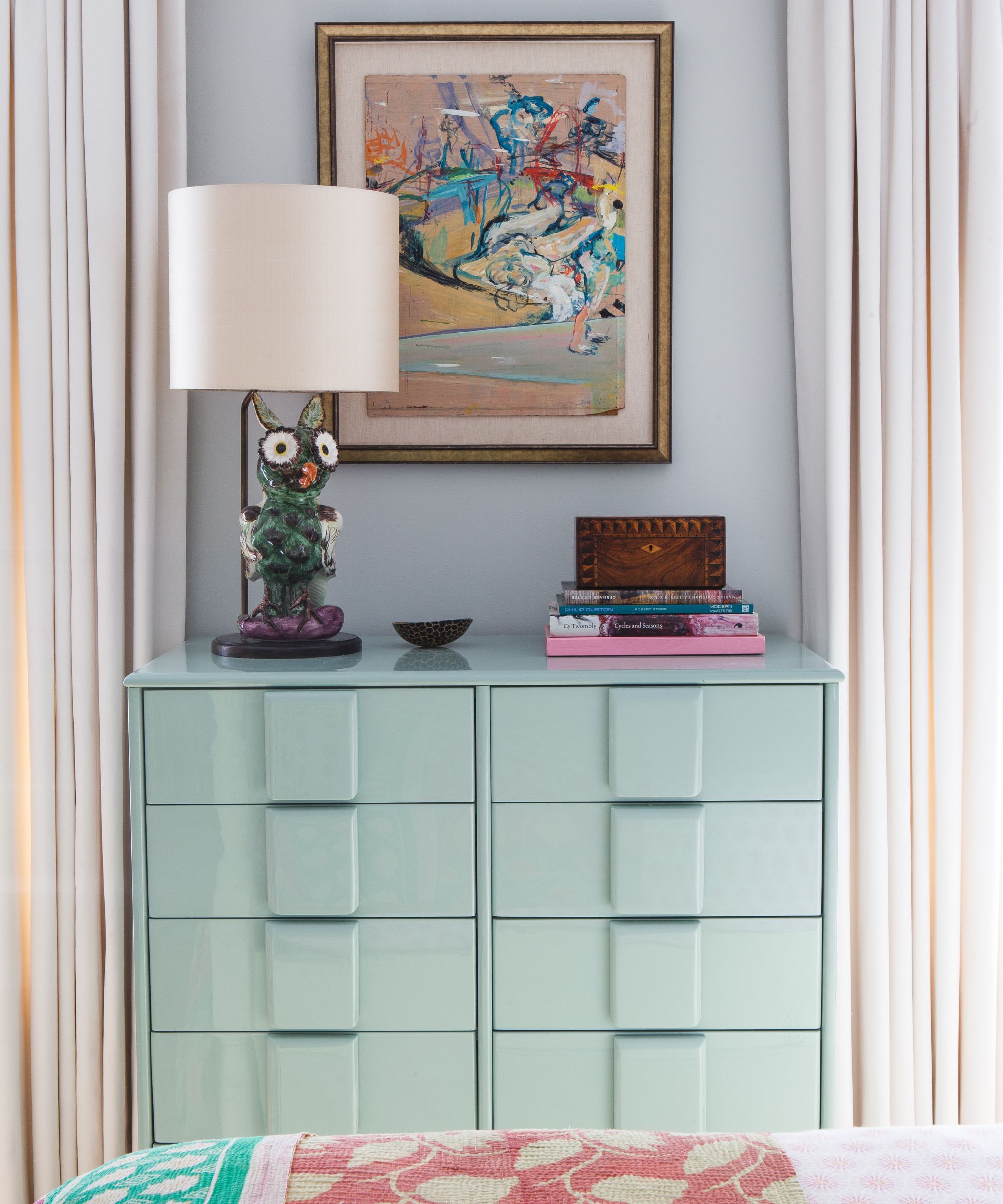
It is in the layering. I always say that a house is not static and needs to adapt to its owner’s evolving lifestyle. Art and objects have to adapt to these changes, too. We need to live with it, around it and sometimes use it. We do not live in museums. For this reason, layering is inevitable.
For example, a chair, a chest of drawers or even curtains might interact with a piece. Family photos, books and lighting might even get in the way. Consider what you want to make center stage. Use that as an anchor. Place it in the room where your eye is naturally drawn to.
The chest of drawers (below) takes center stage in this bedroom. The art, lamp, objects, and bedding bring color harmony but contrasting pattern and material allow your eye to wander between each piece yet pulling the composition together.
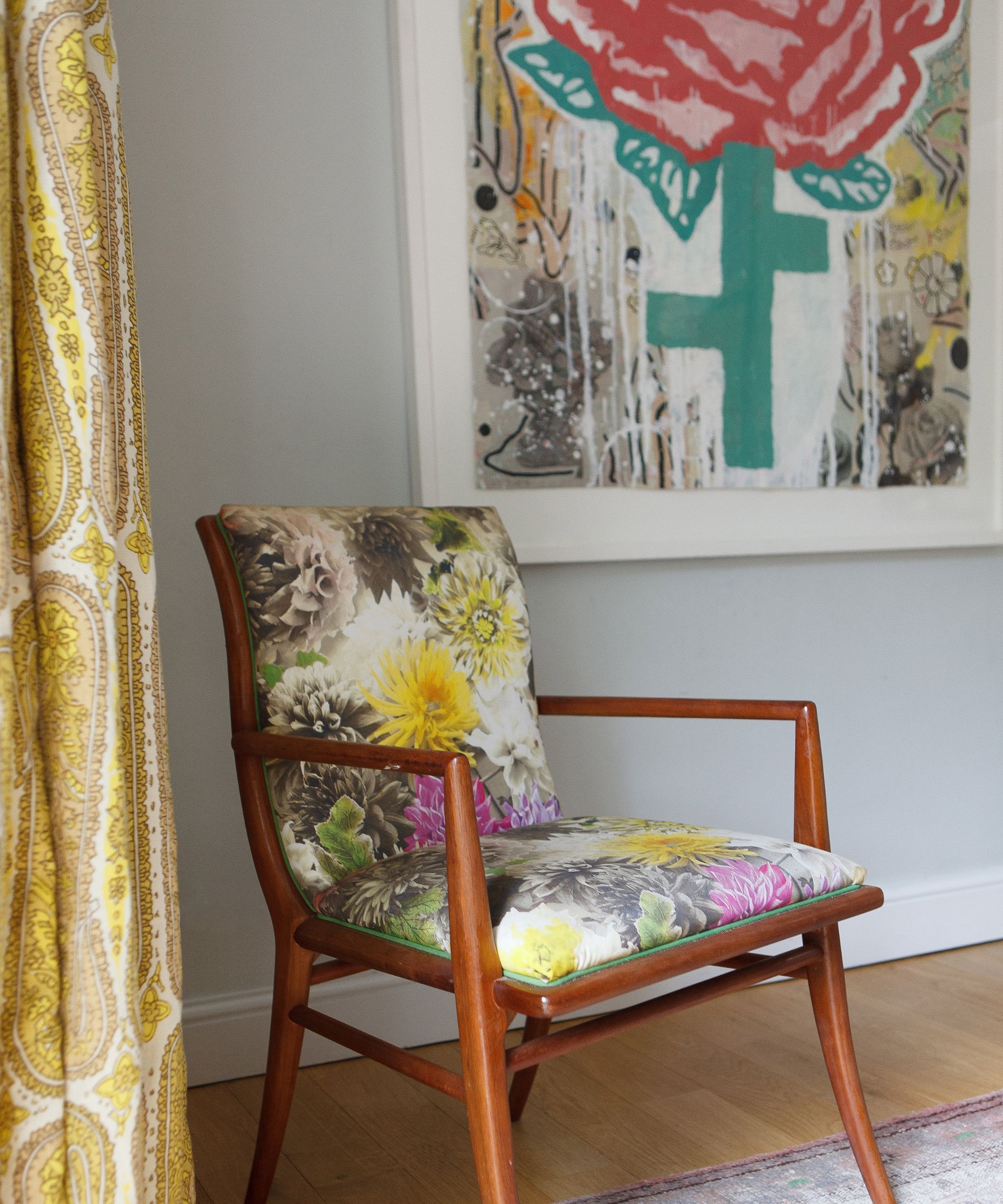
Build up with contrasting materials, variety of heights, scale, patterns, contrasting or harmonizing colors. An example is the upholstery on the dining chair and curtains (above). They have similar energy and palette to the painting, reinforcing the emotional impact of the piece of art. The same goes for the pieces to support the large work in the next example.
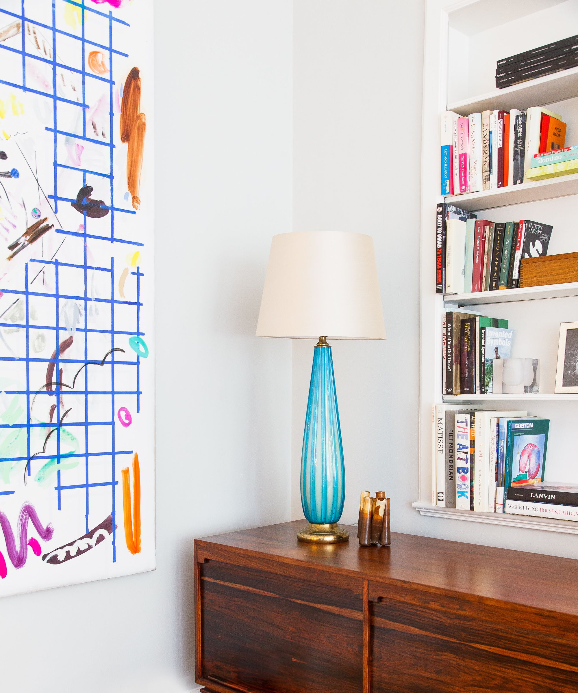
The lamp (above) is in harmony with the art. The books – not color coded but considered – are similar in scale to the geometric forms. This is purposeful – each reinforcing the other with a clear champion driving the composition.
I once read that if someone enters a room and can only focus on one thing, the overall design was not successful. I agree wholeheartedly. It is the dancing of the eye across a wide range of pieces that are unexpected yet cohesive which makes successful design.
Art and the room together are an installation of form and function. It is packed full of memories and feelings unique to its owner. Its beauty is in the sum of the parts as well as the pieces themselves. Finding the balance, giving each piece space to breathe and have presences but equally not to upstage.
I encourage you to have fun and build the stories you want to tell for yourself. Ultimately, the goal is to be artful with your pieces and give them the presence they deserve.
Sign up to the Homes & Gardens newsletter
Design expertise in your inbox – from inspiring decorating ideas and beautiful celebrity homes to practical gardening advice and shopping round-ups.

Natalie Tredgett is an interior designer known for her inimitable use of color in combination with distinctive artworks. Natalie encourages her clients to express their own creativity within the projects she creates with them – a Natalie Tredgett designed space is a clear representation of the client with her unique perspective running through it. Natalie founded her studio in 2012 having established herself under design guru Nicky Haslam. She trained in Interior Design at KLC, has an MBA from the University of Edinburgh, holds a Bachelor of Art from the University of Western Ontario and has a background in management consultancy. Natalie Tredgett Design has recently moved to a new studio in the heart of Notting Hill, London.
-
 How to get rid of bean seed flies – a pest control expert reveals how to keep crops safe from these seed munchers
As their name implies, these insects primarily feed on bean crops
By Tenielle Jordison
-
 Sarah Michelle Gellar's kitchen cabinets are moody yet elevated – I've always used dark paint with caution, but they make bolder tones accessible
The actress's black kitchen cabinets are bold yet palatable, proving that this dark shade is a trendy yet timeless color pick
By Hannah Ziegler