
Designers are the ultimate experts when it comes to colors to use in your home and they know how they work in different spaces to enhance for maximum effect.
'As someone who has dedicated her life to the transformative power of paint ideas, I can confidently say that color is one of the most powerful tools in interior design. The strategic use of paint can create cohesion and elevate style, turning any space into a harmonious, stylish haven,' says paint and color expert, Annie Sloan.
Color trends come and go, but there are some key shades that never date and have become part of designers' repertoires because they're so fabulous at making a space feel designed and stylish. We look into the most versatile and easy to use paint colors below.
The most versatile and easy to use paint colors
From the softest lilac to a sky blue, we delve into what are the most versatile and easy to use paint colors that create not only add impact, even if subtle, but they are high-spec shades that are loved by interior designers worldwide.
1. Dark gray

A dramatic look yes, but one that has become a classic statement color that has stood the test of time. A dark gray contrasts beautifully against white and we love how it works with blonde wood flooring – which adds a gentle warmth.
'Down Pipe is a versatile grey and pairs with many colors from soft muted pinks such as Setting Plaster and ochre yellows like India Yellow but sits perfectly with muted neutrals that have underlying green notes,' says Patrick O'Donnell, brand ambassador at Farrow & Ball.
Down Pipe also works in both modern and timeless spaces making it such a go-to color, Patrick describes his most perfect and timeless scheme using this shade, 'Down Pipe on walls, Bone on your woodwork and Slipper Satin on the ceiling – modern yet elegant and restrained. Bring in warm elements such as shades of tobacco and caramel and wall sconces in burnished brass.'

Patrick O’Donnell has been bringing his impeccable eye for colour to Farrow & Ball since 2012. Over that time, he has been a showroom manager, global color consultancy manager and now brand ambassador. However, he is best known as the much-loved face of Farrow & Ball on social media
2. Lavender

Perhaps a surprise choice, but lavender is a very versatile shade that's under-used, yet it's incredibly pretty and a color that lifts dark corners and looks fabulous with other colors.
Dominic Myland, CEO of Mylands explains, 'Pastel shades are incredibly versatile and easy to work with and are subtle enough to be used as a neutral within a larger scheme. Soft purples like Lavender Garden No. 30 are calming and relaxing, and ideal for creating a restful living space.'
Dominic makes a great point regarding using it as a neutral – in the past neutrals were seen as creams and taupes for example, but now they've been extended to other colors like pale barely there tones that have more of a color to them.

Creating outstanding products in over 200 shades and offering its bespoke colour-matching service, Mylands has, over six generations, crafted its wares with quality, versatility and depth at its heart. In 1984 Dominic joined the business full time, having previously worked there in his school holidays from the age of 14. Working across all areas of the company from the factory to the boardroom, Dominic took over the company from his father in 1998 and continues the family tradition of perfection in paint.
3. Stone

You can't beat a good warming neutral and that's exactly what stone is, it can instantly warm up a cool north-facing room and adds a really grounding element.
'The most versatile colors are neutrals or blues,' says Annie Sloan CBE, 'Neutrals are, by their nature, easy to work with.' In this charming bathroom designed by Annie, the earthy wall shade is Canvas – a warm neutral beige-white that provides a perfect backdrop for more color should you with to add it. We think blush pink would look great, as does the olive painted tub.

Annie Sloan, CBE, invented her revolutionary furniture paint, Chalk Paint™, in 1990 and hasn’t stopped refining and improving her formula since. She is widely considered one of the world’s leading authorities in paint, colour and style.
4. Off white

When a bright white paint is too much, a soft off-white, cream, or barely there gray are your next options.
'We steer clear of recommending a stark bright white for ceilings, architraves, or doors as it can feel overly clinical and disrupt the harmonious flow of your interior palette,' explains Jenny Weiss, co-founder of global Hill House Interiors.
'A personal favorite is the “Slaked Lime” collection by Little Greene, which offers five exquisite neutral tones. We prefer using the lightest shade for ceilings, the second tone for architraves and skirting, and for walls (particularly on paneling) we opt for the richer, deeper tones. This is the perfect way to ensure a seamless and sophisticated blend of colors.'
Choosing two or three colors from the same color family that can be blended this way is a great idea, just make sure they work tonally so they don't jar visually.
5. Sky blue

There's something lovely about a sky blue kitchen, it's uplifting and cheery, especially first thing in the morning and it's a great shade for reflecting the light.
According to Christina Bull, studio lead at global interior design studio, Sims Hilditch, a soft neutral base palette is always going to be the most versatile. 'Neutral can be imagined in such a fresh way now, with many gorgeous greys, off whites, and even blues that can give you a lovely ‘all-round’ option.'
Sky blue is one such color that can be considered as a good base option, Christina adds, 'We love to take inspiration from our surroundings, we paired a joyful blue here with Lewis and Wood’s Windrush fabric, bringing in greens, blush pinks, and burnt oranges – all of which you would expect to see walking through the British Countryside.'
For a similar sky blue have a look at Benjamin Moore's Serenata AF-535, it's an elegant shade that's similar to a summer's day.

Having graduated from Southampton Solent University where she studied Interior Design & Decoration. Whilst her background has typically been technical, she covers both interior architecture and the interior decoration of a project. Christina enjoys the beauty of designing the internal foundations of a building during the interior architecture phase and bringing it to life through layers of textures and tones from fabrics and furnishings, reflecting the personality of the client while remaining timeless in design.
6. White

White definitely has its place, and it would be remiss not to mention it as a versatile and easy to use paint color because it has so many benefits. Simple yes, but oh so effective, white is useful to have even if you're a color lover.
'White walls and trim allow the other elements of color to shine in the space. And, by painting the trim and the walls the same color it allows the paneling to become a backdrop and the focus to be on the furnishings and textures in the room,' says Elle Cantrell, owner and lead designer at Elle Du Monde.
In this uber stylish living space Elle chose Sherwin Williams' Zurich White SW 7626, a bright white that has a touch of violet undertone.

Based in Atlanta, Georgia, Elle Cantrell designs spaces that are bold and authentic, layering graphic patterns, colors, and timeless finishes. Her interior design projects across the US blend collected contemporary elements with old world character to create beautiful environments that reflect each client. Traveling the world and appreciating different cultures energizes and inspires her designs.
7. Green

Green is a wonderful easy going color to use in your home and so versatile as it literally works everywhere, from hallway to living room, bathroom to bedroom. The hardest decision to make when decorating with green is what shade to use.
We asked Ruth Mottershead, creative director at Little Greene for her thoughts: 'Neither too warm nor too cool – this makes them very versatile, they can be used in lots of different spaces regardless of the tone of light. Green combines fabulously with earthy tones, along with paler shades like creams and stone, and darker, richer colors such as browns, blacks, cherry reds and ochre which can give a more dynamic effect.'
Perhaps most importantly, consider the atmosphere you want to create, Ruth adds, 'Is it calm and cocooned or energetic and vibrant? Vivid, lively greens work well in rooms that are made for entertaining, such as kitchens and living rooms, or consider the earthy ‘Sage Green’ as it works very well as a highlight, as can be seen in this serene bathroom.'

Ruth Mottershead, creative & marketing director of Little Greene, has been working in her family’s business for 12 years. She writes content for the company’s marketing material, manages photoshoots and communicates with Little Greene and Paint & Paper Library’s customers.
Color is of course subjective, but our expert designers have a keen eye for what's hot and what's not. This ensures that the colors they choose add style, elegance and have longevity.
You can use these colors as much or as little as you like within a space, but rest assured they are tried and tested and will look amazing.

-
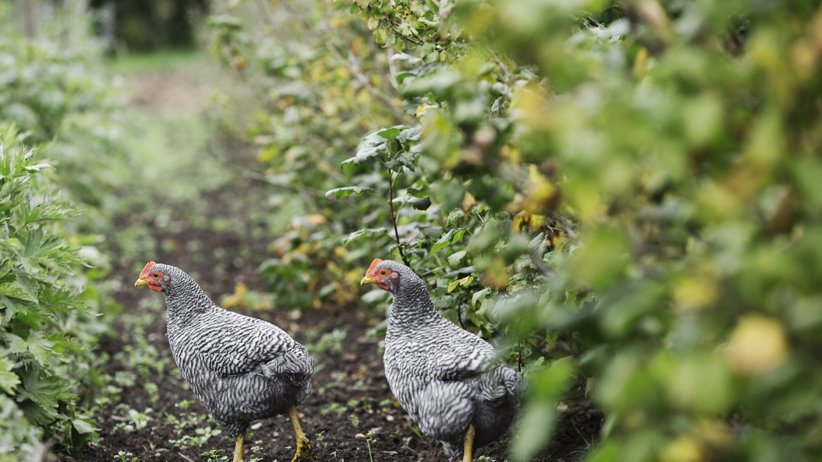 Best plants for a chicken run – 7 fragrant and floral plants for happy hens and beautiful coops
Your chicken run can be every bit as beautiful as your own garden, so long as you do your research first
-
 Anna Kendrick's favorite coffee maker is the first machine to make iced beverages that are 'just as cold as a coffee shop' – it's currently under $200
The actress uses this smart machine to make perfect mocha frappes straight out of her kitchen – it's a summer 2025 must-have

