This serene yet moody home library project offers a literary escape for a busy mother-daughter team
Interior designer Emily Frank created this space for a family of book lovers looking for an at-home getaway. Here's a look inside
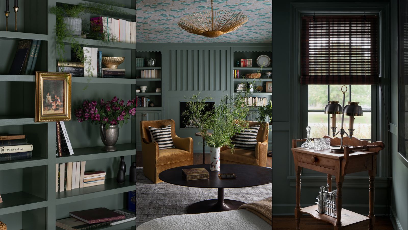

There's nothing quite like curling up with a good book at the end of a taxing day – and the ritual's even better when you have a designated space to relax. When designed with dreamy evenings in mind, a home library can offer a calm and comfortable escape for the whole family.
Emily Frank, interior designer and founder of Frank & Co. – a bespoke design studio based in the Midwest United States – was recently tasked with creating such a space for a mother-daughter duo with packed schedules and an enduring love for literature. And the gorgeous home library she created allows the pair to enjoy each other's company while diving into fictional worlds.
To get some insight into the room's considered design style, we sat down with Emily. Here's what she shared about what went into bringing this home library to life.
'We created a space for a woman who's a single mom. She's a pharmaceutical marketing executive, and she has a daughter, and she does it all by herself. She makes the money, she makes the decisions, so we really wanted to honor that pathway for her and give her a space that is atypical in today's society,' says Emily.
Inside this stunning mother-daughter space
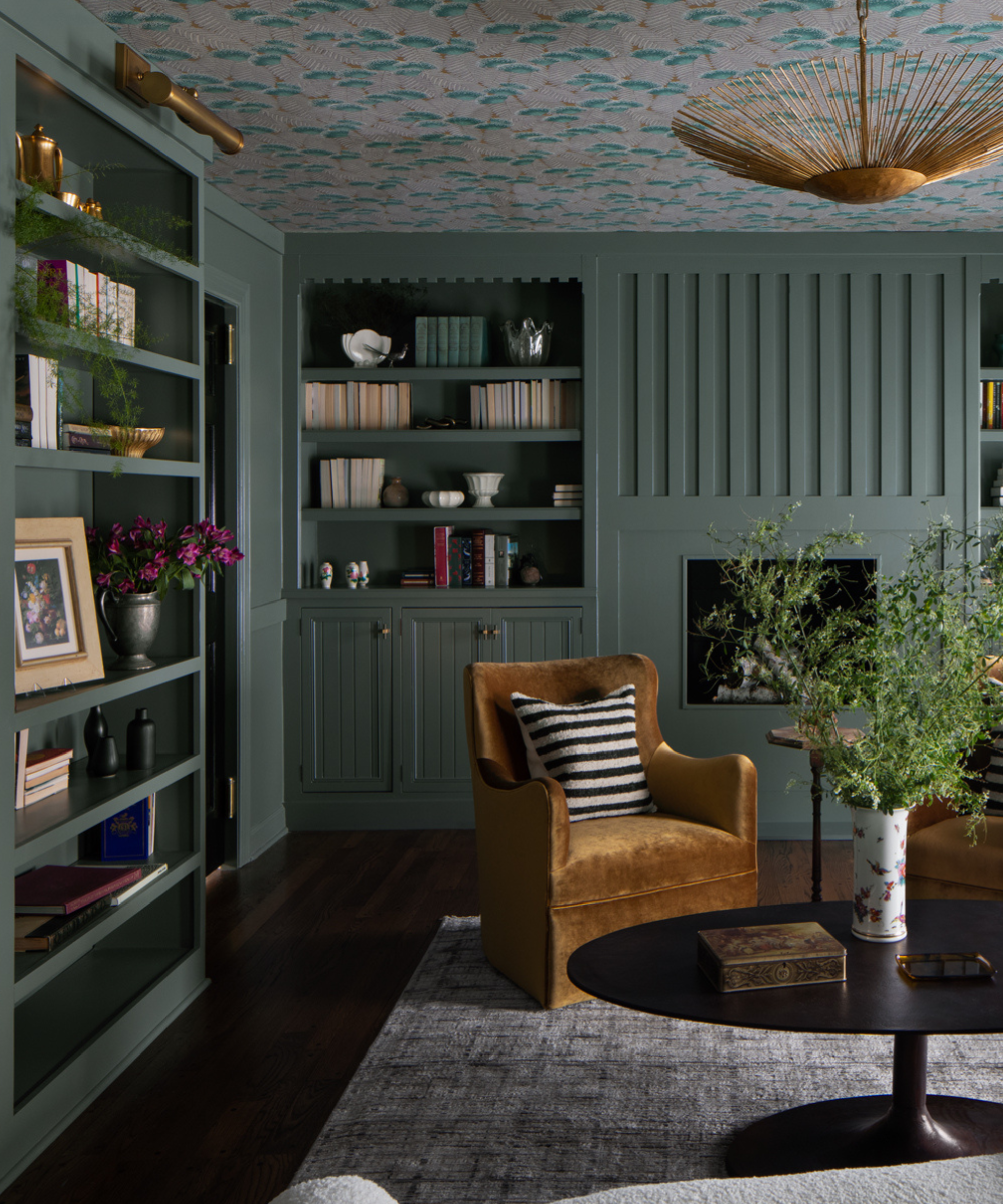
The library is nestled away just off the 'expansive' home's entryway, offering a cozy and enclosed nook within a larger space. And while Emily says the design team considered including sliding doors to further close off the space, they opted to add more bookshelves – a natural way to encapsulate the comfort-forward room.
But when creating the cozy feeling so evident in this space, Emily says selecting a color scheme had the biggest impact. The tone-on-tone paint color contrasts with the rest of the home, which she says is defined by high ceilings, light paint colors and large windows.
'With this particular space, I really wanted it to feel cozy the moment you stepped through the door. By doing a moody paint color and having it be all one tone, with the bookshelves, the walls and the ceiling, it really did give it its own cozy feeling,' says Emily.
Sign up to the Homes & Gardens newsletter
Design expertise in your inbox – from inspiring decorating ideas and beautiful celebrity homes to practical gardening advice and shopping round-ups.
Originally, Emily and her design partner considered a red or ruby hue, but this earthy color – Green Smoke from Farrow & Ball – felt more grounding to the client. The shade's lovely mix of green and gray contributes loads to the room's organic, tranquil atmosphere.
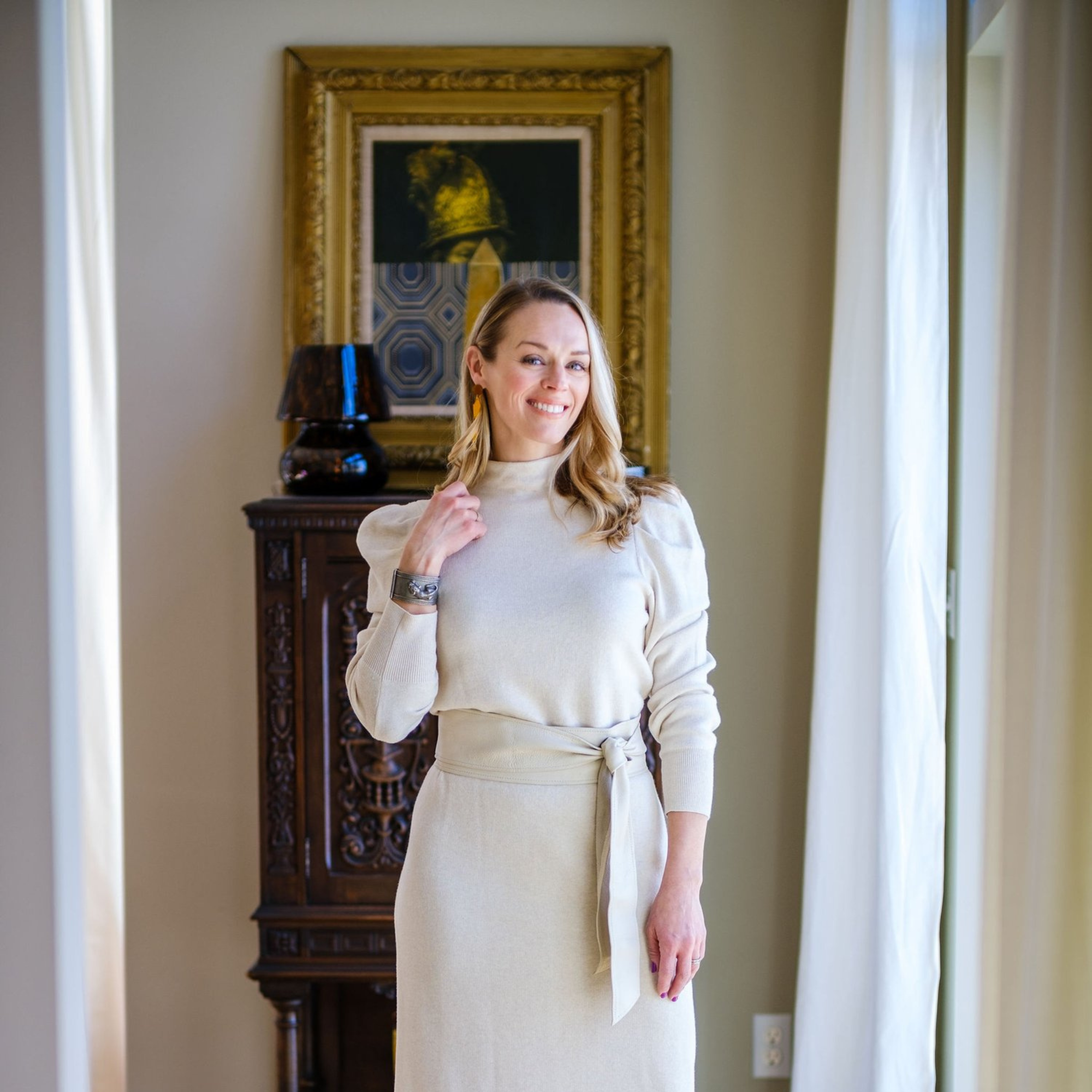
Emily Frank is the founder of Frank & Co., a bespoke interior design studio based in the Midwest United States.
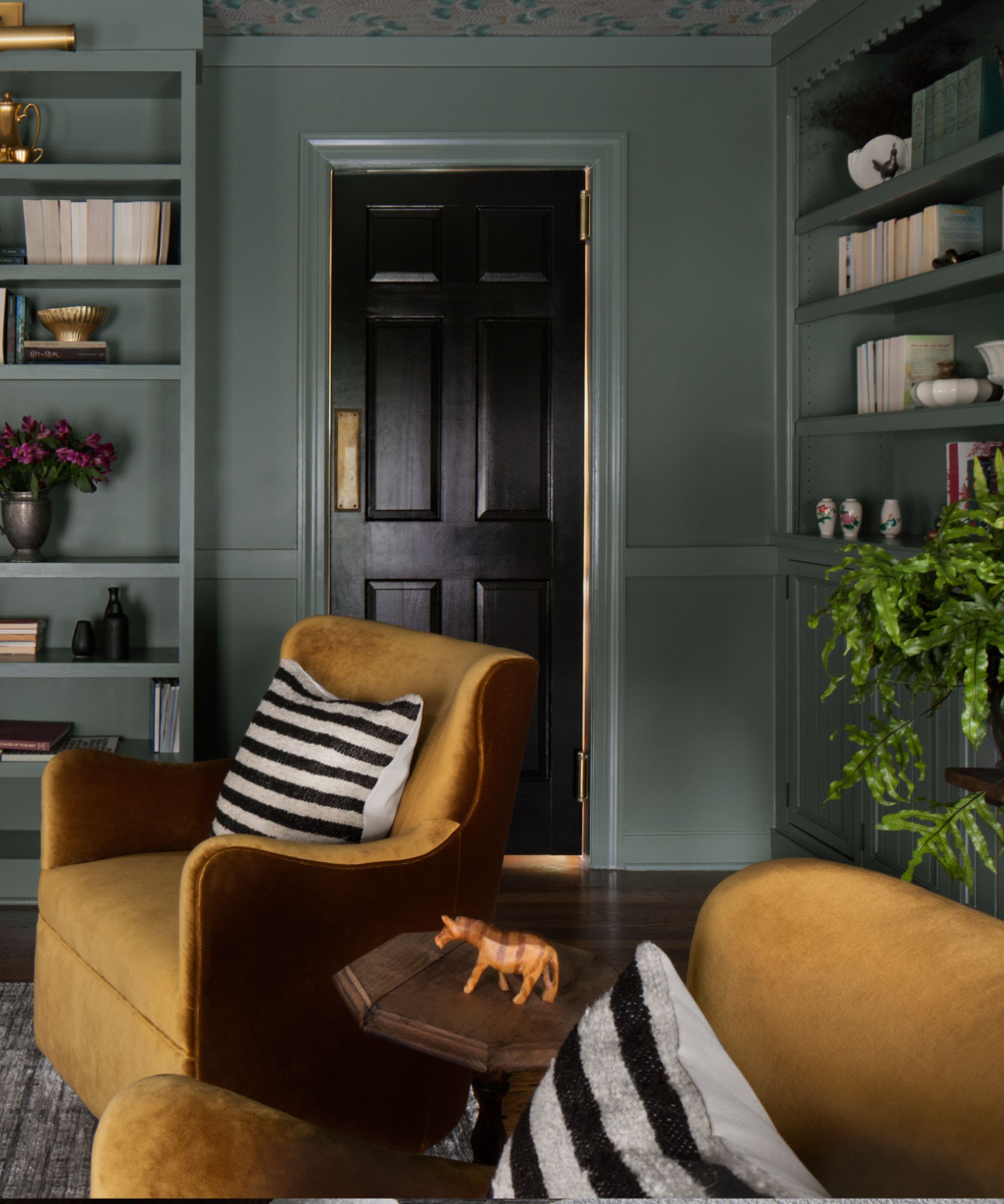
Though the room heavily features the dark green hue, looking up toward the ceiling reveals a design detail you don't want to miss. The home's older foundation inspired the design team to opt for a light, intricate wallpaper to top off the room – adding both visual interest and the illusion of a higher ceiling.
'That's why I selected to have that feathery, more whimsical wallpaper up on the ceiling, so that it really gives you that opportunity to say, "Okay, I can see all my books, I know that I'm in my library, but when I look up I feel a sense of relief." That was just where we selected to make that opportunity happened for her,' says Emily.
In the center of the statement ceiling, an eye-catching light fixture from Visual Comfort & Co. illuminates the room. But the space offers plenty of opportunity to avoid overhead lighting, too, with library lights and small lamps littered throughout the space. The Frank & Co. team made sure to install outlets in convenient locations to ensure the space was lit just well enough for reading.
'We wanted it to be sparse lighting. We wanted you to feel that you could read, which is the point, so we did do the arcing lamp – but we didn't want it to be too bright. So we went with this whimsical theme with the lighting to bounce some shadows on the ceiling, and also, when you're in there at night, to light the area but then provide more focused reading light.' she says.
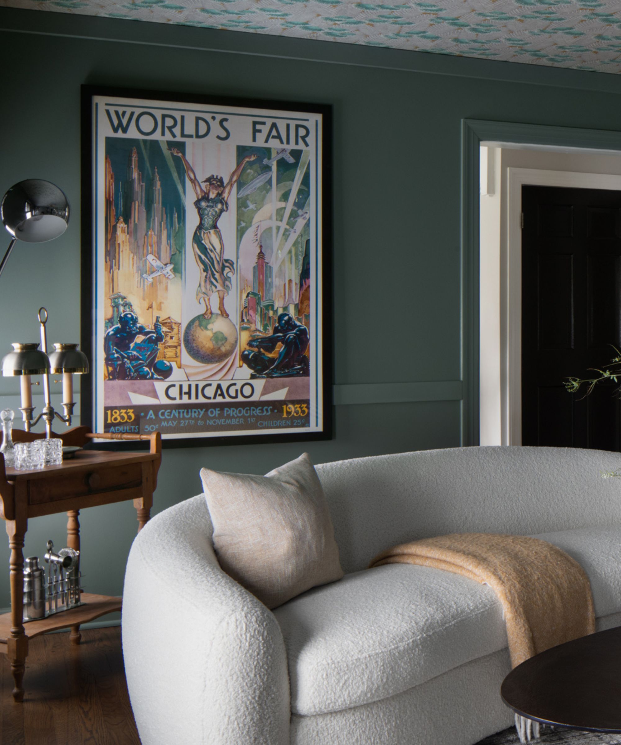
As of late, the design world has been up in arms about 'bookshelf wealth,' a trend featuring sprawling collections of books built up over time. And while this library doesn't just follow that trend – instead it's an authentic and organic representation of a true reader – it demonstrates many of the look's key tenets.
Emily says that designing the space proved personal for her client, as reading has remained a constant throughout every stage of her life.
'She looks at the wealth of her library as stories that have been a part of her whole life, and it's transported her in and out of difficult times in her own life. So I think that's where the wealth comes from – the knowledge, and the desire to continue to build that for her and for the next generation that she's raising,' says Emily.
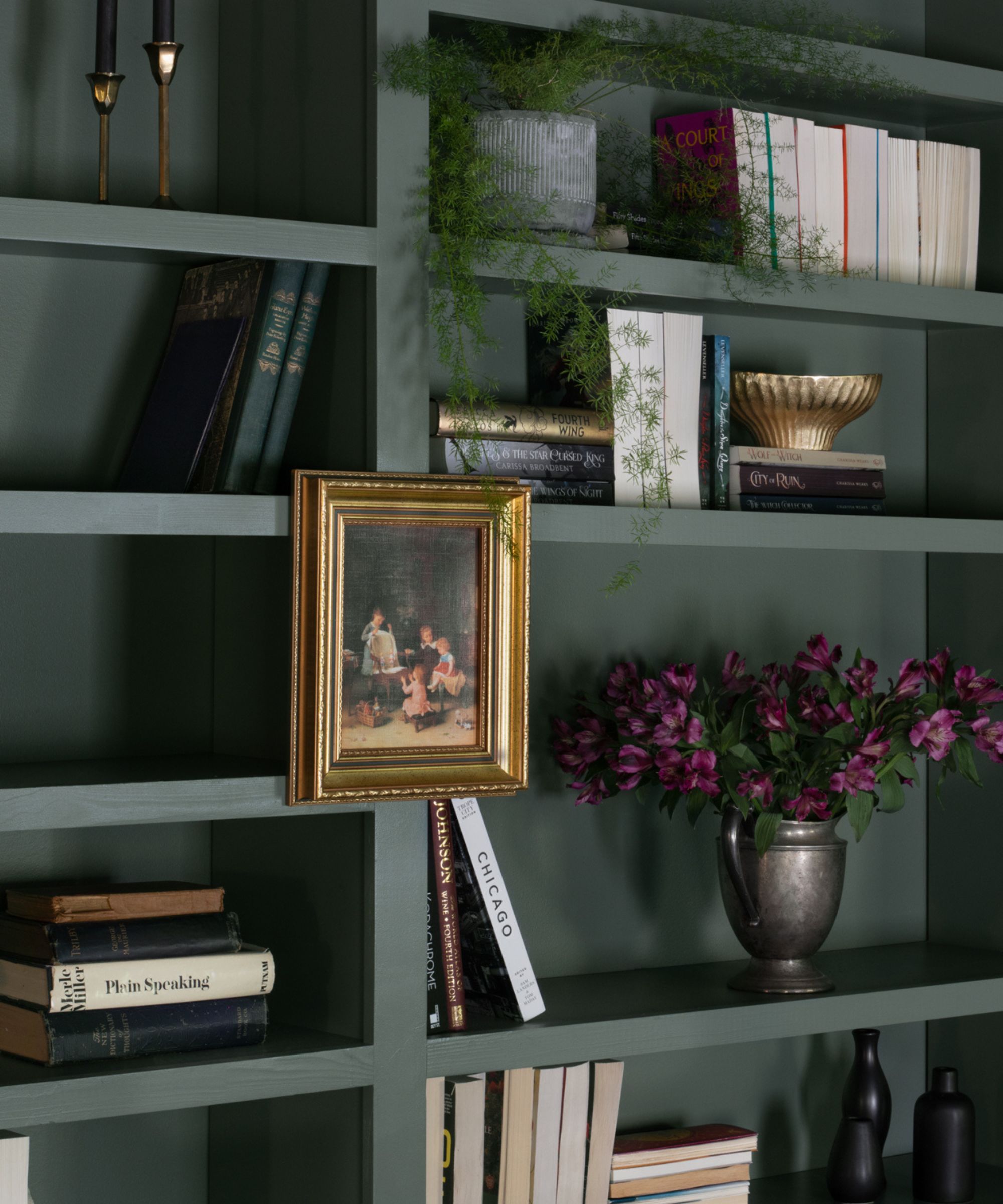
The team at Frank & Co. strives to include a collected mix of vintage and antique pieces in each of their projects, and Emily says this library includes an array of unique items. The Chicago World's Fair print, for example, belonged to the client's father – it earned its place in the room for being a 'memorable' and cherished piece of art that was passed down.
'My desire to start the studio really came from my love of antiques and collecting things through estate sales and auctions – and really falling in love with these elements. They maybe don't make sense when you see them sitting by themselves somewhere, but when they're brought in, collected over time, and really made to feel a part of a story, that's where it excites us,' she says.
Each shelf is a carefully curated vignette, featuring a mixture of the client's books, fresh house plants and decorating with antiques. And while turning books' spines to face outward proves a controversial choice for book lovers, Emily says this decision went beyond design aesthetics. Though the choice does make the room feel less cluttered, it also provides a bit of privacy for the client when guests come to stay – book collections can be quite personal, after all.
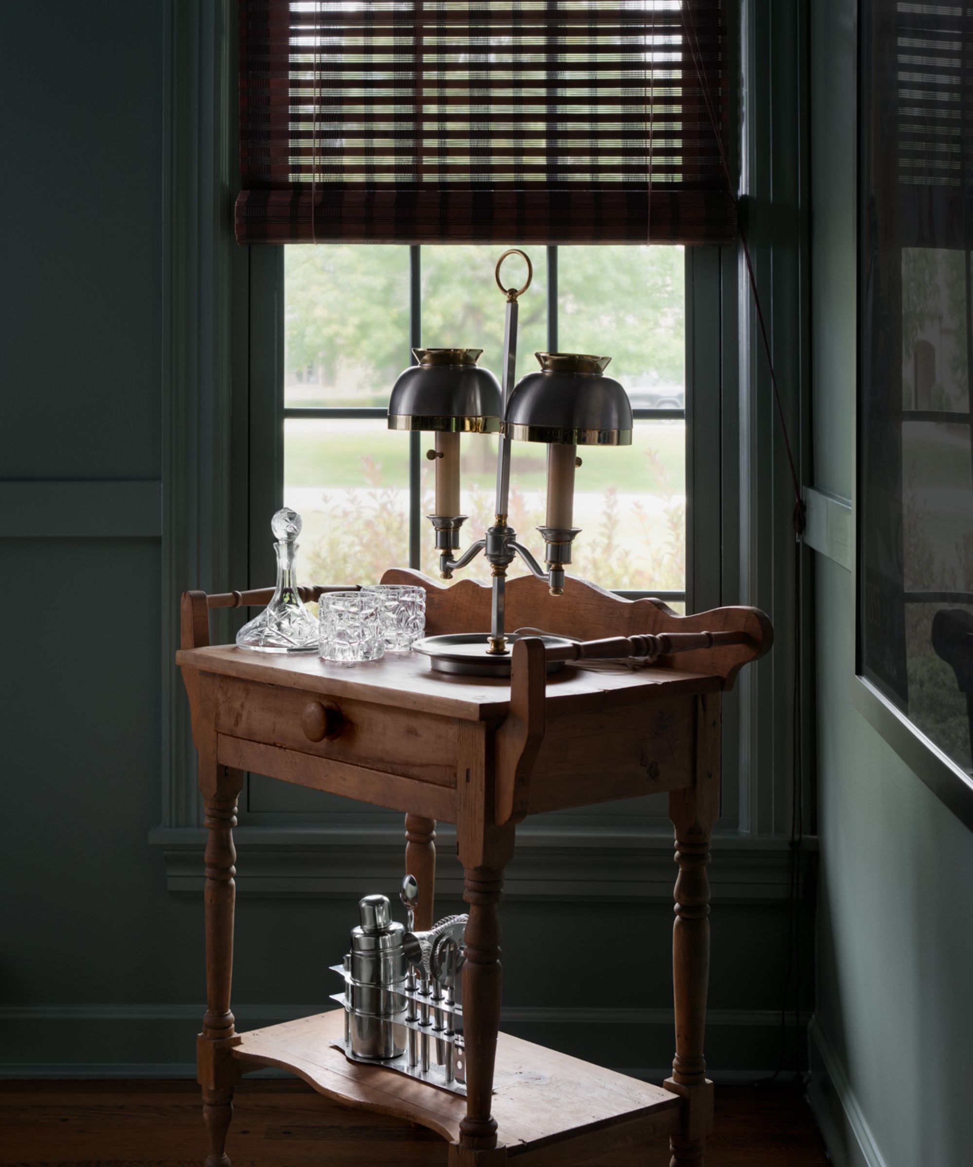
In the corner of the homey space, Emily decided to stow a small bar cart – a feature sure to level up any hosting the client does in the brand-new and fabulous room. Though the designers considered installing a full wet bar, this antique detail felt like a better fit for the intention behind the space. The compact yet charming cart houses a vintage lamp, and a pared-back selection of bar essentials.
'When we thought of and envisioned this room, it was first and foremost for her and her daughter, so we wanted the space to be for the two of them – and then also a special place for her to bring her girlfriends when they come over on the weekends. We wanted there to be a movable element of entertainment in there, but not something that took away from the main focus, which was book storage,' says Emily.
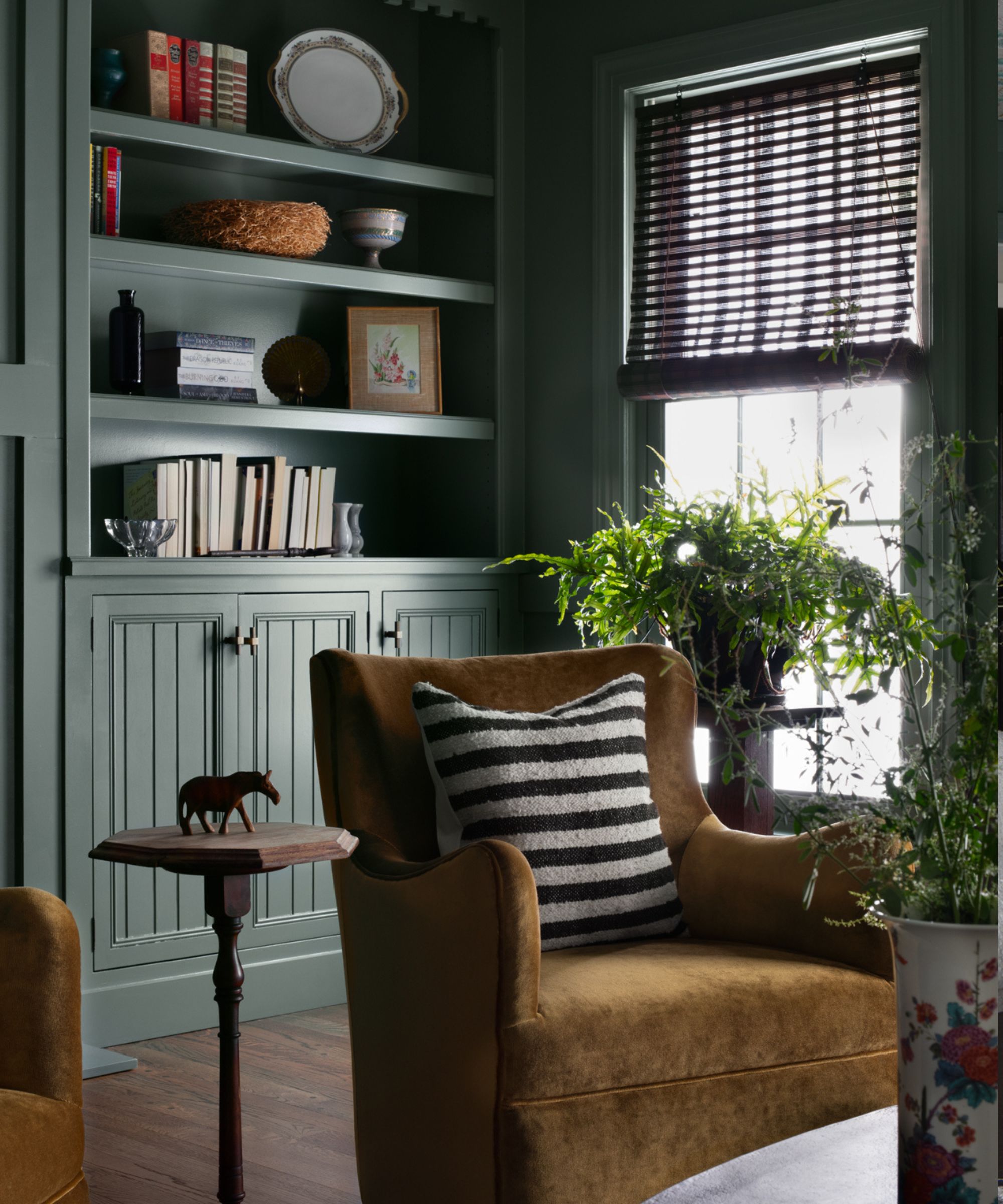
The space is clearly a success in providing an at-home getaway for a mother-daughter pair – just housing enough shelving to store all the client's books was a small win in itself. But Emily says this room went deeper than just another design project, adding that it 'shaped [her] as a designer.'
Designing a hobby-driven space for a woman and her daughter felt like a statement to Emily, who says that often, the design world still designates kitchens and laundry rooms as spaces for women. Meanwhile, dressing rooms and studies are more heavily associated with men.
'I think that there's an antiquated element to the way that our society thinks about homes and how we move through them. What myself and my client really tried to do is think practically and realistically about women in our society today, and how they use their spaces – that they have a hand in designing and have a hand in paying for,' says Emily.
Emily says she loves that the space feels whimsical and unexpected, adding that the gold velvet chairs (which swivel) are her favorite finishing touch. But the fact that her client is left with an at-home library made just for her is 'thrilling,' she says.
'This is something that she's wanted for a really long time, and this was a dream come true for her. That's why this project is so special.'

Abby was the Interior Design News Editor at Homes & Gardens and is now studying for her Master's degree in Journalism at City University, London. Prior to joining our team, she worked with Better Homes & Gardens, where she wrote and edited content about home decor, gardening tips, food news, and more. She studied Journalism and English Literature at New York University and moved to London to pursue her love of writing in 2023.
-
 Courtney Love's historic loft combines rock star luxury with raw New York bones – it's on the market for almost $9.5 million
The singer's former SoHo home features exposed brick walls, original wooden columns, a gas fireplace, and high ceilings – take the tour
By Hannah Ziegler
-
 Triangular shaped garden ideas – landscape designers share 9 ingenious ways to redesign your corner plot
Expert tips for planning, planting and finessing a triangular shaped plot, so you can savour the space year round
By Jill Morgan