5 minimalist decor ideas – learn how to embrace minimalism while still having a home filled with character
Here's how to create minimalist spaces that are free from clutter but not free from personality...
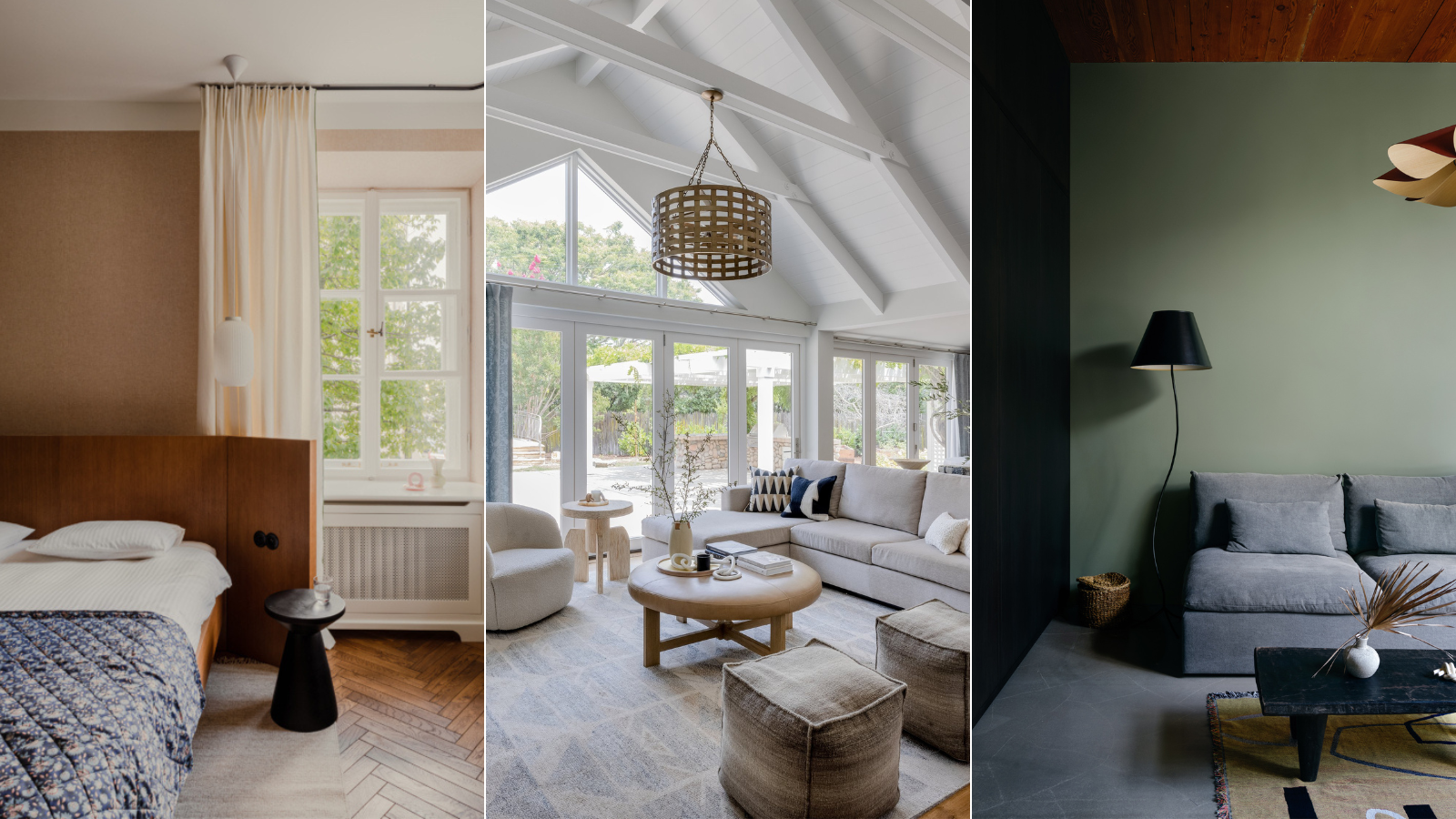

Minimalism is an interior design trend, in fact, it's been too long standing to call it a trend, an interior design style, that's been around for decades. It shifts around slightly, sometimes it's more sleek and Scandinavian, sometimes it goes a bit retro and mid-century modern, and sometimes it's softer and more lived in. And it's that later take on the look that we are currently most drawn to. Minimalist interiors that still feel welcoming and homely. Because, no matter what style or home decor ideas we like, isn't that what we want all our rooms to be?
So we spoke with designers to find out how to make the minimalist trend more approachable. How can you embrace the clutter-free style and yet still create a home that has depth and character? What colors work best? What furniture shapes should you look out for? And how can you blend minimalism with other trends and decorating ideas?
What is minimalist decor?
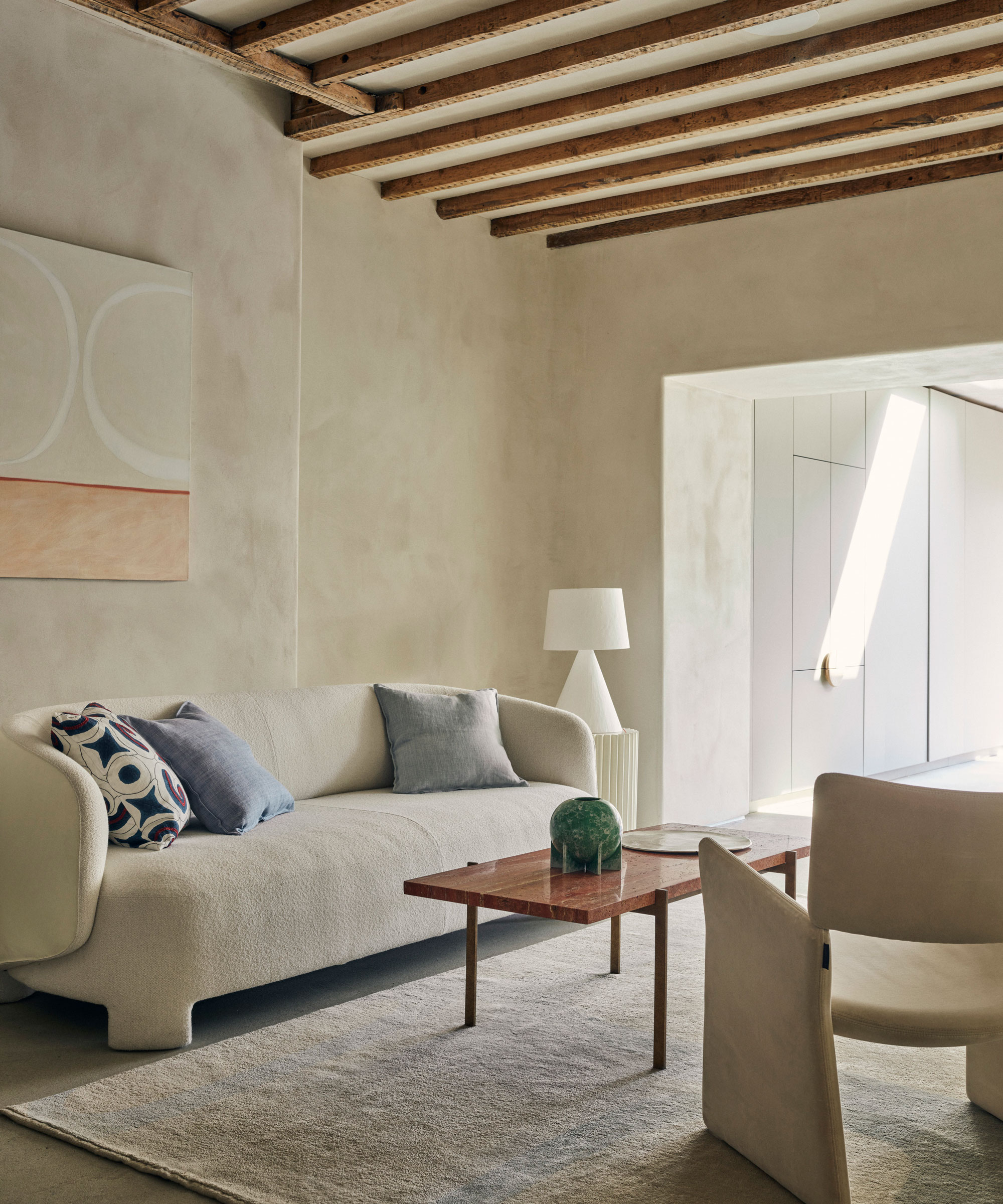
Minimalism dates back to the start of the 20th century and was a total switch from the frills and fuss of the Victoria era. But the interior design trend really started to be embraced later in the century, around the same time as the mid-century modern movement. The less is more approach is what really summarizes the style. These spaces are clutter-free and fuss-free, with the focus being very much on form and function.
Furniture is simple but beautiful, with clean lines and usually low-slung silhouettes. It's the high-quality materials make the pieces become focal points of the rooms. The color palettes are usually neutral and fairly limited with just a few shades coming together.
As with any long-standing interior design style, minimalism does have many different takes. And it's a look you can blend with others too, so just take from it what you love and what works for you.
1. Layer up textures
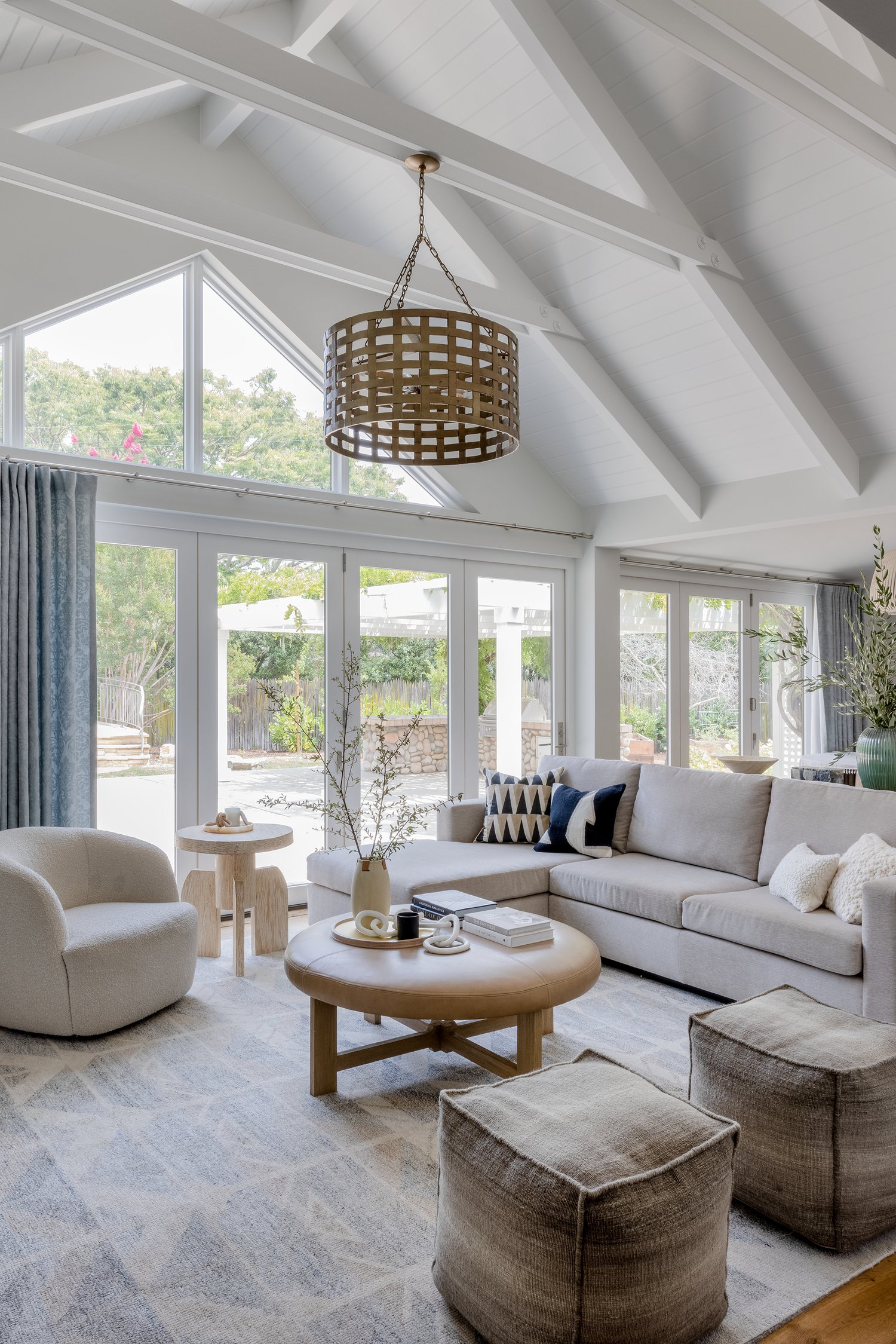
Using texture in interior design is key if you want to create a minimalist space that still feels welcoming and lived in. Colors and shapes tend to be kept fairly stripped back so it's textures and finishes that will add interest and depth to minimalist rooms. Layering up textures will also ensure that your rooms still feel very warm and welcoming, as well as decidedly minimalist.
This minimalist living room was designed by Kendra Nash, she explains: 'The goal was to keep the space neutral, yet interesting with slight patterns, textures, and architecturally interesting furniture pieces.'
'Careful consideration is essential when selecting decor for minimalists, as it's easy for it to appear cluttered or unbalanced. When contemplating decor choices, opt for the most cherished items and present them in the best light,' adds Kashi Shikunova Director of YAM Interiors. 'Layering texture into the minimalist design is a personal preference of mine, as a skillfully executed minimalist aesthetic is warm and balanced.'
'The addition of varied textures, soft hues, and natural materials such as stone or wood can contribute to a gentle and inviting atmosphere. Incorporating handcrafted items that show subtle imperfections adds a genuine and unique charm to the space. I love blending softer contours alongside crisp, unadorned lines, creating a dynamic and harmonious arrangement.'
2. Keep the color palette soft and warm
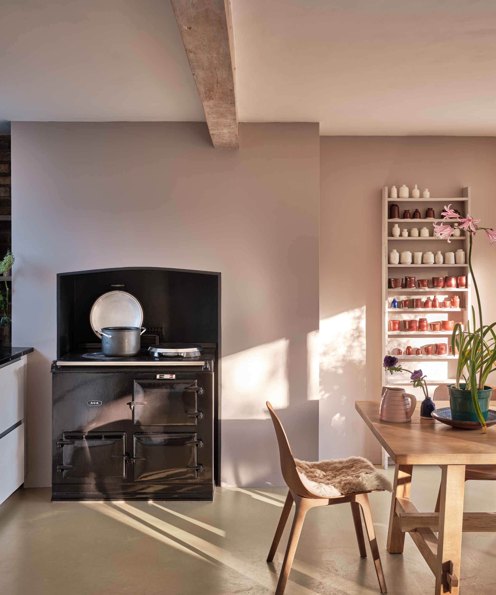
White room ideas are the color often associated with minimalist style. Clean, crisp and the perfect backdrop for some statement silhouettes, it certainly fits the aesthetic. But the trouble with white is it can come across as quite stark and clinical in its purest forms. So, for a more comforting, but still neutral, minimalist palette, look to the warmer side of neutrals – warm whites, soft greys, and creamy beige tones.
'Whilst whites seem the natural destination for a minimalist space, look to whites that are more nuanced rather than true,' suggests Patrick O'Donnell of Farrow & Ball. 'Consider something with a specific undertone that will carry with the sparse elements of the interior, this could be anything that has a specific undertone, be it green, blue, or even the softest pink note.'
'Err on the side of more earthy whites or neutrals – something with a little brown-ish warmth. These will bring a balance, so whilst the interior may be blessed with a lack of clutter, a gentle neutral will add a dash of character whilst letting your aesthetic bent breathe!'

Patrick O’Donnell is Farrow & Ball's color consultant & brand ambassador and has been with the brand since 2012. Patrick works with designers in the UK and North America, helping to bring their projects alive with the iconic, F&B color palette.
3. Not all minimalist spaces are about neutrals, so be brave with color
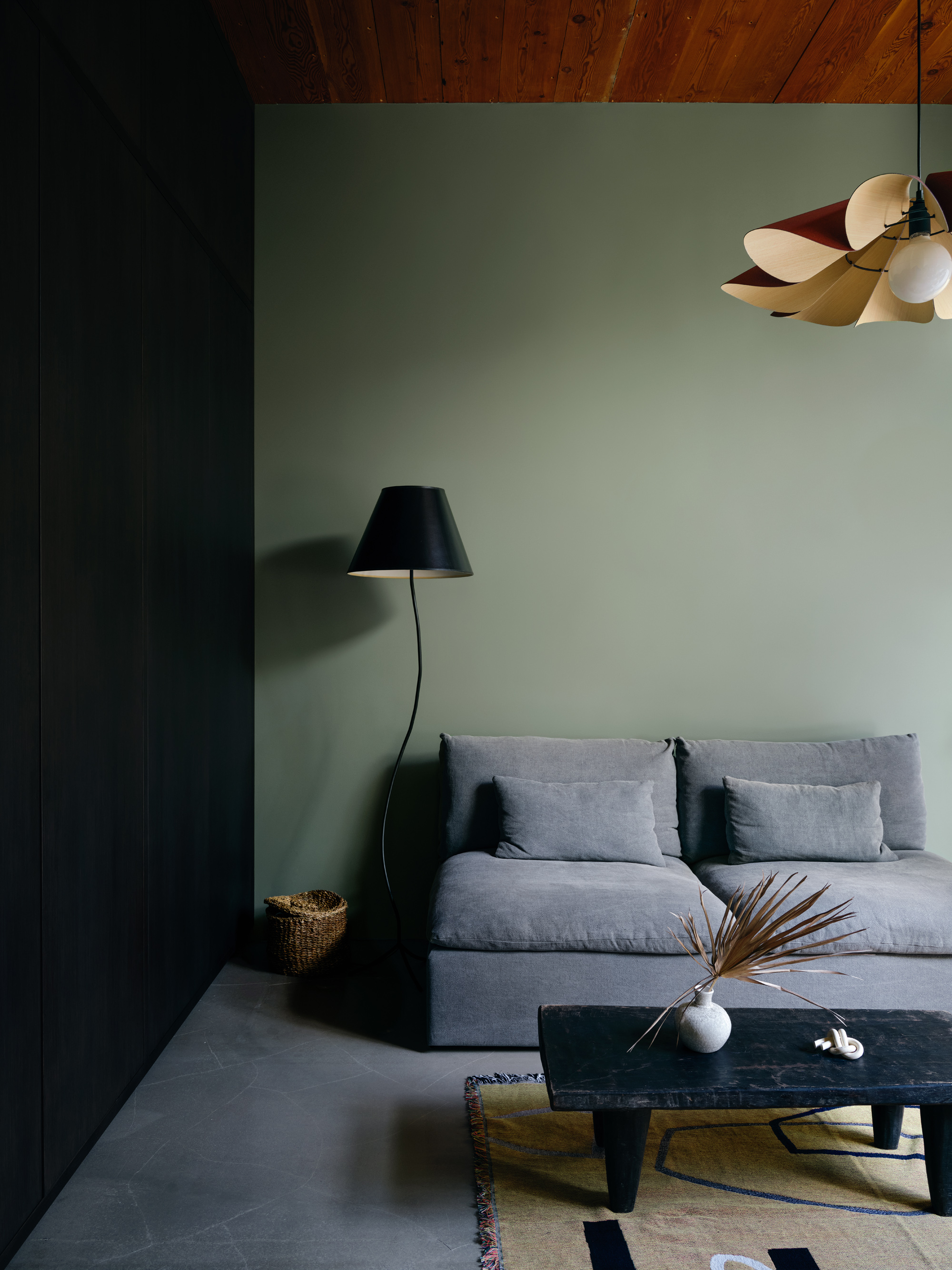
When you think of a minimalist color scheme, your mind perhaps goes to whites, greys, beiges, and perhaps an accent of black. But a minimalist style can be adapted to suit any color palette, not just neutrals. If you like the more paired-back aesthetic but want your rooms to feel more inviting, color is the way to do it. Stick with the simple, sleek shapes and don't clutter the space with too many pieces of furniture, but make the color palette deeper, more jewel-like. You'll create a space that's sumptuous and luxurious but still feels decidedly minimal.
Case, in point, this living room and home office, designed by Bespoke Only. The black, grey, and sage green color scheme is so deep and rich and the mix of textures too fills this otherwise very minimal space with interest.
'We always like to incorporate texture and tactility to create depth in an otherwise pared-back space, through materials and layering. This room is a home office suite that opens out to a private courtyard. We loved the abundance of light and wanted to really create the connection with the landscape outside – both the wood ceiling and olive green walls are the subtle touches to bridge the inside and outside.' explains the studio's founder Melissa Lee.
4.Focus on beautifully made statement pieces
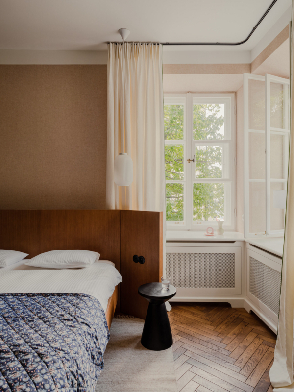
Despite its name, since minimalism went mainstream it's such an easy trend to bring into your home quickly and cheaply. Every high street brand makes replicas of the classic minimalist pieces, which is great that it's making this look more accessible, but if you are really committed to the trend invest in quality over quantity. Don't try and transform your home and make it 'minimal' in one online shopping haul. Remember the whole less is more concept that pretty much sums up this style? Minimalist is about focusing on quality – well-made, beautifully designed pieces that are classic and will last.
Count the pieces of furniture you can see in this minimalist bedroom. Two. The bed and the bedside table. And yet they both bring so much into the room you really don't need anything else.
'This project was created in a modernist tenement house. The modernist style is characterized by a more modest decoration but a great emphasis on functionality, ergonomics and the quality of the materials used,' explains Marta Chrapka, founder of Colombe. 'In this project, we had a lot of original preserved elements and we wanted to emphasize those. Woodwork, windows, window sills, tiles, they were all original and were a great inspiration.'
'With a minimalist style, the focus is on the quality of the materials used. Because they are used sparingly, we pay attention to almost every element in the interior, and precision of workmanship and high quality are mandatory.' she adds.
5. Incorporate classically minimalist shapes
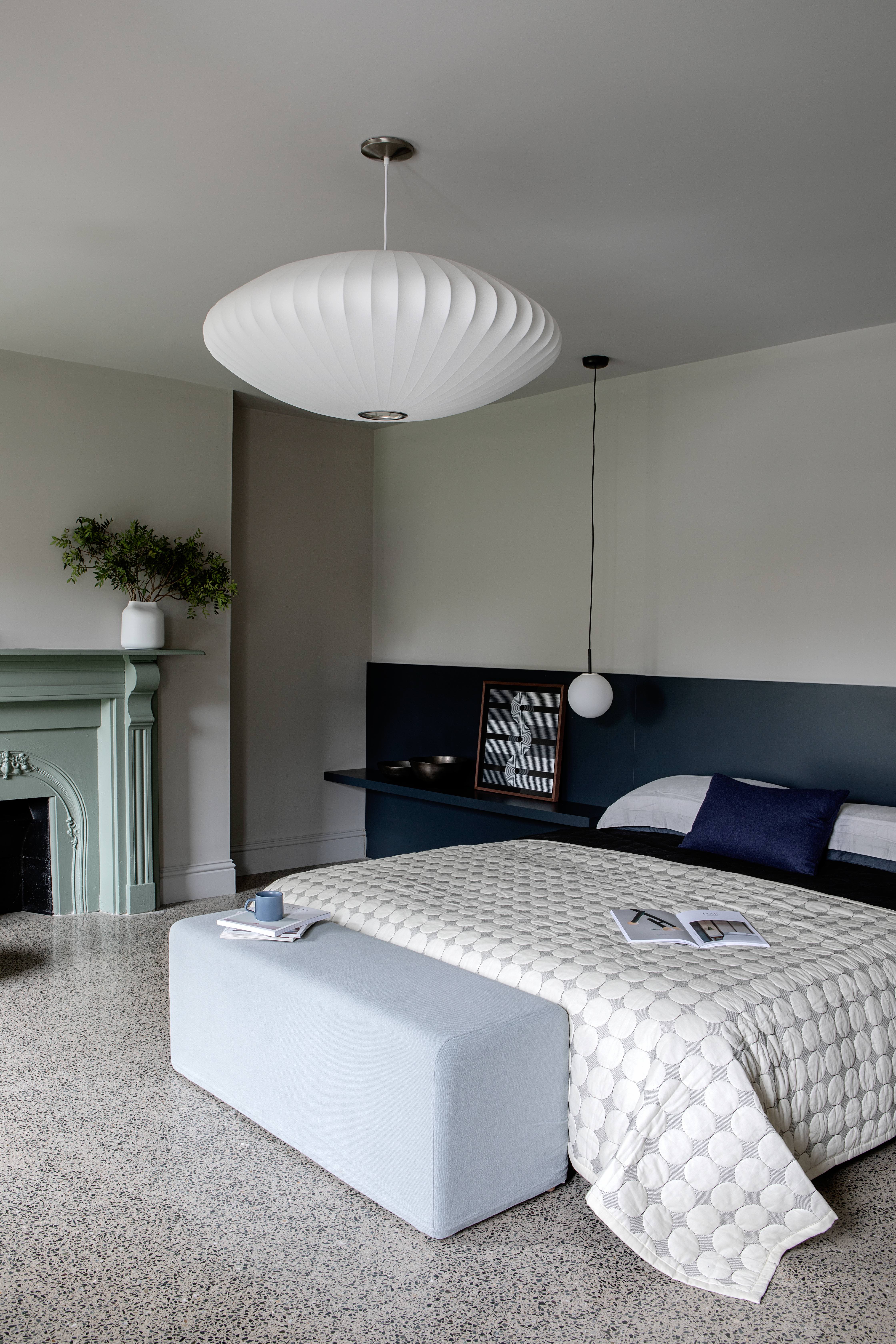
A big part of minimalism is the shapes and silhouettes. Since there's not always a ton going on in terms of color, or the amount of furniture in the room, every piece of furniture or decor you do bring needs to give something. So look for designs that have something statement about them, whether that's the fact they are oversized, have a funky outline, or are made from a material you wouldn't expect.
The bedroom lighting used in this space design by Kingston Lafferty draws a lot of the focus. It's minimal, and yet statement and perfect for this very calming bedroom, that needs that key focal point to ground the room. 'We wanted to ensure this guest bedroom exuded a timeless calm with colors that wouldn’t date. Purbeck Stone from Farrow & Ball, forms the basis of the space, wrapping all surfaces it touches in its neutral, putty-like hue, including ceiling, doors, and skirting, and is enhanced by the contrasting navy tone. Simplicity is very effective at creating a sense of calm,' explains the studio's founder, Roisin Lafferty.
Sign up to the Homes & Gardens newsletter
Design expertise in your inbox – from inspiring decorating ideas and beautiful celebrity homes to practical gardening advice and shopping round-ups.

I am the Head of Interiors at Homes & Gardens. I started off in the world of journalism in fashion and luxury travel and then landed my first interiors role at Real Homes and have been in the world of interior design ever since. Prior to my role at H&G I was the digital editor at Livingetc, from which I took a sabbatical to travel in my self-converted van (not as glamorous as decorating a home, but very satisfying). A year later, and with lots of technical DIY lessons learned I am back to writing and editing, sometimes even from the comfort of my home on wheels.
-
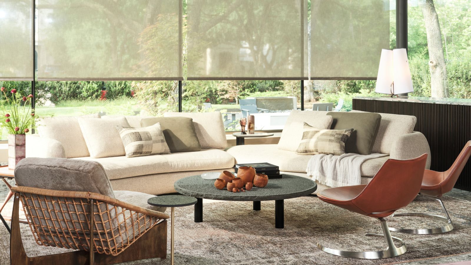 Thoughtful modernism – how one Dallas home makes bold contemporary design feel warm, welcoming, and comfortable
With its mix of textural finishes and carefully curated furnishings, this modernist home is a refreshing retreat
By Karen Darlow Published
-
 'Wick away the ick' – 6 things people with clean laundry rooms always do to make this hardworking space shine
These tips on how to clean your laundry room will banish grime
By Seraphina Di Mizzurati Published