Midimalism is the perfect balanced yet characterful style – 10 ways designers create the on trend look
Discover how to embrace the Midimalism interior design trend with these decor ideas and expert tips
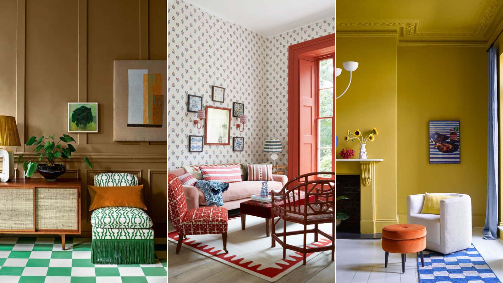
- 1. Choose a neutral wall paint
- 2. Balance color with the 60-30-10 rule
- 3. Use the color wheel
- 4. Balance walls and floors
- 5. Choose a small-scale wallpaper
- 6. Mix patterns with plains
- 7. Carefully curate artwork and collectables
- 8. Choose a statement piece of furniture
- 9. Paper part of the wall
- 10. Be bold in small spaces

We’ve all heard of minimalism and maximalism, but have you heard of the emerging decor trend midimalism? Yes, you guessed it, ‘midi-malmism’ - also seen referred to as ‘middle-malism’ - is pretty much what you’d expect - an interior trend that sits between these two decorating extremes.
Do you appreciate clean, organized spaces yet equally don’t shy away from color and pattern and curated artworks and decorative objects? Chances are you’re a midimalist. Here we’ve explored what this new interior design trend means and consult the experts on how to tread the fine line between maximalism and minimalism to create characterful spaces that remain balanced and harmonious.
What is midimalism?
To understand midimalism it’s important to first familiarize ourselves with minimalism and maximalism. Minimalism is essentially the art of living simply with open spaces, sleek lines and just a few carefully chosen furnishings. Minimalists believe that less is more and prefer living in neutral, clutter-free spaces. Alternatively, maximalism is about dialling up decor to the extreme – juxtaposing bold colors with pattern, statement furnishings and artwork in abundance. Midimalism or 'middle-malsim' falls between the two. Midimalists love the idea of combining color, pattern and personal pieces, but ensure a feeling of calm and order prevails.
The term midimalism covers a vast array of looks and styles and some critics have argued whether this wide middle ground of the interior design spectrum can defined with one term. However, some designers and social media influencers have begun using the phrase to sum up their interior design style.
Home decor influencer Lindsey Sopcak of The Rural Legendas proclaimed herself a 'middle-malist' on TikTok ‘Some people call themselves minimalist’s other people claim to be maximalists - me? I’m a middle-malist. I like to think I walk a fine line between displaying my treasures and collections and avoiding having a mental break down every time I clean the house,’ says Lindsey Sopcak.
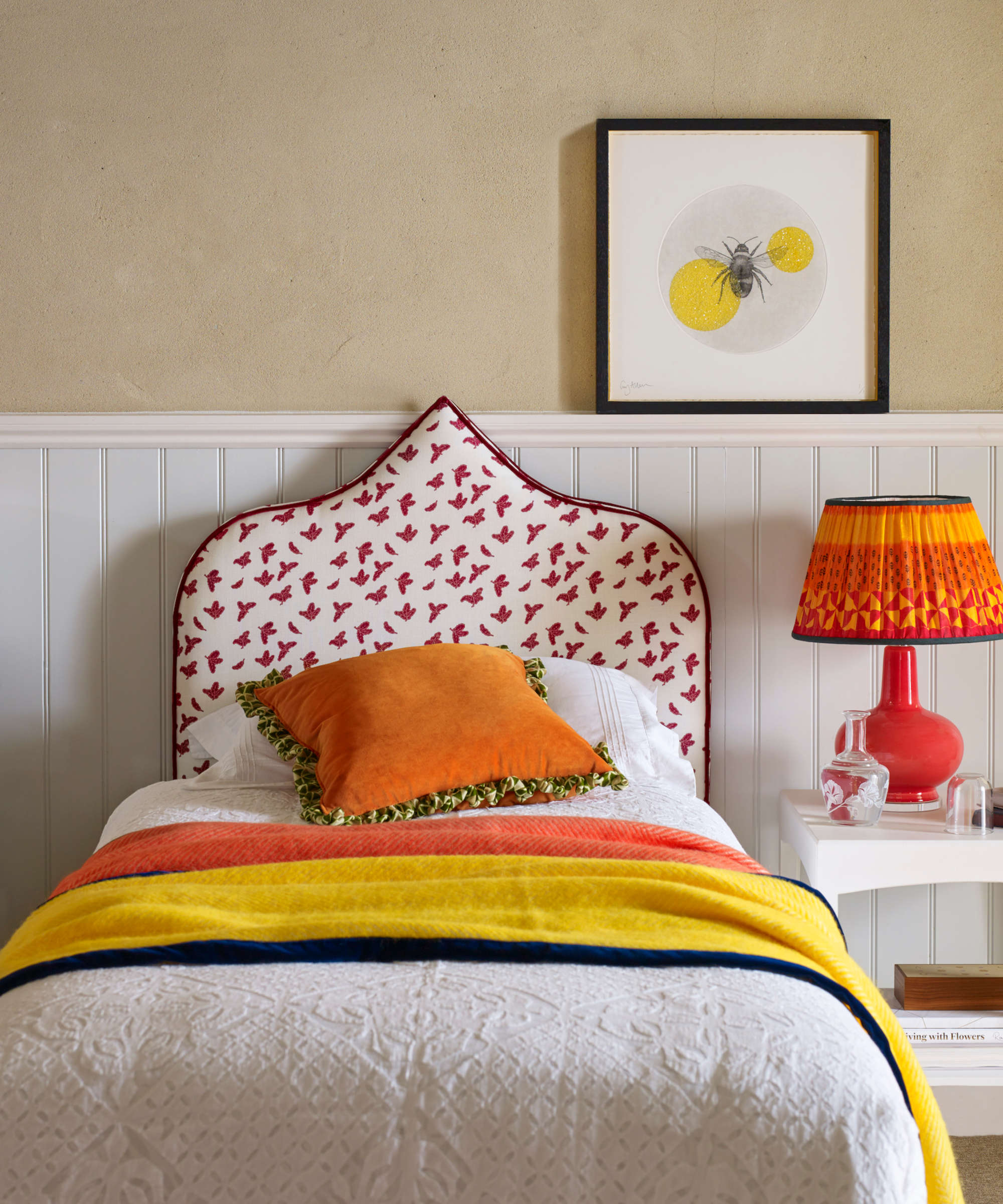
Essentially, whether you give it a label or not, creating an interior between minimalism and maximalism is all about achieving harmony and balance.
‘Midimalism is all about treading the line between minimalist and maximalist decor styles, getting the best of both worlds. When it comes to introducing color, pattern and texture in the living room for instance, it's important to maintain balance and cohesion,’ explains Emma Deterding, founder of Kelling Designs. ‘If you have a fairly neutral base on walls and floors, then you really have the flexibility to do what you want. If you are bold and daring, then opt for upholstery in bold colors - velvets in rich hues will instantly liven up the space and help act as an anchor for building your design scheme.’
1. Choose a neutral wall paint
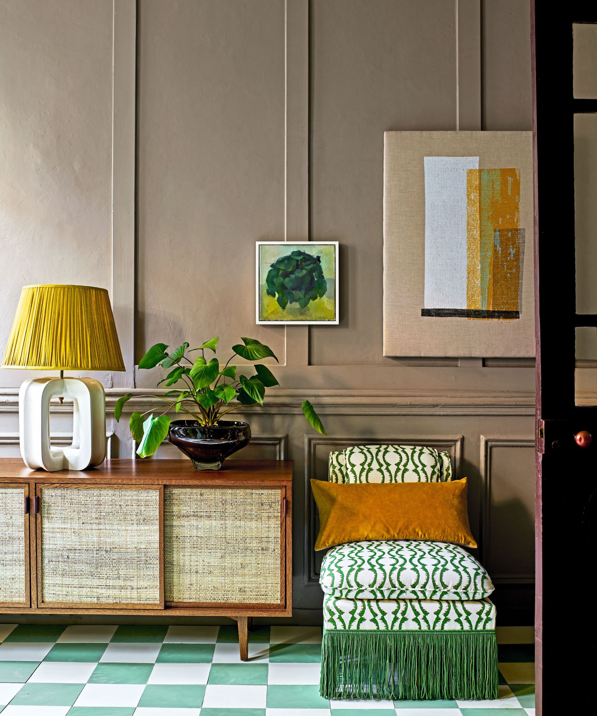
When we asked interior designers for their tips on creating a midimalist look one piece of advice kept coming up again and again – opt for walls in neutral colors as a base for layering pieces in brighter accent colors and patterns.
'Midi-malism’ offers the perfect balance in interior schemes. To create this ‘in-between’, opt for a more neutral base to a room that can act as a versatile foundation for bolder, colorful accessories and furniture,’ says Helen Shaw, director of marketing (International), Benjamin Moore. ‘When picking a neutral, consider the rest of the rooms in your home. If your home tends to lead towards warm tones – reds, oranges, yellows - try a warmer neutral or even white paint colors with warm undertones such as Sparrow and Edgecomb Gray. This allows for those who are more color shy to subtly combine an eclectic mix of patterns, colors with a nod to midimalism.’

Helen Shaw is a color expert and international marketing director at Benjamin Moore's UK division. Helen and her husband Craig are founders of Shaw Paints which was acquired by Benjamin Moore in 2020.
2. Balance color with the 60-30-10 rule
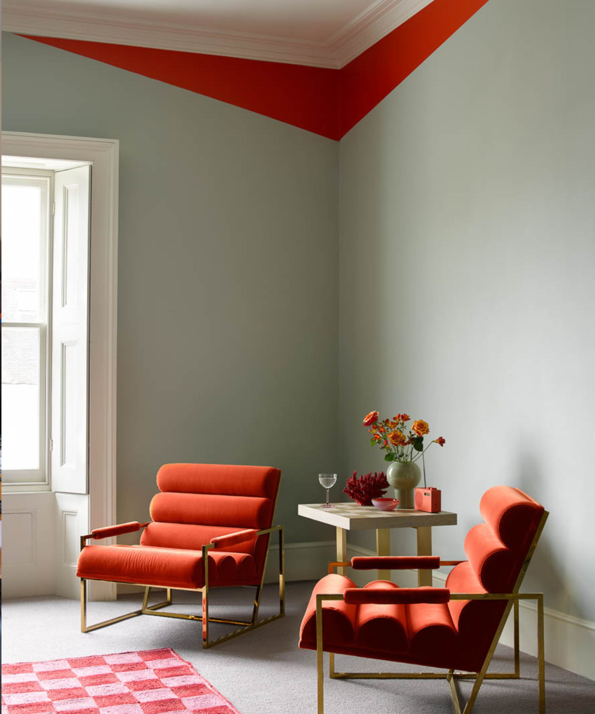
Alternatively, if you prefer your room to have a colorful backdrop, think about splitting colors into ratios to ensure a balanced scheme says Helen Shaw. ‘We recommend thinking about splitting the room into ratios. With the main color being 60% of the scheme, 30% the secondary and 10% an accent. The accent color can help to break up an ultra-contrasting scheme and allows the look to be tied together. Rich and dramatic, or pale and interesting, you can look at all variants of shades to create a ’midimalism’ design.’
3. Use the color wheel
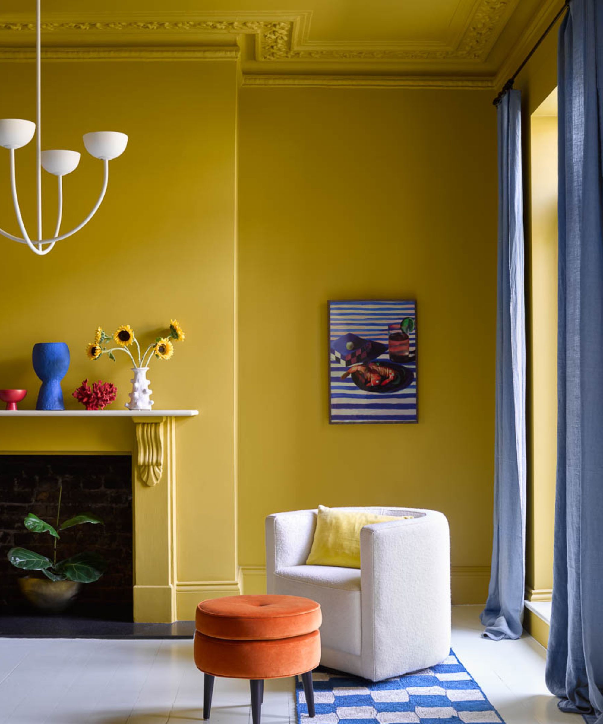
If you're looking to create a balanced color scheme the color wheel makes a handy device.
'Two colors which sit opposite one another can add a dash of invigoration, this is called a complementary scheme. This is a sure-fire way to create a beautifully vibrant look; try a paler shade of one and a darker hue of another which will inject energy into your room without being too overpowering,' suggests Helen Shaw.
'Alternatively, an analogous scheme uses adjacent colors on the wheel. Due to their proximity, they work incredibly well with one another to create a harmonious scheme that’s easy to live with.'
If you prefer to stick to one color with a monochromatic scheme she suggests 'varying levels of saturation of one color. This can be a great way to take your room from bland to bold by instantly shifting the dimensions' adds Helen Shaw.
4. Balance walls and floors
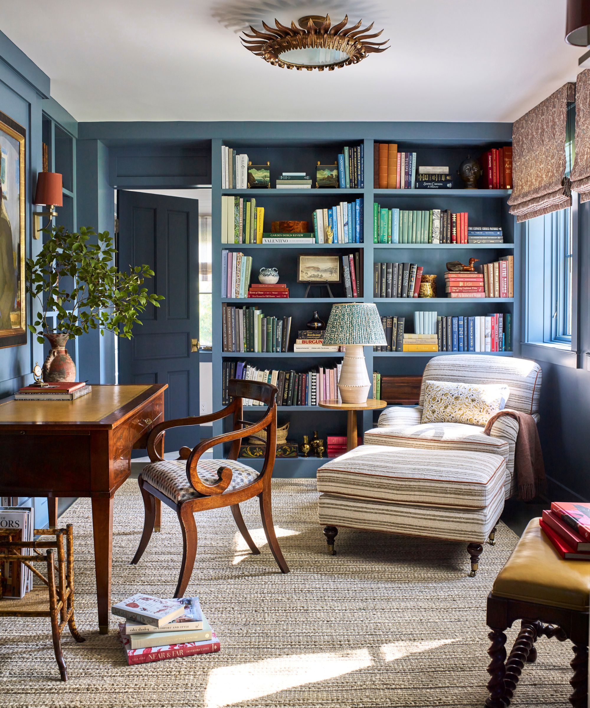
To create a characterful space that balances minimalism and maximalism be sure to include large areas like floors or ceilings in a neutral color says Louise Copeland, especially if you're looking to use bold colors on walls as done here in her Germantown project.
'While I love layering patterns, starting with larger, relatively understated elements is important,' says Louise Copeland, interior designer and founder of L.B. Copeland. 'In our Germantown project, we chose a rug with subtle stripes that mostly read as a solid and kept the ceiling simple white. This "clean slate" opens up the space for layering more upholstery patterns and smaller accents like artwork or decorative pieces, without overwhelming the senses.'
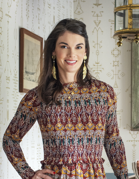
Louise Copeland, founder of L.B. Copeland, creates sophisticated and timeless interiors for modern living. Her career began in Jackson, WY, followed by pivotal years in New York City where she collaborated with renowned international fabric and furniture houses. This experience paved the way for a five-year tenure with the esteemed AD100 Designer Steven Gambrel. Louise went on to found her design firm L.B. Copeland Interior Design in San Francisco before relocating to NYC in 2017. Now based in North Carolina, she works on a wide array of residential projects across the US from Greenwich, CT to Miami, FL.
5. Choose a small-scale wallpaper

Introducing pattern through wallpaper ideas and fabrics is a wonderful way to bring softness and a relaxed welcoming feel, but used in the wrong quantity or scale they can overwhelm a space. Small-scale wallpapers are perfect for a midi-malist look as they provide subtle interest without dominating a room, they also make a great starting point for pulling a room color scheme.
'Small print wallpapers are a great tool to make a room look bigger and also serve as an excellent backdrop to hang artwork over to create a layered and decorated look - as you can see with our Jaipur Flower and Floral Ogee designs,' says Kate French, creative director at Dado Atelier. 'They are a playful yet subtle way to add a touch of broken color to a home and an excellent starting point for your design process as they are malleable to different environments, complementing an abundance of colors, textures, and patterns they often help add a natural balance to a scheme.'
6. Mix patterns with plains
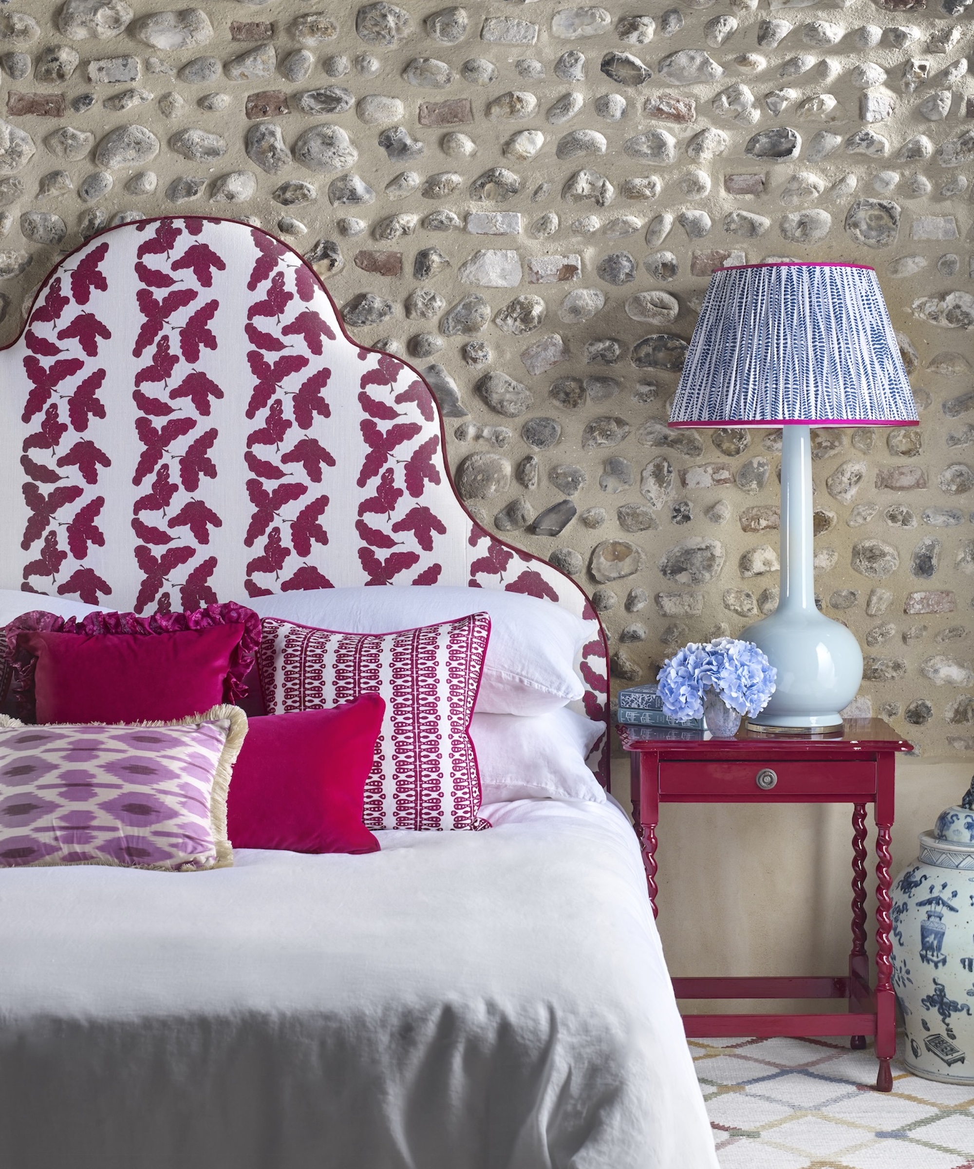
Midimalist spaces embrace pattern, but do so in a balanced way. According to Emma Deterding, founder of Kelling Designs, the key to success is to work within a palette and mix up plains and prints in different scales.
'For a cohesive look, opt for accessories such as throws, cushions and textiles in complementary shades. Don't be afraid to mix and match patterns, but limit these to three or four to avoid overwhelming the space and losing the balance. Use natural materials such as linens, wools, wood and rattan to add texture, playing with different layers to create depth and interest. Finally, don't forget the power of plain space to allow your eyes to rest and appreciate the key elements in the room,' says Emma.
7. Carefully curate artwork and collectables
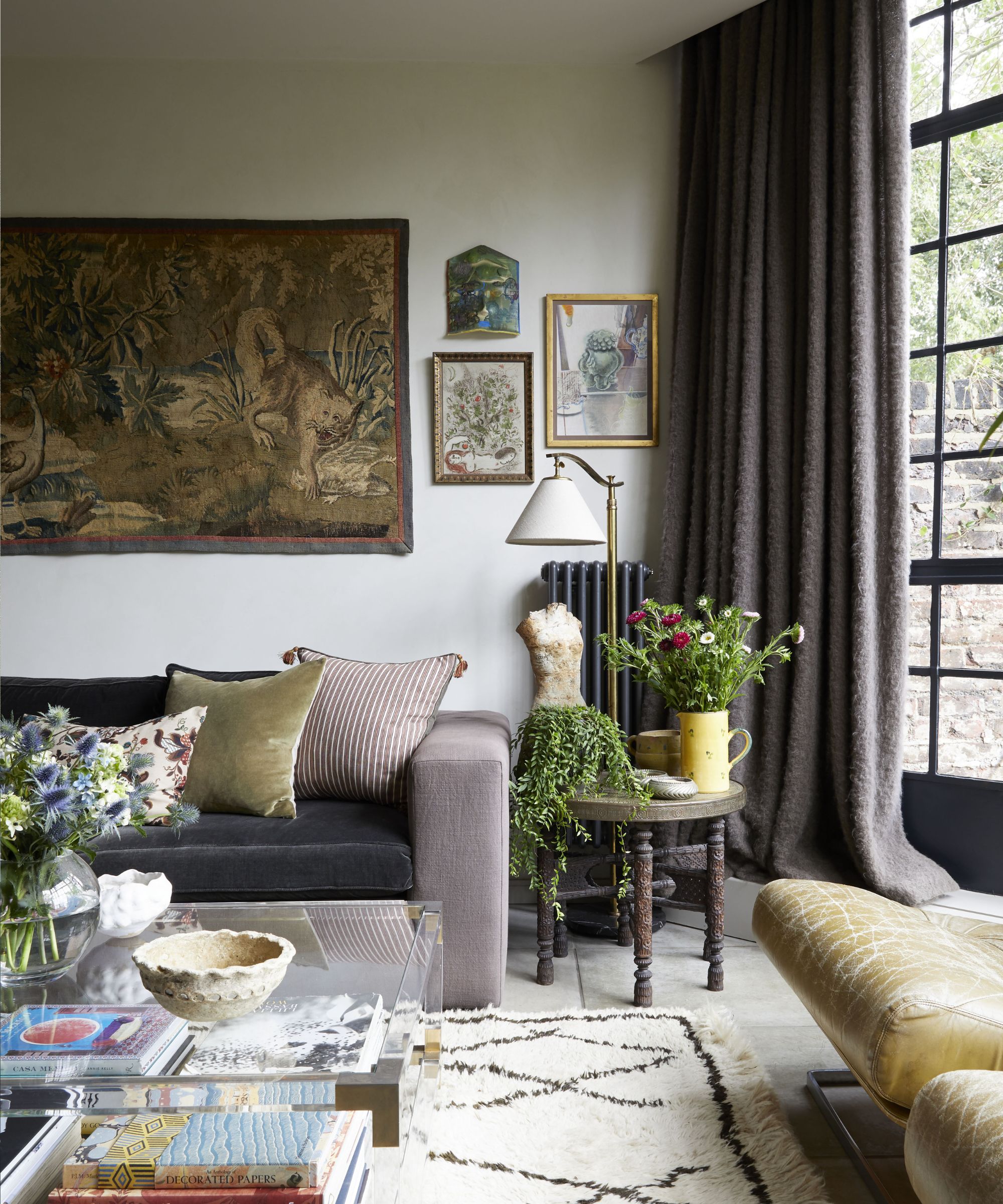
Unlike minimalists, midimalists don't shy away from decorating with art, decorative objects and collectibles. Where maximalists may combine an abundance of eclectic pieces together, in a midimalist space collectibles are more likely to be displayed in smaller groups or grouped by color or theme, plus they are given a little more room to breathe.
'The whole point of collecting art or mementos is so they can be appreciated. They should be special or significant pieces that you want to stand out. In this project the art was grouped together alongside various momentoes and collectibles adding to the overall feel of midimalism,' says Georgina Cave, founder of Cave Interiors. 'Not overthinking it is key. However, we do always check anything to be hung on walls as a group do sit well together by laying them out on a flat surface first.'
If you're a collector be sure to look into how to display collections without clutter during your design process.
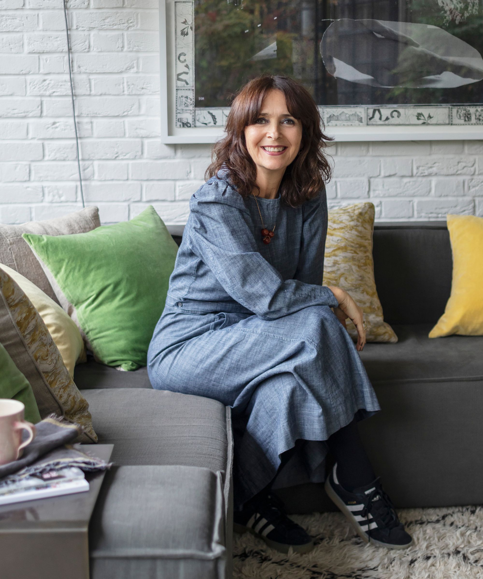
Georgina Cave is the founder and director of Cave interiors, which she runs alongside her daughter Anoushka at their North London studio. With a passion for architecture, interior design, art and antiques, they aim to create beautiful yet functional spaces built around their clients’ needs, working on everything from new builds to the full renovation of historic and listed buildings. Georgina is skilled and experienced in sourcing and enjoys hunting out the very best art, antiques, salvage and unusual items for each project.
8. Choose a statement piece of furniture
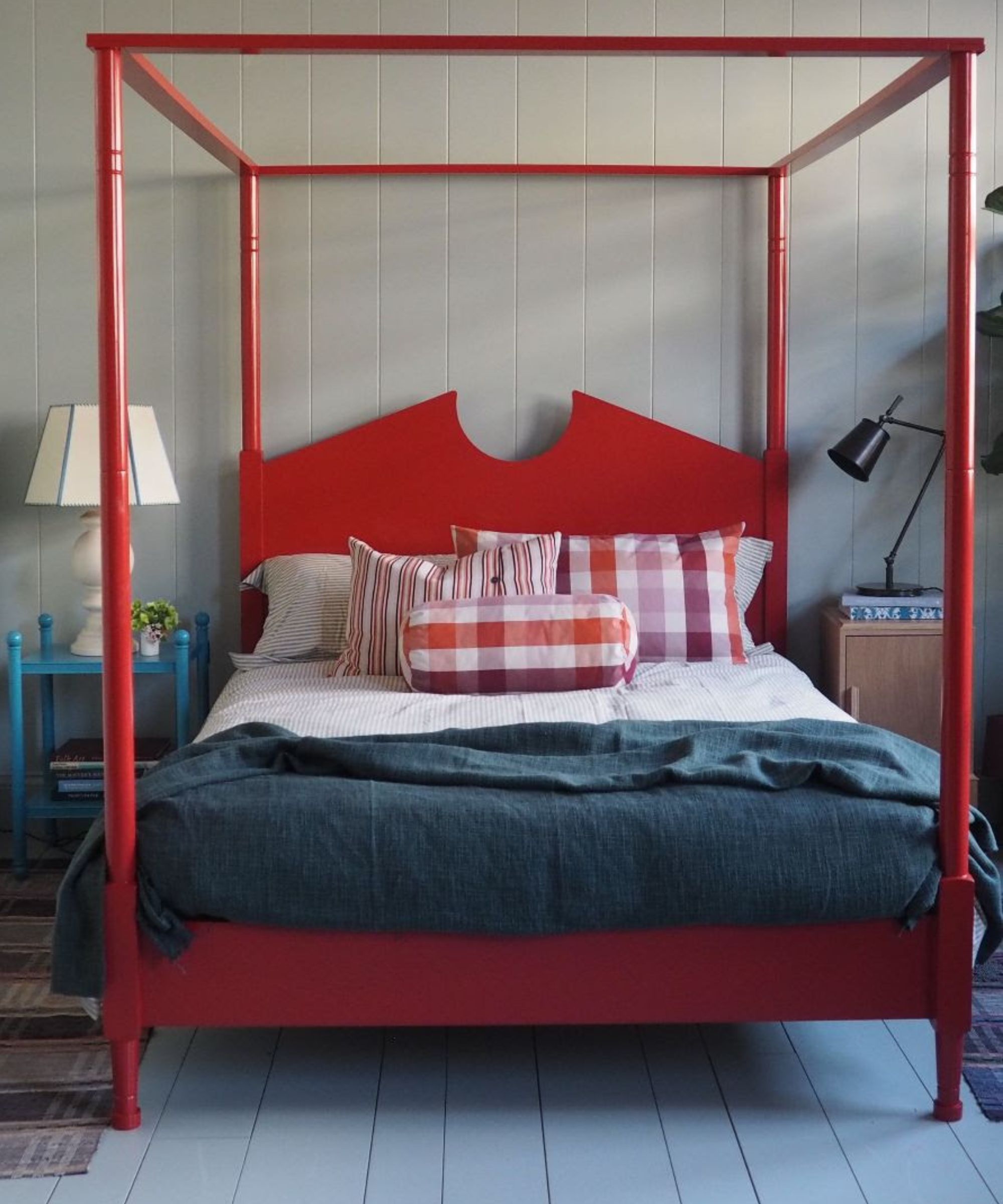
Showcasing a statement piece of furniture such a striking bed or a vibrant upholstered headboard in an otherwise pared-back scheme is a wonderful to create a focal point while keeping spaces feeling calm and restful. Acting like a piece of functional sculpture, the Out for the Count four poster bed in Ruby Red from Nix by Nicola Harding brings instant joy and life to this space.
9. Paper part of the wall
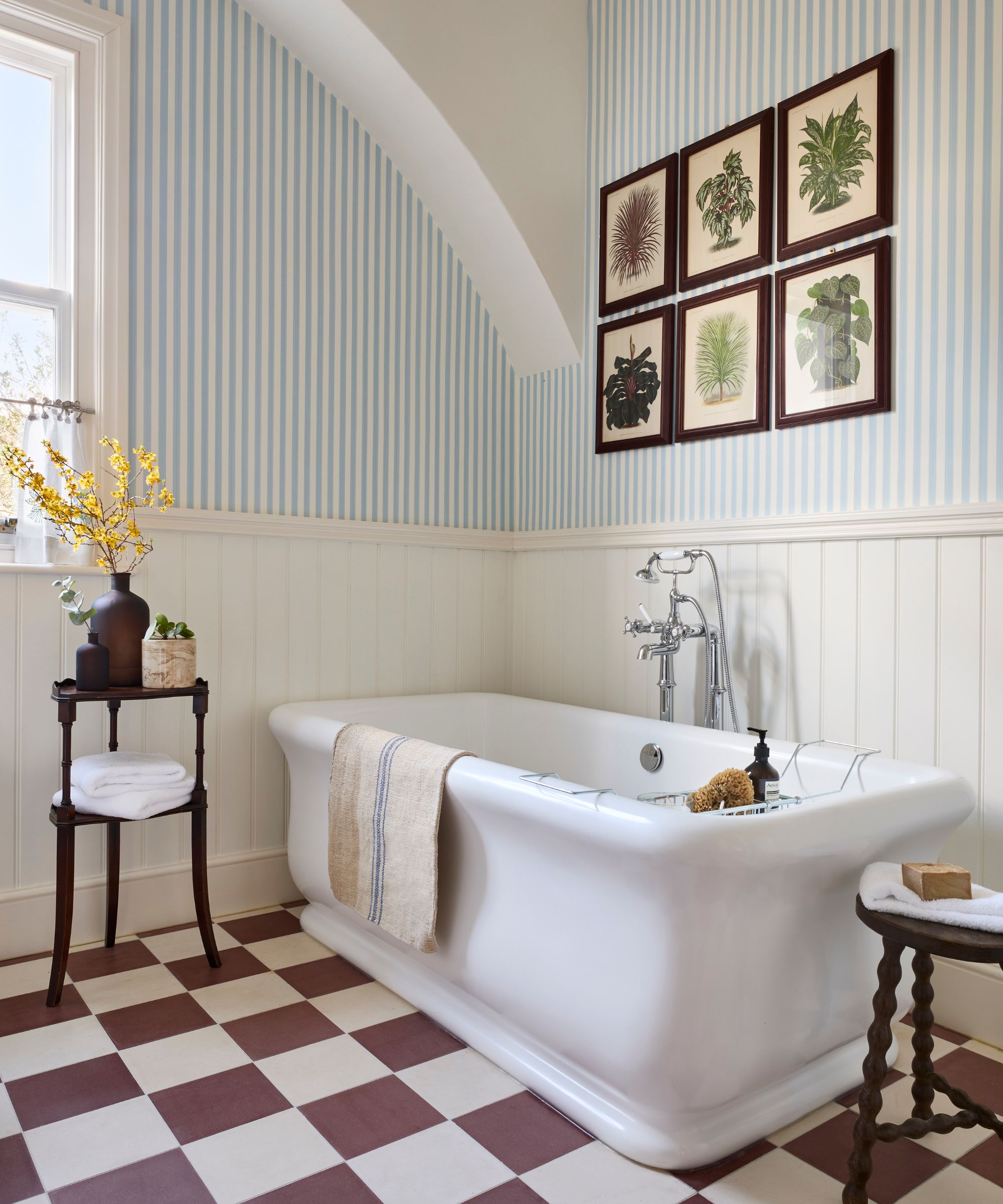
Using wallpaper over all four walls can be overpowering, especially when paired with a feature floor. Papering above wainscot paneling is a great way to inject an easy-to-live-with pattern into a space while keeping them feeling open and balanced. The look works particularly well in hallways but is also popular in bathrooms where the painted paneling provides a splashproof surface near wet areas.
10. Be bold in small spaces
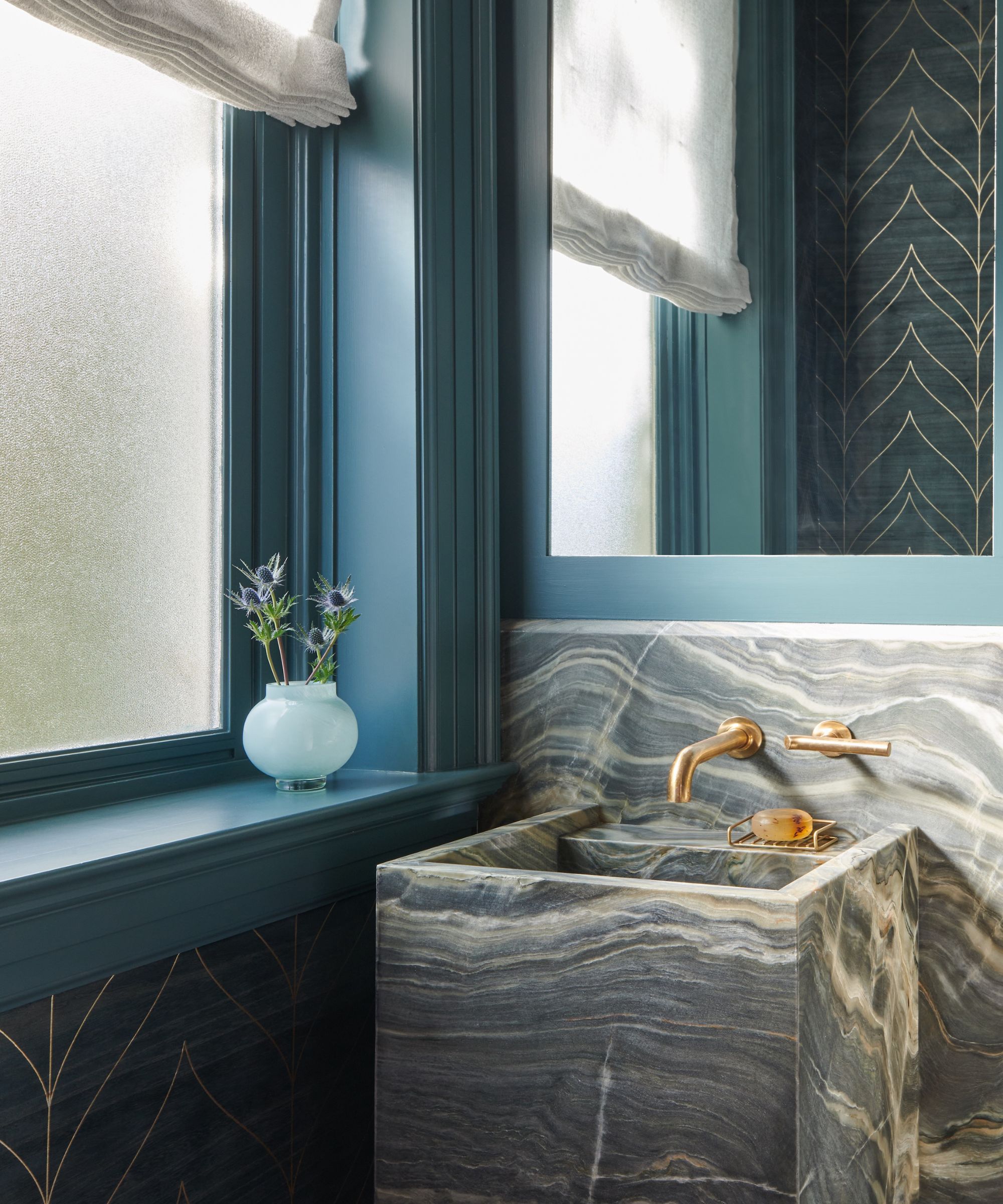
If you're trying to achieve a balanced, midimalist look throughout the home, it's important not to address the design of each room as a single entity. Try to think about how different rooms relate to one another and how the flow and colors work throughout the home. If you love to use color on the walls, but are scared to use it in large everyday spaces, use it in small occasional spaces.
'Be more daring with colors and patterns in smaller spaces like powder rooms and mudrooms,' suggests Tracy Morris, founder of Tracy Morris Design. ‘Add art that you love, but in softer tones, especially for the main living areas.'
Creating a balanced and welcoming interior which combines all the things you love like collectibles and artwork, as well as color and pattern can be tricky.
When we asked the interior designers how best to achieve a balanced ‘midimalist' aesthetic decorating with neutrals and adding color and texture with furnishings, textiles and artwork was the advice that often came up.
‘Keep the colors of the main furnishings, such as sofa and chair fabrics, draperies and rugs, in neutral tones. They ground the spaces,’ says interior designer Tracy Morris. ‘Add touches of color and texture in pillows and accessories, but keep the tones balanced with the rest of the spaces for a soothing approach to design.’
The team at Th2 Designs agreed that keeping a neutral foundation is a good starting point. ‘The beauty of designing a project with a relatively neutral envelope is that we can then layer with artwork, accessories, and rugs to inject our clients’ personal style and help them to achieve the mood and feel they want for their homes.' Don't be afraid to mix up patterns, colors, and textures to add interest.’
If you’re wanting to introduce pattern into your room scheme with wallpapers or fabrics, be sure to consider the scale of the print is appropriate for the space and always mix patterns with plenty of plain areas or features to give the eye time to rest.
Sign up to the Homes & Gardens newsletter
Design expertise in your inbox – from inspiring decorating ideas and beautiful celebrity homes to practical gardening advice and shopping round-ups.

Pippa is a contributor to Homes & Gardens. A graduate of Art History and formerly Style Editor at Period Living, she is passionate about architecture, creating decorating content, interior styling and writing about craft and historic homes. She enjoys searching out beautiful images and the latest trends to share with the Homes & Gardens audience. A keen gardener, when she’s not writing, you’ll find her growing flowers on her yard for styling projects.
-
 5 living room paint colors going out of style in 2025
What colors are going to date your living room this year? We look at the shades that are falling out of favour in 2025
By Sophia Pouget de St Victor
-
 Your hydrangeas will flourish with bigger blooms and healthier growth thanks to this natural material
Discover why you should be using leaf mold to mulch hydrangeas
By Drew Swainston