10 mid-century modern ideas to convince you this style is always on trend
With its sleek lines, low slung silhouettes and sophisticated designs our love of this look is going nowhere...
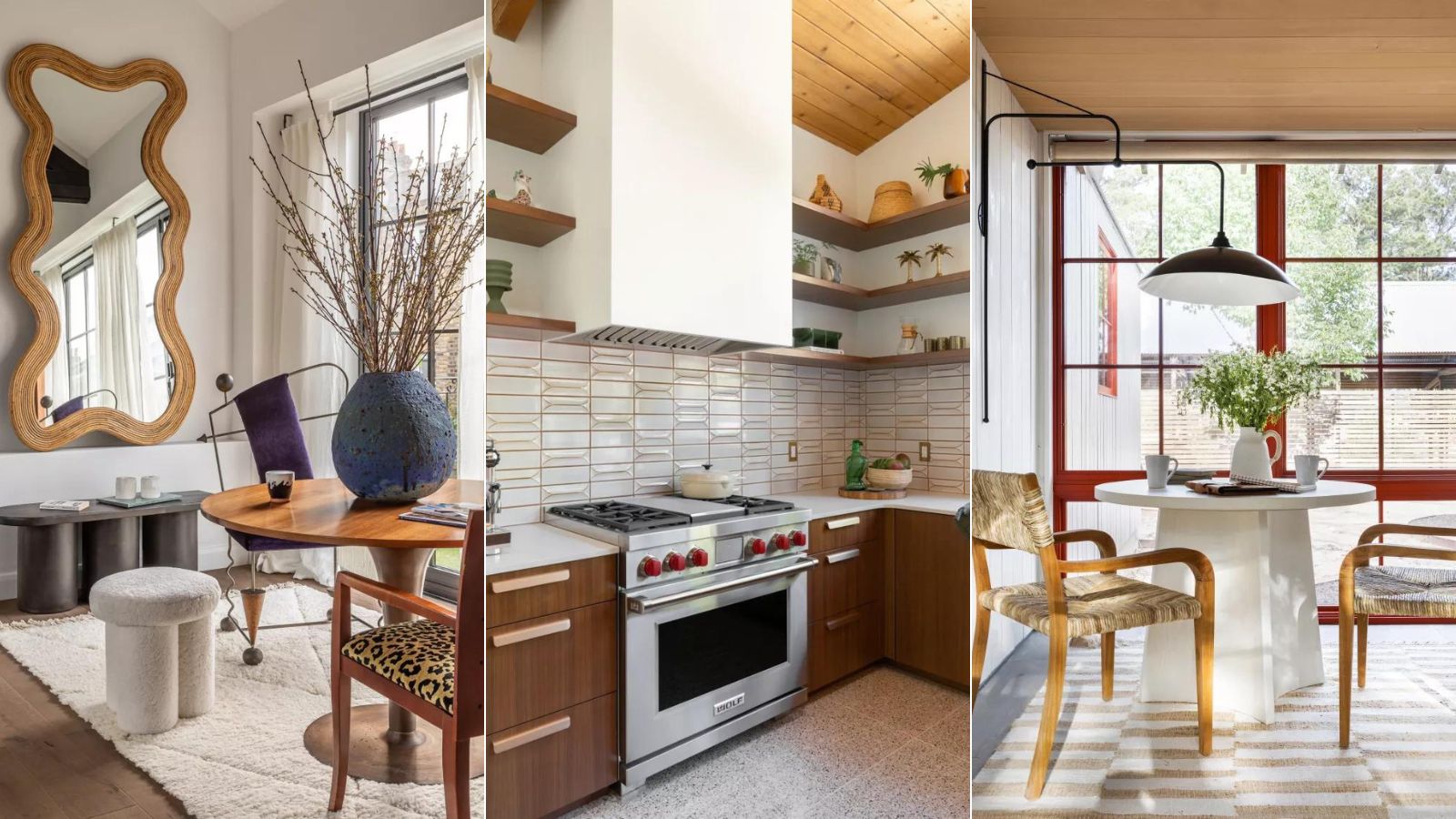
- What is mid-century modern style?
- 1. Think statement but simple
- 2. Blend other styles with mid-century modern
- 3. Add a flourish with the lighting
- 4. Accessorize with caution
- 5. Keep the backdrop simple and let the furniture be the focus
- 6. Play with a stronger color palette
- 7. Combine unexpected materials
- 8.Go abstract with shapes and patterns
- 9. Bring back terrazzo
- 10.Decorate with a retro wallpaper

If there's one style that's an absolutely constant in interior design trends it's Mid-century Modern. Sure, it might take on a slightly different look from season to season, sometimes it's more true to its 1940s roots and has a reel retro feel, sometimes it's more in line with the minimalist Scandi aesthetic. But our love of tapered legs, low-slung silhouettes and the sleek, less-is-more approach is going nowhere.
The staying power of this style says a lot about how adaptable it is. It's been on trend for over 80 years, with resurges coming every decade or so, and we see it used over and over again by designers the world over. So to pay homage to this ever-in-favor style, we've asked designers to talk us through their favorite mid-century modern spaces, and how you can bring the look into your home, whether you want to commit to the whole look or just add a touch of mid-century.
What is mid-century modern style?
'Mid Century modern references the type of furniture and design that was being produced in, you guessed it, the middle of the last century,' explains designer Bethany Adams. 'There was an air of utilitarianism, simple forms and new ways of using materials. We automatically think of the 1950s, but actually, the mid-century period stretches from the 1930s to the 1970s.'
In terms of shapes and styles, it was all about form and function. Bold color was about, and key to the style, but there was just as much of a focus on the structures and sculptural shapes of mid-century spaces. There isn't much in terms of fuss with this style, think clean lines, almost utilitarian. And the focus was very much on materials, lots of solid wooden pieces – particularly teak. Metal, glass, and vinyl were all popular furniture materials too.
'Mid-century modern style furnishings are very easy to use in any home style and work well with other, more traditional decor elements. Their simple lines and materials can act as a stunning foil to more ornate moldings and keep a formal space from feeling too stuffy. Look for walnut wood furnishings with elegant tapered legs, pedestal tables, and interesting chair forms with brass detailing,' adds Bethany.
Today's take on mid-century is far more flexible and there are lots of versions of the look that have come out of the very practical, functional style. It can now be dilated with other styles, it's a lot less formal and function focused. Essentially, there's a version of mid-century style that anyone can work into their home...
1. Think statement but simple
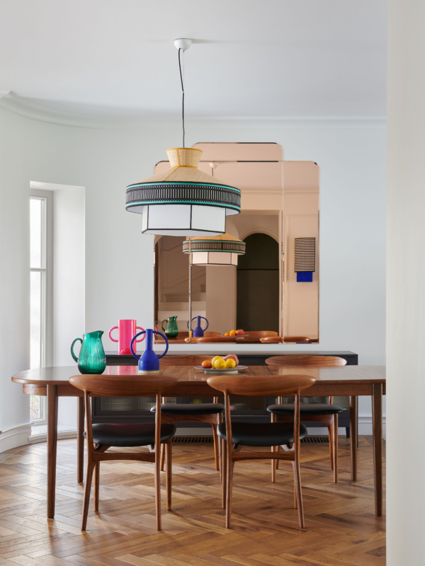
Mid-century modern style might sway towards quirky in some of its shapes and designs, but it's never fussy. The lines are usually always clean and simple. As Anthony Barzilay Freund, Editorial Director, 1stDibs describes the style, 'mid-century modern style could best be characterized by having clean lines realized in natural materials. Emerging after the end of WWII, it embraced the promise of a brighter future and the ways in which the Machine Age could fuel a new design aesthetic and greater production and distribution of these pieces. Mid-century design rejected the fussiness of the 19th century and saw these lighter, cleaner pieces as the backdrop to a happier, better life for all.'
However, that's not to say Mid-century modern isn't a statement, it most definitely is. It's just about finding that balance between sleek and sophisticated and statement. This dining room designed by Colombe gets it spot on.
'This dining room is built in the 1950s and the design brief was a warm, colorful space for two parents with four children. The owners really like warm, cozy, and unpretentious interiors and I associate the midcentury modern style with them,' explains the founder of the studio Marta Chrapka. 'A wooden table (usually teak or walnut dominates in this period) has been set with chairs finished with black leather – also a common material for the era and decorated with strong color accents such as a geometric lamp, rose mirror, or colored glass.'
2. Blend other styles with mid-century modern
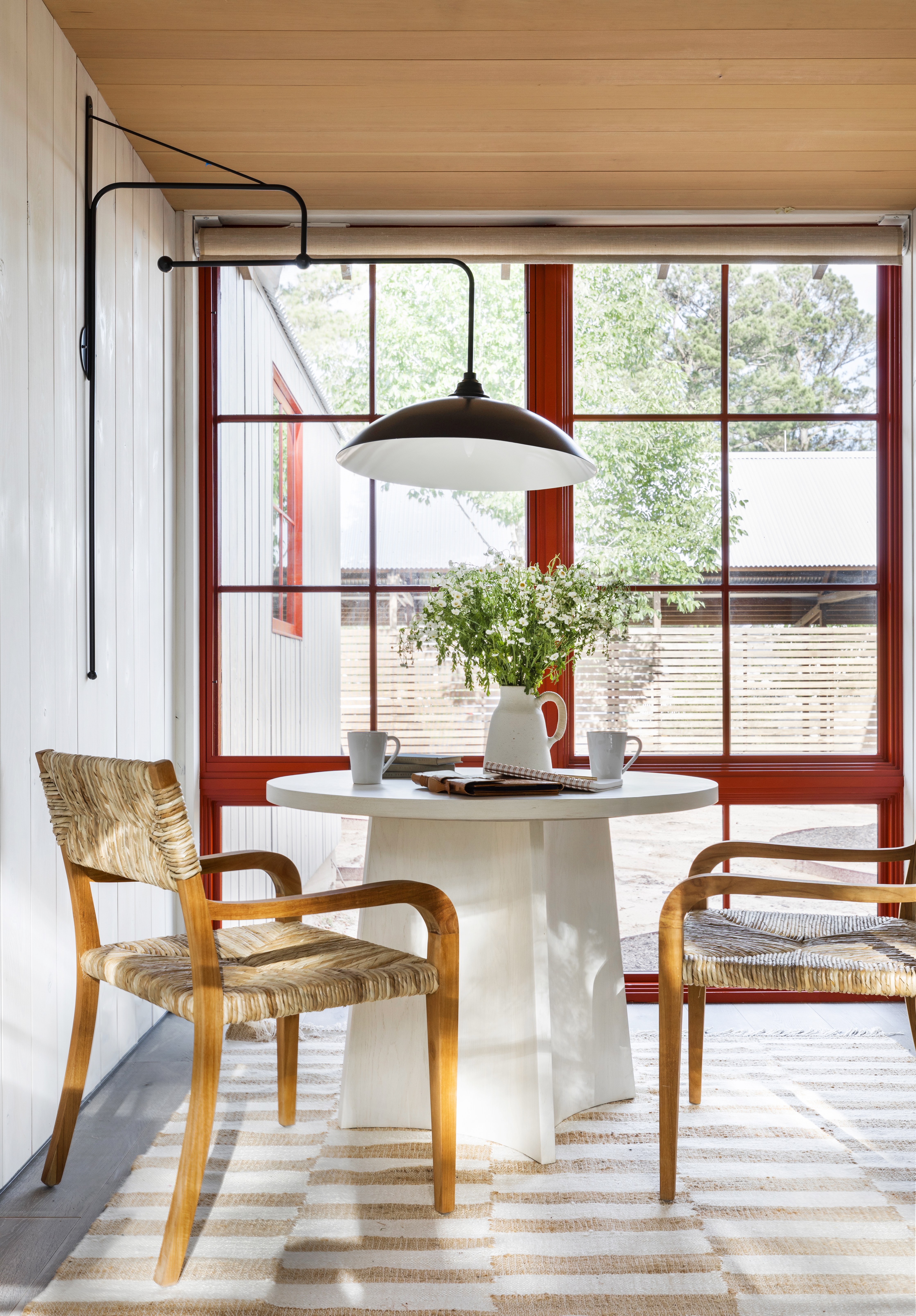
Mid-century modern style is so versatile. There are so many variations as it's changed through the decades and lots of different ways you can let it influence your interiors. This versatility also makes it the perfect style to combine with other trends. In fact, the most interesting and intriguing rooms are one that doesn't just stick with one style but bring in aspects of lots of different looks.
'Many mid-century pieces have become timeless classics that are heavily used in design today, but filling an entire room with furniture from that era will feel dated and old,' explains Julia King, founder of Studio Roene. 'The key to making this look fresh and livable is to have a varied combination of styles. Mix old and new, geometric and curved, bring unexpected things together from different time periods.'
'A lot of the curvier and bolder shapes made today can be paired very well with the more functional mid-century pieces, and so can more decorative pieces from Art Deco and Art Nouveau periods. The options are endless, but the key is to do this in a thoughtful manner that feels collected and somewhat restrained. When possible, buy only originals or licensed reproductions as there are many bad copies out there that look cheap.'
3. Add a flourish with the lighting
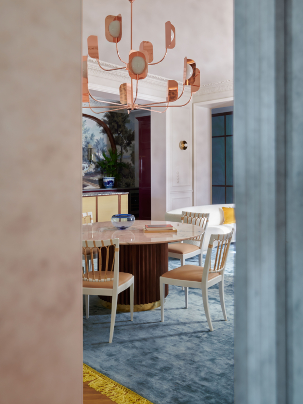
Unique lighting was where fuss and flourishes are allowed in mid-century modern style. You'll notice even in the most simple, stripped-back mid-century modern spaces, the lighting will be giving something special. And lighting is a great way to bring in a touch of the mid-century into other styles too. This dining room is a smorgasbord of styles, blending traditional with contemporary and mid-century modern.
'This space is the interior of a tenement house from the late 19th century and its original features are very decorative,' explains Marta. 'Lots of stucco, polished brass and copper, and rich stones were juxtaposed with simpler furniture. The brief was an elegant interior, not necessarily functional because it is occasionally used by a couple without children. The serious classicist style was broken with colors, wooden accents, and contemporary geometric patterns.'
4. Accessorize with caution
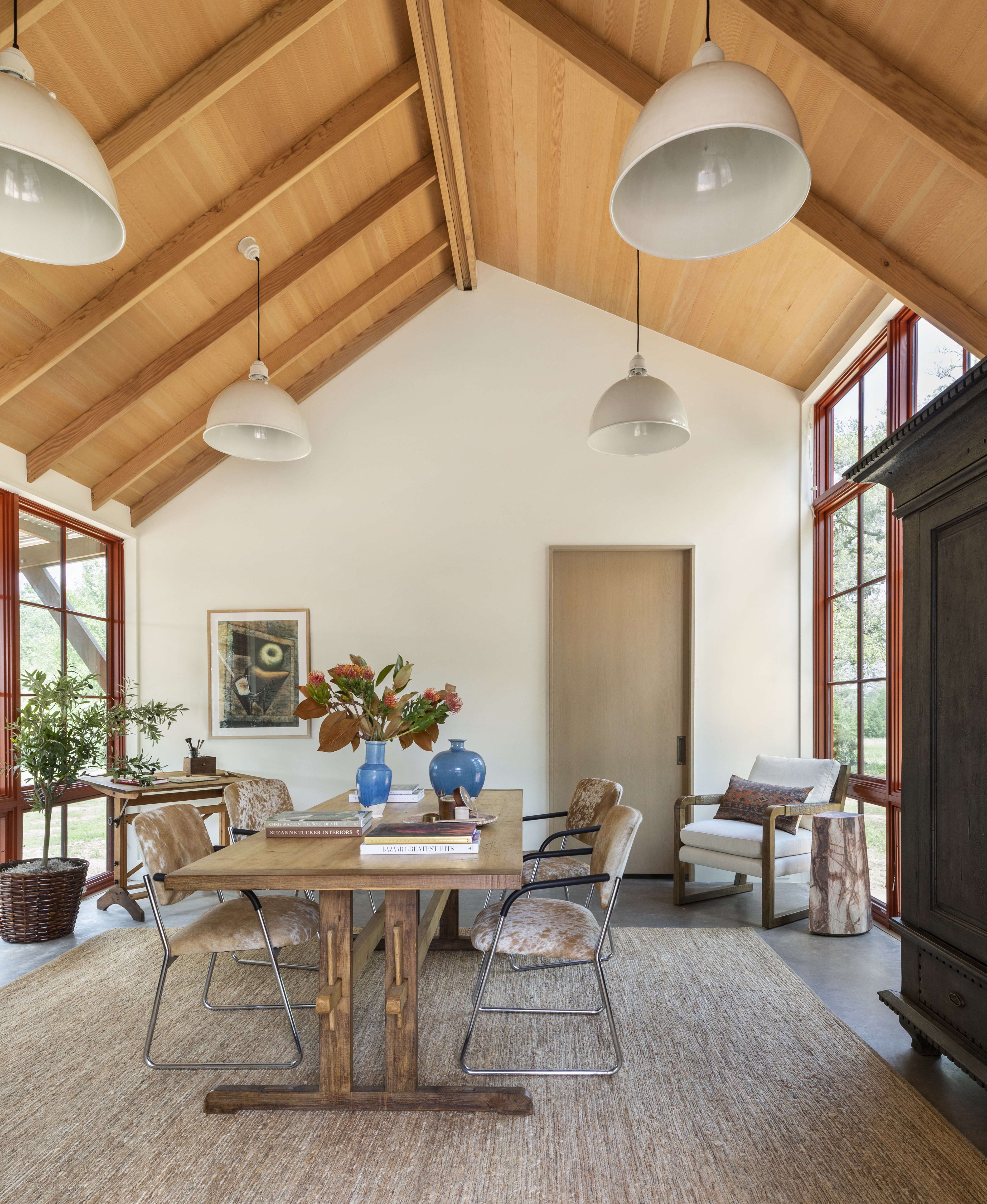
No matter what vein of mid-century modern you are going with, curated and considered is always a must. These spaces are fuss and frill-free, and all decor feels purposeful. The furniture is the focus, and the decor is very much in second. Any decorative pieces you do bring in ensure they have a home, like on shelving or a mantel, and look for organic, curved shapes – handblown glass pieces and quirky ceramics are perfect for injecting a retro vibe.
'Mid-century style is most noticeable by the clean, simple lines typically found throughout the design of furniture, lights, and case pieces. Mid-century style is also often void of decorative accents and embellishments. And I always appreciate the simplicity of mid-century pieces and love to incorporate them in design,' explains designer Marie Flanigan. 'I always appreciate when a room feels collected over time, so I approach these pieces as an accent piece as opposed to a room full of this style.'
5. Keep the backdrop simple and let the furniture be the focus
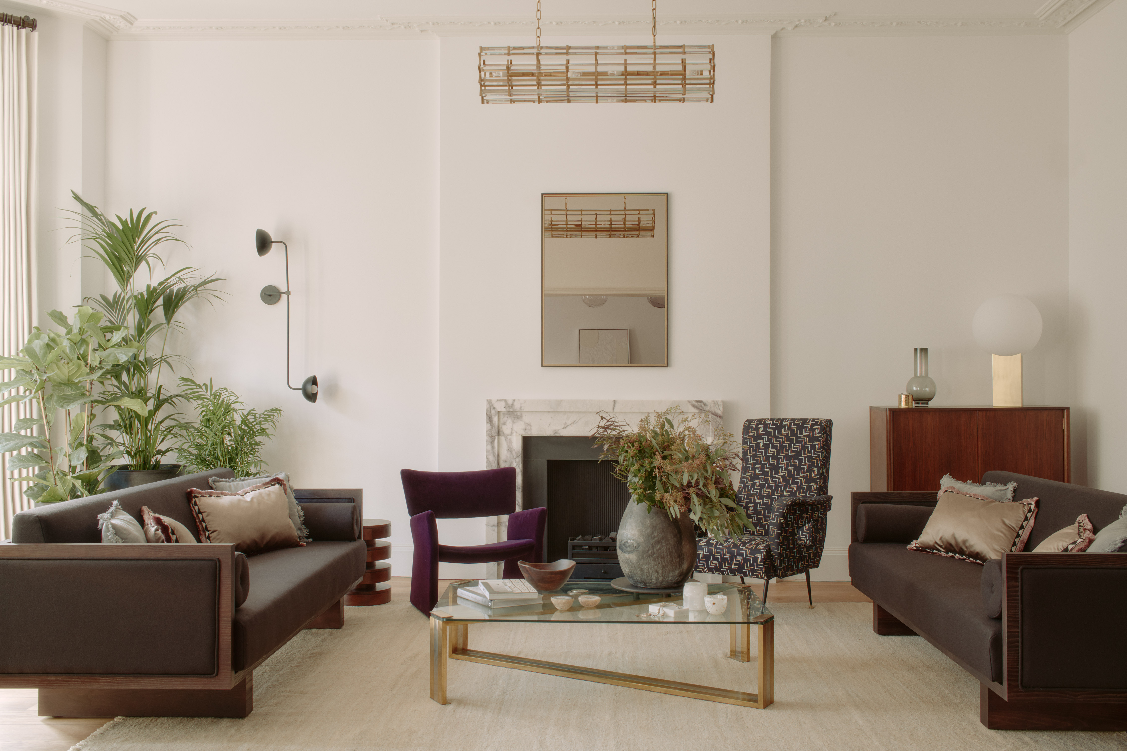
We've talked a lot about how mid-century interiors are all about form and shapes and unusual materials. This can make for very unique pieces that can at first appear tricky to style if you want to really embrace this aesthetic but still keep your space liveable. But this living room designed by Tala Fustok gets the balance spot on.
The room is clearly very inspired by the mid-century look and all the pieces have that fabulously retro feel, and yet the room doesn't look overwhelmed by the furnishings. The simplistic warm white backdrop, and the fact that all the pieces sit low to the ground, giving you plenty of negative space above gives the furniture room to be the focus but also keeps the space looking fresh and contemporary.
'This project is a monochromatic retreat again reflecting our client's personality which we honor in all our work,' explains Tala. 'To create an energetic boost, we played confidently with bold statements to build a backdrop for artwork, vintage furniture, and simple furnishings to enhance the calming powers of this soothing sanctuary.'
6. Play with a stronger color palette
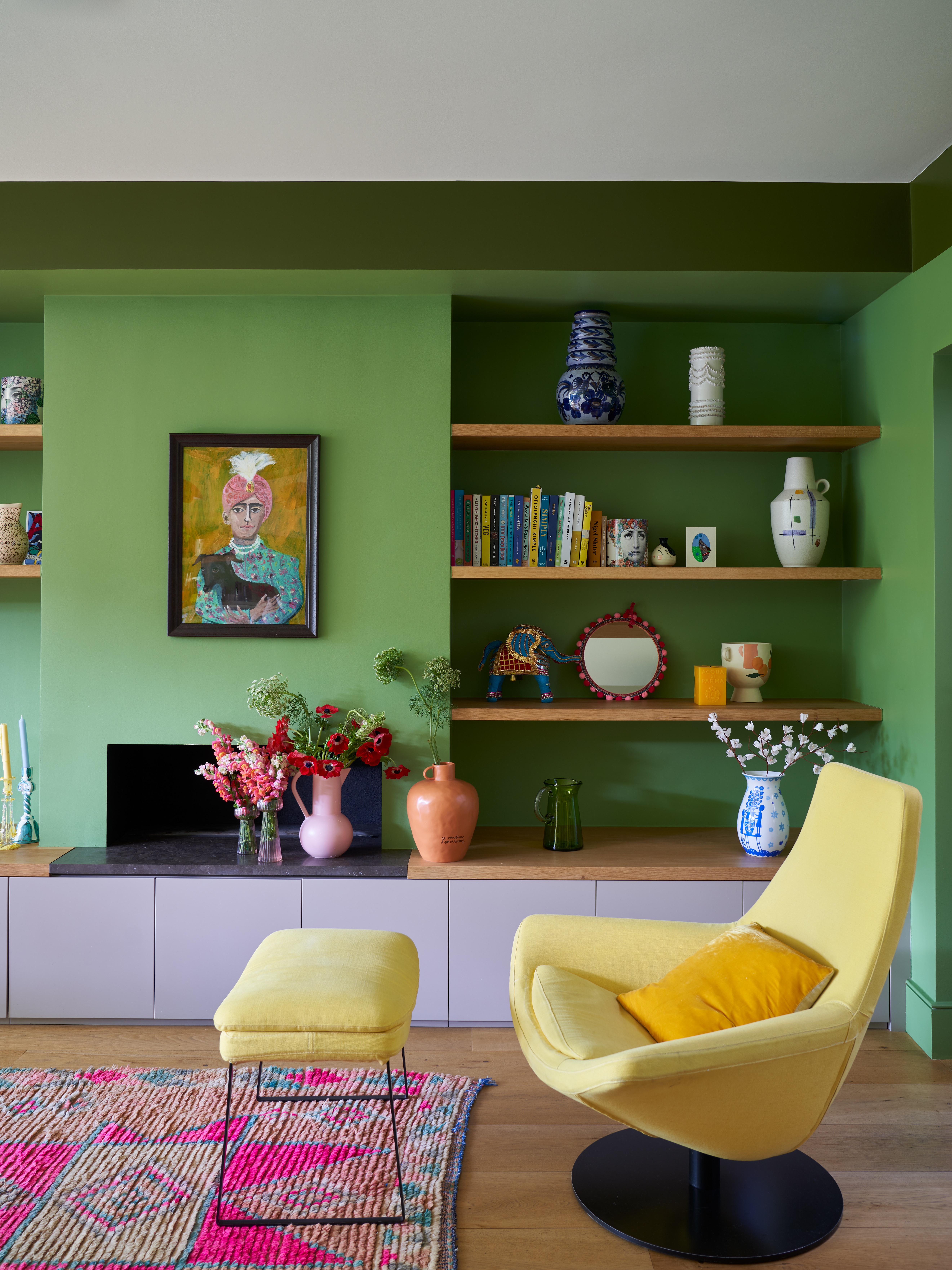
It wasn't all about the shapes, there was a big dose of color in mid-century modern interiors. The 21st take on trend has in some cases toned down this bold color scheme as the style got closer and closer to that of a minimalist, Scandi aesthetic that's so often all about the neutrals. But vivid primary colors are at the heart of the original mid-century modern look.
'Think of some of those great Californian interiors, lots of wood and warmth but with dashes of color added through but never there to overwhelm the space,' says Patrick O'Donnell of Farrow & Ball. ' Think olive greens l or for something more Scandinavian in vibe add a splash of gunmetal blue. Bring stronger colors like chromium yellow or azure blue into the mix in ceramic lamps or appropriately chosen art.'
This green living room is bold sure, but there's also something so serene about it. The clashing colors, don't seem to clash at all in this space, they feel soft and inviting. The wooden accents are key to this – if you do want to experiment with this bolder scheme, as Patrick says, look to all those 1970s Cali-cool spaces and you will notice all of them include plenty of warm wood.
7. Combine unexpected materials
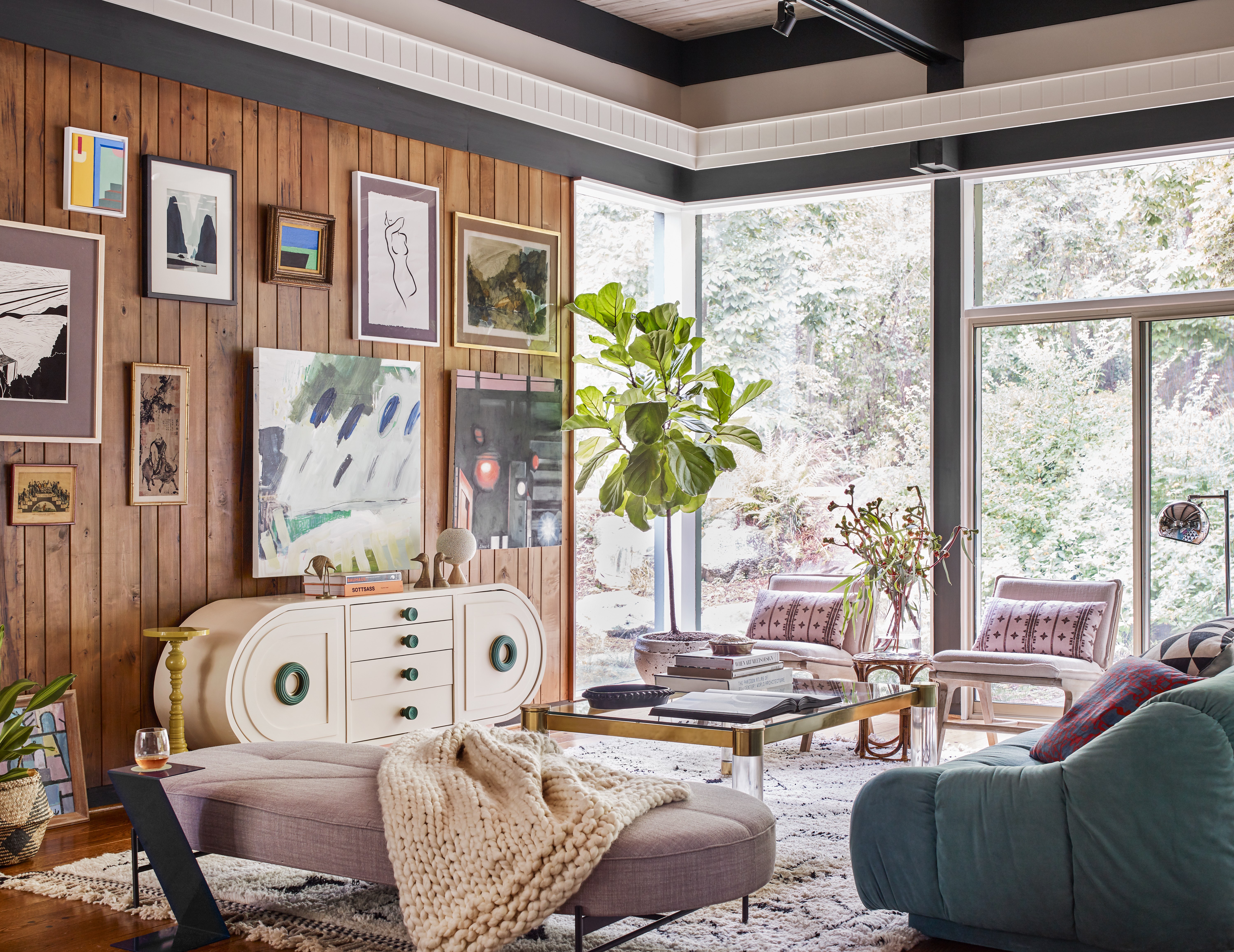
This was a big part of the mid-century modern style. After World War Two, materials were gradually starting to become plentiful once more, and new technologies meant more man-made materials, so rather than furniture just being made of wood, synthetic materials started to come into play too. Fibreglass, vinyl, and metals all started to be used alongside natural materials.
So consider this when recreating Mid-century modern in your own home – mix in different textures and materials and finishes. See how in this living room design by Atelier Davis, warm wood mixes with plastic finishes, glasses, and metallics to create a room full of texture and interest. And that mix of shapes too, curves and clean lines come together – again very of the era.
'The space has mid-century bones layered with a mix of textures, materials, and art,' explains the studio's founder Jessica Davis. 'Mid-century style tends to be clean-lined but leans into warm woods and stones. Usually, the lines tend to be more horizontal and sometimes have a bit of a space-age quality to them. I'd always recommend mixing in other pieces on top that aren't overly mid-century. You want it to feel layered and not thematic.'
8.Go abstract with shapes and patterns
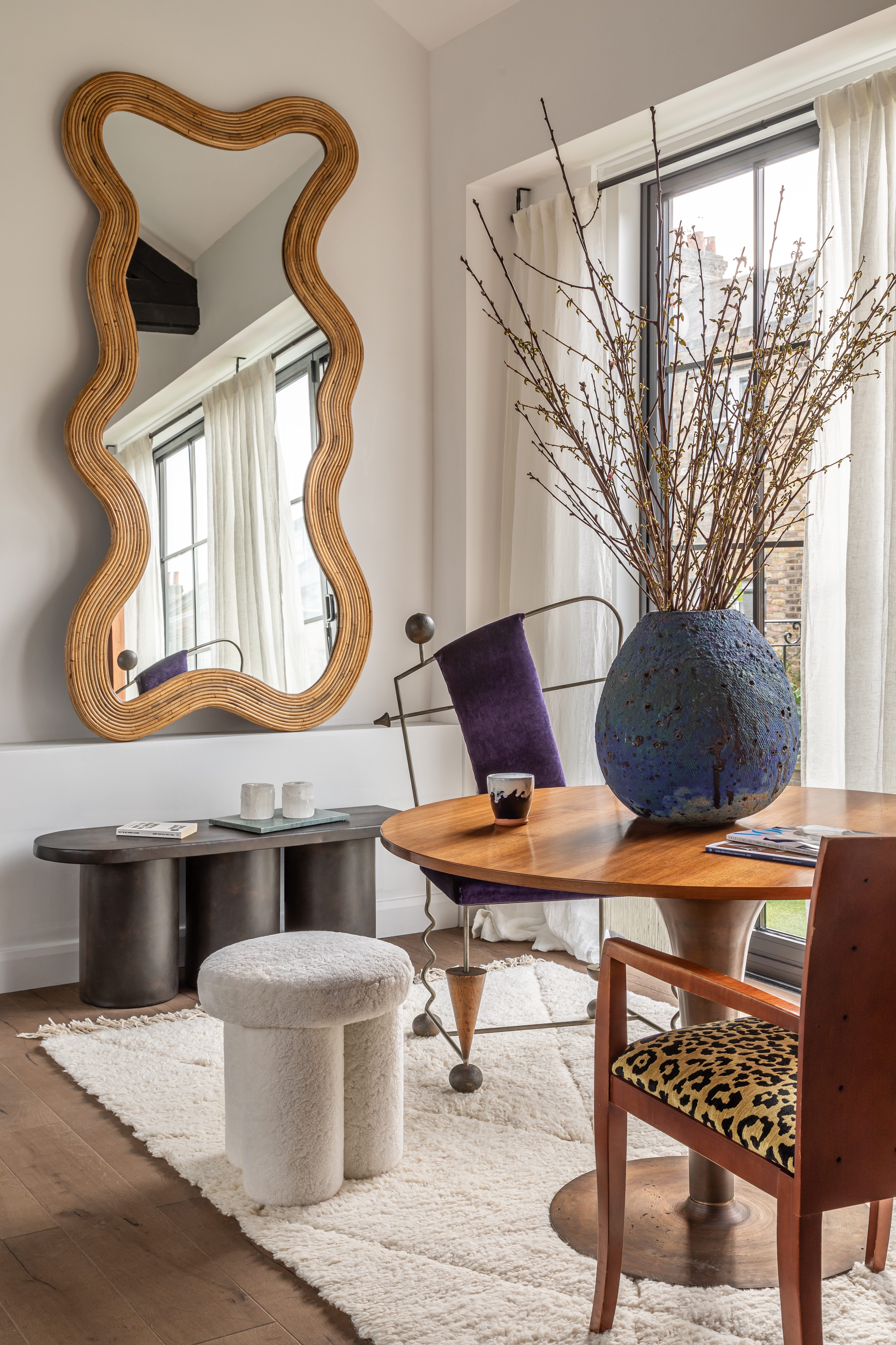
Not every line in a mid-century style space needs to be straight and horizontal. You do want to keep some of those simple lines in there, but bring in curves and sculptural shapes too to soften the look and prevent a room from looking too stark. Freeform furniture and biomorphic shapes were big towards the end of the mid-century era (think the Noguchi glass coffee table).
The same goes for patterns. Pattern was a big part of mid-century style, flamboyant, geometric, and abstract prints in particular. You can find some fabulous wallpapers if you want the pattern to be a real feature or just inject a hint of pattern with soft furnishings like the hint of leopard print used in this space.
'We wanted to cohesively bring an abundance of color and texture to showcase a home now bursting with life,' explains Tala Fustok. 'Bold leopard print and reclaimed oak flooring offer a juxtaposed pop of fun and calm. This loft apartment has a clean modern aesthetic, however, the elaborate mix of carefully curated objects and vintage furniture creates layers of depth and curiosity. Enviable pieces from a rare Pierre Paulin Chair to a Petra coffee table from Toad Gallery are all elements that contribute to a recipe centered around flow and creativity.'
9. Bring back terrazzo
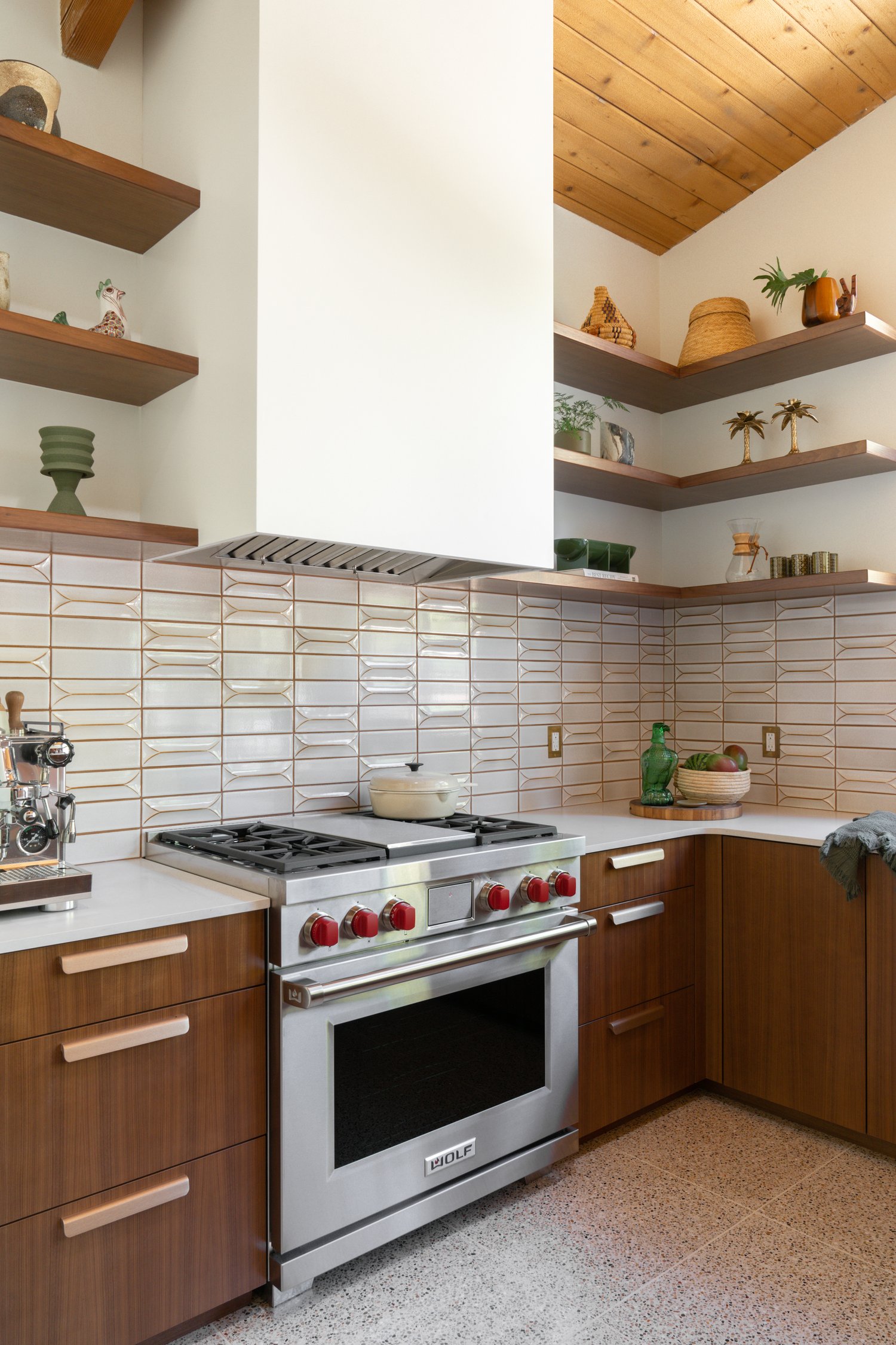
Not so long ago terrazzo was banished, only to be used to grace the floors of public spaces. But terrazzo has been making a slow comeback in the world of interior design trends and seeping back into our homes. Terrazzo has technically been around for many centuries, but it made a comeback in the form we know it towards the end of the mid-century modern era.
'This renovation was completed in 2021 and updated an original William Krisel Mid-Century Modern home in San Diego. In keeping with the vein of the mid-century style, we updated the kitchen with dimensional tile, terrazzo flooring, and walnut cabinetry, all three of which are quintessential styles of mid-century modern design,' explains designer Abbie Naber.
10.Decorate with a retro wallpaper
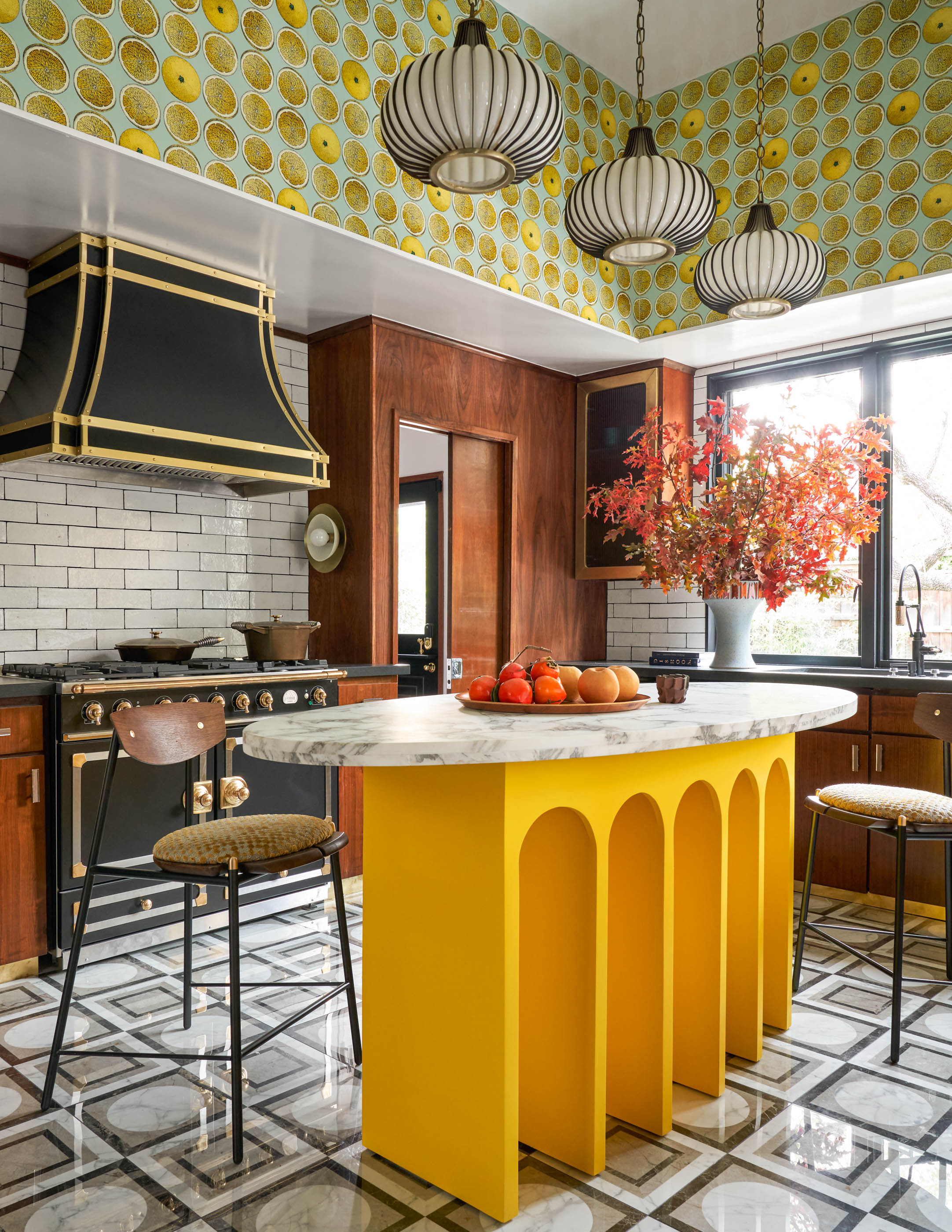
Loving the bold, playful colors going on in this vintage kitchen. And the wallpaper adds the perfect pop of retro pattern. 'I had saved and loved this wallpaper for a long time, but never had a spot for it,' says Eddie Maestri, principal architect and creative director of Maestri Studio. 'I wanted the space to feel like a true 1970s kitchen, so I opted for a lot of pattern on pattern and bold color. I went through retro kitchen books to get inspiration and see what would’ve been done in the ‘70s, and then put a modern twist on it.'
'Much of mid-century modern design is composed of clean lines and simplicity. Furniture is often low to the floor on sleek legs with a strong disposition for wood elements. Spaces designed in this style often have a pop of color, utilizing varying tones of primary colors,' he adds.
Sign up to the Homes & Gardens newsletter
Design expertise in your inbox – from inspiring decorating ideas and beautiful celebrity homes to practical gardening advice and shopping round-ups.

I am the Head of Interiors at Homes & Gardens. I started off in the world of journalism in fashion and luxury travel and then landed my first interiors role at Real Homes and have been in the world of interior design ever since. Prior to my role at H&G I was the digital editor at Livingetc, from which I took a sabbatical to travel in my self-converted van (not as glamorous as decorating a home, but very satisfying). A year later, and with lots of technical DIY lessons learned I am back to writing and editing, sometimes even from the comfort of my home on wheels.
-
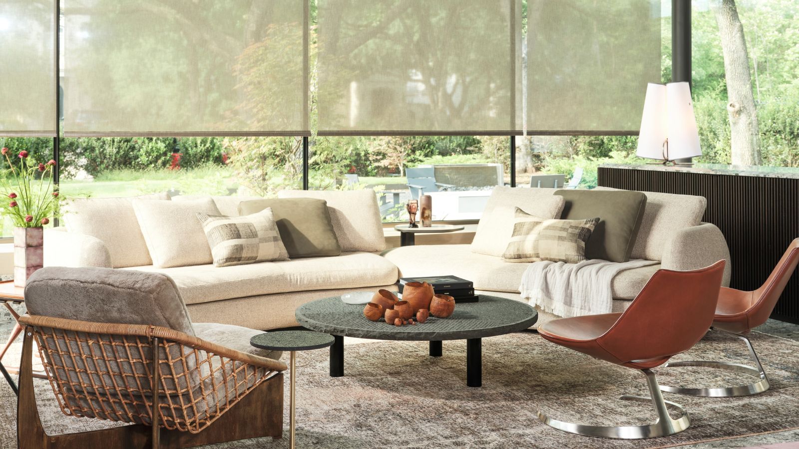 Thoughtful modernism – how one Dallas home makes bold contemporary design feel warm, welcoming, and comfortable
With its mix of textural finishes and carefully curated furnishings, this modernist home is a refreshing retreat
By Karen Darlow Published
-
 'Wick away the ick' – 6 things people with clean laundry rooms always do to make this hardworking space shine
These tips on how to clean your laundry room will banish grime
By Seraphina Di Mizzurati Published