Mid-century modern decor – 10 expert ways to introduce this timeless design trend
Mid-century modern decor is back, but this time it's infused with clean Scandinavian style, subtle pattern and a color palette that is cooler than ever
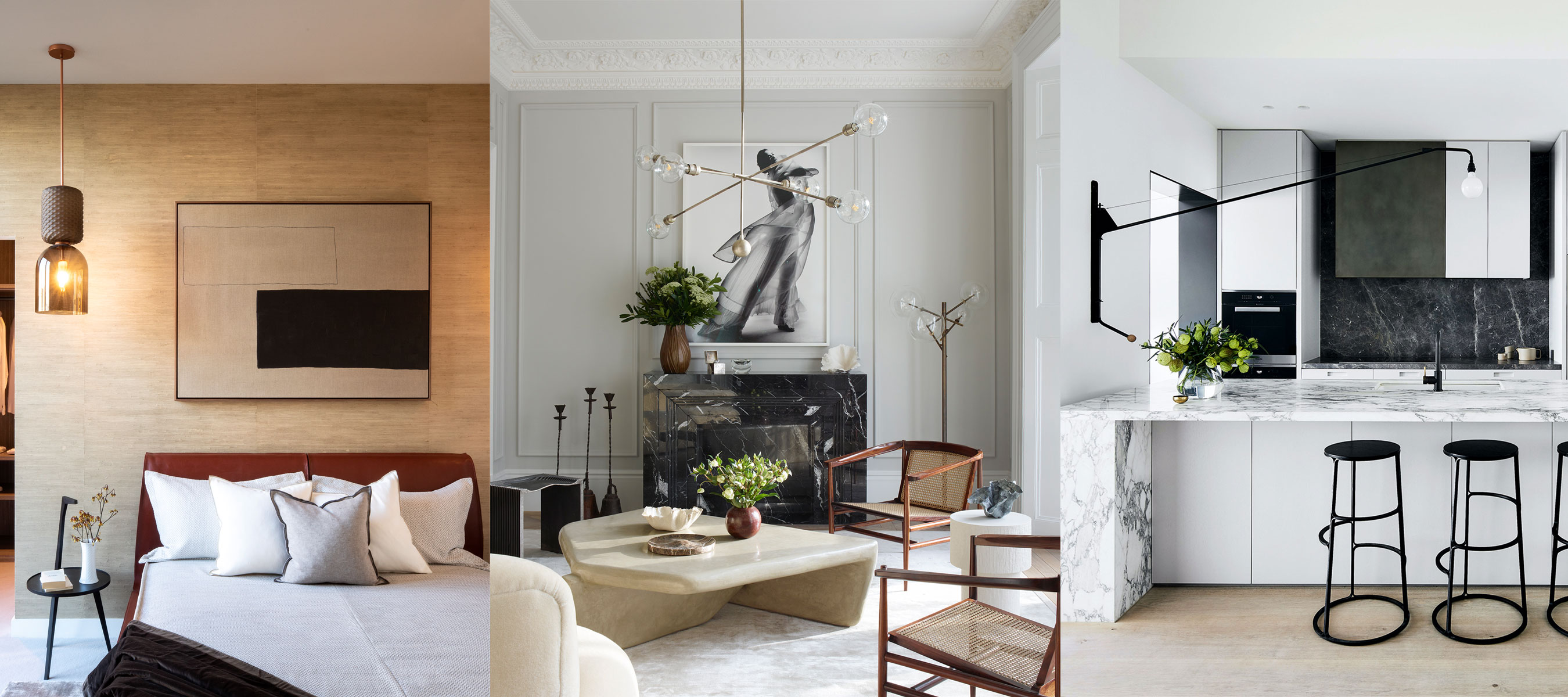

With their classic looks and pared-back style, mid-century modern decor ideas are enduringly popular – and it is easy to see why this look is revered so highly, even now.
Spanning the decade between the Thirties and the Seventies, these simple shapes were inspired by earlier design movements, including the Bauhaus school in Germany. Materials such as moulded plastics allowed world's best interior designers to explore new textures, colors and forms.
Here we explore the very best of the mid-century modern décor trend – and how to effectively and beautifully use this popular interior design aesthetic in your home.
Mid-century modern decor ideas – how to embrace this popular trend
While the style is still used today in new structures, the name comes from the period in which the style emerged, between 1945 and 1970, though primarily between 1947 and 1957.
These Mid-century modern decorating ideas will inspire you to recreate the timeless interior design trend in your home – in 10 simple ways.
1. Give mid-century modern décor a biophilic update
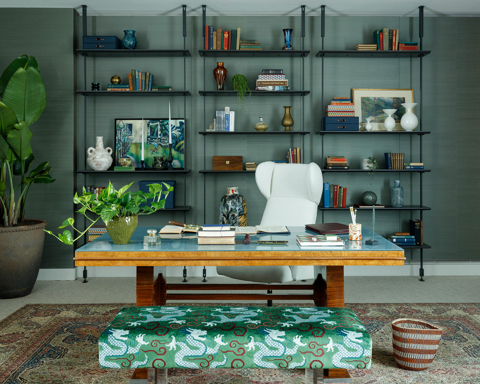
Bring a classic mid-century look into the 21st century with modern materials and a soothing color scheme – reminiscent of nature.
'When decorating this penthouse, I chose layers of velvety botanical green to echo the old flower market location,' says Sophie Ashby, founder, Studio Ashby. 'I find green as a color, and biophilic design in general, to be hugely grounding and inspiring – especially important for your modern home office ideas.'
'I love finding ways of displaying books, ceramics, artwork and special objects to weave character into a space,' the designer adds. 'The Italian-designed modular bookcase in graphite is one of my favorite aspects of this scheme as I enjoy the process of curating and exhibiting a collection.
Consider whether every element is essential and take away those that are not. 'I’m not a minimalist, but I do believe in only having things in the work area that either inspire or hold significant meaning.'
'Most office chairs with the correct back support are less attractive unless you invest in a statement piece, such as this one. A substantial mid-century dining chair that you can have re-covered also ticks all the boxes.'
2. Celebrate craftsmanship with wooden furniture
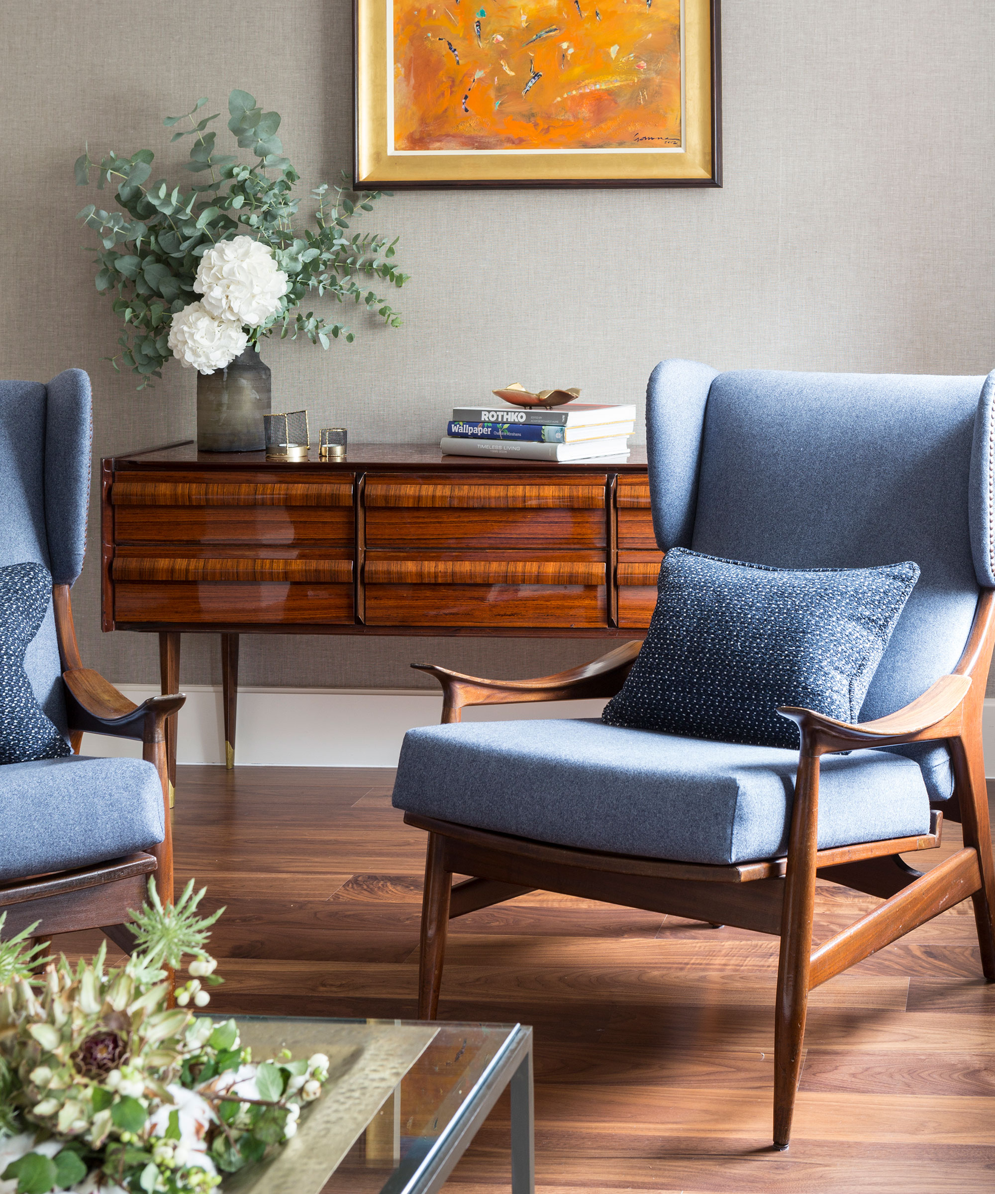
When it comes to furniture trends, we take the matter very seriously. Well-built pieces, made to stand the test of time and that lead the way with iconic good looks are key factors for mid-century modern décor.
Despite the development of innovative new materials such as plastic, fibreglass and laminates, timber sustained popularity throughout the mid-20th century. Furniture designers favored durable hardwoods, such as teak, cherry, maple and beech.
Exuding warmth, and famed for its timeless beauty and durability, solid wood is still one of the most popular materials to use in an authentic mid-century modern living room. For true mid-century modern appeal, invest in streamlined timber pieces with tapered legs.
3. Achieve an elegant mix of mid-century and modern
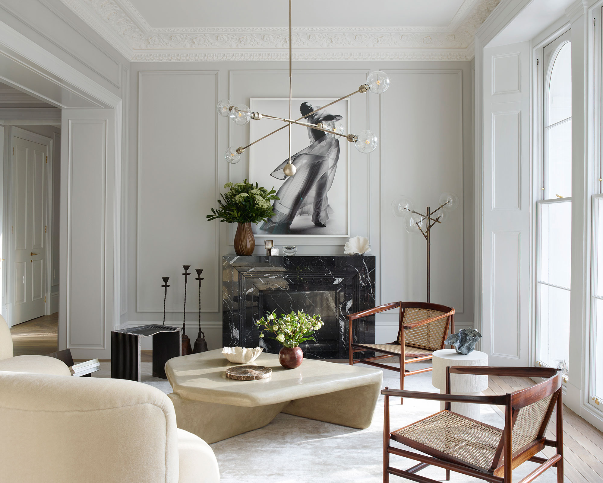
Katie Harbison of property development and design studio Banda achieves an elegant mix of modern and mid-century modern living room design in this room. Allow the room’s beautiful proportions and original crown molding ideas to shine by keeping the backdrop neutral.
‘Walls are painted in a subtle grey and the floor is a natural oak, topped with a silky grey rug,’ explains Katie. The sofa’s rounded shape almost embraces the angular coffee table by artist Thomas Markunpoika. Every piece in this mid-century modern room is individual, but together they create a sense of harmony, thanks to their natural colors and subtle textural interest.
4. Add mid-century modern decor to existing rooms
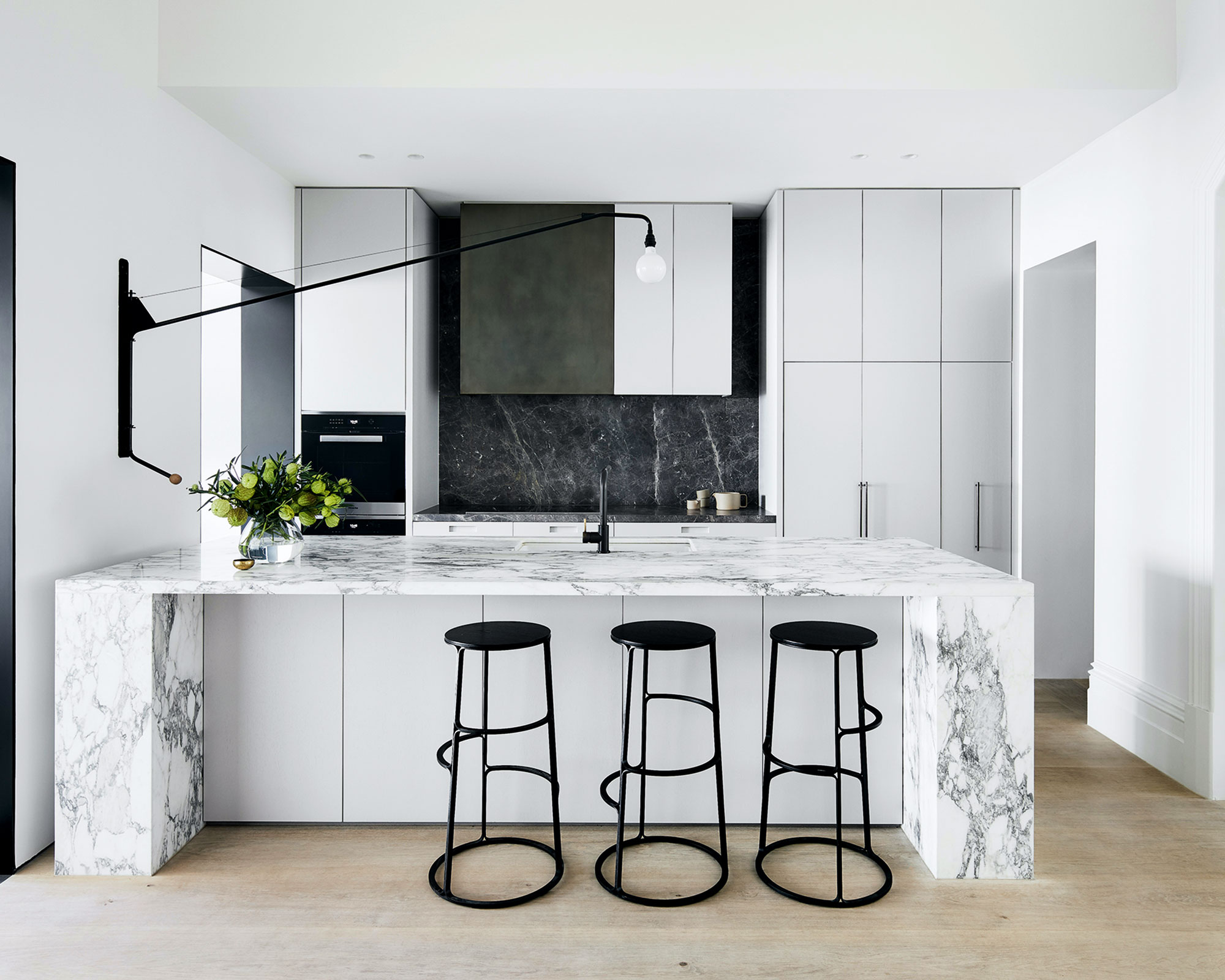
Furniture isn't the only way to introduce mid-century modern decor ideas to existing schemes: modern kitchen lighting ideas can play a small but significant role in your home, even if it wasn't built in the fifties.
If you’re going for one statement light, make sure it’s a keeper by seeking out timeless design. This monochrome kitchen, created by Australian interior designer Fiona Lynch, is punctuated by Jean Prouvé’s purist masterpiece for Vitra. Designed in the 1950s, its pared-back industrial lines still feel modern more than half a century later. We love how the tubular steel swing arm can be effortlessly moved between sink and breakfast bar. Similarly enduring lighting brands include Flos, Lampe Gras and Louis Poulsen.
5. Be sympathetic to the age of your property
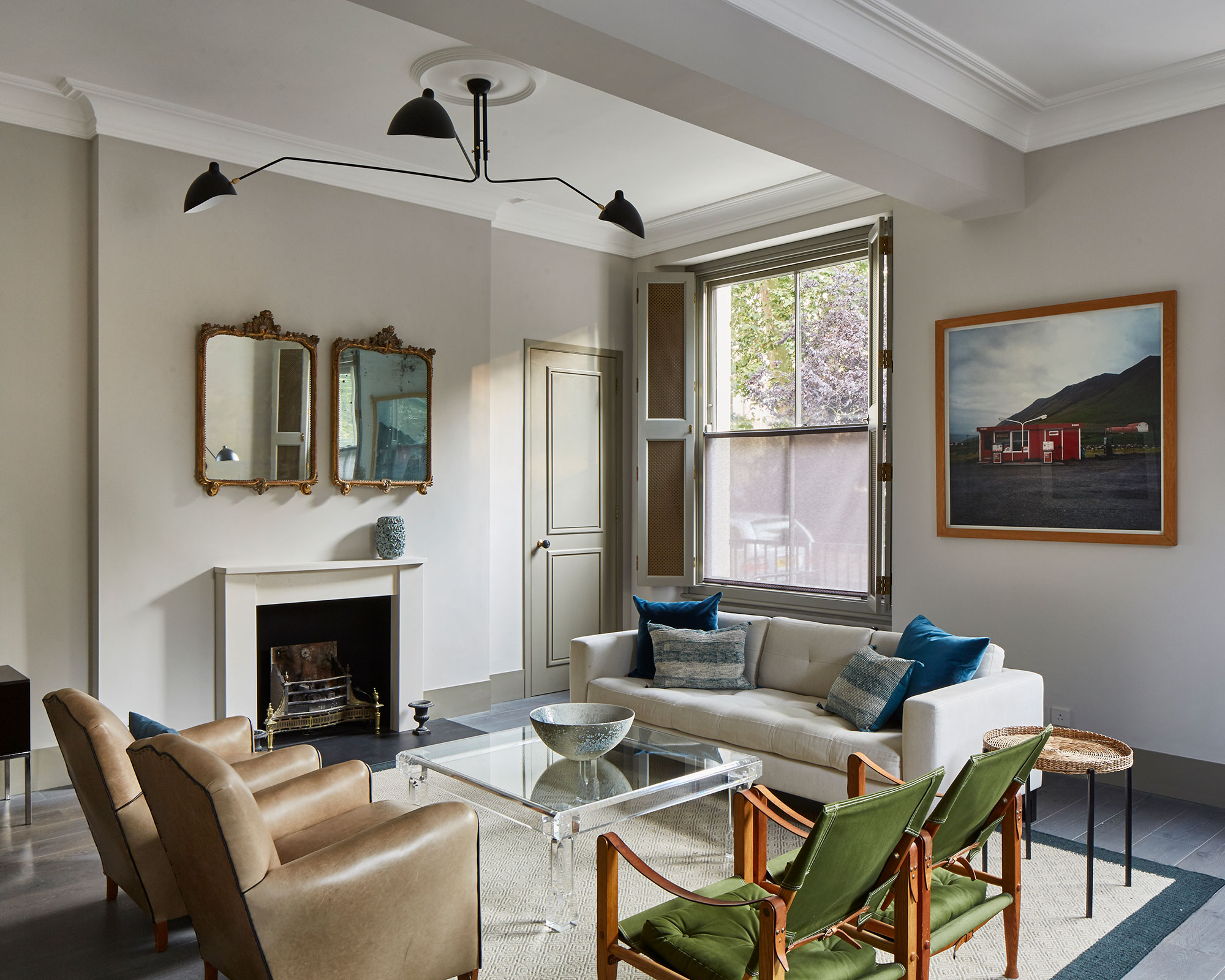
Work with the age of your home to create a sympathetic mid-century modern decor scheme that is both timeless and stylish. To reflect the age of the property, interior design company Sigmar used traditional grey for the walls, providing a contemporary note with pale-green doors and woodwork.
A stronger color was added with green Kaare Klint Safari chairs and cushions in sea blue tones to create a calm but edgy look. ‘This space was stripped of its Victorian details in the 1960s,’ says designer Ebba Thott. ‘We reinstated cornicing and deep skirting boards, raising the door frames to celebrate the ceiling height.’
6. Bring in warmth
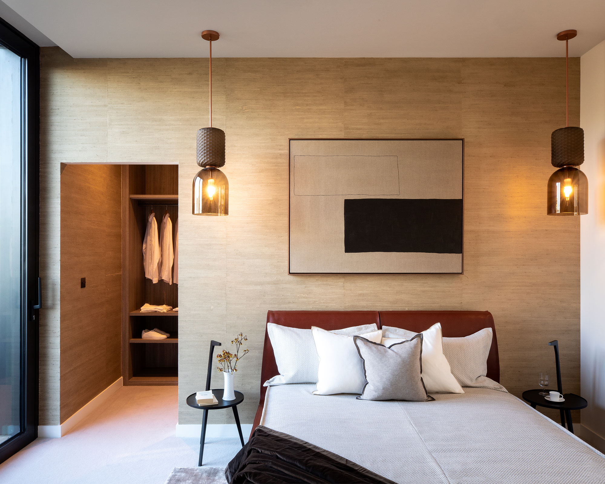
For a cozier take on the open-plan look, this mid-century modern bedroom has a walk-in wardrobe finished in the same textured hessian fabric as the wall behind the bed. It’s in an apartment designed by Italian brand Cassina at the Television Centre in west London, a mid-century landmark recently revamped by architects Allford Hall Monaghan Morris.
The warmth of the natural hessian is accentuated with wooden shelving in the dressing room, amber glass lights – Ficupala by Cassina – and a pale plush carpet, which heightens the sense of enveloping softness. But to maintain a light feel, the surrounding walls and the ceiling are simply painted in an off-white shade.
7. Don't forgo the things you love
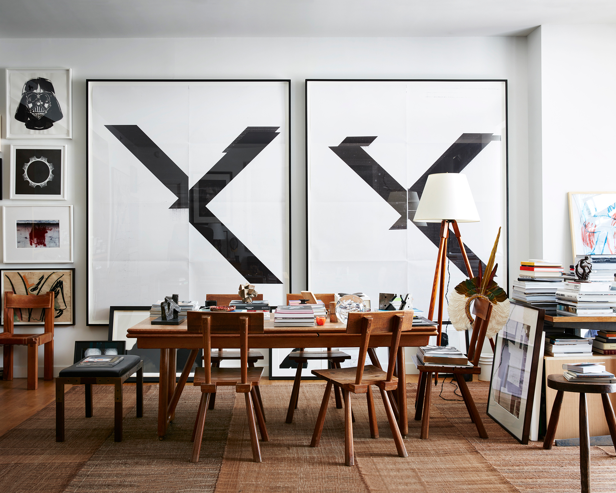
In this mid-century modern home office, Robert Stilin, the famed American decorator expresses his curatorial eye and innate ability to arrange art, furniture and objects from varying eras with a sparing use of color combinations. With an emphasis on simple lines and purity of design, combined with the enduring beauty of wood, mid-century modern décor has a timeless appeal, which sits well with other styles both old and new.
This room is in my own apartment in New York City,' says American designer Robert. 'It’s a large living-dining area which faces west with floor-to-ceiling glass. I don’t often host dinners, so it makes no sense to have the dining table taking up all that space and set for the ten times a year it’s used.'
'When designing a mid-century modern décor scheme, I always start with function. Having said that, the Guillerme et Chambron table is a foundation piece, as are the two Wade Guyton prints behind it. If I ever change the artwork, I’d still always have one or two large pieces on the wall and the salon-style hanging of smaller ones to the left because it just makes sense in the space.'
'I am a big collector and the neutral, textured backdrop is easy on the eye and comfortable to live with. But, as expressed in this room, I also like layers: they create depth and character. Mixed with the function of the furniture selected, the layers keep the space from feeling like an art gallery or a museum.'
8. Craft a grown-up scheme
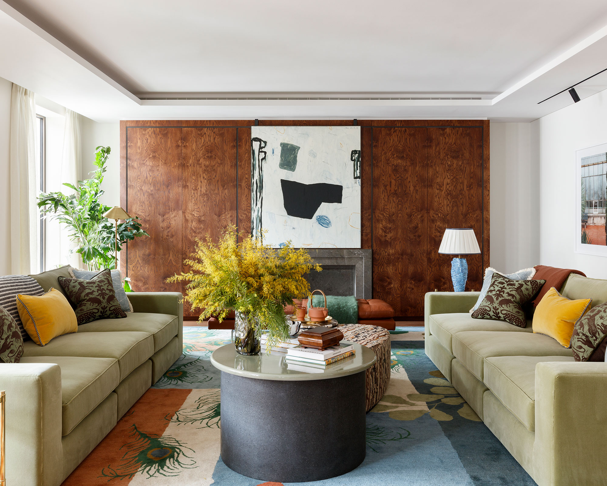
Interior designer Sophie Ashby reveals that nature provided the inspiration for this scheme’s welcoming, earthy palette. This is quite a grown-up mid-century modern room, and the seating arrangement reflects this, with a pair of bespoke, classic couches in a sage-green velvet, teamed with a tan daybed.
‘The palette was inspired by Holland Park in London and features neutral colors: greens, blues, russets, oranges and yellows,’ says Sophie. ‘We started with the rug, which we designed as an ode to the park, incorporating peacock feathers as well as leaf motifs.’
‘When looking at softer aspects within a space, opt for richer colors that can give a sense of warmth. If you are looking for a more trend led design then focus on investing in items with fringing or trims as it adds more depth to the design,’ advises Holly Gannon, Design Manager, Milc Interiors.
9. Make the most of vintage finds from different eras
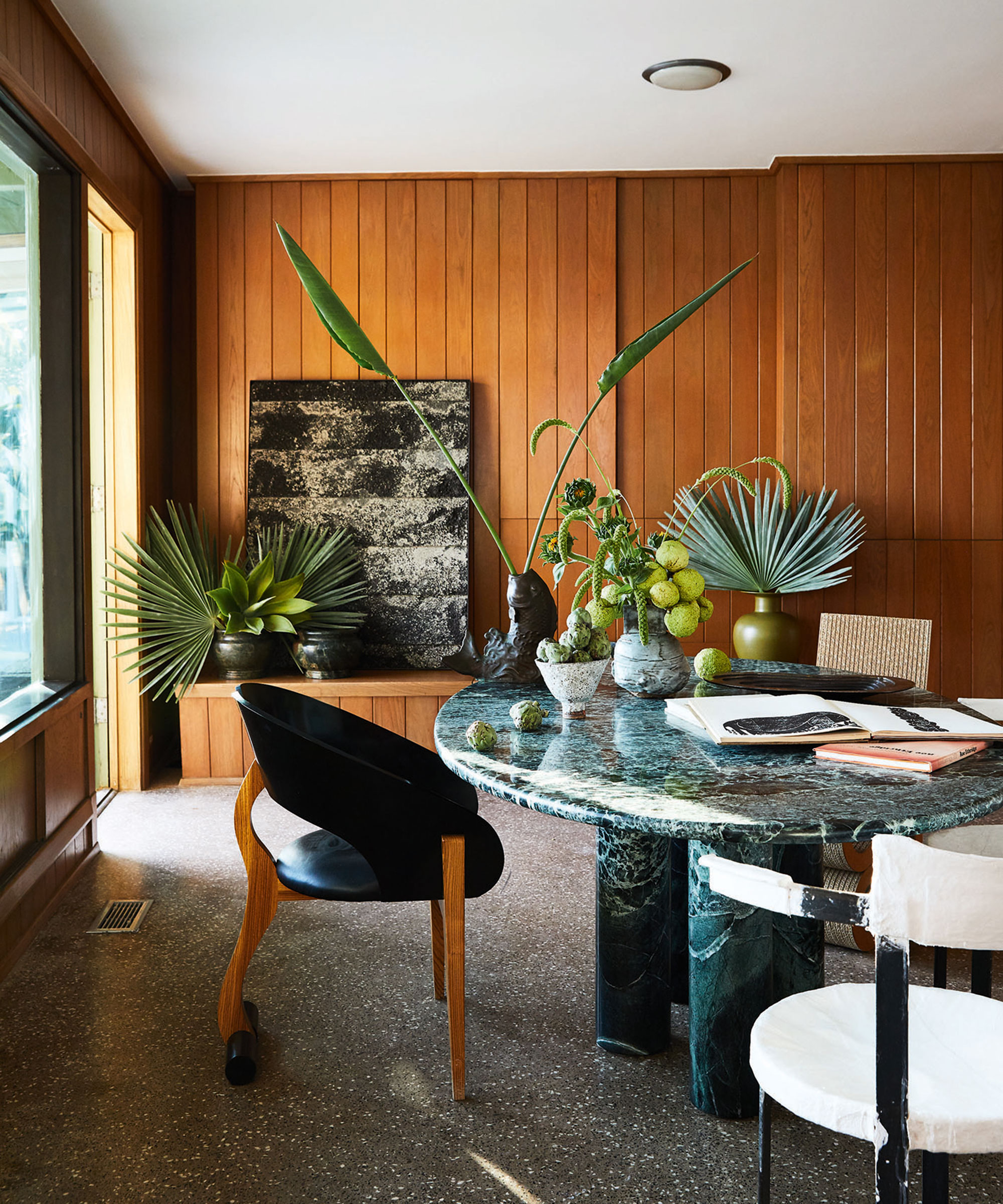
'I am a firm believer that in every era there is incredible design and I pull from lots of different periods – I love mixing deco, Bauhaus, mid-century; sticking to one era can be a bit one note, says renowned interior designer Kelly Wearstler. 'If you buy all your furniture new it’s going to start to look dated quickly, but if you take the time to curate and shop in a variety of places, you end up with a much more timeless room'
'I start sourcing furniture early on in projects, and taking time to find the right pieces makes all the difference,' she adds. 'I’m always looking for a balance between vintage and contemporary. If I buy a new sofa maybe I’ll look for a vintage coffee table, so they offset one another.'
'There’s nothing I wouldn’t buy vintage – I’ve even installed 1960s carpets before. Vintage carpets can be so beautiful, the fading of the colors and the patina of the rug.'
10. Choose mid-century modern light fixtures
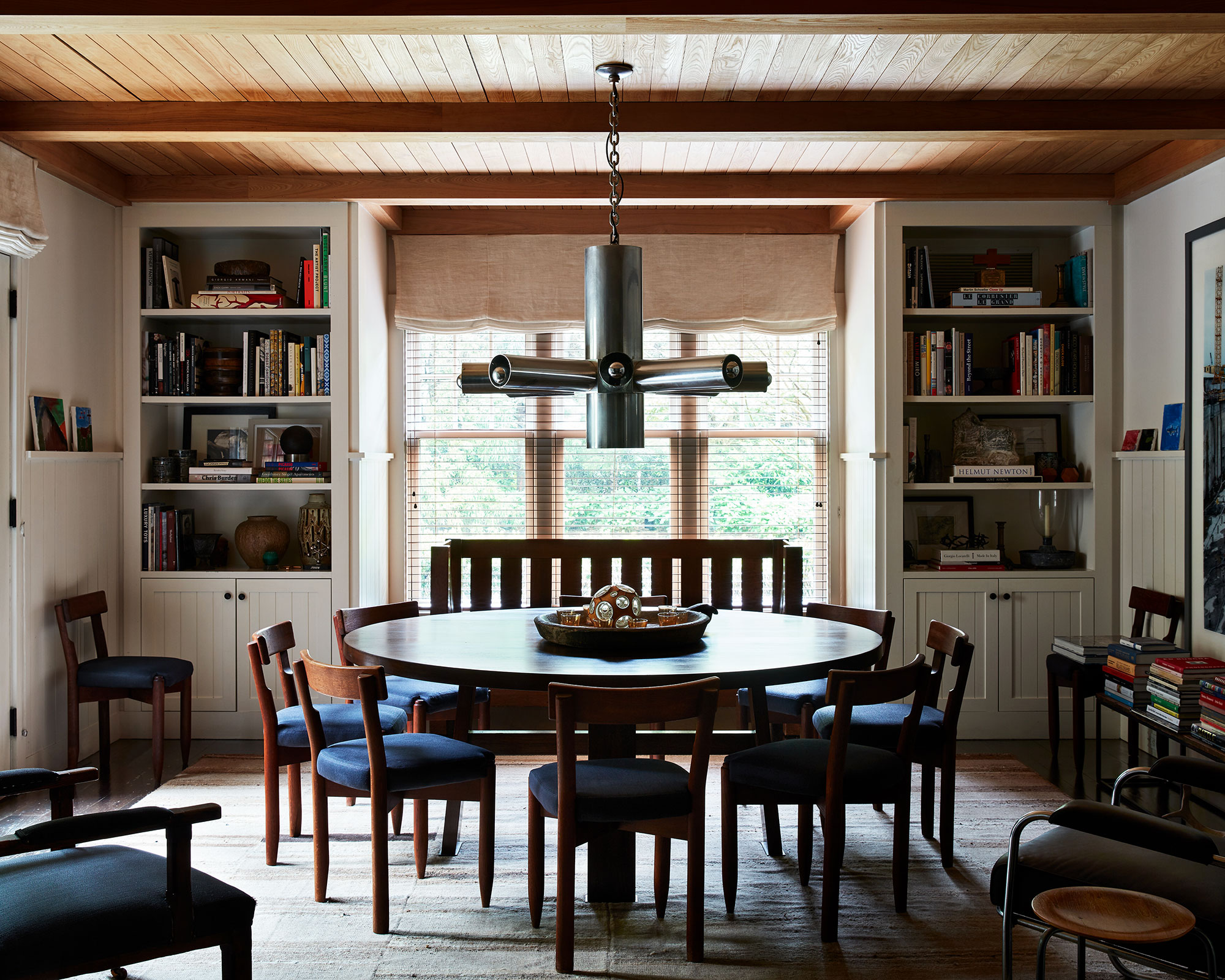
When looking for mid-century lighting ideas – proportion is key for an understated look. This is impeccably demonstrated in the East Hampton home of American decorator Robert Stilin, where a Mid-century metal design strikes the right note over a vintage table and chairs.
‘Even though I keep it dimmed quite low, the way it glows from the end of each arm creates a great mood,’ says Robert. Ideally, the gap between the base of an overhead light and the top of a dining table should be 30-40 inches – this gives functional illumination while still feeling warm and cozy.
Like Scandinavian design, the main purpose of mid-century modern decor is to improve daily life. Lighting should therefore not only about stylish elegance, but also about functionality – it should serve a purpose and stand the test of time.
What makes schemes Mid-century modern?
Mid-century modern décor is predominantly focused on straight lines, wood furniture, geometric shapes and minimal color schemes.
Invest in unfussy, utilitarian-style furniture. Go for functional, fluid designs and abstract prints based on natural shapes – rediscovered and reinterpreted for today’s modern interiors, architecture and lifestyles.
For ideas, look to icons like Florence Knoll and Arne Jacobson for inspiration – both of whom were prominent designers during the mid-century modern period. Their work still serves as design inspiration for some of the world’s top creatives.
What shapes are Mid-century modern?
Mid-century modern décor is characterized by clean straight lines and flowing organic curves. Simplicity in design and styling is key, along with a lack of ornamentation and a limited color palette. Although mid-century modern décor was driven by advances in technology, it was also inspired by the natural world, and wood is the most widely used material for furniture.
Geometric and circular shapes were another key element of early mid-century modern décor and architecture. Launched into prominence throughout western schemes in the roaring 1920s, geometric designs lent themselves to the bold, angularity of Art Deco design and later with mid-century modern décor.
Sign up to the Homes & Gardens newsletter
Design expertise in your inbox – from inspiring decorating ideas and beautiful celebrity homes to practical gardening advice and shopping round-ups.

Jennifer is the Digital Editor at Homes & Gardens. Having worked in the interiors industry for several years in both the US and UK, spanning many publications, she now hones her digital prowess on the 'best interiors website' in the world. Multi-skilled, Jennifer has worked in PR and marketing and occasionally dabbles in the social media, commercial, and the e-commerce space. Over the years, she has written about every area of the home, from compiling houses designed by some of the best interior designers in the world to sourcing celebrity homes, reviewing appliances, and even writing a few news stories or two.
-
 'It's a fast reset button' – using the 1, 2 ,3 ,4, 5 decluttering method cleared my persistent mess in seconds
It's easy, effective and so quick to do
By Ottilie Blackhall Published
-
 Nectar vs Layla – which mattress brand is best on test?
I've set the Nectar Premier Hybrid Mattress and the Layla Hybrid Mattress head to head to help you work out which mattress meets your needs
By Emilia Hitching Published
-
 6 mid-century modern entryway ideas for a modern-meets-vintage design
A blend of modern and vintage, deep wood tones, and airy neutral colors, these mid-century modern entryway ideas will add personality and style
By Molly Malsom Published
-
 Black and white living room ideas – 13 monochrome looks that make a statement
Create balanced and versatile interiors with these black and white living room ideas
By Pippa Blenkinsop Published
-
 Mid-century modern living room ideas – 15 expert ways to introduce this timeless trend
Be inspired to create sleek, stylish and timeless spaces with these mid-century modern living room ideas
By Jennifer Ebert Last updated