Mayonnaise by Benjamin Moore is having a moment – does this mean magnolia neutrals are having a revival?
Designers share how to decorate with the warm and bright neutral to bring a sense of calm to any space
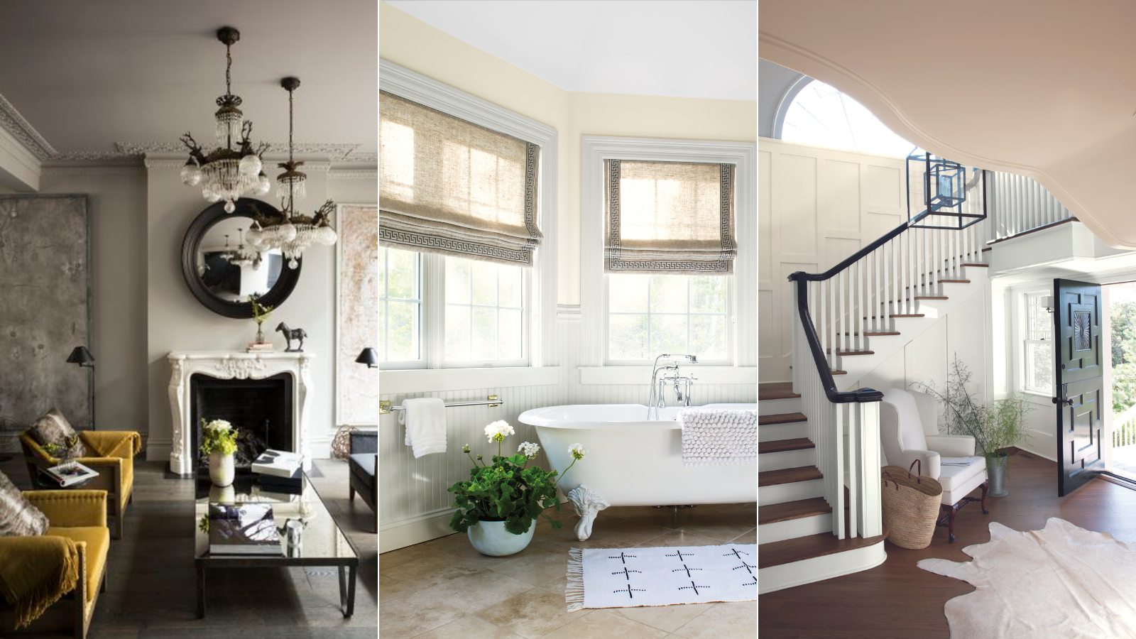

Neutrals never go out of style, but specific shade preferences shift over time. And though cool-toned neutrals had their moment, warm tones are on the rise in color trends for 2024. Bringing depth, dimension, and a cozy feeling to any space, shades with warm notes are finding their way into more and more interior design projects.
The shade Mayonnaise by Benjamin Moore is loved by designers for its versatility and charm, and it brings loads of warm neutral inspiration. However, there's no denying that the shade leans pretty close to those yellow-toned creams that have been shunned for so long in the world of interior design.
Here's what color experts and interior designers have to say about why the color is on the rise once again, plus tips for bringing the hue into your decor scheme.
How to decorate with Mayonnaise by Benjamin Moore
Mayonnaise offers endless possibilities and works best in a space you'll use for relaxation. Hannah Yeo, senior manager of color marketing at Benjamin Moore, says this is one of the main reasons why the shade is making a comeback.
'We have seen a move towards warmer whites and neutrals. These hues, Mayonnaise OC-85 and many alike can create a feeling of softness rooted in wellness, which has become mainstream,' she explains.
Mayonnaise strikes a beautiful balance between bright and understated. And while the undertones of the popular hue allow it to shine no matter the lighting scheme, Hannah suggests using it in north-facing rooms that offer cooler lighting.
'The yellow undertone of Mayonnaise OC-85 brings warmth, and is bright enough so that it’s not overwhelming. With a light reflectance value (LRV) of 88, this light hue is great for north-facing rooms, connecting areas such as entryways or as an all-around house color,' she says.
Sign up to the Homes & Gardens newsletter
Design expertise in your inbox – from inspiring decorating ideas and beautiful celebrity homes to practical gardening advice and shopping round-ups.
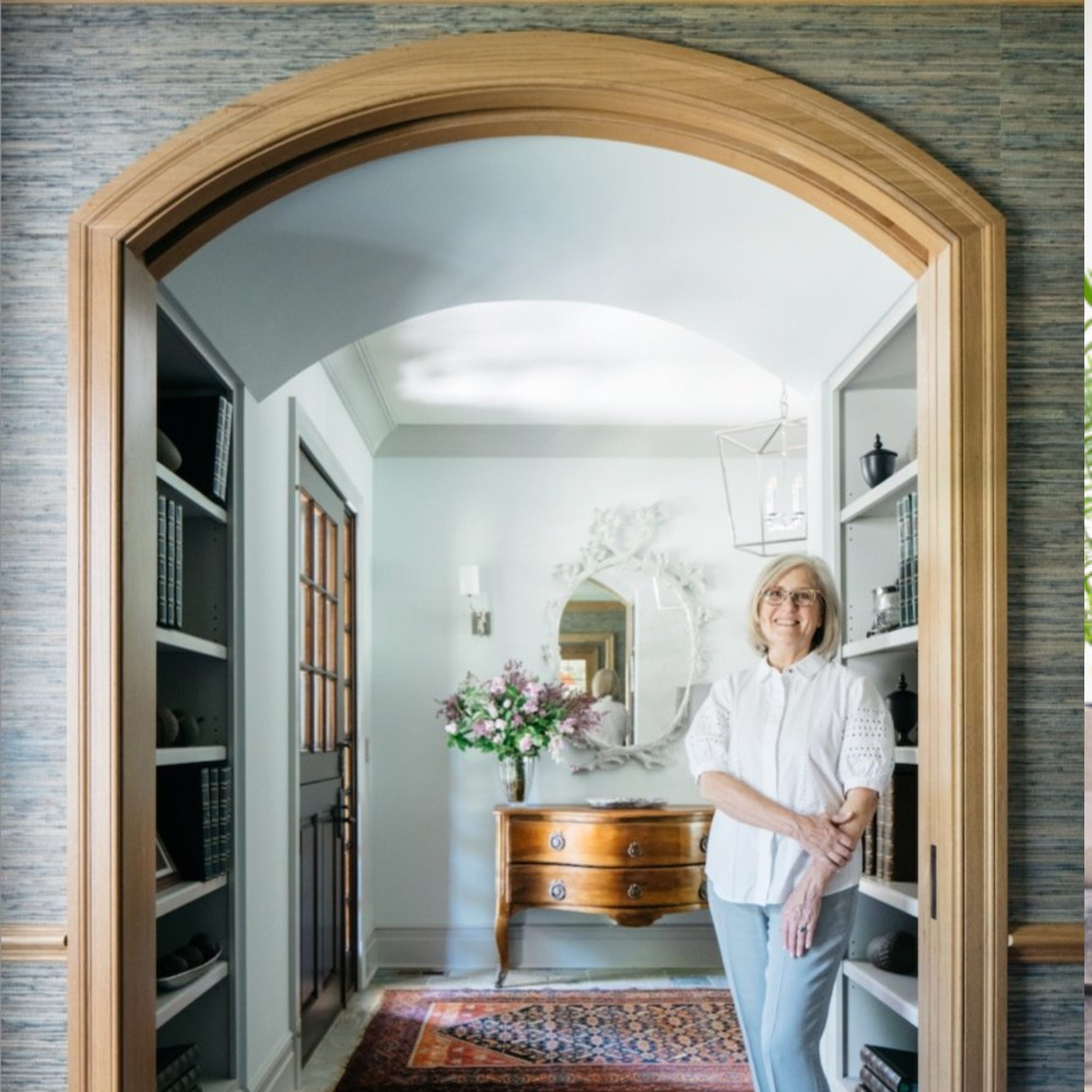
In the entryway pictured below, Mayonnaise paired with 'delicate off-whites' creates a soft and welcoming atmosphere, says Hannah. For more colorful combinations, she suggests 'deep, saturated hues' like the brand's Wenge AF-180 or Vanderberg Blue 721.
Hannah Yeo is a color and design expert, and the senior manager of color marketing with Benjamin Moore.
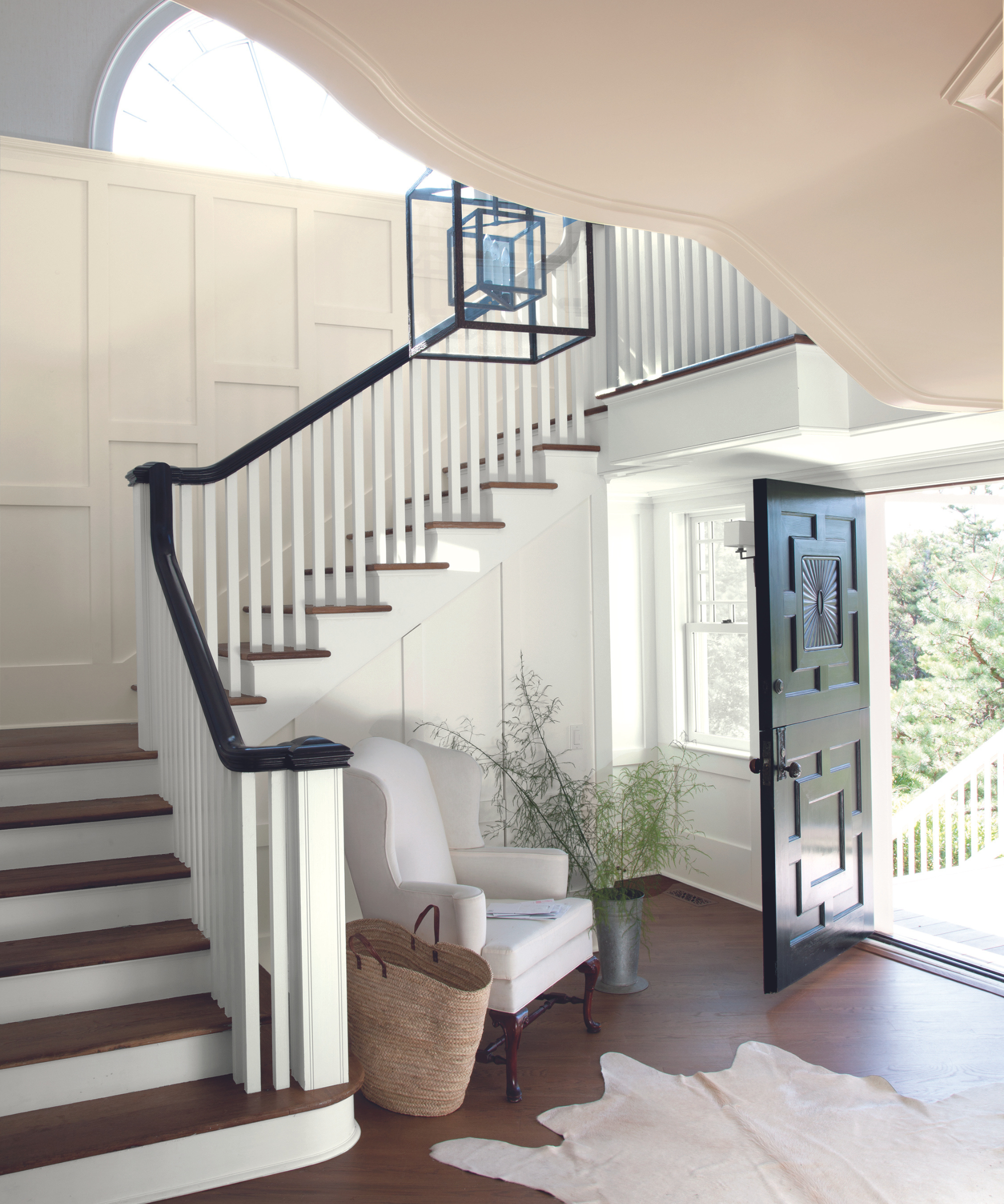
Jennifer Mabley and Austin Handler, co-founders of Mabley Handler Interior Design, have seen homeowners start to move away from grays with cooler undertones, and toward warmer neutrals – it's part of the natural back-and-forth of trending colors. But decorating with Mayonnaise is an easy way to bridge the gap, says Austin.
'Benjamin Moore’s Mayonnaise is that perfect transitional choice, bridging the gap between cold and hot: It offers some warmth, without hitting you over the head with a yellow bat,' he says.
Jennifer adds that the tone works doubly to bring coziness to a darker space and even more energy to a room that already gets a lot of sun. And while this entryway uses the shade for wall paneling, pairing it with bright white and dark wood accents, Jennifer says the shade is 'natural and neutral enough to be used as a whole-house color.'
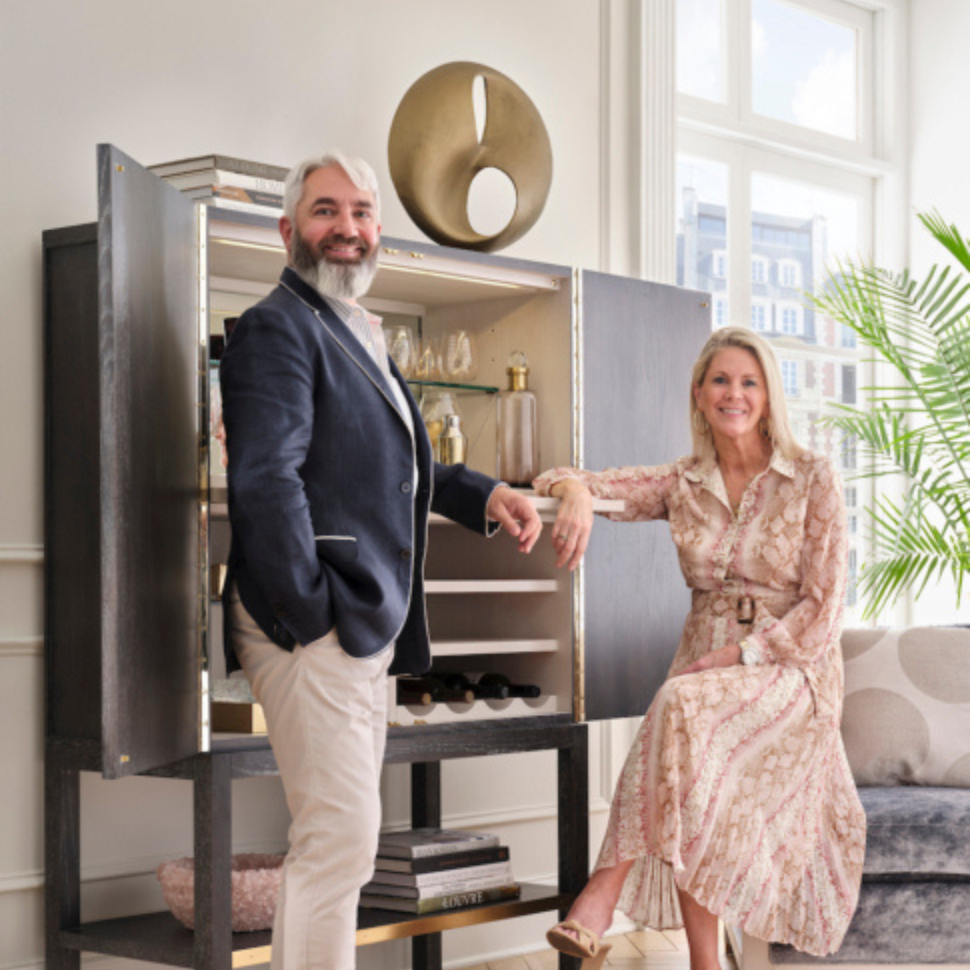
Mabley Handler Interior Design is the husband-wife interior design team led by Jennifer Mabley and Austin Handler. The firm is based in the Hamptons, with studios in New York City and West Palm Beach.
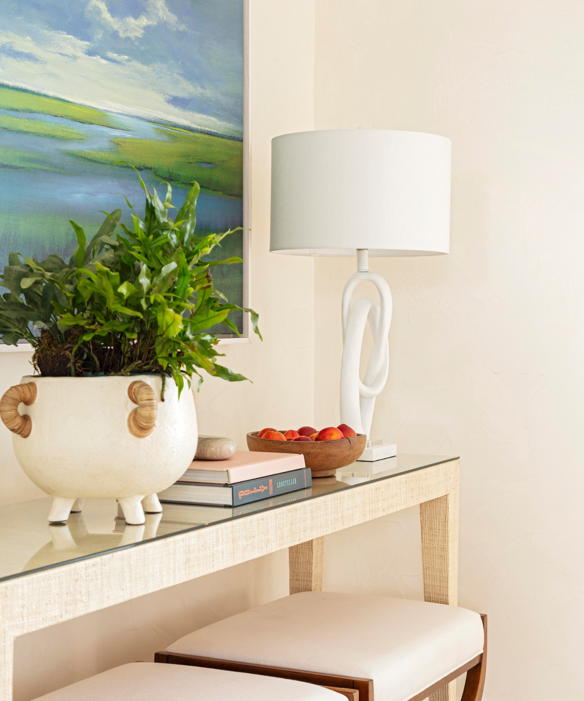
When it comes to creating a color scheme around the shade, Caroline Brackett of Caroline Brackett Studio of Design notes several exciting possibilities. She's found success pairing the hue with bold navy and French blues, contrasting cool statement colors with the classic creamy shade. Plus, she says there's plenty of room to add some pattern to the mix.
'It's a beautiful, warm hue that works with the background of many floral fabrics and wallpapers that we love,' she says.
Caroline suggests keeping trim on the simple side, though, saying she likes to match Mayonnaise-colored walls with the same shade for the trim. This helps to avoid a contrast that contributes to a dated look, she says.
Because it can be intimidating to choose 'the best white paint' when decorating your home, and bright yellows can be just as daunting, Caroline suggests using Mayonnaise for a 'happy, in-between choice.' She also recommends Farrow & Ball's Matchstick for a creamy, warm neutral that never dates.

Caroline Brackett is the principal designer and founder of Caroline Brackett Studio of Design, a full-service interior design firm based in South Carolina.
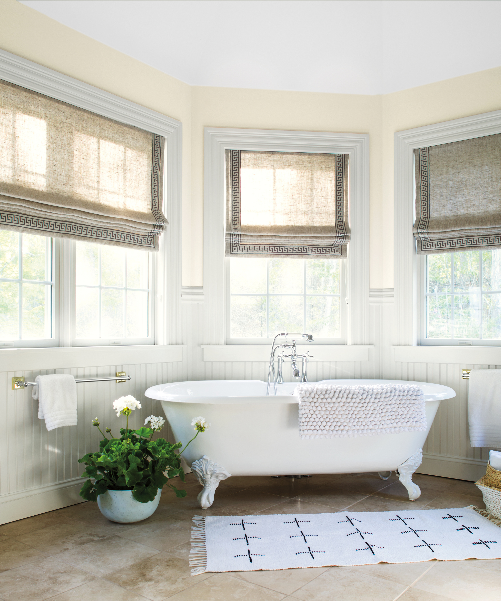
Elizabeth Drake, principal designer of her namesake design firm, suggests using Mayonnaise for one simple reason: 'because it's not cream.'
'It threads the needle between warm undertones and a neutral white without becoming a light yellow or cream wall, which can turn a room’s decor in a different direction,' she says.
Elizabeth adds that the shade helps minimize the unwelcome shadows that appear on ceilings or in poorly lit corners. 'Short of installing new windows, yellow, warm undertones are the closest substitute for daylight,' she says.
Elizabeth Drake is the principal designer of her eponymous design studio, a full-service firm based in Chicago.
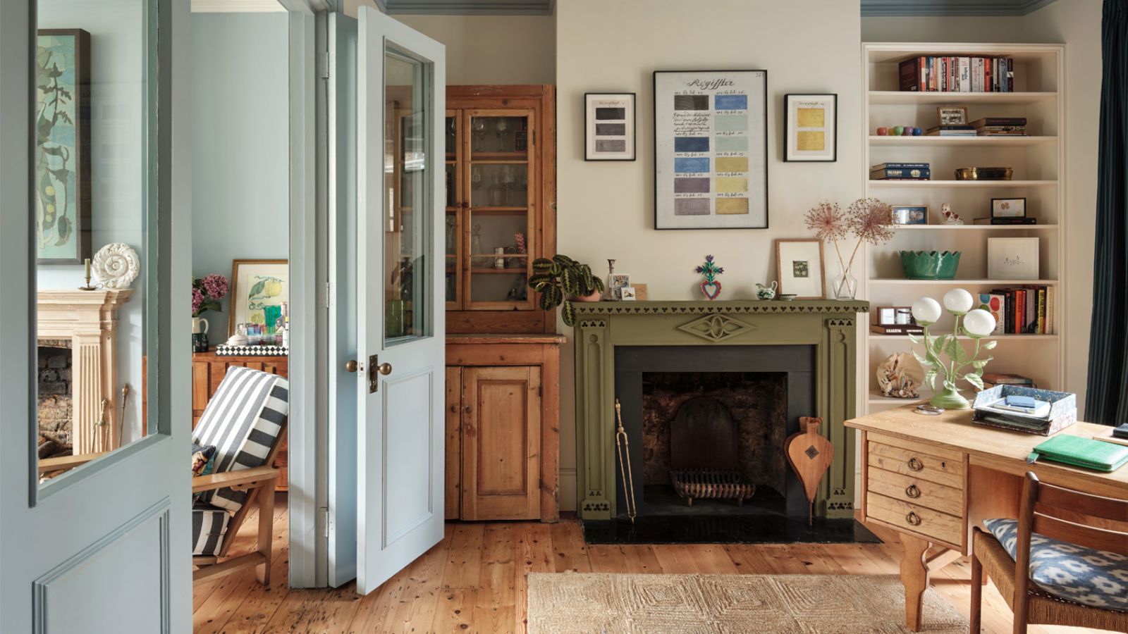
Michael Ellison, principal designer of New York City-based Studio Michael Ellison, says he plans to use more of the white-yellow hue in his 2024 projects. As the design world gradually moves away from what he calls a 'less is more,' white-meets-gray approach to color, he finds comfort in the warmer hue.
'With this white, I am overwhelmed with nostalgia for the soft rays of evening sun beaming through a window and landing on the corner where two walls meet; the feeling of going outside to commune with nature whilst in the comfort of your sanctuary,' says Michael.
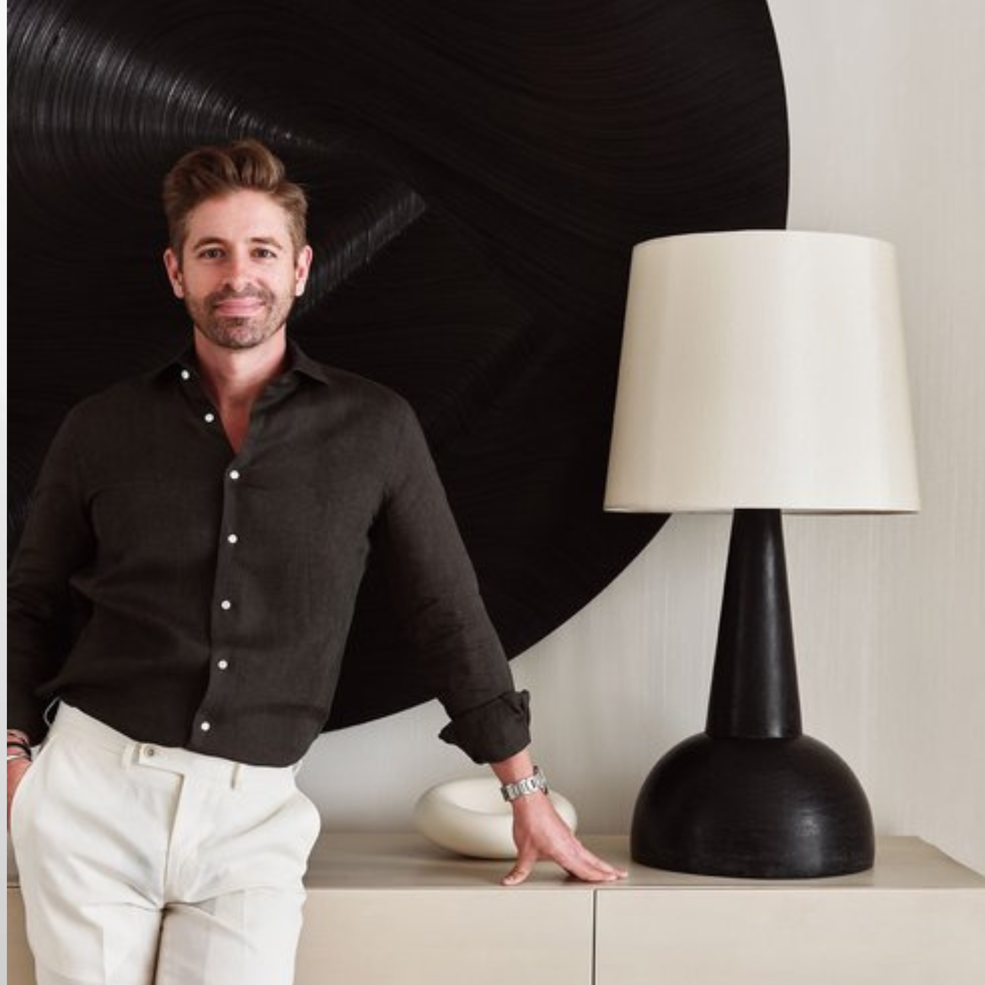
Michael Ellison is the principal designer and founder of Studio Michael Ellison, a design firm based in New York City.
Benjamin Moore's Mayonnaise is sure to bring warmth and comfort, even on the coldest of days. Paired with bold accents or left to speak for itself, the shade represents a new wave of neutrals that designers continue to love.

Abby was the Interior Design News Editor at Homes & Gardens and is now studying for her Master's degree in Journalism at City University, London. Prior to joining our team, she worked with Better Homes & Gardens, where she wrote and edited content about home decor, gardening tips, food news, and more. She studied Journalism and English Literature at New York University and moved to London to pursue her love of writing in 2023.
-
 5 surprising but brilliant ways to clean with old socks – from perfectly buffing stainless steel to deterring pests naturally and more
Tackle dust in tricky corners, clean your mirrors and even banish bad odors with those rogue single socks
By Andy van Terheyden Published
-
 How to grow astilbe – expert advice on cultivating this shade-tolerant flowering perennial
Shade-tolerant and pest-resistant - astilbe are hardy and tough perennials that can thrive in many settings
By Ellen Wells Published