7 maximalist homes that nail the 'more is more' aesthetic
Because sometimes less doesn't always equal more in interior design
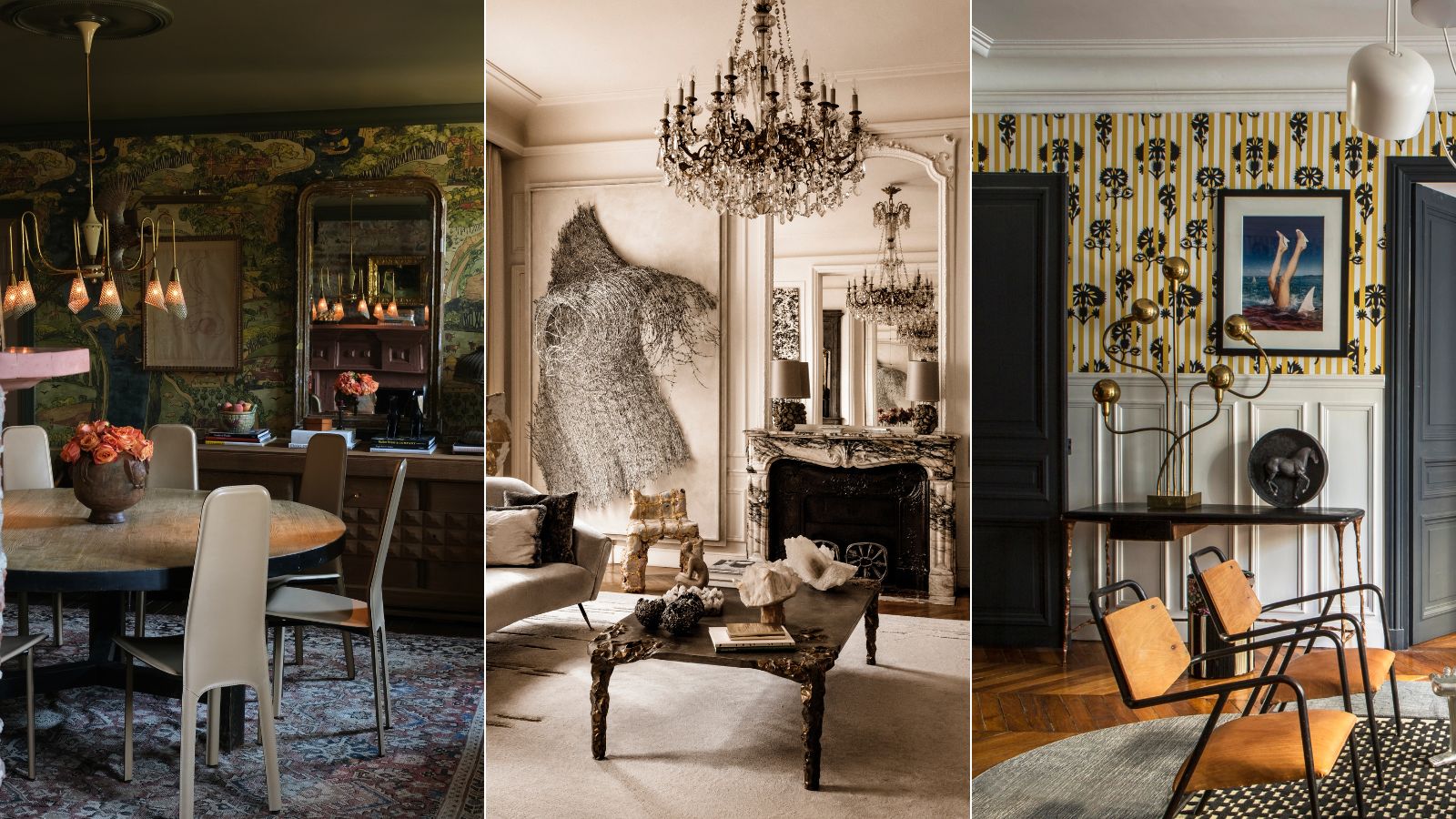
- 1. An enveloping wallpaper dining room
- 2. This quirky-yet-comfortable living room
- 3. An under-the-sea themed powder room
- 4. Mismatched furniture and a daring ceiling in this dining space
- 5. Maximalist art meets a soft color palette
- 6. A monochrome scheme still manages to be bold
- 7. Art takes center stage in this apartment

Maximalism is all about injecting personality into your home to create spaces that feel rich, dynamic, and utterly unique. It's a celebration of individuality, a rejection of minimalism (naturally), and a testament to the idea of throwing out the rulebook sometimes in interior design. In maximalist homes, more is always more.
Maximalist decor ideas are typically seen as abundant spaces. Abundant in color, in pattern, in texture, and in joy. If you're looking to rebel against minimalism's toned-down aesthetic in favor of something more lavish; then perhaps these 7 spaces will provide you with some much-craved inspiration.
Here, we speak to the interior designers behind each room or home, and why they love to adopt a 'more is more' design approach.
7 Spaces That Prove More Is Always More
When thinking about whether maximalism is more on trend than minimalism, the answer always lies with you. Trends may come and go, but the only way you're truly going to love your home for the long haul and feel super comfortable in that space, is to decorate it in a way that speaks to you. If you're looking to dip your toe into the more is more approach, here are 7 spaces that are sure to inspire.
1. An enveloping wallpaper dining room
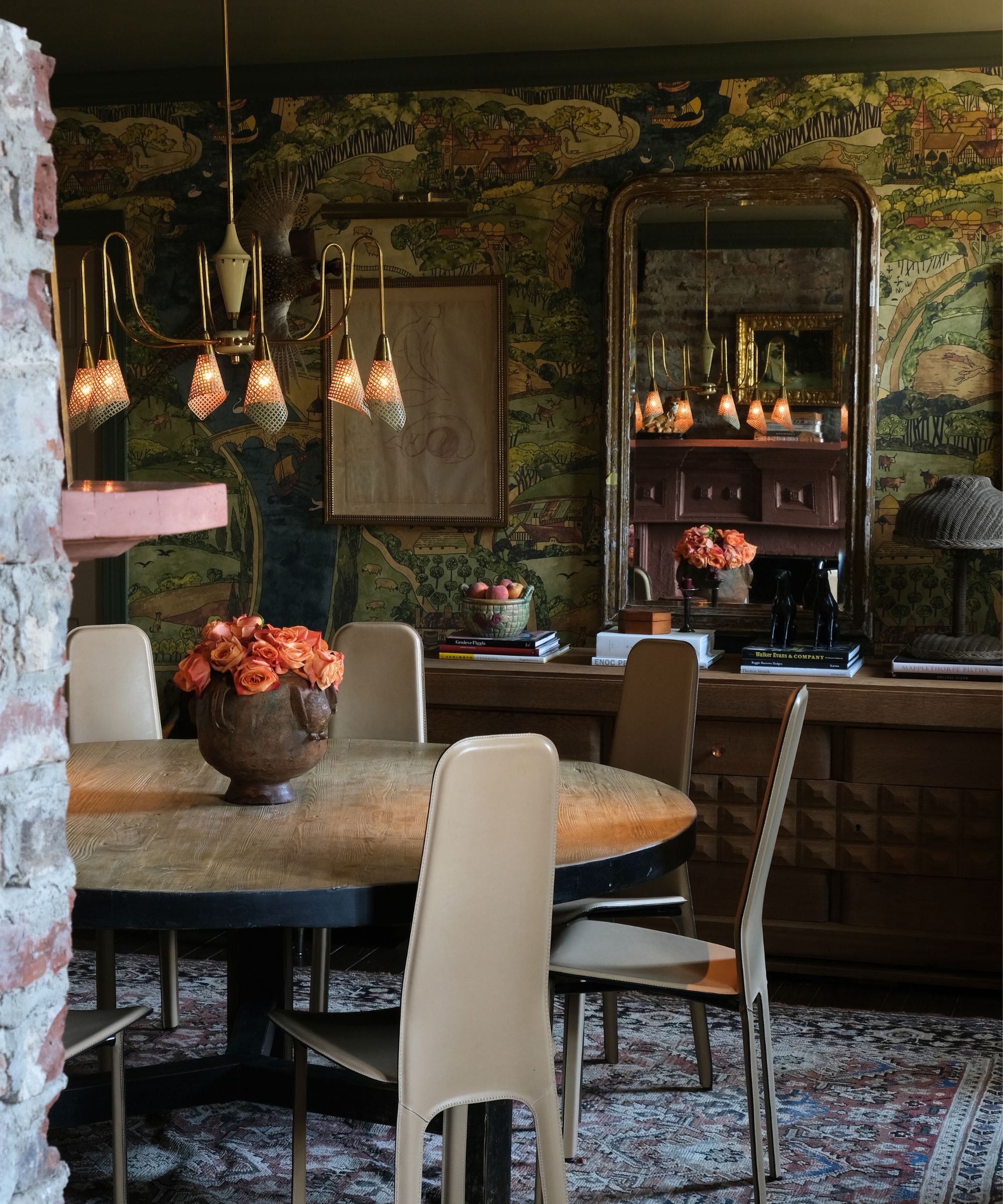
When considering the rules for decorating with maximalism, the single most important rule is that there are no rules. That's what makes this interior design style so fun. And that is just what designers Emily and Louisa did when approaching this dining space.
'In our Tennessee project [above], we really went for the maximalist wallpaper look,' explains Emily Ward of Pierce & Ward. 'We mixed so many periods together to achieve an indiscriminate inviting room, where time spent there would be an opportunity to see something new and be enthralled by it. Or perhaps just get swallowed up and enjoy the room as a whole.'
With a bold, nature-inspired wallpaper taking president over the design and color palette, the duo chose to lean into the cocooning effect and paint the ceiling in a dark forest green. Then they mixed styles, eras, and plenty of standout accessories to create their own unique mix. Each item individually might feel bold, but put together the result is welcoming and cohesive.
2. This quirky-yet-comfortable living room
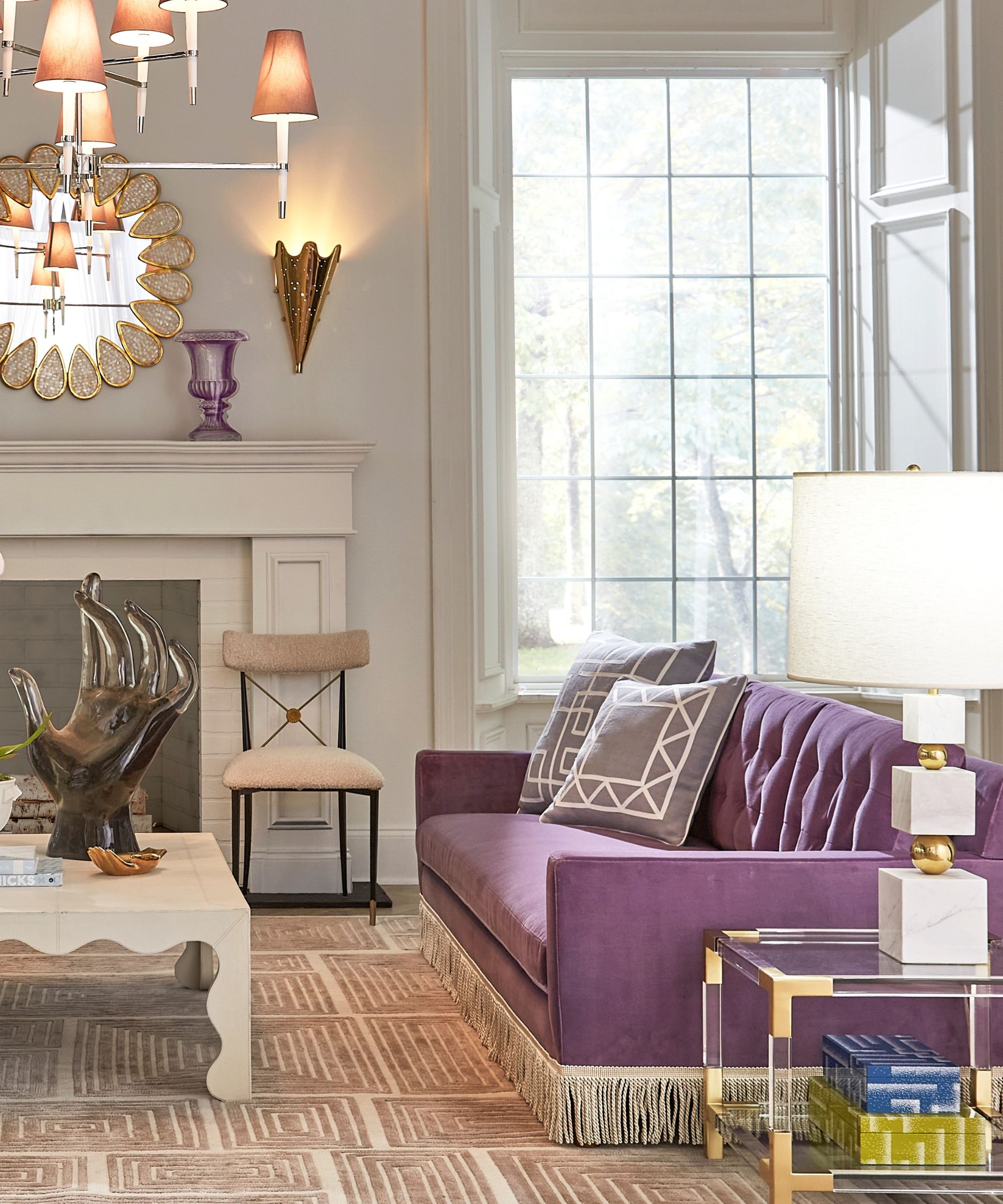
Pinching an idea from minimalist decor ideas, in this living room by potter and designer Jonathan Adler, the color palette is kept fairly neutral with an unexpected pop of lilac on the couch. The accessories, however, are where this design really shines.
'I’m a maximalist decorator and a minimalist designer' explains Jonathan. 'When I’m designing, I strive to express myself with an economy of gesture. But with interiors, I’m a maximalist who wants to be surrounded by all the people and things I love most. This hasn’t changed over the years.'
Everything feels incredibly considered in this space. The shapes all speak to one another, and the quirky nature of the decor pieces doesn't feel to overwhelmed by a riot of color. 'We like to pick a max-moment rather than decorate in a maximalist style throughout,' agrees Ginger Curtis, designer at Urbanology Designs.
3. An under-the-sea themed powder room
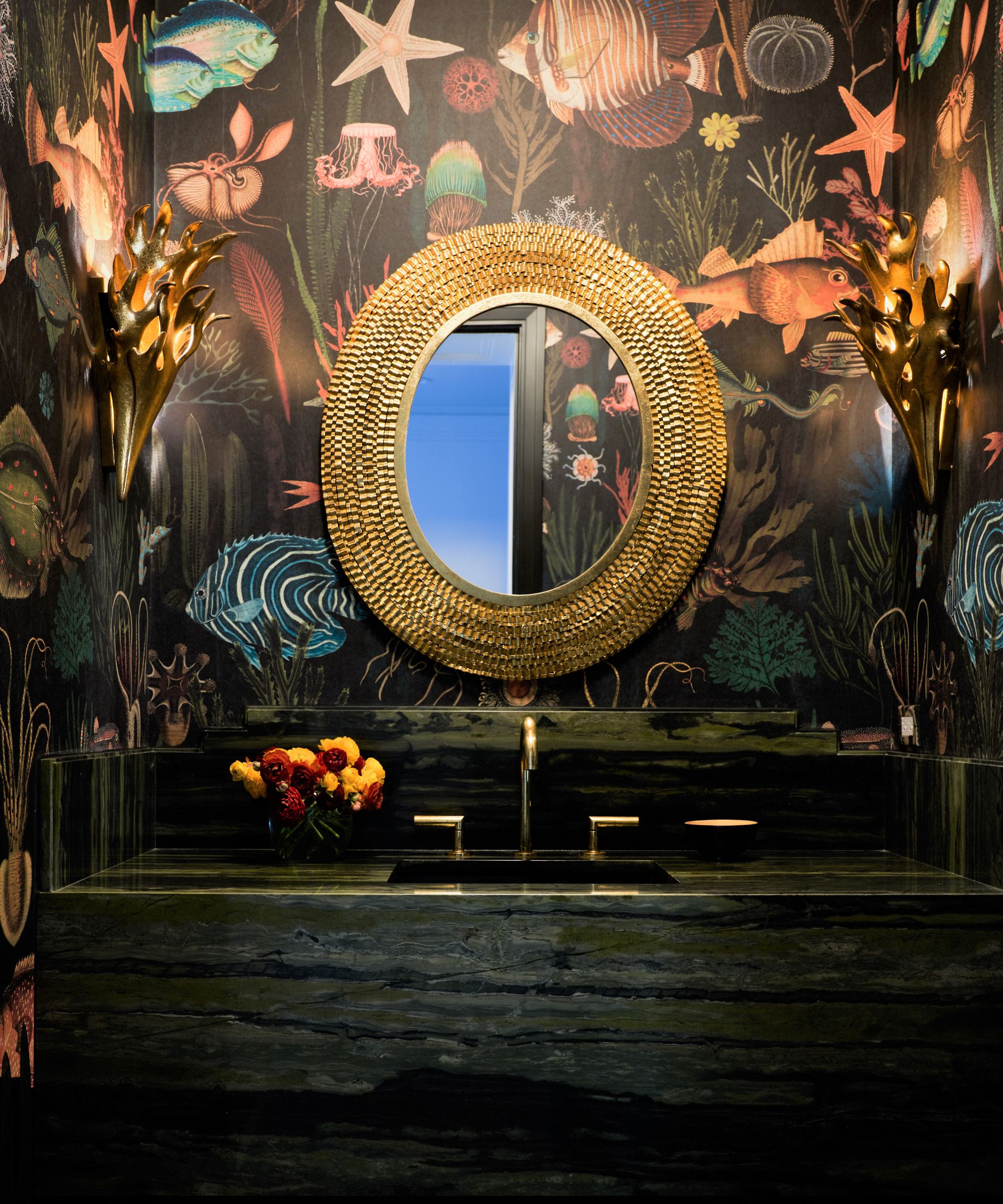
Powder rooms are one of the best ways to ease into maximalist design. In this small bathroom by Nadia Palacios Design, Nadia chose a bold wallpaper to create a wow moment in the most functional of spaces.
'A powder room in a house where “more is more” is a great opportunity to lean into maximalism,' agrees founder Nadia Palacios Lauterbach. 'Here, [above] Mind the Gap’s undersea wallpaper is paired with verdant Brazilian marble, a Kravet mirror, and gold sconces to create an immersive experience.'
While it benefits from the vibrant pattern in the wallpaper, the color scheme is quite dark and enveloping so Nadia's clever use of reflective metallic surfaces works wonders in bouncing light around the bijou space.
4. Mismatched furniture and a daring ceiling in this dining space
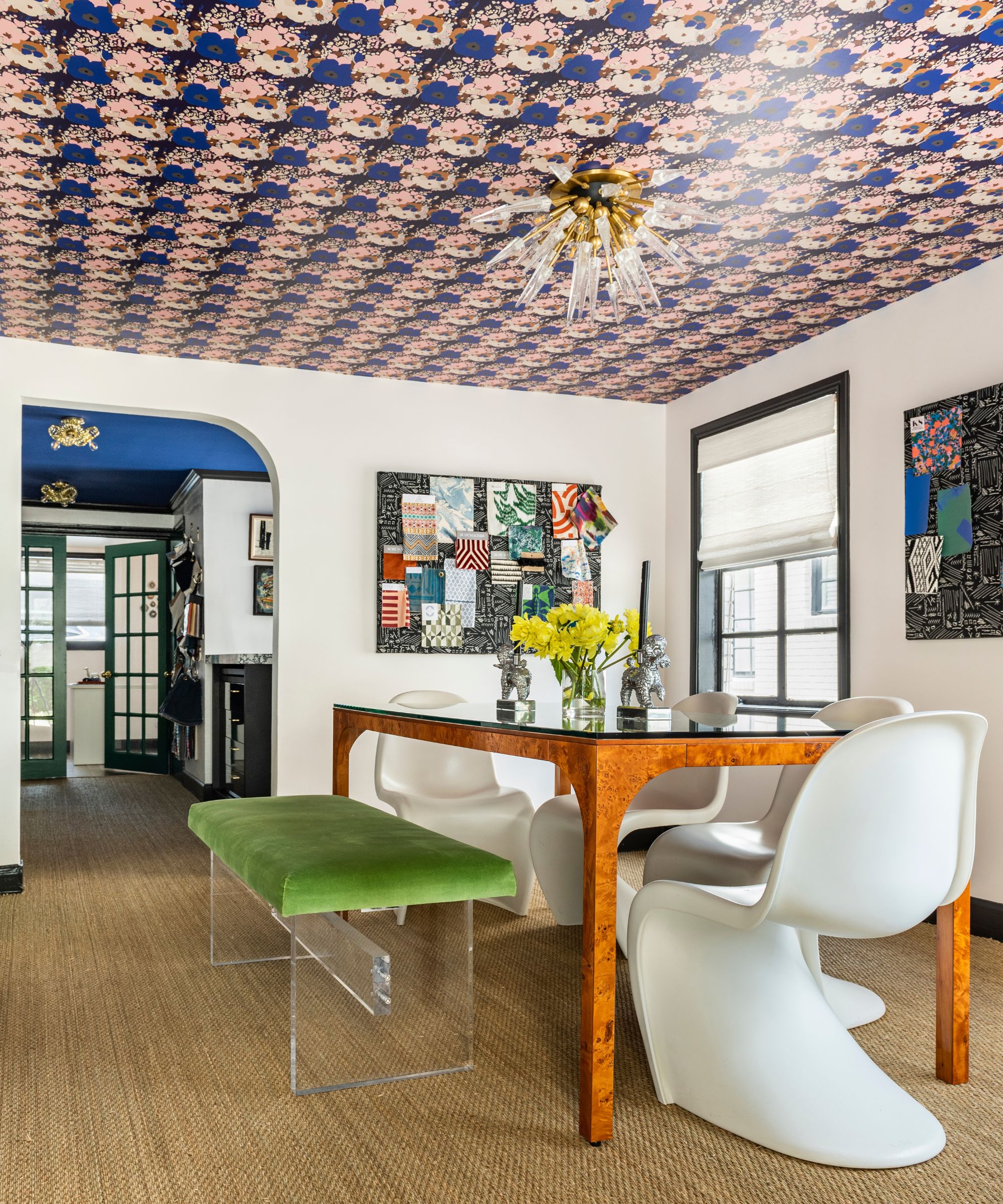
By now you'll be well-versed in the offering of wallpaper ideas out there. But, have you ever considered an accent ceiling? In this vibrant project, you can see not one but two statement ceilings using paper and paint ideas.
'Maximalism is about showcasing color, texture, pattern, and what you love as a homeowner,' advises Emily Spanos of Emily June Designs. 'Thinking in terms of layers when designing a room with a “more is more” feel allows the space to feel harmonious, eclectic, and deep while avoiding feelings of clutter and overwhelm.'
'A unified color palette helps bring cohesion to a mish-mash of furniture styles, textures, and even patterns,' she adds.
5. Maximalist art meets a soft color palette
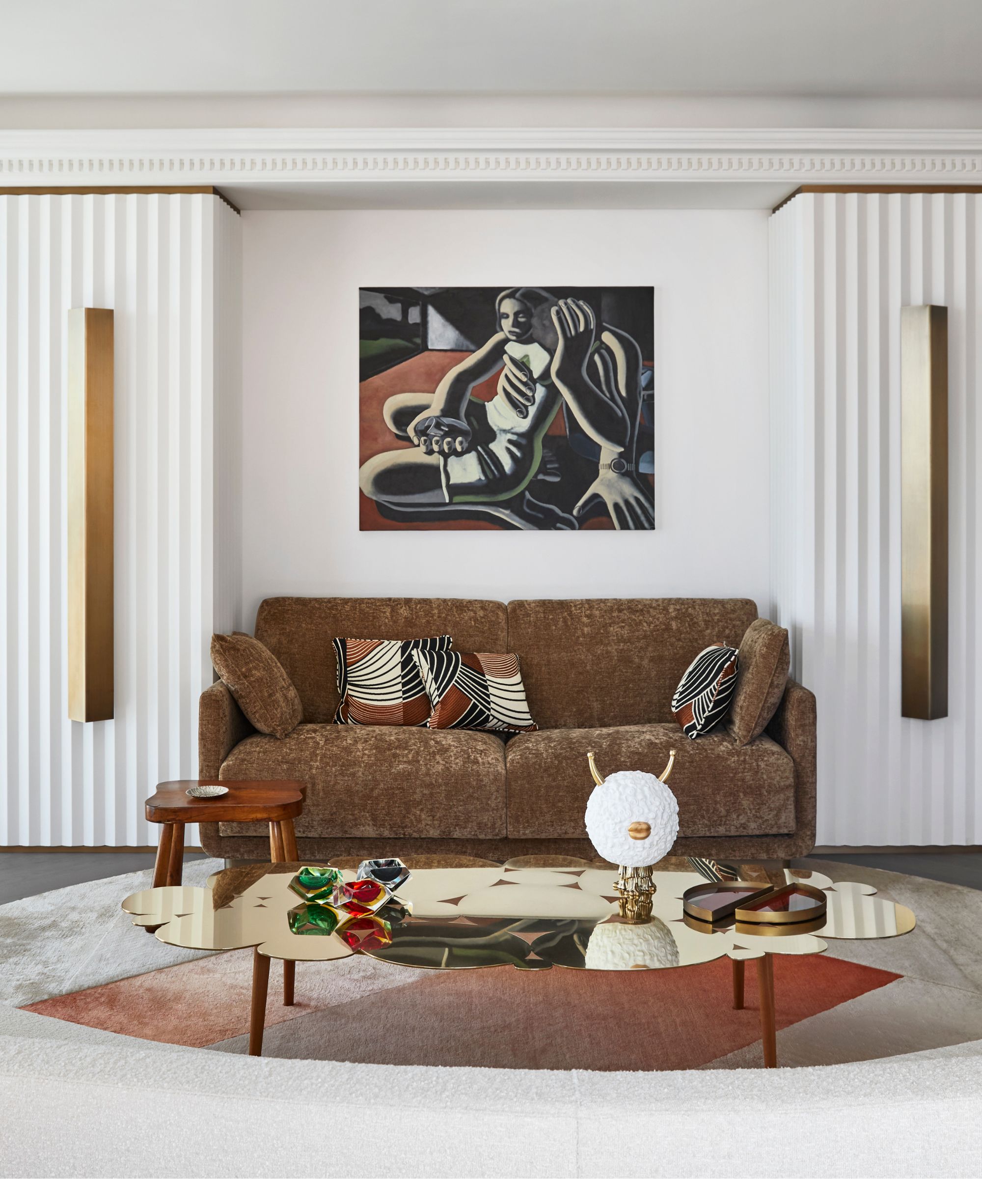
Color trends are all well and good, but if you already have a vibrant collection of art and oddities, sometimes bright white is the better choice. Particularly when used with 3D textures like molding and paneling to still bring a sense of depth.
'When delving into maximalist design, it’s essential to strike a balance between bold statement pieces and subtle design elements,' advises Christoph Poyet and Emil Humbert, founders of Humbert & Poyet and creators of the space above. 'Maximalism is all about curated abundance, where each element contributes to the overall narrative of the space.'
'For this project, we harmonized the daring sculptures of the client’s collection with a soft and neutral palette, integrating custom finishes, new patterns, and moldings to highlight the artworks while maintaining a sophisticated mood,' they explain. 'For example, in the living room, we created a freestanding shelving unit in front of the windows to display the owner’s eclectic collection of smaller sculptural pieces while allowing natural light to pass into the space.'
6. A monochrome scheme still manages to be bold

Maximalism isn't always about pops of color and shiny, contemporary spaces. Here, in this transitional living room, designer Aline Asmar d'Amman founder of Culture in Architecture pared the original features of this decadent space (note that marble fire surround) with statement modern art, like a 3D wave, and decorating with antiques. The color palette, however, remains totally monochromatic.
'For me, designing a house is about embracing the celebration of life, love, and diversity,' explains Aline. 'It’s about intertwining old soul with contemporary creativity, infusing every room with a sense of freedom and emotional connection.'
'From layering textures, colors, and patterns to incorporating statement pieces and cherished heirlooms that speak to you, it’s the unexpected combinations that create richness and depth,' she adds. 'More importantly, it is the balance between all those elements and the curation with intention that contributes to the overall harmony of the design.'
7. Art takes center stage in this apartment
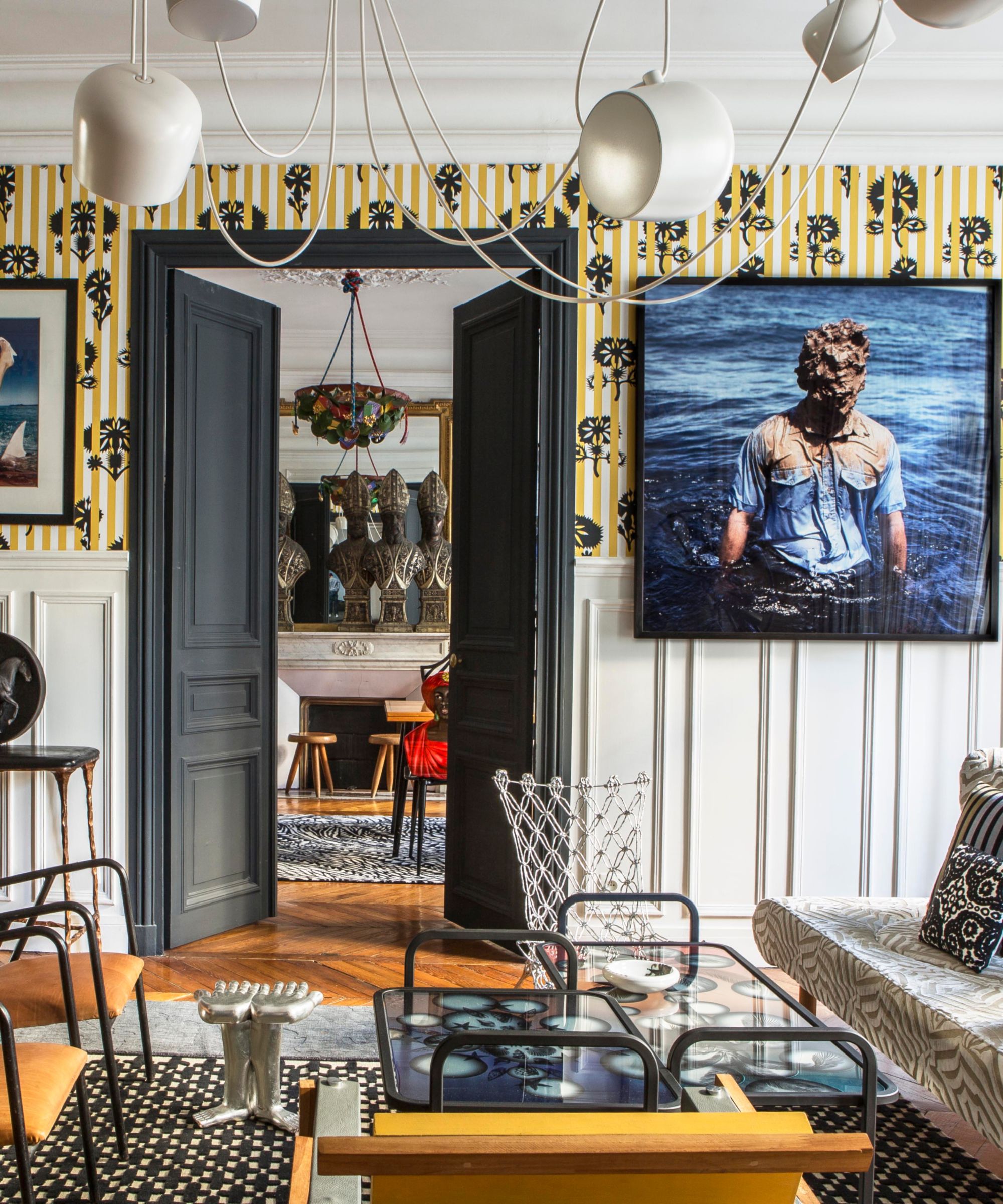
You may have realized by now, but it is clear that the most impressive maximalist rooms include a great collection of art and artifacts. In this apartment, by designer Sacha Walckhoff, you can hardly find a wall that isn't adorned with statement art, sculptures, or decadent wallpaper.
'The “more is more” approach for me is the vibrant fusion of art and design, where every element competes for attention yet harmonizes perfectly in the scheme,' says Sacha. 'Whether it’s integrating bold sculptures or mixing styles from different eras, the challenge lies in creating cohesion amidst the chaos. Just as I seamlessly incorporate historical ceramics alongside contemporary masterpieces, I strive to find equilibrium amidst the merge of styles and influences.'
Combine collected art – of both new and old – and curate a gallery wall with family photos, children's artwork, prints, memories, or even framed clippings of fabric or wallpaper. You can then ever choose to let the art suggest your color scheme, or work totally against it and pair with unexpected, rebellious hues.
The most important thing is to be true to yourself and your vision. Maximalism isn't just about creating beautiful surroundings, but about embracing life with open arms and filling our homes with the things that bring us joy like art, color, curated antiques, or more modern oddities. And pulling them all together to create a harmonious home. As Iris Apfel, famously said, "More is more, and less is a bore."
Sign up to the Homes & Gardens newsletter
Design expertise in your inbox – from inspiring decorating ideas and beautiful celebrity homes to practical gardening advice and shopping round-ups.

Charlotte is the style and trends editor at Homes and Gardens and has been with the team since Christmas 2023. Following a 5 year career in Fashion, she has worked at many women's glossy magazines including Grazia, Stylist, and Hello!, and as Interiors Editor for British heritage department store Liberty. Her role at H&G fuses her love of style with her passion for interior design, and she is currently undergoing her second home renovation - you can follow her journey over on @olbyhome
-
 This once-dated kitchen is now a timeless space with the coziest details – and its the classic color palette that's made it a chic, welcoming space
Warming colors and natural materials combine to create this enduringly classic kitchen scheme
By Molly Malsom Published
-
 How to grow crepe myrtle in pots – and transform even the smallest of yards with dazzling flowers this summer
Growing crepe myrtles in pots will inject splashes of brilliant color into your outside space
By Thomas Rutter Published
