How do you layer 7 patterns in one room? A maximalist designer just shared her simple tips
Interior designer Isabel Ladd tells H&G all about how she developed her signature style, plus shares how to pair multiple patterns for an eclectic yet cohesive design scheme
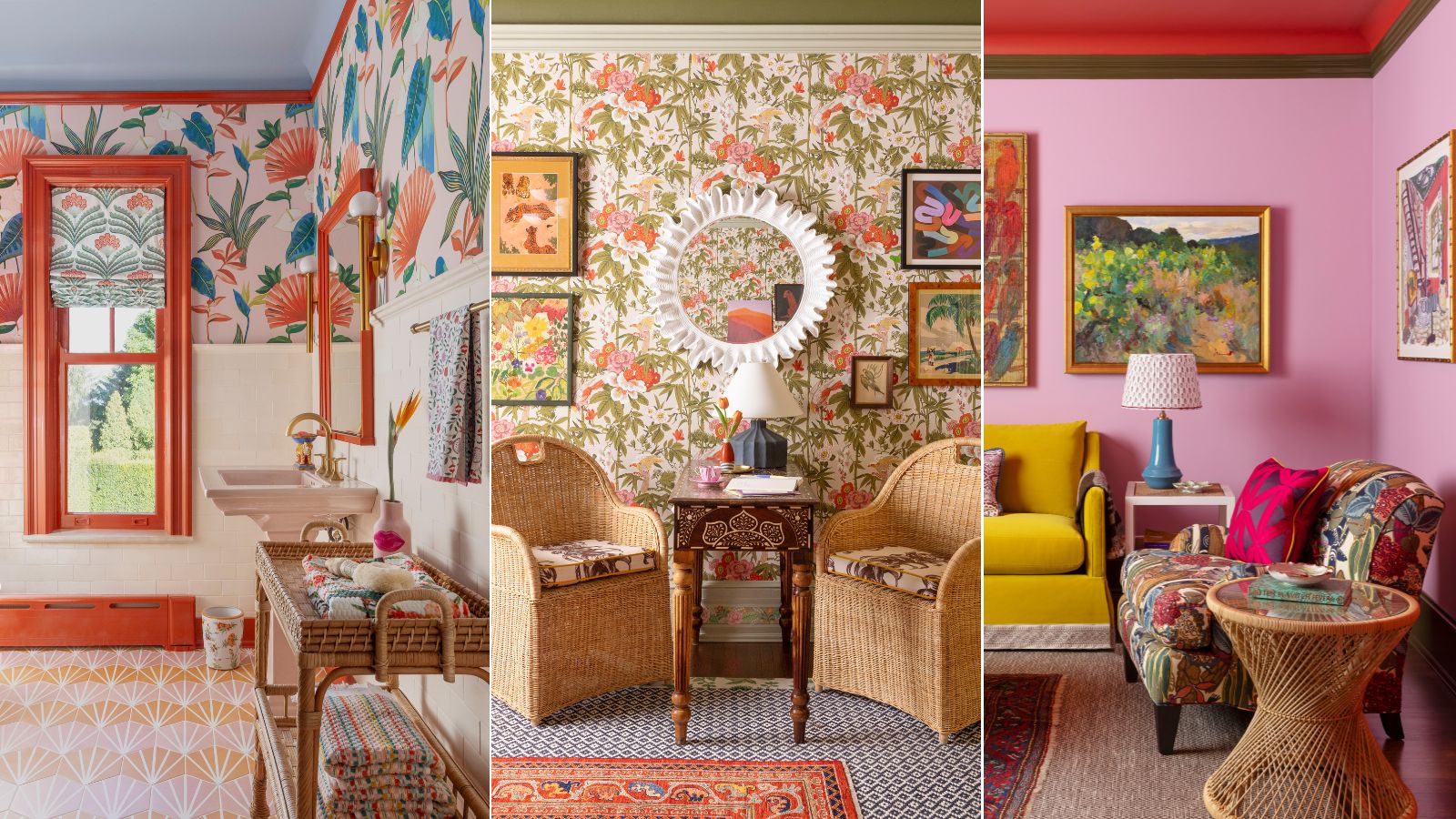

Few interior designers layer patterns as much as Isabel Ladd – the maximalist designer lives by the words 'more is more, less is a bore,' after all. Each space Isabel shares delivers on bold, bright and characterful design, and pattern is a major player. Whether working with intricate florals or eye-catching geometrics, she's a master at pairing, mixing and layering – carefully approaching the line of 'too much' without crossing.
Recently, Isabel was told that most of her designs include a total of seven unique patterns, and she realized she'd been turning to the lucky number time and time again. To hear a bit more about how she packs seven patterns into a single space, we sat down with Isabel, and she provided her expert list of pattern-mixing tips. Plus, she shared how her style's evolved over time, taking a 180-degree turn from neutral and trend-centric to eclectic and exciting. Here's all you need to know.
What's to love about pattern?
While a maximalist color palette is an integral part of Isabel's all-out style, pattern defines many of her design schemes: 'It's such a great way to express what you really like, and what mood you want to evoke – whether that's something energizing or something relaxing, whether it's something very unique and different, whether it's your favorite colors but muted. Whatever it is, you can just do so much with patterns,' Isabel tells H&G.
She mentions that one of her design philosophies is inspired by Diana Vreeland, former Vogue editor-in-chief, whose biographical documentary is titled The Eye Has to Travel. Though Isabel says the fashion icon's take on the phrase was likely a bit different, she applies the globally inspired phrase to the world of interior design.
'I like for you to walk into a room and your eye to travel around that room from one cool thing to another, to another, to another. And with different patterns, you really get that. Decorating with pattern is just so important to me for those reasons, for conveying a sense of self, or what brings you joy. And really, it evokes a mood and an idea like no other,' says Isabel.
A post shared by Isabel Ladd (@isabel_ladd_interiors)
A photo posted by on
Though Isabel's love for pattern is clear, it took someone who had been following her on Instagram for some time to point out the specific number of patterns she tends to use in her signature design schemes: seven.
'I was like, “What? That’s crazy. Nuh-uh.” And he said, “Yes, start counting them.” So I did just that, and it’s so true – seven was the closest number. I have no idea how I did that in my brain for so long. When I’m designing I don’t do it and then count the seven – it just naturally happens. So something in my brain is saying lucky number seven,' she says.
Sign up to the Homes & Gardens newsletter
Design expertise in your inbox – from inspiring decorating ideas and beautiful celebrity homes to practical gardening advice and shopping round-ups.
Though the secret formula of seven distinct patterns was entirely subconscious, she believes the combination's success has something to do with odd numbers: 'I love working in odd numbers,' she says.
While designers often look to the rule of three to inform their processes, Isabel says that 'as a maximalist,' three just doesn't cut it. She says she often hears that a solid design formula includes a floral, a stripe and a geometric pattern, but she's not quite sold on stopping there.
'If it had been three, that’s too low. That’s just a floral, a stripe and a geometric, and that’s not me... I would never do that little. But then five, maybe that’s a little bit more regular maximalist, but I’m not a regular maximalist. So seven feels good,' she says.
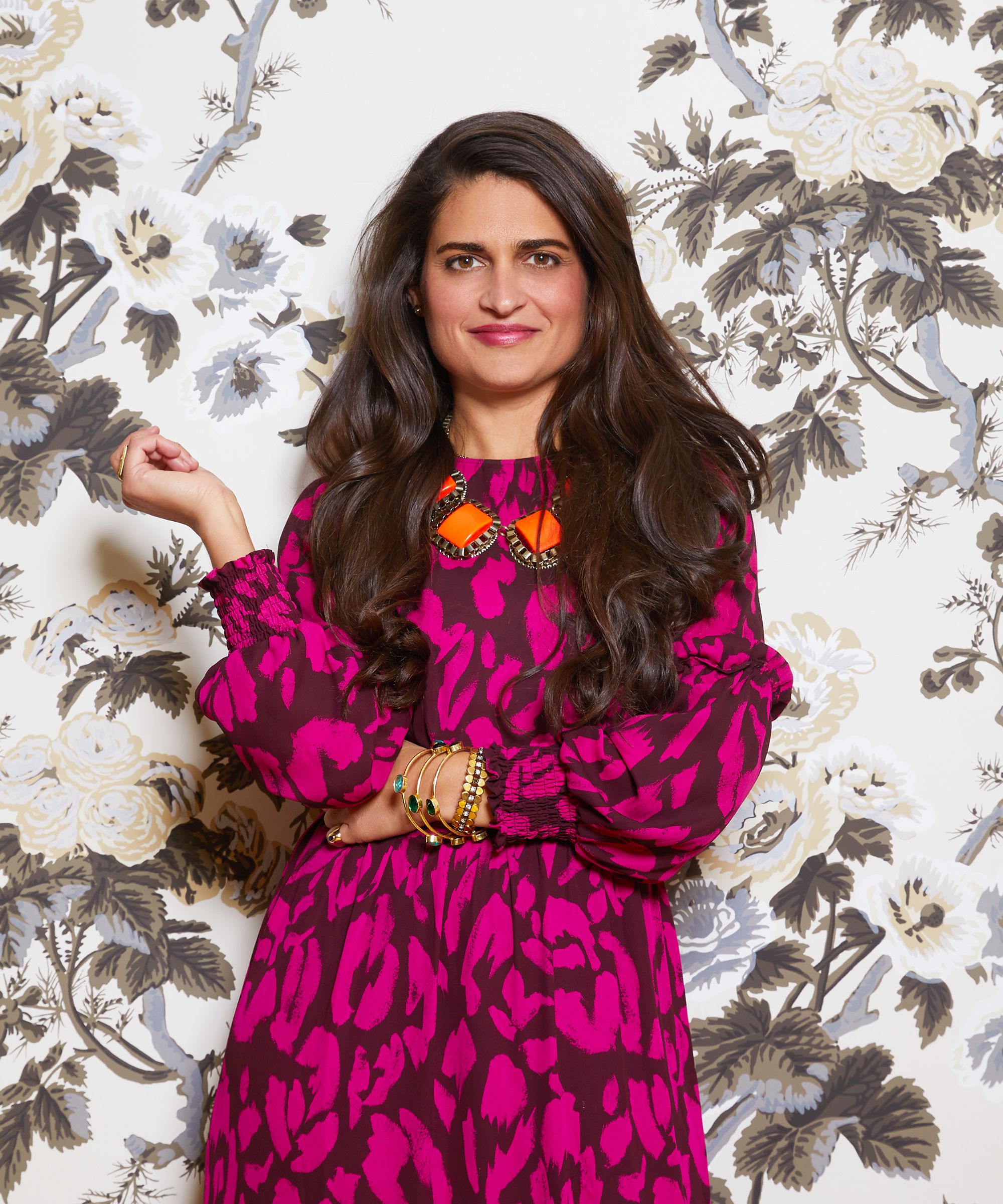
Isabel Ladd is a self-proclaimed maximalist interior designer who lives by the words 'more is more, less is a bore' and 'beige is NOT a color.' She is the founder and principal designer of Lexington, Kentucky-based Isabel Ladd Interiors.
How to layer seven patterns, all at once
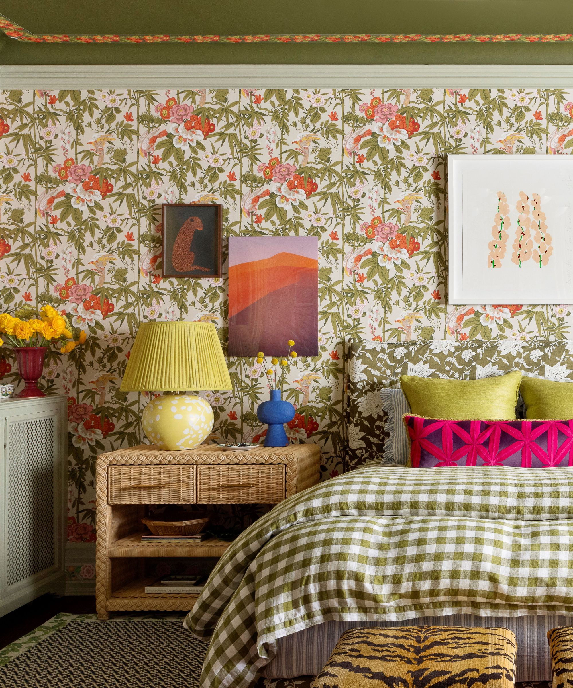
Layering pattern comes quite naturally to Isabel, but the process of mixing and matching bold designs can feel intimidating to others. Luckily, she shared her top tips for putting patterns together that'll ease even the most pattern-skeptical through the process.
Isabel shares that her pattern play is aided in large part by a 'giant library of fabrics and wallpapers,' so she's not going in with a blank slate every time, but adds that turning to the internet for inspiration can be an accessible way in. Her first tip has to do with the scale of the patterns she picks out.
'I love having one giant, really big piece – a really big hero moment. Then other patterns will be denser in scale,' she says. No matter where you're starting, pick out one true statement piece that you'd like to define the entire space. Let that pattern shine, then layer in the slightly more pared-back picks.
You won't have to sacrifice on color and design in this process – you're simply aiming to let the 'hero moment' have its time. 'When you've got something with a really big scale like a floral, do something else with a smaller scale,' she adds.
'Tip number two is to consider negative space. Some patterns are going to be denser, and they need to pair up with other patterns that have negative space in the background. There’s still an image, and there’s still a pattern, but there’s negative space in the background,' Isabel says. Along with scale, this tip allows your central pattern to take center stage and helps avoid visual clutter despite the presence of multiple intricate patterns.
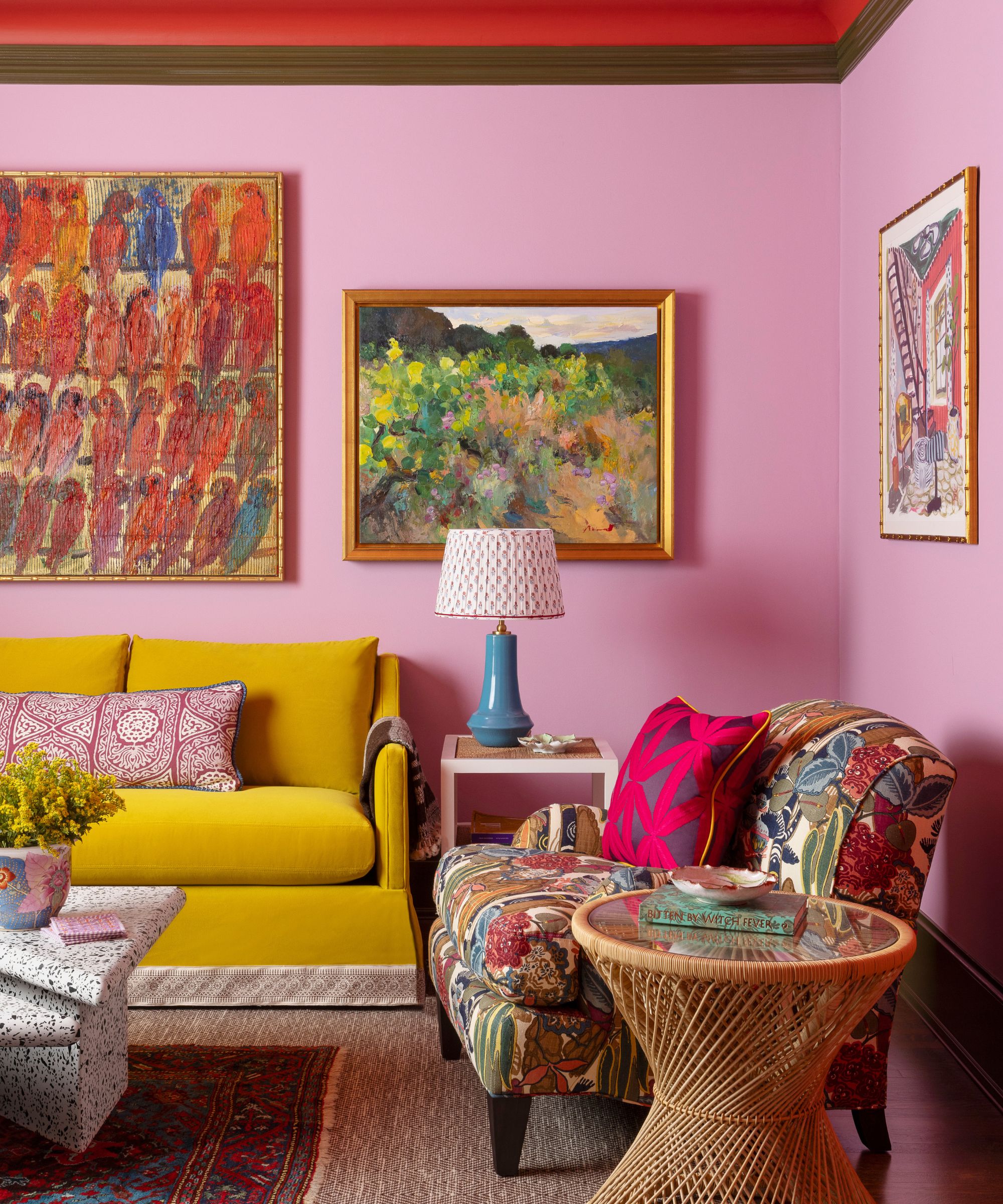
She suggests going for a 'very cool' geometric pattern that stands on its own (so not a basic stripe or plaid, she clarifies). And though it might come as a surprise that Isabel favors a neutral once in a while, she does include them in her designs – her definition of a neutral just looks a bit different than most.
'Sometimes that can be a deep indigo tie dye or something that just doesn’t have a repeating pattern but there’s still a lot of interest to it. And I love an indigo tie dye or Batik – I love bringing in that global element,' she says.
Instead of the classic combination of decorating with black and white, a pattern staple in many design schemes, Isabel suggests opting for a brown and white pair: 'Brown and white to me is just warmer, and not as sharp as black and white. When layering all of these patterns, I think that's important. This is not the case for every instance – there’s going to be an instance where I do a black and white – but overall, I like brown and white.' This combination softens your space, and allows other patterns to do the heavy lifting when it comes to contrast.
If you've decided to follow in Isabel's footsteps and inject some pattern into your space, you may be wondering where to start – and with so many possibilities, we don't blame you. Isabel says that in her designs, more often than not, these three places will be drenched in pattern: lampshades, curtains and the wallpaper.
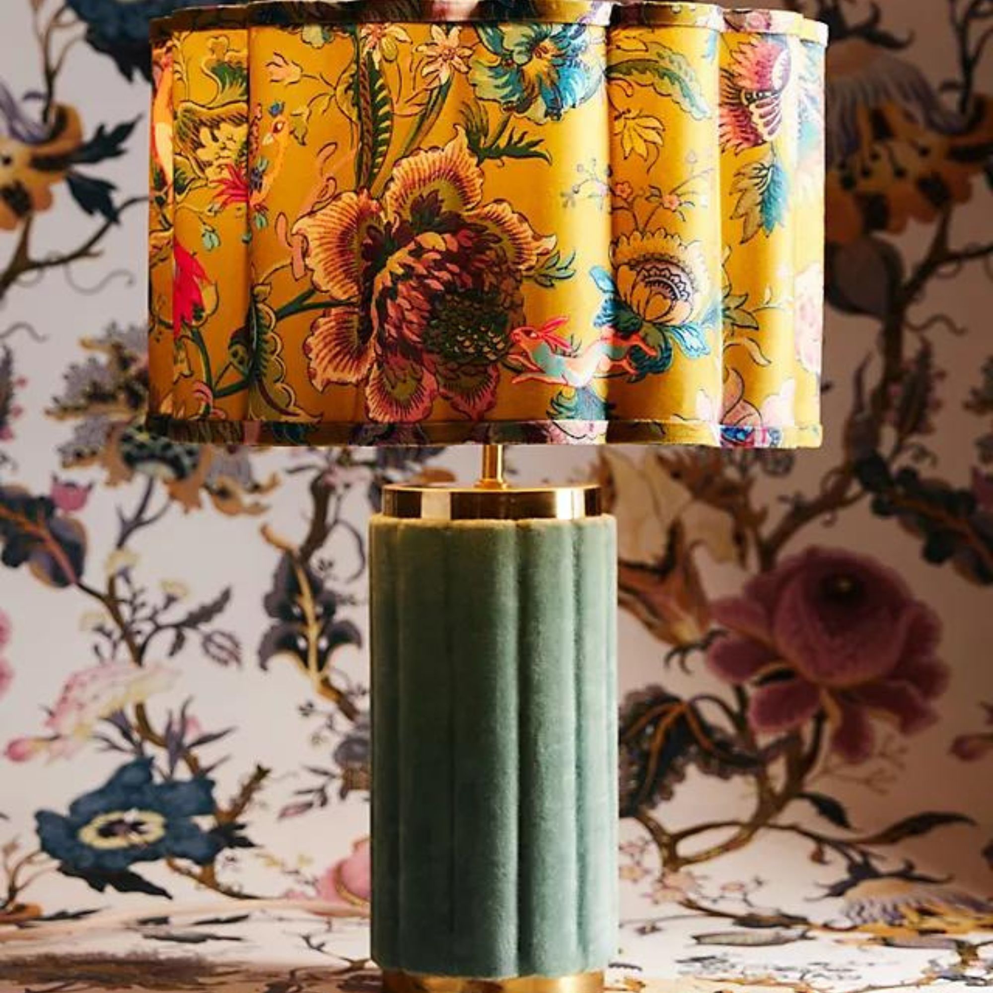
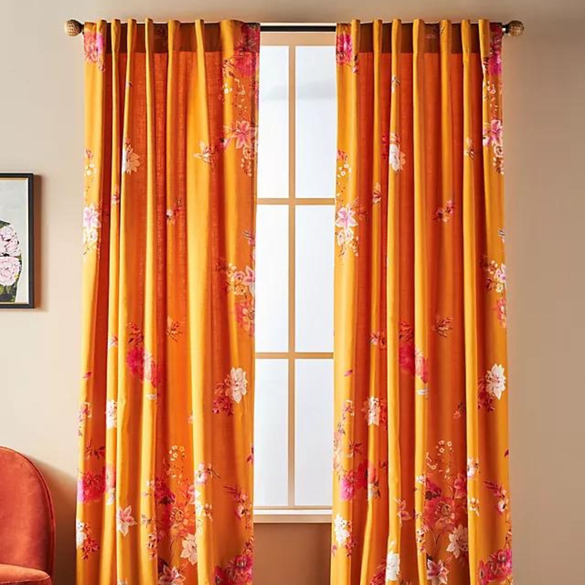
'I love incorporating a patterned lampshade. Oftentimes those will be either marbled paper or they’ll be a gathered fabric, so you’re not seeing that pattern dead-on... I sometimes put my busiest print on the curtains because it’s going to be gathered. Don’t ‘waste’ a solid or a stripe or something like that on a curtain – put a really busy fabric on the curtain, because it’s just going to be gathered,' she tells H&G.
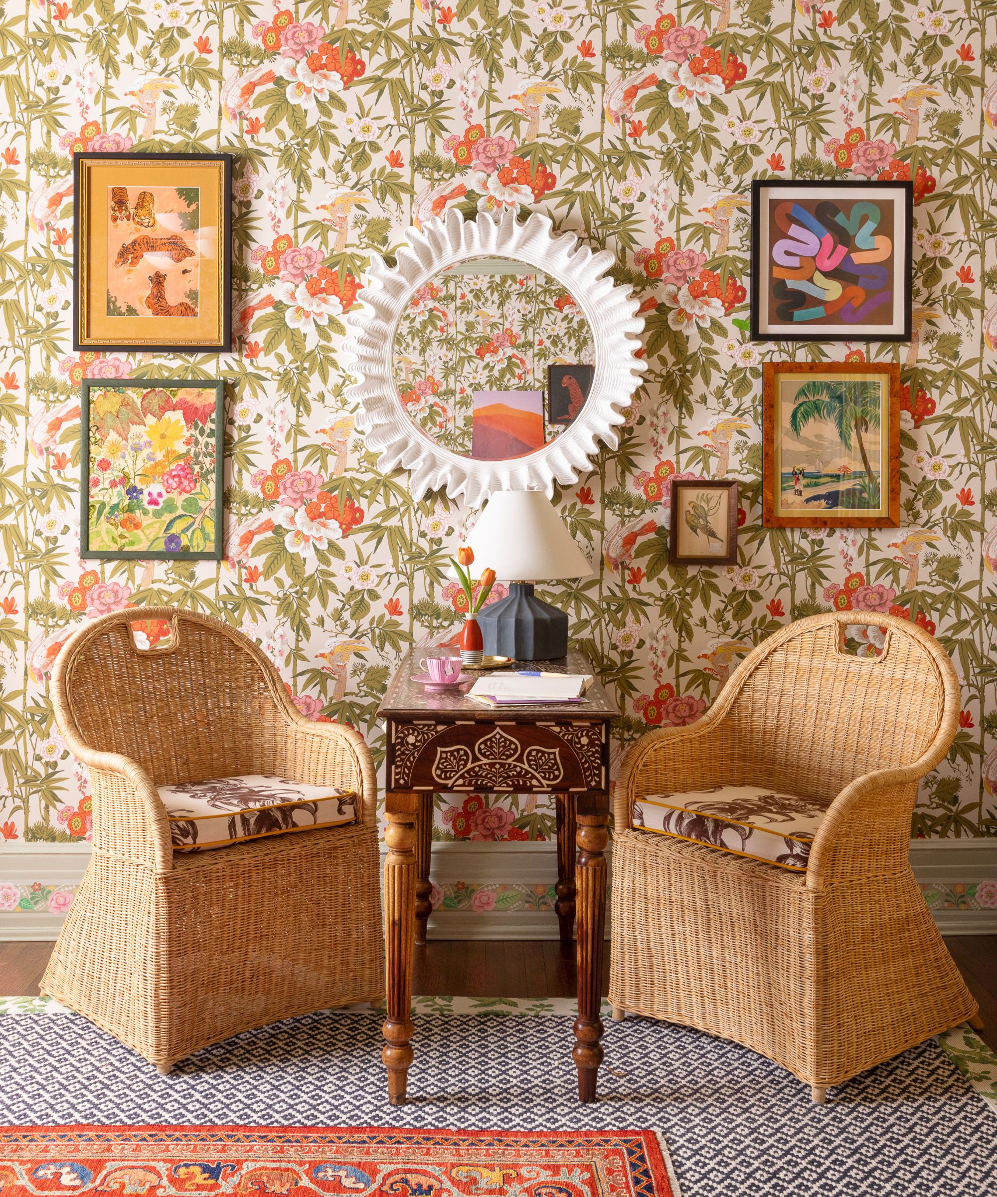
But where's the absolute best place to put pattern? 'Number one, above all else, would be wallpaper,' she says. Isabel adds that patterned wallpaper is 'confident and direct' – 'nothing in my opinion makes a room better,' she adds. 'And I make it loud.'
How to break out of your design comfort zone

Sometimes, Isabel's faced with clients who need a little nudge to go all-out with color and pattern in their own homes – even if they're familiar with her work. She says people face indecision, and worry that they'll grow sick of the bold wallpaper or bright design accessories she introduces to their space over time.
'To that, I say I hope your style does change in a few years. Because design shouldn’t ever be done. It should be an evolution, a reflection of how you’re evolving and how your style changes,' says Isabel.
You have to design your house for it to be a reflection of you right now. What brings you joy right now? Because who you are now is going to be different than who you are in 10 years, is going to be different than you are in 10 years. I think it’s just so much more interesting when you do evolve, when you do discover something new, and you can change,' she continues.
As it turns out, Isabel has a bit of personal experience with this as well. Believe it or not, she wasn't always into maximalism – as little as 10 years ago, Isabel shares that she 'was scared of color.' She originally designed her home so it would be attractive to potential buyers down the line. Now, she says that was 'the craziest way to think.'
'I wasn’t scared of color for my own sake – I was scared of color for other people’s sakes. So I did a white kitchen with white walls with a plain runner on my stairs, and I was decorating with what was trendy and what other people like,' she shares.
After some time, Isabel decided that ultimately, sticking to the trends wasn't a reflection of her and her personality – let alone a reflection of what makes her happy. She says she took 'baby steps' to remedy the situation. Starting by wallpapering the kitchen ceiling and walls, then painting the cabinetry in a stunning marigold shade, she's transformed her kitchen into her beautiful, authentic signature style over the years.
'I have evolved in 10 years and I’m going to keep on evolving, and I want my house to reflect my style evolution and what brings me joy at this moment. Because by God, I hope I keep evolving ... You have to make it yours, to be a reflection of you and what brings you joy. It would be a miserable way to life if not, if you’re thinking about other people or hypothetical other people coming into your private space,' she says.
When people ask Isabel how she achieves such successful maximalist designs time and time again, she's sure to tell them 'there's just not any scientific method.' Though her tips will come in handy when layering patterns and crafting a design scheme, the most important part is trusting your gut.
'I just keep experimenting ... and I just keep going until it feels right. It’s just so instinctual when to keep going and when to be like, “I’m done, this is it.”
If you're now feeling pumped about pattern, you're not alone. Embracing exciting colors, shapes and designs opens up a whole new world of design possibilities. And with these tried-and-true tips from a maximalist pro, you're more than ready to embark on a pattern mixing journey of your own.

Abby was the Interior Design News Editor at Homes & Gardens and is now studying for her Master's degree in Journalism at City University, London. Prior to joining our team, she worked with Better Homes & Gardens, where she wrote and edited content about home decor, gardening tips, food news, and more. She studied Journalism and English Literature at New York University and moved to London to pursue her love of writing in 2023.
-
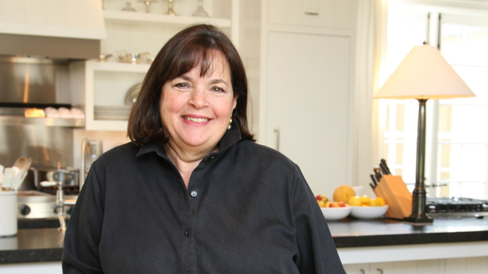 Ina Garten's storage pantry is an insightful window into all of the best cookware used by the chef – and it's easy to recreate on your kitchen shelves from $48
The beautiful dishware in The Barefoot Contessa's Hamptons pantry showcases the tools she uses most often to cook – this is exactly how you replicate it
By Sophie Edwards Published
-
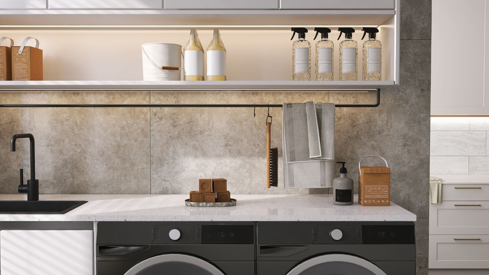 Extend the lifespan of your appliance with 5 simple but crucial washing machine maintenance tips
From cleaning the filters to keeping the door open, experts reveal the washer tips they swear by
By Andy van Terheyden Published
