Mary Kitchen's French Regency-style 60s mansion in the hills of LA is fearlessly flamboyant with
Designer Stephen Kent helped the celebrity to create her Art Deco meets Miami Beach dream home
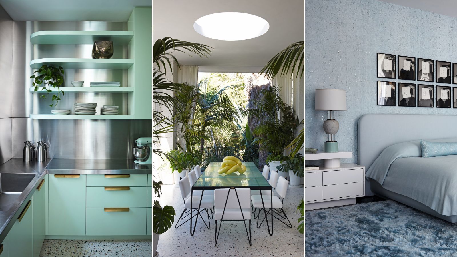
Fashion designer and Swinging Sixties icon Mary Quant once said, ‘Good taste is death; vulgarity is life.’ The owner behind the extraordinary house design of this property might well agree.
Television presenter, model, and philanthropist Mary Kitchen has little time for the tasteful properties that ripple across the hills of her Los Angeles neighborhood. She wanted a house that shouted ‘full-on fun’ rather than whispered ‘discreet good taste’, and interior designer Jamie Bush willingly obliged when invited to join her in its daringly different renovation.
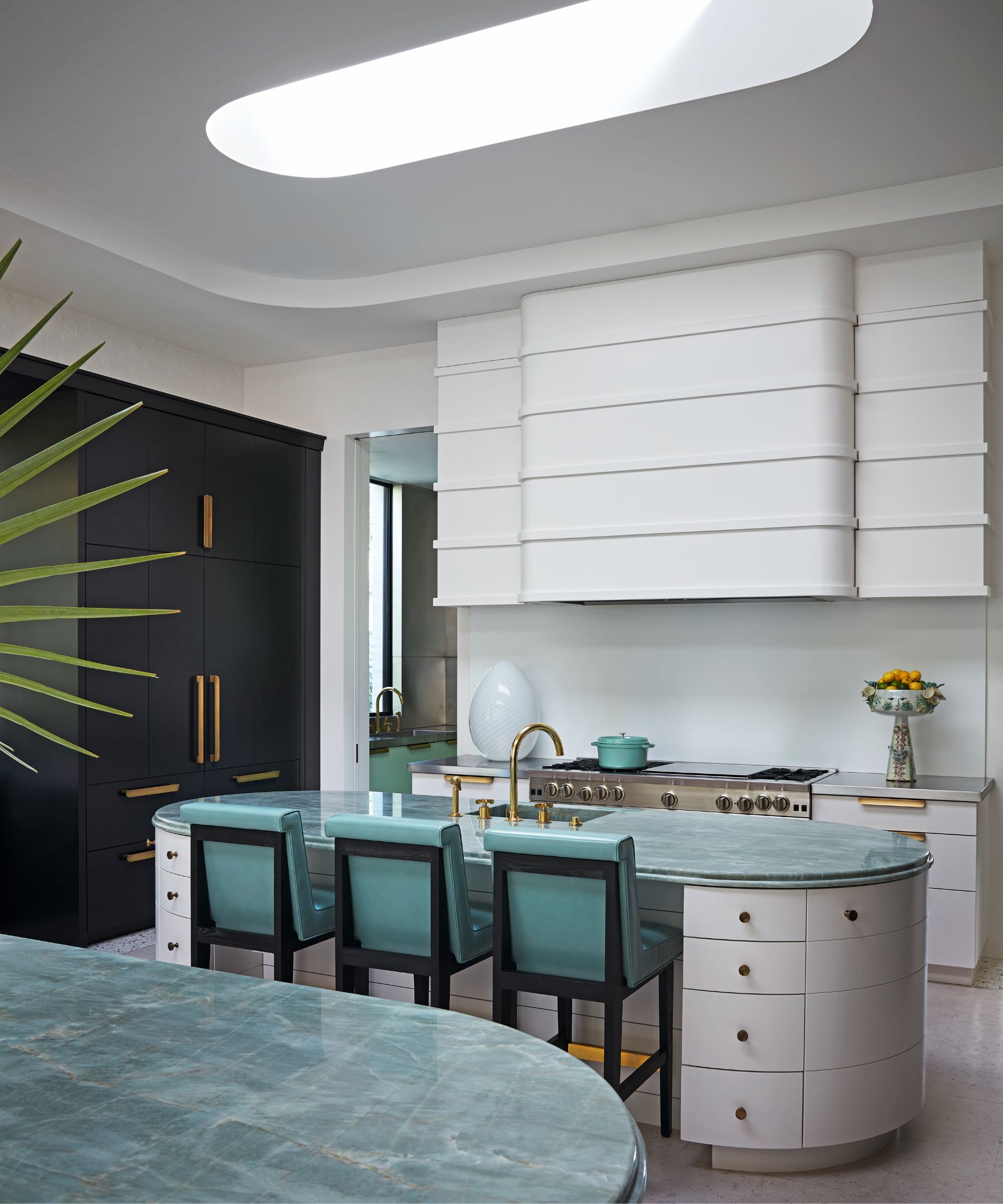
Stools, Studio Van Den Akker. Custom brass hardware, Pashupatina. Sink fittings, Waterworks. Emerald Green quartzite, Gem International.
Mary and her husband, Jonathan Orszag, bought the house from rock vocalist Adam Levine and his wife, Behati Prinsloo Levine, who had moved on mid-way through renovations, leaving it stripped almost to its bones.
Built in 1966 by noted architect, Caspar Ehmcke, the French Regency-style mansion came with grand proportions to its rooms, some of which were still adorned with vintage crystal chandeliers.
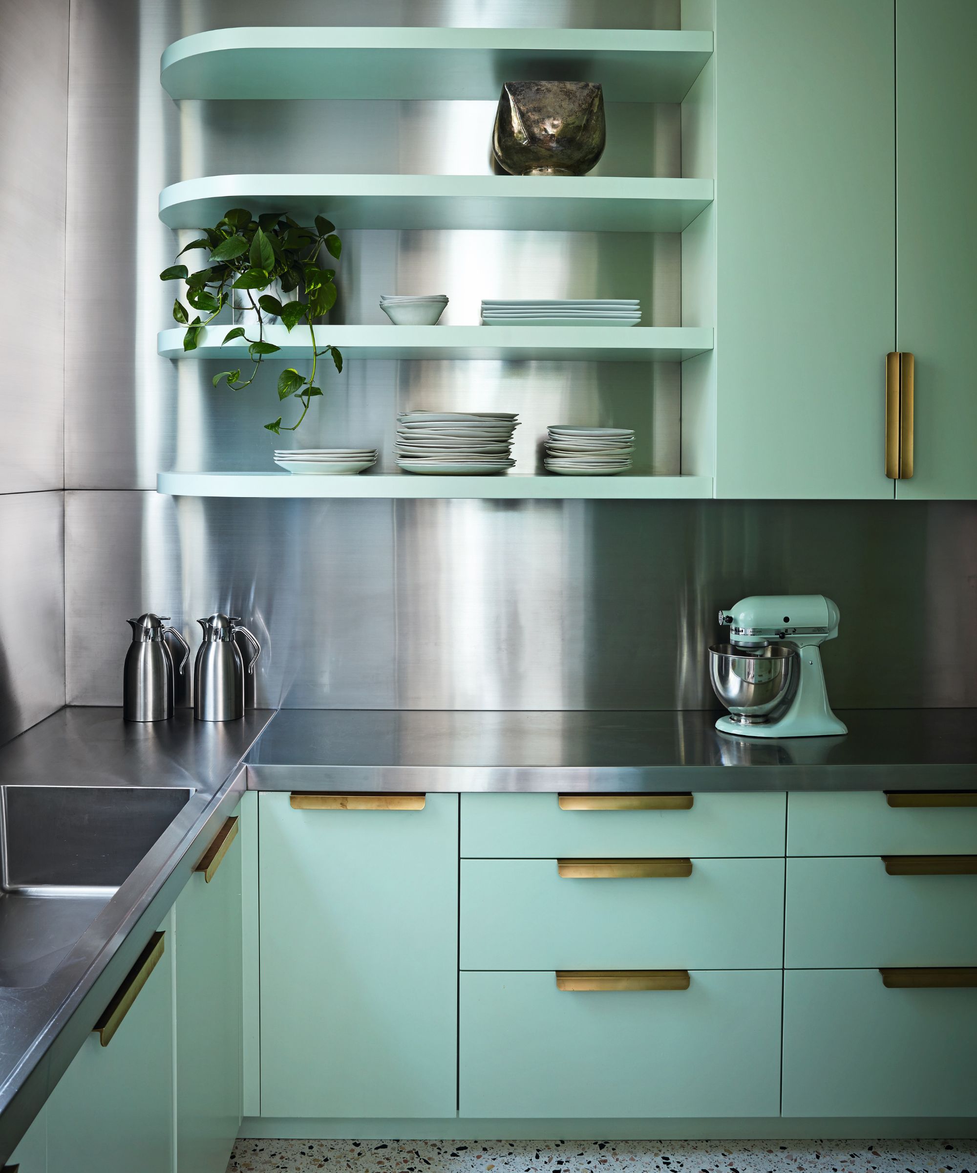
Flooring, Hermosa Terrazzo. Custom cabinetry and stainless steel surfaces, Swiss Woodworking.
Mary didn’t want to lose the original character entirely, but she was keen to bring what she calls ‘a dose of anti-establishment taste’ to the house.
To this end, architect William Hefner modernized the building by leveling its formerly pitched roof, adding modern eaves and windows, and replacing the original exterior stucco with white-painted, reclaimed brick.
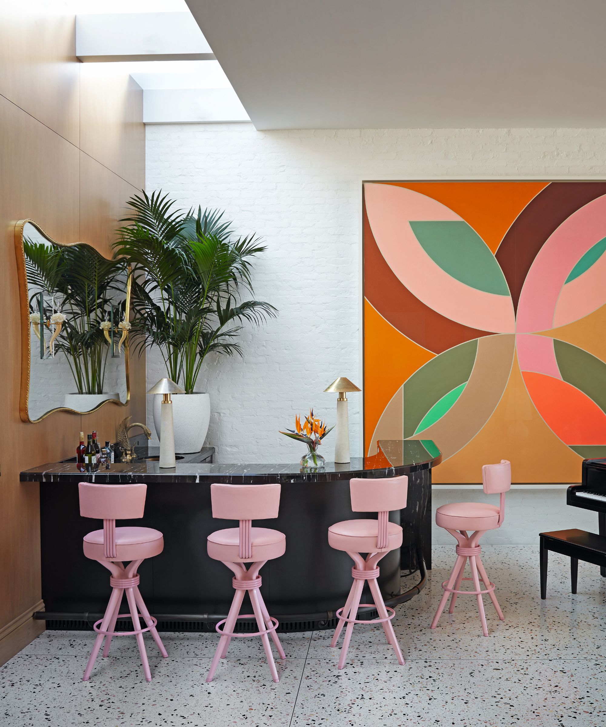
Stools in Pavoni leather, William Haines Designs. Painting by Frank Stella.
Jamie then established a melange of styles within, conjuring up a glamorous, period-throwback fantasy, where art deco elan meets Miami Beach brio via Hollywood razzle-dazzle.
‘The look is one of complete make-believe,’ explains Jamie. ‘We started from scratch, creating new versions of old aesthetics, mixing inexpensive and high-end materials.’
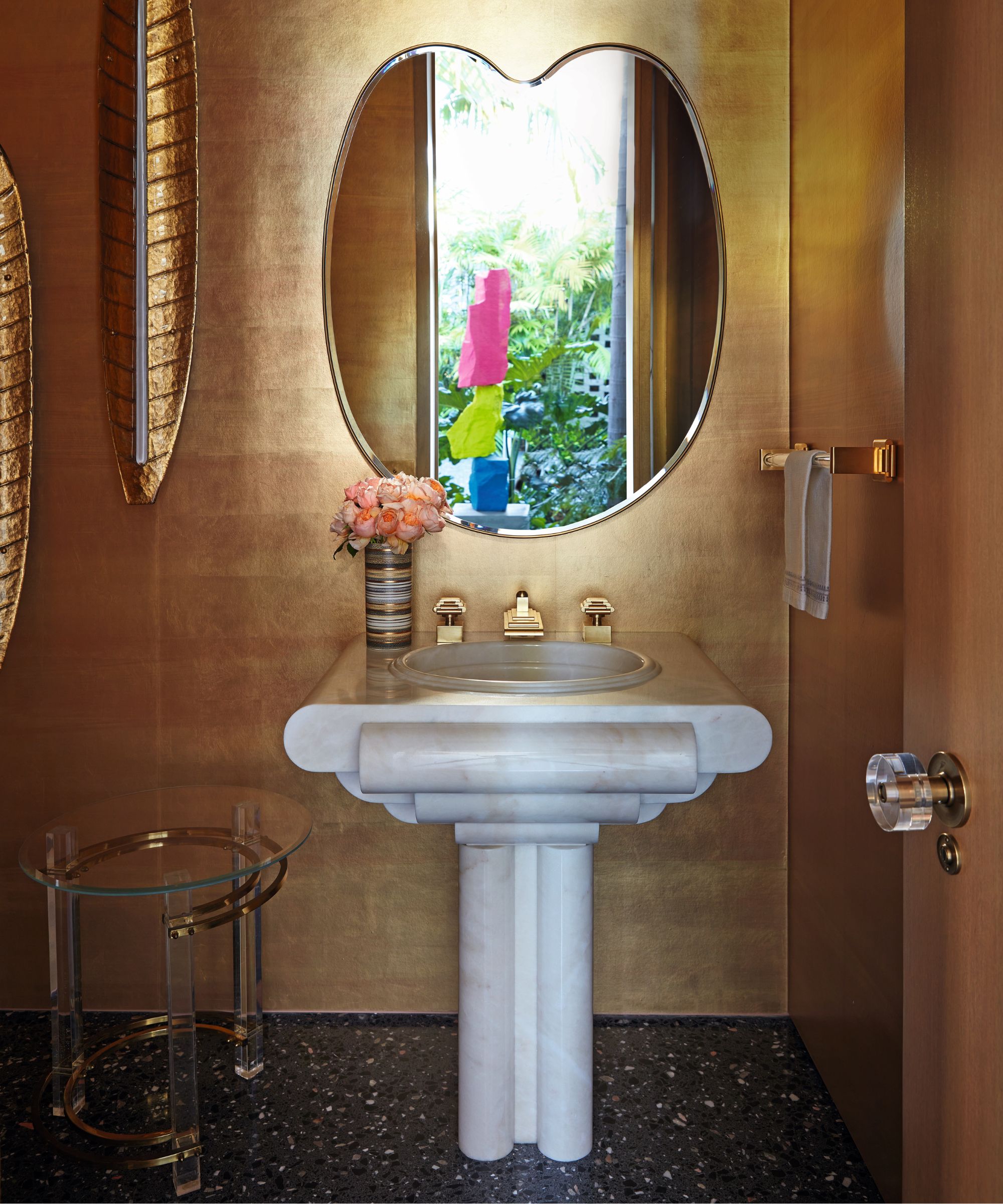
Basin and fittings by Sherle Wagner International. Wallpaper, Calico. Vintage side table by Charles Hollis Jones. Mirror, Julian Chichester.
A kaleidoscope of color envelops the new interior. The vast sitting room is a vision in shades of pink, the dining room is lilac, the main bedroom pale blue, and the kitchen/pantry is celadon green.
‘The rooms are all colourblocked, which is key to allowing the disparate elements to coexist together: to create control over the variety of things and themes from far-flung places and different eras that Mary was drawn to,’ says Jamie.
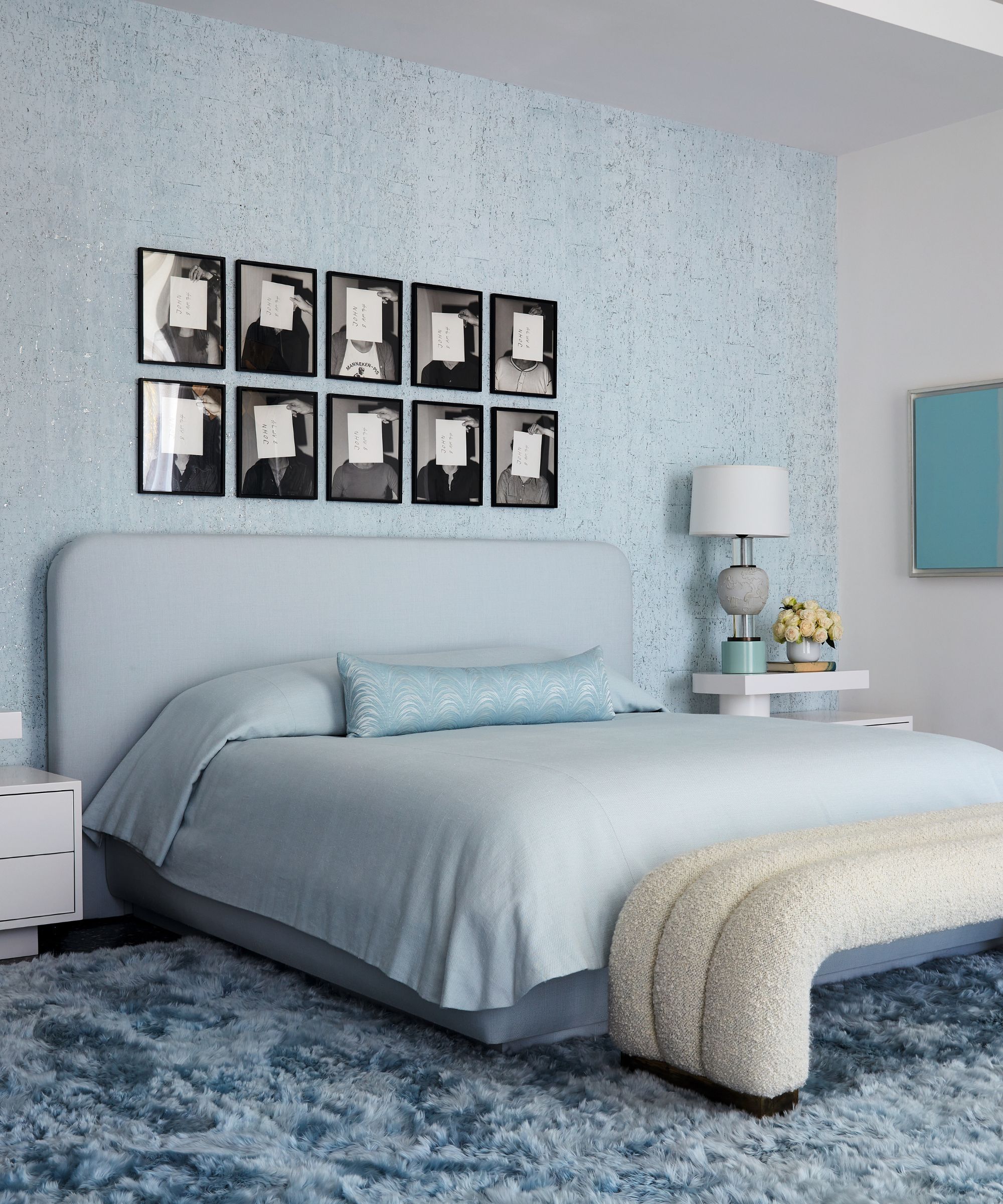
Custom bed in fabric by Pierre Frey. Vintage lamp by Williams Haines. Alpaca shearling rug, Marc Phillips. Artworks by John Baldessari.
Pattern-drenching gets a look in too, with the bedrooms of Mary’s three daughters, as well as their sleepover bunk room, wrapped, floor-to-ceiling, in fabric and wallpaper. ‘Mary loves to push the limits on taste and had a wonderful playfulness that she wanted to bring to the house’ says Jamie.
He continues, ‘With a significant art collection and bespoke furnishings used throughout, the design could have been directed in a very earnest fashion, rather than with humor and joy.’ Despite appearances to the contrary, many elements here are new but made to look whimsical and retro.
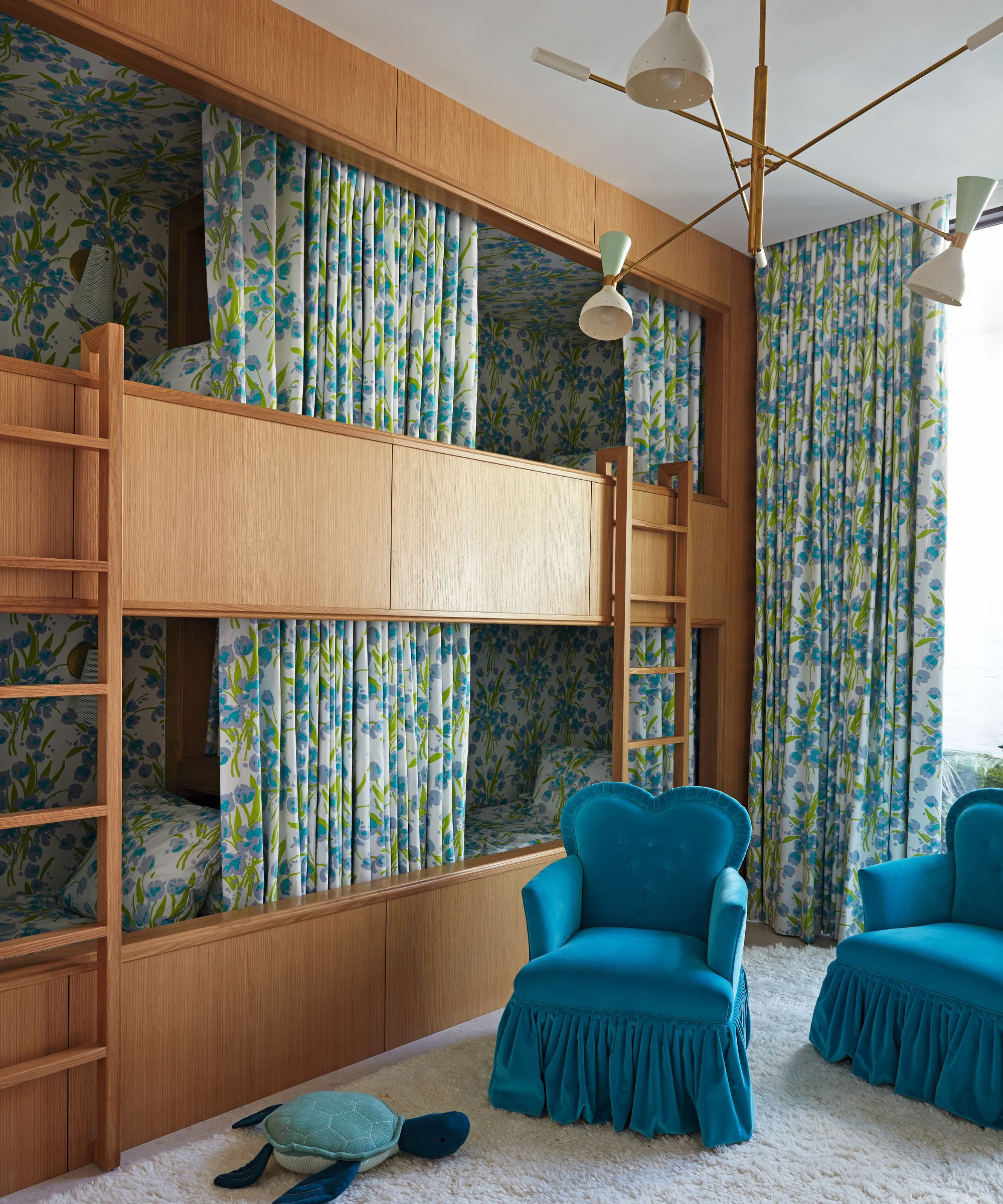
Bunk beds and curtains in a fabric by Quadrille. Pendant light, Silvio Piattelli Design. Vintage chairs in fabric by Dedar. Carpet, RH.
Jamie embraced 1950s and 60s design trends, such as Lucite hardware, Formica surfaces and paneling, antique painted brick, and even clear plastic furniture covers. ‘But it’s all put together in the most beautifully detailed way,’ he says.
The preserved Waterford Crystal chandeliers and the 19th-century Gustavian furnishings more than happily rub shoulders with the fake fur chairs by Edra and the hot-pink leather bar stools.
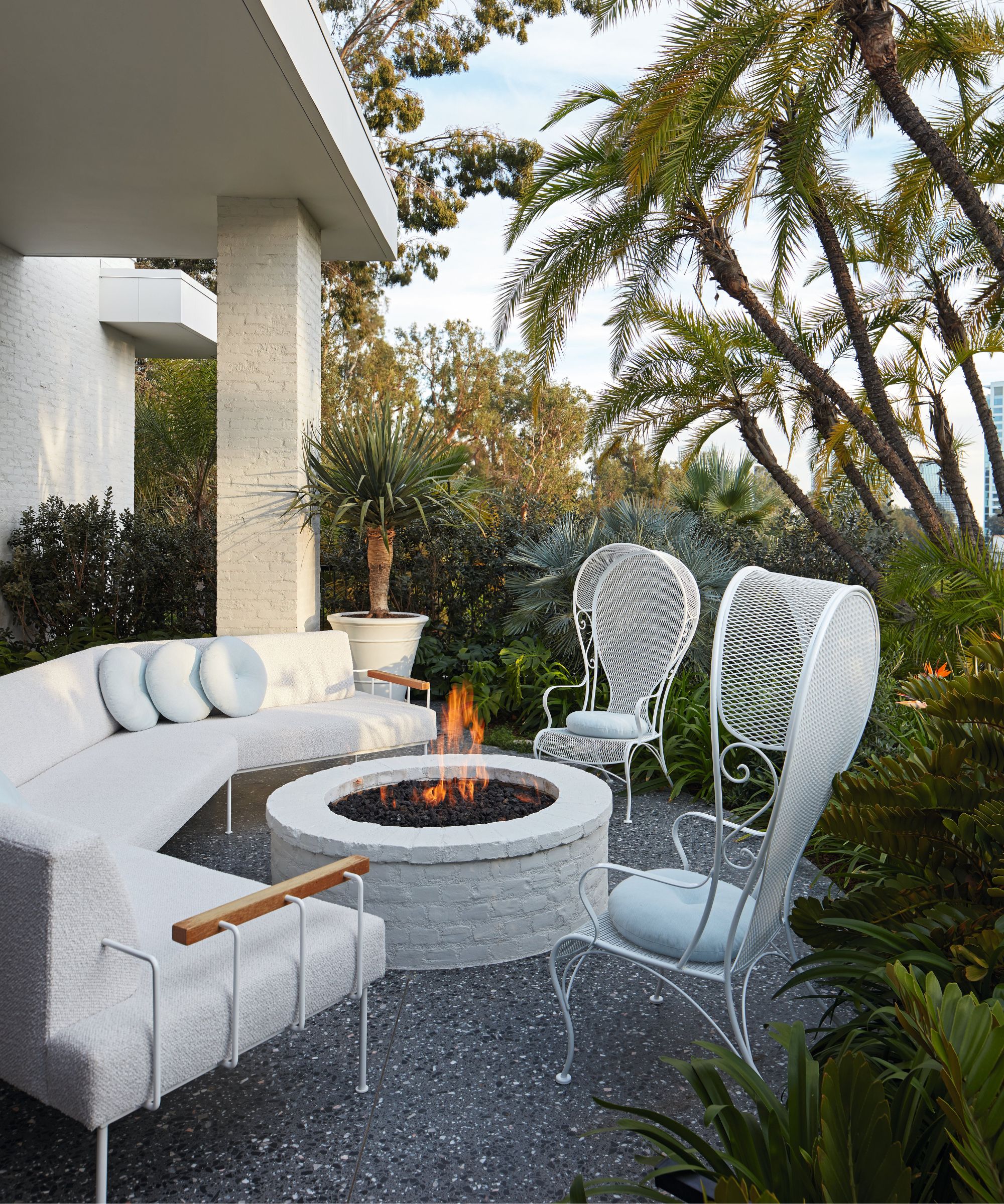
Custom sofa, Brambila’s Draperies; in fabric by Perennials. Vintage Russell Woodard wingback patio chairs.
'I love the fact that Mary embraced the concept of mixing old-school traditional furnishings and fabrics with important mid-century pieces, and all kinds of fabulous contemporary and kitsch ones too,’ says Jamie.
‘Mary pursued her vision in the most audacious way. Most people simply wouldn’t have the chutzpah!’
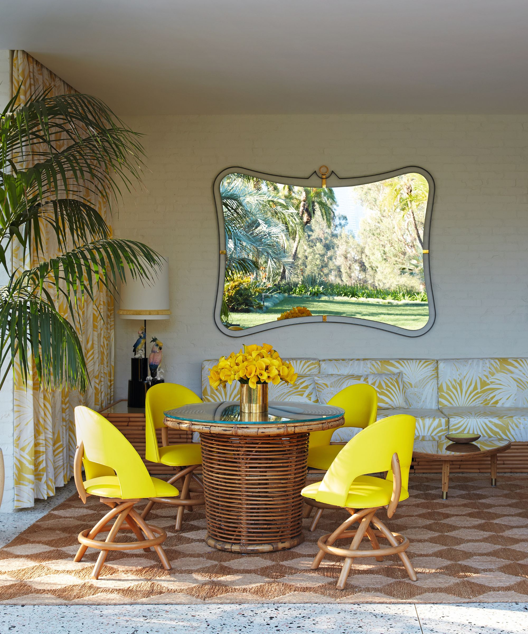
Custom rattan banquette and curtains in fabric by Bob Collins & Sons. Vintage table, Orange. Vintage chairs, Chairish. Custom mirror, D&J Custom Benchworks.
Meet the designer
Jamie Bush shares his style inspiration
What's your go-to color?
Yellow is always my north light. My parents had a beach house in the 1960s that made a huge impression on me. It was a small modern shack with bright yellow vinyl sofas, yellow Formica countertops, and matching plastic Italian dishes. It was pure magic as a kid.
Do you have any design heroes?
Ward Bennett, François Catroux and Jacques Grange.
Favorite piece of architecture?
If pressed, I would say the Brion Tomb by Carlo Scarpa near Treviso, Italy. It’s the most obsessive exploration of architectural detailing, rendered in bronze, stone, and concrete.
Can you reveal a secret address we should know?
Billings, a Los Angeles-based auction house that specializes in important mid-century furnishings. You can always find something special there.
What was the last thing you bought for your home?
A charming chest of drawers named Genesio made in different colored veneered woods with unique sculptural knobs by Alik Cavaliere, circa 1990.
Sign up to the Homes & Gardens newsletter
Design expertise in your inbox – from inspiring decorating ideas and beautiful celebrity homes to practical gardening advice and shopping round-ups.
-
 Ina Garten's storage pantry is an insightful window into all of the best cookware used by the chef – and it's easy to recreate on your kitchen shelves from $48
The beautiful dishware in The Barefoot Contessa's Hamptons pantry showcases the tools she uses most often to cook – this is exactly how you replicate it
By Sophie Edwards Published
-
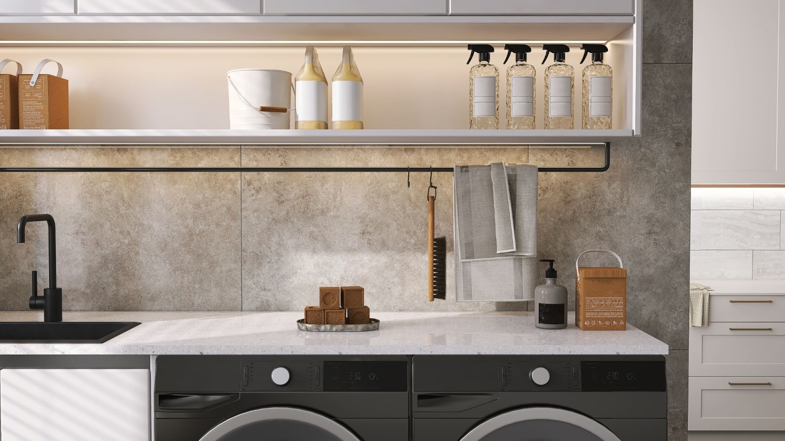 Extend the lifespan of your appliance with 5 simple but crucial washing machine maintenance tips
From cleaning the filters to keeping the door open, experts reveal the washer tips they swear by
By Andy van Terheyden Published