Interior Designer Martyn Lawrence Bullard's kitchen admittedly isn't used for cooking but it is set to inspire some 'high-style kitchen moments'
It's the crash course in 'high style' that we all need for 2024


Ripe for entertaining and full of delicious talking points, when Martyn Lawrence Bullard posted his latest kitchen upgrade on Instagram, designers had much to say on the space.
Modern to the nines, with accent chrome everything, hidden art, and more in the way of intriguing kitchen design, this key room in Martyn's weekend pad, is all about the bold decisions. But will this uber-modern, uber-sleek, look be big in kitchen trends for 2024? We certainly think so, and both designers and celebrities are in a agreement.
High-style design lessons from Martyn's chrome kitchen
Martyn himself admits that this space is not used so much for cooking, but that is not to say that it will not be kept busy with guests, who are certain to be fans of Martyn's hosting, not to mention admirers of his unique and contagious interior design style.
'So chic.' commented Ben Soleimani amongst others, including Guns N' Roses' Matt Sorum. In truth, even we thought we had our kitchen interior design trends completely forecasted, but Martyn's super modern chrome setup has stopped us in our tracks and might even be initiating a modern design wave that we were not expecting.
Here is why you might want to let his kitchen design choices shape your interior design style too:
A post shared by Martyn Lawrence Bullard (@martynbullard)
A photo posted by on
1. A mirrored ceiling will impress guests
The star of Martyn's kitchen show has to be the mirrored ceiling. Many praised it in comments on his post, and though it's a bold look for such a practical space, there is no denying that it is designed to impress.
Typically, it might be a more colorful kitchen that would grasp our attention, but this is not quite the case here. 'Martyn is so talented at creating these visually very stimulating environments where either he uses color so skillfully, as a visual vector, or he creates this very interesting graphic sensibility where you're able to look at volumes through color blocking,' says Cliff Fong, a New York-based interior designer, founder of Matt Blacke Inc, and a close friend of Martyn's. 'I like color but I don't use it in the same way Martyn does,' continues Cliff. 'I think this is really interesting because it's almost devoid of color but, you have this incredibly interesting graphic sensibility and I love the reflective ceiling, I think that's amazing.'
Sign up to the Homes & Gardens newsletter
Design expertise in your inbox – from inspiring decorating ideas and beautiful celebrity homes to practical gardening advice and shopping round-ups.
Cliff is not the only one taken aback: 'The ceiling is what caught my eye the most,' says Mikel Welch, Interior designer and the founder of Mikel Welch Designs who notes how such a reflective 5th wall will do wonders to bounce light around the space, and off the pendants above the countertops in particular – especially come the evening time. 'I think it's a really smart idea,' continues Mikel. 'I'm sure it's going to be super reflective and generate a lot of light.'
We couldn't really agree more. Although not a typical way to make a kitchen look more luxurious, we don't see why a mirrored ceiling wouldn't make a playful addition.

Cliff Fong is a consultant, interior designer, and the owner of Matt Blacke Inc. Born in New York and with a diverse upbringing, Cliff has lived in many countries and has been a part of the Los Angeles thriving design community for two decades. A background in fashion has equipped Cliff with unique design sensibilities and the ability to create personal and unexpected environments for clients.
2. Seamless cabinetry (and invisible storage) is the one
Next, with such a clean-cut and modern-looking kitchen space, it is impossible to ignore that nothing, appliance-wise, is on show. You could almost call it an invisible kitchen.... 'I can see that everything is hidden in the space,' says Mikel, 'I can't, obviously, attest to what he's hidden, but knowing Martyn, he's done a really great job of hiding everything from the dishwasher to any type of storage compartment.'
There is no doubt about it, the kitchen cabinets are barely there in themselves, and they are successfully keeping everything a kitchen needs to function – including kitchen storage – beautifully under wraps. 'I love how he used the cabinetry to conceal things. I think that was a really smart design.' Move along open kitchen shelving, we no longer require your services.

Mikel Welch is a New York-based interior designer and the founder of Mikel Welch Designs. Mikel shares his best renovation tips with viewers of Quibi's Murder House Flip and is a former on-air personality of TLC’s Trading Spaces, with his designs having been featured on HGTV, The Real Housewives Of Atlanta, and Good Morning America. Mikel's work is admired by several publications and he has had the honor of designing lavish VIP green rooms for prominent personalities, including First Lady Michelle Obama, Oprah Winfrey, Faith Hill, Steve Harvey, Harry Connick Jr., Joan Rivers, and Halle Berry.
3. Terrazzo tiled floors are having a revival
Yes, Terrazzo is still considered a fairly contemporary kitchen floor covering. However, avid tile trend followers will know that Terrazzo peaked somewhere in 2020. Thanks to Martyn, however, could it be that Terrazzo is going through a renaissance period?
'I never knew I would be a fan of Terrazzo,' continues Mikel who admits to appreciating Martyn's take on the tile in the space: 'Just to lighten things up a little bit,' he says.
It appears that Martyn might have used Terrazzo for balance and for added intrigue in an unprecedented way. 'Because he did choose a very monochromatic, clean palette. So, I think when we talk about texture and tone and color, that is probably the one area where I'm going to be a fan of Terrazzo.'
4. Retro can be clean-cut
Though not typically 'retro' (the definition of which has changed over the years), we can still see the 60's influence in the pendant lighting Martyn has included in his kitchen.
'The lighting, I think, are statement pieces,' says Mikel who notes the 'cool design.' Kitchen lighting has come far in recent times, but we love this return to the noughties. 'It really looks like he just went as clean and simple as he could. And he let certain key elements be the star of the show, like the light fixtures.'
5. Finer details should leave room for imagination
As well as the all-chrome finish, it really is the finer details that make Martyn's kitchen niche and unique. From the mirrored kitchen backsplash to the light brushes of sage green, which we swear we can see in the corner... 'I love how the range buttons just kind of like go away. You can see them politely placed on the front of the cabinetry.' This thoughtful design gives the space an enviably polished finish.
'It's a thumbs up from me,' says Mikel. 'I'm loving the oven off to the side. It looks just like a fun retro kitchen and honestly, I'm seeing (maybe it's a reflection) but I'm getting a hint of, I can't even call it sage green...' We also can't ignore the stunning chrome eggs and colorful print – they bring artistic and architectural detail.
6. The best interior design style is one that is truly personal
With the aforementioned features in mind, it is clear that this space is iconic, but even still, it can't quite be placed into a particular interior design style or era. 'Martyn does a really beautiful, tailored interior,'
'One thing I really like about this is that it is not indicative of any kind of any existing trend that people might recognize,' says Cliff. Rather than represent a specific 'trend', Martyn's space might reflect more the shift in our reaction to said trends.
'We have something very slick and lux, and shiny and graphic, and I think that its sensibility will no doubt be a talking point for how a lot of people might be able to redefine their environments.' Instead of the earthy, bohemian, and even modern Farmhouse interiors that we have loved for so long, are we returning to a much more polished and new-age look? ‘I love this kind of high-style moment that Martyn is so great at manifesting,' says Cliff.
Is a mirrored ceiling a good idea?
Who can deny, that mirrored ceilings make interesting design choices? It works wonders at expanding the space in Martyn's cool 'Palm Springs' black and white kitchen, but does that mean we can consider a mirrored 5th wall elsewhere? 'I think any room could be a good candidate, as long as you've created enough of a foundation where it makes sense,' says Cliff. As with all DIY projects, in the sense that you are bringing a design to life without a professional in the field, you need to be certain that it is going to work with the rest of your space.
'I think there's more than meets the eye,' says Mikel about Martyn's kitchen which although it might not be used for cheffing, we are sure would be a joy to both cook and entertain in. Plus, though hard to tell, since Martyn has conducted such wizardry, we suspect that this is actually not the biggest kitchen space. With clues lying in the slimline kitchen island and elaborate mirrored finishes...
'I think there are a lot of hidden things he has to disclose, he's done a great job of just concealing everything in such a small space,' says Mikel. 'It's pretty spectacular.' With that said, how might you add intrigue to your kitchen remodel in 2024?

Camille is the former deputy editor of Real Homes where she covered a broad range of topics, including house tours, small space design, and gardens. She studied English language and Italian at the University of Manchester and during a year abroad studying linguistics and history of art in Bologna, Italy she started documenting her adventures and observations in a blog. Camille is always creating and spends her downtime painting, taking photos, traveling, and writing short stories.
-
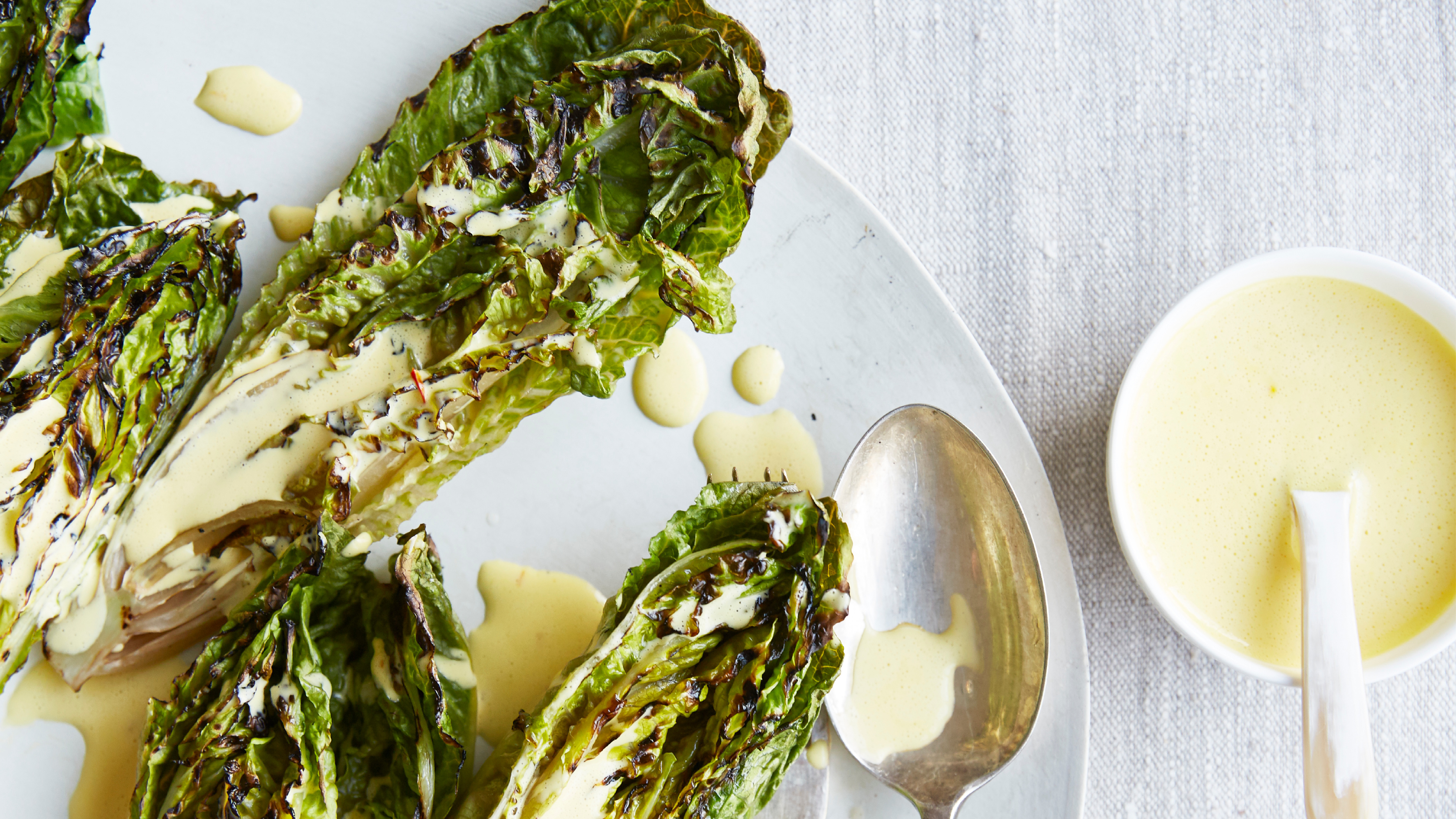
 Charred little gem with saffron dressing
This recipe with charred little gem is both easy to make and sure to impress guests. It's the perfect side for fresh spring menus
By Alice Hart
-
 Grilled asparagus with herb and pickled red onion
This grilled asparagus couldn't be easier, and it's a wonderful way to get the best flavor from our favorite spring veg. It's perfect alongside fish or lamb
By Alice Hart
