This designer just threw out the rulebook when designing their snug – it's got us rethinking everything we knew about small spaces
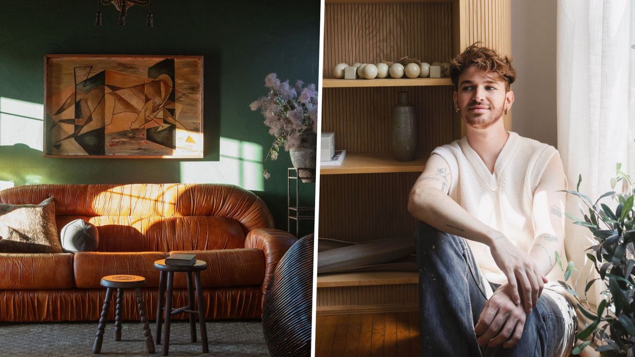
Drew Micheal Scott from Lone Fox Home just redecorated his snug in a rather unexpected way

There are a few tried-and-tested interior design rules that the experts all tend to abide by. From ideal furniture placement to lighting tricks and paint hacks that make certain spaces feel bigger (or smaller), these 'rules' are interior designer lore.
So when we spotted designer Drew Micheal Scott of Lone Fox, had completely thrown out the rulebook when redesigning the snug room in his personal home we were pretty intrigued.
Breaking all the small room ideas we thought we knew and loved, Drew has drenched his cozy space in a dark, cocooning hue and pilled in plenty of furnishings. Here, we go over the 3 small space design rules he's got us rethinking after seeing this eclectic and inviting redesign.
A post shared by Lone Fox by Drew Michael Scott (@lonefoxhome)
A photo posted by on
Previously a muted home office that just wasn't getting used enough, creator Drew – who is best known for his warm, transitional style and creative DIY videos – admitted defeat and made it his mission to redecorate this unused space. And the result is rather unexpected.
'The first iteration of this room was my office, which, honestly, I only sat in maybe five times throughout the last year (I almost always work at my dining table),' says Drew. 'I kept going back and forth on what I wanted this room to be, but I decided on more of a lounge/conversation area.'
Below we chat to Drew about the inspiration behind the snug and the 3 small space interior design rules he has us questioning.
3 Small Space Design Rules We're Now Rethinking
1. Dark colors should be avoided
A question interior designers are often asked is what colors make a small room look bigger – and the most common answer is light and bright hues work best to make the room appear airier.
Sign up to the Homes & Gardens newsletter
Design expertise in your inbox – from inspiring decorating ideas and beautiful celebrity homes to practical gardening advice and shopping round-ups.
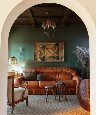
In stark contrast, the Lone Fox Home founder has chosen to drench his space in Vogue Green by Sherwin Williams in a flat finish, which he refers to as his favorite color in the video. Instead of bringing the walls in, it instead leans into the scale of the space to create a cozy and cocooning vibe.
'Because the space was so well-lit and connected to a neutral-toned room, I knew I wanted to go with a bold wall color,' Drew explains. 'I had also previously painted this room a medium-toned green and always felt it was just a tad flat, so going a bit darker and bolder was exactly what I was looking for.'
2. Larger furniture won't work
To make the most of a small room, typically the experts recommend not cramming the space with large, oversized furniture and decor.
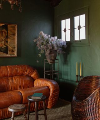
Drew, however, filled his small living room with a large couch, two statement armchairs with plenty of stools, and side tables. As he proves so perfectly, when done correctly, large pieces can make the space seem more spacious. So scale up!
While it feels wrong, actually lots of little dollhouse-sized furniture can make a room feel cluttered so try to maximize every inch of your space with the biggest pieces you can find to fit that room.
'I knew I wanted to use this brown leather vintage couch because it was the perfect size for the room and I LOVED how the color of leather looked against the green,' continues Drew. 'I embellished the room with some vintage pieces I’ve been holding onto for a while now, including the German glass lamp that was in my carry-on from my Round Top trip last year.'
3. Dark ceilings will suck out all the light
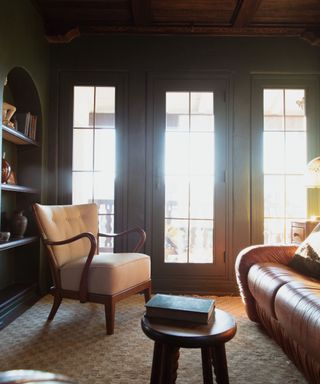
The idea of color-drenching paint across all walls and the ceiling to make a room feel bigger and airier – it blurs the line where the walls and ceiling meet, so the walls feel continuous, creating the illusion of a bit more space.
In a similar effect, the dark wood ceiling paneling in Drew's snug avoids the harsh lines that a traditional white ceiling brings. In another tutorial video shared to his Instagram, Drew explained how he first painted the ceiling a dark brown to test how he felt about a deep hue up top before adding in the wood with a dark stain to match the original 1920s walnut wood beams.
'I recently saw an image for an emerald green wall and the "country club, old money" vibes were ringing in my head,' adds Drew. 'Something about a classic dark green just felt right. I wanted the room to feel like its own little section of the house with rich colors and textures. The little fox crests in the windows were custom 3D rendered and printed after my logo and added the most precious personalized touch to the room.'
Shop The Lone Fox Look
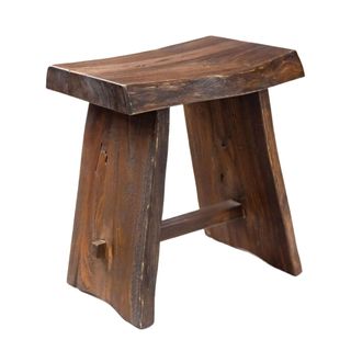
Made of solid teak that is both beautiful and durable, each of these small stools is individually unique due to the natural variances within the wood. A perfect accent piece, you can pop this next to an armchair or style in your bathroom.
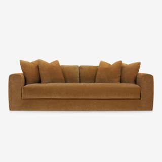
Covered in rich cognac velvet, this Lulu & Georgia couch is a great alternative to the vintage leather Drew used in his space – and much easier to source! The boxy yet curved silhouette will hold attention.
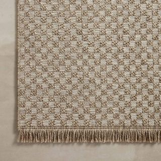
This subtle checkerboard rug from the Loloi Dawn collection looks almost identical to the one in Drew's snug. Made from a power-loomed polypropylene that resembles sisal, this can be used indoors and outdoors due to its durability.
The use of such a deep, emerald green hue pared with an even richer ceiling and plenty of furniture piled into this small snug room in Drew's home really struck a chord with the team at H&G. Forgoing the trusted design rules we tend to play by, we love the way that Drew tore up the rulebook and created a space that certainly doesn't feel small but instead cozy, sumptuous, and really, really cool.

Charlotte is the style and trends editor at Homes and Gardens and has been with the team since Christmas 2023. Following a 5 year career in Fashion, she has worked at many women's glossy magazines including Grazia, Stylist, and Hello!, and as Interiors Editor for British heritage department store Liberty. Her role at H&G fuses her love of style with her passion for interior design, and she is currently undergoing her second home renovation - you can follow her journey over on @olbyhome
-
 I test and review 100s of cleaning tips for a living – here are the 7 I always use in my own home
These are the only ones that have stuck for me
By Chiana Dickson Published
-
 Aimee Song’s Lulu and Georgia collaboration is full of fashion-forward pieces – including the chicest mirrors for taking outfit pics
From outfit inspo to interiors, Aimee Song’s latest collaboration with Lulu and Georgia brings style into every corner of your home
By Charlotte Olby Published
