Which wall to accent in a living room? 6 steps to making the right call
The effort-to-reward ratio of painting an accent wall is pretty incredible, once you've worked out which wall it should be
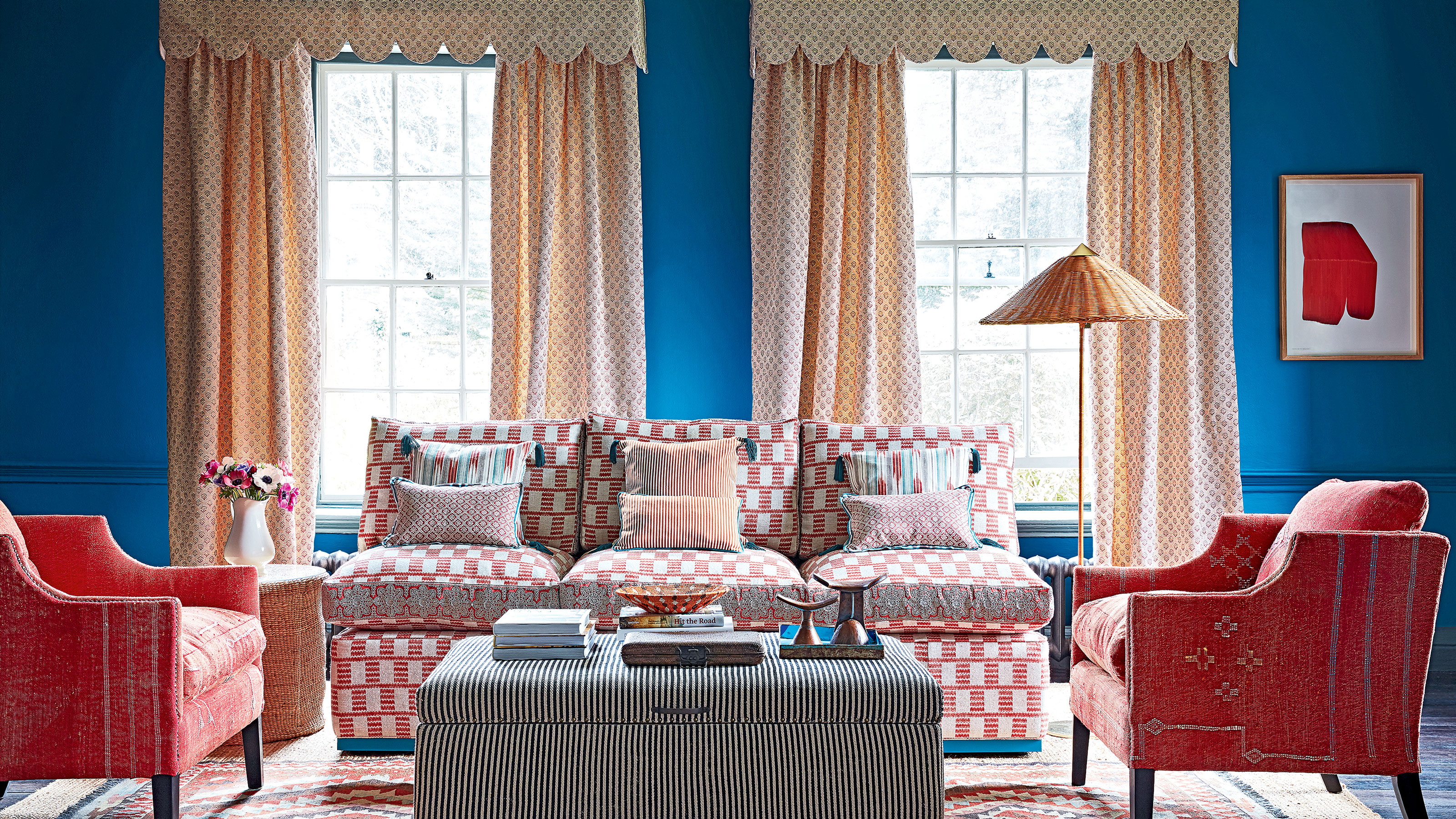

Working out which wall to accent in a living room isn't always glaringly obvious, especially if you have an oddly-shaped room with nooks or a particularly narrow space. A living room accent wall (painted a different color from the rest) is a great feature to have because it creates a clear focal point.
This, we'd argue, is one of the fundamental aspects of a calm and welcoming space, because it creates a sense of balance. So, which wall should you pick?
You can't go wrong painting your living room accent wall color on the wall behind the couch, and we'd recommend avoiding any walls that have large windows or doors, because they attention draw away from the accent wall itself. Interior designers share their expert advice below to help you decide.
Which wall to accent in a living room?
The important thing to say is that there's no wrong answer, here. However, some walls look better picked out by a paint color or wallpaper pattern than others. Here, design experts offer guidelines.
1. Consider the Feng Shui command position
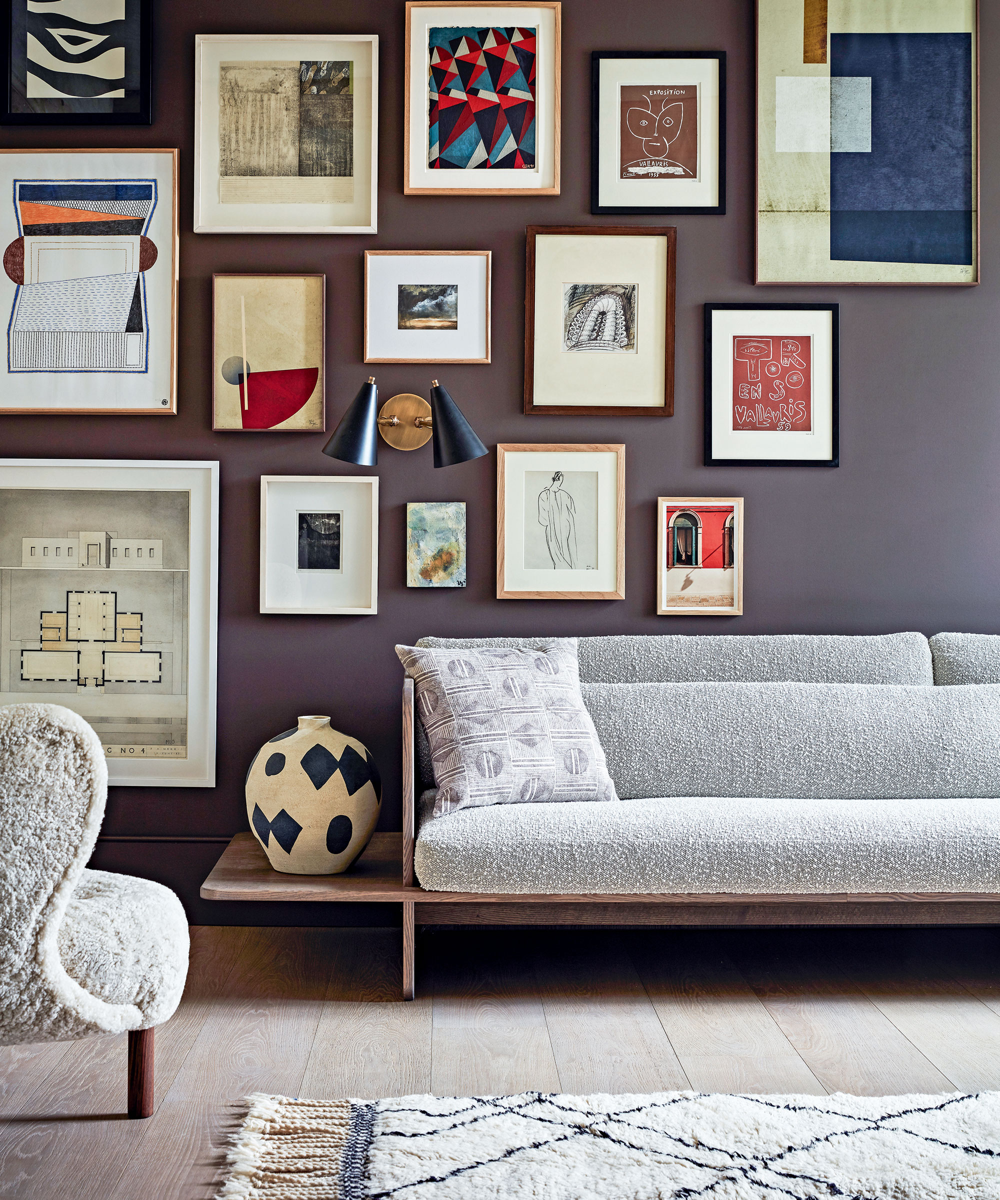
Frustratingly, there's no hard and fast rule to follow when working out which wall to accent in a living room, because it all depends on the dimensions and layout of your space. A long thin room might not have an obvious focal point compared to a square room with a fireplace and built-in bookcase, for instance.
So it does mean trusting your own design intuition – interior designer Jennifer Davis says the first thing you need to work out is which wall feels like the anchor. In Feng Shui, the command position is the most comfortable spot to sit in, ideally with a view of the door.
We'd suggest locating the Feng shui living room command position and either making the wall behind or in front of it your accent wall. Where are you most drawn to when looking around the room? What's your favorite spot to sit in, and which wall do you end up facing there?
2. Choose the wall adjacent to the window
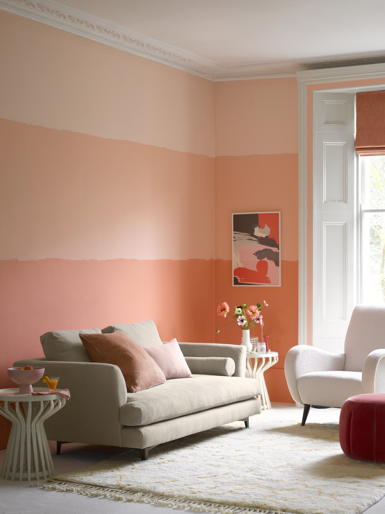
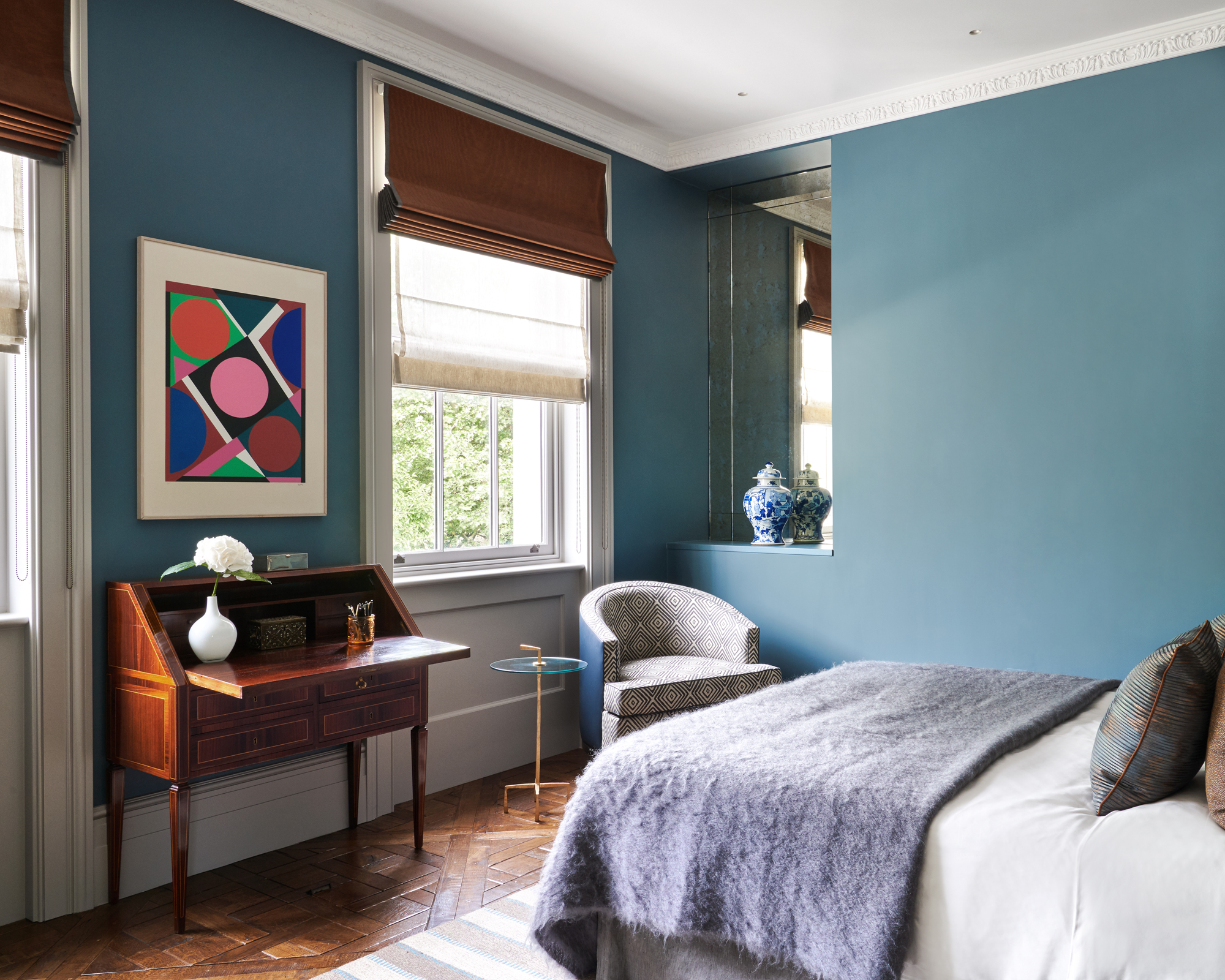
'In my open-plan kitchen and living room, I painted the back wall of the kitchen area a dark terracotta to warm it up and create more depth,' comments Lucy Searle, Global Editor in Chief at Homes & Gardens. 'By painting the wall adjacent to the window in a warm tone, you can make a cool, north-facing room feel more cozy. In the same way a mirror placed adjacent to a window will reflect lots of light into the room, a darker wall in a warm tone will influence the light that's reflected in and make it feel warmer.'

Lucy Searle has written about interiors, property and gardens for over 30 years, starting within the interiors departments of women's magazines before switching to interiors-only titles in the mid-1990s. She spent five years as Associate Editor on Ideal Home, one of Britain's biggest and oldest interiors titles. In 2018, Lucy took on the role of Global Editor in Chief for Realhomes.com, taking the site from a small magazine add-on to a global success, with a large US audience. She was asked to repeat that success at Homes & Gardens, where she has also taken on the editorship of the magazine, which is the UK's oldest interiors magazine at 103 years old. Lucy is a serial renovator and also owns rental properties in the UK and Europe, so brings first-hand knowledge to the subjects she oversees.
3. Let your furniture layout decide
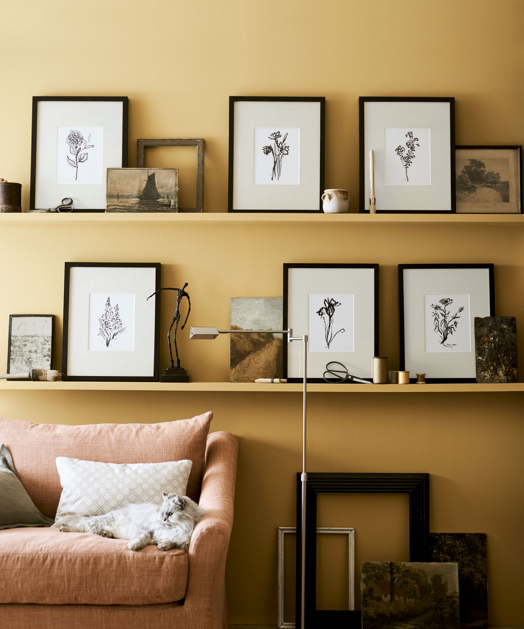
Wall painted in Saffron matt emulsion, Neptune
Why not let the furniture layout of your living room dictate where your accent wall should go? For example, the wall behind your fireplace or couch might make sense as a feature wall. 'If you put your accent wall on a side wall or a wall without any big statement pieces it will feel off balance,' warns Jennifer Davis. Painting a wall behind your couch the same color as the couch is a big trend, and can look really impactful.
4. Consider where you want to lead the eye
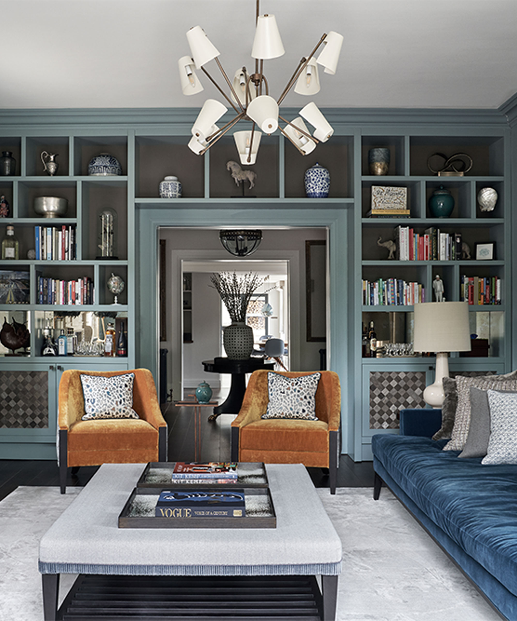
Jennifer Davis' rule of thumb is to think about where you want to draw the eye. Most of the time, she says it's the first wall you see as you walk in, but not always. 'It depends on the individual space,' she adds. 'We also like to highlight the fifth wall (the ceiling) as it is often overlooked and can create a huge impact in a smaller space.'
5. Choose the wall that makes the biggest impact
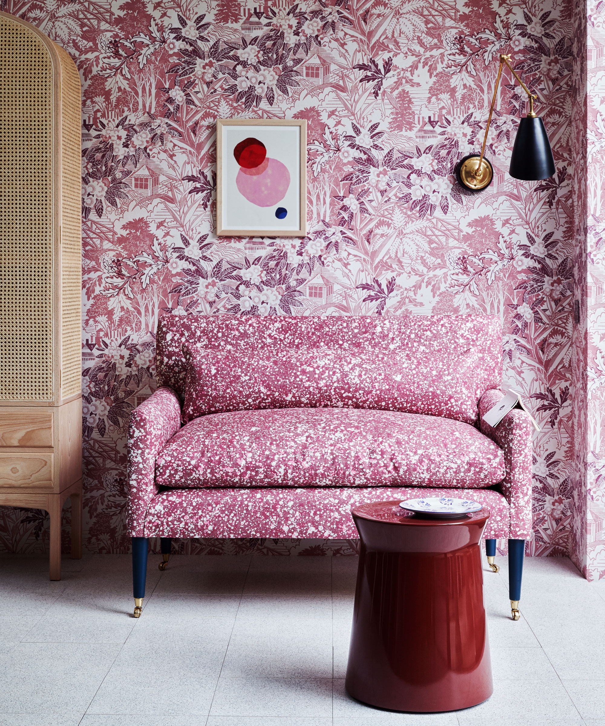
'Always go for the biggest impact,' interior designer Robin Burrill enthuses. 'It doesn’t have to be the first wall you see but it should be the one that makes the biggest impact! If you’re going to paint it, make sure it’s an impactful color and finish!'
She encourages clients to experiment with paint and other media to create a really dramatic look in their homes. This could simply be a different sheen than the rest of the walls, removable wallpaper or a wall mural.
6. Use the accent wall to highlight architectural details
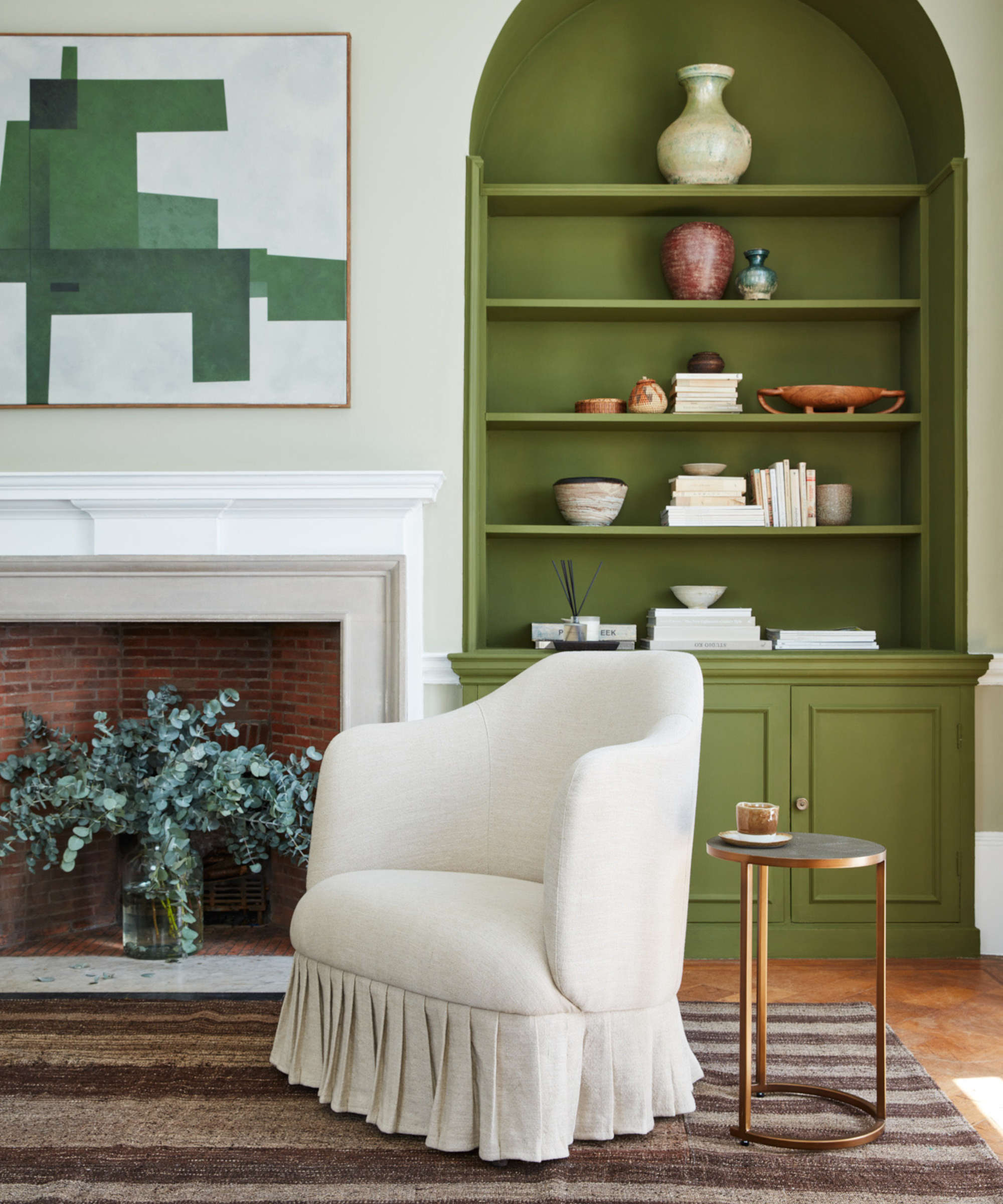
'The wall across from the room’s entrance is usually the one you’ll make your accent wall,' says Grace Baena, Interior Designer of Kaiyo Used Dressers. 'This can change depending on the room’s layout.'
She explains that rooms with nooks or other architectural variety, such as built-in bookcases, exposed brick or wall paneling, can benefit from the accent wall being placed in an area that diverges from the rest of the room. 'So, you might end up with your accent wall being the wall with a fireplace or window nook,' she says.
It really depends on the shape of your living room and how you intend to use it, so spend some time in the room before reaching for the paintbrush.
Which wall is best to accent in a living room?
Sometimes the best wall to accent in a living room is the one that corrects or improves the proportions of the space. For example, if yours is a narrow, long room, painting or wallpapering the furthest wall in a darker color than the other three will make it advance visually, making the room seem shorter and, therefore, less narrow.
Sign up to the Homes & Gardens newsletter
Design expertise in your inbox – from inspiring decorating ideas and beautiful celebrity homes to practical gardening advice and shopping round-ups.

Millie Hurst is a freelance lifestyle writer with over six years of experience in digital journalism. Having previously worked as Solved Section Editor at Homes & Gardens and Senior SEO Editor at News UK in London and New York, Millie has written for an array of homes brands including Livingetc and Real Homes and was formerly Senior Content Editor at Ideal Home. She has written and edited countless features on home organization, decluttering and interior design and always hopes to inspire readers with new ways to enjoy their homes. She loves to weave nature-inspired decor and nods to time spent in Italy into her own home.
-
 7 expert-approved painting hacks to minimize clean up – to make an already exhausting task easier
Avoid a backbreaking clean-up after your next painting project with advice from the professionals
By Chiana Dickson
-
 Gwyneth Paltrow's quiet luxury kitchen is so beautiful, we almost overlooked her ultra-smart cabinets – they make the use of 'every inch' of storage space
The Goop founder makes use of dead space in her kitchen with customized cabinetry that reaches to the ceiling, providing ample storage
By Hannah Ziegler
-
 7 dorm room organizing rules for less clutter and more space
Experts offer their top tips for creating a well-organized dorm room, no matter the size, space, or layout.
By Ashley Chalmers
-
 How to maximize storage in a small or shared dorm room, according to pro organizers
Find out all the hidden storage zones you might never have noticed
By Ashley Chalmers