6 snug room mistakes – expert advice on how to fix issues with furniture and layout
Where are we going wrong? Interior designers put right our snug room mistakes to create a better, cozier space

The clue is in the name, a snug should be exactly that, a small, cozy room for relaxing. Snug room mistakes come about, however, when these compact spaces are jam-packed with furniture and clutter, creating an awkward, uncomfortable room that's anything but relaxing.
So how do you avoid making the common small room mistakes in your snug? Fear not, help is at hand. We've got some great tips and snug room ideas from interior experts for the best arrangements for furniture and furnishings to ensure we create the perfect snug space, plus some ideas for what to include in the room, and what to clear out. Follow their advice to avoid snug room mistakes, and max-relaxing is almost guaranteed.
Snug room mistakes to avoid
So what are the snug room mistakes to avoid? The key problem areas in these rooms include too much furniture, furniture that's too big, room layout, not thinking about the room décor, and a lack of clarity about the room's purpose. A snug is often one of the smaller rooms in a home, a second living room, but getting the most out of the space still requires careful planning. Here's how to avoid snug room mistakes.
1. Not being clear about the snug's purpose
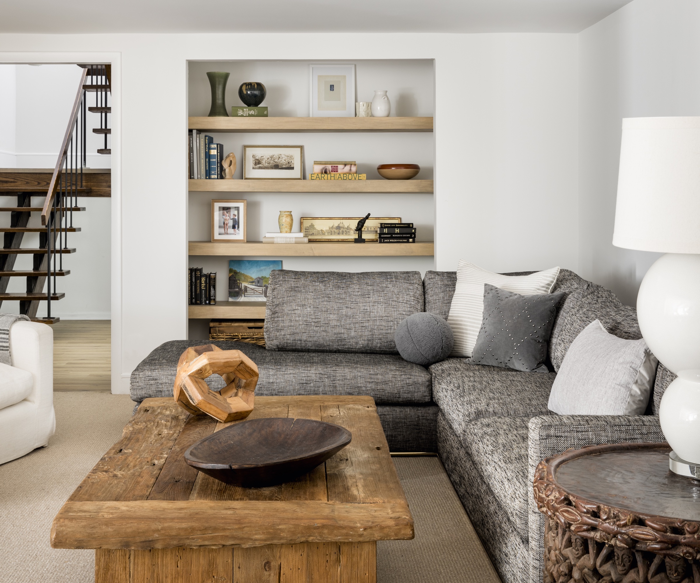
Unless you get this one key issue sorted right from the outset, you will go on making snug room mistakes.
Ask yourself the following questions to get some clarity on how and when the room will be used. What is your snug for? Who will use it? When will it be used?
If your snug is to be a TV or movie-watching den, you will obviously want a big screen and a different seating arrangement, perhaps a sectional, oriented toward the screen.
On the other hand, if the snug is a quiet bolthole for those in the family who want to escape the TV to read, write or do craft activities, it probably needs a very different vibe and layout.
For either eventuality, you'll still need to be aware of the classic snug room mistakes (see below for how to avoid these) to ensure you have a fully functional, comfortable and attractive place to spend time.
2. Having too much furniture
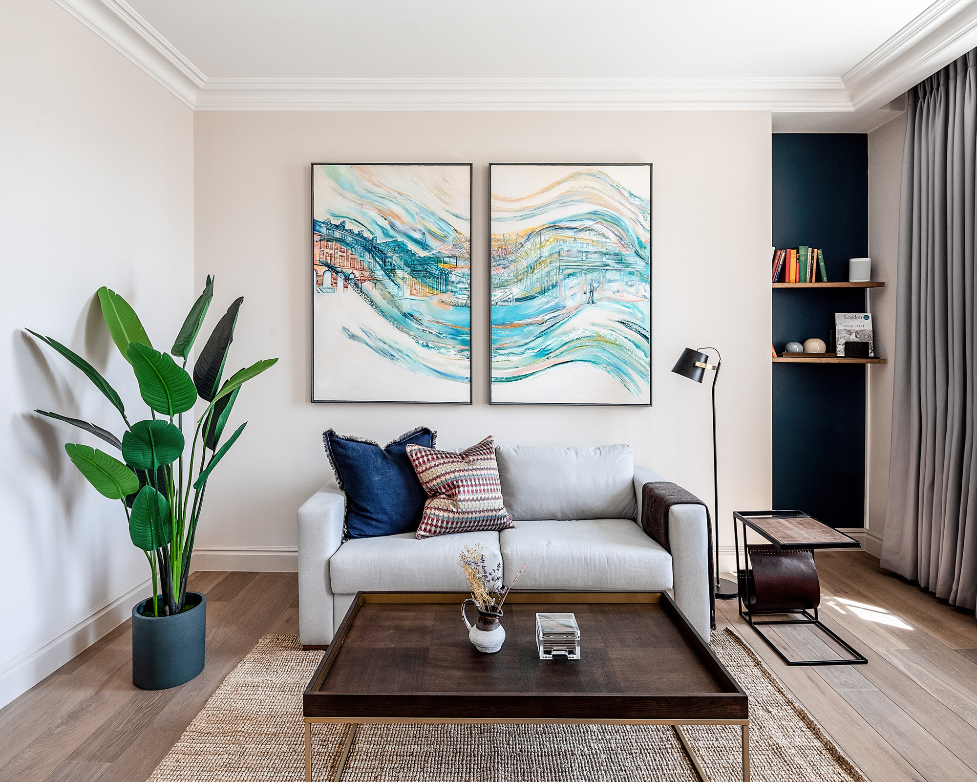
There's a big difference between 'snug' and 'cramped'. One of the biggest snug room mistakes is having too much furniture in a small space. You need to be able to comfortably navigate the room without squeezing past surplus armchairs or tripping over one occasional table too many.
'If the snug is a secondary living room, be realistic about how many people are likely to sit in it at any one time. Cater for that number and no more. Move any surplus seating, whether that's armchairs or a sofa, to another room or get rid of them altogether,' says Lucy Searle, global editor-in-chief, of Homes & Gardens.
Ward & Co's airy scheme, pictured above, works well for this snug that's also used as a study. The furniture is pared back to the basics and there's no risk of the room feeling claustrophobic or cramped.
It depends on the size of the snug, but as a rough guide, one small two-seater sofa and a maximum of two armchairs should be sufficient. Then opt for either one central coffee table, or several smaller tables that fit neatly next to the arms of the chairs. An ottoman might be a good option instead of a coffee table as it's one way to add extra seats to a small living room. However, ottomans can be bulky so choose your design carefully so as not to create a cluttered look.
Besides a small sofa, armchairs and a coffee table, try to find space for a bookcase or some kind of shelving, not just for books but perhaps as somewhere to display ornaments and artwork. A floor lamp or reading lamp will also be handy if you're going to sew or read in the snug.
Interior designer, Nastassja Bowman of Kristen Elizabeth Design agrees: 'Add in functional casegoods like bookshelves or nightstands to keep activities or hobby items in the snug room. Because when you go to a snug room you go for relaxation or enjoyment, and having your favorite things in one place is the best way to make the most of your snug room.'
3. Choosing oversized furniture
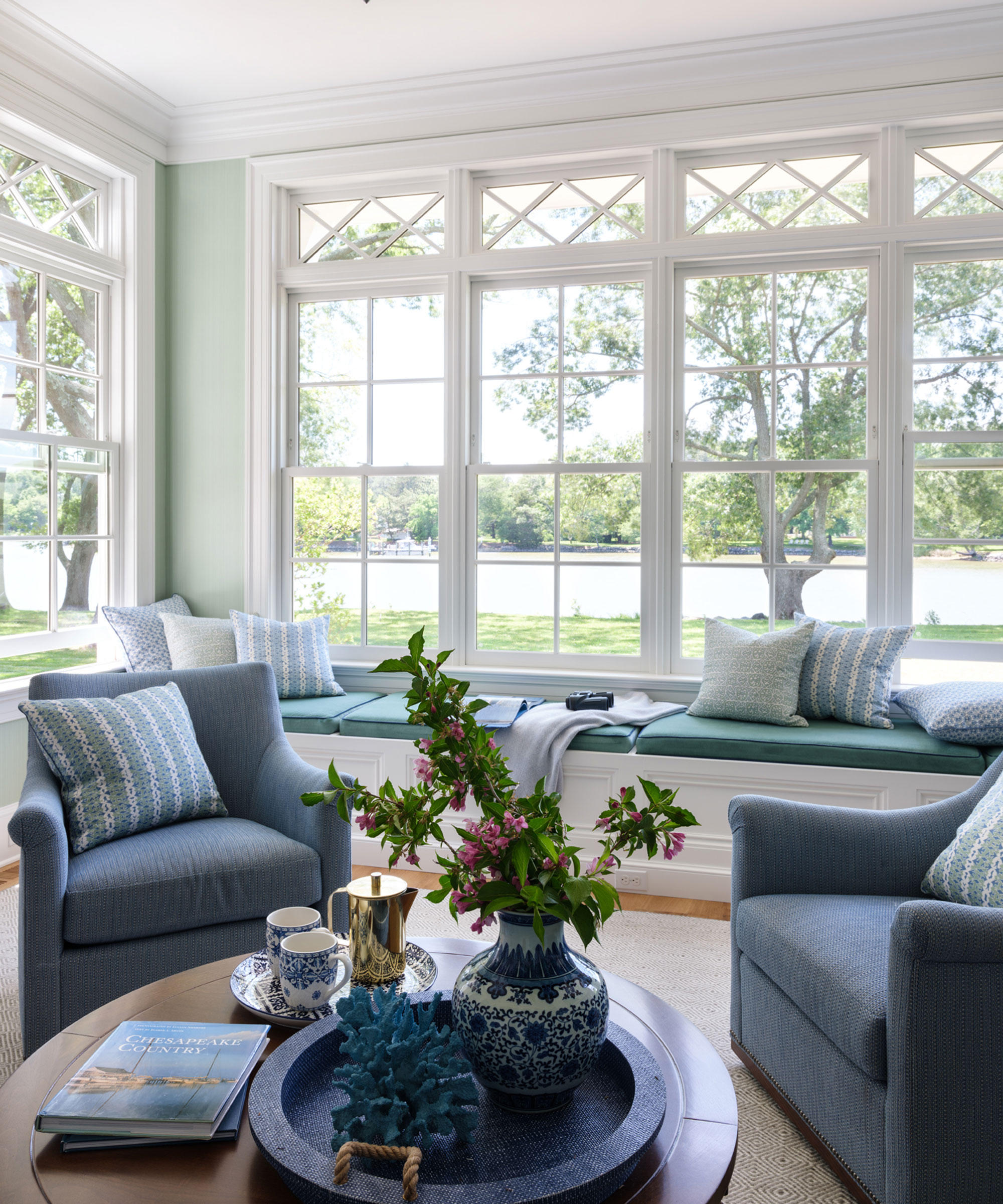
This is a potentially expensive mistake. If you invest in new furniture that's too big for the space you're risking having a cramped space that will never look right or having to start all over again and choose new furniture. It's important to get the scale of the furniture right for the size of the room.
Designer Nastassja Bowman agrees this is crucial. 'Something you don't want to put into a snug room is oversized furniture,' she says. 'One piece shouldn't take up the whole space making the rest of the space unusable. There should be a balance of the elements and furnishings. Don't force items to fit.'
If you're not sure about scale or how to buy the right couch for a small living room, draw a plan of the room, to scale, allowing circulation space around the key items of furniture. This will give you an idea of how much space there is for a sofa and armchairs.
In the riverside snug pictured above, designed by Marika Meyer two neat armchairs are supplemented by an inviting window seat so there's plenty of seating but all designed to perfectly fit the space available.
4. Getting the layout wrong
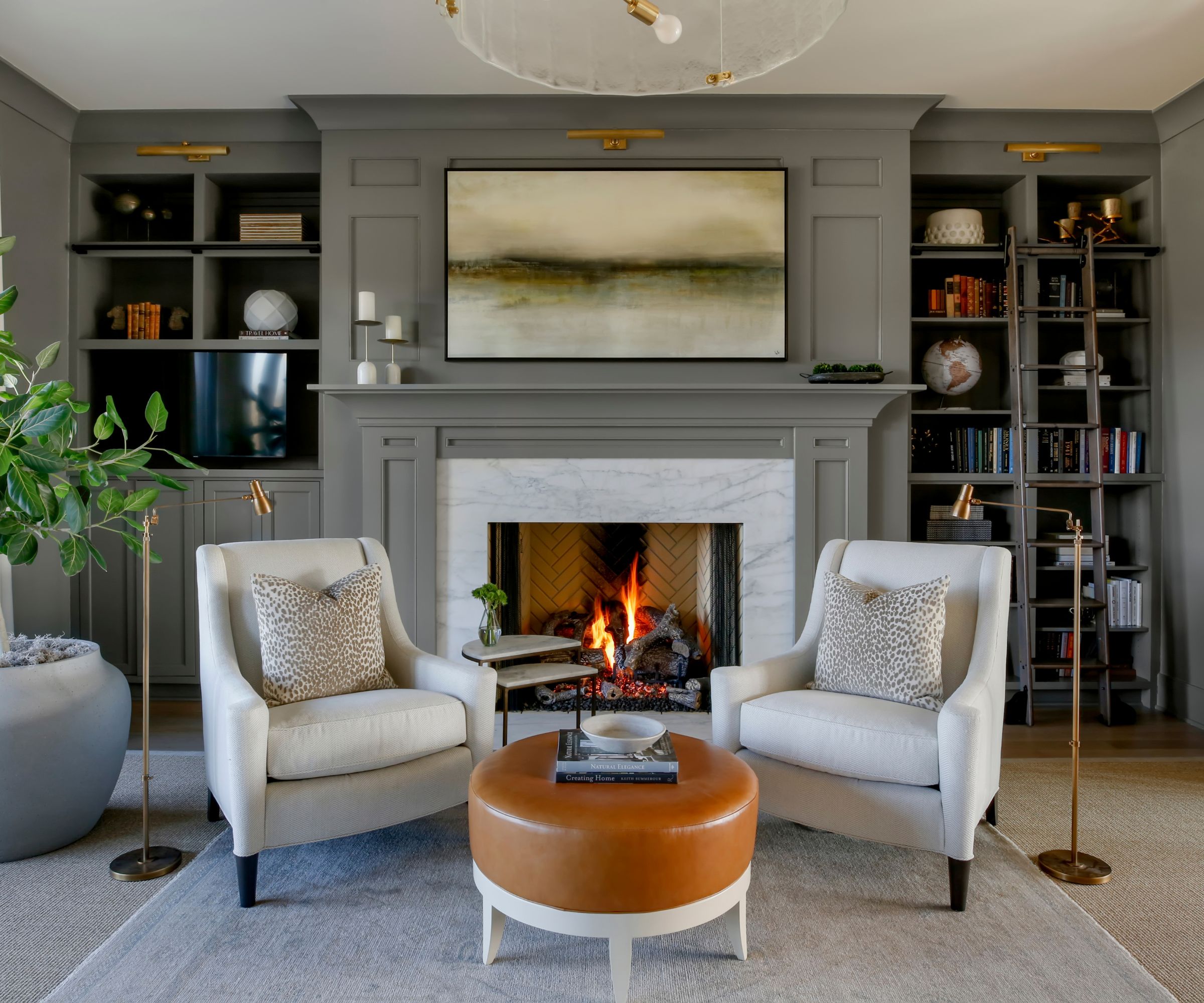
'No one wants to walk into the back of a couch and have it cut off the room,' says interior designer Kendra Nash. 'It makes the space feel uninviting and difficult to navigate.' In other words, don't have the back of the couch facing the entry to the snug. Instead, create a clear pathway and view into the center of the room, so you feel you're being welcomed in.
It's not only the seating position that can go wrong, as designer Nastassja Bowman explains: 'Most mistakes that occur in a snug room have to do with the functionality of the space. A snug room doesn't have to be a cramped space. You want all your pieces to be able to function and be accessible,' says Bowman. 'We go back to space planning basics. You want to be able to open and close all your casegoods. You don't want to block doorways or windows. You want enough floor space to reach all your seating. You don't want to be hitting your head on overhead lighting. Anything that becomes an obstacle to those space planning necessities can be a big mistake.'
Back to Nash for more on the perfect room layout: 'We love the idea of creating a circle of conversation in our furniture layouts. It is nice to be able to see one another and visit without being too far away from one another.'
If you're lucky enough to have a fireplace with an open fire or woodburner in your snug, you can't go far wrong with the classic fireplace grouping of couches and armchairs centered around the focal-point fire. This really will create the most relaxing and cozy atmosphere, just what you're looking for in a snug room.
5. Not taking enough care over the décor
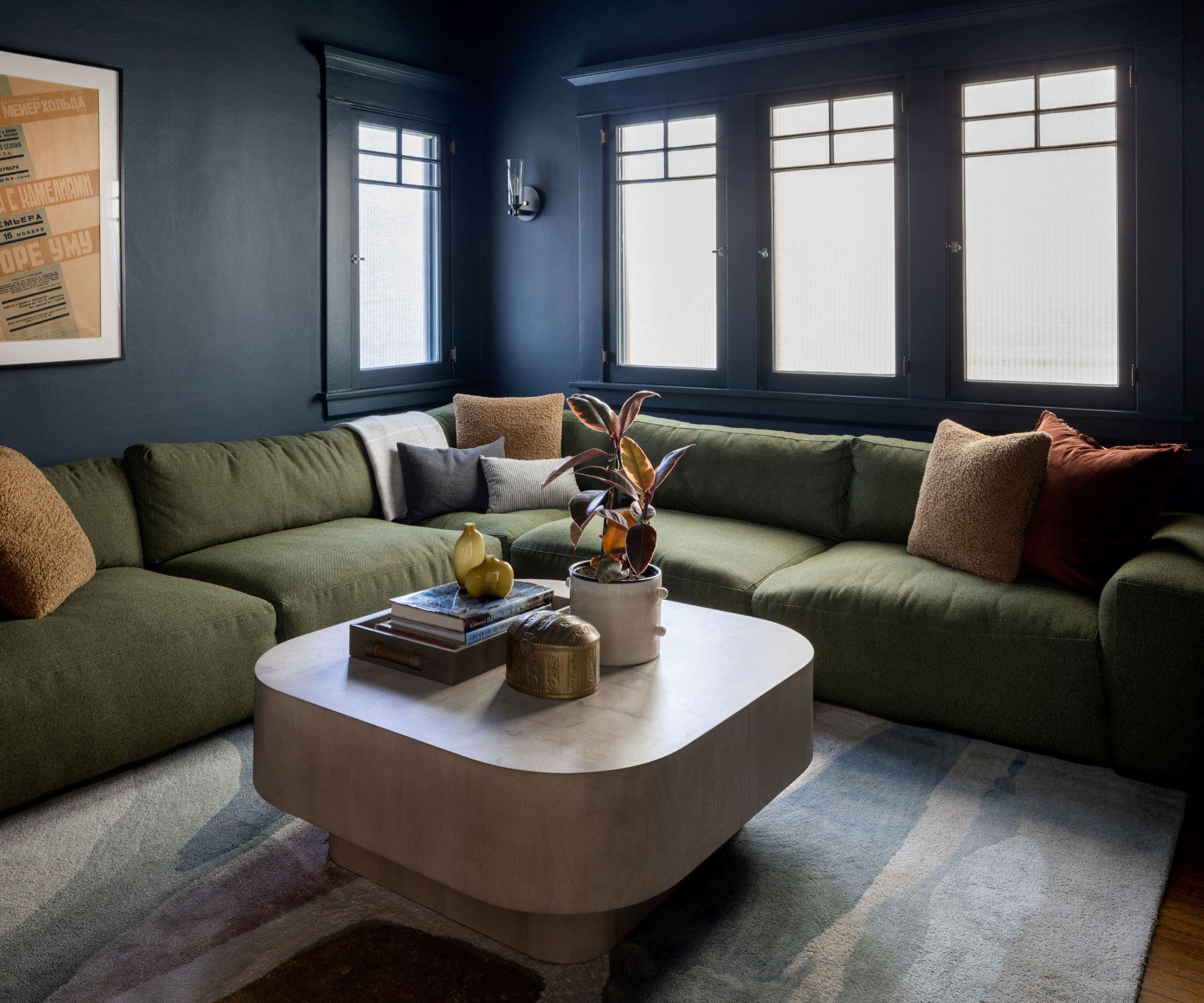
It might be a small, secondary sitting room, but it still deserves – and will benefit from – a coherent and well-thought-through interior design scheme. Without a plan for the décor, the snug is likely to end up looking like a jumble of cast-off furniture and furnishings left over from the rest of the house.
First up, think about the color scheme. There are plenty of paint tricks for small rooms that would create impact in a snug. Or how about wallpaper? That designer wallcovering might be expensive, but it won't be so costly in a smaller space. One question we're often asked is whether 'small rooms be painted in light or dark colors?'. Spoiler alert, you can do either but dark colors really can make a small room feel cozy and, surprisingly, they can even make it seem bigger, as in Dmar Interiors' stylish movie-den snug pictured above.
'Something you can do to create a successful snug room décor is to create overlaps, bringing about a cozy experience,' says Nastassja Bowman. 'You can layer rugs to give a plushness and comforting experience. The multiple layers create an ambiance of warmth and invitation. A place well lived-in.' And make sure there are some cozy blankets and pillows around for optimum snuggling.
That's rugs and blankets covered, but don't forget the other essential home comforts. 'Having a perching spot for a drink is always a must,' says Kendra Nash. 'We love little drink tables as small as 8 inches or an ottoman that can also act as a seat or add a tray for that drink.'
6. Getting the lighting all wrong
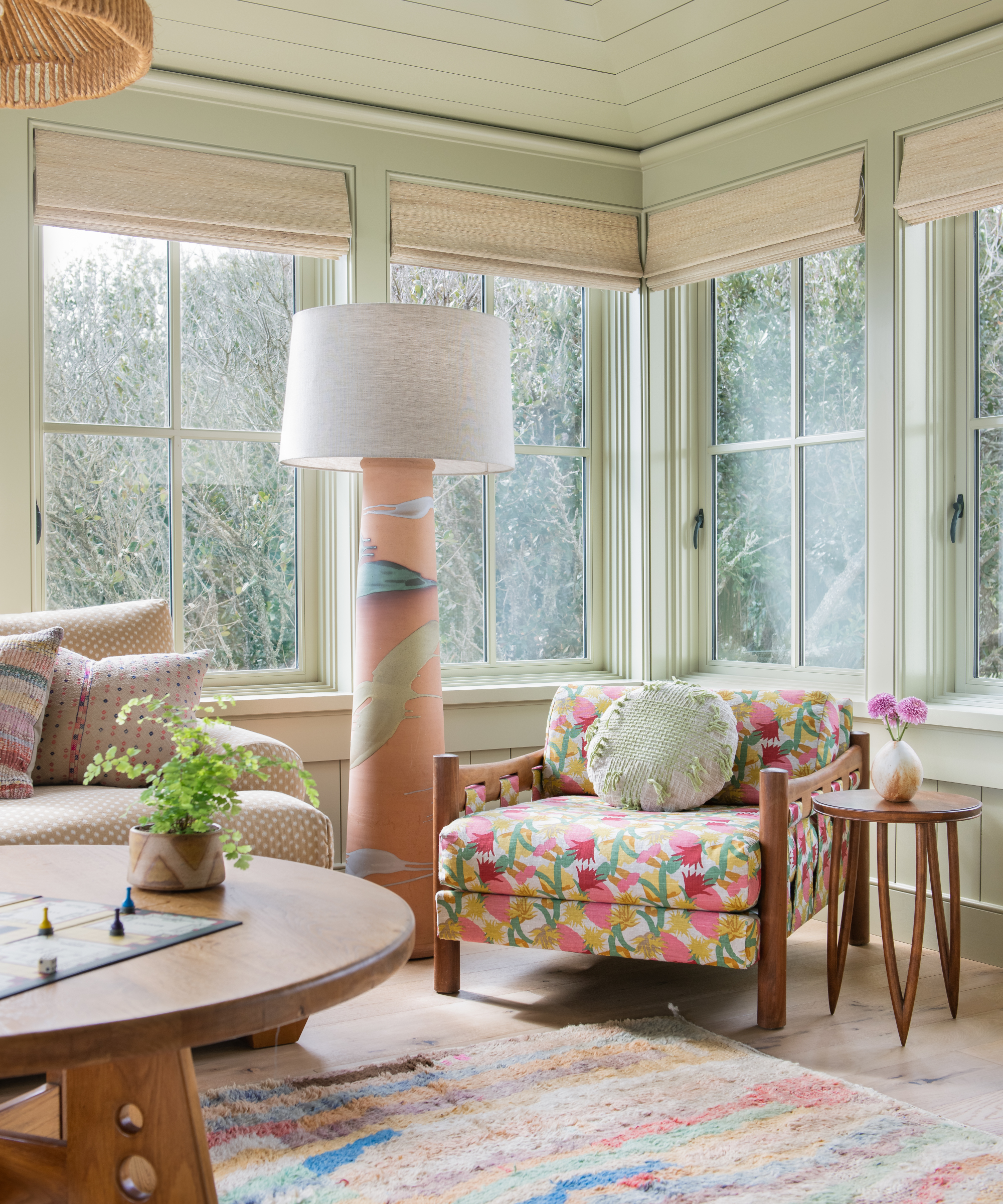
It's something we hear a lot from interior designers, if a room's lighting is wrong the room is wrong. The key to any successful room design is planning the lighting from the start and this crops up over and over again as the interior designers' top element in getting a room scheme right.
Nastassja Bowman says, 'You can have layered lighting in the form of overhead lights, task lighting, general lighting. Add some table lamps, add a floor lamp,' she says.
Kendra Nash offers the following advice for lighting a snug room: 'Make sure there are layers of light – recessed cans can feel like you're being blinded and create unflattering shadows,' she says. 'We prefer playing with different levels and hues that decorative lamps can provide throughout a space.'
In the Kiawah Island house snug, designed by Cortney Bishop and pictured above, a central pendant light and a showstopper floor lamp offer different lighting options that add personality to the room's décor.
Follow the designers' advice to avoid these six common snug room mistakes and you'll be well on your way to creating a cozy, relaxing room that's fit for purpose and a pleasure to spend time in.
Sign up to the Homes & Gardens newsletter
Design expertise in your inbox – from inspiring decorating ideas and beautiful celebrity homes to practical gardening advice and shopping round-ups.
Karen sources beautiful homes to feature on the Homes & Gardens website. She loves visiting historic houses in particular and working with photographers to capture all shapes and sizes of properties. Karen began her career as a sub-editor at Hi-Fi News and Record Review magazine. Her move to women’s magazines came soon after, in the shape of Living magazine, which covered cookery, fashion, beauty, homes and gardening. From Living Karen moved to Ideal Home magazine, where as deputy chief sub, then chief sub, she started to really take an interest in properties, architecture, interior design and gardening.
-
 Kevin Bacon and Kyra Sedgwick's rustic kitchen island is stunning, but controversial – designers say you can get the look without the hassle
A popular material finds an unorthodox home in the couple's kitchen, but experts disagree on whether it should be used – here's how to do it instead
By Sophie Edwards
-
 How to grow grapefruit for homegrown sweet and tangy, highly nutritious harvests – a fruit tree expert shares their planting and care tips
From planting to harvesting, this is all you need to know about grapefruit trees
By Drew Swainston