11 small living room design rules – I use these to enhance tight spaces
As an interior designer, these are the small space techniques I use to enhance the living rooms I design for clients, and in my own home
- 1. Play with organic shapes
- 2. Soften up the edges
- 3. Blend wall and trim colors
- 4. Infuse natural light with sheer treatments
- 5. Go for small scaled prints
- 6. Scale up the floorcovering
- 7. Embrace a floating layout
- 8. Go for thoughtful and light accessorizing
- 9. Elevate with larger artwork
- 10. Choose light-hued walls
- 11. Embrace monochromatic harmony
- FAQs

These are my small living room design rules.
Compact living spaces have to work really hard: they're often the heart of the home, but their limited size can mean that anyone looking for small living room ideas is limited on choice of decor opportunities.
Below, I list out the rules I swear by when designing small living rooms, from choosing the right furniture to living room styling.
1. Play with organic shapes
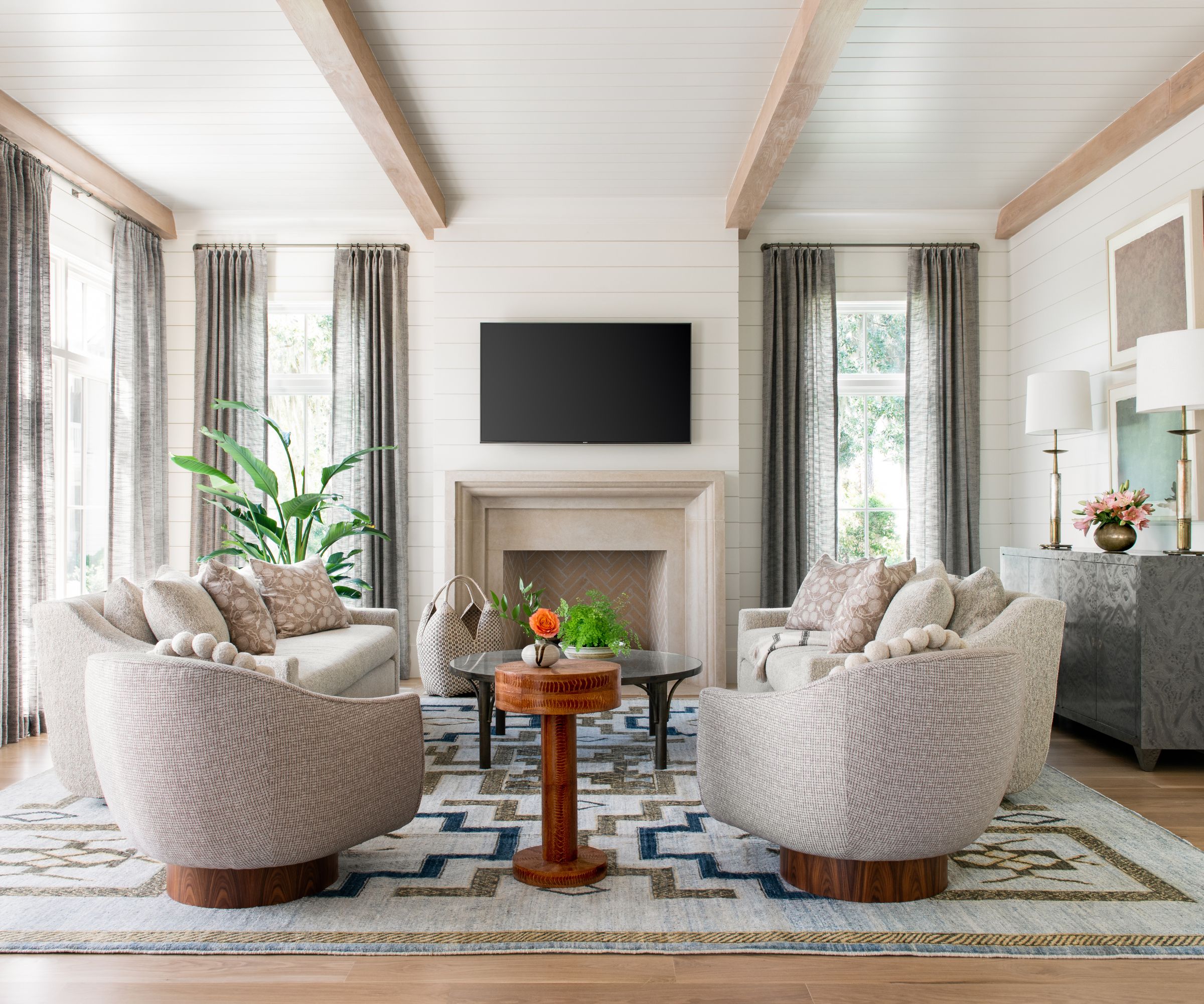
Incorporating organically shaped furniture with natural, flowing lines creates interest in the space that takes the focus away from the room's size. It serves both as a clever distraction and an invitation to get creative with your space.
This can help you when you are looking to buy the right couch for a small living room.
2. Soften up the edges
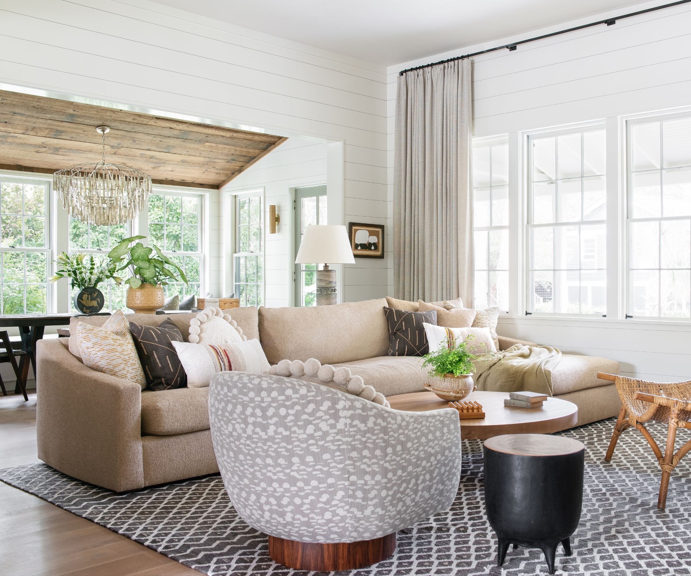
Furniture with softer lines on upholstery is like a friendly invitation to move about. Using curves in interior design creates more space to walk around, so you're not constantly bumping into hard corners.
3. Blend wall and trim colors
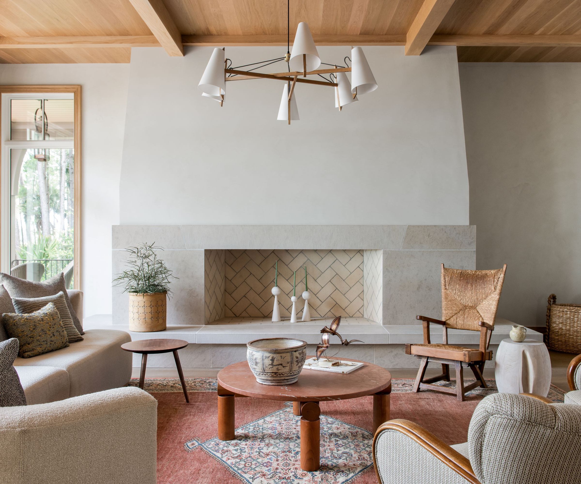
Should your trim match your wall color? Yes – painting walls and trim in the same color blurs boundaries, creating better flow. This trick makes the room feel more open and less dimensional.
4. Infuse natural light with sheer treatments
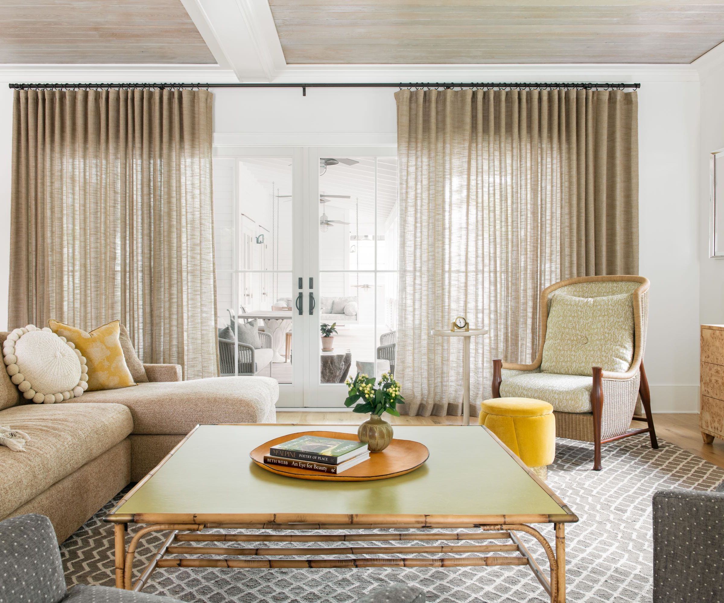
Sheer window treatments invite ample light into the space and the sheer quality of the fabric lends a sense of airiness to the room, making tight spaces feel more relaxed and open.
5. Go for small scaled prints
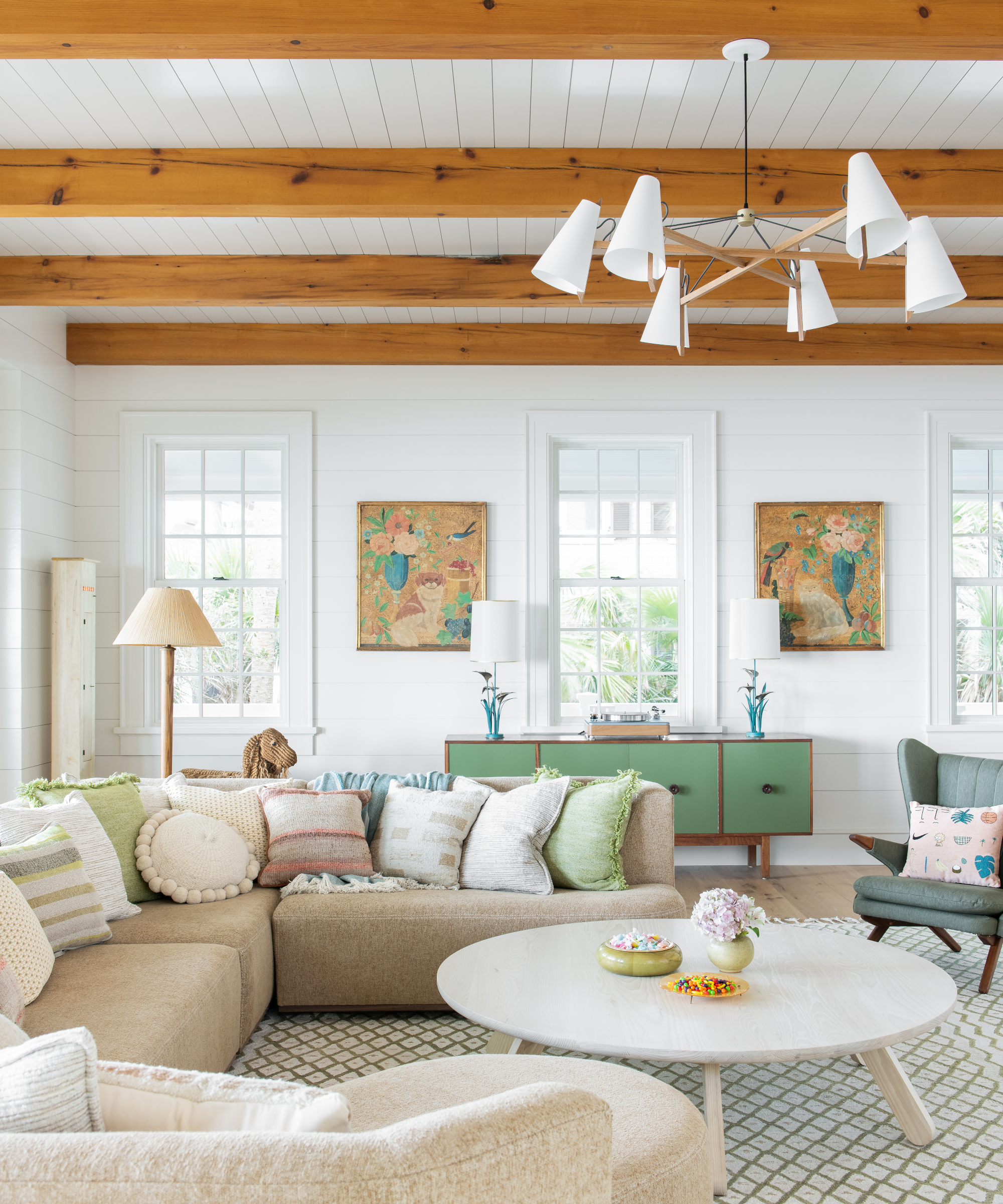
Be sure to avoid big bold prints on drapery or upholstery, as they can quickly overwhelm the space. Opt for small scale prints instead to create more depth.
6. Scale up the floorcovering
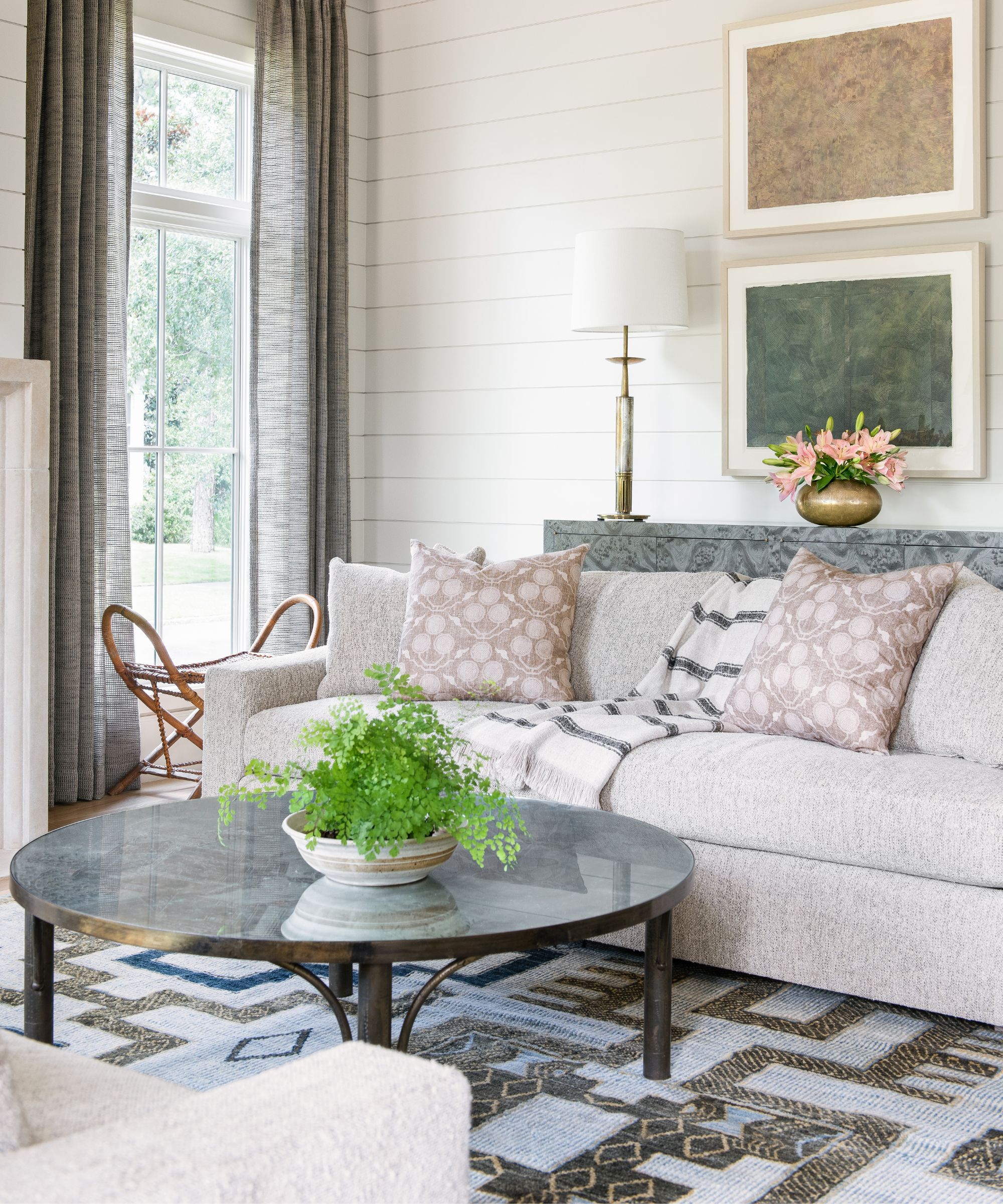
Choosing the ideal size area rug for a living room means opting for a generously sized rug that covers a significant portion of the floor. This enhances the room’s overall composition and sense of spaciousness.
7. Embrace a floating layout
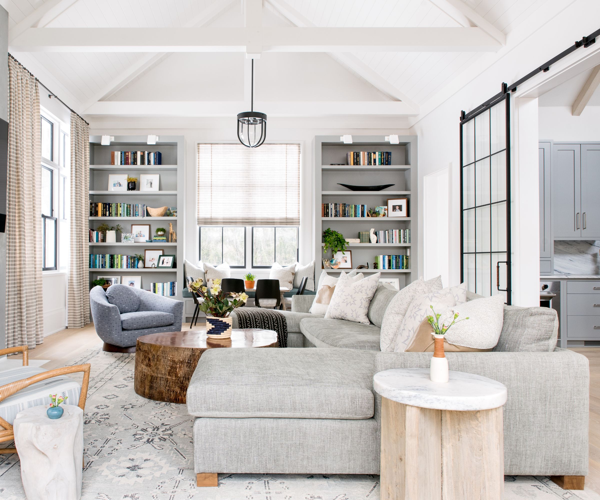
Arrange living room furniture in a way that centralizes the space. This living room layout style ensures that every inch of the space is utilized effectively and creates an inviting sense of openness.
8. Go for thoughtful and light accessorizing
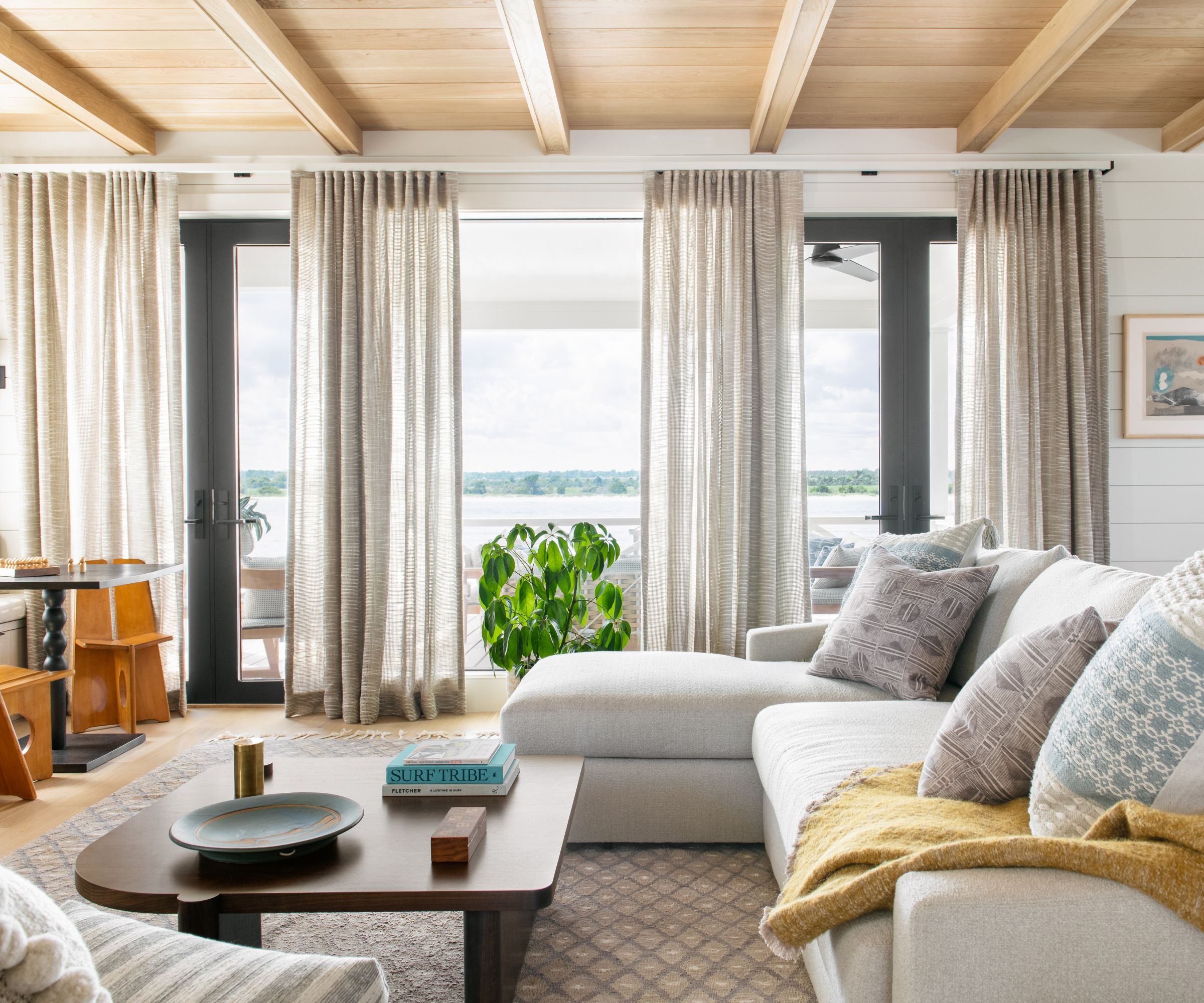
By focusing on quality over quantity and being intentional with your selections, you can create a space that's curated and purposeful while maintaining a clean visual aesthetic.
9. Elevate with larger artwork
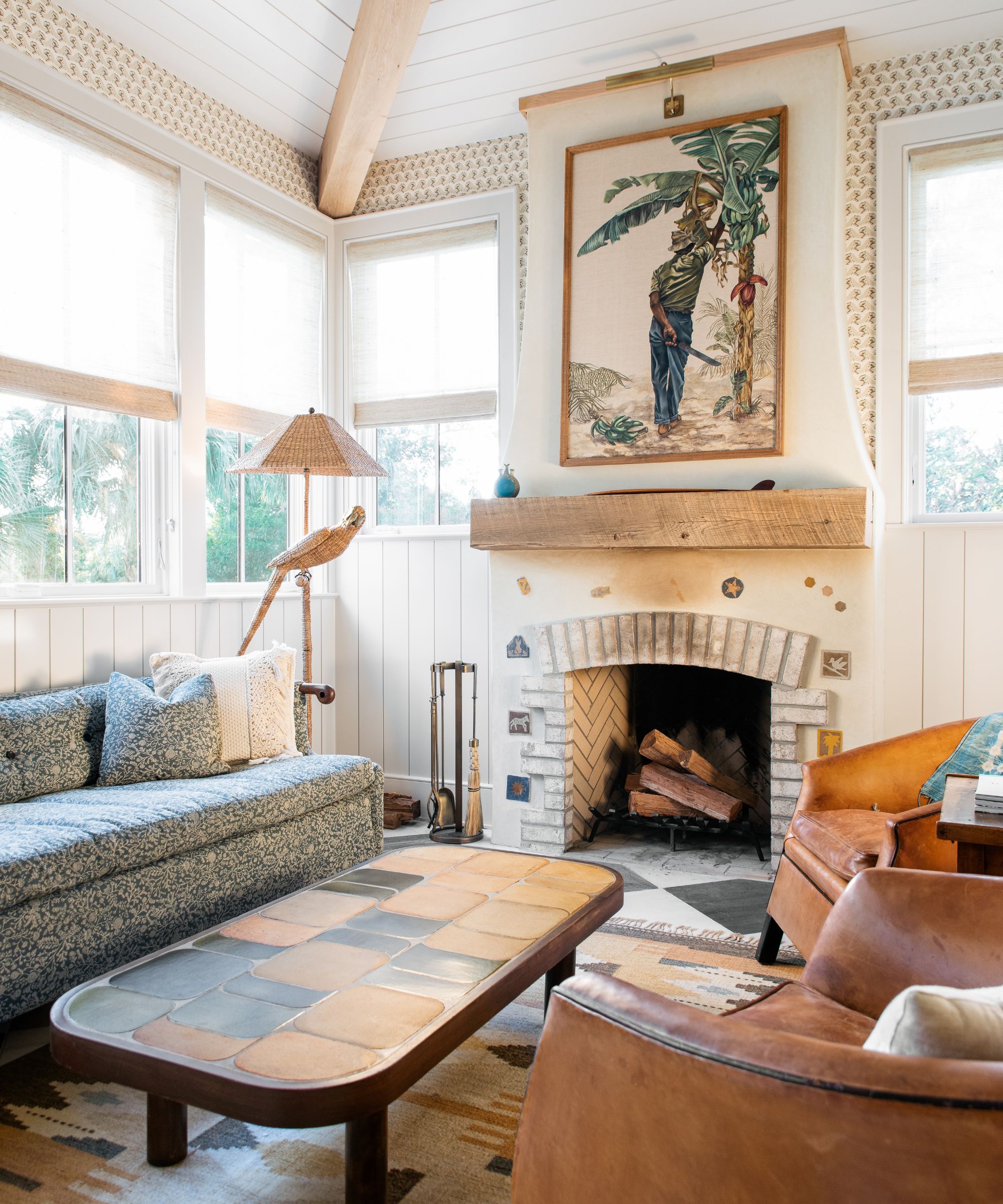
Incorporating sizable artwork on the walls draws the eye upward, creating a sense of vertical space. By emphasizing the height of the room, the space feels more expansive.
10. Choose light-hued walls
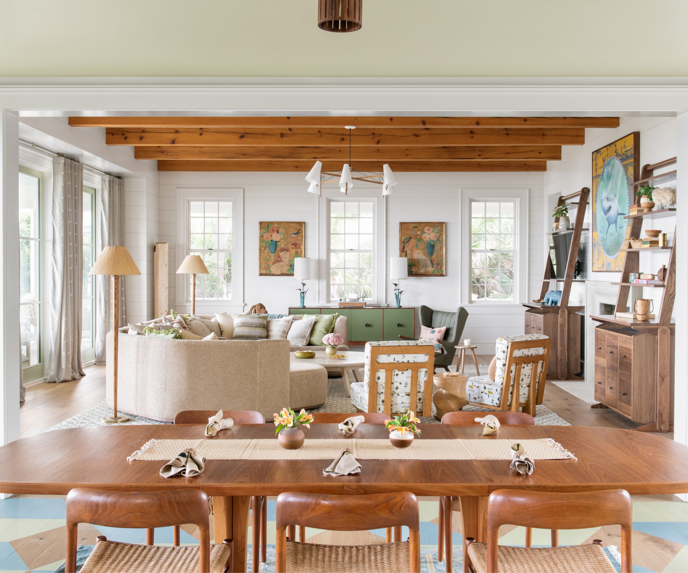
What colors make a small living room look bigger? Opt for light shades like creams or warm whites on walls, ceilings, and trim. Light hues reflect light around the room, creating an atmosphere of openness.
11. Embrace monochromatic harmony
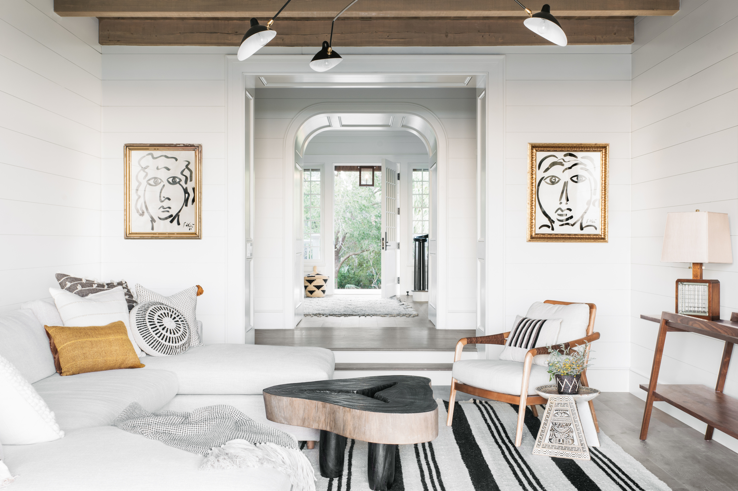
Incorporate a monochromatic color scheme for both fabrics and wall colors. The consistent color palette creates an uninterrupted visual flow, unifies the room's various elements, creating a cohesive and visually soothing environment.
FAQs
How do you arrange things in a small living room?
Small living room layout rules that can help it feel larger and more balanced include incorporating symmetry in your interior design, choosing built-in furniture over freestanding storage, picking low-slung pieces are in proportion to the size of the room, and that allow light to flow in, and hanging mirrors.
All of these design rules will help your small living space feel brighter, yet won't rob it of its character. I like to include lots of texture in my interior design. This takes up no space but, in layers, can make your space feel characterful and welcoming.
Sign up to the Homes & Gardens newsletter
Design expertise in your inbox – from inspiring decorating ideas and beautiful celebrity homes to practical gardening advice and shopping round-ups.

Cortney Bishop, principal design and owner of Cortney Bishop Design, founded the full-service interior design firm in 2007. She holds a BBA in business marketing from the University of Georgia, and pursued her design career by blending her passions for travel, art, fashion and music. Her wide-ranging talent and innate ability to mix patterns and hues has resulted in a robust portfolio of diverse, inspiring residential and commercial projects, each reflective of a client’s lifestyle, personality and aesthetic. Cortney regularly contributes to Homes & Gardens.
-
 Plants never to grow next to fruit trees
Expert advice on which plants to keep away from fruit trees to encourage a healthy harvest
By Jacky Parker Published
-
 Martha Stewart's tips for arranging daffodils are unbelievably simple and effective – it's the only flower advice you need this springtime
Martha shows us that we can create gorgeous bouquets of this seasonal flower by simply trimming the stems and placing them in specific vases
By Hannah Ziegler Published