Living room furniture arranging mistakes – 7 ways to avoid bad layouts in the main room
Can't get your space to work right? We look into the common living room furniture arranging mistakes that we've all made
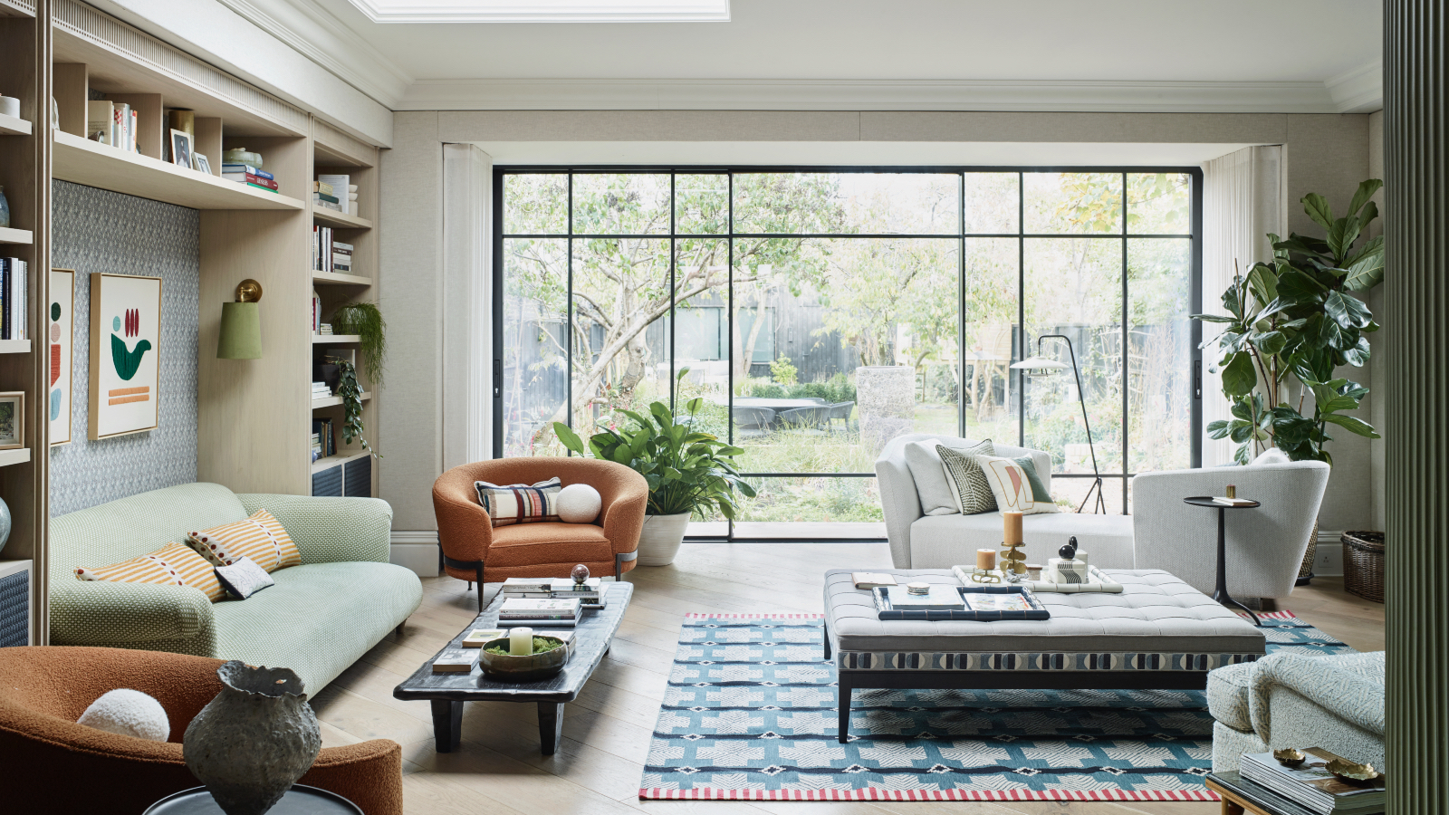

Cohesiveness, functionality, and style – these are the watchwords to consider when designing and deciding how to arrange your living room furniture and avoid any common living room layout mistakes.
There are golden rules to follow when arranging living room furniture and we have asked out favorite interior designers what these rules are and how we can avoid creating a living room that is badly configured.
We may be lured into buying a piece of furniture that is in the sale or is our favorite color, but then it is delivered, and, oh no, it does not fit in size, style, color, or aesthetic. So, before you start shopping read on to avoid these basic mistakes and find out how the interior designers arrange the perfect living room setup.
Living room furniture arranging mistakes
Decorating mistakes and interior faux pas are easy mistakes to make and ones we all do to some degree. You might notice some rooms in your house make you feel physically at ease and just 'work', while others may feel a little jarring, but you cannot decide why – this is because furniture arrangement can make or break an interior.
If you feel like you have poor furniture placement have no fear, adjusting furniture is a simple and easy way to create a new layout that just works.
We've discussed it with the interior experts to find out what the are worst living room furniture arranging mistakes and how to resolve the layout using the principles of interior designer-approved home decor ideas as guidance. If in doubt, our selection of the best indoor furniture stores will help you to source the most desired designs.
1. Ignoring a focal point
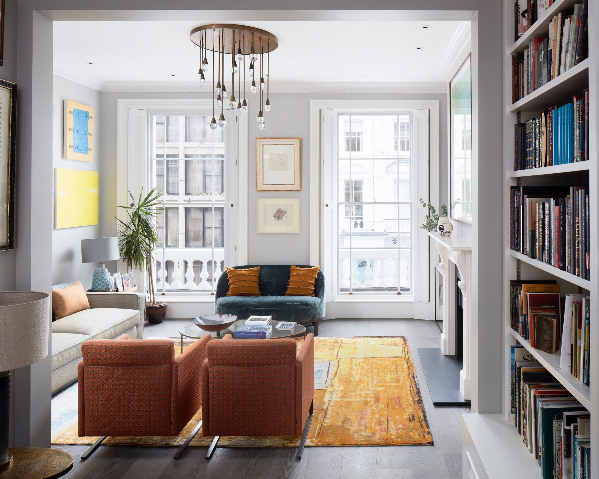
Your living room will have a natural focal point, be it the window, fireplace, a wall of books, artwork, mirror or even set of French doors, working out where that focal point is, is the first thing to do when deciding on the overall living room layout of the space. Everything else will fall into place once you have this point agreed upon. Not knowing where that focal point is, will leave you with a jumble of furniture and no cohesion.
‘The number one mistake people make when arranging living room furniture is forgetting the focal point of the room. If the room has a stunning view, for example, I arrange the furniture to maximize it. Alternatively, I might use an open fireplace or a beautiful wall of joinery as the focal point,’ says Irene Gunter, interior designer at Gunter & Co.
Amy Youngblood, principal designer at Amy Youngblood Interiors agrees, ‘When designing a living room, you want to choose your focal point whether that’s your living room TV, fireplace, or a piece of art, and position furniture around it for optimal functionality and cohesiveness.’
However, Irene disagrees with one focal point, ‘Whatever you do, avoid making the TV the focal point,’ she adds, ‘You can hide it from view to create a more aesthetically pleasing space. There are various options, such as concealing it behind an automated wall panel that moves aside when you turn the TV on or a sliding painting. Alternatively, incorporate the TV into a dark-colored shelving unit so that it won't stand out.’
Whether you agree with us or not is entirely up to you, but ensuring you know what the focal point is in your living room will provide you with the optimal layout design for the furniture, and help you to avoid any sofa arranging mistakes.
2. Not measuring furniture
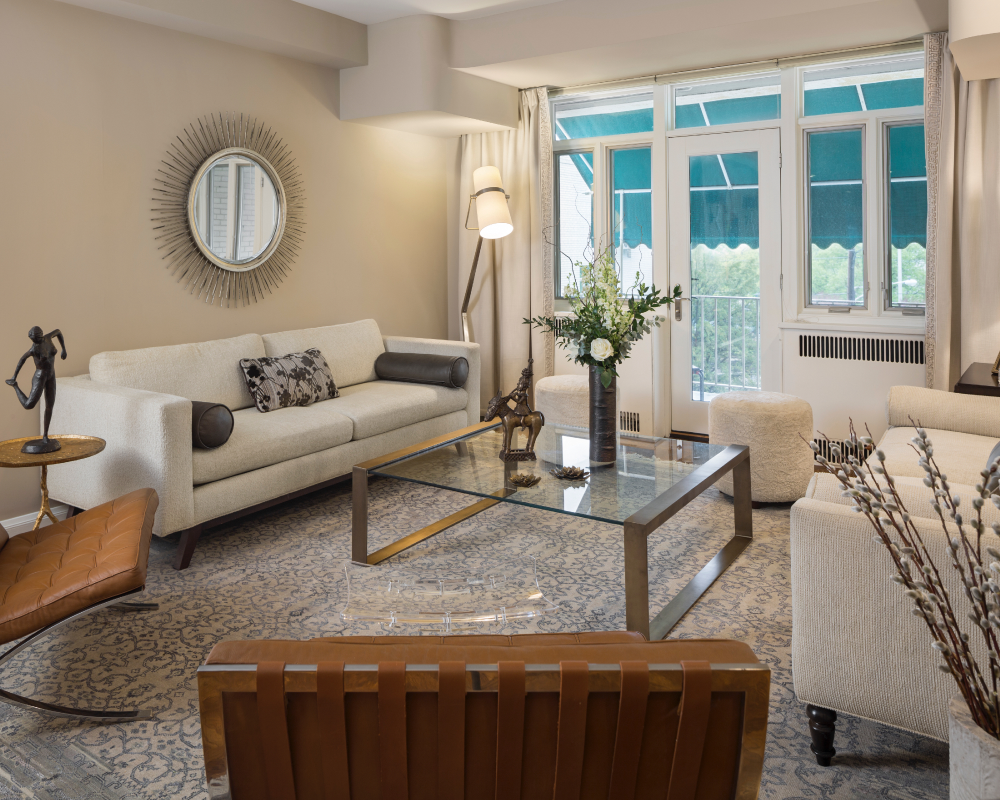
It seems obvious but many of us may get carried away by an exciting price point or a fabulous piece of beautiful furniture in a showroom, but do not stop to consider the scale. Scale and size are fundamental to a good or a dreadful layout and should be one of the key thing considerations, once you have decided on the focal point when considering the layout of your living room.
‘Marking out furniture on the floor using FrogTape also helps you decide how big (or small) furniture pieces should be. You don't want a small two-seater sofa in a grand living room, as it will look out of place. However, you don't want a small living room swamped by a large L-shaped sofa either. The scale of the furniture needs to be appropriate for the size of the room.’ Advises Irene Gunter, interior designer at Gunter & Co.
Mistakes can be made with furniture if it is too big or too small, as Ami Mckay, president and principal designer, at Pure Design says, ‘Mistakes are made if things are the wrong scale for the room, oversized furniture in a small space.’
‘The scale of your sofa is important. Too big and it can feel like it engulfs the whole room, too small you’ll be fighting over the best seat in the house. Finding that sweet spot is key,’ adds, Patricia Gibbons, at sofa.com.
3. Forgetting to considering flow and circulation
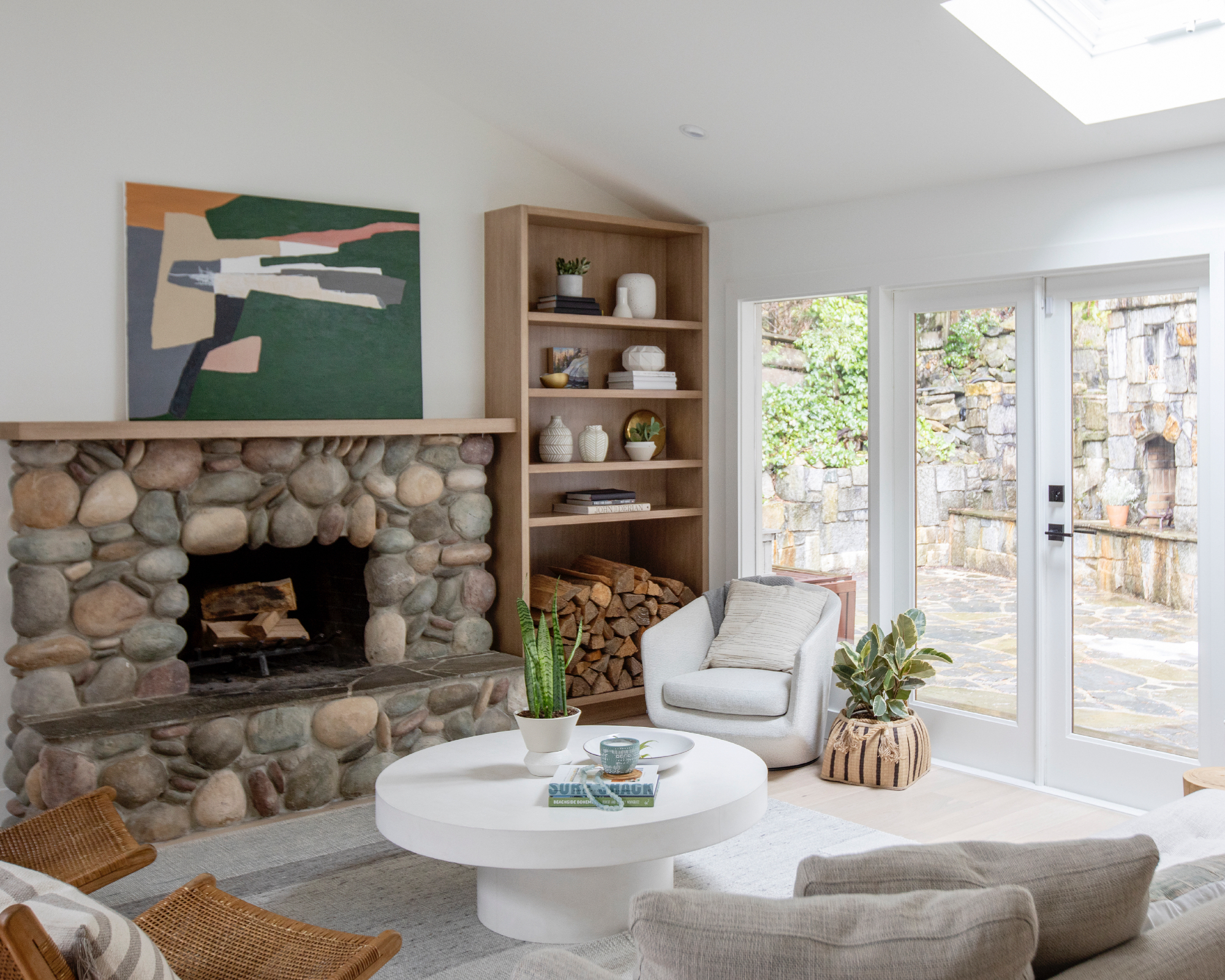
You have chosen your focal point and you have measured up your main pieces of furniture – the sofa, armchairs, and side tables, and the living room layout is beginning to come together. However, circulation and flow are the cornerstone to an arrangement, space around furniture is a factor that we may disregard but one that when done correctly, can ensure seamless flow in the room, and therefore calm and order, which we all want in the living room.
For some interior designers, there is a measurement rule of thumb to create space around furniture, so that, ‘You can move effortlessly through the room without furniture getting in the way,’ explains Irene Gunter.
Find the perfect position for the sofa, and then match the scale with your coffee table; you want the coffee table about 16-18 inches from the sofa. Add chairs where there’s room considering traffic flow and scale,’ explains president and principal designer at Pure Design, Ami Mckay.
Dani Burroughs at Snug says that a sofa should be, ‘ideally around 12 inches from the window.’
Ami Mckay goes on: ‘For conversation and visiting, arrange seating no more than 8 feet apart. For example, two sofas facing each other, with a group of chairs and tables at one end for a separate conversation area.’ But she adds, if you have a huge room, ‘pull your furniture away from the walls to create a floating arrangement.’
4. Neglecting the lighting
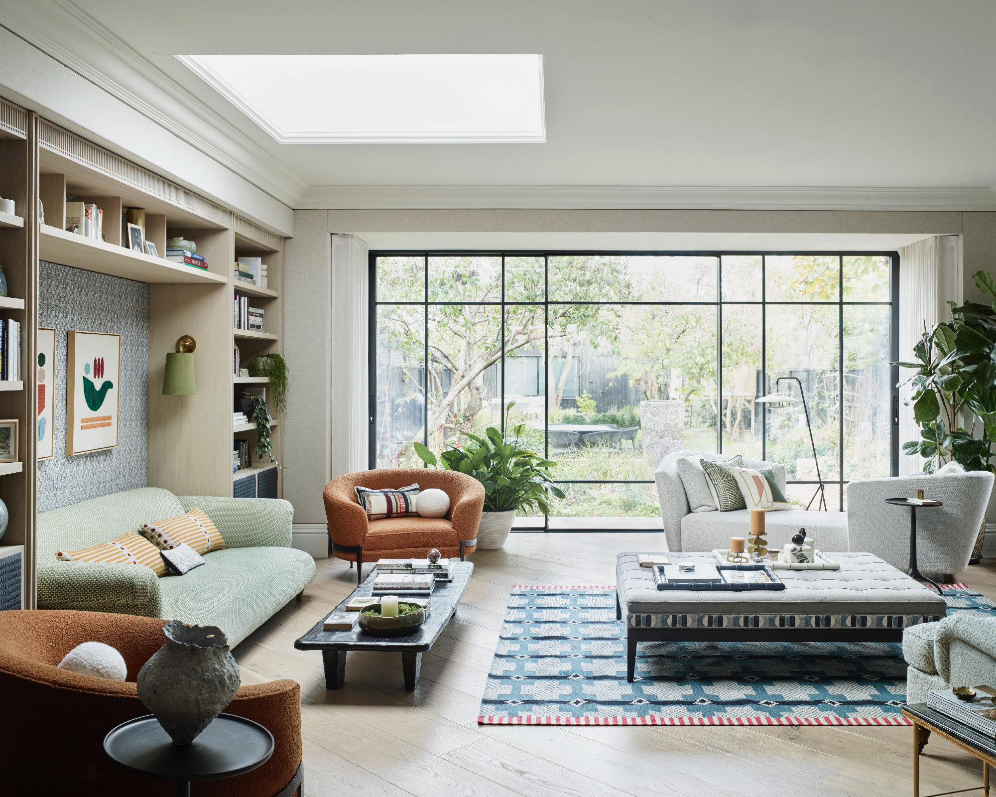
It is a design no-no to assume that one light in the center of the ceiling is all that is needed in a living room layout. Absolutely not, lighting, like furnishings and style details, is better if it is layered, with consideration given to different types of lighting for each area of the room.
President and principal designer at Pure Design, Ami Mckay, explains more: ‘Good lighting is a must! Pendants, lamps, and sconces allow for ambient lighting at night. Uplights behind plants, candles on the mantel, and floor lamps that light up the ceiling will create a beautiful glow. Try not to use overhead lighting and do have it on a dimmer for options when needed. My other tip is to install in-floor electrical outlets for floating furniture arrangements.’
5. Never overlook the details

The details make the room, think side tables, a rug, books, cushions, artworks, vases, and objects. Layering your sitting room with decorative notes adds a personal, warm, and welcoming atmosphere to the room, so do not overlook this important and final design touch.
Most of the interior designers we spoke to advocated for a rug in the living room, Caroline Milns, head of interior design at Zulufish explains: ‘A rug is key to providing an anchor within the room, inviting you towards the seating area and creating a social setting, where sofas and armchairs allow for family and friends to gather together.’
Amy Youngblood principal designer at Amy Youngblood Interiors agrees, ‘Find the right size rug for the space and think about how much seating you're going to need, find a coffee table or ottoman that is scaled appropriately, and add accent chairs for extra seating.’
Don’t forget to add lots of cushions and a throw or two, this will ensure people can relax and feel truly at home. Artworks, antiques, house plants, and books will breathe fresh life and add to the layering element, providing a deeply personal finishing touch to your living room.
6. Don’t disregard an accent chair
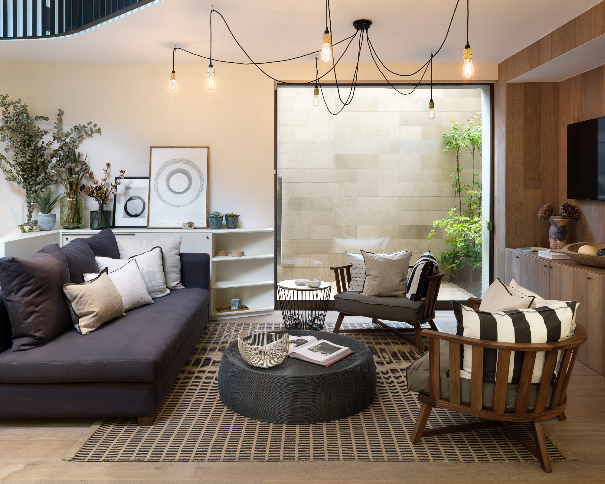
An accent chair will complete your seating environment. An accent chair is often a more decorative chair, that is used as a design element in the overall look but comes into its own when you have visitors and need extra seating.
Katie Lion, senior interior designer at Kitesgrove, says that ‘accent chairs are a great way to visually separate a space while adding character and definition to an open floor plan.’
7. Limiting yourself to one seating area
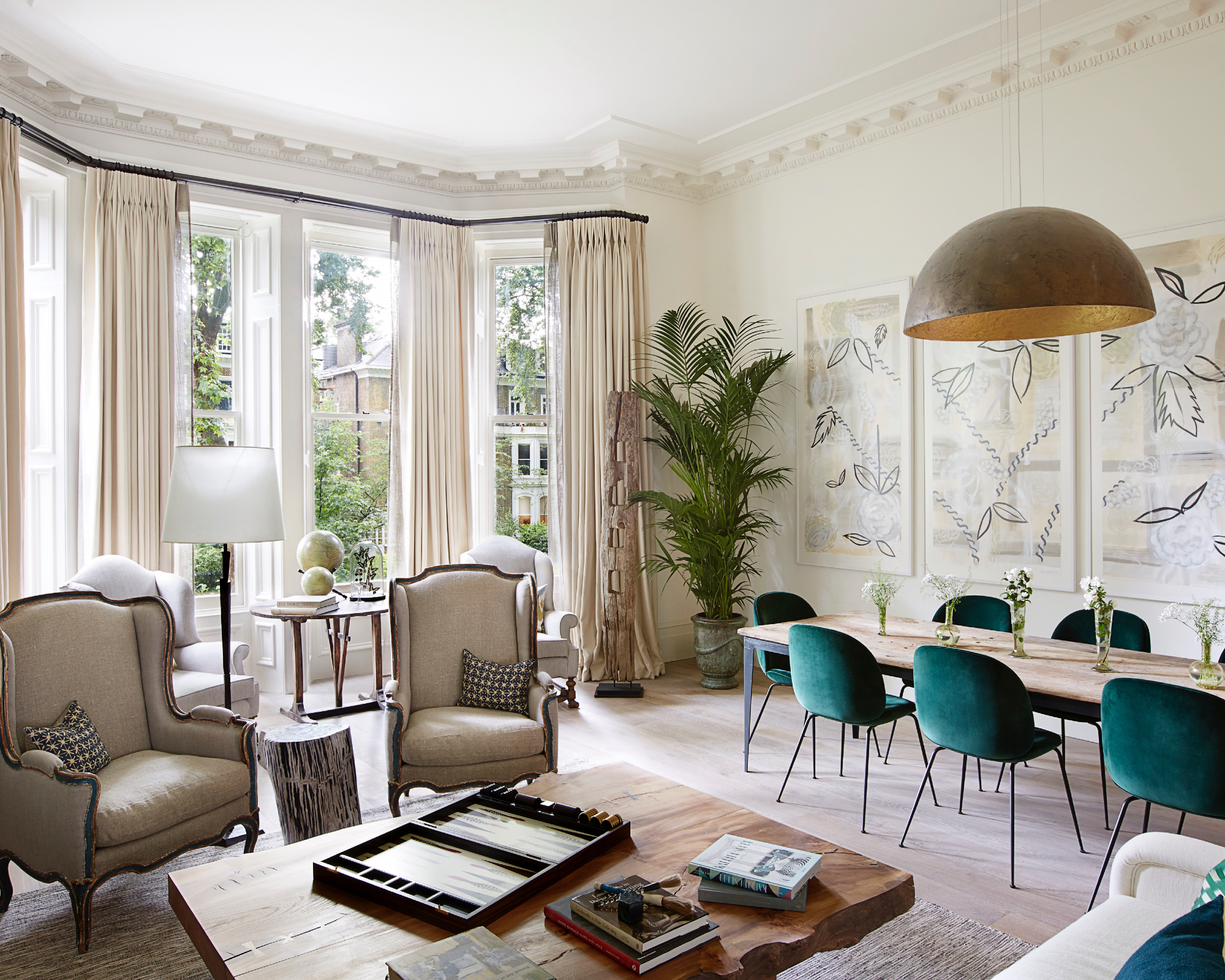
The design of living rooms has changed over the decades as houses with open-plan layouts have become more popular, which can lead to a slight blurring between the dining and living room design.
But interior designers have created clear and clever ways to work with these larger spaces by creating smaller vignettes of seating or dining.
Caroline Milns at Zulufish explains: ‘Consider creating a series of spaces within the room to provide the greatest flexibility. For example, if you wish to have a place for quiet reading, then adding a favorite armchair, occasional table, and table lamp, or lowered pendant within a corner or window vignette will mark out a cozy spot, in contrast to the more classical approach of a grouped sofa and armchair scenario, which offers a more sociable situation.’
How to arrange living room furniture without making mistakes
The potential power of recreating your living room furniture layout, cannot be overlooked. Scale, a clear focal point, flow around furniture, considered layered lighting for the walls, side tables and focus areas, not to mention the details and seating areas, to have a sitting room that feels considered, relaxing and elegant without you noticing why it does.
Extra seating is a must for extra guests, to have a cozy and inclusive space, Liv Wallers, co-founder of Yellow London chooses to include, ‘a club fender or some small stools that can be pulled up when entertaining, so no one is ever too far away for a conversation.’
Sign up to the Homes & Gardens newsletter
Design expertise in your inbox – from inspiring decorating ideas and beautiful celebrity homes to practical gardening advice and shopping round-ups.

Hannah Newton is a lifestyle, interiors, travel and design journalist and editor who has been writing for the past two decades, she has written for national newspapers including The Times, The Telegraph, The Guardian and The Observer as well as interiors titles Elle Decoration and Architectural Digest in the UK and across Europe, South Africa and Australia.
-
 This simple marble hack elevates my budget-friendly wooden kitchen countertops and prevents the dreaded water damage for way less than you’d think
This design trick looks expensive, solves a problem, and was the easiest decision I made during my kitchen reno
By Charlotte Olby Published
-
 Emily Blunt gifted Cillian Murphy this $545 pillow – she's 'obsessed' with these luxury pillows, and frankly, so are we
The Oppenheimer stars sleep on this ultra-luxe goose down pillow – here's why we love it – plus our affordable alternatives from $35
By Sophie Edwards Published