The furniture placement rule that makes my small living room look bigger and more cohesive
Why you shouldn't put furniture up against the wall and hope for the best
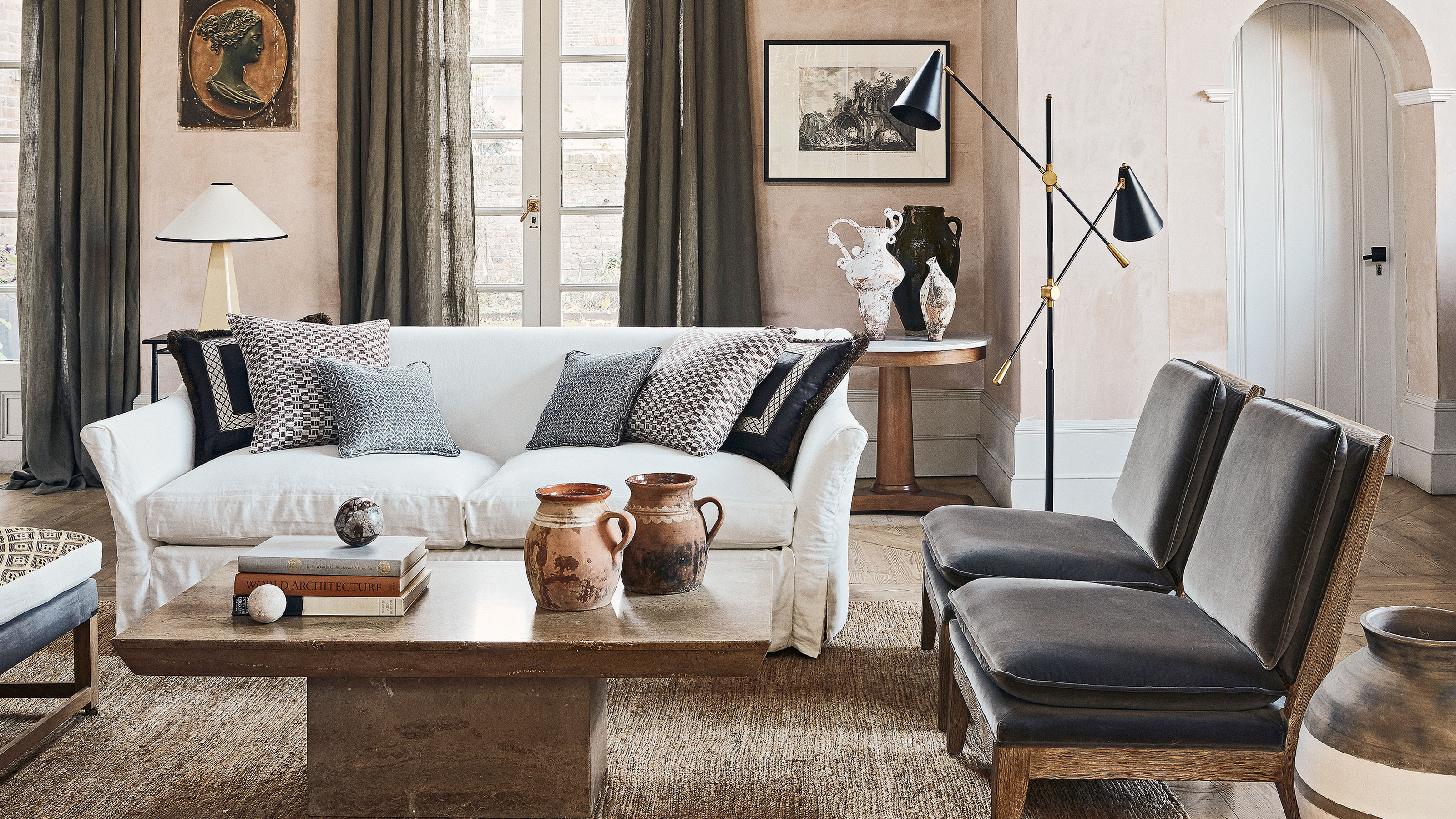

Furniture layout can make or break a room, but because it feels daunting to be inventive, we tend to put our couches and armchairs against the walls. Sure, this frees up floor space in the middle so you're not banging into things as you pass through, but it also means you run the risk of making the room feel cold and uninviting.
Whether we realize it or not, rooms with furniture right up against the walls often feel lackluster. They're neither spacious nor welcoming, totally lacking in a focal point and, dare I say it, often look a bit like a waiting room.
If, like me, you're blessed with a small living room, bring your furniture away from the walls and I promise it will feel better. Small living rooms come with lots of design dilemmas, but if you have the confidence to really own the space you can create a room with a big impact no matter the size. This is how.
The furniture placement rule I always follow in my small living room
Quick disclaimer: obviously, in some living room layouts, there's simply no other option but to have the couch against the wall, and if you have young children, you'll need the space for them to play. But maybe you've got a separate armchair or coffee table that you could invite into the center?
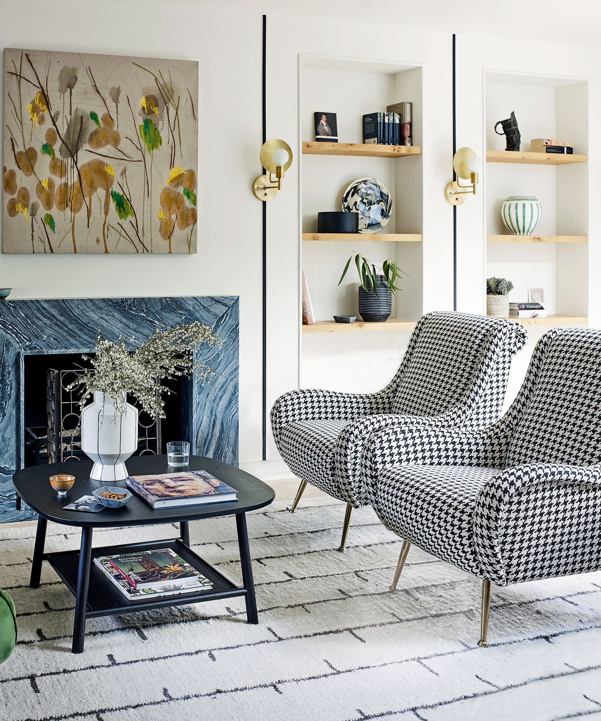
Bringing pieces of furniture into the middle will absolutely make a more sociable setup. Anchor the room with an area rug with at least the front two legs of the furniture on top, and instantly the room makes more sense. Take the example below.
The cozy fireplace flanked by pieces of artwork forms the focal point, and a range of seating arranged in a loose circle directs guests on where to go. The rug defines the space, and there's also somewhere convenient to rest a drink or cell phone. Push all the furniture to the edges and everything will look a little lost and awkward, like people dancing around the edge of the dance floor at a party.

Not only will keeping furniture away from the walls make for a more convivial space, making it easier when hosting, but it will also make the room feel more unified and therefore a more appealing space to linger in because everyone feels included in the conversation.
This furniture placement rule also helps create a sense of flow, and trick the eye into seeing a small living room as bigger. For example, a couch with a console table behind it, or just a couch on its own facing away from your home office area, can act as a room divider in a small open concept space. This gives you different zones, which can enhance the sense of space.
It depends on how you're using the space, but painting a small room white and putting furniture against the wall won't make it feel any bigger. It's one of the most common living room design mistakes, along with choosing a rug that's too small. Maximize every square inch of your space by bringing the furniture to the center and getting the biggest best couch you can fit. Knowing the best time to buy furniture gives you the best chance of getting a good deal.
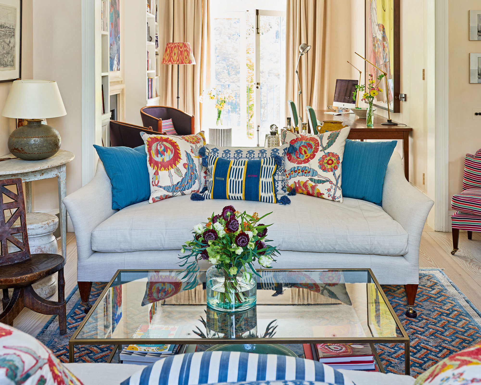
Jeanette Fusco, an interior designer at HiHomePicks agrees that furniture against the wall can make the room feel smaller than it actually is. 'This effect is particularly pronounced in small living rooms, as the walls create a visual barrier that prevents the eye from moving freely around the space,' she says.
Jeanette says that by angling or floating furniture away from the walls, you can give the illusion of a larger room and make the space feel more open and inviting. She even says that furniture pushed against walls can prevent guests from feeling at ease.
'When furniture is placed against the wall, it can look a bit too formal and cluttered. Instead, angling the furniture gives it a more casual, relaxed feel that is conducive to conversation and relaxation. This is especially important in a small living room, as you want to create an atmosphere that encourages conversation and socializing,' she says.
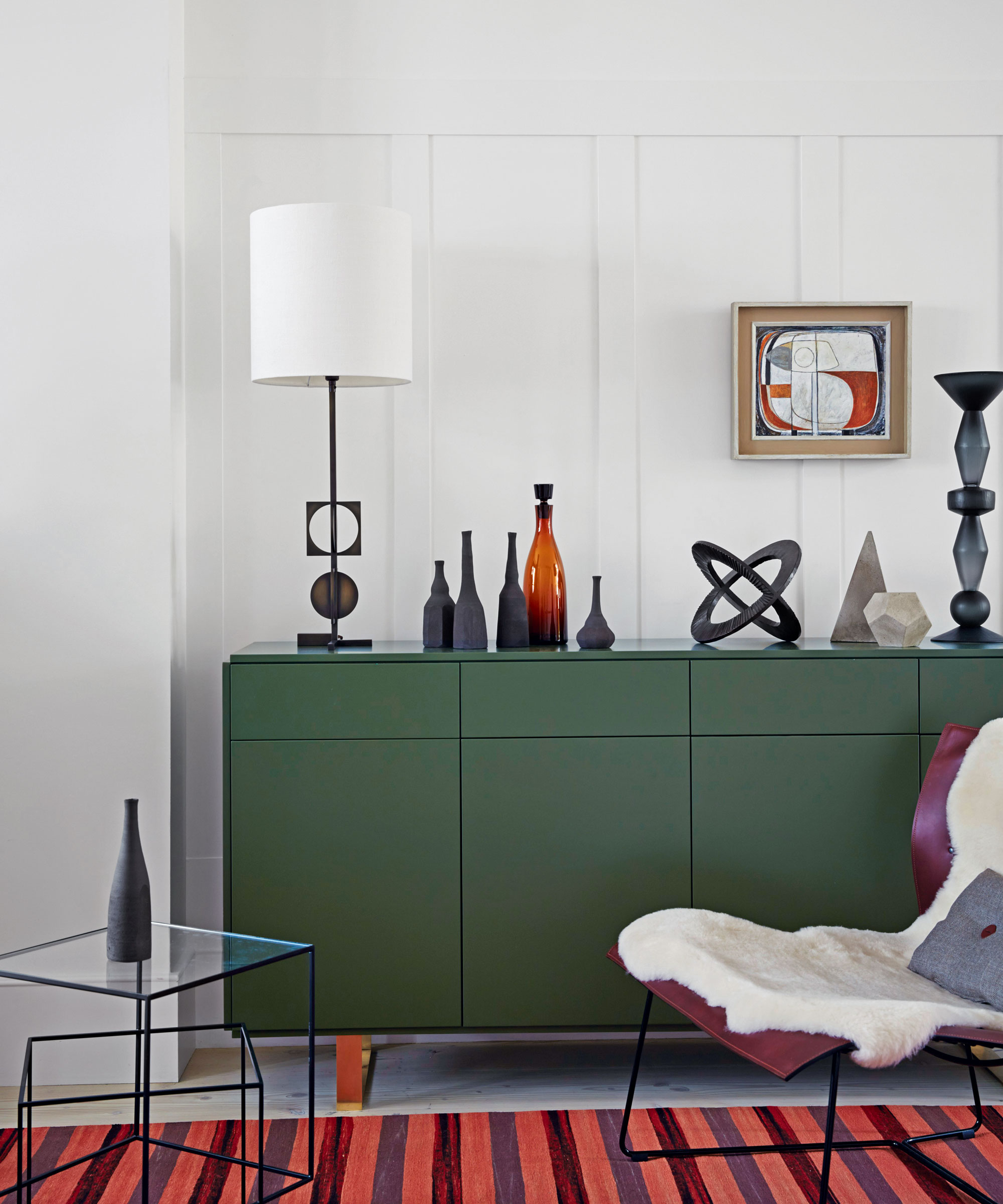
Finally, having furniture hug the wall makes it harder to rearrange things. Jeanette comments that it makes things feel more fixed and static. 'If you want to switch up the layout, it can be difficult to do when all of your furniture is against the wall. Angling or floating furniture allows you to easily move it around and create different looks with minimal effort,' she says.
Sign up to the Homes & Gardens newsletter
Design expertise in your inbox – from inspiring decorating ideas and beautiful celebrity homes to practical gardening advice and shopping round-ups.

Millie Hurst is a freelance lifestyle writer with over six years of experience in digital journalism. Having previously worked as Solved Section Editor at Homes & Gardens and Senior SEO Editor at News UK in London and New York, Millie has written for an array of homes brands including Livingetc and Real Homes and was formerly Senior Content Editor at Ideal Home. She has written and edited countless features on home organization, decluttering and interior design and always hopes to inspire readers with new ways to enjoy their homes. She loves to weave nature-inspired decor and nods to time spent in Italy into her own home.
-
 5 fast-growing tiny flowers – expert recommendations to fill your pots and borders with color in record time
These fast-growing tiny flowers prove that miniature can also be marvelous
By Thomas Rutter
-
 Midimalist kitchens are the trending way to create a characterful yet clutter-free space – and these 8 spaces prove how chic this best of both worlds style can be
It's the go-to kitchen style for a balance of busy and simplistic design
By Molly Malsom
-
 7 dorm room organizing rules for less clutter and more space
Experts offer their top tips for creating a well-organized dorm room, no matter the size, space, or layout.
By Ashley Chalmers
-
 How to maximize storage in a small or shared dorm room, according to pro organizers
Find out all the hidden storage zones you might never have noticed
By Ashley Chalmers