The biggest family room mistakes you can make according to designers – and how to avoid them
A family room is one of the hardest working rooms in the home, so it's important to get the design spot on...
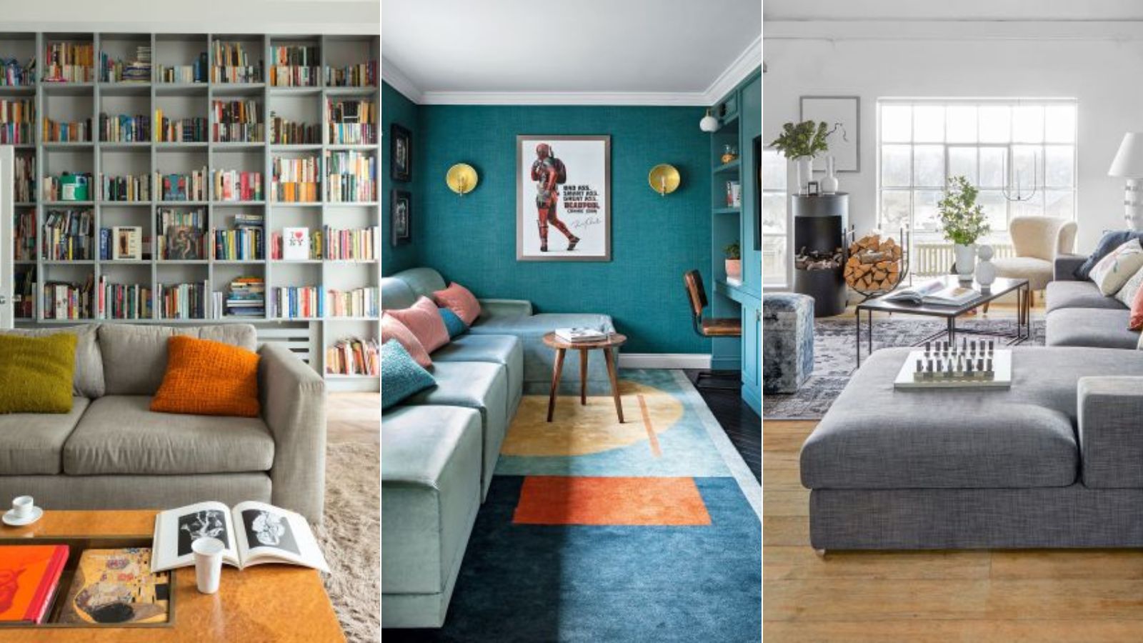
- 1. Putting aesthetics before the purpose of the space
- 2. Not having enough (or the right kind) of seating
- 3. Choosing cheaper furniture
- 4. Using impractical fabrics
- 5. Focusing everything around the TV
- 6. Not including enough light sources
- 7. Playing it too safe with color and pattern
- 8. Picking out the wrong sized rug
- 9. Overlooking how much storage you need
- 10. Not adding in the personal touches
- FAQs

A family room has to wear a lot of hats. It has to shape-shift from playroom to entertaining space, to a spot to work from home, to a place for a movie marathon. It also has to cater for all members of the family, often all at the same time.
So, obviously, there are a lot of important design decisions to make when considering family room ideas. But when designing a multi-functional room there are mistakes to be made.
It can be so easy to tip the balance in favor of a playroom or a more formal living room, and then the whole concept of a family room that can be used by all is no longer. To avoid making this particular error, and many more, we spoke with designers to get their expert advice on what works and what doesn't when designing a family room.
Family room design mistakes you should avoid
We would avoid all of these – expert designers advise what to do instead.
1. Putting aesthetics before the purpose of the space
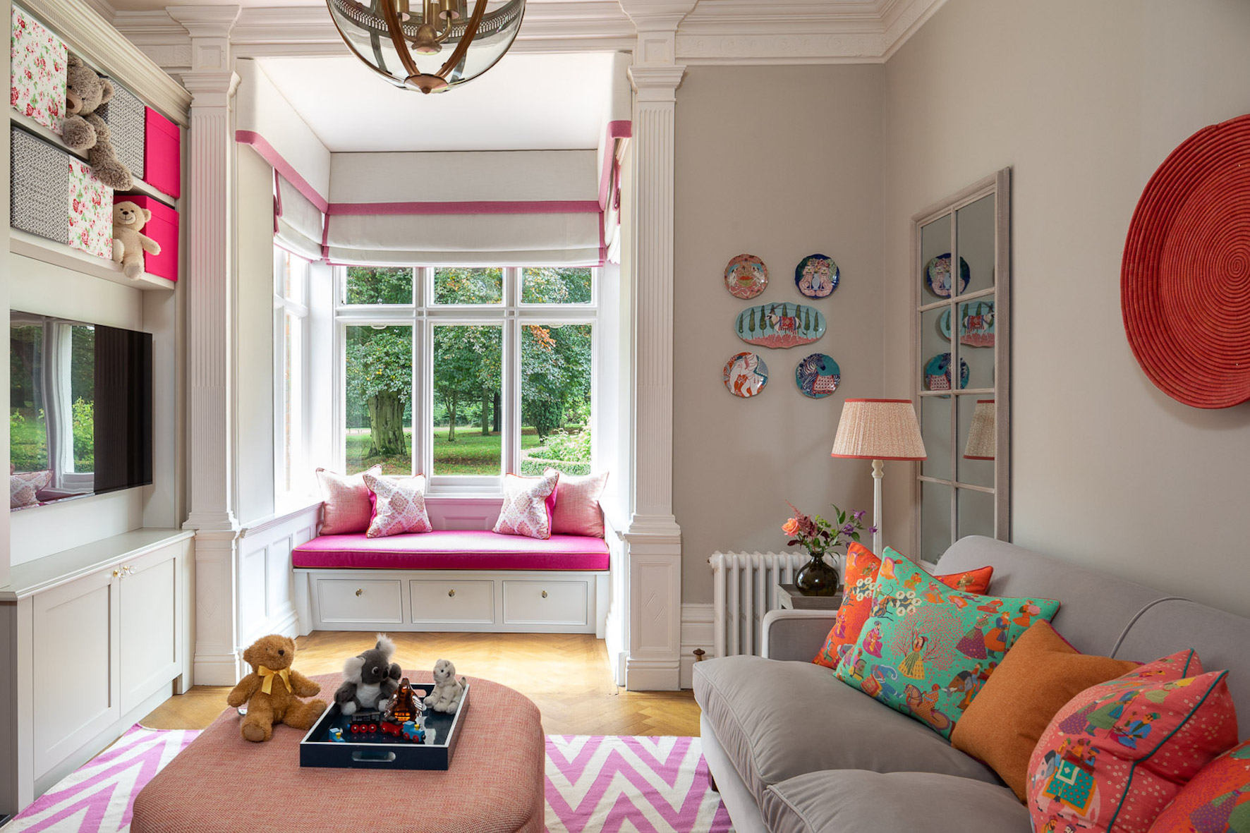
We get you want every room in your home to look perfect and polished. But when designing a family room, one of the easiest mistakes you can make is not thinking about everyone who uses the space. While you may want a cream-colored sectional and glass coffee table (with all the on-trend coffee table books), your kids probably just want a comfy spot to hang out and watch TV. So put aesthetics on the back burner for just a second and really consider how everyone will want to use the family room.
'When it comes to designing family rooms, one of the most common design mistakes clients often make is not considering the functionality of the space,' says Emma Deterding, Founder and Creative Director, Kelling Designs. 'It’s important to design a family room that’s not only beautiful but one that also serves its purpose. By creating a layout that promotes conversation, easy traffic flow, meets the needs of all the various people using the space (and how they intend to use it), as well as incorporating storage solutions to keep clutter at bay, you can make sure the space is fully functional.'
2. Not having enough (or the right kind) of seating
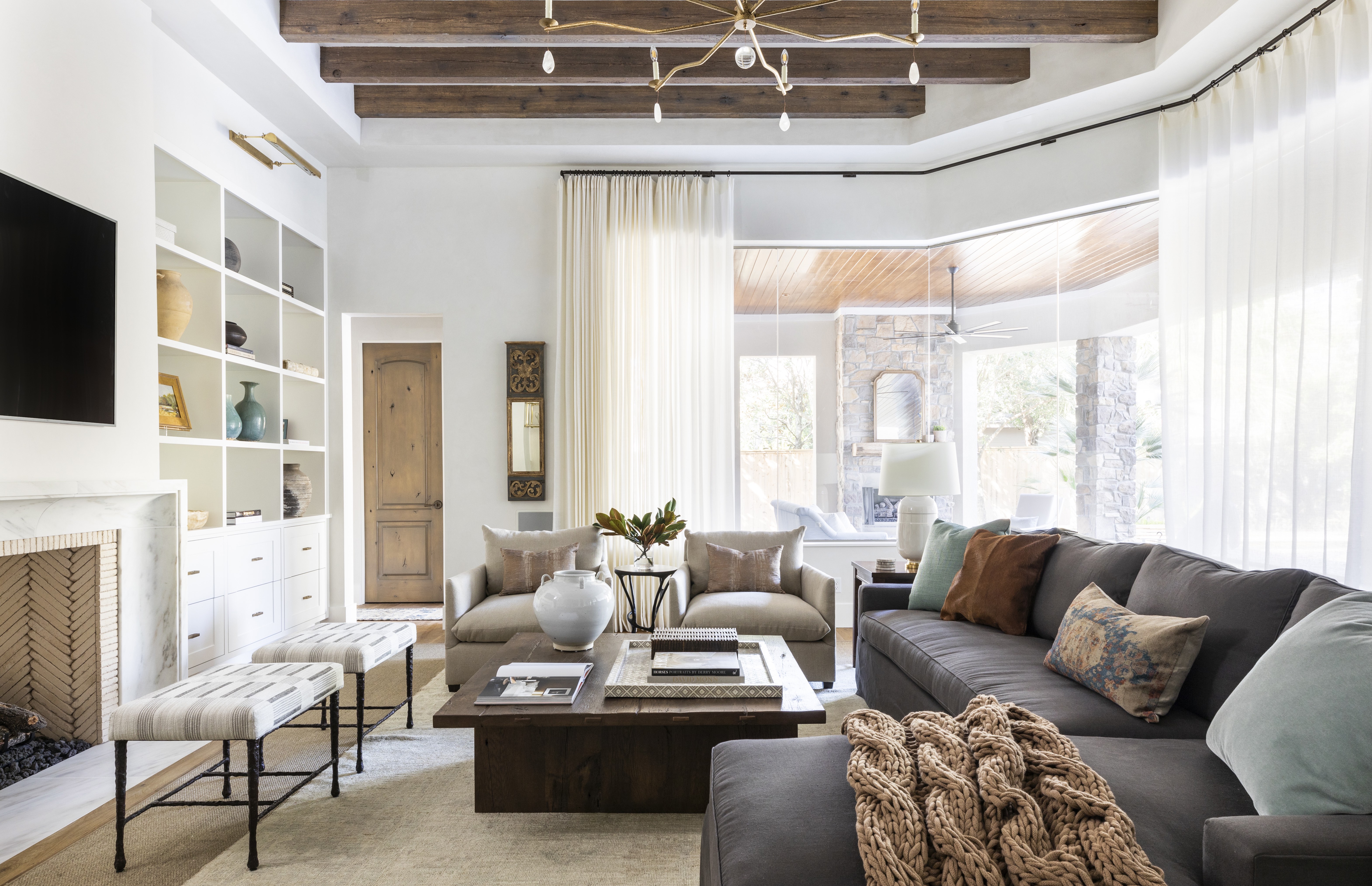
'The ideal family room has adequate seating and different types of seating,' advises Victoria Holly, Principal and Founder of Victoria Holly Interiors. 'You don't want to just have a sofa or just have a sectional – which doesn't allow for a conversation space.'
'I like to have at least three types of seating, such as a sectional or sofa, accent chairs, and then an ottoman. This is great for kids who want to jump around and have fun while watching TV, or use the ottoman to build things or set up a train station, and more. It's also great for when you have friends over for different conversation locations. Having multiple types of seating allows for breakout conversations as well as main conversations within the space. I also like to make sure there is usually a large built-in or storage piece to provide a home for the TV and games and toys.'
Designer and founder of Nune, Sheena Murphy agrees that when choosing family room furniture, 'think a lot about the scale of furniture here so it's comfortable and accessible for all. Low-level sofas and chairs work well for those with small children and we always recommend a large rug that really fills the space so it feels anchored, cozy and comfortable. This is also the room for an L-shape sofa if you feel so inclined.'
3. Choosing cheaper furniture

When picking out furniture for a family room it can be tempting to think that because the furniture will see so much wear, it's better not to invest in more expensive pieces. But in fact, because this furniture will see so much wear and tear, you should be investing in well-made pieces that are going to last.
'When designing a family room, do not make the mistake of buying cheaper furniture. Still spend on comfortable seating but cover it with robust fabrics and textiles. We use a lot of outdoor fabrics when designing this room, so the family can come together, relax with food and drinks, and play games without worrying about the odd spillage ruining their sofas,' says Amelia Brooks of K&H Design.
4. Using impractical fabrics
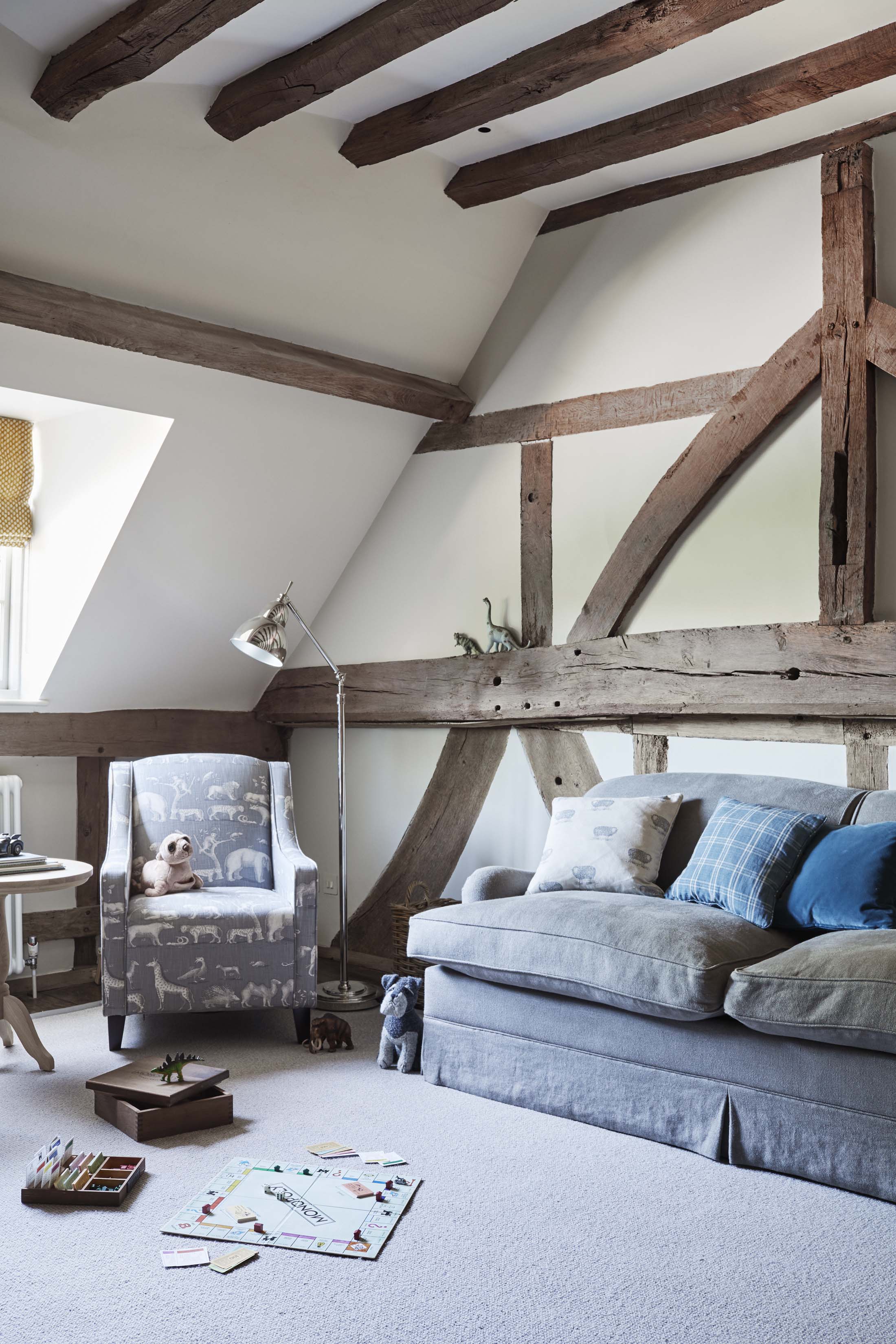
Make everything you possibly can waterproof, stain resistant or washable. With anything that's not an option for, go with stain-disguising patterns that can handle the... challenges of a family room.
'You want to avoid having fabrics that aren't easy to clean or durable. Your family room is going to be home to a lot of friends, guests, and activity, and will be prone to spilling and high traffic. It's important you pick an easy-to-clean material, like polyester or nylon for your rug and acrylic or polyester or blends for your upholstery. This is more important than the color of the furniture,' says Victoria Holly.
Designer Emma Sims Hilditch also agrees. 'Avoid neutral fabrics on sofas. Adding a pattern or texture to upholstery makes it more forgiving. And if you do love neutrals, loose covers are a great option as they can be washed.'
5. Focusing everything around the TV
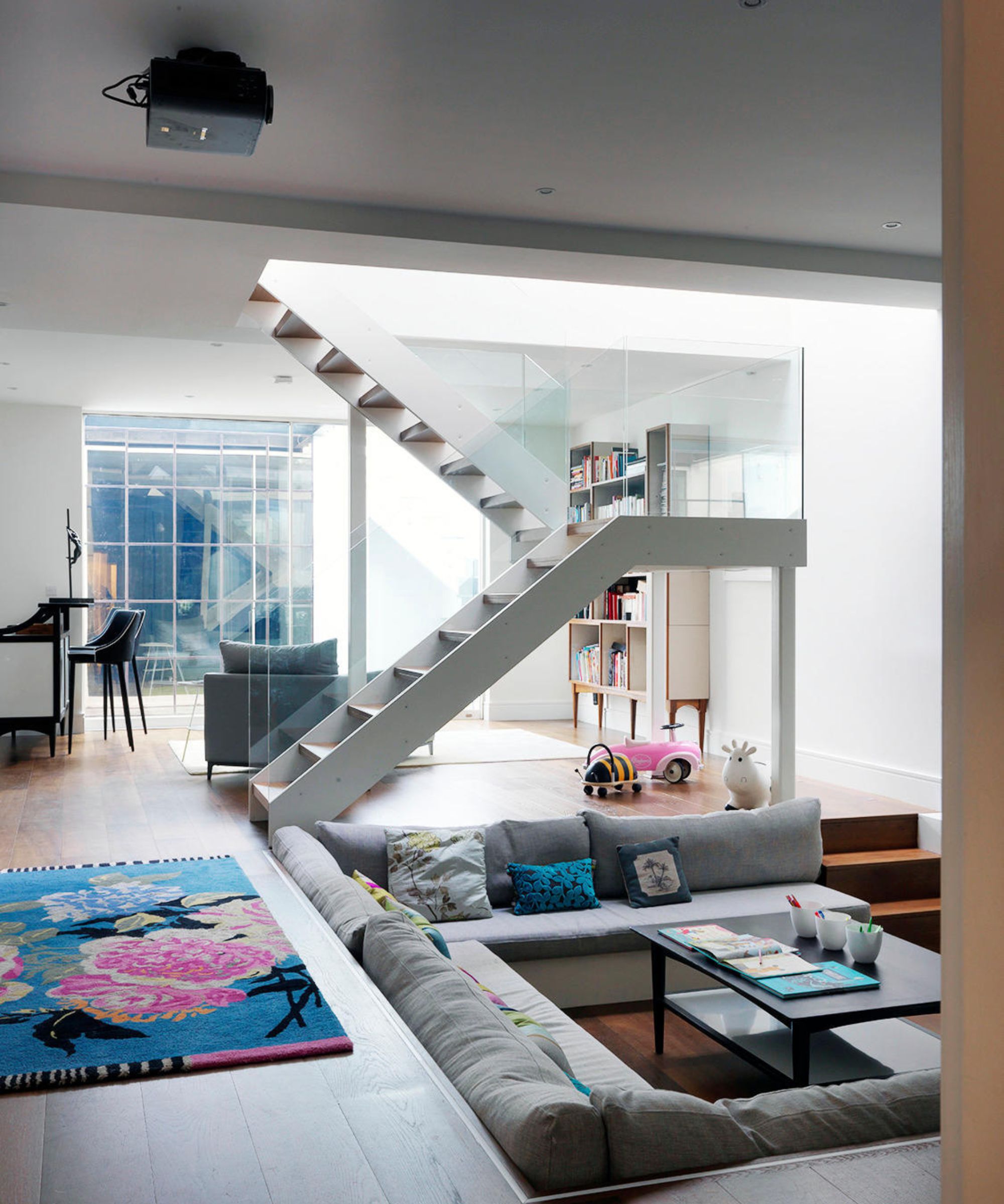
'I sometimes see family rooms that are very much designed around the television and media cabinet without much consideration for all the other ways the room will be used. I like to think of a family room space as an area for gatherings, game nights, projects, and schoolwork. TV placement is definitely a factor to consider, but I like to arrange seating and tables in ways that can easily work for other activities as well so that it's not so screen-centric.' says designer Kathy Kuo.
We think a good compromise for a family room TV idea, and an easily way to ensure the screen isn't always a focus is to disguise the TV.
'Many of our clients like to be able to "hide" their TVs so we might design some joinery that is close-able if you don't want to see the TV, or products like the Samsung frame work really well because they can display artwork when the TV is off,' suggests Sheena Murphy.
6. Not including enough light sources
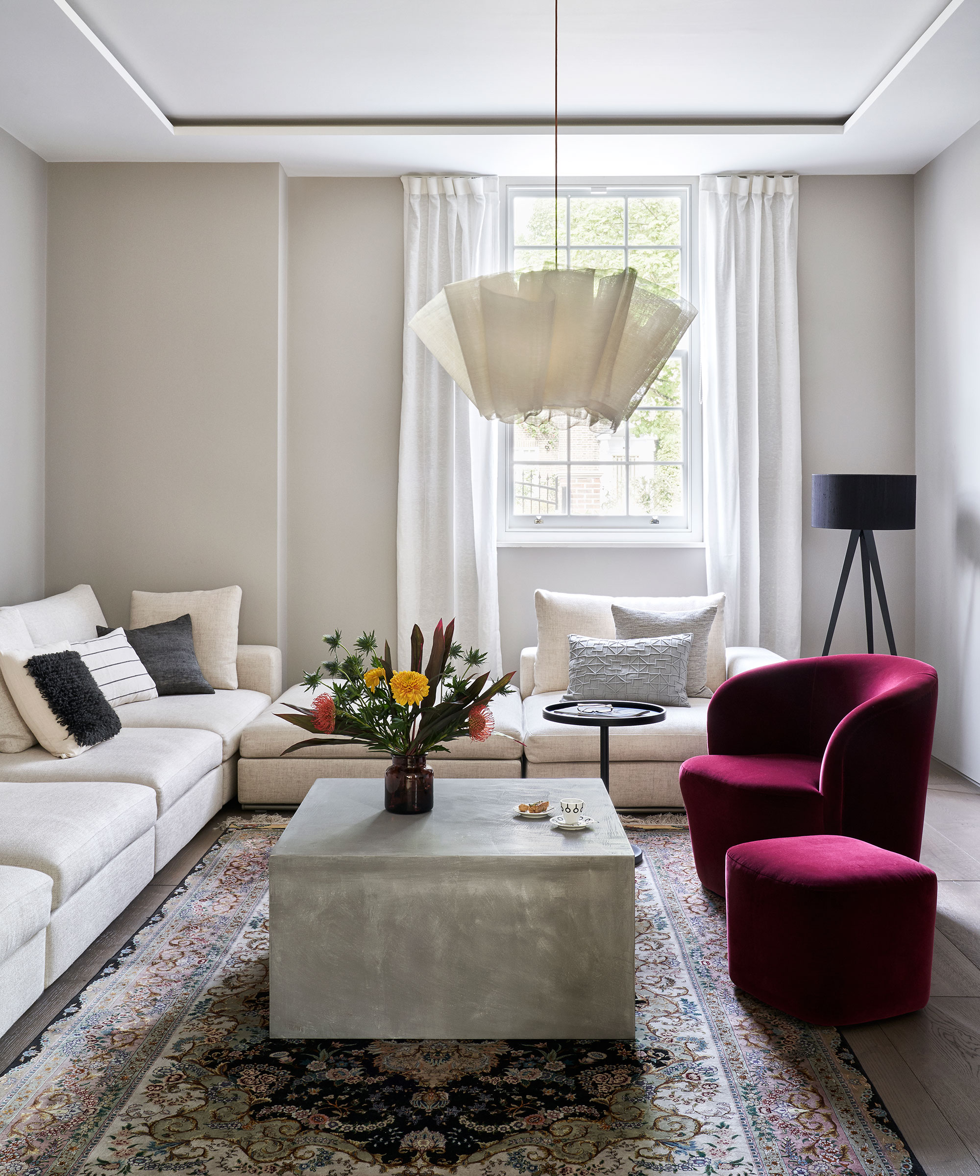
'Poor lighting is another mistake often made,' says Emma Deterding. 'People often overlook the importance of lighting and how crucial it is in setting the mood and tone of the space, as well as how it can affect functionality. This is why it’s so important to design a layered lighting scheme that combines ambient, task and accent lighting across ceiling lighting and pendants, floor lamps, table lamps and wall lights.'
Victoria Holly adds, 'You want to make sure you have three sources of lighting, allowing you to set different moods for different activities. For example, in our family rooms, I like to have recessed lighting as the main lighting, then a larger accent light like a chandelier or pendants, and then lastly a sconce or sconces for mood lighting.'
7. Playing it too safe with color and pattern
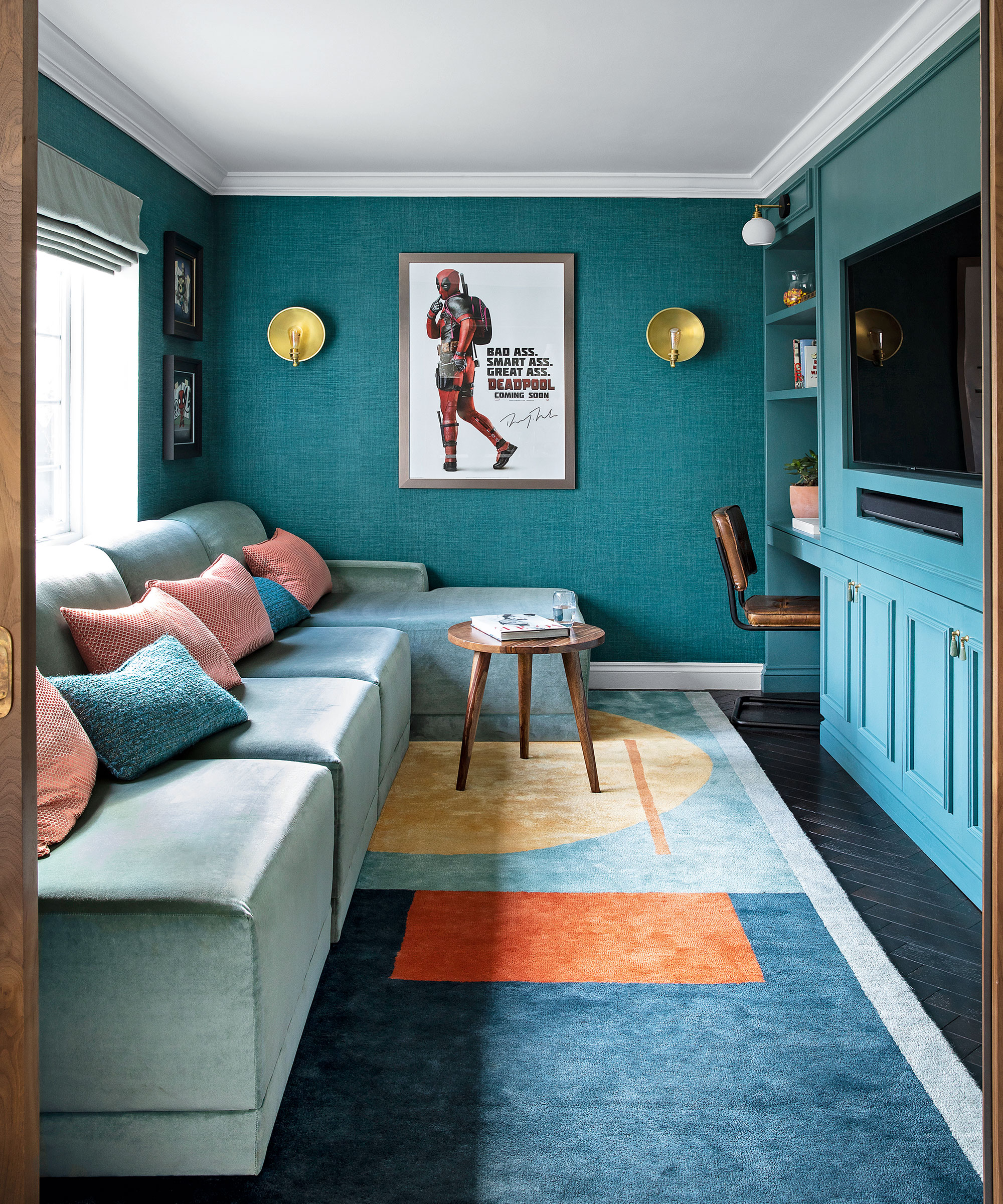
Again, this goes back to remembering who's using the room. A family room is a place you can have a bit of fun with color and pattern and perhaps break slightly from how you would normally choose to decorate. Don't just stick with the neutrals you might use in a more formal living room, get creative with your family room paint ideas.
'People are afraid of using color and pattern, as they may not know how to use them properly, and this is definitely a mistake when it comes to family rooms,' says Emma Deterding. 'The colors and patterns you choose can really affect the mood and feel of the space, so it’s important to bring life, color, and most importantly, your own personality into the room.'
'For a cohesive look, choose two to three colors that complement each other, and use these across the space for a balanced feel. Introduce patterns with textiles, artwork, or accessories in a way that adds interest and depth. If you are more daring, then why not let your inner maximalist out and go bold with lots of color, pattern, and texture.'
8. Picking out the wrong sized rug
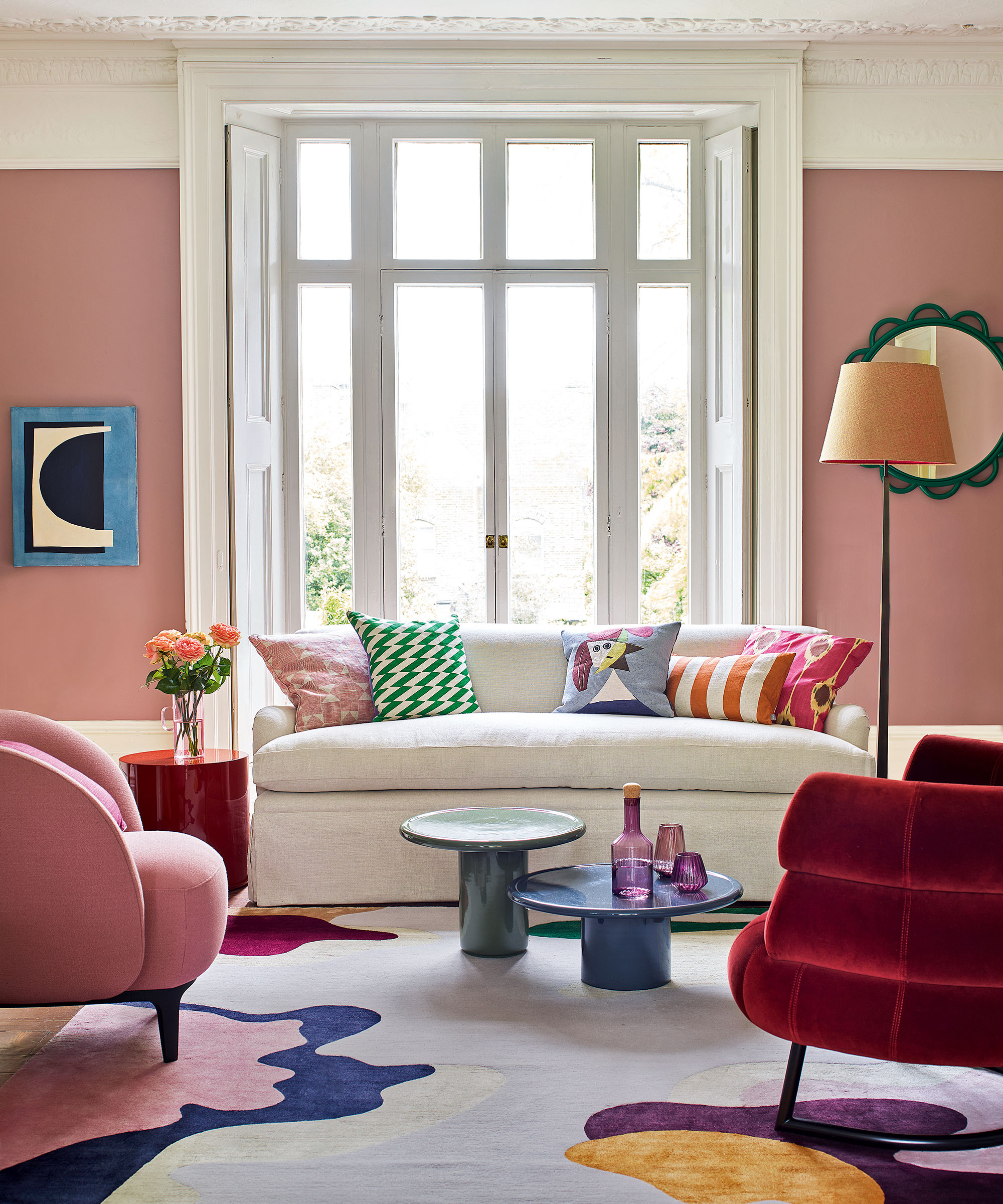
'It’s important to purchase the correct rug size, which keeps the space feeling intimate and connected without being cramped. Before deciding on a rug size, measure your space and determine where your furniture will be placed.' says Marie Flanigan.
'Sometimes the size of a room, its furniture, and the appropriate size rug can be deceiving. Don’t forget, your entire couch does not have to fit within the rug’s parameters. You can leave the back legs of a sofa or chair off of the rug, which allows the room to feel more spacious.'
You can use the same rules for choosing the ideal area rug sizes for a living room to get it right.
Also, rugs are the perfect opportunity to bring in some color and pattern. If you want to design a space that feels both grown up and slightly playful for the younger people who will use the room, choose a living room rug that makes a bit of a statement. It's less commitment than going bold with your wall color, and you can switch it out as the way the room is used changes.
9. Overlooking how much storage you need
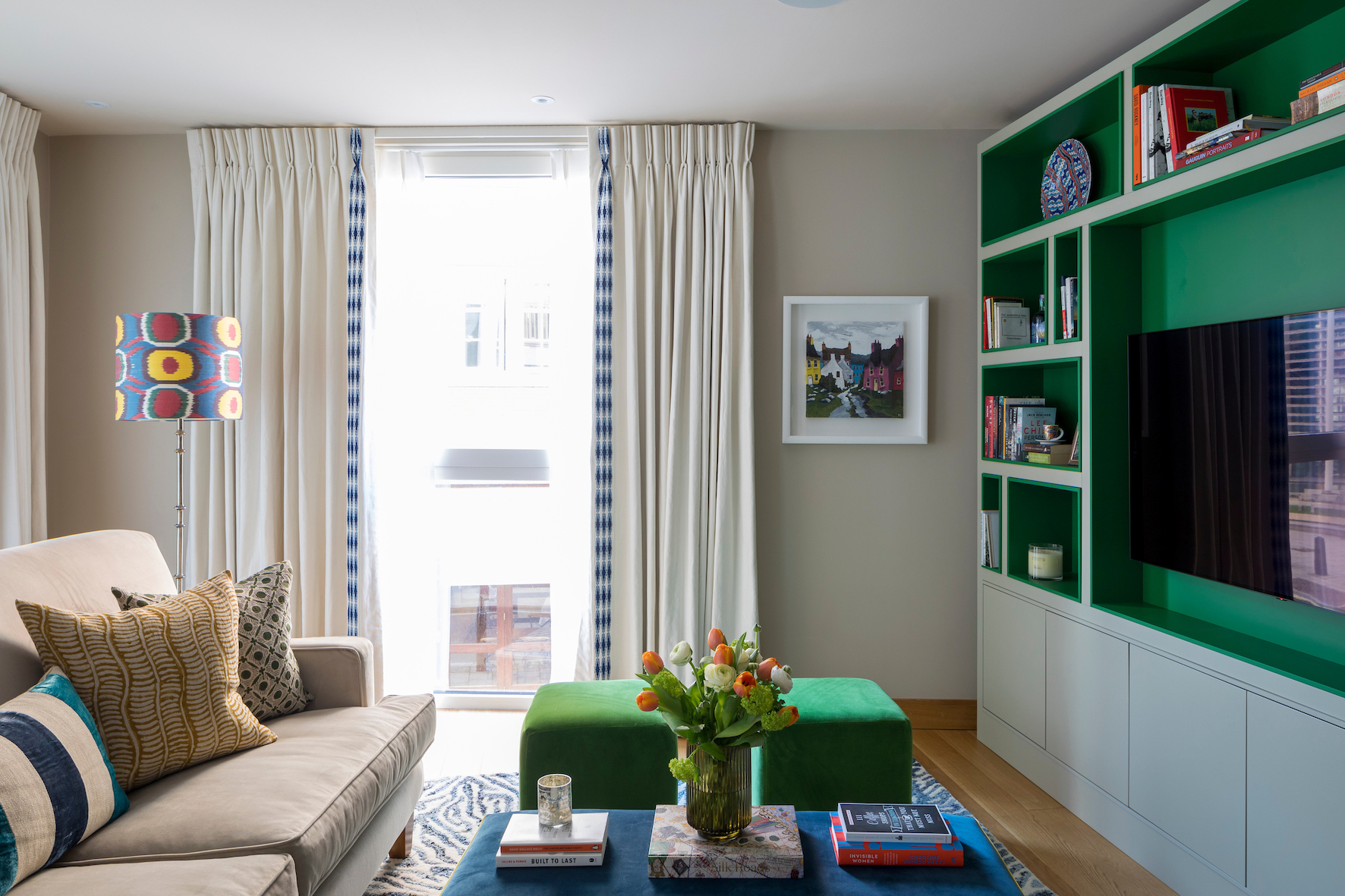
Any room that's going to cater for kids needs storage. And you want as many built in cabinet ideas for family rooms as possible, so you can hide away toys, tech, and general clutter and stop the room from just becoming a playroom.
'Most of the family rooms we've designed look quite grown up on the surface but they tend to hide a lot! One of the primary focus areas when designing these spaces is storage.
'Depending on the ages of family members, they may need to house tons of toys/games /books and most of us don't want to have to look at those things when the space may also double up as a TV or reading room at night or the weekend. So storage, whether built-in or free-standing, is key,' says Sheena Murphy.
10. Not adding in the personal touches
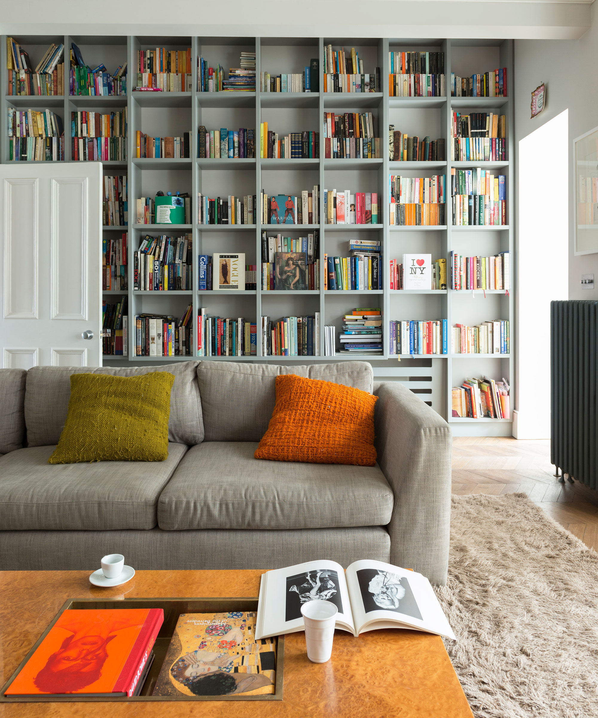
'The biggest mistake is not adding personal touches,' says Emma Deterding. 'A family room should be about the family living within it, and should be a reflection of your entire family, so it’s important to incorporate meaningful decor items such as family photos, artwork created by family members, and even souvenirs from holidays. These will help bring personality and charm to the room and make it uniquely yours.'
And the best way to add this personality without the room becoming cluttered? Shelving. Built-in or freestanding, add plenty of shelving to your family room to give you all the surface space you need to display your knick-knacks in an as aesthetically pleasing way possible.
FAQs
What are the most impactful family room mistakes?
Making family room layout mistakes can make the room dysfunctional, so ensuring you have made the best use of floorspace, furniture layout and storage is vital to the room's success. Your starting point should be creating a space that caters to the room's primary use.
Another family room mistake you can easily make without meaning to? Using finishes that won't stand up to the wear and tear. Furniture aside, ensure your family room paint ideas are wipeable, scuff proof and easy to recoat.
Sign up to the Homes & Gardens newsletter
Design expertise in your inbox – from inspiring decorating ideas and beautiful celebrity homes to practical gardening advice and shopping round-ups.

I am the Head of Interiors at Homes & Gardens. I started off in the world of journalism in fashion and luxury travel and then landed my first interiors role at Real Homes and have been in the world of interior design ever since. Prior to my role at H&G I was the digital editor at Livingetc, from which I took a sabbatical to travel in my self-converted van (not as glamorous as decorating a home, but very satisfying). A year later, and with lots of technical DIY lessons learned I am back to writing and editing, sometimes even from the comfort of my home on wheels.
-
 5 freezer cleaning mistakes you must avoid – or risk compromising your food quality and shortening the lifespan of your appliance
Avoid these blunders for a safer kitchen
By Seraphina Di Mizzurati
-
 What is an island bed? This clever garden design trick can add privacy and drama to any backyard
Create a long-lasting, low-maintenance and visually appealing island bed that also serves a purpose in the garden
By Sarah Wilson