

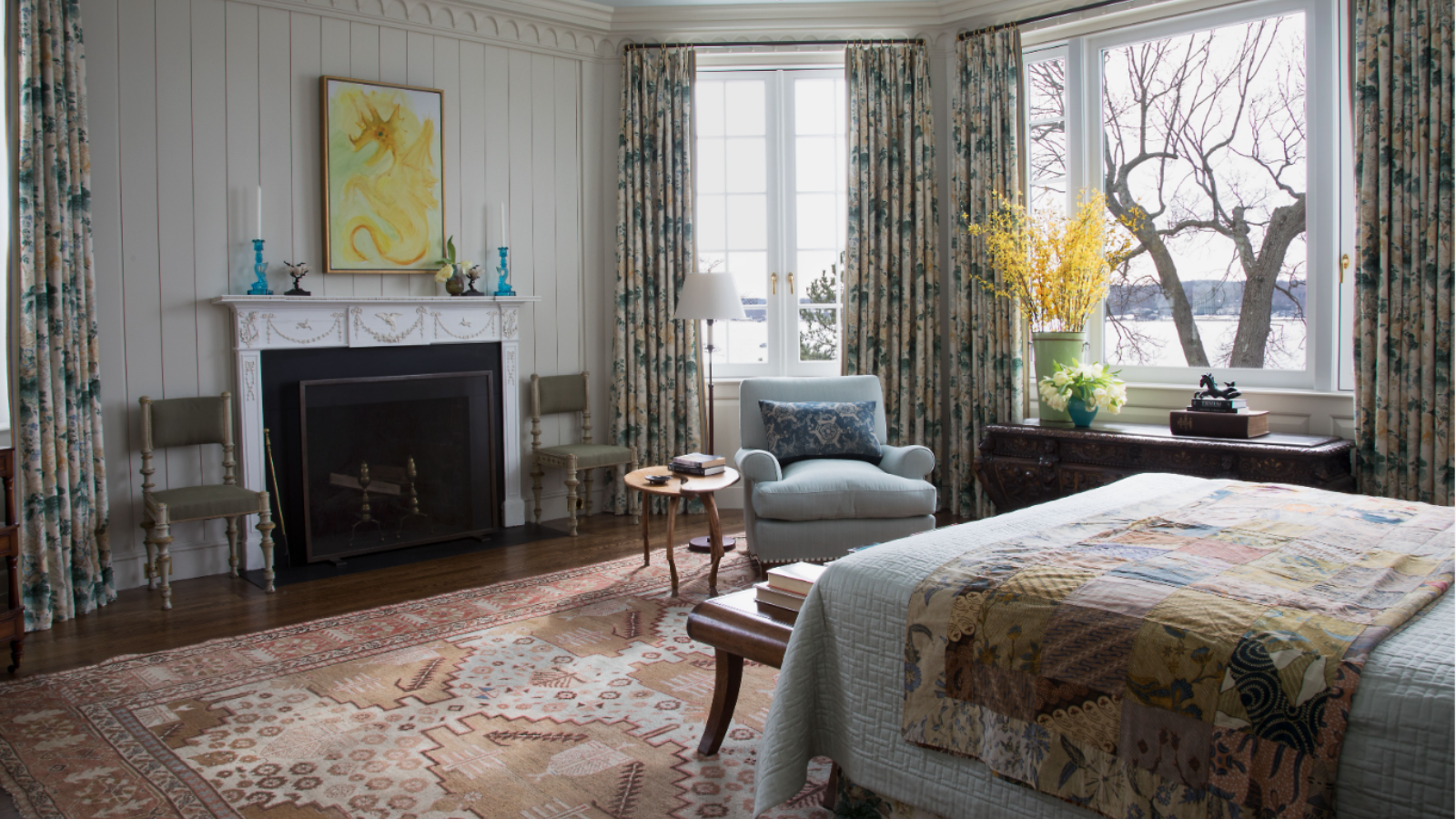
The family room, otherwise known as the living room’s lighthearted sibling, is quickly becoming a household must-have. Whether you’re using the space as an entertainment hub for your children or as a space to unwind in therapeutic activities, finding the right family room ideas for your home is an increasing priority. And nothing impacts the room quite like color.
When planning how to design a family room, its paint color will be at the top of your priority list, and all for a good reason. Your room color ideas impact the light levels, style, and atmosphere of a family space, just like every other area of your home. So, it’s essential to get them right. The best place to begin? By avoiding these popular shades, say color experts.
5 colors to avoid in your family room
While decorating with white and some tones of gray are at the top of color trends this season, they are better left outside your family room. Here are the five hues that experts are avoiding.
1. Dark green

Dark green is having more than a moment in various rooms around the home – whether through kitchen cabinetry or green bedroom ideas. However, in all its organic goodness, green room ideas are less suitable for family rooms despite being one of the best colors for a living room for a relaxing space.
'Dark green is a contemplative color, more suited for libraries, bedrooms, and even, dare I say, guest bathrooms,' says designer Melanie Thomas from Melanie Thomas Design. This is because it can 'appear dingy,' and often, the natural light does 'not play well alongside its dark tones.
2. Bright white

'One surprising color people should avoid for their family room is bright white,' says Stefan Bucur from Rhythm of the Home. But why does he caution against this family room favorite? 'It might seem a bit controversial, but bright white can make a room feel sterile and not welcoming,' the designer says.
However, avoiding bright white does not mean you must entirely stay away from white room ideas. The expert urges you to invest in an eggshell or cream-white to add a bit of warmth to your family room without feeling too clinical.
3. Deep reds

Deep red knows how to make a statement in a room, but the experts caution against choosing red room ideas for your family room.
'Deep reds are overbearing and can be extremely distracting,' warns Geoff Sharp, the President at Sharper Impressions Painting. And he is not alone in his warning. Melanie similarly urges against this rich shade, adding that – while it 'energizes and invigorates' – it also 'increases aggressiveness and ability to focus.'
Instead, Geoff recommends experimenting with red through other decorating ideas such as pillows or drapes. This will allow you to play with red in a softer way.
4. Steel grey

When planning a color scheme, you would be forgiven for thinking that grey living room ideas can do no wrong. However, just as the experts suggest avoiding bright white for its sterile aesthetic, steel grey has a similar effect. 'This color is very cold and sterile and does not stimulate conversation or openness,' Melanie warns.
5. Mustard yellow

Mustard yellow radiates positivity, and it's right on trend – but experts warn against introducing yellow room ideas into your family space. '[Yellows] are overly cheery and [appear] too much for a large room,' Geoff says. Instead, he suggests choosing a softer shade that leans more white or cream with a hint of yellow.
Stefan Bucur adds that – while yellow is in vogue – it may not be the best color for a 'timeless' family room, as this hue could 'quickly fall out style.'
What color should you not paint your family room?
'There are no hard and fast rules as to colors to avoid in a family room,' says Homes & Gardens' Editor in Chief Lucy Searle. 'And it does, to an extent depend on what you do in your family room, when you do it, your room's orientation and how much light it gets naturally. Plus, of course, the atmosphere you want to create. However, it's likely that you'll want to create a space that feels calm and relaxing, even if it's used for family games' nights or parties, so choosing tones that are at the muted end of the color wheel will be better than going for bold primaries, for example. In other words, pick a color you love, then tone it right down, adjusting to suit light levels.'

-
 What is an estate sale? Everything you need to know about how they work and what to expect, whether you are holding one yourself or shopping second-hand gems
It pays to know exactly what you are getting into when shopping at estate sales
-
 How to grow lady's mantle – for a shade-tolerant ground cover plant that will thrive in challenging borders
With lush green foliage and luminous lime flowers, lady's mantle can add color and impact

