5 living room rug placement rules that always work, according to interior designers
The right rug placement can ensure a cohesive living room
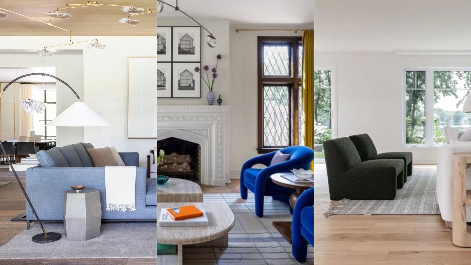

The placement of your living room rug can make or break the space. When positioned properly, a rug in a living space can enhance visual appeal while also helping to zone the space.
From large area rugs to smaller decorative rugs, it turns out that interior designers have a lot to say about the positioning of living room rug ideas, and have rules they often follow when designing spaces.
Below, we've rounded up five of these rules, which will help you ensure the placement of your living room rug adds design interest and steers clear of making common living room design mistakes.
1. Place all furniture on the rug
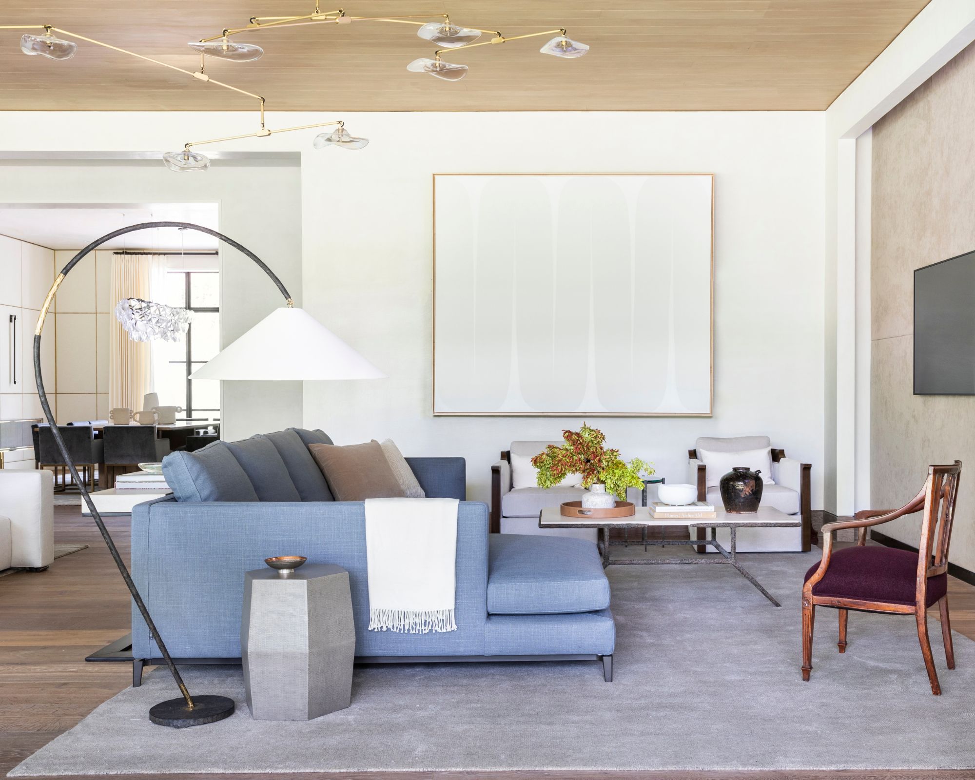
One simple placement rule for living room rugs that designers often follow is to position them beneath all of the room's main furniture pieces. 'Ensure a cohesive and well-defined space by placing key living room furniture pieces, such as sofas and chairs, on the area rug,' suggests interior designer Marie Flanigan. 'This not only anchors the seating arrangement but also establishes a visual connection between the furniture and the floor covering, creating a harmonious balance in the living space.'
Designer Jessica Cinnamon, founder of Jessica Cinnamon Design Inc also follows this rule in her projects. She adds that it can work especially well in awkwardly shaped rooms to aid in grounding the space: 'When you are dealing with an irregularly shaped room, this rule is particularly important. You want all the seating to be grounded and feel a part of the conversational group of furniture. A large rug really will ground the furniture within the space.'
2. Ensure the front legs of chairs and sofas are on the rug
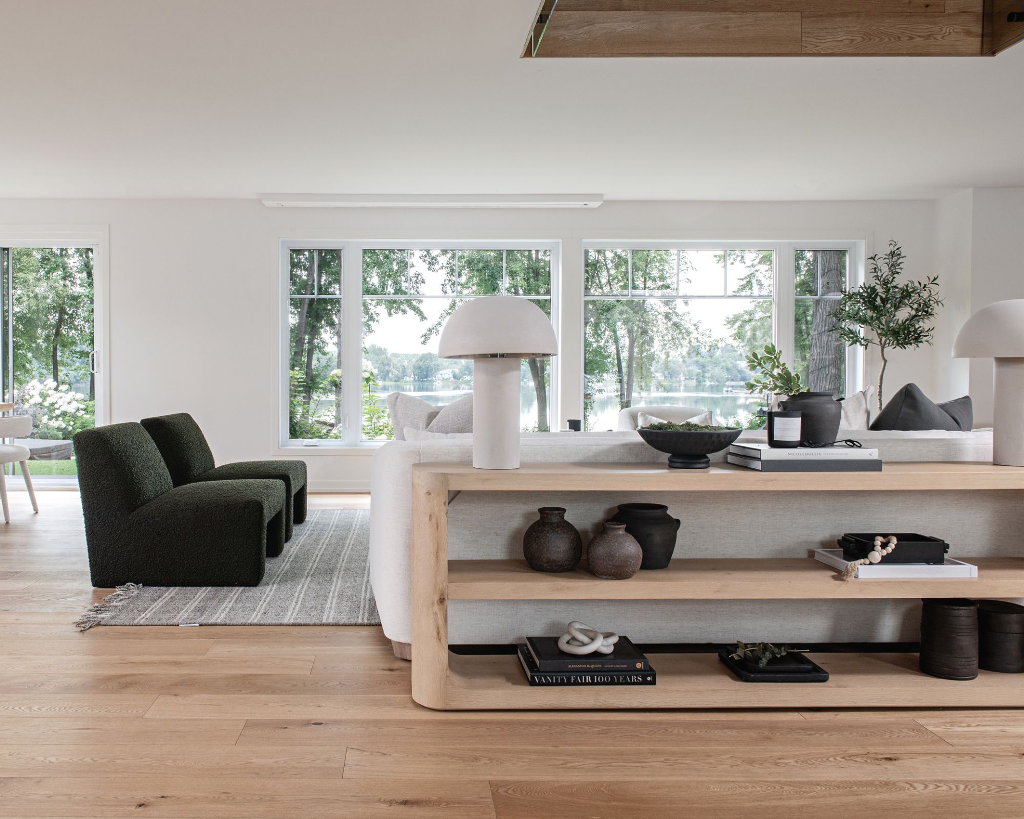
While fully placing furniture on top of a large area rug may not be feasible in some spaces, especially in small living rooms, you should always aim for the front of sofas and chairs to be over the rug. Designers agree that this creates a cohesive look throughout the space.
'When considering the placement of a living room rug for a balanced aesthetic, it's essential to ensure that the front feet of the sofa are always positioned on the rug,' says Eugenia Triandos, principal designer at Hibou Design & Co.. 'This simple rule not only anchors the seating area but also creates a cohesive visual connection between the rug and the largest piece of furniture in the room.'
This is also true if you're using a smaller rug. Positioning the front legs of furniture over it will ensure the smaller-sized rug doesn't appear off balance in the room, as interior designer Soledad Alzaga explains: 'If using a smaller rug, make sure all furniture front legs are on it to maintain a balanced look.'
3. Use architectural elements to center the rug
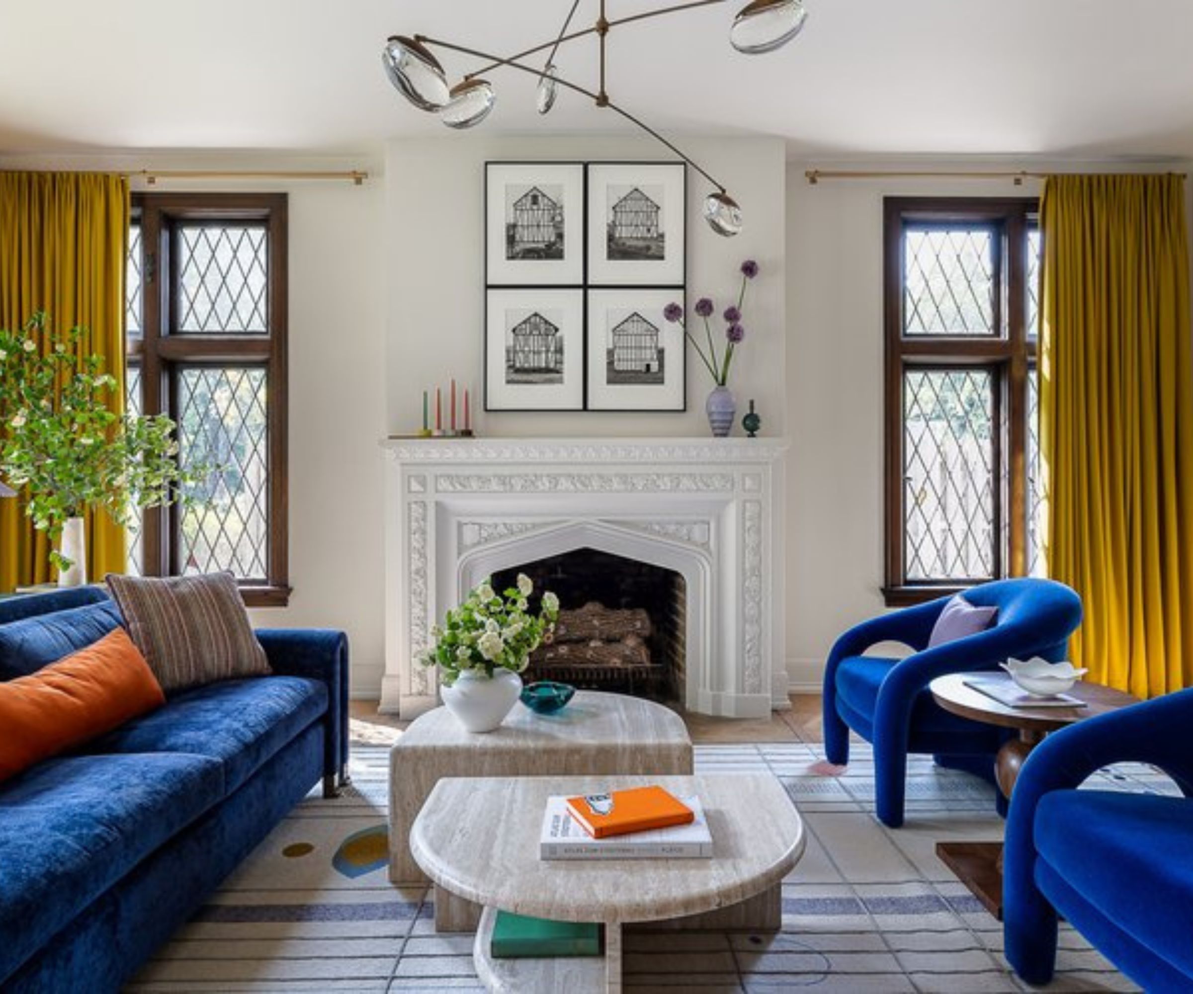
In addition to positioning your rug according to furniture placement, you should also consider how the rug aligns with the more permanent elements of a living room. Choosing to center your rug according to built-in architectural details is one rule designers often use.
'Centering the rug to large architectural elements such as fireplace ideas or a window will help to achieve a sense of balance and will help to achieve "zones" around these key areas,' explains interior designer Brandon Lange, principal designer at BZ Interiors.
'Rugs do not necessarily need to be centered below furniture arrangements, but instead if placed correctly can determine the desired function of a furniture grouping, such as enjoying a fireplace or admiring the view from a window,' continues Brandon.
4. Place the rug central to the sofa for a symmetrical look
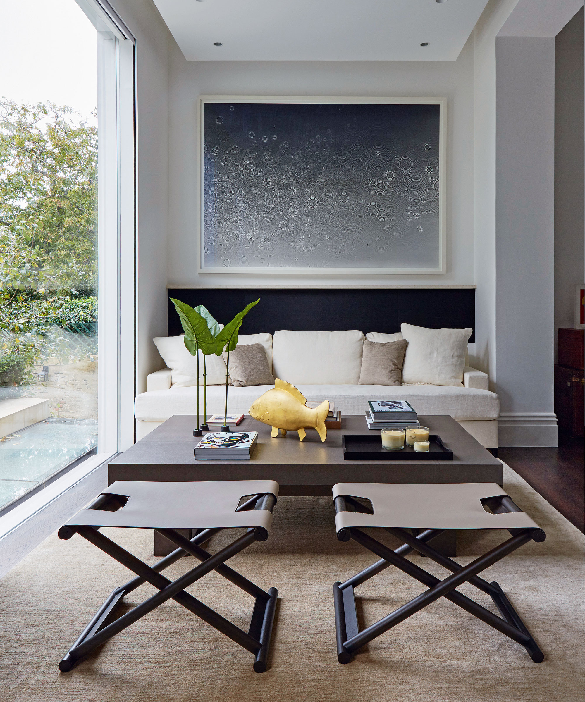
Another commonly used rule when deciding on the placement of living room rugs is to align it with the couch. This means that however large your rug is, the sofa should be placed centrally so there are equal amounts of rug on either side. The same rule applies to matching the negative space with a smaller rug too. 'Center the rug with the couch to define the seating area and create an intentional look,' advises Soledad Alzaga.
5. Always consider the room's traffic flow
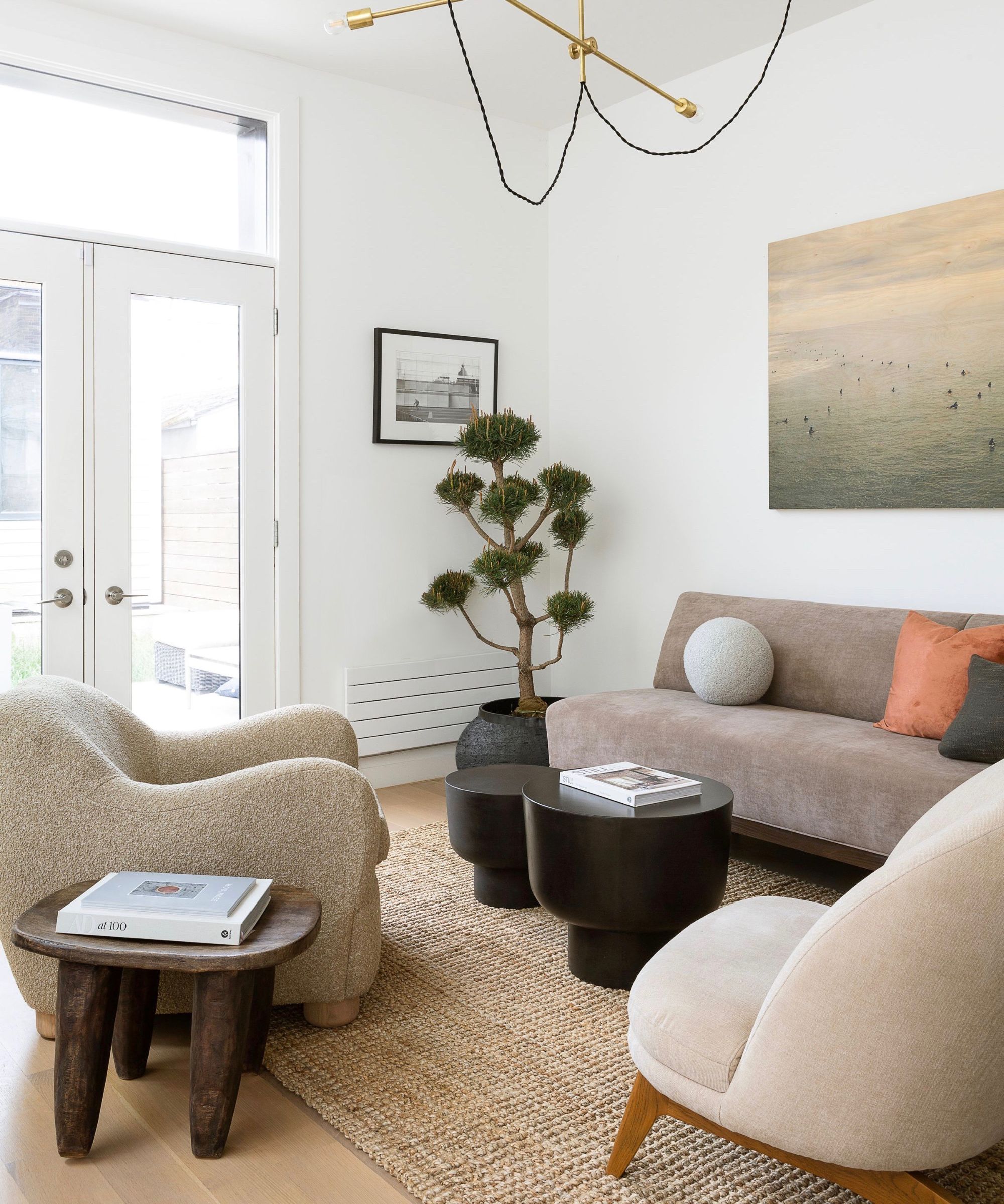
Lastly, it's important to consider how the placement of your living room rug either enhances or disrupts the existing traffic flow. While some placements may look good, they can negatively impact the flow of the space if they block any obvious walkways.
'Consider customizing your area rug to perfectly suit your space and complement the traffic flow patterns,' suggests Jessica Cinnamon. Start by working out which areas are generally used as walkways to help you determine which placement will work to reflect these rather than intersect them.
With these expert rules, you can ensure your rug placement helps create a cohesive living room. If you're looking to switch out your existing rug, shop the below products to refresh your spring living room.
Sign up to the Homes & Gardens newsletter
Design expertise in your inbox – from inspiring decorating ideas and beautiful celebrity homes to practical gardening advice and shopping round-ups.

Emily is a freelance interior design writer based in Scotland. Prior to going freelance in the spring of 2025, Emily was Homes & Gardens’ Paint & Color Editor, covering all things color across interiors and home decor for the Homes & Gardens website. Having gained specific expertise in this area, Emily is well-versed in writing about the latest color trends and is passionate about helping homeowners understand the importance of color psychology in home design. Her own interior design style reflects the simplicity of mid-century design and she loves sourcing vintage furniture finds for her tenement flat.
-
 Plants never to grow next to fruit trees
Expert advice on which plants to keep away from fruit trees to encourage a healthy harvest
By Jacky Parker Published
-
 Martha Stewart's tips for arranging daffodils are unbelievably simple and effective – it's the only flower advice you need this springtime
Martha shows us that we can create gorgeous bouquets of this seasonal flower by simply trimming the stems and placing them in specific vases
By Hannah Ziegler Published
