From entryway to bedroom – 8 lessons in luxury design from hotelier Jay Jeffers
Designer Jay Jeffers knows how to pack a room with color and personality – he shows how to create a little hotel luxe at home
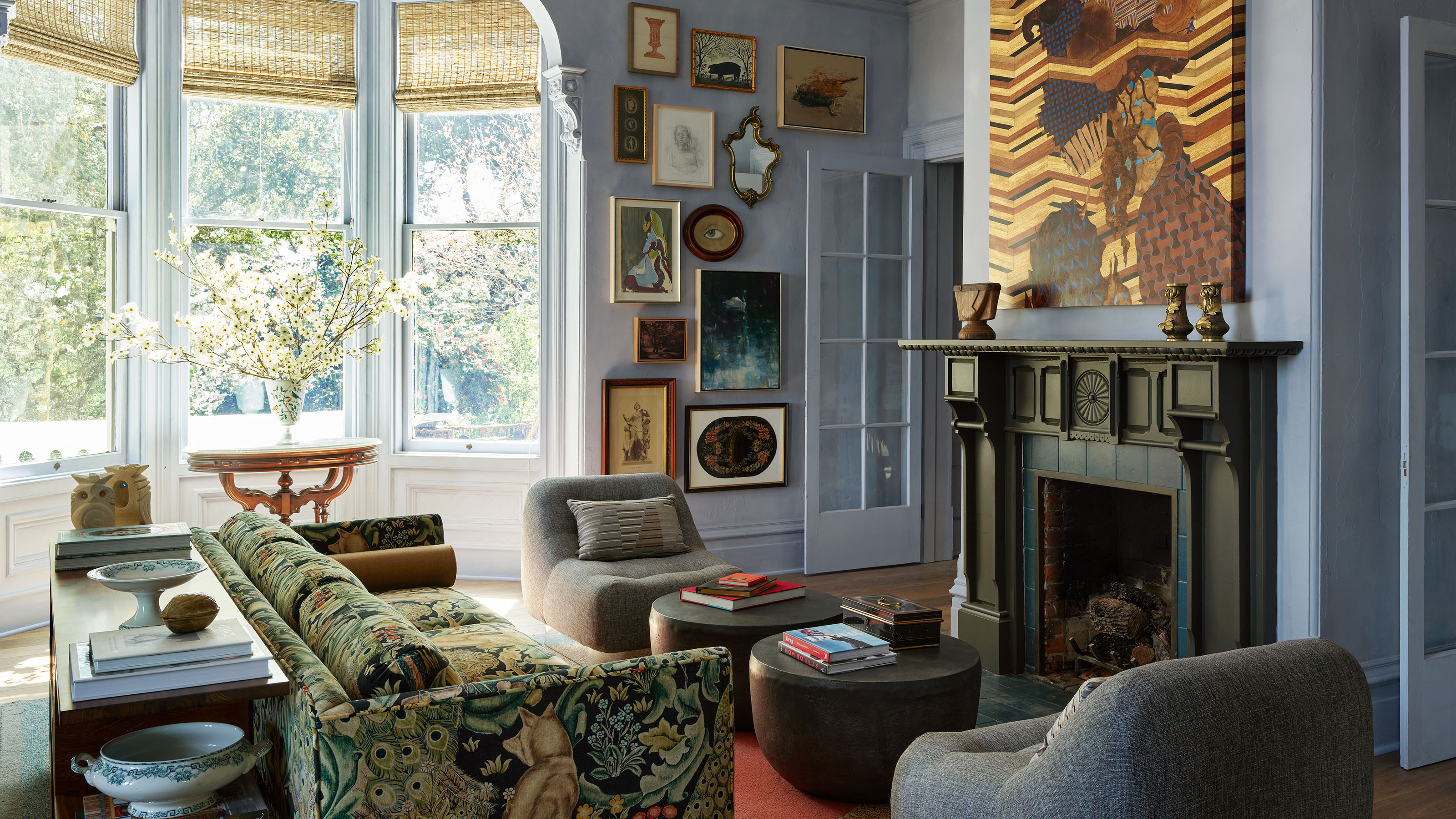
What can we learn about luxury design from hotel interiors, and how transferrable is hotel style to our own homes?
To find out, we caught up with California-based Jay Jeffers, who recently completed the interiors for an exclusive new boutique hotel in California's Sonoma County wine region. He explains how his hotel design ideas could look just as good in a home, and talks us through some of his key luxury looks.
Anyone looking for dining room ideas will find plenty to inspire them in Jay's bold and beautiful designs for the hotel's dining spaces. There's a private dining room to seat up to 20 people, and the main hotel dining room which caters for more than three times that number. Obviously it's a question of adapting the hotel ideas to suit the space available at home, but this can be done while keeping the sentiment of the larger hotel spaces, explains Jay.
The new hotel, The Madrona, was originally built as a private residence back in the 1800s. 'These past few months it felt like I was decorating this dream of mansion… because I was!' says designer Jay Jeffers. 'I really wanted to hold onto that residential feel, so each bedroom, each bathroom, even the front parlor (above) with the mismatched couches and gorgeous art curation could absolutely be reflected in any home. I never shy away from color and personality in any of my residential projects, and it’s no different with The Madrona.'
1. Use lighting as art
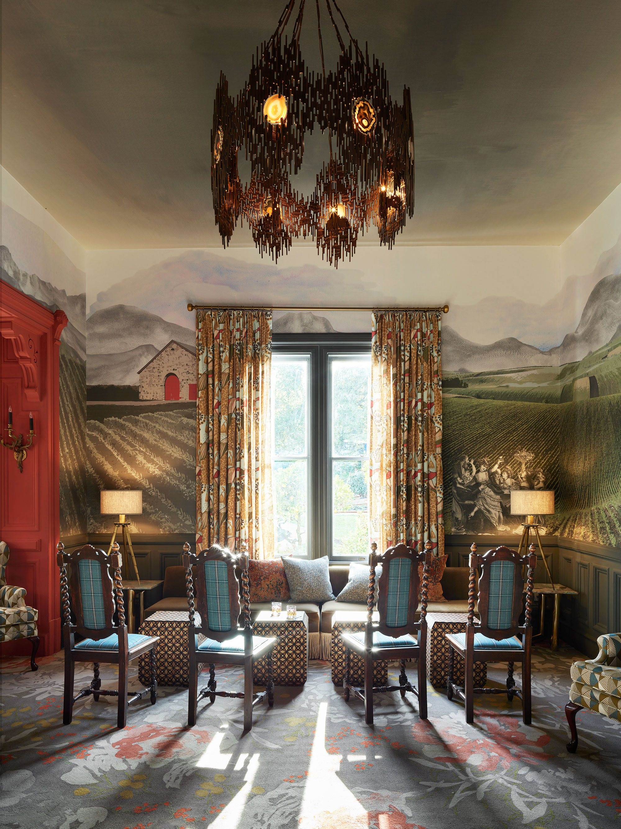
'While the gorgeous light fixture in The Madrona’s private dining room may be a little big for your your typical dining area, using lighting as art is a go-to décor tip that I implement in residential homes as well,' says Jay. 'Skip the classic, cookie-cutter chandelier and go for something more artistic or skip the table lamp and go for a chic sconce next to the bed. Lighting is one of the easiest ways to add depth to any space, whether a home or a hotel.'
The private dining room is rich in color and pattern, with a digital mural by Phillip Jeffries that takes you through The Madrona’s history.
2. Be playful with color
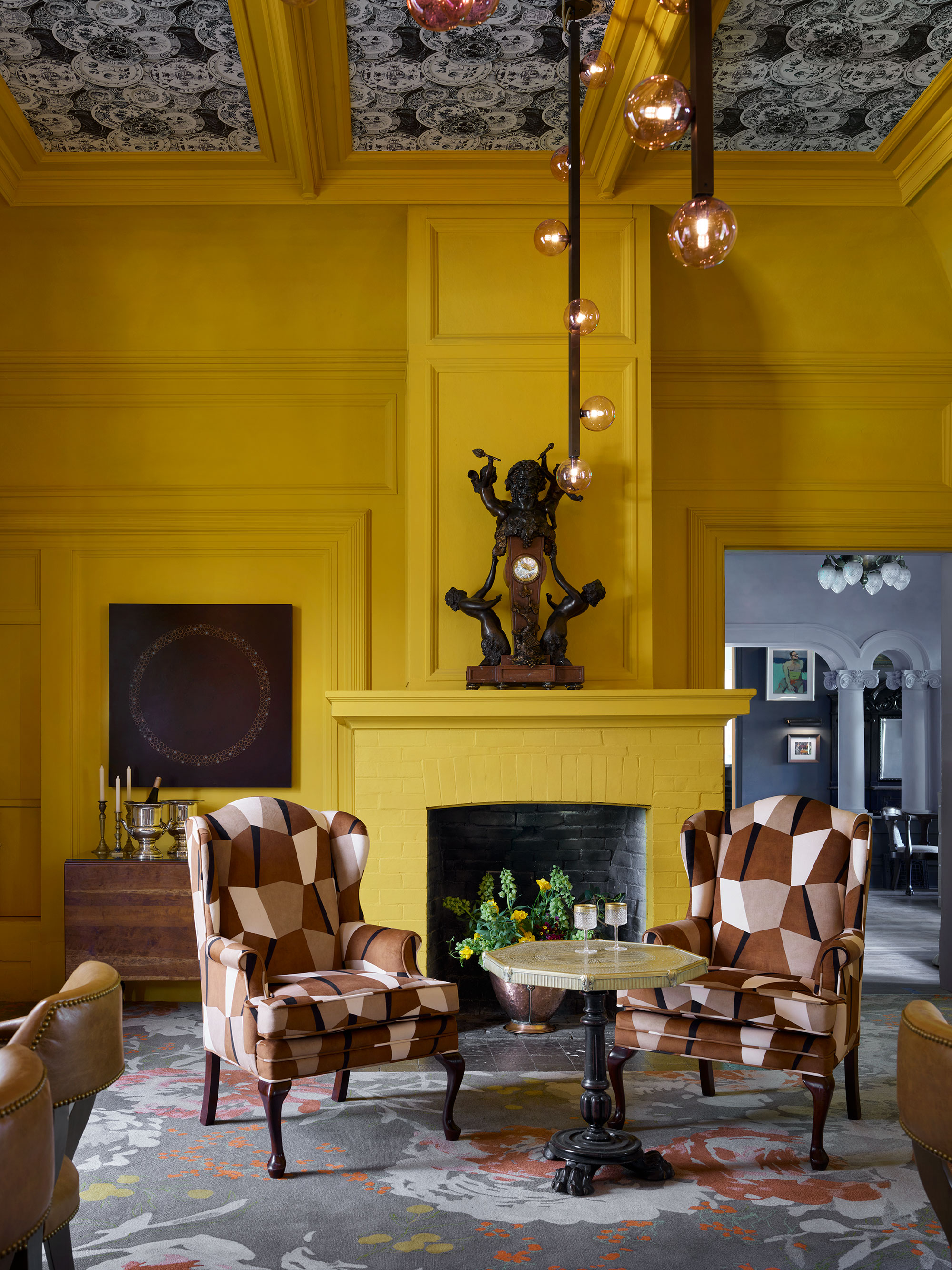
'I definitely did not shy away from color when it came to the dining room color scheme,' says Jay. 'This area is truly meant to entertain, with a showstopping Lumifer light fixture overhead.' This shade of energetic yellow is a great choice for home dining room ideas too, and is guaranteed to bring in the sunshine whatever the weather.
3. Make a good first impression with the entry
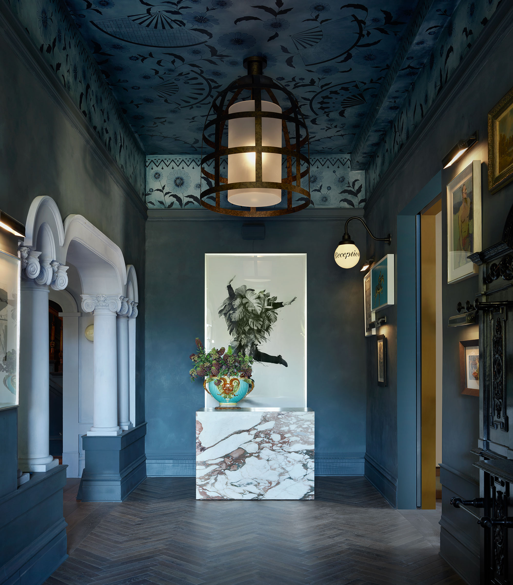
Whether it's the entrance to an hotel or to a private home, hallway ideas are all about giving the right first impression. The entry hall is where you set the scene for the rest of the property and you may want to start with a flourish – as Jay Jeffers does here – enhancing period features with a dramatic choice of color. And why not opt for a patterned ceiling?
'The clean marble next to the beautiful, original ornate architecture makes for quite a regal grand entrance if you ask me!' says Jay.
4. You can't go wrong with a gallery wall
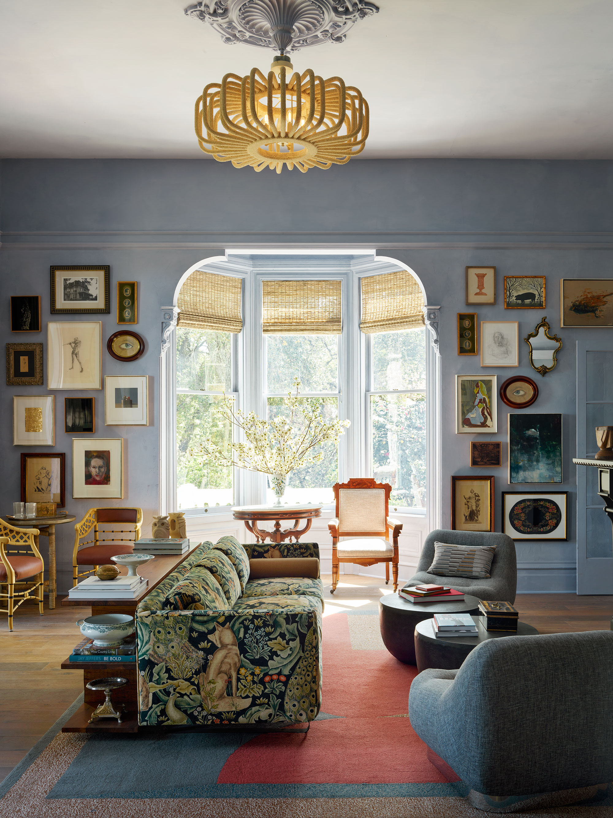
Make sure a gallery wall is on your list of living room ideas – it's a great way of creating an extra point of interest in a room, the mismatched frames being just as much part of the finished look as the art inside them.
'The art as well as all the décor that you’ll find around the hotel's front parlor is a mix of modern and antique; a trend that is a game changer when it comes to curating a unique space!' says Jay. More on that below…
5. Mix antiques and contemporary furnishings to great effect
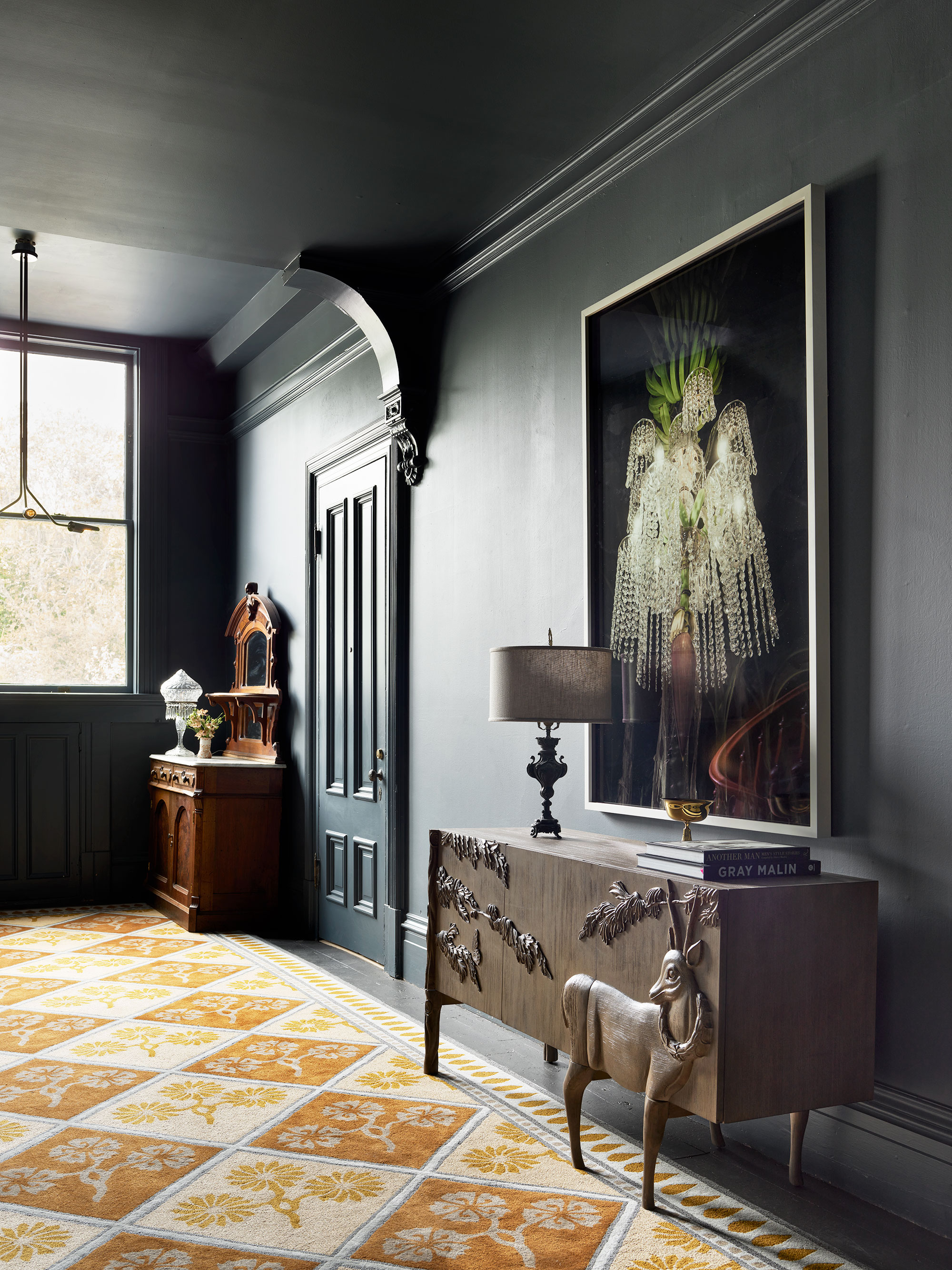
When you're decorating a historic property, using a mix of antiques and contemporary furnishings can really help to bring it to life, and bring it up to date. Here, Jay Jeffers adds to the building's story by including of more than 200 antiques inherited with the property, some of them even belonged to the original owners in 1881.
'This section of the hallway contrasts the dramatic tones of the paint and the grand, antique wooden chest against the vibrant contemporary rug and creates such a stunning juxtaposition,' he says. 'I want guests to be able to wander from room to room intrigued by each item and where it came from, while everything still feels modern and relevant. This combination of old and new is what makes a home feel charming and collected over time.'
It's just a matter of finding complementary – or even contrasting – pieces.
6. Cozy, clean and chic bedroom style
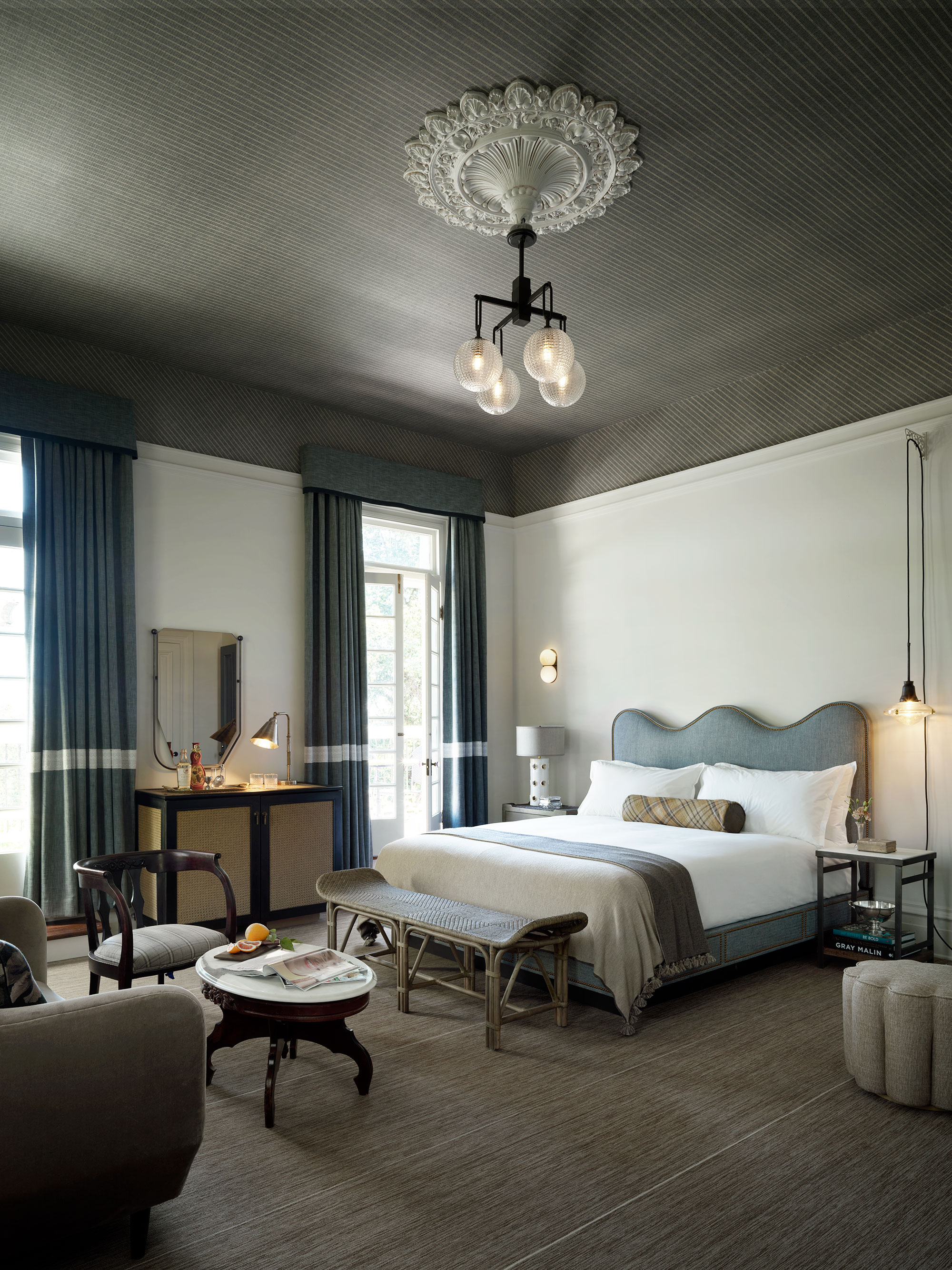
Anyone looking for bedroom ideas will surely find inspiration in this smart but cozy hotel room. We love the unusually relaxed approach to bedside lighting. Whoever decided each side of the bed had to match? Vive la difference! We're also rather keen on the wavy headboard.
Jay explains the concepts here: 'Cozy, clean, chic. These are the three words that came to mind when I was thinking of how I wanted a guest room at The Madrona to feel. The cool tones combined with the chunky knit throws and stools completely sets the perfect tone to a relaxing weekend in wine country.'
7. Classic bathroom elegance
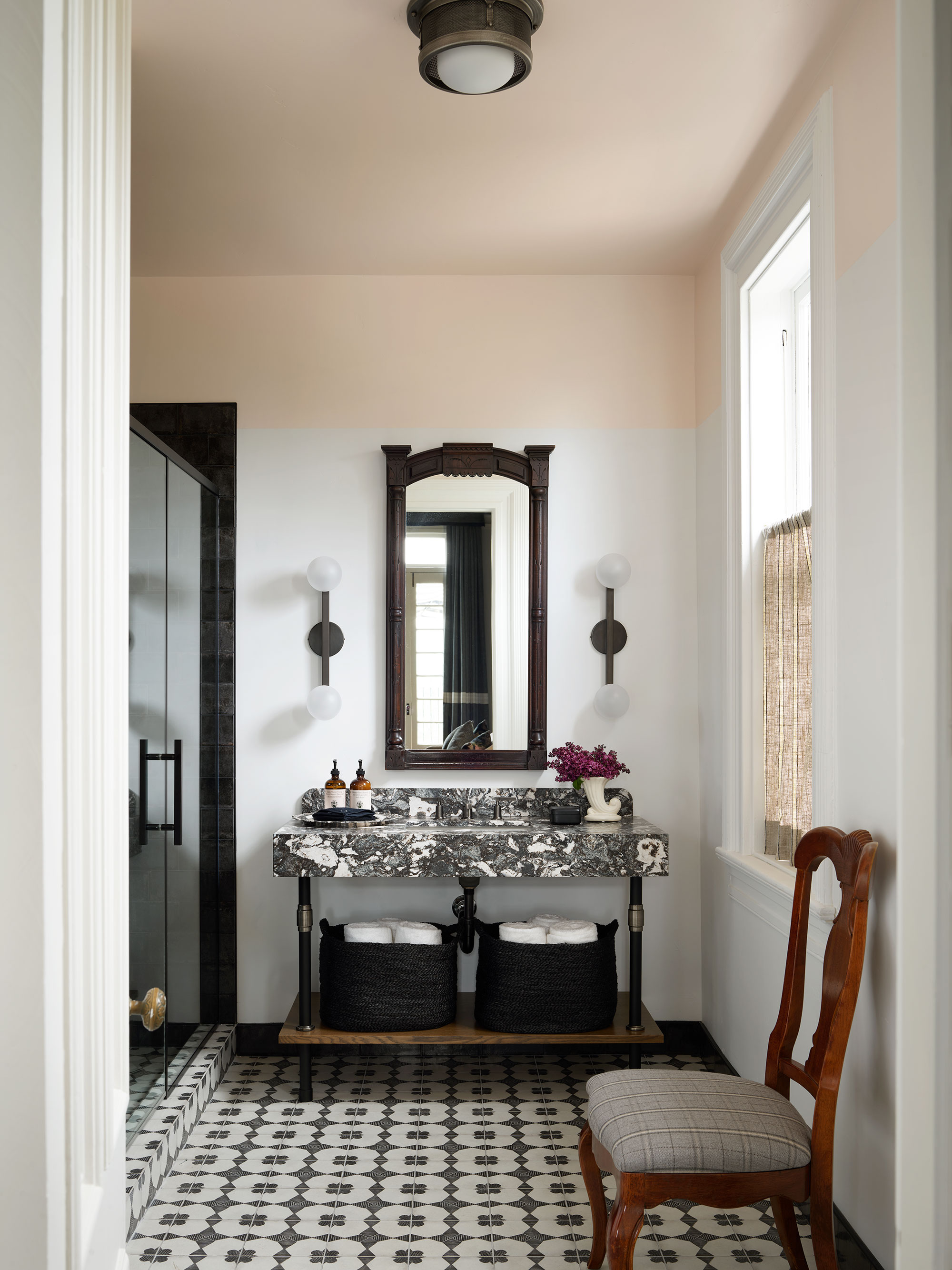
'While I’m a sucker for a pop of color, there’s nothing like a crisp, chic bathroom,' says Jay. 'This one perfectly blends neutrals with beautiful patterns and is punctuated with the antique mirror for a touch of residential charm.'
These bathroom ideas would work equally well in a home bathroom. The patterned tiles offer the perfect traditional balance to the more contemporary marble slab vanity, but keeping to the monochrome scheme ensures a contemporary edge of elegance.
8. Harmonize the interiors with the original architecture

Jay Jeffers designed the interiors to do justice to the historic setting and that's one of the key lessons from this project that applies to homes. Don't consider the inside in isolation, you need to look at the property as a whole.
'They say they don’t make them like they used to, and I completely agree when it comes to this stunning architecture!' says Jay. 'We preserved the buildings’ original charm and architectural details, while reimagining it to reflect today’s modern traveler.'
Sign up to the Homes & Gardens newsletter
Design expertise in your inbox – from inspiring decorating ideas and beautiful celebrity homes to practical gardening advice and shopping round-ups.
Karen sources beautiful homes to feature on the Homes & Gardens website. She loves visiting historic houses in particular and working with photographers to capture all shapes and sizes of properties. Karen began her career as a sub-editor at Hi-Fi News and Record Review magazine. Her move to women’s magazines came soon after, in the shape of Living magazine, which covered cookery, fashion, beauty, homes and gardening. From Living Karen moved to Ideal Home magazine, where as deputy chief sub, then chief sub, she started to really take an interest in properties, architecture, interior design and gardening.
-
 How to grow crepe myrtle in pots – and transform even the smallest of yards with dazzling flowers this summer
Growing crepe myrtles in pots will inject splashes of brilliant color into your outside space
By Thomas Rutter Published
-
 I've spent over 200 hours testing vacuums and swear by my two Dysons – this is how I properly clean a Dyson vacuum filter for longer-lasting appliances
Your Dyson vacuum will last much longer and clean at its best
By Dan Fauzi Published