Sherwin-Williams is known for its best-selling neutrals, but these lesser-known colorful shades are favorites among designers
From rich shades of purple to statement greens, these Sherwin-Williams paints are serving us fresh color inspiration for 2025
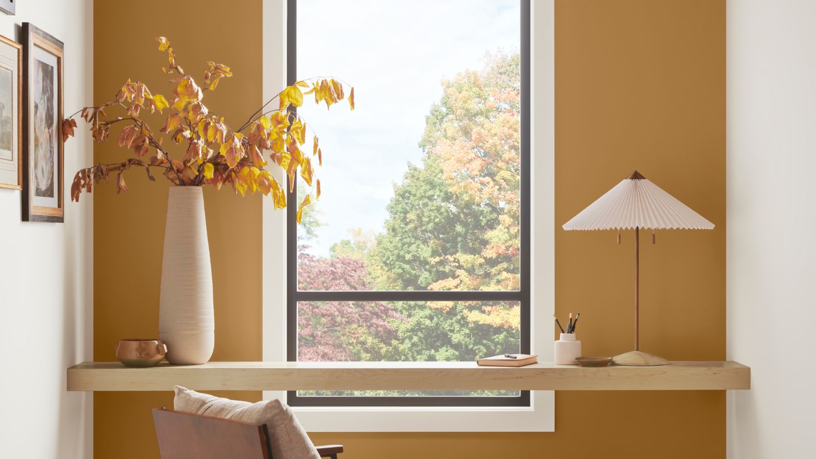

From the iconic Alabaster to the flattering Swiss Coffee, Sherwin-Williams has garnered a cult following for its popular neutral paints. But what about its more colorful shades?
From dark and moody green paints to warming orange paints, Sherwin-Williams has much to offer in the realm of colorful hues, but they're arguably not as widely known as its enduring neutrals.
And so, we spoke to interior designers to get to know some of their favorite Sherwin-Williams paint colors which may not have heard of before.
1. Raisin
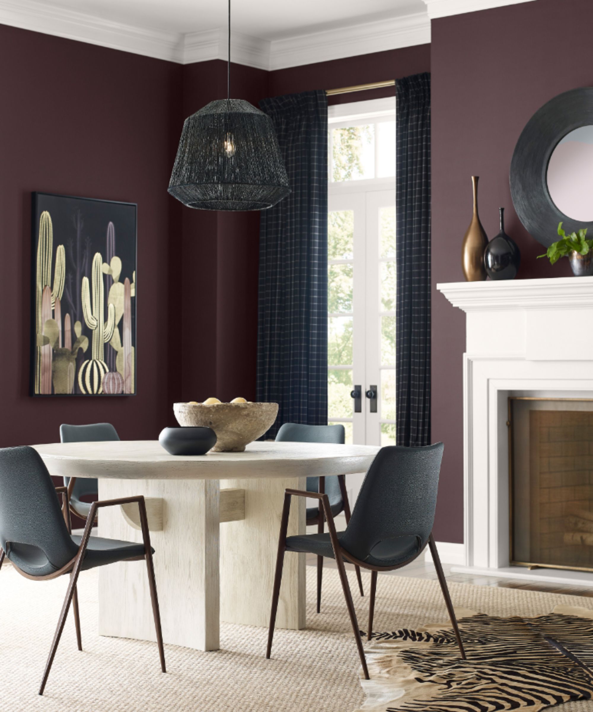
Sherwin-Williams' Raisin
'Lately, I’ve been drawn to deep purples, and Sherwin-Williams' Raisin hits the perfect balance of moody and refined,' says Lisa Shaffer, CEO and creative director at Lisa & Leroy. 'It has just the right amount of depth with a hint of purple, and the way light interacts with it creates a stunning effect.'
While Raisin is technically a dark brown paint, you can see its prominent purple undertones in this sophisticated dining room. For a similar look, embrace color-drenching with this dark paint, or, Lisa adds that you can use it more sparingly: 'If fully color-washing a room in a bold shade feels intimidating, try using it on millwork – it frames a space beautifully.'
2. Faded Flaxflower
Blue paints have seen much love recently, in some cases working as a calming neutral. Faded Flaxflower by Sherwin-Williams does just that, with gray and yellow undertones giving it a serene feel.
'One of the most requested colors from our clients is blue, and Sherwin-Williams' Faded Flaxflower never disappoints,' says Lisa Shaffer. 'It has a crisp, clean feel that brightens a room effortlessly. For a fresh tonal look, pair it with cobalt blues – it’s a timeless combination that feels both serene and dynamic.'

Faded Flaxflower is a calming blue paint with gray and yellow undertones. Use it to create a serene bedroom or light and airy living space.
3. Bosc Pear
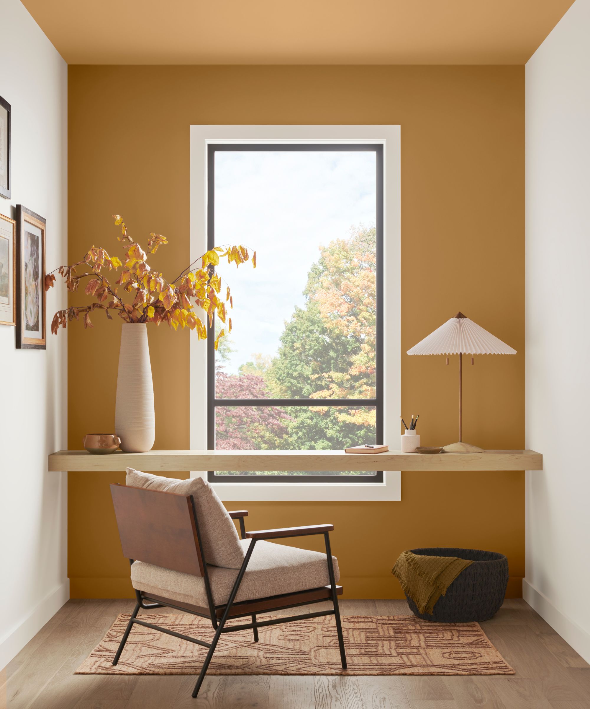
Sherwin-Williams' Bosc Pear
Moving onto warmer paint colors, there are plenty of earthy tones from Sherwin-Williams to explore. Below, Lisa Shaffer shares two of her favorites:
'I love an ochre moment, and Sherwin-Williams' Bosc Pear delivers with its rich depth and incredible versatility. This warm hue pairs beautifully with deep browns, rust, and neutrals for a cozy, sophisticated feel, or it can be energized with a sunny yellow or peach-like Sherwin-Williams' Stone Fruit to bring vibrancy to a space.'

This warming, coral orange paint is sure to add interest to rooms. Take inspiration from Lisa and pair it with Bosc Pair for a colorful scheme.
4. Cocoa Berry
'Right now I am crushing hard on Sherwin-Williams' Cocoa Berry,' says Kate Pinney, interior designer at Inside Stories. 'This rich, moody hue falls within the pink family, but its depth keeps it from feeling too feminine.'
With a muted feel, Cocoa Berry doesn't feel too lively and would work well in lots of rooms where you want to add more depth than neutrals. For Kate, using it to color drench a powder room is a favorite way to go: 'This color would look amazing in a powder room – paint both the ceiling and the walls to create a truly elevated, immersive space.'

This brown-toned pink paint feels moody and subdued, serving as a grown-up color to add plenty of depth to rooms.
5. Cascade Green
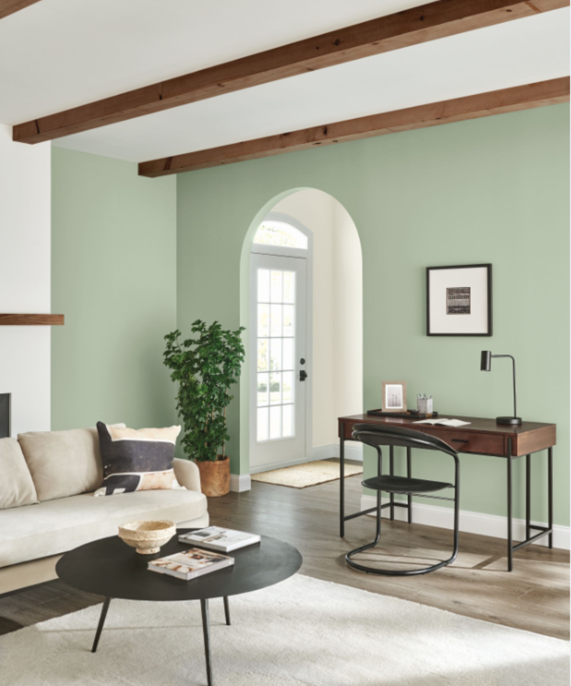
Sherwin-Williams' Cascade Green
'Cascade Green by Sherwin-Williams is a vibrant but neutral green and part of their historic collection,' shares interior designer Nureed Saeed, owner and creative director at Nu Interiors. 'Many of the lighter greens can read mint or very yellow, but this one blends well with a range of colors and shades of blue or green.'
This green paint is used across the walls in this living room, bringing a calming feel to the space while uplifting the otherwise all-neutral decor.
6. Thistle
'Thistle is that perfect muted purple paint that works with everything,' says Denver-based interior designer Nadia Watts. 'It’s a nice subtle pop of color that exudes calm, cool, and collected.'
'This color feels at home in any room, from bathrooms to kitchens and everything in between. It’s subtle yet impactful and it works beautifully with a cool palette of blues and greens or a warmer palette with yellows and oranges. I love it when color works almost like a neutral when it works with just about everything, and Thistle is one of those colors,' says Nadia.

A warming mid-toned purple paint, Thistle is an uplifting color yet its muted quality makes it liveable for lots of rooms.
7. Mercurial
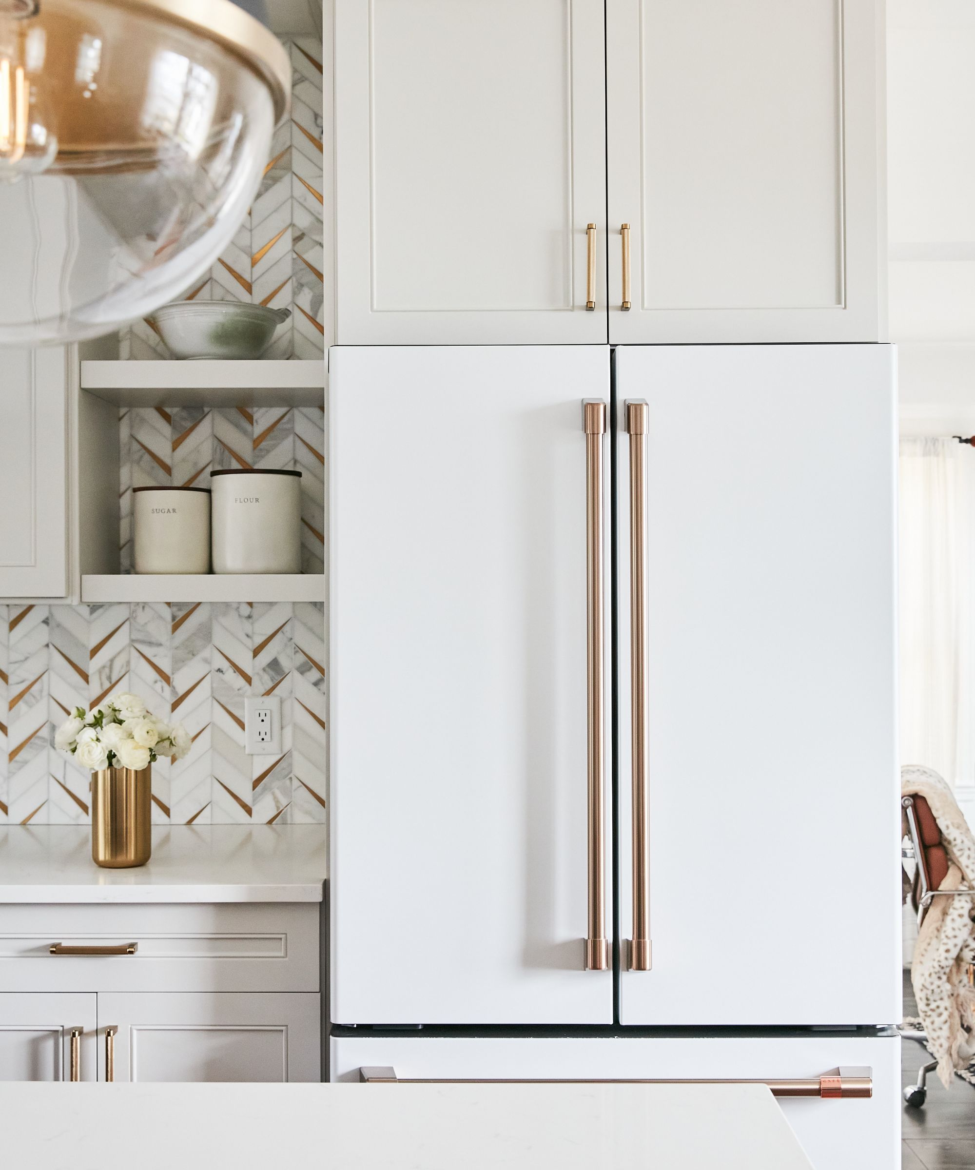
Kitchen cabinets: Sherwin-Williams' Mercurial
When it comes to neutral paints, Sherwin-Williams has much to offer. While it is well-known for its most popular neutrals, from Snowbound to Accessible Beige, there are many more shades to explore that feel perfectly balanced.
'Sherwin-Williams' Mercurial is my go-to greige for kitchen cabinet colors,' says designer Nureed Saeed. 'It is the perfect blend of white, beige, and grey, giving you the 'not white', white kitchen that will stand the test of time.'
8. Country Squire
'I'm obsessed with Country Squire,' says interior designer Amber Guyton of Blessed Little Bungalow. 'It's a deep blue-green, nearly jade, that is a striking jewel tone that pairs well with neutrals as well as bright hues like chartreuse or Fuschia.'
If you're looking to make a statement and create a dark color scheme with a feeling of sophistication, this dark green paint makes a great choice, especially in small rooms such as a snug room or home office.

Technically a blue paint, Country Squire has strong green undertones resulting in an elegant, moody paint color.
Which of these Sherwin-Williams paint colors would you try in your home? Whichever you're drawn to, remember to sample shades first so you can see how they look in specific rooms with changing light throughout the day.
Sign up to the Homes & Gardens newsletter
Design expertise in your inbox – from inspiring decorating ideas and beautiful celebrity homes to practical gardening advice and shopping round-ups.

Emily is a freelance interior design writer based in Scotland. Prior to going freelance in the spring of 2025, Emily was Homes & Gardens’ Paint & Color Editor, covering all things color across interiors and home decor for the Homes & Gardens website. Having gained specific expertise in this area, Emily is well-versed in writing about the latest color trends and is passionate about helping homeowners understand the importance of color psychology in home design. Her own interior design style reflects the simplicity of mid-century design and she loves sourcing vintage furniture finds for her tenement flat.
You must confirm your public display name before commenting
Please logout and then login again, you will then be prompted to enter your display name.
-
 Step up your pool cleaning routine with Beatbot AquaSense 2 Ultra
Celebrate National Pool Opening Day by saving up to $618 on a luxurious pool cleaning solution from Beatbot.
By Sponsored
-
 Isabella Rossellini's kitchen defines 'pantry perfection' – her sleek storage method is one of the most beautiful ways to bring order to your shelves
A custom Chilean applewood pantry lines the walls of the Conclave actress's kitchen – you can tap into her stunning technique from $42
By Megan Slack