Layerism is the new maximalism: this is how I apply it to my interior design
I've coined myself a layerist – and I believe it's a wonderful way to build a home for real life
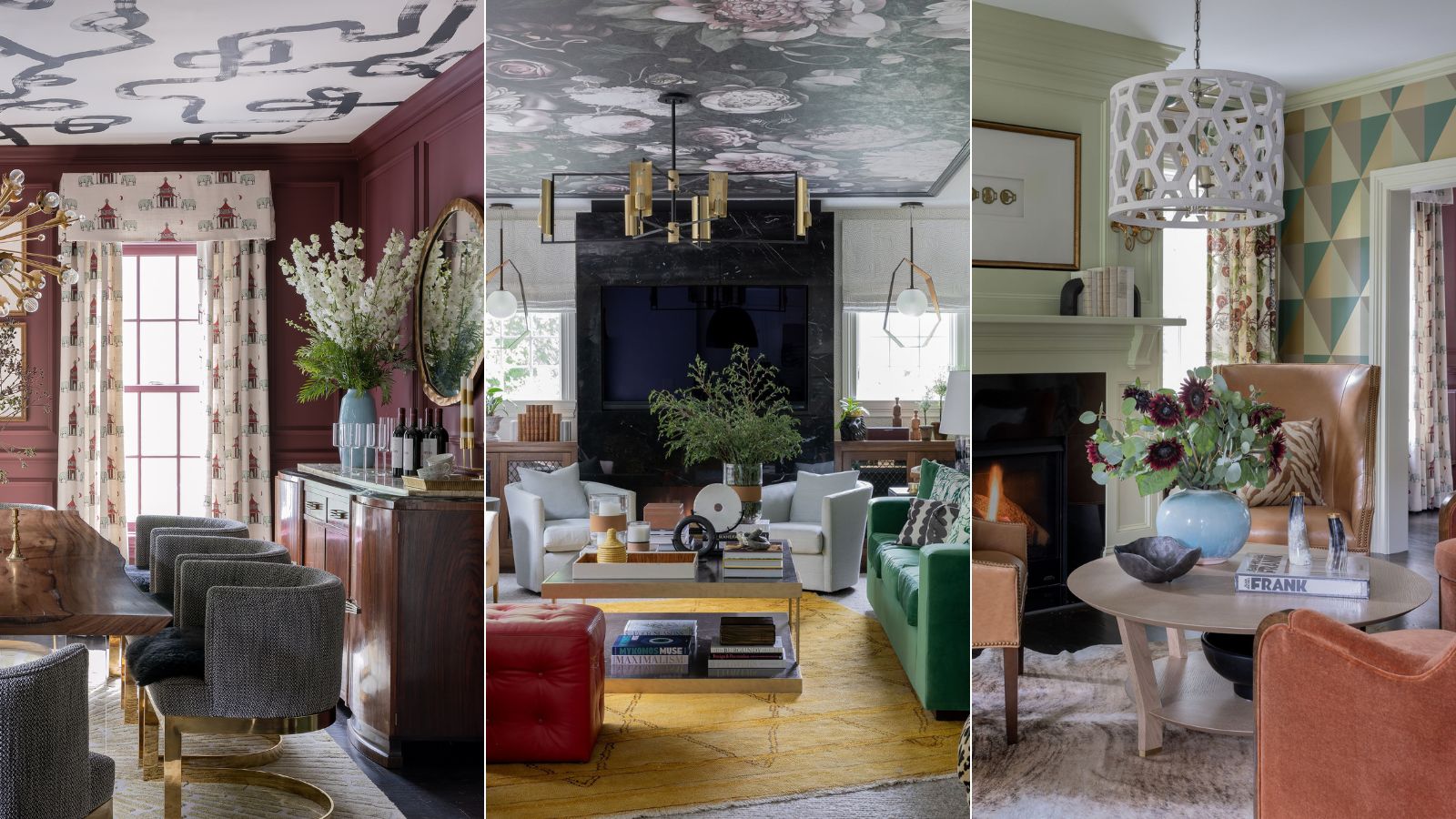

Designers tend to be categorized into nebulous categories like 'Traditional', 'Transitional', 'Contemporary', 'Minimalist', or 'Maximalist'. As a 'Layerist', I want homes to feel layered because that's what real life feels like, because, over time, you collect memories and experiences and stack them. Just like life and relationships: layer upon layer.
When you live in a layered house, you keep adding things you love until there's a fullness. When a home is too minimalist, no doubt it is chic and beautiful, but it can also feel austere and cold.
We design homes for people living their lives: children, pets, activity, and vitality. Although we love and appreciate minimalism, it does not give us joy. Color, pattern, layers that feel collected, the building of shared memories, and the imperfect drive our creative process.
This is how I use layering in interior design.
1. Layerism is the new maximalism
Maximalism is the intentional mix of multiple patterns and colors where every surface and all furniture is a kaleidoscope and a visual feast.
Layerism, on the other hand, builds upon a deliberate design by adding layers of warmth and pattern that complement the other design elements but don't dominate the space or overwhelm its inhabitants.
We love color and fully embrace pattern, but only some surfaces need such a high level of ornamentation. Carefully creating a design plan that strategically uses decorative elements like patterned wallpaper and textiles can go a long way when used strategically.
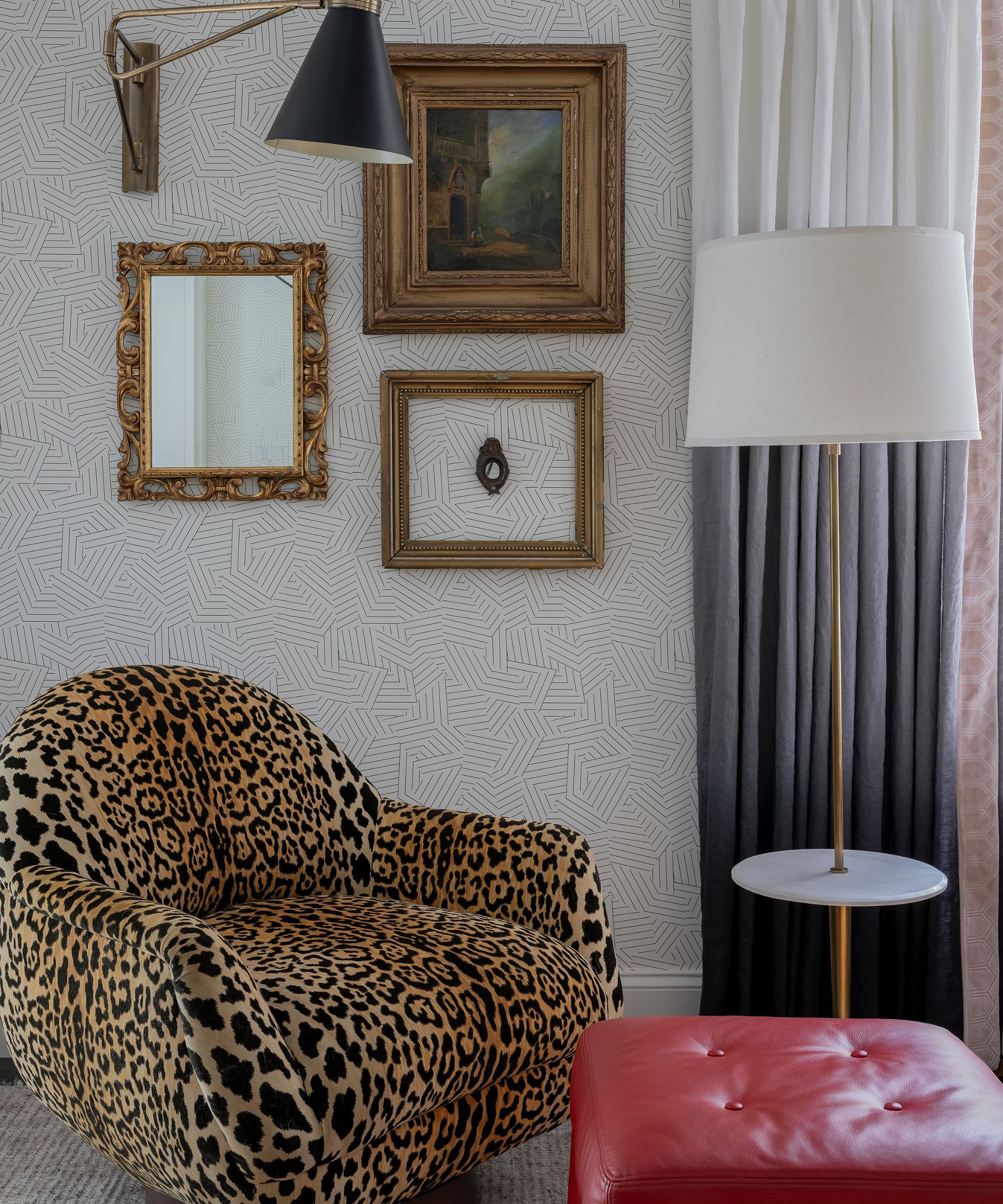
In the vignette (above) we paired a leopard printed velvet with a red leather ottoman, with the gray ombré curtains and black mid-century sconce tempering the 'wild' factor while the soft geometric wallpaper serves as the overall foundation.
Intelligent layering is about balance, scale and also instinct.
2. How I introduce layerism
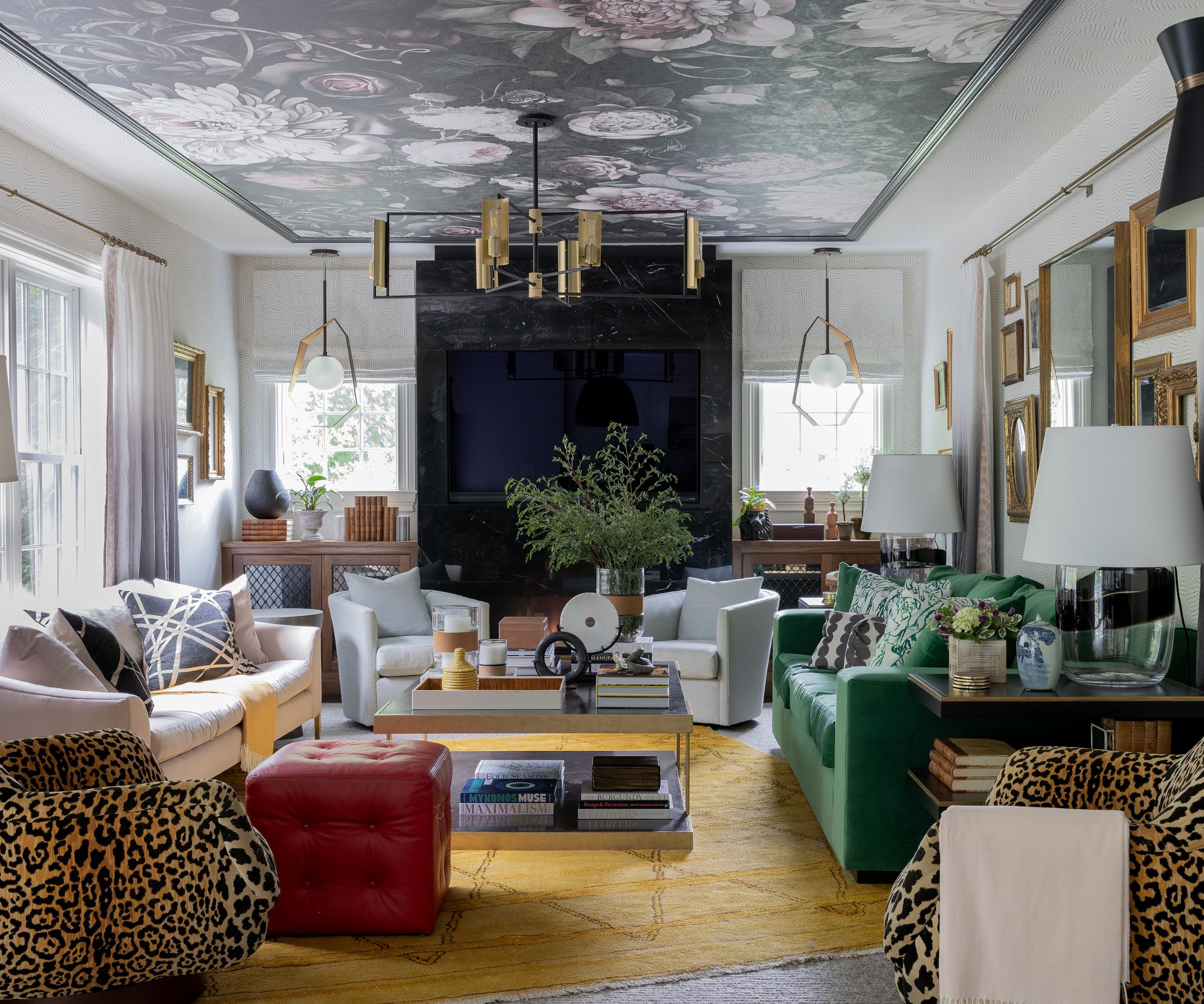
In this living room, we added a bold floral wallpaper to the ceiling while pairing a second wallpaper with a white base and a soft geometric pattern.
This way, we have a subtle pattern and not plain white walls, and this foundation allows the ceiling to be the star of this room without dominating or over-saturating the space.
To draw in the pale greys prevalent in the paper, we used an ombre linen for the drapery that draws the eye from the pale white to the darker grey on the bottom edge.
Playing with the color, we placed a bright yellow-toned antique rug with a pair of animal print chairs, but the remaining furniture is upholstered in solid materials. And although the green sofa is a bold choice, in a solid textile, it plays with the rug and red ottoman without being too overt.
Layered and rich, but not overserved. It is all about balance and scale, selecting where and when to bring in bolder patterns and colors.
3. Variety is the spice of life
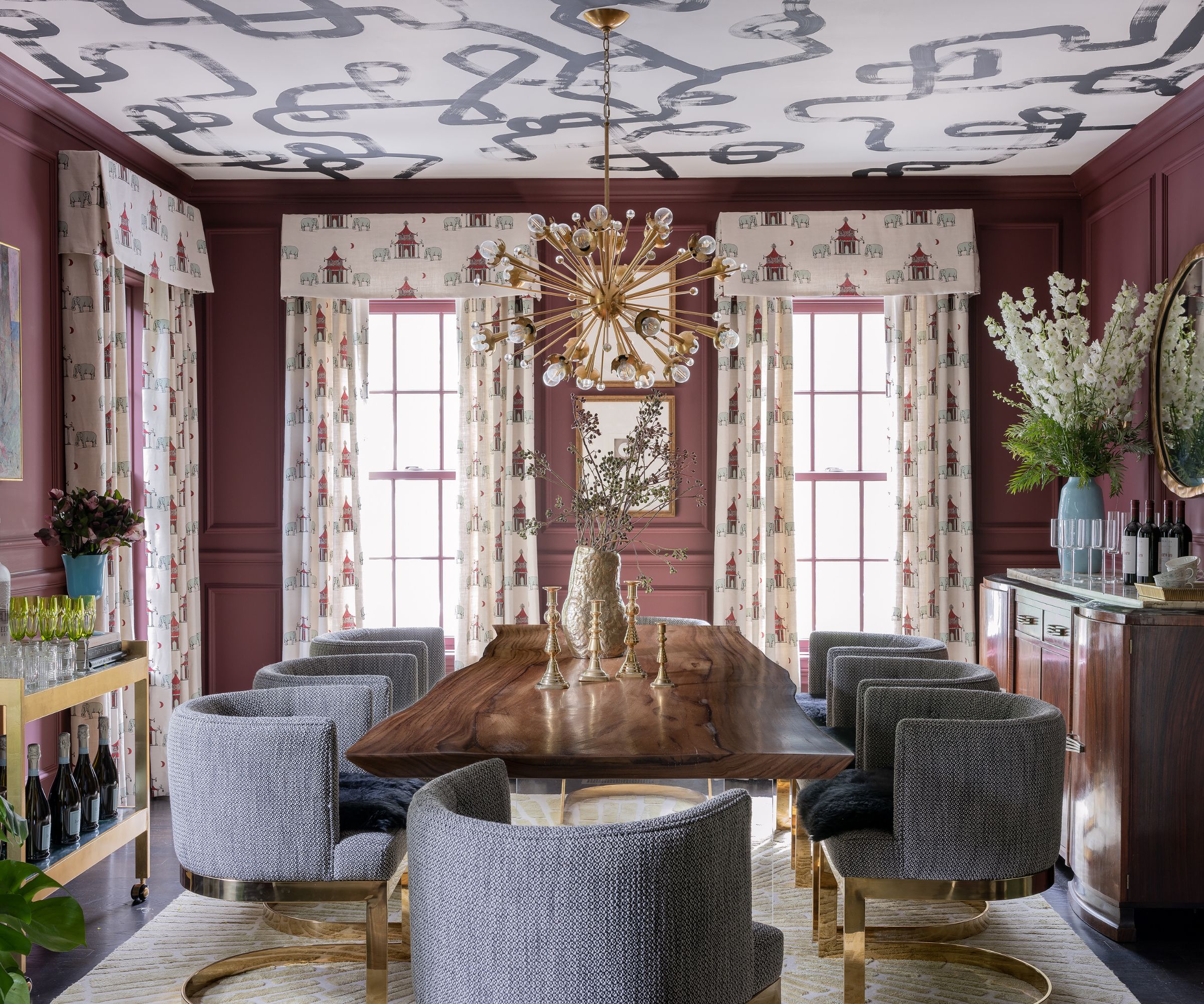
A tenet of my design is a deep-rooted belief that each room should be a different experience. There is a conscious choice to avoid matching the color schemes of each space to one central palette or theme.
Although I am careful to weave a small thread between adjacent areas to create an inherent flow. Our palettes gradually evolve; you start with one color and try it out with others, and through the process, you show your clients how colors relate to one another.
For clients that are a bit newer to (or a bit unnerved by!) the idea of committing to color, I assuage their fears by introducing similar chroma colors in rooms without lots of pattern on pattern.
Here, layerism again shows its utility by bringing visual interest through the combination of different fabrics, finishes, materials, and textures.
4. When is there too much contrast?
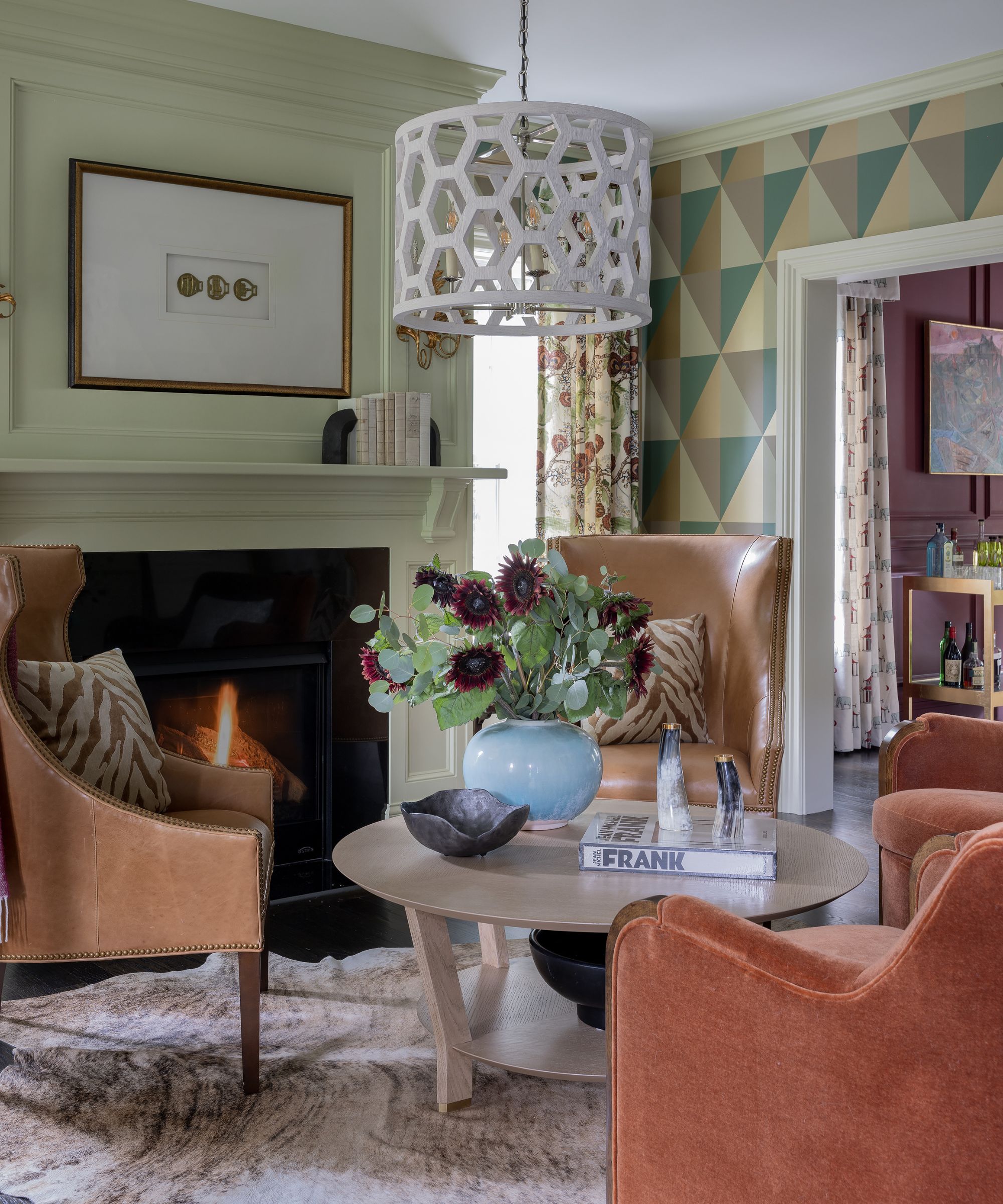
The human eye is naturally attracted to a sharp contrast. If we painted the trim and wood paneling in the family room a soft neutral, then applied the same geometric wallpaper, all you would notice would be this contrast which would distract from the room as a whole.
It is essential to create cohesive spaces that feel unified even if you pop it as we did with these pumpkin spice-colored mohair club chairs. By painting the wood trim, wainscotting, and walls in the same color and finish, we unified the four walls allowing them to serve as the foundation to build our other design elements.
By juxtaposing the sharp geometric wallpaper with a complementary colored floral fabric, the room feels layered and deliberate without screaming at guests. We exude color, pattern, and personality but in a curated way building the rooms layer by layer until there is a fullness, sense of home, and a life well lived.
FAQs
What is layerism in interior design?
Layerism is a term that has long been applied to art and more recently to the combining of analog and digital work. In interior design, it can be used to describe work that includes not just layers of color and pattern and texture, but also of objects with an emotional meaning, and with pieces that are symbolic to the homeowners.
Sign up to the Homes & Gardens newsletter
Design expertise in your inbox – from inspiring decorating ideas and beautiful celebrity homes to practical gardening advice and shopping round-ups.

Robin Gannon Interiors was established in 2009 with the idea of helping clients create the best version of their homes. Her thoughtful process in communication with her clients allows her to get to know them and their aspirations for how they want to live. Her goal is to make her clients’ spaces as individualized as they are. Her design philosophy involves evaluating rooms before decoration, and she often designs architectural changes to elevate a space. 'Rooms must look beautiful before a stitch of furniture is installed or draperies are hung on the wall,' she says. With respect to that approach, Robin Gannon Interiors is a true full-service design firm. 'We strive to exceed our clients’ expectations by working with the best makers, architects, contractors, and subcontractors in the industry.'
-
 5 freezer cleaning mistakes you must avoid – or risk compromising your food quality and shortening the lifespan of your appliance
Avoid these blunders for a safer kitchen
By Seraphina Di Mizzurati
-
 What is an island bed? This clever garden design trick can add privacy and drama to any backyard
Create a long-lasting, low-maintenance and visually appealing island bed that also serves a purpose in the garden
By Sarah Wilson