

Interior designer Kit Kemp's name is synonymous with color. Drawing influences from all corners of the world, her decorating palette spans from Barbados-inspired turquoise to rusty oranges of New York City. However, despite her use of abundant color, Kit's schemes are far from overwhelming. Instead, her room color ideas remain perfectly balanced and always surprising.
But what is the secret behind her sumptuous schemes? In conversation with H&G, the Founder and Creative Director of Firmdale Hotels and Kit Kemp Design Studio sat down alongside Massachusetts-based designer Annie Selke for a masterclass in color. And her color balancing rule was at the top of the agenda.
Kit Kemp's rule for a curated color scheme

According to Kit Kemp, the key to using a strong color is to let it breathe. This means you assess the space around the bold hue and see how it works alongside other colors. How does it reflect against the other tones in your space?
'You will use a sort of strength of detail in your palette. But you have to let it breathe,' Kit says.
When experimenting with kitchen, bedroom, or living room color ideas, it's important to use vibrant colors in doses – and using subtler tones (like gray and white) will allow these spaces to breathe. This ensures your room does not feel overwhelming. However, the designer urges us not to forget strong color in small spaces too.
'The in-between spaces are very important,' she says. 'The spaces when you open the cupboard door, your landings, and staircases. If you can think about those, your house or your space is twice as big because it’s a memorable space that you’re going through.'

So, if you're adding a strong hue to a corner of your entryway color ideas – or a bold tone in a nook on your landing – Kit's rule remains the same as every other space: 'Remember, there must always be something that makes you want to take a deep breath before you go into something else,' she says. 'In between, just give yourself a bit of a break.'

Similarly, when it comes to paint ideas, Annie Selke adds that every color is influential – even those that she calls 'no color colors'.
'They’re technically an ugly color, but they offset other colors. It’s almost like a foil for other colors,' she says. These colors allow the strong hues to stand as a focal point – while allowing room to breathe. 'The unsung heroes that make the other colors look good are important,' she says.
'I also think that color can be a surprise in places that you aren’t expecting it. If you open a bar [for example] and inside is a wonderful color in a small dose, like a jolt of happiness. You’re not dealing with it all the time; it’s just these moments.'
More information about the Kit Kemp Collection for Annie Selke is available online.

-
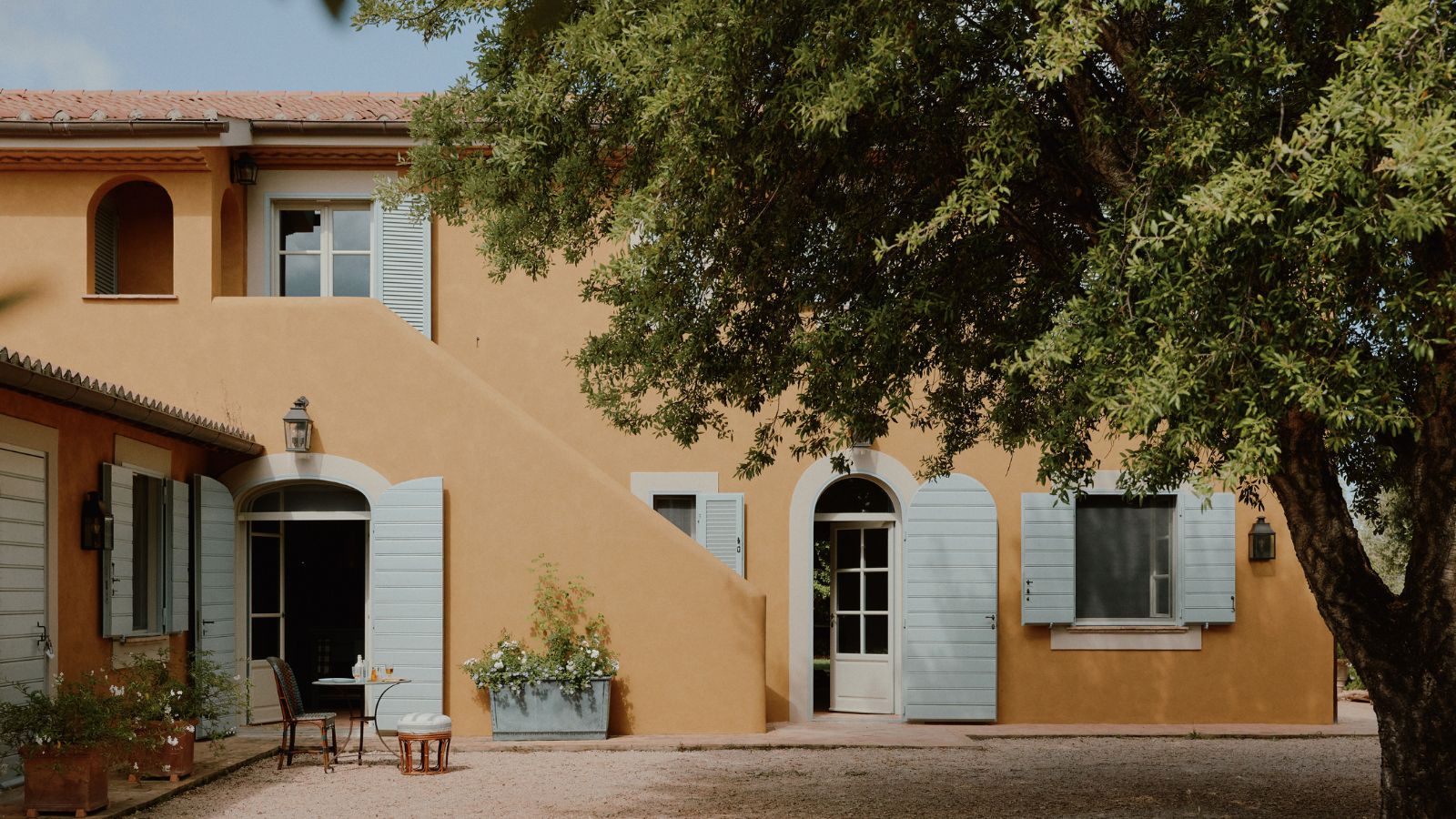 How a British designer brought together the different tastes of a couple wanting to create the dream future-proofed home in the idyllic Italian countryside
‘They wanted a house that would feel immediately like home the minute they arrived, and somewhere relaxing to spend time together as a family and entertain friends.’
-
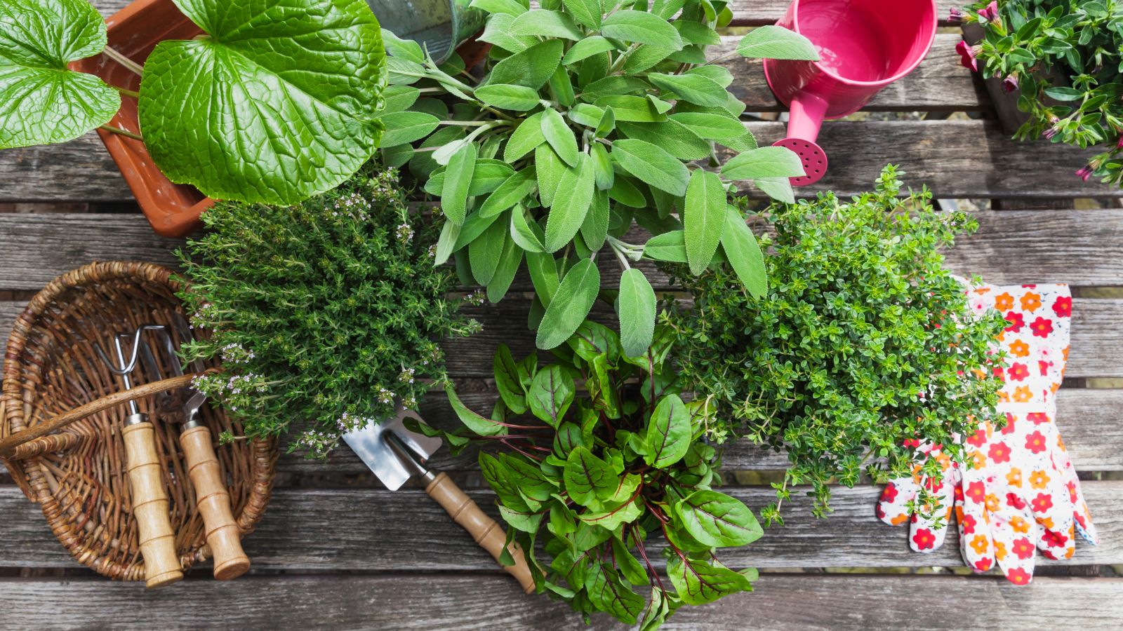 What is your birth month herb? Discover the symbolic meaning behind yours
Herbs offer symbolic wisdom, and play to the natural rhythms of the season

