Here are all the most common mistakes to avoid when decorating a kids' bedroom according to interior designers
If you're wondering what not to do when decorating a child's bedroom, we have the list for you
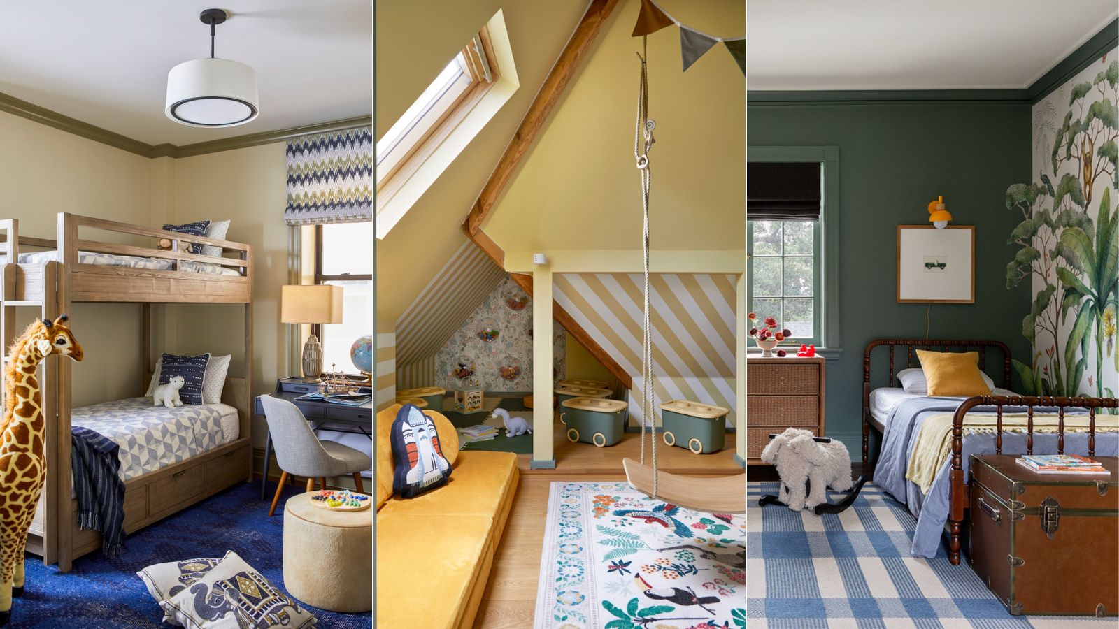

A kid's bedroom should be creative, playful, restful, and practical all in one. A pretty hard brief to nail.
Decorating children's spaces like kids' room ideas or playroom ideas is notoriously tricky without the help of a professional. There are many rules on what not to do when designing kids' bedrooms, so we thought it only right to talk to the experts and find out their most-seen kids' room decorating mistakes.
There are a few common pitfalls parents make that can result in them outgrowing the space too quickly, things getting utterly trashed, and even worse: your kid totally hating their new and rather expensive room. To help you find the right balance of function and fun, we've curated a list of 9 mistakes to avoid making when designing a kid's bedroom.
9 Kids Room Decorating Mistakes To Avoid
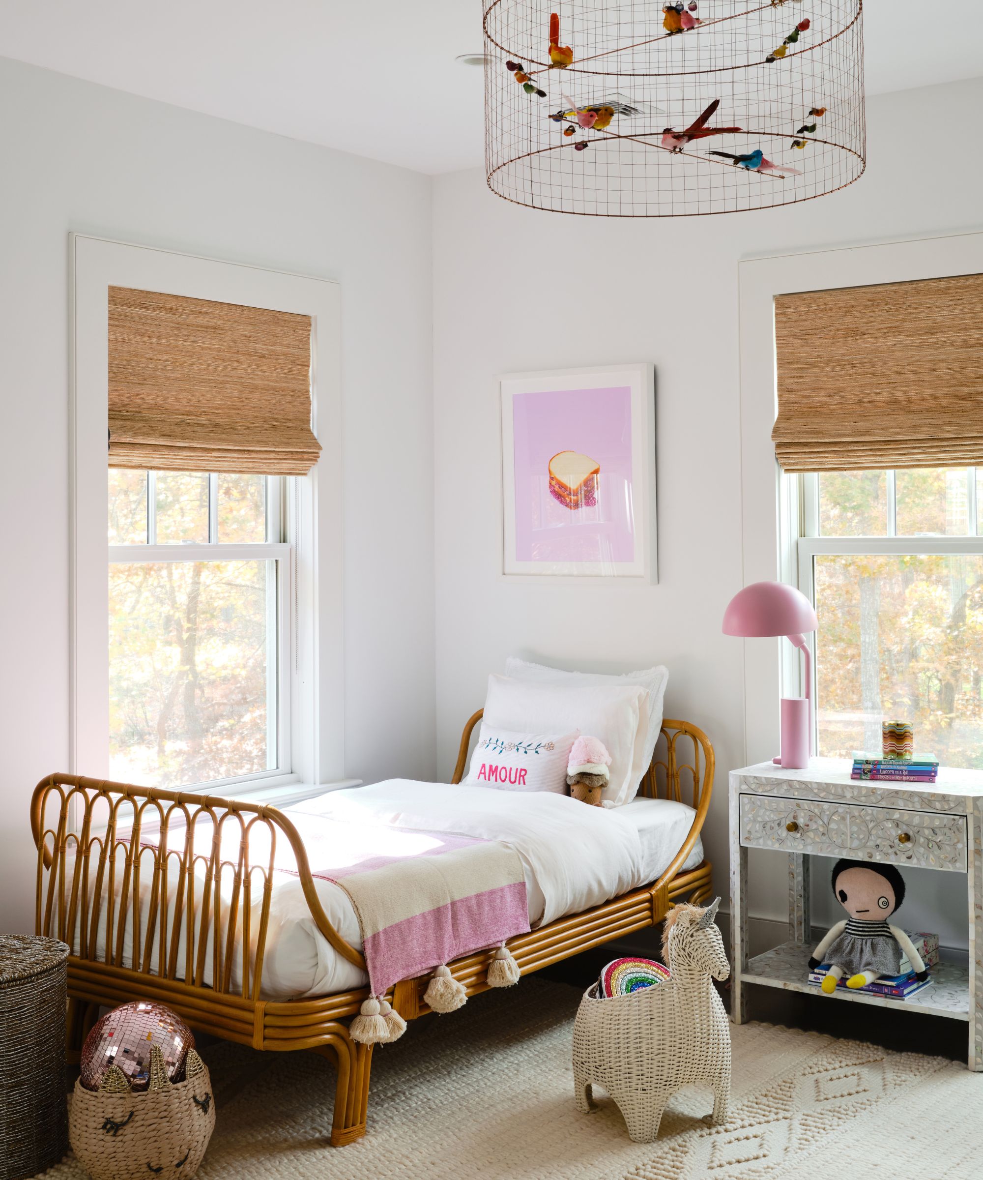
Here, we delve into the common missteps you can easily make when decorating a kids' bedroom that can often lead to unnecessary regret, expenses, and future redecorating.
1. Forgetting to have fun
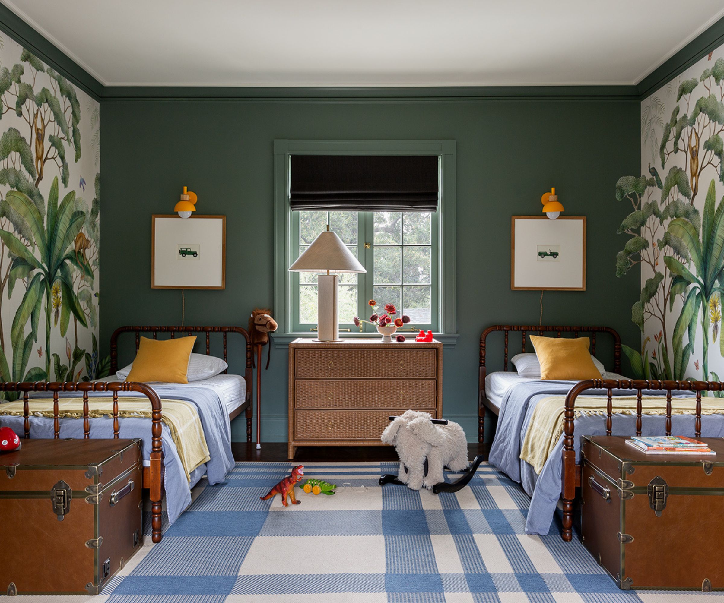
One of the most important aspects of decorating a kid's bedroom is to remember that it's a space meant for play, imagination, and joy. 'I think the biggest mistake people make when creating a kids' room is to be afraid,' suggests Alexandra Azat, designer and founder of Plaster & Patina.
'We love creating fun kids rooms that ignite curiosity and creativity. Personally, having two young kids myself, I have found that incorporating things that are unique to each of them makes them feel heard and loved and makes them feel confident in their unique space.' Many parents overlook the element of fun, opting instead for overly sophisticated designs that forget to prioritize personality and whimsy.
Additionally, the beauty of a kids' room is that it doesn't and shouldn't have to match the curated aesthetic of the rest of your home. 'I think sometimes people get too stuck in the thought that it isn't classic or that it won't last forever, but we love when people embrace the fun of creating a child's space!'
2. Focusing on picture-perfect aesthetics
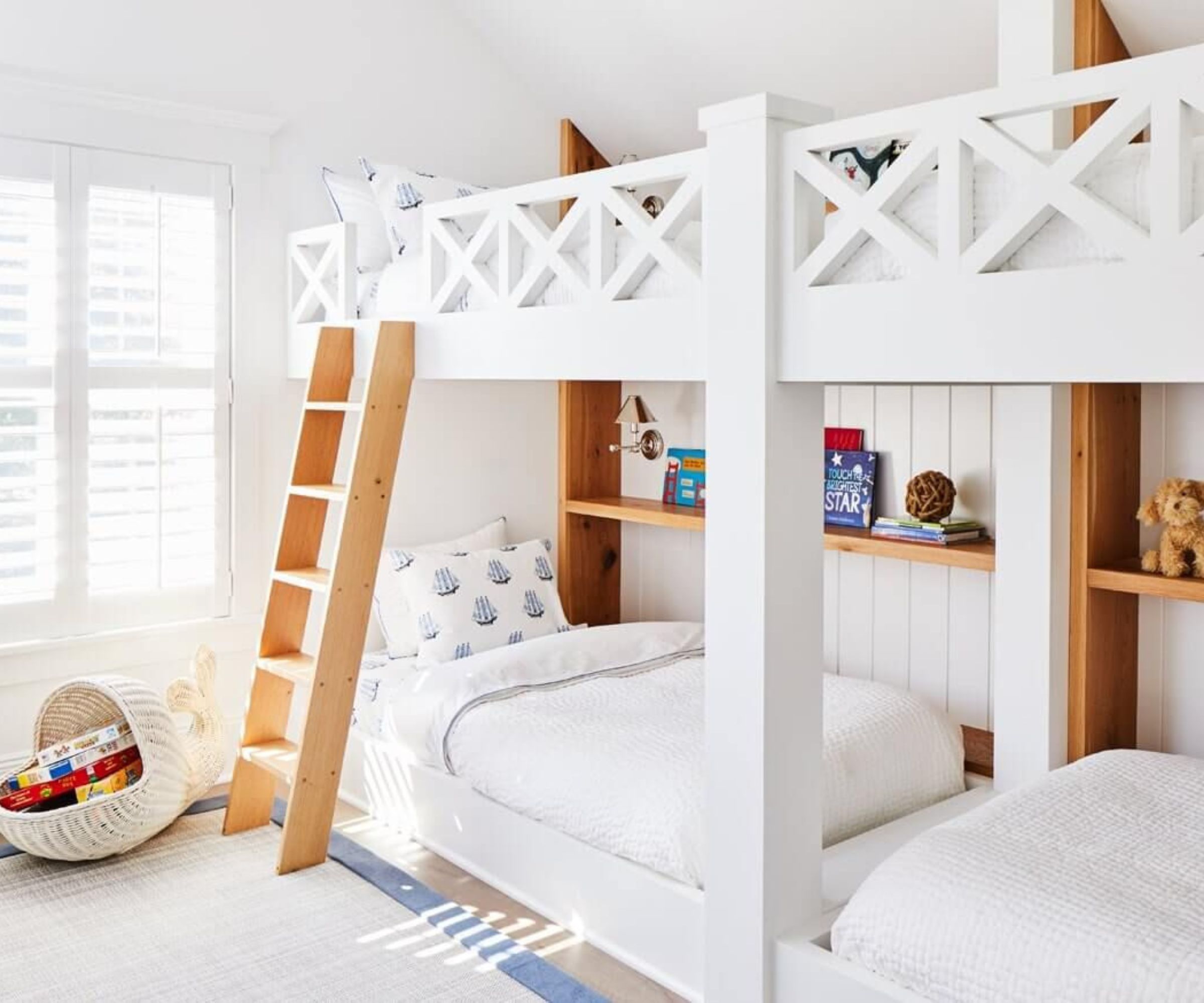
'One mistake you can make when it comes to designing a kids' room is to forget that it needs to function day in and day out for an actual child,' advises designer Kathy Kuo. It’s easy to get caught up in creating a picture-perfect bedroom for your child, but a child’s room should be lived in and loved, not just styled. It needs to be functional and comfortable for everyday use.
'We all see those beautiful children's bedroom and playroom looks on Pinterest and Instagram - spotless white furniture and carpets, everything neat and tidy up on shelves, perfectly made beds - but realistically, that's not how children live,' she explains. Kids are messy, and their rooms need to be durable. Instead of going for the most visually appealing options, pick durable and practical choices that can endure the daily activities of a child.
'Relax a bit and focus on practical, well-made items that will grow with your kids and also withstand the daily wear and tear of active, energetic kiddos being kiddos!'
3. Being too afraid of color
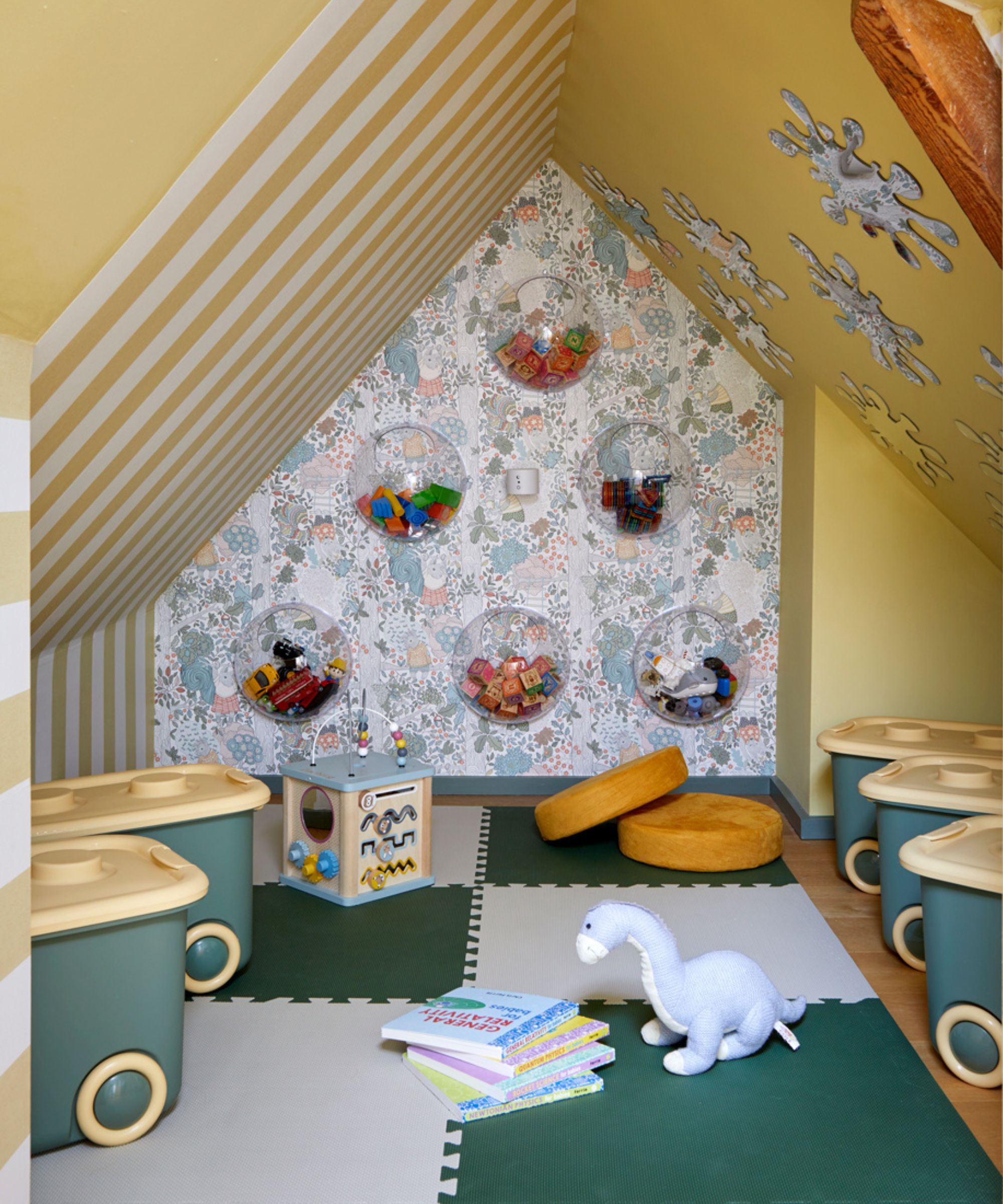
A very common mistake is choosing a muted color palette or minimalist decor that might appeal to adults but doesn’t resonate with a child. Color is an essential part of a child’s development and can influence their mood and creativity.
'With the belief that strong colors can overstimulate children and disrupt their sleep, parents often avoid the idea of using bright colors in children’s interiors. While this may be an outdated theory, it is important to approach adding color thoughtfully,' suggests renowned children's designer Joanna Landais of Eklektik Studio.
'When embracing the idea of incorporating a pop of color, it is crucial to strike a balance in both the intensity and quantity of the chosen color,' she advises. 'If you have a favorite color that you would like to introduce into your child's bedroom, a good approach is to start with a neutral base and gradually add touches of the color throughout the space. This can be done through soft furnishings, lampshades, cushions, carefully selected wallpaper, or other accents.'
'Lighter colors help create a stimulating and happy environment,' agrees Marina of Marina Hanisch Interiors. 'Additionally, keeping the room light and neutral will provide a versatile backdrop that will easily adapt to changing themes and decor as the child grows and their tastes evolve.'
4. Getting caught up in themes
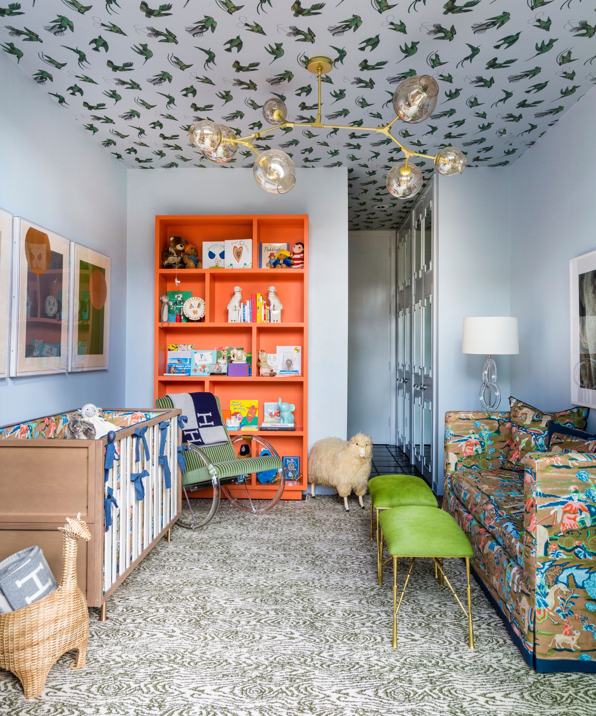
It's easy to get swept up in the excitement of designing a themed bedroom for your child, especially when there are so many adorable options like princesses or jungle safaris. However, an overly themed room can become limiting and quickly outgrow your child's interests.
'Try not to adhere too strictly to a theme,' suggests Bethany Adams. 'It is a real challenge, and one I struggle with myself, but, in order to create a kid's room that is both adorable and gives these small creatures room to develop their own personalities and tastes, we need to leave them some visual and creative space to do it,' Bethany explains.
'So resist the urge to cover every surface in your chosen theme and vow to let Junior find his own passion whether it be matchbox cars, Barbie dream houses, Entomolgy, or all three.'
'Don't go too far with a theme,' agrees Emily Brownell of Gilded Hearth Interiors. 'I love a subtle theme but if you start having woodland creatures on everything it will age fast and get tiresome and potentially not fit your child's personality by next year, instead opt for carrying a theme in things that are easy to swap out like art or pillows.'
5. Not creating enough storage
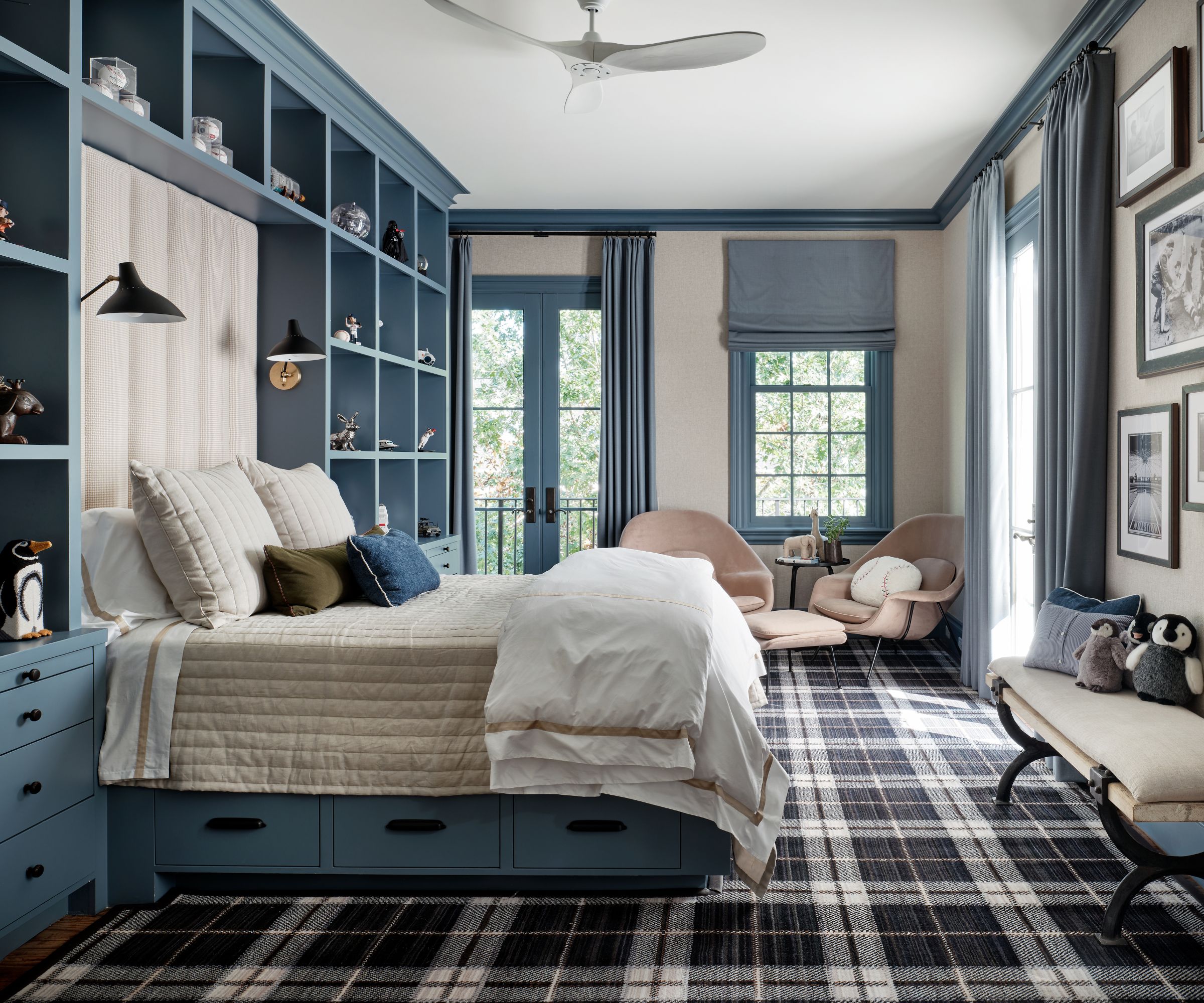
Storage is a crucial component in any child’s bedroom. A well-organized space not only looks better but also functions better and without adequate storage, clutter can quickly take over, leading to a chaotic and stressful environment.
'The most important detail to a kid's room is ensuring there is enough storage for toys, activities, and stuffed animals in addition to their clothing,' says Laura Williams of ATX Interior Design. 'I love to get creative with large baskets & decorative bins so the storage is flexible for years to come.'
Incorporating built-in storage solutions, such as shelves, cubbies, and under-bed drawers, can maximize space and keep items neatly organized. Don't forget to think vertically. Use wall space for shelving and hooks to keep the floor clear for playing. Multi-functional furniture, like beds with storage drawers or benches with hidden compartments, can also be incredibly useful in making the most of a small space.
6. Investing in things they'll age out of quickly
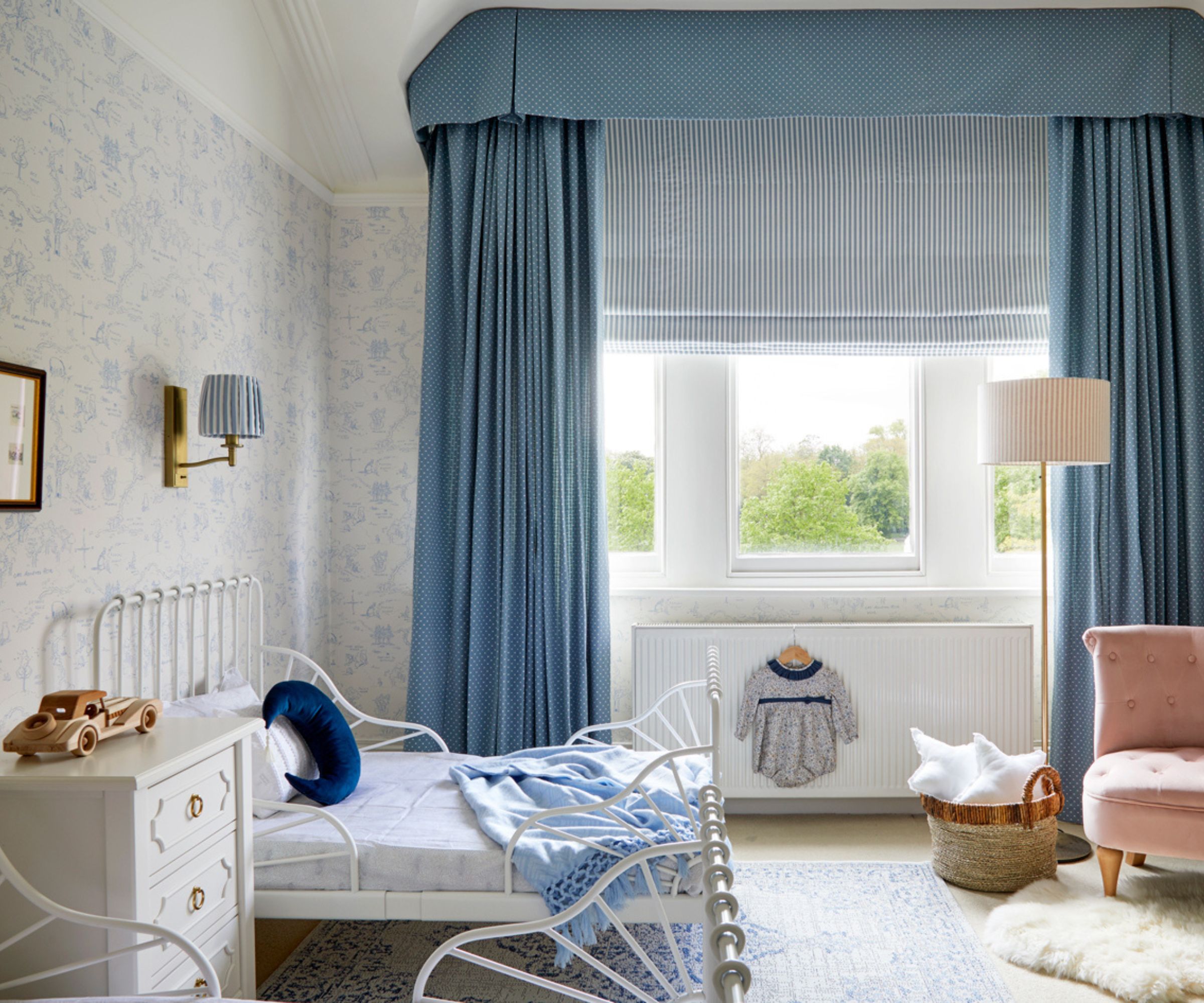
Investing in versatile furniture and decor that can adapt to different stages of your child’s life can save time and money in the long run. For example, a convertible crib that transforms into a toddler bed, or a desk that adjusts in height, can extend the usability of your investment.
Gideon Mendelson, founder and creative director of Mendelson Group, says: 'We are always focused on making sure that these rooms can grow with our client’s children as they grow. I like flexible furniture layouts because kids’ needs change often. All bedrooms should have a bed (sometimes an extra bed for a sleepover), a nightstand, a dresser, a comfortable chair, a desk, and good lighting,' adds Gideon. 'Younger kids tend to need more space for movement. Older kids need more privacy.'
'Choose pieces that have more than one purpose,' agrees Emily Brownell. 'For example, I never use changing tables that aren't dressers first, and most of the time I opt for vintage due to better quality and lower toxicity in the materials. Don't purchase furniture that is low quality just because "they won't have it for that long". If you choose pieces that grow with them they should have them for a long time.'
7. Failing to work with the floorplan
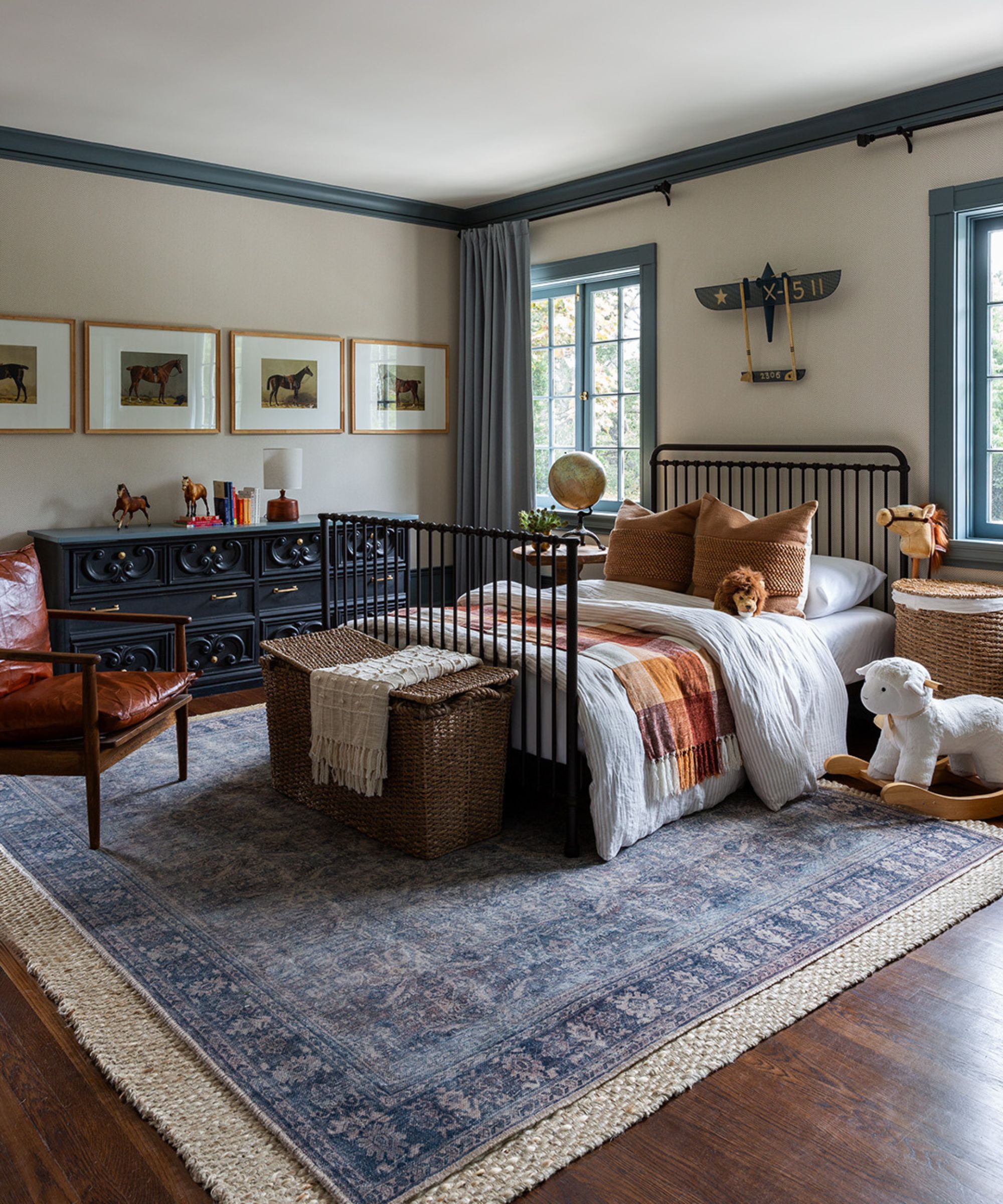
One common mistake is not considering the flow and floorplan of the room first. Always think about how your child will move through the space and ensure there’s enough room for play, avoiding placing large pieces of furniture where they might obstruct pathways or create unnecessary barriers.
'Don't skip making a floor plan first,' Emily suggests. 'No matter how big or small the room is always do a floor plan first and these days there are ample online programs to help you do this,' she advises.
Create distinct zones within the room by using rugs and furniture arrangements to delineate different activities, such as a reading nook, a play area, and a sleep zone. This helps in organizing the room and provides a structured environment for your child.
'When designing a kid’s room, it’s important to consider their needs' adds Marina Hanisch. 'Children love spreading out their toys on the floor. Providing sufficient floor space in front of or next to their bed, allows them to be imaginative and play freely.'
9. Neglecting pattern and print
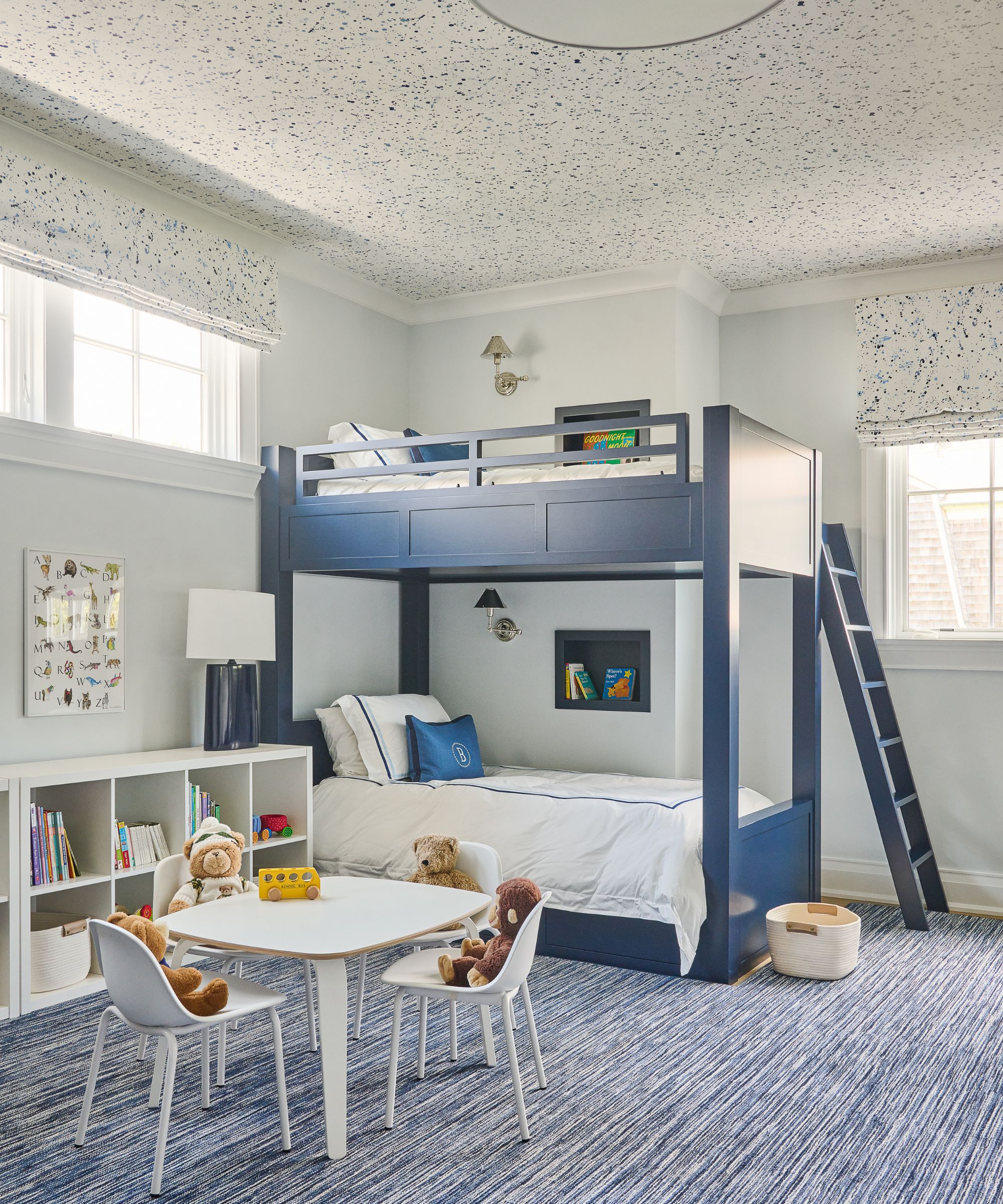
A common mistake we see is sticking to solid colors and plain surfaces, which can make the room feel flat and uninspired.
Patterns and prints are crucial in a child’s room. Don’t be afraid to mix patterns and prints. Stripes, polka dots, and florals can all work together as long as there is a common color thread tying them together.
'One mistake to avoid is not getting creative (or strategic) with pattern placement. Here above] we carried this gorgeous patterned motif from the drapery to the ceiling,' explains Michelle Morgan Harrison of Morgan Harrison Home.
'Adding unexpected pattern creates a sense of whimsy that's perfect for a child's bedroom. Also, depending on the pattern you use, it's a great method for ensuring the room's design easily grows alongside your child,' adds Michelle. 'They might become tired of a vibrant wall-to-wall pattern, especially as they enter their teen years - but using pattern only on the ceiling or drapery allows flexibility with the design as their tastes change. Then, you can easily change bedding, wall color, and more while leaving that dash of fun intact.'
Decorating a kid's bedroom is a unique challenge that requires balancing style, functionality, and fun.
A well-designed room grows with your child and meets their needs at every stage. By avoiding common mistakes such as neglecting storage solutions, fearing colors, and overcommitting to themes, you can create a space that is both beautiful and practical for both parent and child.
Sign up to the Homes & Gardens newsletter
Design expertise in your inbox – from inspiring decorating ideas and beautiful celebrity homes to practical gardening advice and shopping round-ups.

Charlotte is the style and trends editor at Homes and Gardens and has been with the team since Christmas 2023. Following a 5 year career in Fashion, she has worked at many women's glossy magazines including Grazia, Stylist, and Hello!, and as Interiors Editor for British heritage department store Liberty. Her role at H&G fuses her love of style with her passion for interior design, and she is currently undergoing her second home renovation - you can follow her journey over on @olbyhome
-
 5 times you should never paint a room gray – no matter how timeless you think this shade is
It might be dubbed a classic neutral, but gray isn't the right choice for every room
By Sophia Pouget de St Victor
-
 These 7 plants will excel and be pest-free next to rosemary – discover the best companion plants, plus what to keep away
Rosemary companion planting keeps plants thriving, deters pests, and can even improve the taste of some crops
By Drew Swainston
