Interior designer Kelly Wearstler reveals how she creates her SoCal beach house vibe
The epitome of luxurious, laid-back, high-end style, her interiors are so translatable

Kelly Wearstler, founder and principal of Kelly Wearstler (founded in 1995), is an American designer creating multi-faceted, experiential residential, hospitality, commercial and retail environments as well as expansive collections of lifestyle product designs.
Her aesthetic is bold, maximalist, and full of surprise, gaining her a reputation as one of the industry's leading authorities.
Here, we speak to her about what inspires and influences her, especially around creating that SoCal beach house look she's so famous for.
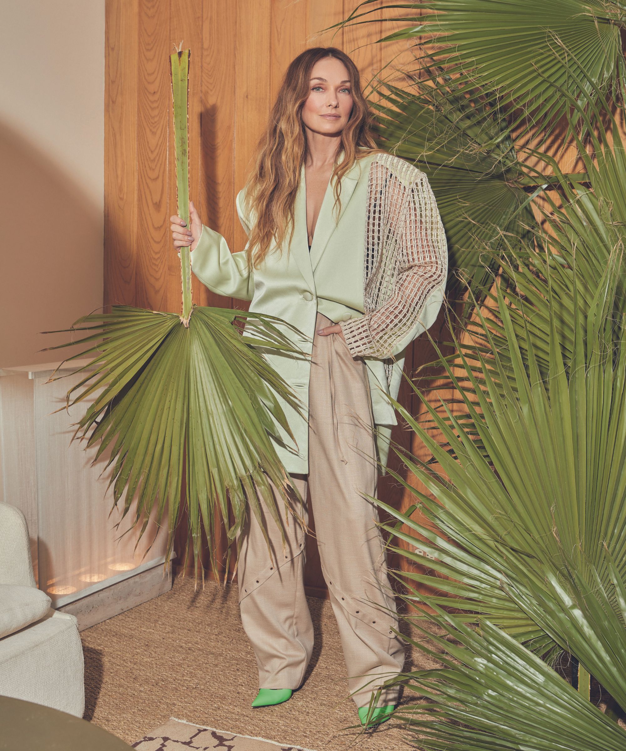
'Taking inspiration from my surroundings has always been an integral part of my creative process, whether it be through the landscape, culture, or history of a place. I instinctively draw inspiration from my environment, and let my personal interests feed into my work.
'I love to hike in the desert, or simply pick wild flowers, branches and leaves, which I then incorporate in various ways within my interior projects. I live in California and it is a constant source of inspiration for me.
'My style is American; it’s an inherently Californian, west-coast aesthetic. Surrounded by natural beauty, California living encapsulates a sense of easy elegance and effortless luxury, which are principles I take into each project.'

'I also enjoy sourcing designs and unique items in antique shops, or exploring flea markets to find vintage pieces, when I'm travelling throughout the rest of the world. I believe that the more places you can look to for inspiration, the richer your work becomes.
'Our Malibu home (above and below) is where we spend most quality time as a family on the weekend, so it’s really a very special space. The house itself is right on the beach, which makes for an ideal retreat where we can truly escape and connect with nature – especially during high tide, when it can feel as though we are on a boat as the waves come crashing underneath the house.'
'At the heart of the property is a Ficus tree, which is certainly a favorite feature. The tree is 18 feet tall so it had to be craned into the house, but over the years it has continued to grow towards the sun. Directly above it we have an operable skylight, which allows for both natural light and ventilation to fill the space.
'Another feature that stands out are the wave-patterned marble walls in the master bathroom, which evoke the undulating movement of the waves. Both of these features bring the outside in, creating a connection with the surrounding space.'
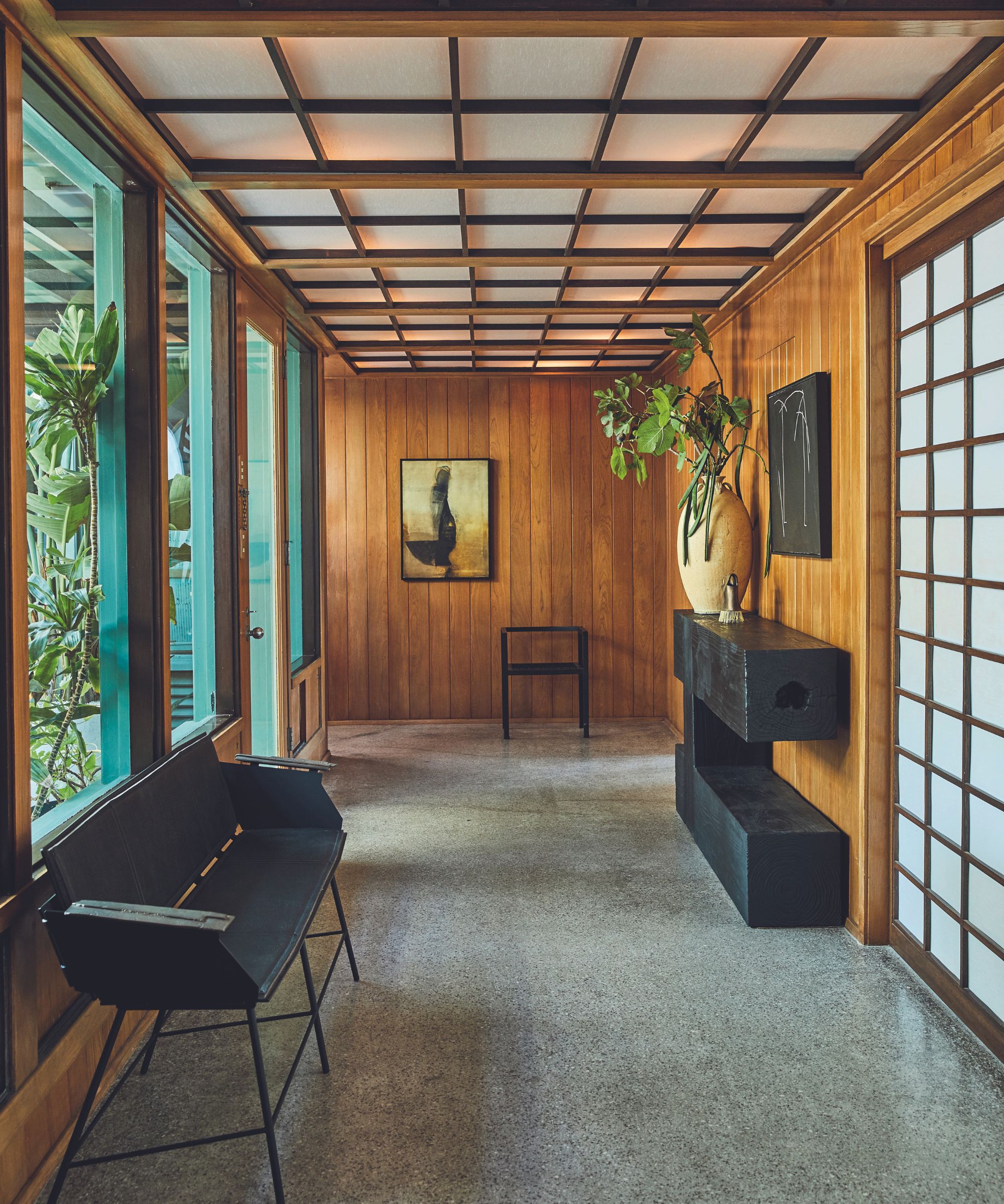
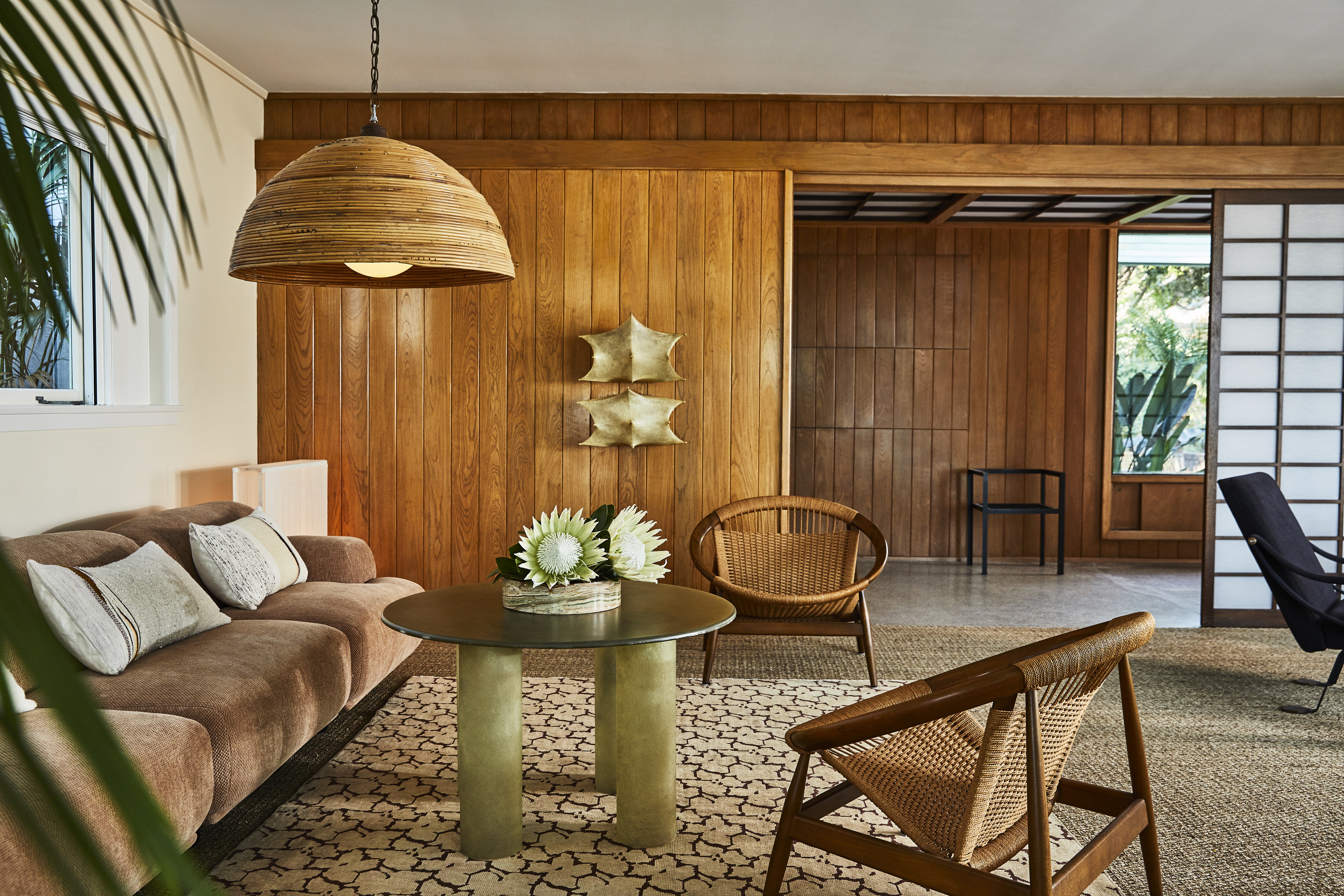
'My interior design for the Broad Beach (Malibu) project shares several aspects with the Malibu property in terms of color palette and materiality, to again create a seamless transition between the interior space and exterior environment.
'I sourced items from local designers and stores in Los Angeles, such as JF Chen and Base 10 and chose rich, earthy and rustic colors for the furniture to create warmth, with a sandy-hue as a backdrop. Large windows maximize the amount of natural light entering the property, and emphasize the connection with the sea outside.'

'When designing a summer vacation home, I focus on bringing the outside in, and aim to create an effortless flow between spaces. Fitting expansive floor to ceiling windows can be a great way to achieve this; natural light can fully infiltrate the interior, allowing for a seamless transition and connection with the surrounding environment.
'I favor sun-bleached color palettes to fill the space with warmth, and try to echo the shapes one might find on the beach. I’m also drawn to natural materials, and tend to incorporate wood or marble into the space to reinforce that connection to nature, whilst still bringing a sense of effortless luxury to the home.'

'When redesigning the four-level South California coastal escape at Seal Beach, I wanted to create a dialogue between the interior and the sea outside. Marine references can be found throughout the design, grounding the home in its environment.
'Deep wood panelling dominates the space, alluding to the interior of a classic sailing yacht, whilst vintage 1960s Italian mohair chairs represent birds on the sand. The colour palette itself reinforces these ties to the sea, through natural, warm and sandy tones of shell pink, soft yellow and rust.'

'For those seeking to evoke a beach house aesthetic and feel, I would suggest it can be achieved by incorporating the shapes, textures and objects that one might find in this environment, and building upon the natural beauty found there.
'This might be translated in curvaceous forms that are reminiscent of the waves, be it through the grains in marble or rounded furniture. It might also be translated through a warm and earthy color palette that includes beige, terracotta or rustic browns. Integrating raw materials – particularly raw stone and wood – can create an emotive link between the home and nature and work to bring the outside in.'
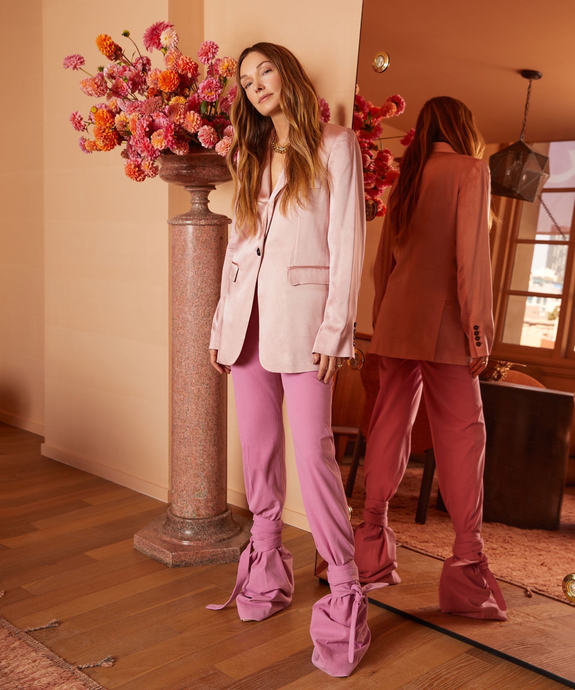
'A great way to create an instant cue of a warmer climate and summery feel would be to consider using paint. My California Collection for Farrow & Ball (above and below) is informed by the colors seen in the natural beauty of this landscape.
'For instance, Faded Terracotta (above) was inspired by the rooftops in Southern California, and provides a warm and welcoming tone to a space, or Citrona (below) picks up on the yellow in lemon trees. This collection encapsulates the influence of the outdoors on indoor living, which is so integral to designing a vacation home.'
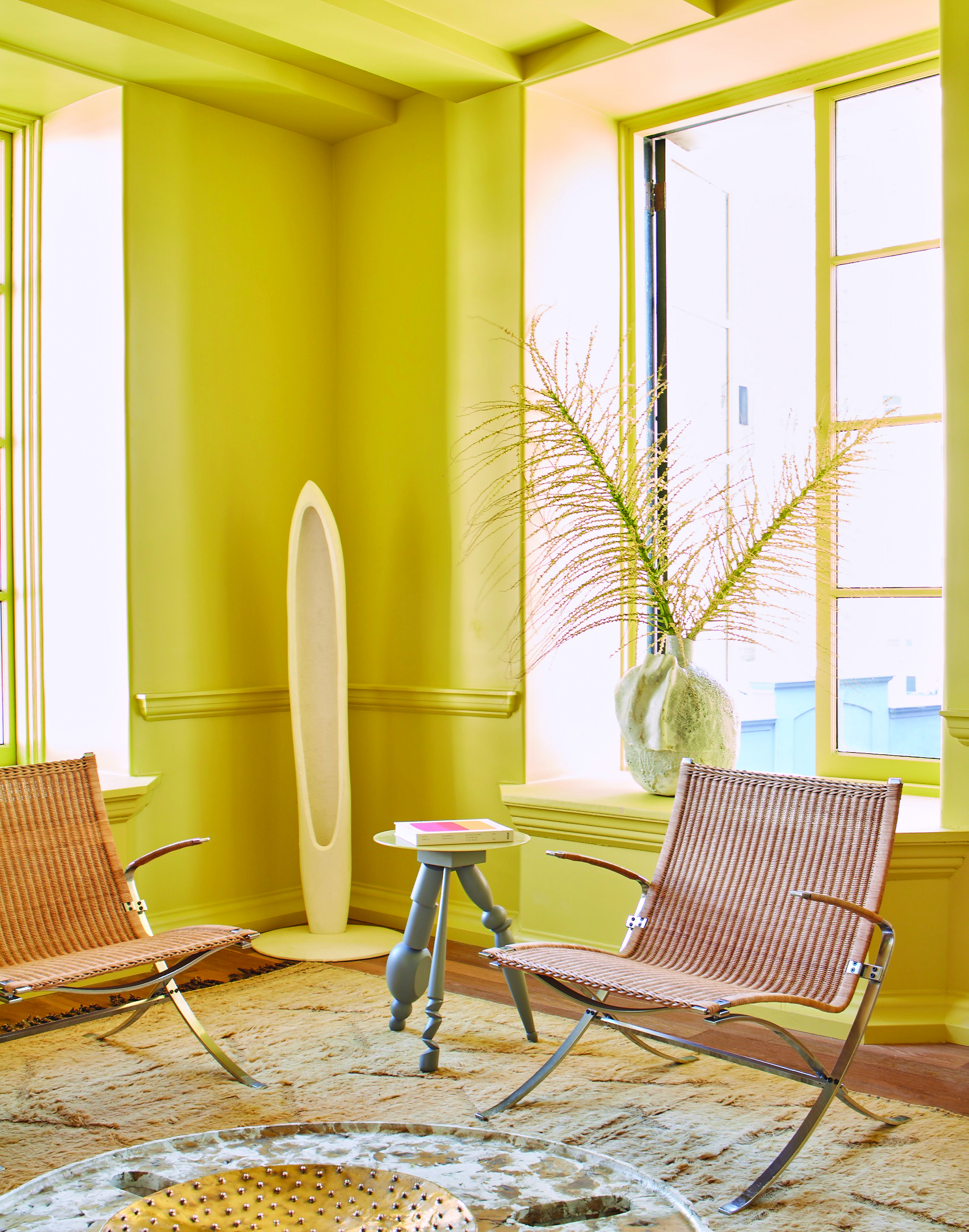
'Terracotta can be a fantastic color to incorporate into a home with its inherent softness, warmth and naturally welcoming tones; much like the morning sunlight.
'Beige is another great color to use as a backdrop, with its warm, yellow undertones. Introducing natural materials that share these tonal properties can create an interplay between color and materiality, and amplify the warm-toned light.
'For instance, choosing brass or copper metal fixtures over cool stainless steel, or rich wood panelling across the walls, as seen in my Broad Beach project.
'Looking ahead, there’s a line up of talent we have planned for my curatorial Gallery platform. New lighting and furniture designs are in development and I also have a super exciting book project launching later this year with publisher Rizzoli which I just can't wait to unveil.'
Sign up to the Homes & Gardens newsletter
Design expertise in your inbox – from inspiring decorating ideas and beautiful celebrity homes to practical gardening advice and shopping round-ups.
Rory Robertson has a long-standing history working across the interiors industry. Rory studied Interior Architecture at the University of Edinburgh, and later, Theatre Set Design and Architectural Illustration at The Rhode Island School of Design on America's East Coast. Rory's foray with the editorial world started a decade ago at Livingetc magazine, a title to which he regularly contributes today. Specializing with a deep-seated appreciation for historical homes and interiors, Rory often travels far and wide to be inspired by unique properties with a fascinating history.
-
 5 fast-growing tiny flowers – expert recommendations to fill your pots and borders with color in record time
These fast-growing tiny flowers prove that miniature can also be marvelous
By Thomas Rutter
-
 Midimalist kitchens are the trending way to create a characterful yet clutter-free space – and these 8 spaces prove how chic this best of both worlds style can be
It's the go-to kitchen style for a balance of busy and simplistic design
By Molly Malsom