Interior designer Katie Ridder's top 13 decorating rules – for the perfectly finished space
Interior designer Katie Ridder tells us about those all-important finishing touches that bring a designer flair to a space
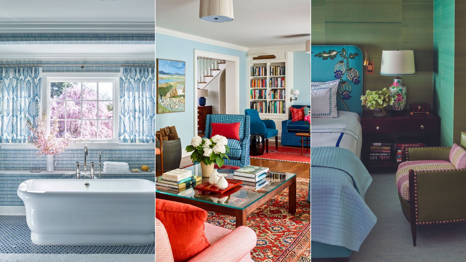
- 1. Include tiny, eye-catching details
- 2. Make space for handmade pieces
- 3. Add personal touches
- 4. Ensure beautifully hung drapes
- 5. Style your bed beautifully
- 6. Repeat design motifs
- 7. Shop for white lampshades
- 8. Decorate the ceiling
- 9. Use red and blue
- 10. Introduce game-changing antique rugs
- 11. Don't neglect texture
- 12. Layer lighting
- 13. Bring in flowers
- Where Katie shops

Katie Ridder is famed for her gloriously colorful spaces.
Recently, the New York City-based interior designer and author exclusively shared her most important home decor ideas and rules with us for a perfectly finished room.
So if your rooms are nearly there but not quite, let Katie's advice help you get them over the line.

Katie Ridder is a New York City-based interior designer, with a line of wallpaper and fabric is carried by Holland & Sherry. Katie’s first book, Rooms, was published in 2011. A House in the Country, co-authored with her husband, Peter Pennoyer, features the couple’s house and garden in Millbrook, New York. Katie’s latest book, More Rooms, was published in September 2020.
1. Include tiny, eye-catching details
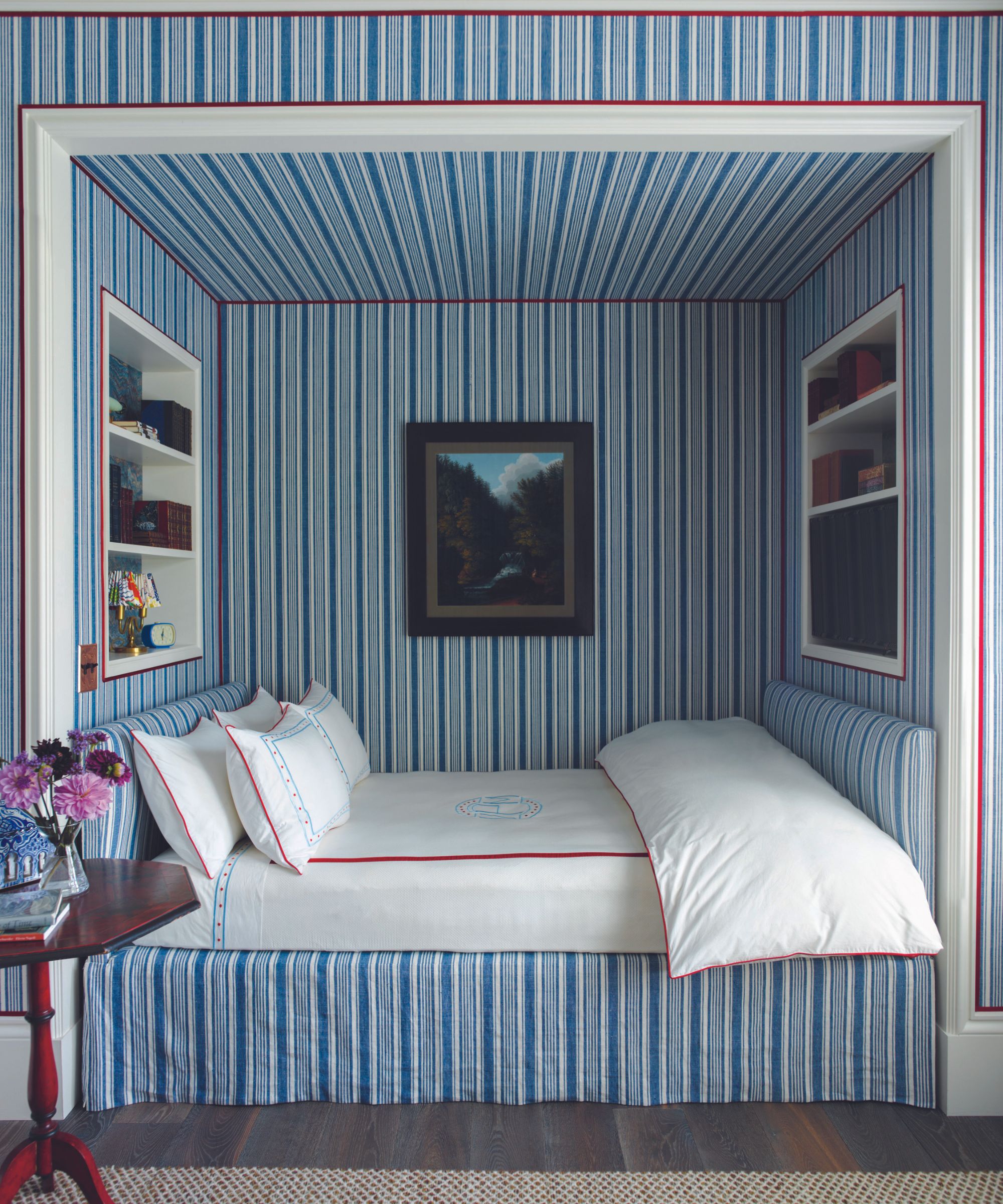
'The thing that really marks out a well-designed and thought-out home is the really tiny details; that is often what’s missing, and what it takes a bit of thought to pull together,' says Katie.
'But when you introduce them – be it a beautiful trim on a lampshade or a painting that picks up on another color in the room or a high gloss paint finish on something unexpected – then the room comes together in a really special way.
'A really brilliant example I have of this level of detail is Charlottenhof Palace, a former royal palace in Germany that has a blue and white striped room with fabric on the walls that looks like a tent; there is some red and white embroidery along the base of the upholstered walls, as well as on the curtains, which perfectly lines up and it’s that detail which brings it to another level. It might not be something you consciously notice if you’re not looking for it, but your brain registers it on a subconscious level.'
You can see Katie's take on this above in the fabulous nook bed idea.
2. Make space for handmade pieces
'I have such respect for artisans, of all kinds, whether they make beautiful lampshades or furniture or woodcraft; as a designer I rely on their skill to make pieces that make a room really sing.
'Hand crafted pieces really bring something extra to a space because they reference the person behind the object and the time and skill that went into the piece.
'Something handmade really elevates a room because by its very nature it is one of a kind. We used a decorative artist to paint the floors of one client’s home and it adds an unbeatable element of pizzazz.'
Our painted floor ideas gallery has plenty of inspiration for your own scheme.
3. Add personal touches
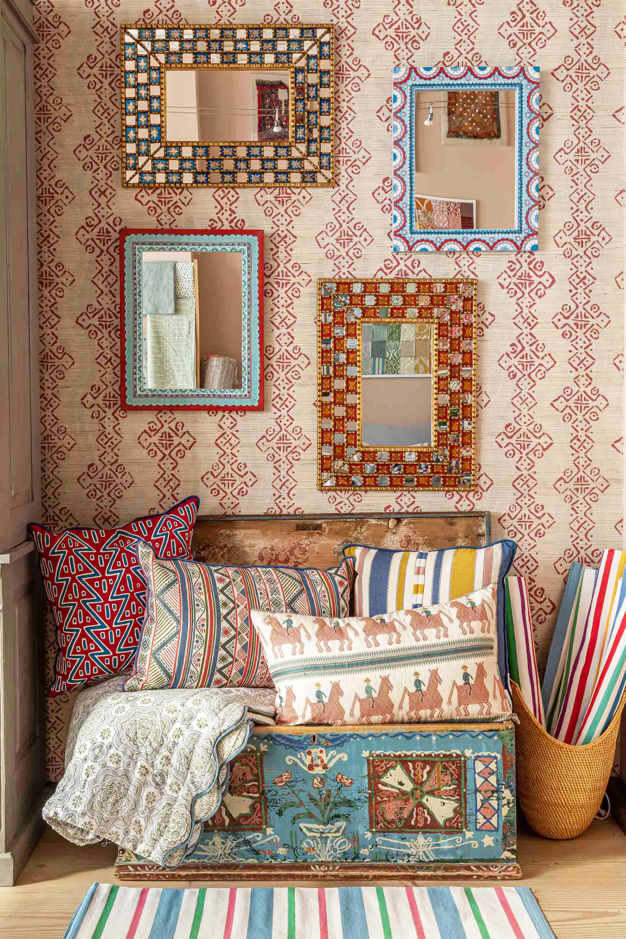
'You don’t need a huge budget to add detail and personality. When my husband and I were first married, we decided to paint detailing on our furniture. He cut a stencil and I painted with it. In a recent project, I lined the back of a bookshelf with marbleized paper. It’s all about having something that no on else has; it forces you to be creative.'
Our painted furniture ideas are easy to copy for your own personal touch.
4. Ensure beautifully hung drapes
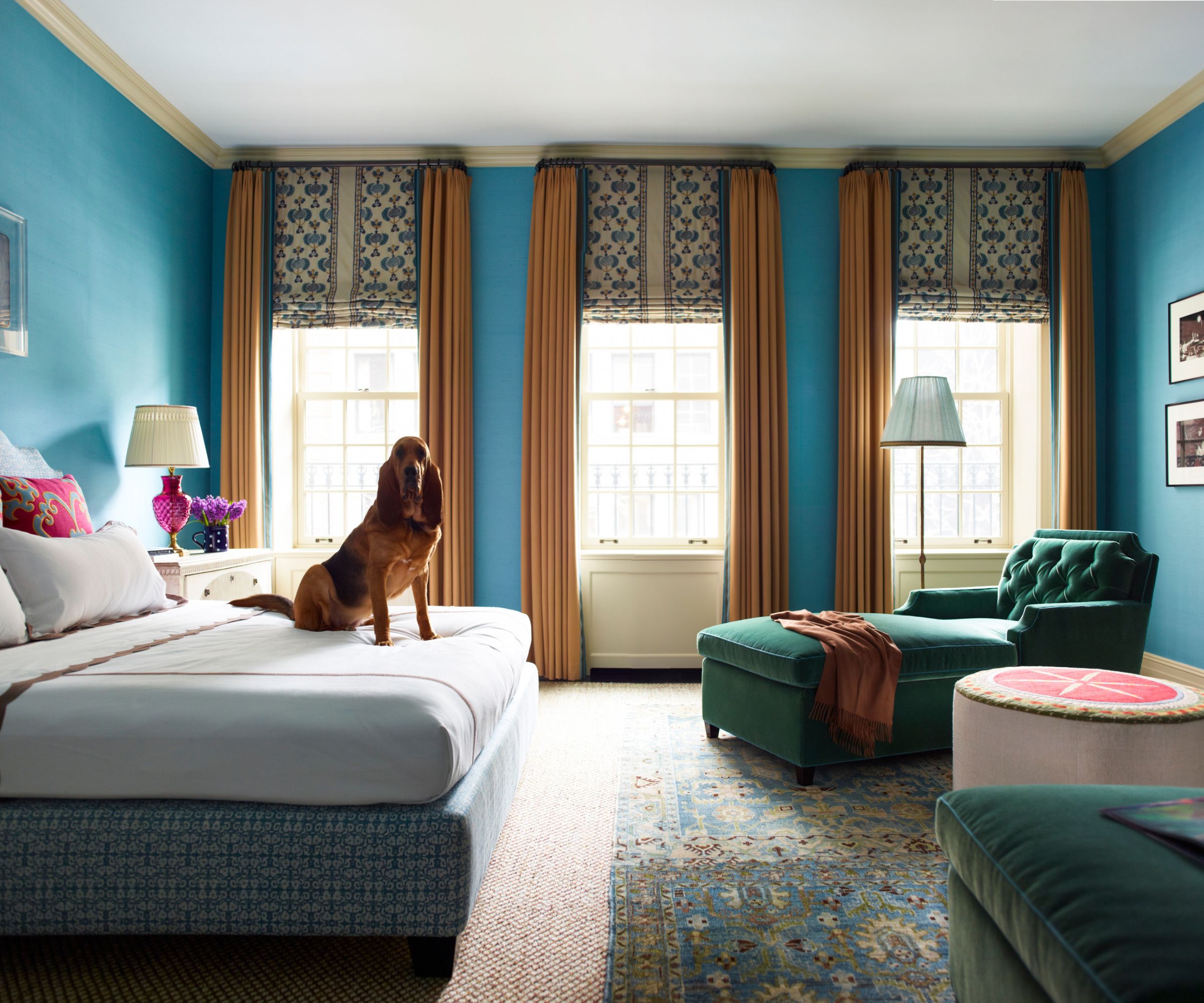
'Beautifully hung curtains can look very smart. One trick I recently learned on a project is to tack the end of the curtain to the wall, and the middle of the curtain panel so that it all stays crisp, tidy and straight.'
We have all the curtain ideas you need to create a sumptuous scheme, whatever your budget.
5. Style your bed beautifully
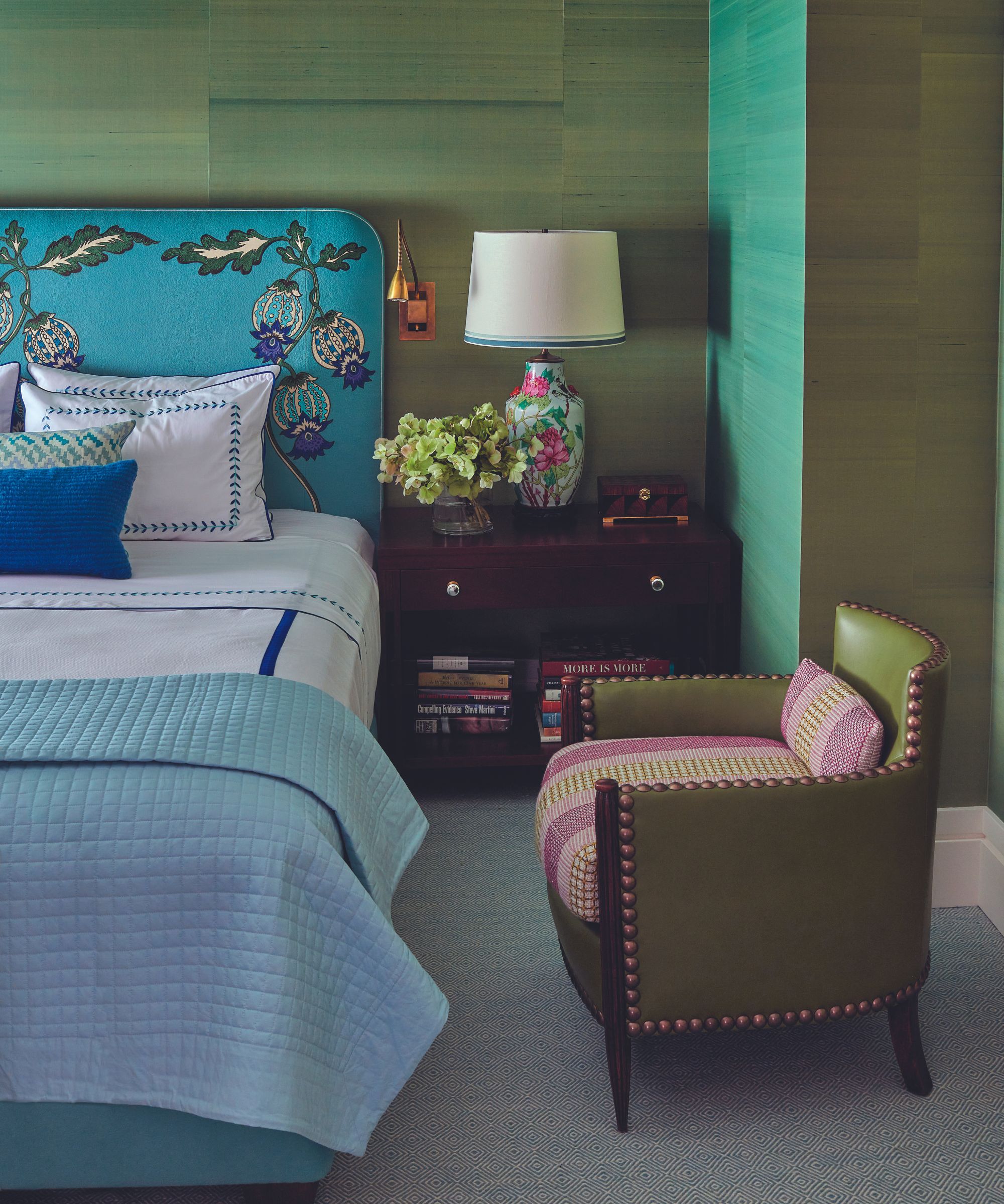
'A beautifully dressed bed is important as it is often the first thing that catches your eye. I like to have a coverlet tucked in very tight and then a duvet or a blanket folded in thirds at the end of the bed.
'What I’m trying to do is make the bed look smaller, so it doesn’t dominate the space. For that reason, I don’t like monster mattresses – they look so out of proportion – and I do not use dust skirts – I get the bottom of the bed upholstered. Bed hangings – curtains around the bed – are also a really nice touch if you have space.'
We have a guide on how to style a bed for the uninitiated.
6. Repeat design motifs
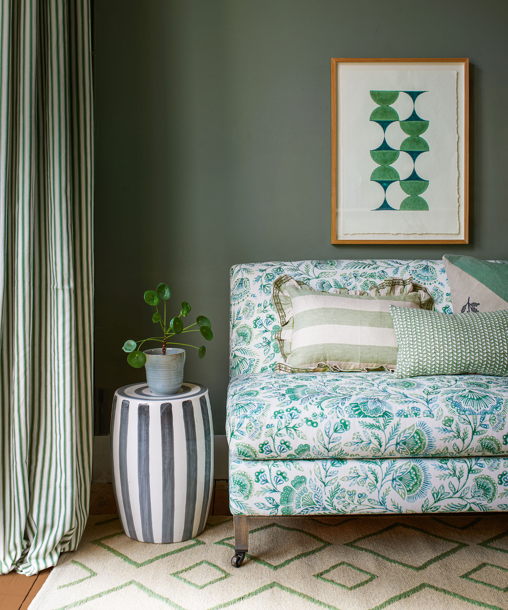
'Tying in design details and repeating them subtly across a room is a subtle way to make a room feel pulled together. I had one project where I had a pair of vintage ceramic lamps, with circles in their design. I paired them with a fabric which had embroidered sunbursts on it – it wasn’t the same design, but it reflected it just enough to work.'
Our feature on repetition in interior design will help you learn how to achieve this seamlessly.
7. Shop for white lampshades
'Crisp white lampshades are the easiest and most stylish shades to pair with any lamp in any room; if in doubt, go white.'
8. Decorate the ceiling
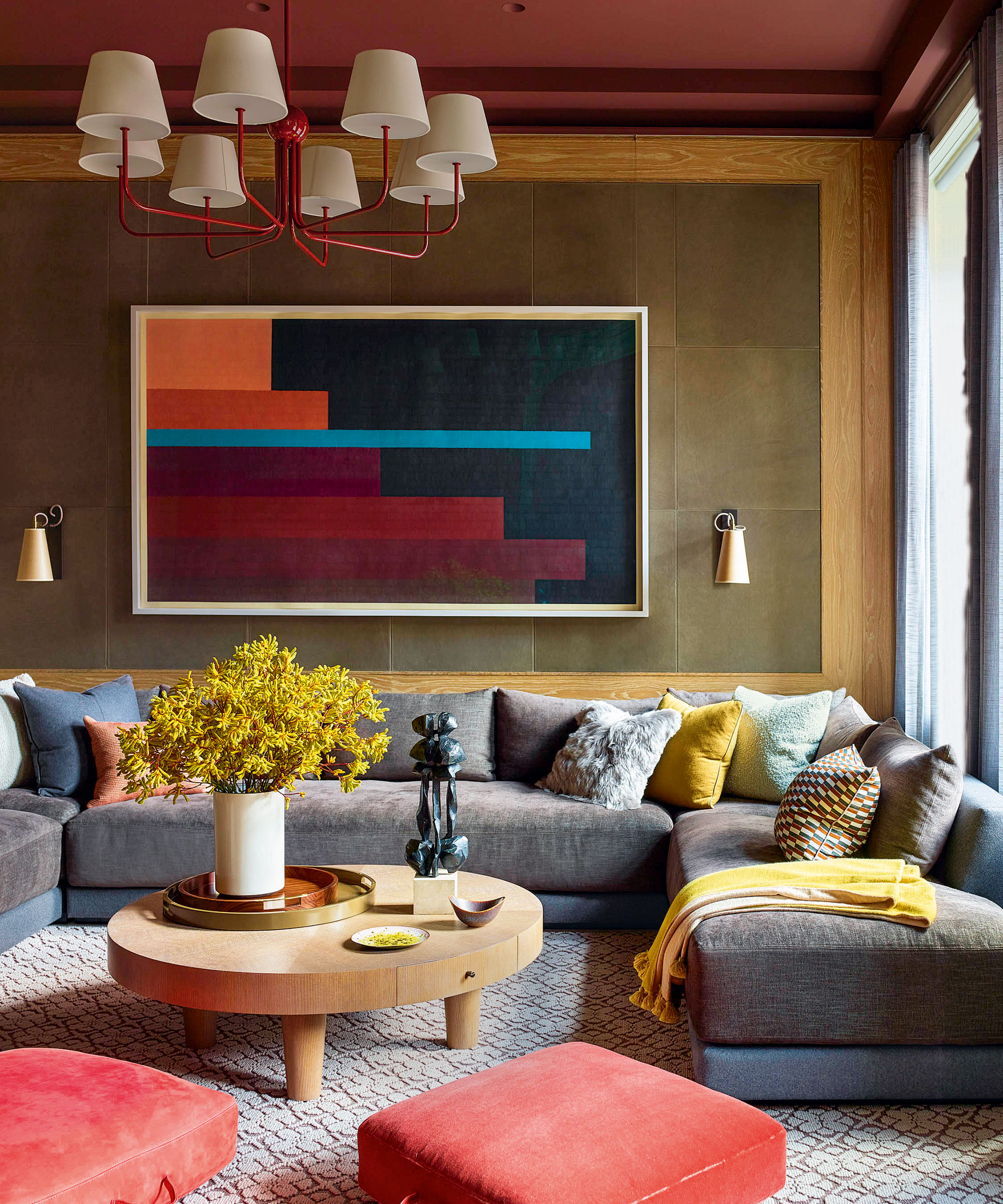
'You can never underestimate the power of wallpaper to transform the look of a room. I love a pattern. Don’t forget to look up: the ceiling can be a whole extra surface to decorate.'
Our ceiling wallpaper ideas and ceiling paint ideas offer up plenty of advice and inspiration.
9. Use red and blue
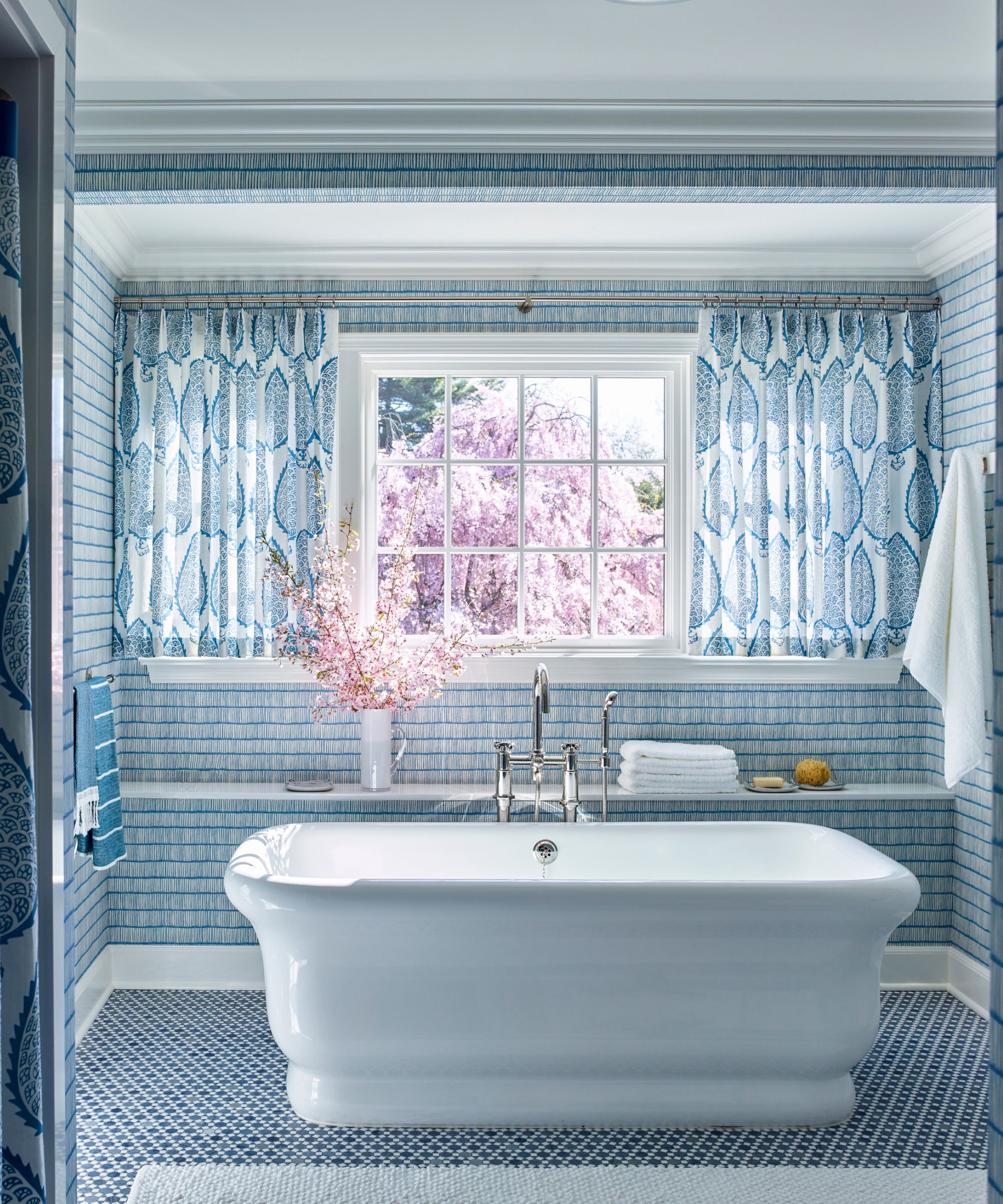
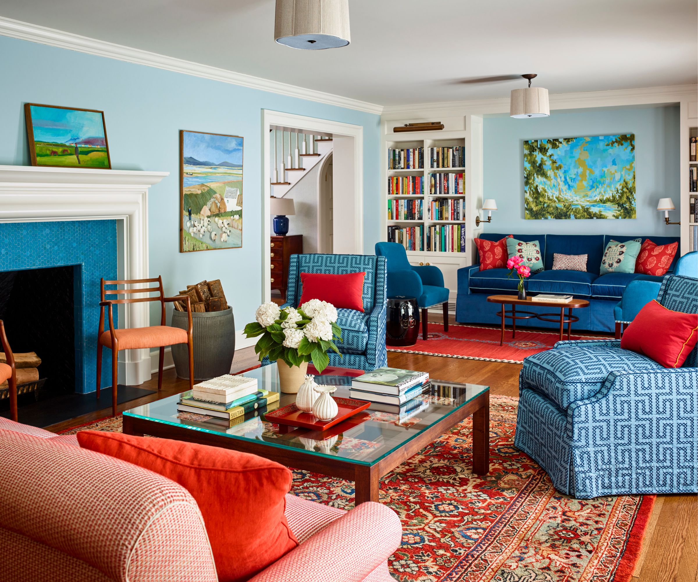
'I think red has such clarity to it – it goes well with brown, navy, goes with everything. I often include red in my work. But I also think that you can never go wrong with the quintessential combination of varying shades of blue.
'I’ve done a bathroom with patterned floor tile, cobalt wallpaper, and marine-colored curtains and it’s divine. In another living room in a Connecticut farmhouse, I’ve combined both red and blue, drawing on the two colors from the antique rug.
'Even if you have disparate colors around the room, all it takes to tie the scheme together is to repeat a color in strategic places. The repetition doesn’t have to be in the biggest items, it can be picking up on a red in a painting and placing a red book on a coffee table and then on a border of a cushion.'
Decorating with red takes courage; decorating with blue less so – you can find advice for both in our features.
10. Introduce game-changing antique rugs
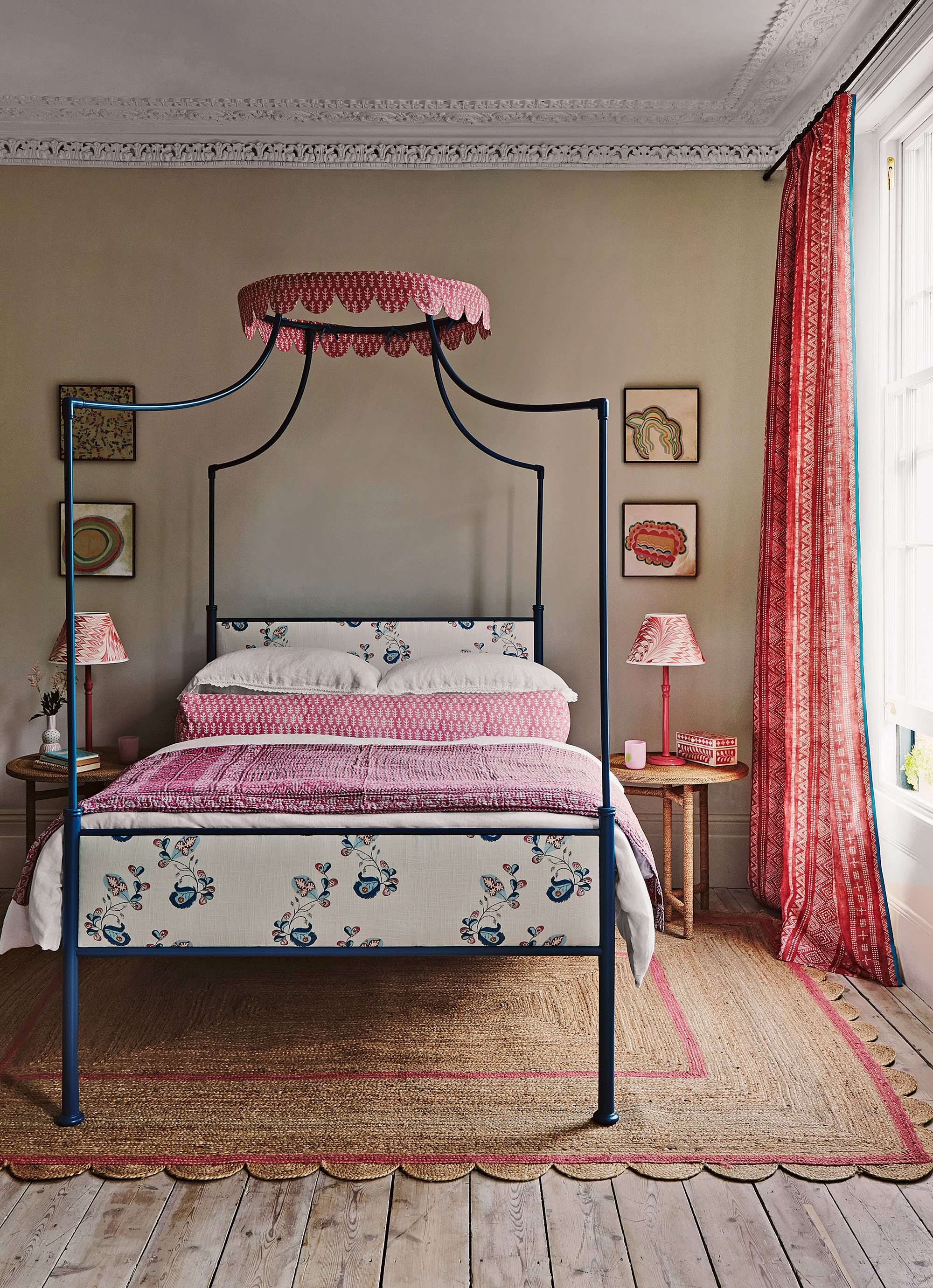
'Rugs are an amazing way to add layers of depth and color to a room; and a great way to update a look if you fancy a change. I love antique carpets because they have a gravitas and interest to them.
'Antiques are really important to me because they set a tone for a room in a bold way. The history and gravitas behind them lends an historical texture that newer pieces just don’t have.'
We have expert tips on both choosing an area rug and decorating with antiques.
11. Don't neglect texture
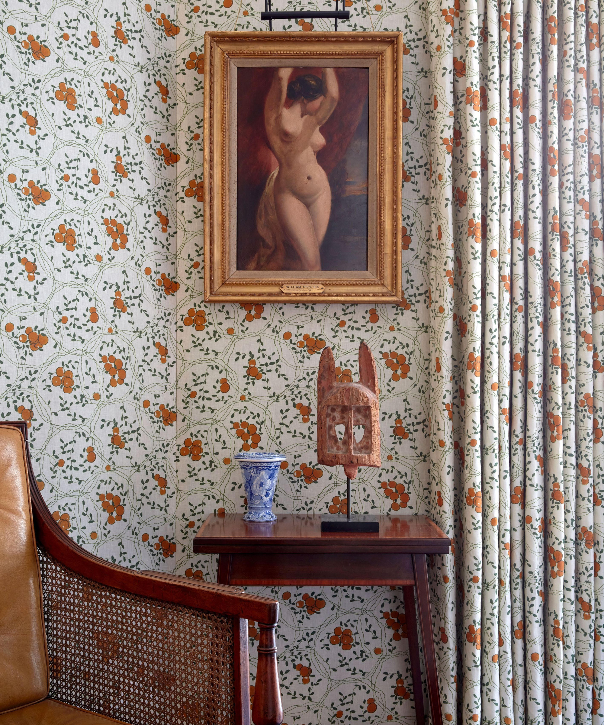
'Try to add textures on surfaces, because it brings a luxury air. Fabric on walls is particularly interesting to me because of the texture it provides, and the way that it can soften a room; my own living room is lined with a cream fabric that has a waxed French glaze. Or in a client’s kitchen I have used fish-scale patterned tiles behind the cooker and worksurfaces. The way the light reflects around the room adds a layer of interest and detail.'
12. Layer lighting
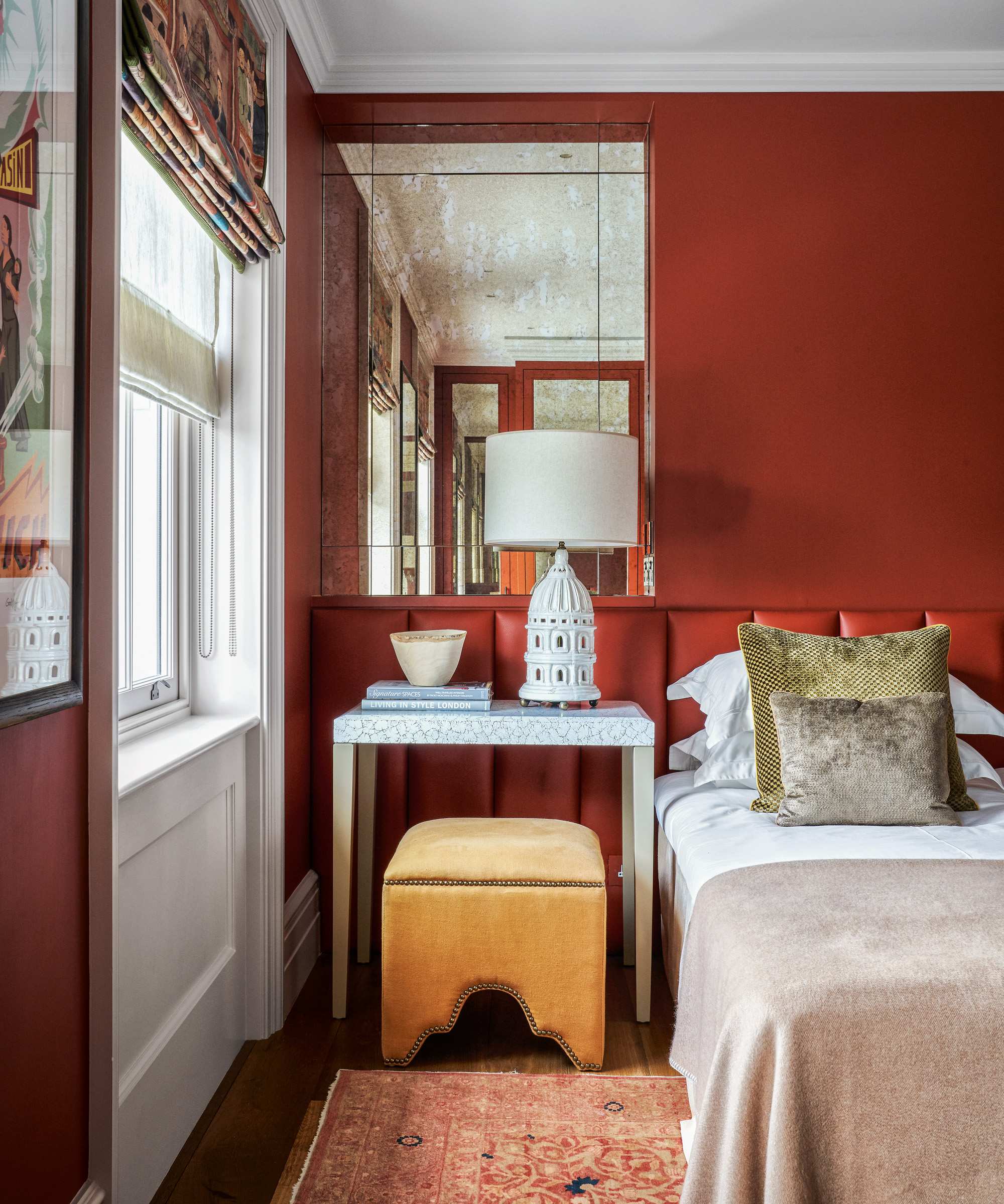
'Lighting is tremendously important and can instantly set the tone – or kill it. I think it’s important to have down lights in the ceiling; the apertures are so small now that they’re not as glaringly obvious as they used to be, and then you pair that within the room with sconces, table lamps, and lighting for paintings – different heights of light create different moods and layers of interest.'
13. Bring in flowers
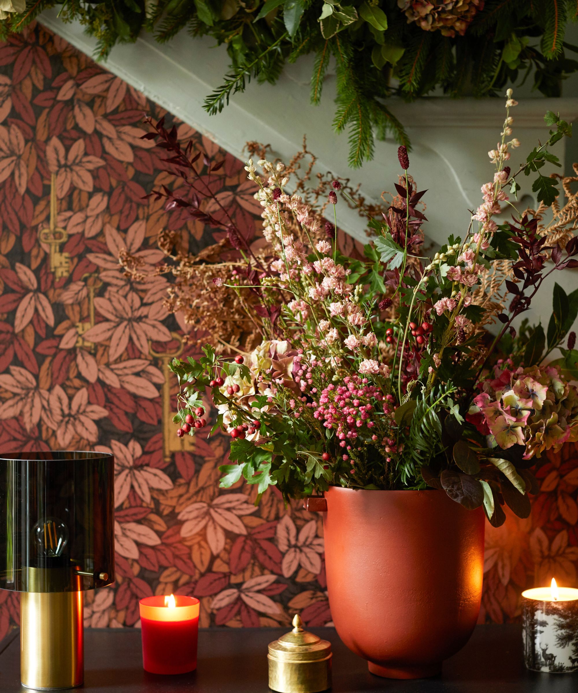
'Flowers are so important to me. I love to bring some element of living nature into a room – even if it is just a branch. It makes the whole room feel friendlier and alive.'
Where Katie shops
Fabrics: I adore Christopher Farr for bold and colorful printed and woven fabrics, Christopher Moore and Robert Kime.
Antiques: we use Alexander Cohane who sources from Europe.
Paint colors: are always Benjamin Moore or Farrow & Ball, because they do beautifully rich shades.
Lighting suppliers: are Collier Webb or Charles Edwards and our lampshades are all custom made by local artisans.
Sign up to the Homes & Gardens newsletter
Design expertise in your inbox – from inspiring decorating ideas and beautiful celebrity homes to practical gardening advice and shopping round-ups.

Jessica Salter is an interiors writer who interviews the leading interior designers and tastemakers each month in Homes and Gardens about their inspiring, yet practical ways to instill a slice of high-end design nous in our own homes and lives.
Jessica has had the luxury of snooping around some of the most stylish houses in the world, such as Pearl Lowe’s Cotswolds manor house, designer Matilda Goad’s London house and the interior design studio and husband and wife duo Buchanan Studio. She delights in asking the biggest names in the world of interiors, from Nina Campbell to Sophie Ashby, the really practical questions that we all want answers to – such as where to source that perfect living rug, kitchen cupboard handle, or paint finish – and loves finding out the design hacks that we can all achieve, especially on a budget.
After studying English Literature, Jessica started her career in journalism as a news reporter at the Daily Telegraph, before moving into the paper’s Saturday Magazine as a commissioning editor of lifestyle and food features, interviewing cultural influencers from authors and actors to politicians and inspirational figures, reporting on key trends across the sectors of health, fitness and wellbeing.
-
 'Sexy disco-era Italy meets Japanese farmhouse in the Brazilian jungle' was the description the interior designer gave this glass-walled modernist home
Offering a warm welcome that defies its stark, modernist lines, this archictectural gem is full of surprises
By Karen Darlow
-
 Are you making the most out of the estate sales in your area? These are the 5 most valuable items you should be shopping for
Vintage lovers and antique experts share the objects you should always look out for when you're exploring an estate sale
By Eleanor Richardson