'Balance is the secret sauce to any well-designed space' – designer Jordan Samson shares 3 simple ways you can create a harmonious interior scheme
From material choice to contrasting colors, this is how to ensure balance runs throughout your home
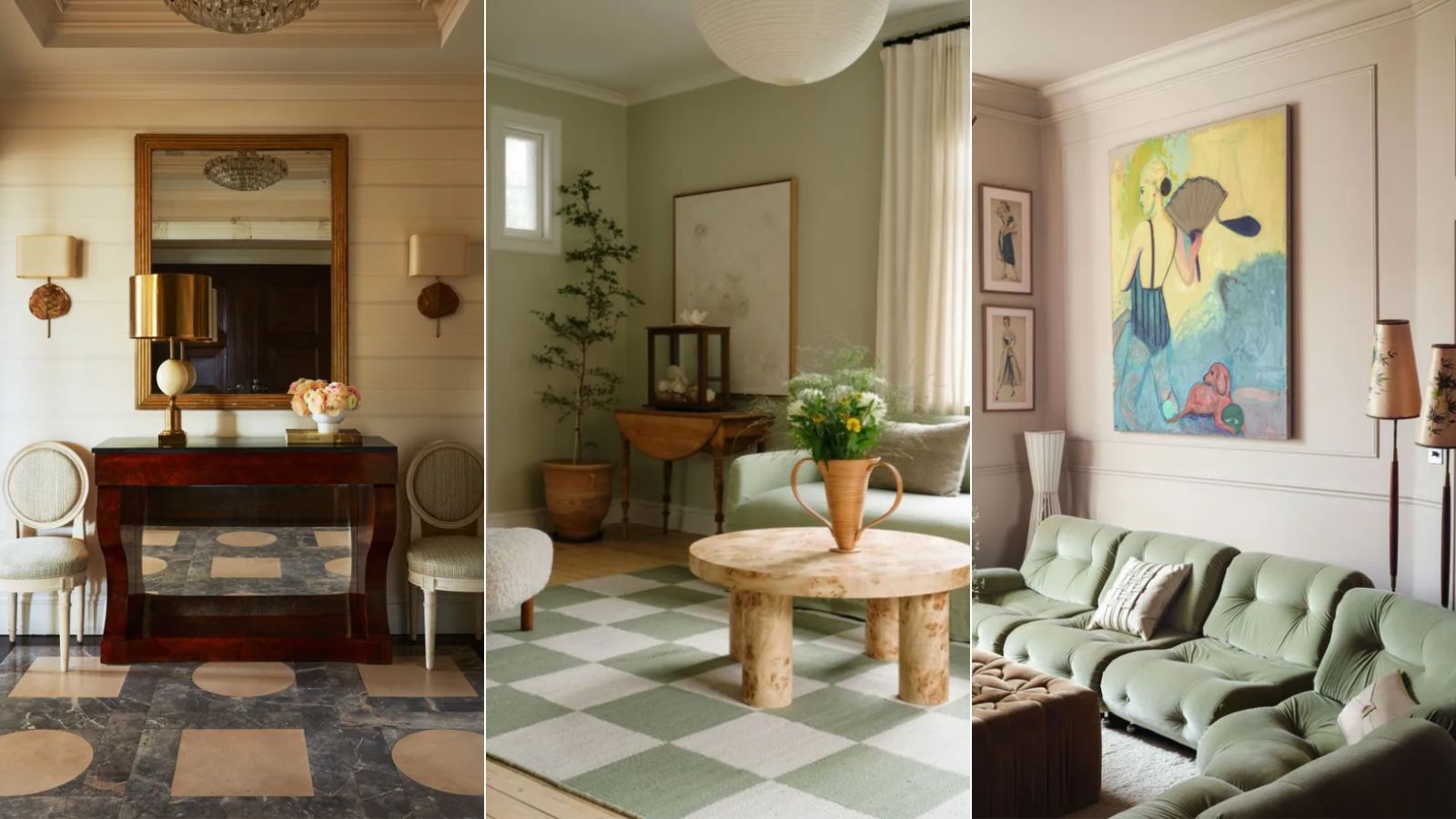

It's widely known in interiors that maintaining balance is central to achieving an effectively designed space. From balancing colors to the heights of decor items, keeping balance front of mind in all your interior schemes is key.
And while balance is often talked about, that doesn't mean it's easy to know how exactly to apply it to your home decor ideas. To help understand how to create balance in interior design, we're turning to the expertise of interior expert Jordan Samson.
'If something in your home is feeling just a little bit off, this is probably why,' explains Jordan. 'Balance is the secret sauce to any well-designed space.'
How to create a balanced interior scheme
A post shared by Jordan Samson (@jordansamsondesign)
A photo posted by on
1. Decide on a symmetric or asymmetric look
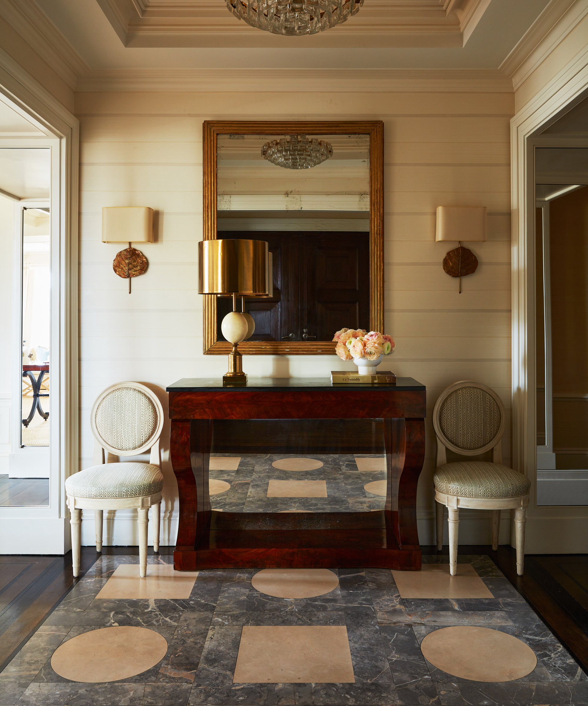
The first step towards creating balance throughout your interior schemes is to consider the placement of furniture and decor, whether that be a symmetrical or asymmetrical layout. While decorating with symmetry will create an aligned, structured feel, asymmetric layouts can still look balanced by thoughtfully positioning furniture items.
'Either a symmetrical layout... where your furniture and decor almost mirror each other or asymmetrical where everything is seemingly thrown together yet still achieves balance through carefully placed items,' says Jordan. Decide on which look you want to create as a starting point before considering how balance can be achieved.
2. Contrast furniture weight, color and texture
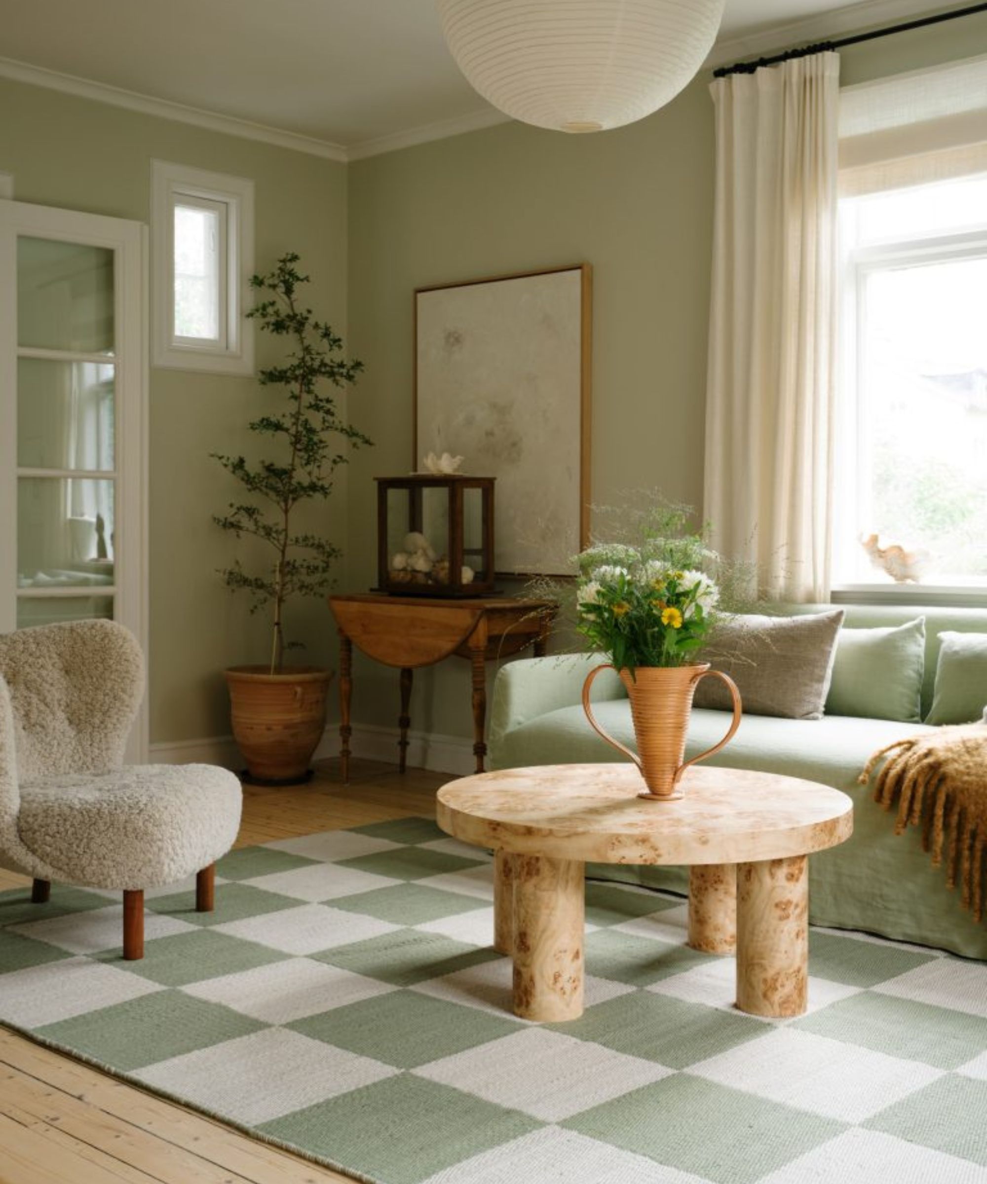
The next step in achieving balance is to contrast different furniture styles. While some furniture pieces are incredibly bulky and heavy, others are a lot lighter and more delicate. By including both throughout your interior schemes – of contrasting colors and materials too – your space will have a nice level of juxtaposition and won't feel weighed down by pieces that command a lot of space.
'We also need to think about visual weight like pairing bulky seating with a coffee table lighter in both design and material,' explains Jordan. 'In a dark saturated room with dark furniture, incorporate lighter armchairs.'
Sign up to the Homes & Gardens newsletter
Design expertise in your inbox – from inspiring decorating ideas and beautiful celebrity homes to practical gardening advice and shopping round-ups.
'We can also achieve balance with contrast like a smooth leather sofa paired with a textured rug. Or a colorful pattern rug paired with solid neutral colors. Or with contrasting silhouettes like pairing angular furniture with softer rounded edges.'
3. Consider scale and proportion
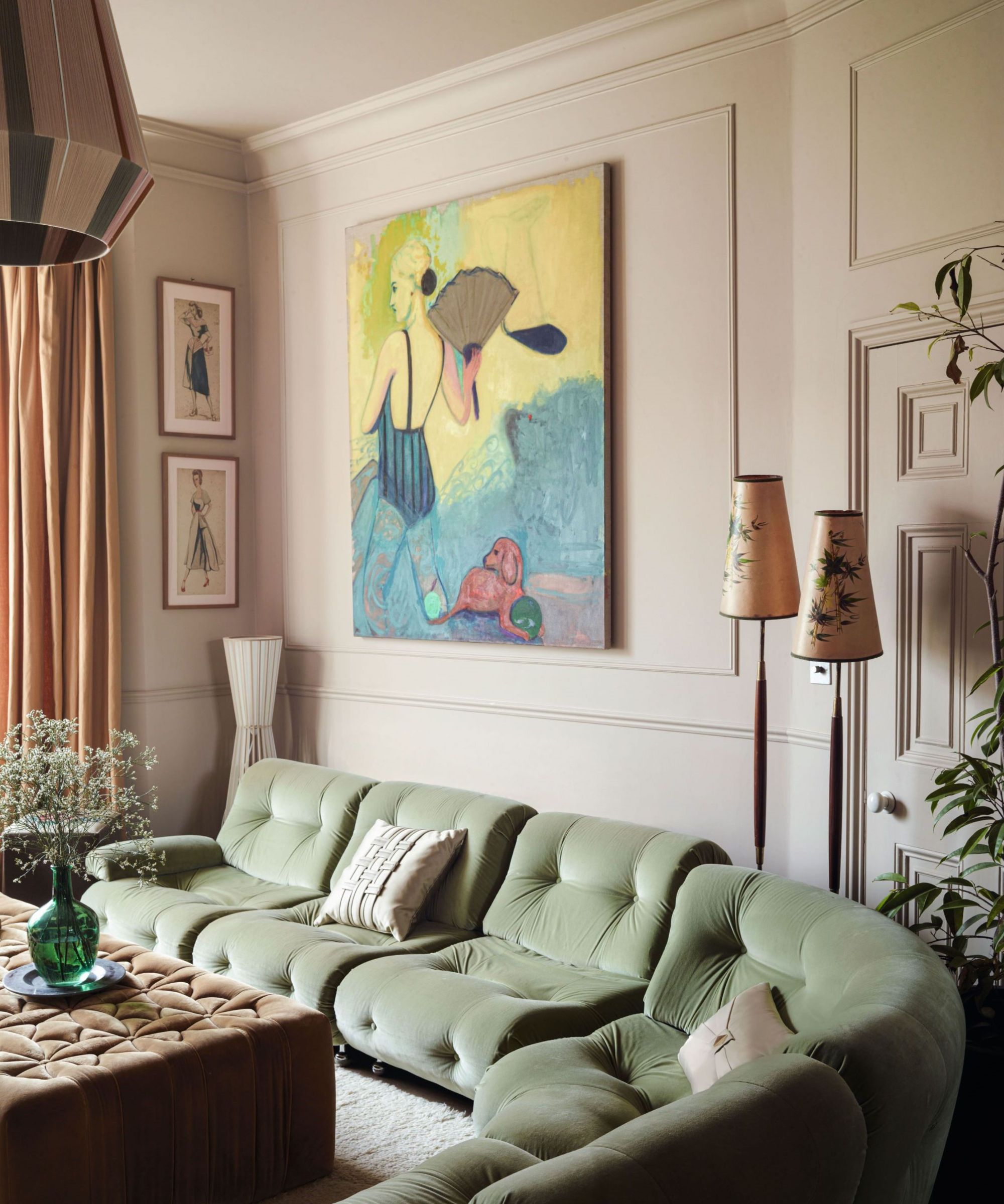
'We also need to think about scale and proportion,' says Jordan. This is a crucial step in any room and it's all about working to the specific proportions of your space. It's about adequately filling well-sized spaces with large enough pieces and likewise not overpowering a small room with pieces that are too big.
Jordan suggests how balance can be added by considering proportion and scale in interior design: 'Choosing furniture large enough for the room, art that fills two-thirds the space below, and a large enough rug with at least the front feet of all your furniture on it.'
The same applies to the height of your decor pieces, too. For a scheme that feels balanced, make sure to include items of varying heights rather than everything being at the same level. To do so, Jordan suggests incorporating 'contrasting heights using floor lamps, poufs, and decor to keep the eye moving around the space.'
For more help with your home decor, we've rounded up the fundamental interior design rules to follow to ensure your space feels balanced in every room.

Emily is a freelance interior design writer based in Scotland. Prior to going freelance in the spring of 2025, Emily was Homes & Gardens’ Paint & Color Editor, covering all things color across interiors and home decor for the Homes & Gardens website. Having gained specific expertise in this area, Emily is well-versed in writing about the latest color trends and is passionate about helping homeowners understand the importance of color psychology in home design. Her own interior design style reflects the simplicity of mid-century design and she loves sourcing vintage furniture finds for her tenement flat.
-
 Martha Stewart's intelligent cabinets 'take every inch into consideration' – their 'visually light' style will solve your small kitchen storage problems
'Every kitchen can be beautiful and functional, no matter what the size': 9 years since sharing her clever storage, Martha's cabinets are just as beautiful
By Megan Slack Published
-
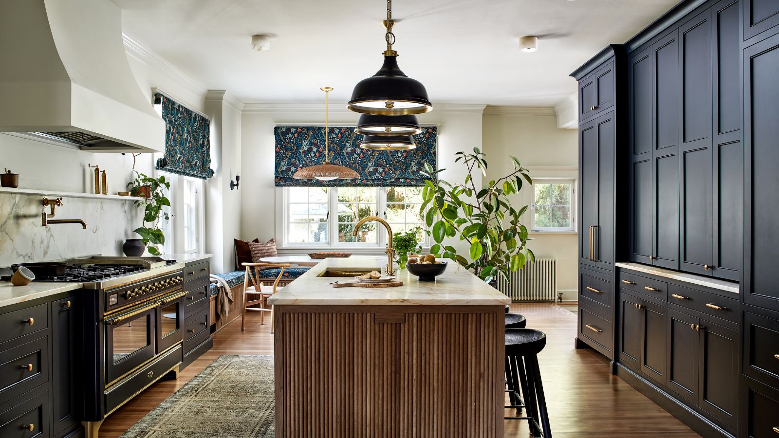 This once-dated kitchen is now a timeless space with the coziest details – and its the classic color palette that's made it a chic, welcoming space
Warming colors and natural materials combine to create this enduringly classic kitchen scheme
By Molly Malsom Published