'It's a true decorating solution' – Jonathan Adler just announced a cutting-edge wall art collection, featuring his iconic designs
Jonathan Adler is teaming up with TilePix, offering magnetic wall art in eye-catching prints and patterns. Ahead of the launch, he sat down with H&G to share more
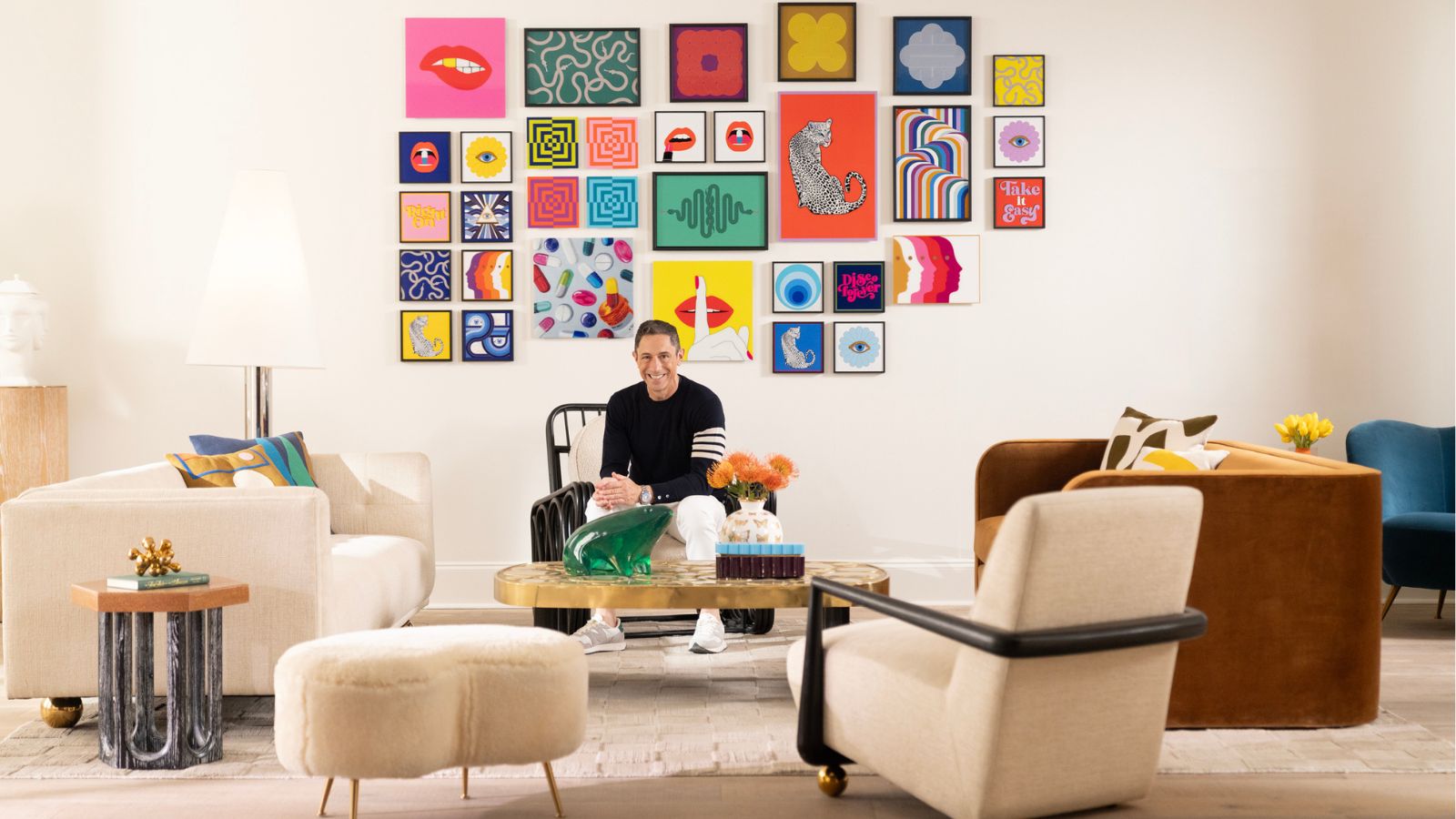

Interior designer Jonathan Adler is making his way into the wall art game – but you won't need a hammer and nails to bring his latest collection home. The iconic designer has teamed up with TilePix – a damage-free, magnet-based solution to hanging artwork – and you can now shop his bold, impactful prints at an unbeatable price.
Featuring hypnotic designs, playful catchphrases, and some of the designer's signature motifs like leopards and lips, the new collection has made decorating with art easier than ever. Plus, TilePix technology allows homeowners and renters to place and adjust the pieces without damaging walls, and expand choice pieces across multiple tiles for a striking design statement.
Ahead of the launch, Jonathan sat down with Homes & Gardens – here, he shares how he'd decorate with the TilePix pieces in his own home, and reveals his favorite print from the collection.
'The best thing about it is that it's chic and easy, and at a friendly price point – sort of like me,' Jonathan tells H&G. If something is of impeccable quality and affordable, then I think that's a great victory.'
A look inside the Jonathan Adler x TilePix collection

The designer tells H&G that as a 'seasoned decorator, he's 'the enemy of all walls' – they 'just see [him] coming at them with a hammer and nails.' TilePix tackles this problem head-on. Fitting in beautifully with Jonathan's whimsical approach to interior design, the patented technology allows users to magnetically affix art to their walls. Perfect for renters (or fellow wall enemies), this collection blends accessible convenience with the Jonathan Adler 'Modern American Glamour' style. 'It hits all the right notes,' he says.
'When they first approached me and I saw how it works, I was truly blown away. It's really an extraordinary product. I feel like it's disrupting art in a great way,' says Jonathan. 'It's also quite versatile and modular, so you can either do little framed small pieces, or you can do a floating, glossy, photographic look – framed kind of how I would frame something for my most couture decorating projects.'

With over 100 styles to choose from, the collection truly has something for everyone – whether you love Jonathan's emblematic pill designs, or prefer something more abstract, the colors and patterns available are vibrant and exciting. But if you're looking for a little guidance, you're in luck: Jonathan revealed his favorite piece to H&G.
Sign up to the Homes & Gardens newsletter
Design expertise in your inbox – from inspiring decorating ideas and beautiful celebrity homes to practical gardening advice and shopping round-ups.
'I love the big double-leopard split thing – I think that just looks really great,' he says, referring to the 'Animalia' Framed Splits piece.
Jonathan adds that the collection takes inspiration from Gilbert & George, a performance art duo known for their eye-catching, out-of-the-box artwork: 'Their work is so groovy – it's modular, bright, framed pieces made into a grid ... There's a wink and a nod to my boys Gilbert & George,' says Jonathan.
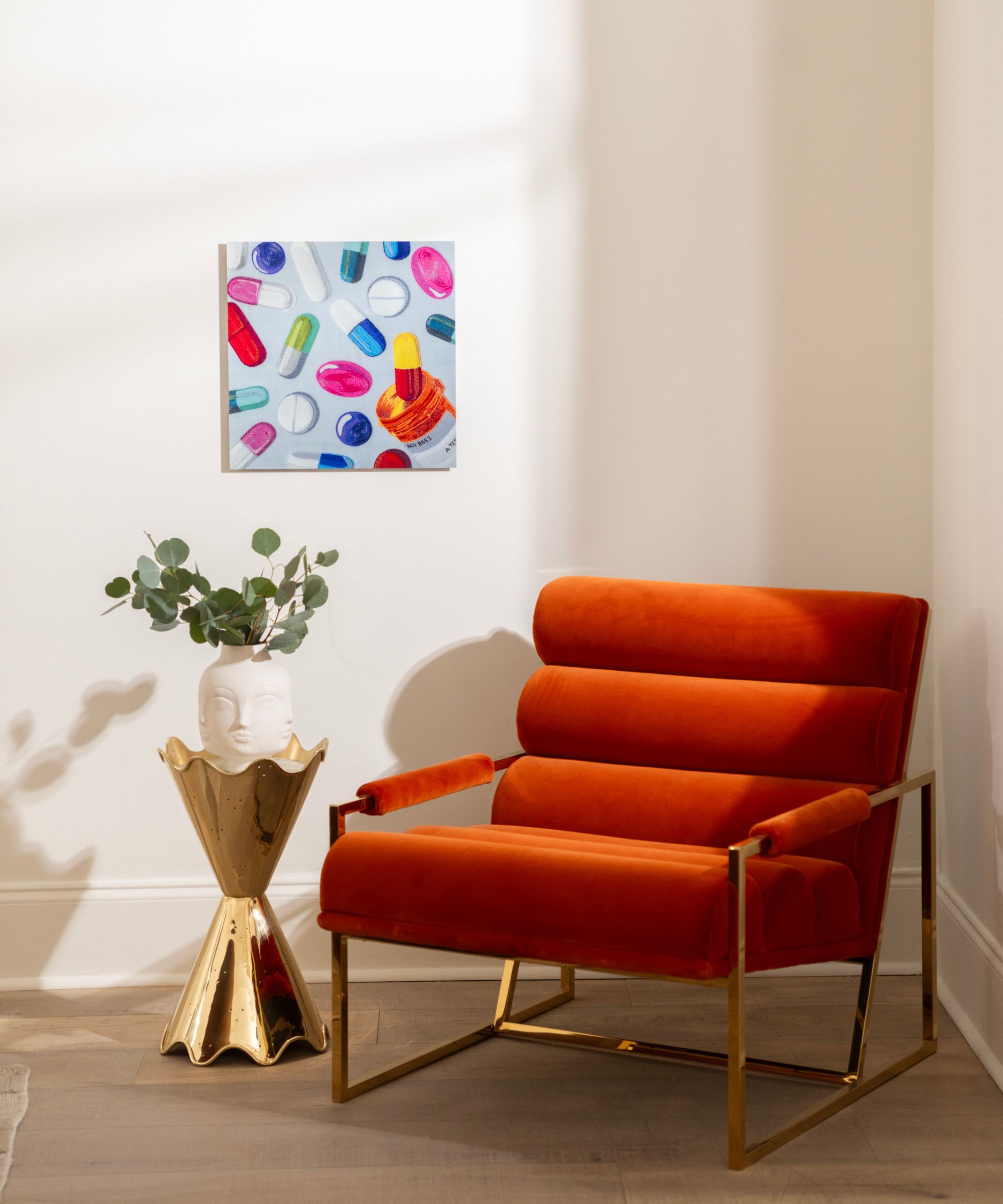
One of the designer's favorite things about the collection – and something that makes it stand out from the pack – is its versatility. The bold pieces are 'affordable enough' to fit in a kid's room, or even a dorm room, he says.
'However, if you do a split where you combine the different pieces to make one big image, that … would look incredible presiding over the most chic Brooklyn townhouse imaginable. It's affordable masquerading as unaffordable. So that versatility is great. A split image above a sofa in a luxe townhouse totally gets the job done,' Jonathan adds.
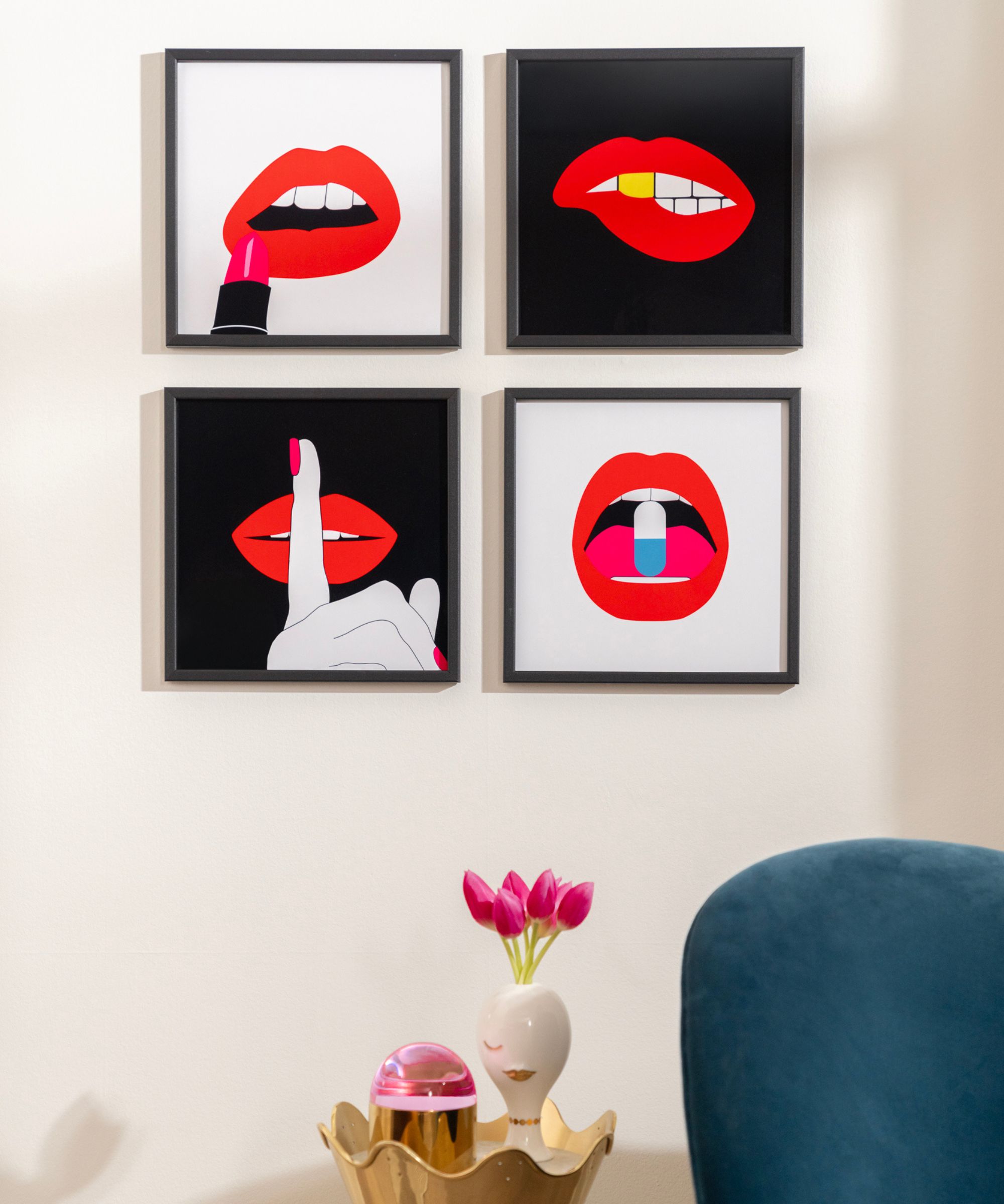
When picking out a piece from the collection, shoppers can swap out sizes, or opt for a larger design that spans multiple tiles – the largest piece comes with eight. Jonathan says this 'versatility of the sizing' makes finding art for specific places across the home more approachable.
'Let's face it: we all need art that looks good behind the sofa and that fits the space perfectly. The versatility and the modularity enable you to create your own journey. It solves your decorating problems – it’s a true decorating solution,' he says.
'I love that you can go with a little wink, with one of my deep thoughts pieces that says, “take it easy” or “disco forever.” Always good in a powder room – powder rooms need a little wink. And then a split piece is great over a sofa or over a bed. The over-the-bed art moment is always a tough one, and I think just a simple grid of four usually hits the spot for over the bed. It's kind of the right scale,' he continues.

In true Jonathan Adler fashion, the collection features plenty of color and playful pops, but neutral tones also make an appearance. Though a tasteful mix is always important, Jonathan says that color acts as 'fantastic punctuation' within a design scheme.
'Colorful accessories are sort of like the earrings of the home, and I think art is especially important in that regard. In terms of a focal point, art has to do the trick, because it's the final resting place for your eye. It's the end of the story. It's a focal point,' he says.
Jonathan's go-to bit of design playfulness also makes a starring appearance in the collection: 'A lot of my work features eyes and faces, and I think it comes from sort of a visceral desire to stare at something that is staring back at you. So eyes and faces on everything, whenever possible.'
Jonathan Adler's collection with TilePix is available to shop now at tilepix.com, with pieces starting at $27.99.

Abby was the Interior Design News Editor at Homes & Gardens and is now studying for her Master's degree in Journalism at City University, London. Prior to joining our team, she worked with Better Homes & Gardens, where she wrote and edited content about home decor, gardening tips, food news, and more. She studied Journalism and English Literature at New York University and moved to London to pursue her love of writing in 2023.
-
 This Michelle-Pfeiffer-approved chair is made of a forebodingly unusual material, opening the debate: Is it a rustic stunner, or a danger to sitters?
The actress took to Instagram with a chair made of a controversially sharp material – and fans are unsure of how they feel about it
By Sophie Edwards Published
-
 How to clean a patio – 6 different methods, and when you must use a chemical cleaning agent
From manual scrubbing, natural solutions or calling in the pros, industry experts reveal the benefits and considerations of each method
By Andy van Terheyden Published