Joanna Gaines's mid-century modern kitchen is the best room she's ever designed – 6 chic and functional buys to replicate the look
Chip and Joanna Gaines's latest project – to celebrate their 10th Fixer Upper anniversary – is their best one to date
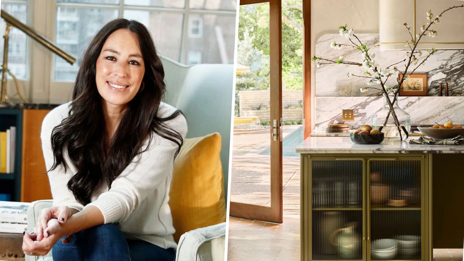

Joanna Gaines is a master of her craft. The TV personality, interior designer, and star of HGTV's Fixer Upper is a force to be reckoned with when it comes to designing spaces. Her most recent renovation; an elevated mid-century modern masterpiece is perhaps her best renovation yet – with the kitchen being the star of the show.
The highly-anticipated Lake House renovation is a mid-century modern one-off, designed by the dream team behind Magnolia, the Gaineses – husband and wife team Chip and Joanna – have given this popular interior design trend an updated feel – beautifully reimagined for its Texan location.
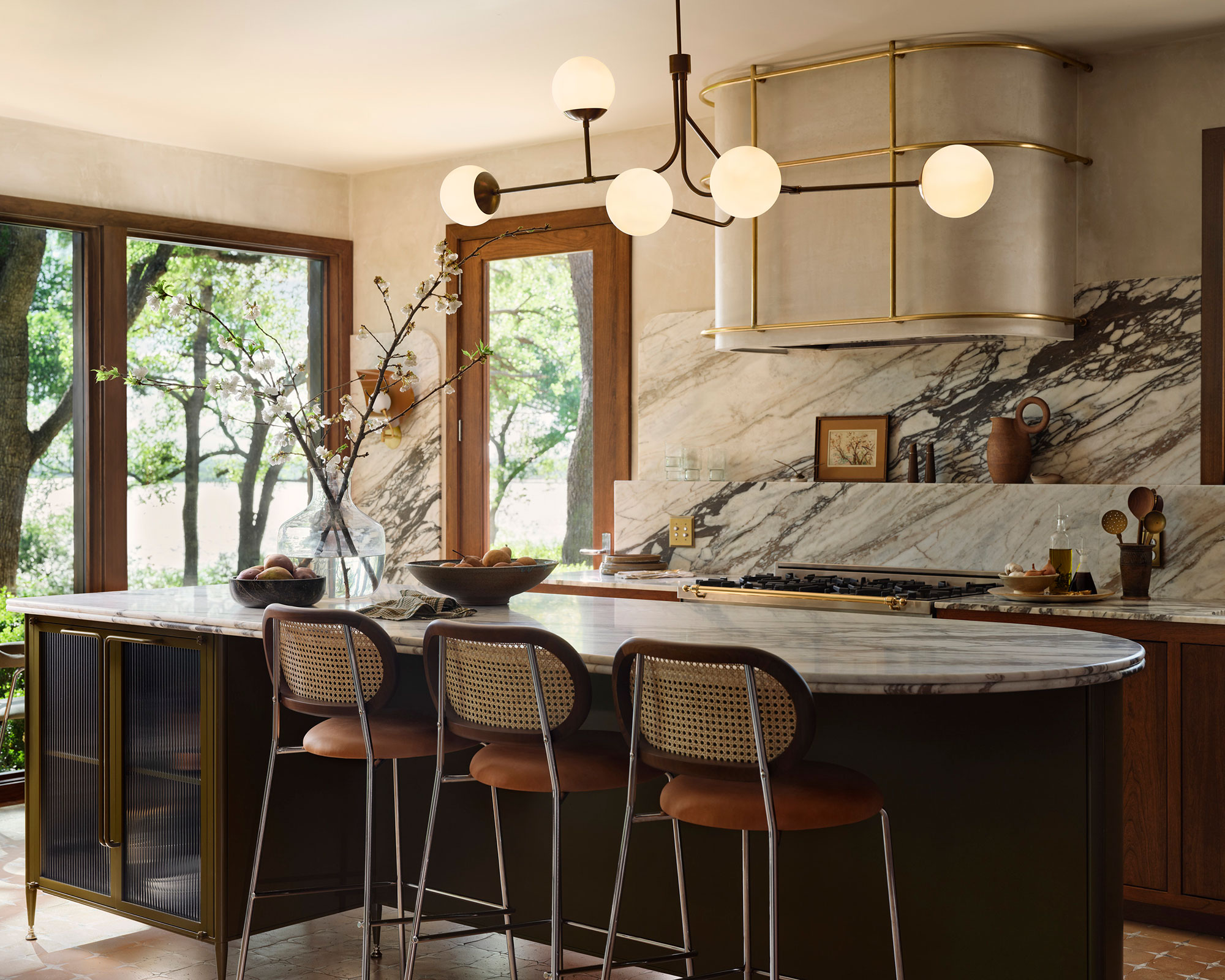
There is so much I love about this kitchen. It also exemplifies how much Gaines has grown and evolved as a designer over the years. The color scheme for a start is a masterclass.
The beauty of the Texan landscape surrounding the property and its panoramic view of Lake Waco served as inspiration for the kitchen color scheme. A poignant moment in one episode of Fixer Upper: The Lake House sees Gaines holding up a sample of the cherry wood used throughout the home to the backdrop of trees in the yard: It’s a match, she delights.
A winning color combination of sage green, beige, and rich brown will never date. ‘A biophilic color palette is comforting and warm, especially in times of uncertainty. This palette evokes the thought of foraging and nourishment in the natural world, growth, renewal and life as a whole,’ says Alice Hood, senior design consultant at Roundhouse. ‘It brings the outside in, even in the most urban setting, and studies have been conducted to show that being surrounded by green and brown, in particular, can relax our nervous system and help us to feel calm, and in some cases, even live longer.’
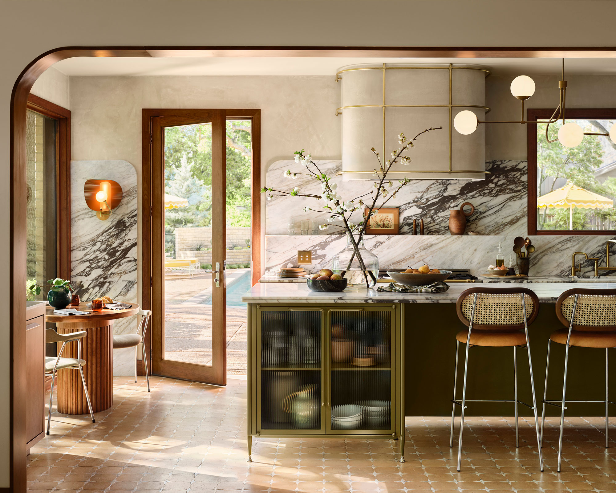
Another fundamental aspect is the clever use of textural accents. Using texture in interior design can instantly elevate the entire look and feel of the space. Quite simply, without texture, a space will fall flat. It's crucial to look at the room as a whole and bring an area together with mixed materials for vibrancy and warmth. It's a way of adding depth and dimension to a room as well as comfort.
Gaines uses texture in the form of tactile objects, such as wood and stone, to add physical comfort and visual interest to a space. Mixing materials and layering is key to making textural elements work.
Sign up to the Homes & Gardens newsletter
Design expertise in your inbox – from inspiring decorating ideas and beautiful celebrity homes to practical gardening advice and shopping round-ups.
Tiffany Leigh, of Tiffany Leigh Design, agrees: 'Texture in design is all about creating tactile moments that invite touch. It refers to the feel, appearance, or consistency of a surface or material. Textures help to keep a space from feeling flat or one dimensional.'
Finally, although mid-century in design, the room doesn't feel too themed. With its peaceful palette and carefully curated collection of antiques and modernist pieces, this handsome, mid-century modern kitchen is a balm for the soul.
Shop the look
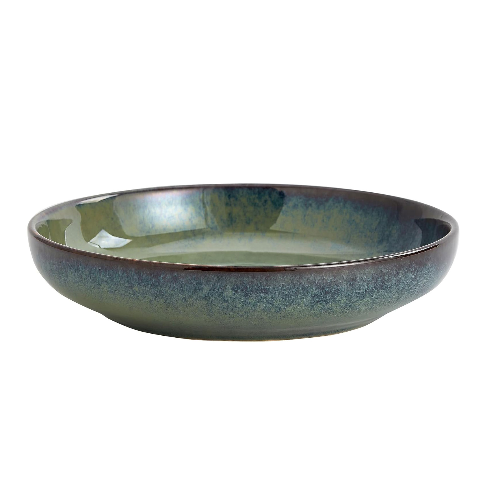
This gorgeous green-blue glazed pasta bowl, which can be used as a fruit bowl, will make a wonderful addition to your kitchen island. The color is timeless and enduring.
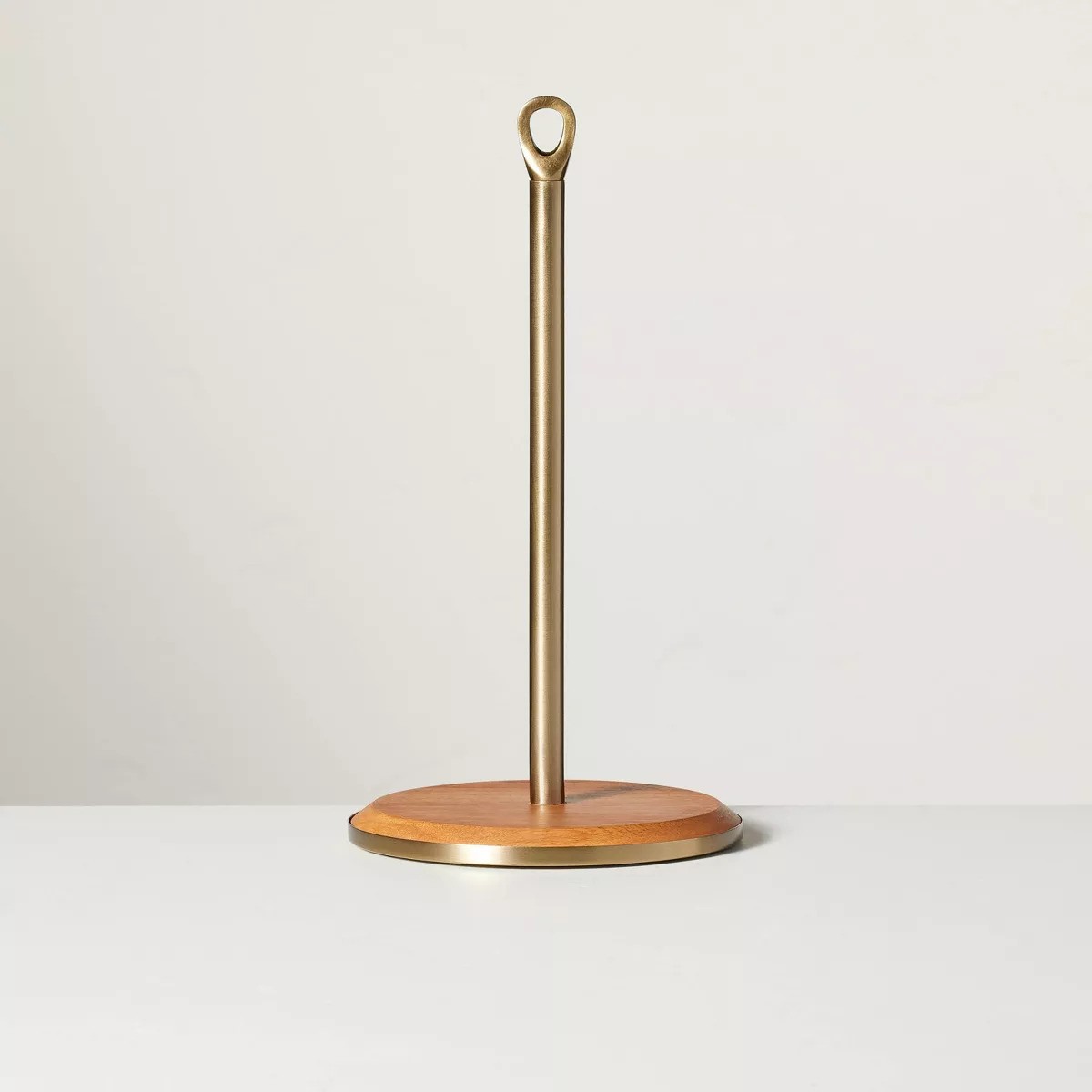
Joanna Gaines manages to make the most mundane accessories look beautiful, and this wood and brass paper towel holder is no different. Highly-rated and best-selling, this design is one of the nicest I've seen.
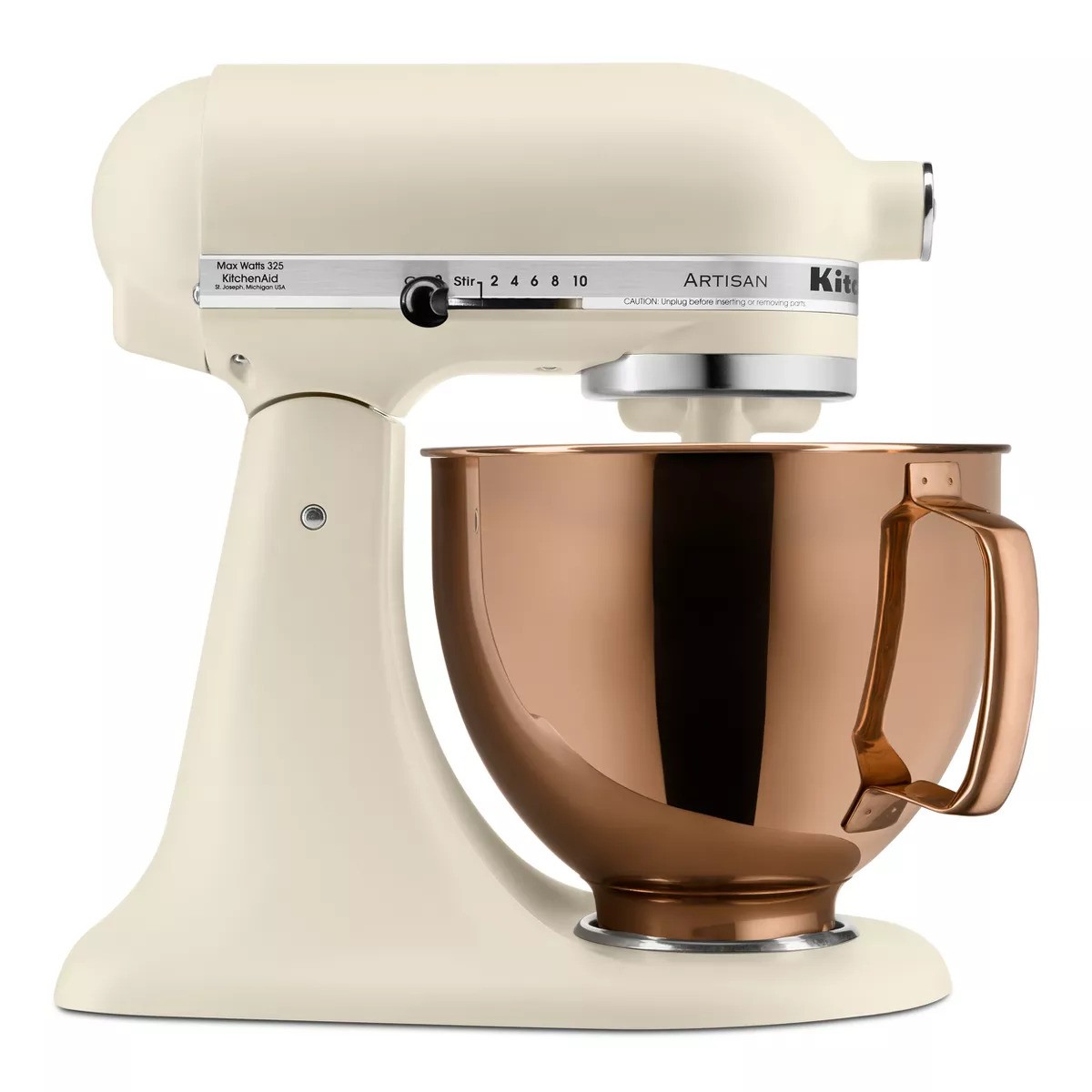
For budding chefs and bakers, a stand mixer is a must-have item. This isn't just the best KitchenAid stand mixer: it's the best stand mixer, bar none, as tested by our kitchen expert and chef, Lydia Hayman.
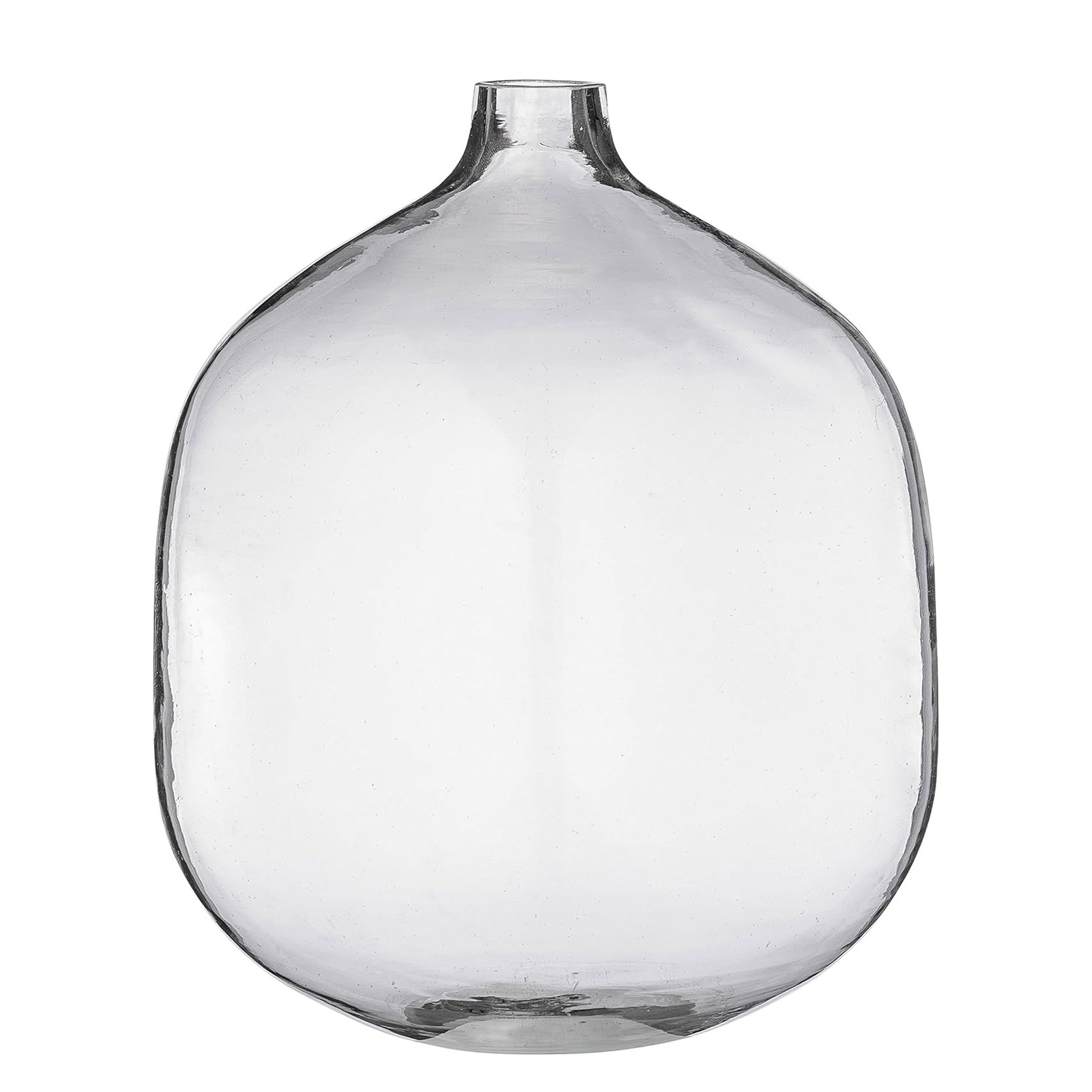
A simple glass vase is a must to add textural detail to a kitchen. Add two-three stems of gypsophila for a hint of greenery.
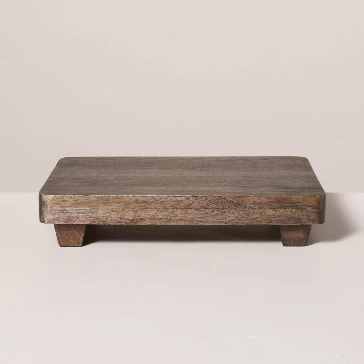
Classic in its design, this wood serving trivet can be used purely for decoration or to serve food. Either way, it is a must have in your kitchen.
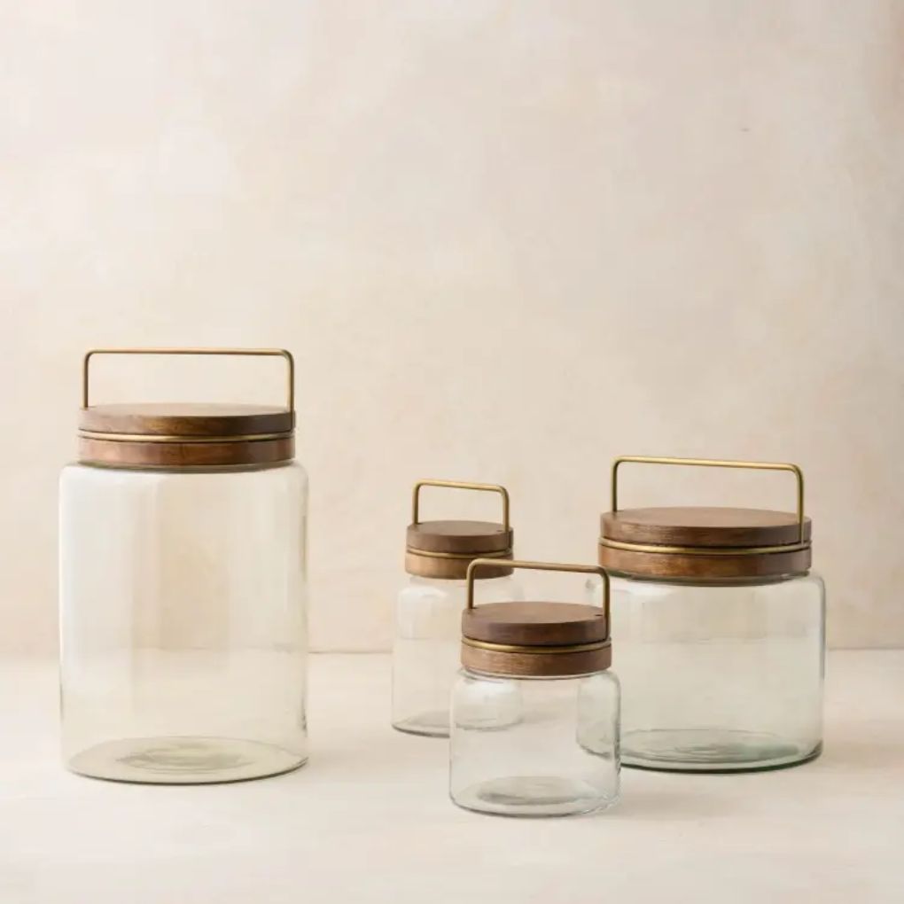
Glass canisters make great gifts, especially when they are as luxe as these ones from Magnolia – Joanna Gaines's own store. Fill them with pastas, and grains, or even use them as decorative objects.

Jennifer is the Digital Editor at Homes & Gardens. Having worked in the interiors industry for several years in both the US and UK, spanning many publications, she now hones her digital prowess on the 'best interiors website' in the world. Multi-skilled, Jennifer has worked in PR and marketing and occasionally dabbles in the social media, commercial, and the e-commerce space. Over the years, she has written about every area of the home, from compiling houses designed by some of the best interior designers in the world to sourcing celebrity homes, reviewing appliances, and even writing a few news stories or two.
-
 6 things you should never throw in the trash – and what to do for safe disposal instead
From batteries to space heaters, experts reveal what not to throw
By Andy van Terheyden Published
-
 Worst-smelling plants to avoid – experts reveal 5 pungent species and suggest perfumed options to grow instead
These are some of the worst-smelling plants that can cause quite a stink
By Thomas Rutter Published
-
 I'm calling it: Joanna Gaines and Victoria Beckham's favorite color will top trends in 2025 – designers and color forecasters agree
Soothing, bold and rich, our love affair with this sumptuous shade is far from over
By Jennifer Ebert Published
-
 Joanna Gaines designed a sentimental 'tiny museum of springtime' in her kitchen – it's a seasonal feature you can recreate for under $100
The designer released a shadow box display that is perfect for storing dried flowers and photographs – and it comes in a gorgeous brass frame
By Hannah Ziegler Published
-
 Joanna Gaines' famous TV kitchen champions unpainted kitchen cabinetry – the trend designers say we will want to replicate in 2025
Celebrating the craftsmanship of natural wood, unpainted kitchen cabinets embrace an authentic beauty and an old-world charm
By Jennifer Ebert Published
-
 Joanna Gaines' kitchen corner is the perfect way to make dead space feel important, useful and beautiful
Get creative with your kitchen corners. The decorating possibilities are endless
By Jennifer Ebert Published
-
 Joanna Gaines loves retro Christmas decor, and it just so happens that nostalgic ornaments will be the biggest holiday trend for 2024
Take a step back in time by decorating with your favorite childhood ornaments...
By Jennifer Ebert Published
-
 Joanna Gaines's Christmas living room reinvents 90s minimalism for 2024 – and proves that white can be warm and cozy
Forget stark minimalist interiors, Joanna Gaines has found a way to warm up a predominantly white and silver color palette – just in time for Christmas
By Jennifer Ebert Published
-
 Joanna Gaines's festive front porch is decorated with a garland, wreath, and an unusual floral display – and it is not a Christmas tree
Do away with traditional decor in favor of something that will still work after Christmas
By Jennifer Ebert Published
-
 Joanna Gaines' Christmas living room is a masterclass in traditional decorating for 2024 – it is timeless, sophisticated, and will never date
Celebrate the timeless beauty of Christmases past with classic decor, plenty of foliage and cozy colors inspired by nature
By Jennifer Ebert Published