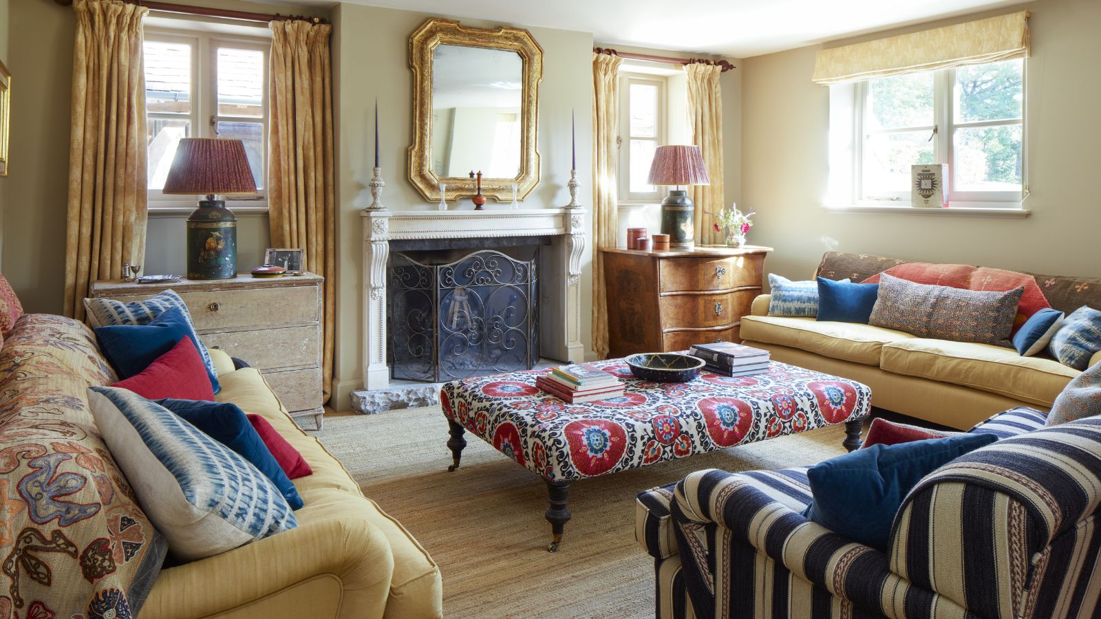
'Everything in here serves a purpose' – Jeremiah Brent walks us through the memory-filled media room he shares with husband Nate Berkus
With a bookshelf that tells a story and personal touches in every corner, this room proves that the best design schemes are packed with personality


Designing a home with high-end furniture and stylish accessories is well and good, but the best part of curating your space is filling it with memories.
Whether you place family photos through each and every room, have inherited storied furniture, or have a unique collection you've accumulated over the years, the design details that show off your personality truly make the space.
For interior designer and Queer Eye star Jeremiah Brent, furniture and finishes stand for much more than his profession. He's also filled his home with treasured, hand-picked pieces that tell the story of his life, and the family he shares with celebrated designer Nate Berkus. And one room of the family's New York City home, the media room, is a masterclass in designing a home that feels like you.
We've seen glimpses of the couple's media room before, but Jeremiah just took to Instagram to share an in-depth look – he explains how the two designers' styles blend with ease, and shares a list of the specific pieces that make the space special and nostalgic. Here's a look into the elegant space.
A look inside Nate and Jeremiah's media room
A post shared by JEREMIAH BRENT (@jeremiahbrent)
A photo posted by on
From the cameras left scattered around the space (which Jeremiah says is his 'daughter in a nutshell') to each piece of furniture, every element of the family's media room divulges a new detail about their lives and personal histories. 'Everything in this space has a story,' says Jeremiah.
The designer recalls that he first came across a neutral-colored, tufted armchair that now sits in the media room's corner when meeting his now husband, Nate, for the first time. As they were talking, Jeremiah was sitting in the chair – which was leather at the time. It's now been recovered, and has moved with them to this home, but still brings back fond memories. Another chair in the space also evokes happy nostalgia for Jeremiah.
'This Bugatti chair was something that I'd been coveting and I wanted forever, and my husband got it for me for my 30th birthday,' Jeremiah says, trying to remember exactly which occasion he received the generous gift. 'But everything in here serves a purpose, whether it's emotionally or for function.'
Sign up to the Homes & Gardens newsletter
Design expertise in your inbox – from inspiring decorating ideas and beautiful celebrity homes to practical gardening advice and shopping round-ups.
A post shared by JEREMIAH BRENT (@jeremiahbrent)
A photo posted by on
On one full wall of the stylish room, a built-in bookshelf unit contains what Jeremiah refers to as 'the timeline of our entire life.' With carefully placed picture lights, molded detailing, and a vast collection of books, accessories, and more, the designer says it represents 'everything that we find beautiful, everything that we find interesting, people we've loved, people we've lost. It really is kind of this living thing in our house that always changes and completely evolves.'
The centerpiece of the bookshelves is a one-of-a-kind mirror, hung directly on the shelves. Ornately decorated with shells and a carved metal mask, it makes an unexpected statement in the space. 'This mirror we've had forever – we got it when we lived in LA. I love it. It's so opposite of anything that we normally gravitate towards, but I adore it,' says Jeremiah.
Combining Nate's anti-trend, transitional style with Jeremiah's warm contemporary blend isn't always easy – they have disagreed before. But this space blends the two looks with ease, showing off the best of both.
'I think this room is really interesting because it kind of sums up the two of us in a really interesting way,' says Jeremiah. 'Everything contemporary is definitely things that I love and have been drawn to, and then everything that has a little bit of a traditional layer is my husband's. Everything reminds me of something.'

Abby was the Interior Design News Editor at Homes & Gardens and is now studying for her Master's degree in Journalism at City University, London. Prior to joining our team, she worked with Better Homes & Gardens, where she wrote and edited content about home decor, gardening tips, food news, and more. She studied Journalism and English Literature at New York University and moved to London to pursue her love of writing in 2023.
-
 My mom told me this skin spray is great for stripping stubborn, sticky residue from surfaces – she was so right
Skip frustrating scrubbing and enjoy easy removal with just one product
By Chiana Dickson Published
-
 Natasha Rothwell loves this sleep mask so much, she bought 10 – it's the simple yet luxe accessory you didn't realize you needed
Natasha Rothwell takes the luxe, DROWSY Silk Sleep Masks everywhere; 'I actually got gifted one of these; I subsequently bought 10'
By Hannah Ziegler Published