'Don't come and yell at me' – Jeremiah Brent tells 1stDibs his honest thoughts on 7 interior design trends
From the big light debate to millennial beige, this is what the newest Queer Eye star thinks about some of the most divisive design trends

Interior design styles and trends can prove quite divisive – and sometimes even the pros can't agree. But if you're not quite sure how you feel about the newest trend on the block – think whimsical decor or the Nancy Meyers aesthetic – hearing a second opinion can really help to make up your mind.
Jeremiah Brent, the newest member of Queer Eye's 'Fab Five,' just played a game of 'Yes, please' or 'No, thank you' with 1stDibs, sharing his honest opinions on seven interior design trends that have rocked the industry. Covering everything from mushroom lamps to monochrome, the designer takes us through his thought process on why he loves (or can't stand) these design features.
Here, Jeremiah shares the color that makes him look 'like a pair of teeth,' reveals the design trend that's caused some arguments with costar Tan France, and questions one of TikTok's latest design 'hacks.'
Jeremiah's thoughts on 7 divisive design trends
A post shared by 1stDibs (@1stdibs)
A photo posted by on
Jeremiah, known for creating timeless interiors for firm Jeremiah Brent Design and designing one-of-a-kind furniture for homeware brand Atrio, has made quite the name for himself in interior design. Now, he's busier than ever as Queer Eye's new interior design expert, sharing his design wisdom with 'heroes' across the country. With all this design experience under his belt, his opinion is incredibly valuable.
In the caption, 1stDibs says 'if there were a brain we would like to pick, it's the one inside Jeremiah Brent' – and we can't help but agree. Here's what the designer thinks of some of interior designs most controversial trends.
1. Frame TV
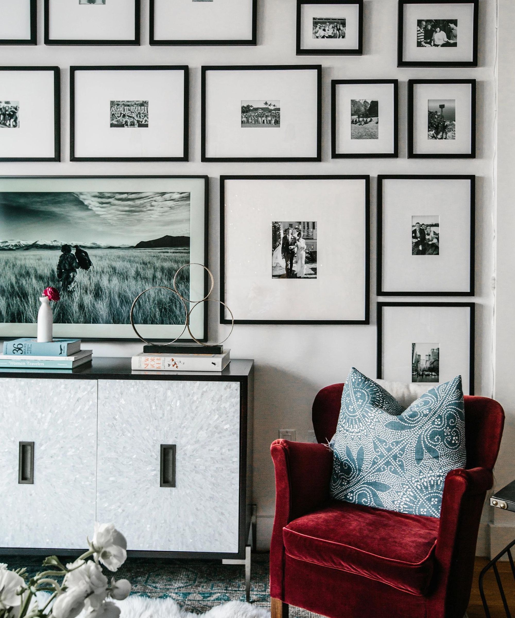
The first trend 1stDibs introduces is the frame TV – a TV that converts into a framed piece of art when switched off. Laughing immediately, Jeremiah shares that this design feature nearly caused a rift in his relationship with Queer Eye costar Tan France.
'Tan France got really mad at me about these frame TVs,' says Jeremiah. 'I know it's very controversial. I happen to like them – I have one downstairs in my family room, and I stand by them.'
Sign up to the Homes & Gardens newsletter
Design expertise in your inbox – from inspiring decorating ideas and beautiful celebrity homes to practical gardening advice and shopping round-ups.
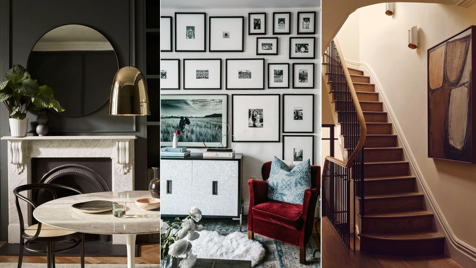
When styled mindfully, frame TVs can be a high-end asset to a living room design scheme. The average TV isn't very aesthetically pleasing, and if you don't plan on using it very regularly, it might make more sense to hide your TV away in plain sight. Blend one into a larger gallery wall, as in the space pictured above, to add an extra element of disguise.
2. Millenial beige
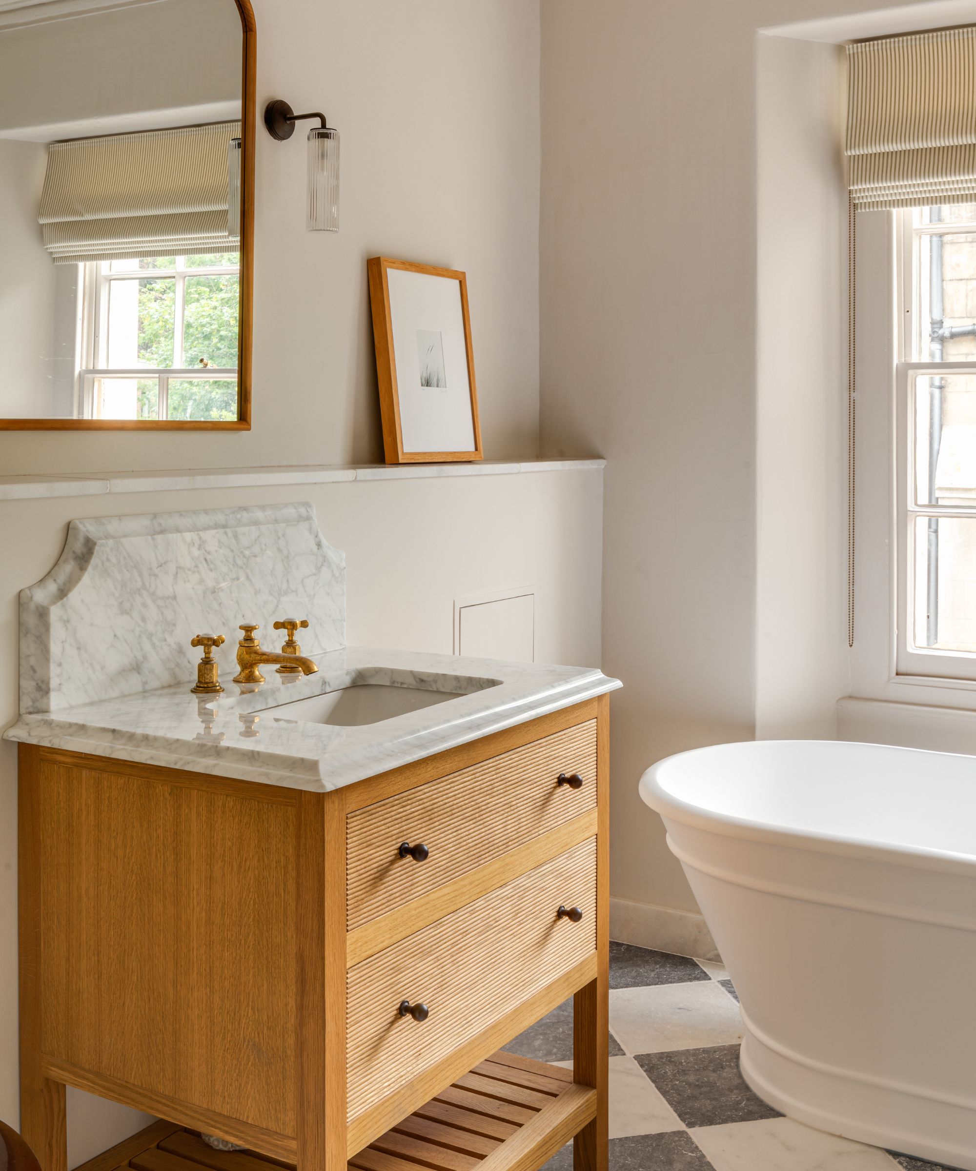
2024 has proven somewhat of an anti-beige renaissance, (we explore, what color is replacing beige in our separate piece) with 'millennial beige' falling out of style and vibrant colors quickly replacing the shade. This neutral is often seen as boring and bland, but some designers stand by it for its appeal as a solid, classic shade. For Jeremiah, though, millennial beige is an easy 'No, thank you.'
'I'm over it, which I know is very shocking because everybody thinks I only do beige, black and white. But I don't like it. And plus, when I stand next to millennial beige, I just look like a pair of teeth,' he says.
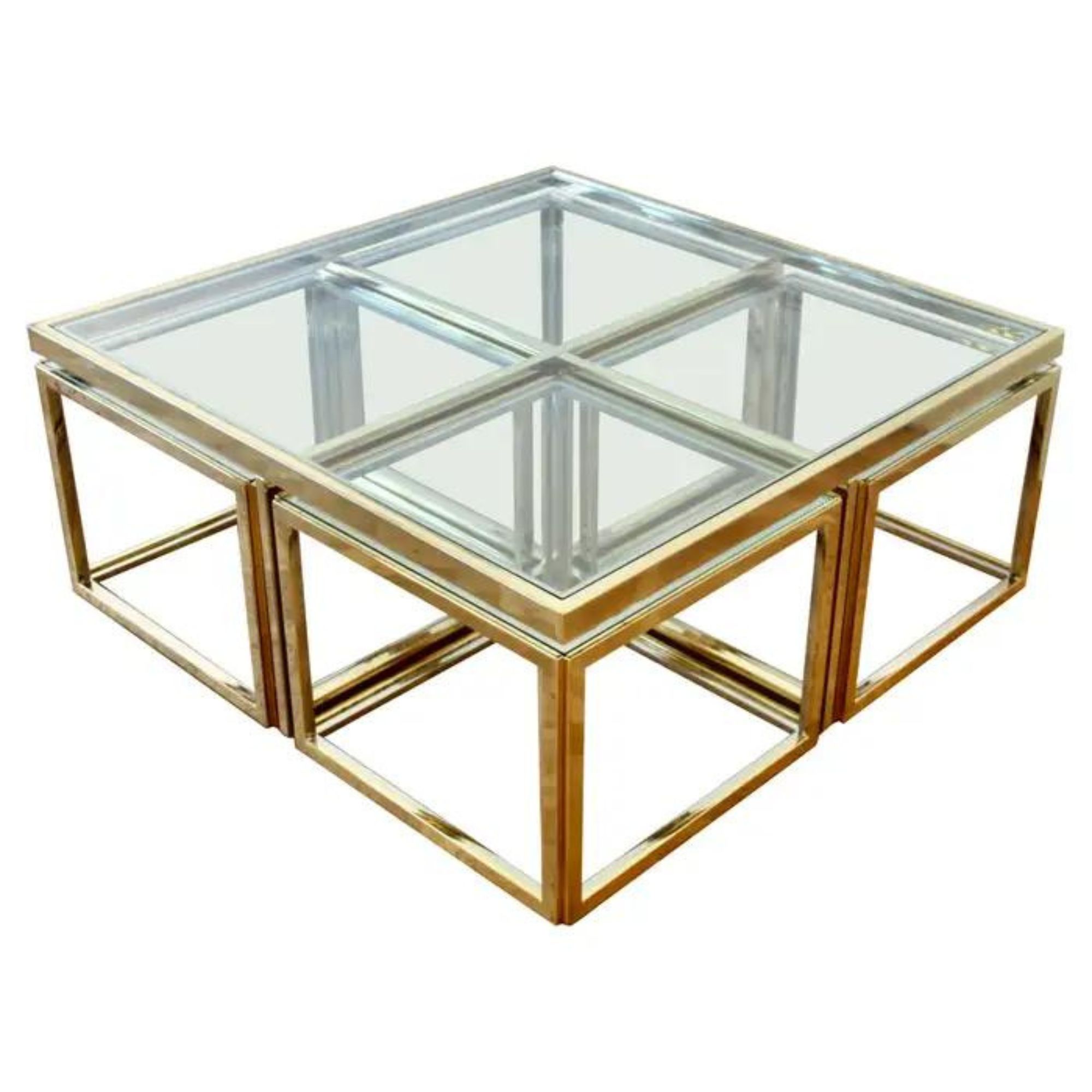
3. Chrome and metallic finishes
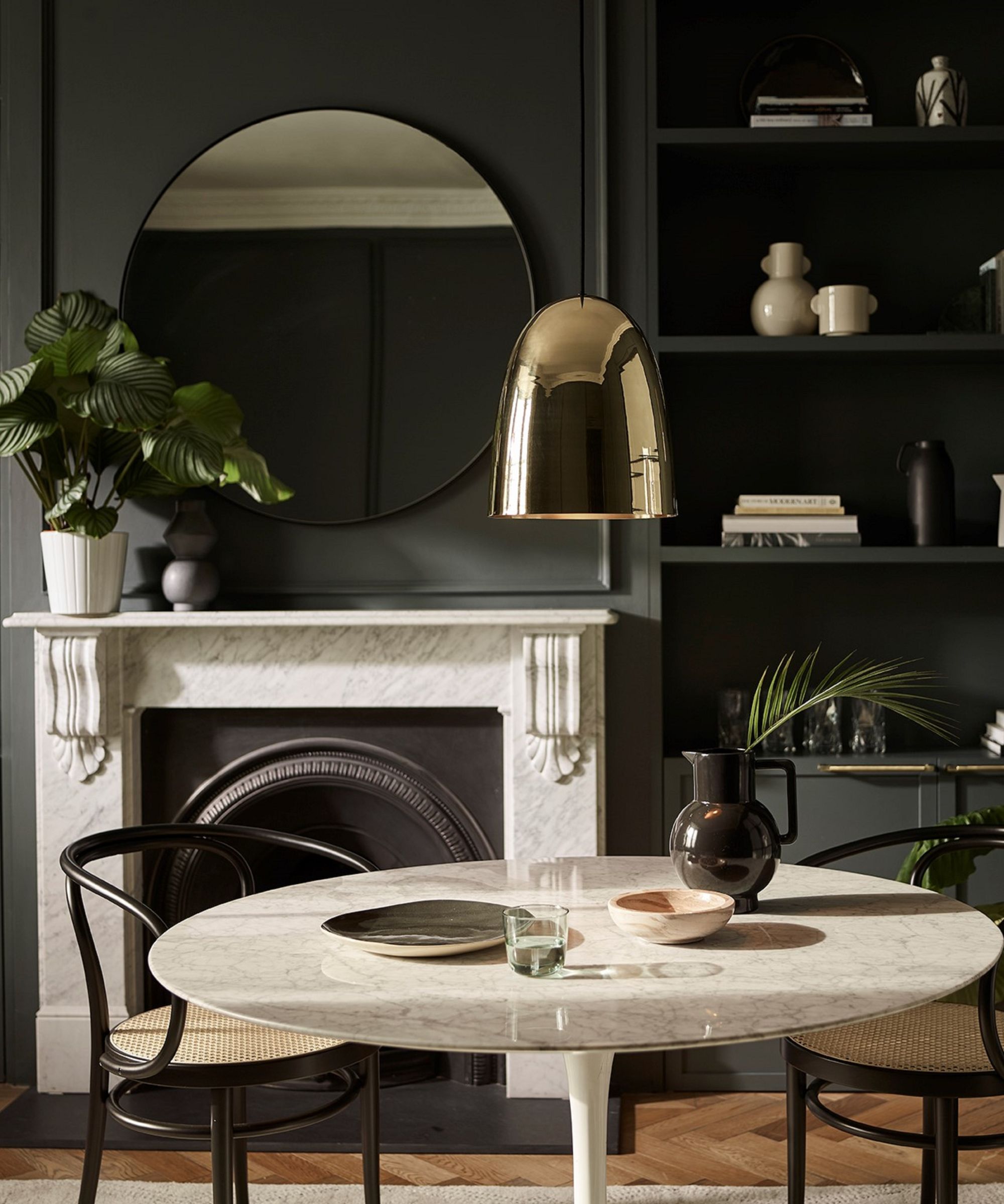
Mixing metals in interior design is more on trend than ever, with chrome decor winning the hearts of homeowners and designers alike. Subtle metallic touches are everywhere, and Jeremiah's pared-back designs are no exception.
'I love a chrome and a metallic mixed with a more neutral palette,' he says. 'I think it feels contemporary, and it can feel traditional, so yes please.'
Metal decor doesn't have to be overly modern (or shiny), and even a matte finish will do. Bringing metal and chrome decor into your home adds diverse texture and visual interest, elevating your entire design scheme. In this moody dining room, pictured above, a stunning pendant light serves as the perfect finishing touch.
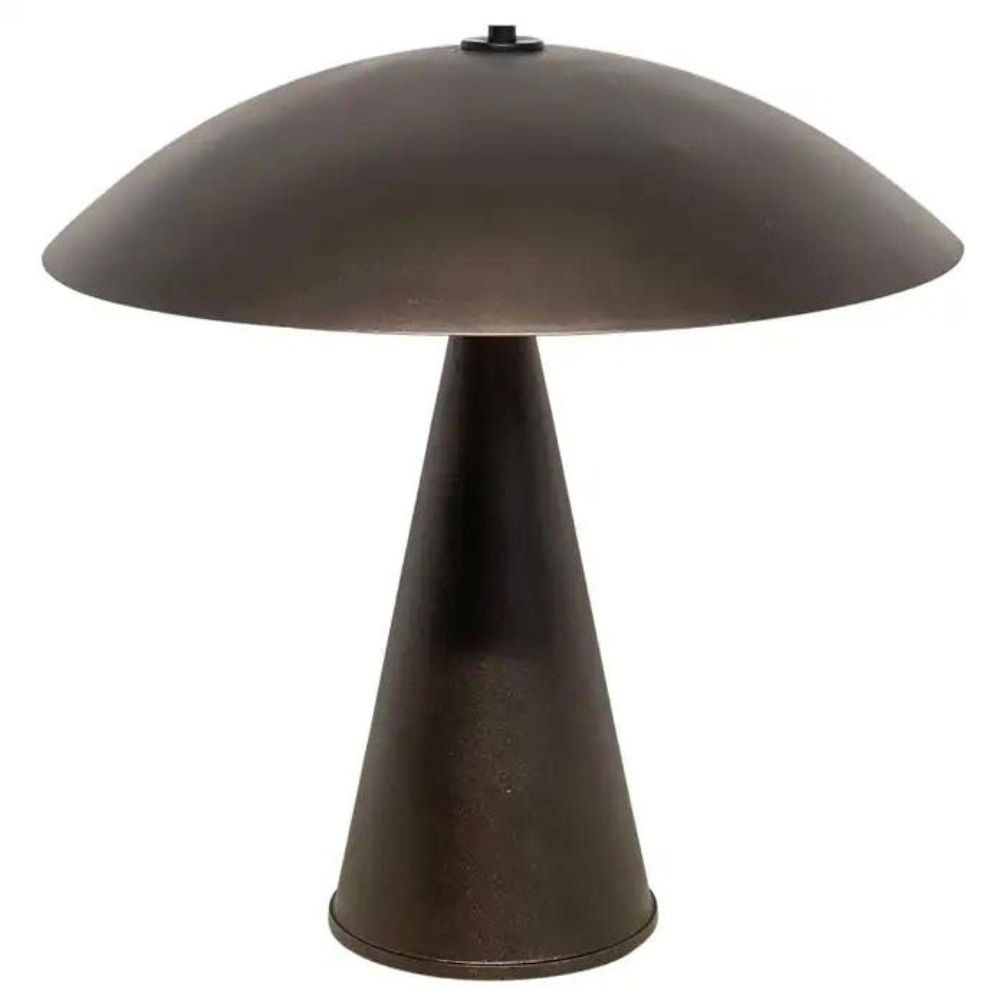
4. Mushroom lamps
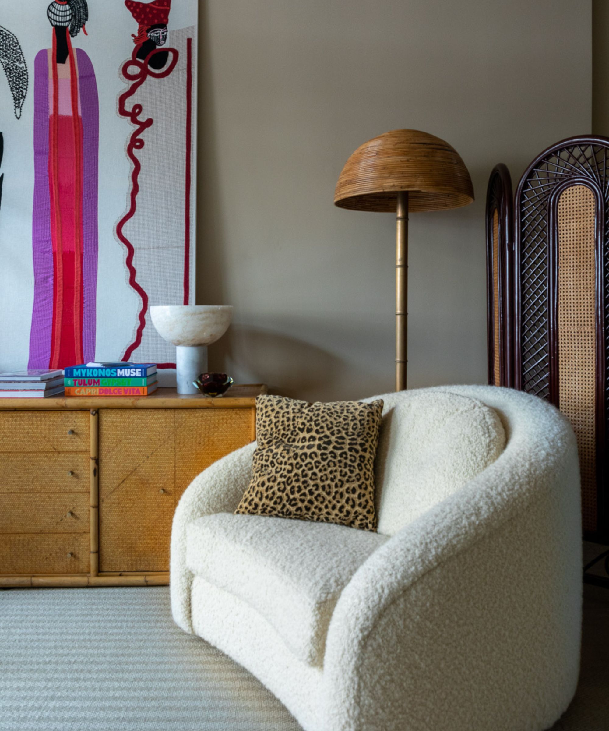
Mushroom lamps, named for their unique shape, took the design world by storm a couple of years back – and so far, they don't seem to be going anywhere. But what does Jeremiah think of this much-loved trend?
'The shape really stresses me out. I'll leave it at that,' he says.
5. The big light
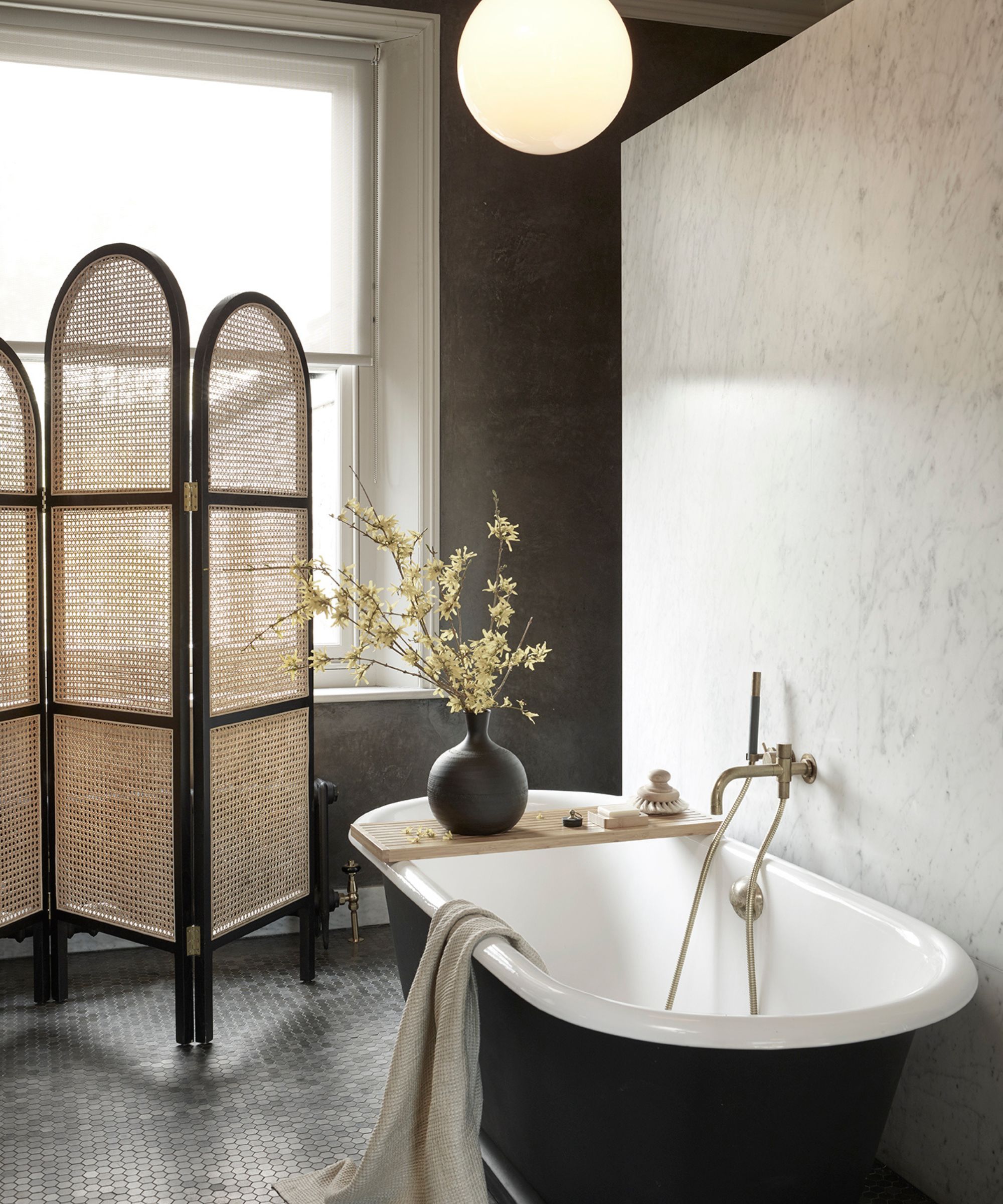
'The big light,' or choosing one central, overhead light do the heavy lifting for an entire room, has sparked quite the debate as of late. While some designers (and homeowners) are adamantly against the big light, instead opting for soft, ambient lighting scattered throughout their space, others think there's a time and a place for the overheads. Jeremiah says he can't quite make up his mind.
'This is a hard one because it's like a no, thank you, but also a yes, please. I also love really ambient lighting, but sometimes a room is dark and you need a big light. I'm in the middle,' he says.
6. Monotone rooms
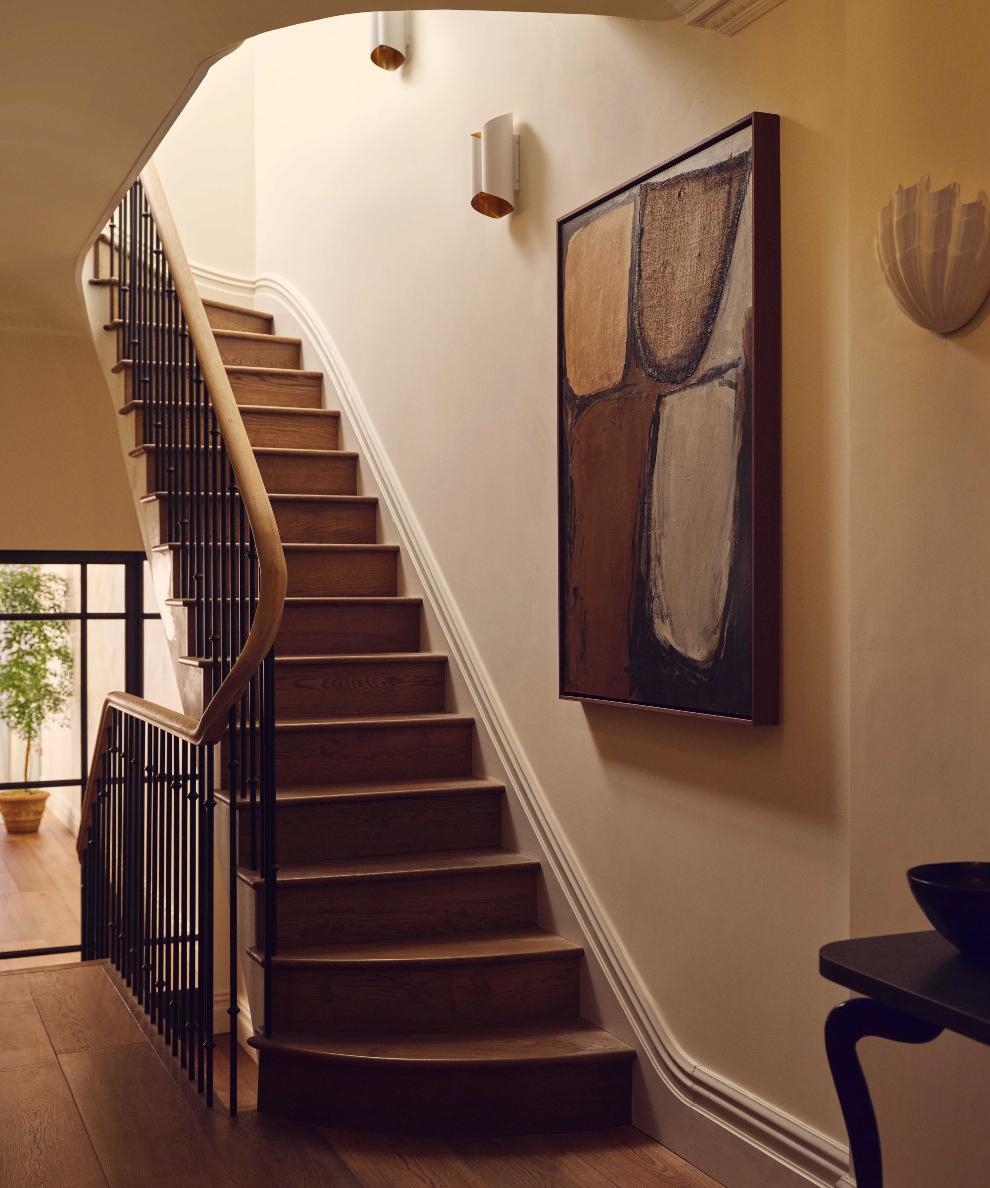
At the mention of monotone rooms, Jeremiah immediately lights up: 'Yes, please the monotone rooms! I can't believe how excited I get about it ... I think it's really beautiful if it's done correctly. Not for everybody, so don't come yell at me.'
Many of Jeremiah's own designs stick to a relatively monotone color palette, seamlessly blending several shades from the same color family. As opposed to a monochrome color scheme, which sticks to the exact same shade throughout, a tonal design scheme allows for a bit more experimentation – all while maintaining a cohesive style and mood.
7. Sock painting
@marley.makes.things ♬ original sound - Marley Makes Things
The last trend 1stDibs brings up has made waves on TikTok lately, and it's a bit out of the box: sock painting. Users have taken to the social media platform to show off this furniture painting 'hack,' and are raking in millions of views and thousands of likes.
Painting banisters and intricate furniture with their hands (which they've covered in clean socks), they're impressing some and horrifying others. Jeremiah seems to fall closer to the second camp.
'That's a no, thank you for me. Also, where does the other sock go? I don't get it,' he says.
Jeremiah's selected some timeless trends to get behind, and even though he's found himself at odds with Tan France in the process, his reasoning is sound. Whether you're ready to turn your living room monotone or want to introduce a bit more metal into your dining room design scheme, Jeremiah's opinions won't steer you wrong.

Abby was the Interior Design News Editor at Homes & Gardens and is now studying for her Master's degree in Journalism at City University, London. Prior to joining our team, she worked with Better Homes & Gardens, where she wrote and edited content about home decor, gardening tips, food news, and more. She studied Journalism and English Literature at New York University and moved to London to pursue her love of writing in 2023.
-
 Lenny Kravitz says design is 'just like music' – and the stunning materials of this bedroom embody this laidback luxe approach
Rich textures and opulent finishes come together in a Los Angeles bedroom designed by the musician – it's ultra-chic, but relaxed
By Sophie Edwards
-
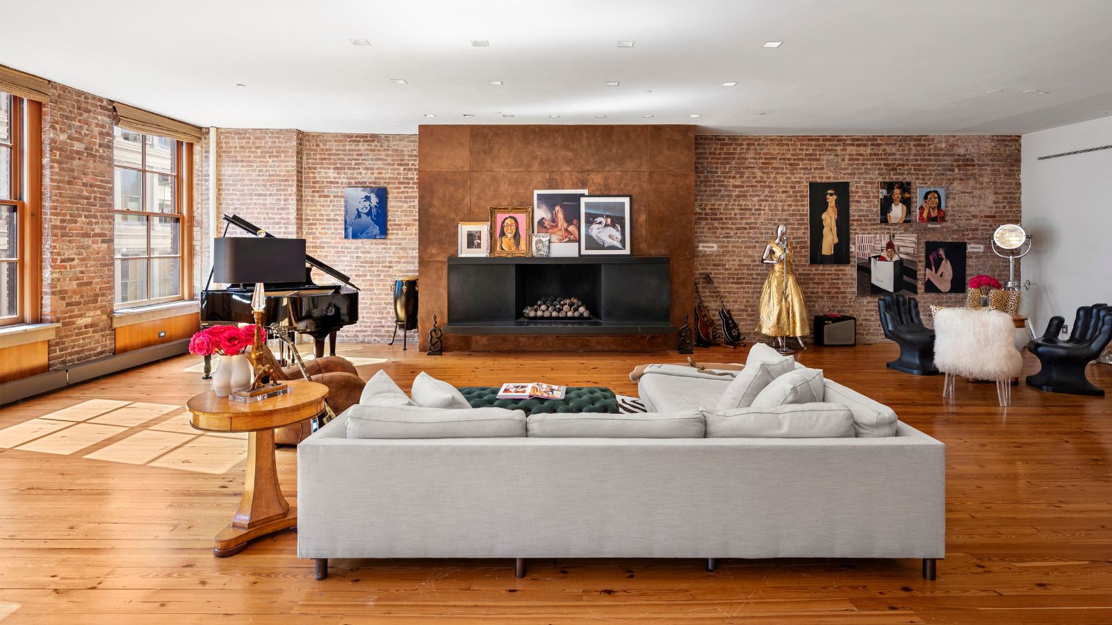 Courtney Love's historic loft combines rock star luxury with raw New York bones – it's on the market for almost $9.5 million
The singer's former SoHo home features exposed brick walls, original wooden columns, a gas fireplace, and high ceilings – take the tour
By Hannah Ziegler
