5 techniques this interior designer uses make art impactful in rooms
Jo Sampson, interior designer and founder of print studio Artorial gives her advice on ways to display in ways that are both affordable and impactful
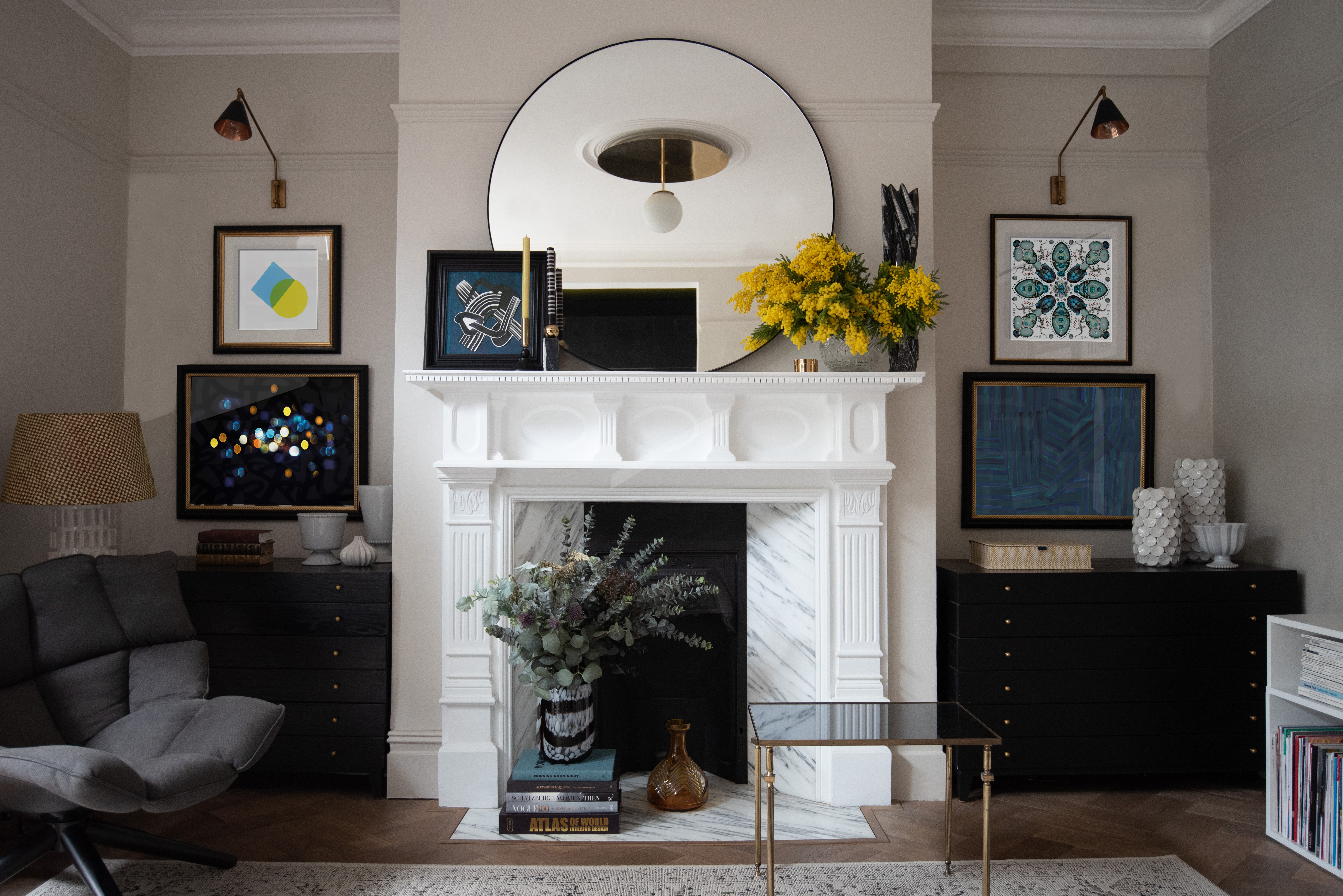

There are so many ways to decorate with art, but success is often down to having an instinct for what looks just right. Knowing how to display anything from artworks to sculpture to every day items doesn't just mean having an eye for the perfect composition, though; experience is key to getting it just right.
So, whether you are looking to hang a single piece of art in a focal position, perhaps over a fireplace, or want to work gallery wall ideas into a space, it's worth seeking the help of an expert.
Jo Sampson founded Artorial with Jenny Crosbie because, despite there being an overwhelming abundance in the marketplace, both found it difficult to source art to match their individual tastes. Jo has over 25 years' experience working in the design industry. Her portfolio spans high-end residential projects, commercial interiors for the world's most prestigious hospitality brands, furniture, lighting, interior accessories and art. As a named designer for luxury crystal brand Waterford, her collections have been sold globally in eminent stores such as Harrods, Selfridges, Neiman Marcus and Bloomingdales.
Here, she offers the top tips she's learnt about displaying art.
1. Create moments
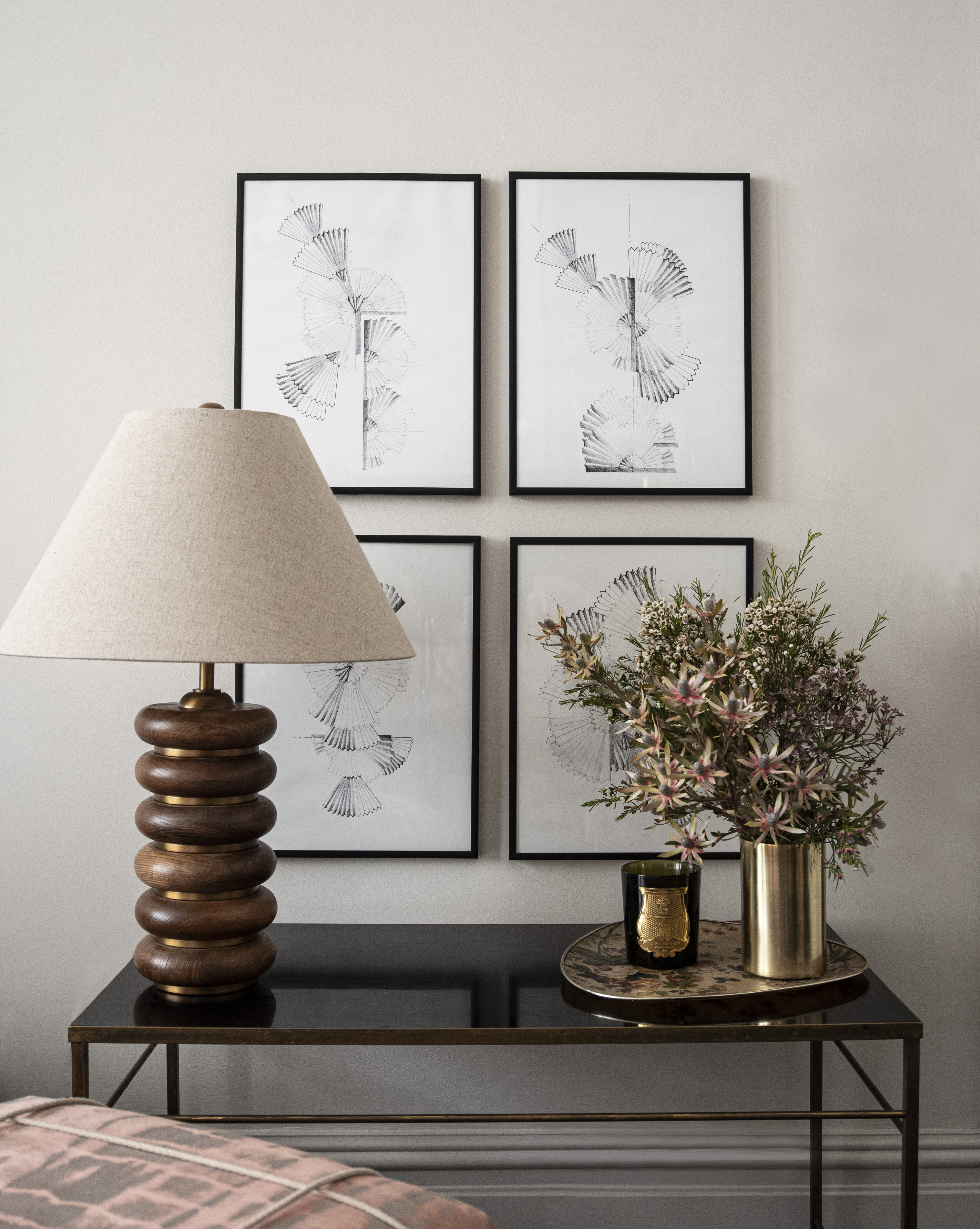
'There is a misconception that artwork should be displayed in the middle of the wall at eye height. I think it's really interesting to shake up the rules,' says Jo. 'I love creating moments, where you wouldn't necessarily expect a piece of art to be displayed.
'We spend a lot of time sitting down in our houses or lying in bed, and in these instances our eyeline is lower and offers a different perspective of a room. I like to create stories around coffee tables or credenzas – furniture helps to ground pieces and also creates a baseline to work from.
'Another surface that gets overlooked are the side of cabinets or closets; again hanging art here is unexpected and creates a talking point.'
2. There's no right or wrong
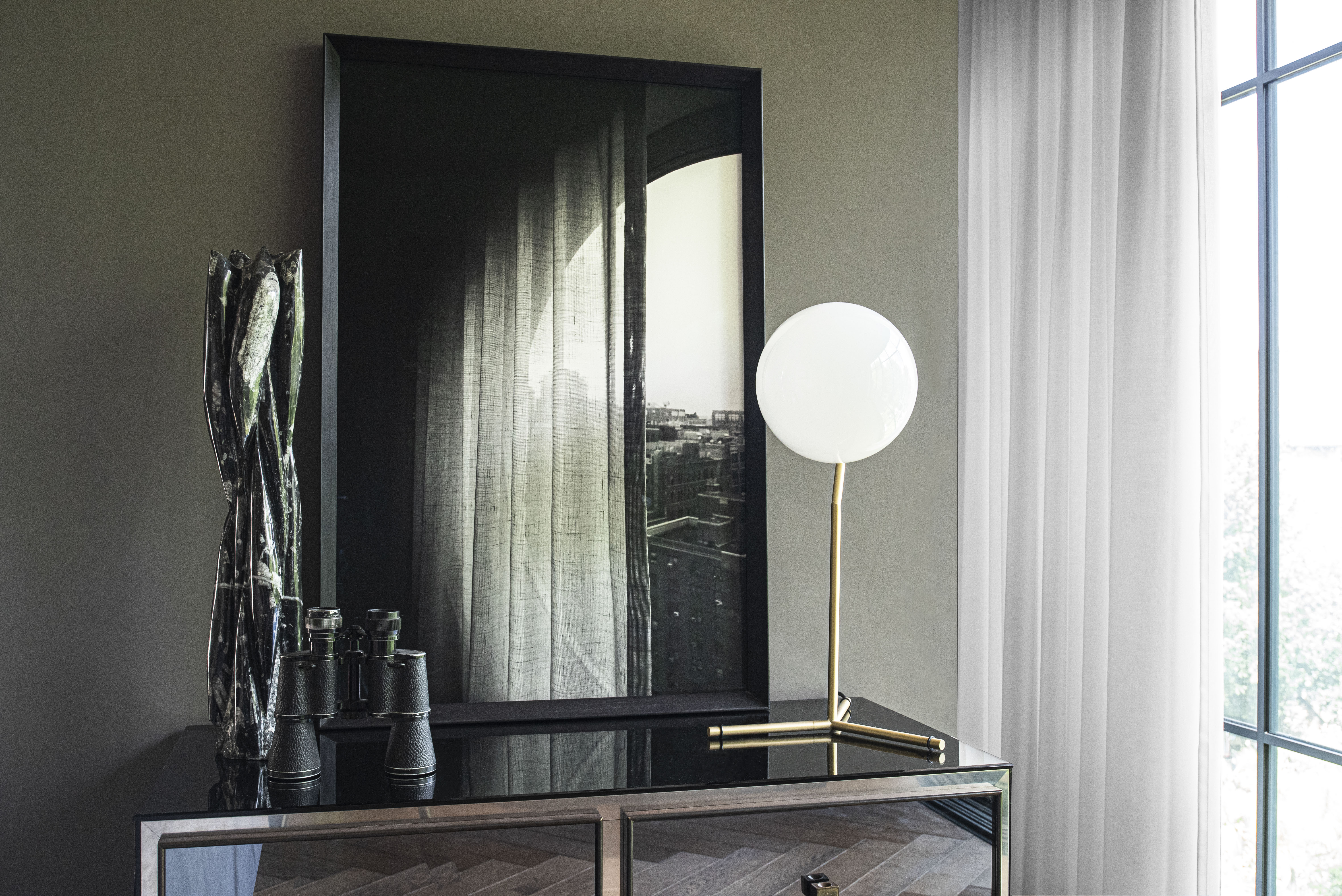
Whether you are looking for living room art ideas or bathroom art ideas, 'remember, there is no right or wrong when it comes to displaying artwork. Individualism should be celebrated.
'Art is an inexpensive way to bring color and life to your interior. Frames can be painted many times to suit different areas in your home nd art doesn't have to be static.
'Have fun placing frames in different areas and to freshen up rooms, it can make a huge impact and doesn't cost anything unlike a refurbishment. I tend to lean a lot of my framed prints as opposed to hanging them – it gives flexibility and you can create some beautiful set ups – especially useful if you're in a rental property where you're not allowed to attach frames to the walls.'
3. Use color for cohesion
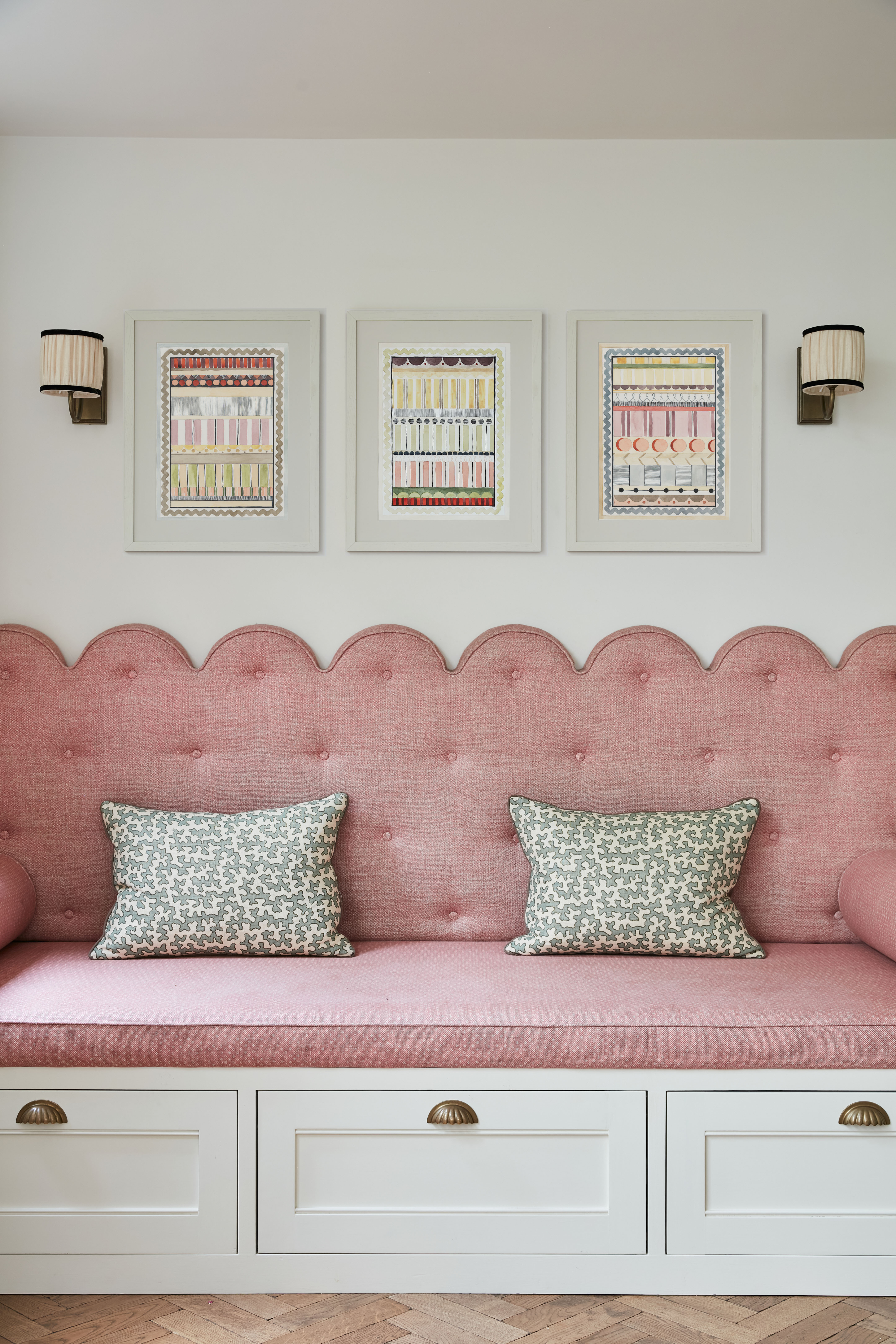
'It's always a good starting point to look at the colors that you have already in a room – wall colour, bedding, tiles, accessories – and use those as a starting point when you're searching for complementary artwork. By reflecting colors you'll bring a cohesive narrative to a room that will make the space look purposefully curated.'
This is particularly useful as a technique when using kitchen art ideas. 'In this kitchen space for example we used the pastel colors as our starting point and then installed this trio of prints in similar tones above.
'When it comes to layout for your artworks, create a focal point and work outwards. We started with just the central print in this kitchen but felt it needed a trio to really make a statement above the scallops of the seating below.
'If you are hanging a gallery wall create a rhythm where pieces fit together like a jigsaw. It's useful to lay the art out on the floor or, alternatively, cut out paper templates and stick these to the wall to get an idea of composition and positioning.'
4. Paint your frames

Bedroom art ideas can effect a quick transformation.
'Always look at frames as another element to animate and add character to your artworks. I love to paint frames in either a contrasting or complementary color, either to the artwork or the room. The frame is just and integral to the art as the art itself. Painted frames can pick out highlights in the artwork or can completely contrast with what is happening within the frame.
'A good tip is simply to buy a tester post of paint and use this to update your frame. It's a really cost effective way of giving artworks and gallery walls a new lease of life. If you want to bring coherence and depth paint your frame two shades darker to the wall color.'
5. Mix modern with classic

'I like to play around by mixing modern prints in varying mediums (paintings / photography / collage) with vintage frames for interest. Hanging contemporary art doesn't mean you have to have contemporary surroundings. I find that the juxtaposition makes the artworks more of a statement. It also means that you'll be able to find frames at second hand shops that cost next to nothing, and can be transformed with a lick of paint.
'To make these prints feel more integrated into this room, I also painted the mounting card in the frame the same color as the wall – this adds a sense of cohesion. Choosing flowers for the room that reflect colors in the artwork is also a goof way to soften and bring life to a space – they are a good cohesive tool for color that can pull artworks in a room together.'
Sign up to the Homes & Gardens newsletter
Design expertise in your inbox – from inspiring decorating ideas and beautiful celebrity homes to practical gardening advice and shopping round-ups.

Lucy Searle has written about interiors, property and gardens since 1990, working her way around the interiors departments of women's magazines before switching to interiors-only titles in the mid-nineties. She was Associate Editor on Ideal Home, and Launch Editor of 4Homes magazine, before moving into digital in 2007, launching Channel 4's flagship website, Channel4.com/4homes. In 2018, Lucy took on the role of Global Editor in Chief for Realhomes.com, taking the site from a small magazine add-on to a global success. She was asked to repeat that success at Homes & Gardens, where she has also taken on the editorship of the magazine.
-
 Is the viral salt hack the secret to a weed-free patio? A garden expert warns of irreparable, long-term damage – plus reveals the safest way to get results
You might have seen gardeners on TikTok or Instagram using salt to kill weeds in pavers, but this hack should be avoided at all costs
By Thomas Rutter Published
-
 9 longest-living houseplants – expert recommendations and tips for species that can live over 10 years
Invest in these houseplants now for years of luscious foliage in your home
By Tenielle Jordison Published