

The latest color trend isn't one standout shade, but rather the emergence of 'in-between' colors. Indeed, we're seeing colors that don't easily fit into one color family come to the fore in interiors, and designers are loving them for their intrigue and depth.
If you're looking for inspiration for your color schemes, look no further than in-between colors. This may be one of the latest color trends, but in-between colors are amongst the most timeless, offering a refined approach to embracing color. 'In-between colors transcend the boundaries between modern and traditional – they work well in any environment,' explains Denver-based interior designer Nadia Watts.
Read on to learn all about in-between colors and how to incorporate them into your home, as explained by a paint color specialist and interior designers.
What are 'in-between' colors?
'In-between' colors are essentially any color that can't easily be defined into one singular color family. Blue-green, brown-purple, pink-gray: any color that you can't easily describe as one specific color.
While in-between colors are nothing new and have often been used through paint ideas, we've been noticing more and more of these interesting hues crop up lately, most notably with paint brands' Color of the Year announcements. From Benjamin Moore's Cinnamon Slate, a brownish purple to Quietude, HGTV Home by Sherwin-Williams' blueish green, there's been a lot of interest around non-traditional colors so far this year.
There's much to love about decorating in-between colors – not only do they add interest to a scheme, fitting less obviously into a 'trend' box, but they also tend to feel liveable with their unique blend of undertones that don't shout.

Stained Glass by Benjamin Moore
Below, Benjamin Moore's Director of Marketing (International), Helen Shaw, explains the benefit of decorating with 'in-between' colors, and shares some of the best ways to embrace them:
'In-between hues celebrate a more nuanced approach to color. What makes these hues special is that each is rich with undertones, making a quietly confident statement without overwhelming a space. As foundational colors, these hues can easily be paired together to form a whole house scheme – as seen in our 2025 Trends Palette. They gracefully transition from room to room exuding warmth, comfort, and a sense of ease.
'In smaller spaces such as bathrooms or snugs, these hues feel slightly more dominant, creating an eye-catching color moment while also maintaining softness. Consider adding an element of gloss to elevate this look further, either in the ceiling or detailing up to the picture rail. This not only creates a cozy yet luxurious look but choosing a finish that reflects the most light, can deceive the eye and make the room seem larger.
'In a dining room scheme, the depth of ‘in-between hues’ creates a cozy ambiance perfect for hosting. Our Colour of the Year, Cinnamon Slate oozes sophistication and pairs beautifully with leather, warm woods, and brushed gold accents.
'These hues also work beautifully in rooms with big windows or those with a skylight. The unique undertones boast an intriguing interplay with light and dark that can transform a space from dawn to dusk.'
Designers' tips for decorating with 'in-between' colors
Below, we've rounded up interior designers' take on in-between colors, who explain various ways to channel this trend stylishly throughout the home.
Go for an 'in-between' neutral

Dead Salmon by Farrow & Ball
Neutral paints that offer intrigue combine various undertones, creating a timeless yet layered feel in the home. Below, interior designer Melissa Read, creative director at Studio Burntwood shares two of her favorite in-between neutrals:
'We find that ‘in-between’ colors are invaluable when creating rooms that feel layered. These shades, neither fully warm nor cool, adapt beautifully to changing light. For example, Little Greene’s Rolling Fog balances taupe and gray in a way that feels serene and grounded.
'Similarly, Farrow & Ball’s Dead Salmon is a particular favorite of ours, offering a muted pink tone with earthy depth. It works brilliantly in spaces where a soft warmth is needed, such as a master bedroom or hallway. One approach we’ve found effective is layering these tones with natural textures like jute, velvet, or soft leather to emphasize their versatility.'
Embrace the green trend with nuanced tones

Green paints have been incredibly popular lately, but if you want to avoid the overly saturated, forest green tones that can risk looking dated in the not-so-distant future, opting for nuanced greens allows you to tap into this trend more subtly and can feel more timeless.
'We have always used in-between colors, or as we think of them, non-color colors, in our palette development,' shares interior designer Andrea Goldman. 'I say non-color colors because the overall effect is impact without screaming a particular color. Our favorite in-betweens are blue-green paint color combinations such as Benjamin Moore's Calico Blue, or a green-black combo: Benjamin Moore's Black Forest Green.'
Color-drench with in-between hues

Cinnamon Slate by Benjamin Moore
When decorating with in-between paint shades, designers recommend embracing color-drenching. This sees the color used liberally throughout a room and can create a cohesive, immersive space that feels design-led.
'In-between colors that defy traditional categorization, like Benjamin Moore’s Cinnamon Slate, are incredibly versatile,' observes designer Emily Tucker of Emily Tucker Design. 'These shades provide a soft and sophisticated impression. They work beautifully when used throughout a space, such as on walls, ceilings, and trim.'
Choose earthy nuanced tones in kitchens

If you're deciding on a new kitchen color scheme, in-between shades are a great way to go. Often the heart of the home that sees lots of daily use, kitchens are about balancing style with liveability, and in-between colors tend to help create balance. Interior designer Glenna Stone of Glenna Stone Interiors elaborates below:
‘These colors often work as a subtle backdrop or bring depth to a space without being too bold or overpowering. We love using them in spaces where balance is key – like kitchens, where you want some warmth but without it feeling too intense. A great example is Benjamin Moore’s Dolphin. It’s this soft mix of green and gray with earthy undertones that pairs perfectly with natural wood accents.'
Embrace colors that reflect nature

If there's any place where in-between colors feel at home, it's within earthy and natural-world-inspired schemes. From muddy brown greens to amber tones, in-between paint colors often feel reminiscent of the complex tones found in nature.
'The 'in-between' colors are where I like to live,' says designer Marcus Mohon of Mohon Interiors. 'They remind me of how the light changes throughout the day on any given surface as the color of sunlight changes from cool pre-dawn to clear mid-day yellow to deep amber hues at sunset.'
'If you can use a color that can’t be described with one word, your room will have more mystery, depth, and charm. I love Benjamin Moore’s Castle Walls. Is it green? Gray? Blue-ish? It’s the color of the main public space walls in my home. I also love Benjamin Moore’s Revere Pewter and Iron Mountain,' Marcus adds.
Although in-between colors have come into the spotlight in the last few months, these interesting shades don't feel like a quickly passing trend. From blue-greens to gray-blues, these shades feel incredibly timeless and sophisticated when used as wall colors.

You must confirm your public display name before commenting
Please logout and then login again, you will then be prompted to enter your display name.
-
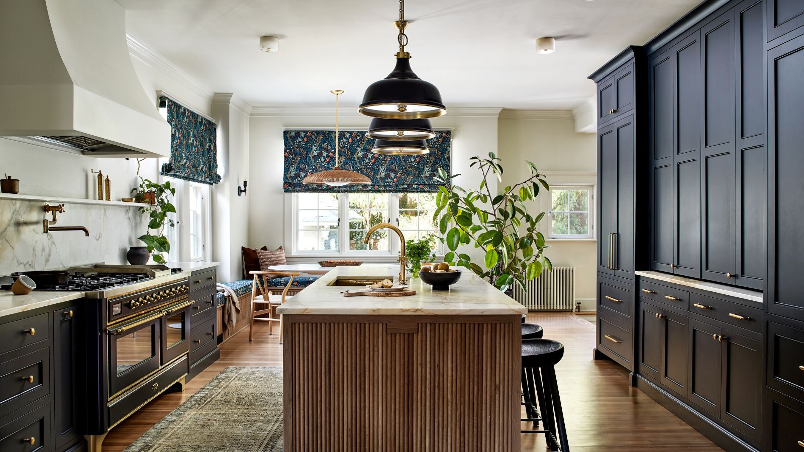 This once-dated kitchen is now a timeless space with the coziest details – and its the classic color palette that's made it a chic, welcoming space
Warming colors and natural materials combine to create this enduringly classic kitchen scheme
-
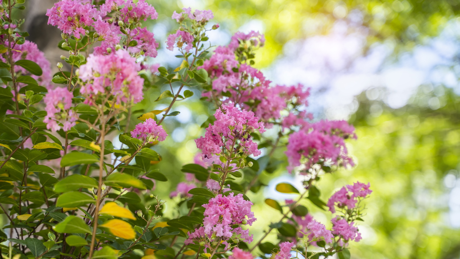 How to grow crepe myrtle in pots – and transform even the smallest of yards with dazzling flowers this summer
Growing crepe myrtles in pots will inject splashes of brilliant color into your outside space

