I ignored this bedroom lighting trend – but now I regret it and wish I'd listened to the experts
Designers love to integrate lighting into bedroom schemes, a trend I chose to ignore. But they were right and I was wrong and now I regret my choice
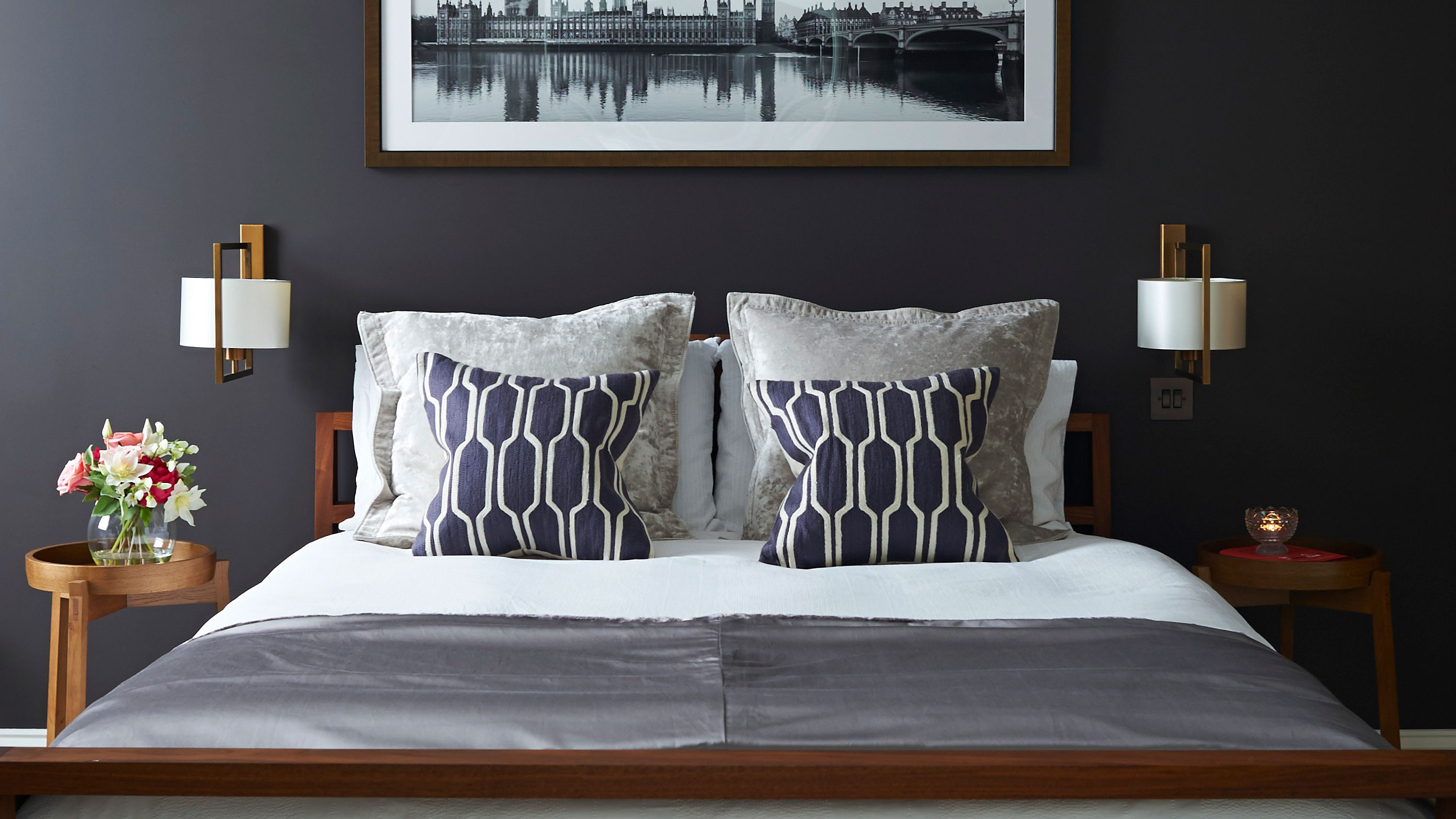
One of the last rooms we got to in our big refurb project was the bedrooms. When we moved into our home we had to rewire the whole house, add a new heating system, and also make the kitchen our priority, as the space that would impact us the most if we got it done and could cook for friends in it and build our new life around it.
But I had great plans for the bedrooms. I was going to follow the lighting trend designers love and have two identical pendants hanging down either side of the bed at just above the height of where your head would rest on the pillow if you were sat up reading. Or I was going to attach sconces at the same height. Either way, they would frame the bed, create a soft downlit glow, and be part of the fixtures of the room.
But I didn't do any of this. It was all happening too fast, with builders and electricians asking me to make decisions quickly about all sorts of things, including where I'd wanted my bedroom lighting to be when the space was just a shell. 'Oh, just stick a light outlet in the middle of the ceiling,' I cried, not being able to think about where the bed might actually be in the room. 'That'll be fine. The either-side-of-the-bed thing is just a trend, it'll be over soon.' But I was wrong, it's more than a trend, and I really should have found time and brain space to go with it – one of the biggest bedroom renovation regrets of my project.
What I did instead
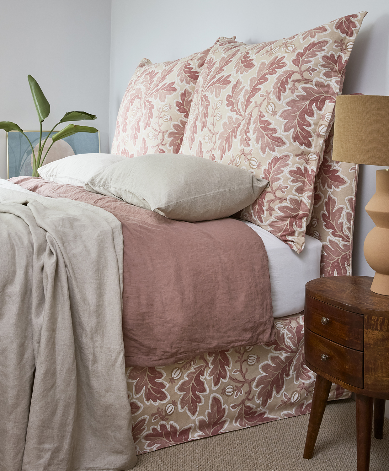
With just a central light hanging in the middle of each bedroom, I placed bedside lights on nightstands on either side of the bed. You might be wondering what the problem with that is, and sure, they do the job. That's my bed, above, and I purposefully didn't choose matching lamps – one is terracotta and tall, the other brass and short. They feel curated in an asymmetric way, and I am able to read at night by them, of course. But I really wish I'd fixed the lights above, for so many reasons.
'You want to feel flattered in a bedroom,' says the interior designer Irene Gunter. 'You want to choose colors and down lights by which you feel flattered.' She suggests pink as a good wall color, and downwards lights with conical shades that create soft pools of illumination from above. Lights on nightstands tend to be lower than your head when you're sitting up, creating not such an easy glow to read by, creating slightly longer shadows.
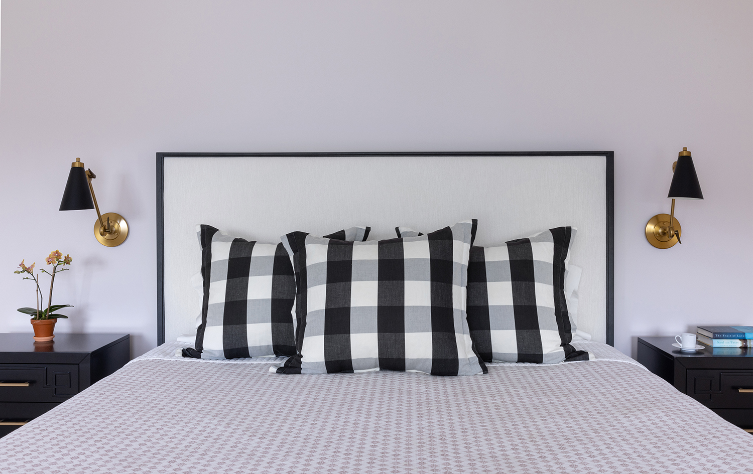
And there are practical reasons for wanting lights fixed to walls or the ceiling, too.
'In primary bedrooms, often the homeowners want a king size bed, and occasionally this is at the expense of space for nightstands,' says Jen DeLalio, founder and principal designer at the Southampton, New York-based studio JKate Designs . 'In those instances, having a wall or ceiling mounted light fixture for the bedside is a clever space-saver.' In the project she created above, the sconces allow for a much less cluttered appearance of the nightstands than I have with mine, now that they have to hold table lamps too.
'You'll want to consider the function for turning the lights on and off, independently switching the lights on each side of the bed and ideally positioning the switches so they can be turned on and off bedside as well as upon entry into the bedroom,' Jen adds. 'The fixtures shown in my South of the Highway project photo [above] are articulating, meaning that the arm and shade position can be adjusted, which optimizes the lighting function for bedtime reading.'
How to get bedroom lighting right
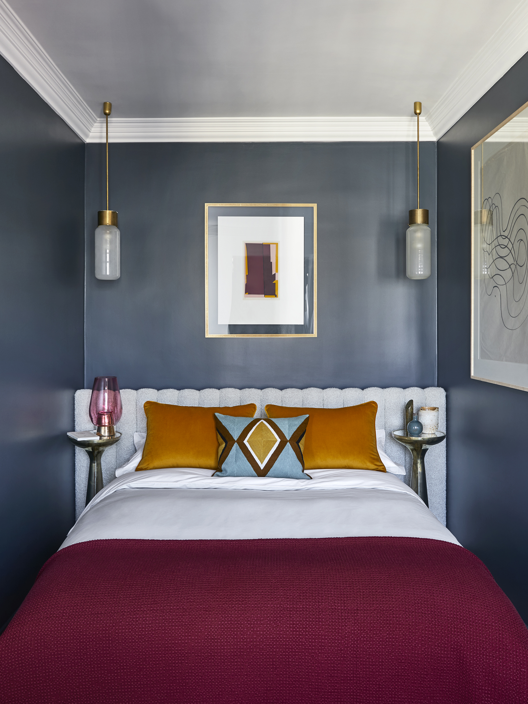
Jen is a fount of knowledge for how to get bedroom lighting right, in a way that goes beyond interior design trends and shows why this approach is a brilliantly practical one, too.
'Guidelines for the height of the lighting should be reviewed and tailored to the homeowner's specific needs,' she says. 'Generally, the height would be 55"-60" off of the floor and 30”-36” from the top of the mattress however you would also take into consideration the height of the headboard (fixture slightly below the top of headboard) and the length of the homeowners reach (in the event that the fixture is switched on the backplate of the fixture.)'
In fact, she says that lights aren't necessarily the first thing you should choose. 'Always select the headboard first, and then determine the left/right placement of the fixtures. The fixture should be no more than 12" away from the edge of the bed,' she advises.
So admittedly, when it comes to my list of renovation regrets and things I've learned along the way, having to have freestanding bedside lamps instead of fixed ones isn't the most disastrous.
But to me, every time I turn those lamps on I'm reminded of how I was too harried to think long-term back in the early refurb stage, how I wish I'd carved out time and energy to think ahead rather than letting all the laborers get to me with their need for me to make decisions. I wish I'd integrated the lighting, which would have made for a more considered look, a better light, and a bit more space on my nightstand.
My decree to you is to not think about this approach as a lighting trend, but as a serious bit of advice that designers love for good reason.
Sign up to the Homes & Gardens newsletter
Design expertise in your inbox – from inspiring decorating ideas and beautiful celebrity homes to practical gardening advice and shopping round-ups.
Pip Rich is an interiors journalist and editor with 20 years' experience, having written for all of the UK's biggest titles. Most recently, he was the Global Editor in Chief of our sister brand, Livingetc, where he now continues in a consulting role as Executive Editor. Before that, he was acting editor of Homes & Gardens, and has held staff positions at Sunday Times Style, ELLE Decoration, Red and Grazia. He has written three books – his most recent, A New Leaf, looked at the homes of architects who had decorated with house plants. Over his career, he has interviewed pretty much every interior designer working today, soaking up their knowledge and wisdom so as to become an expert himself.
-
 Drew Barrymore creates a 'balanced,' beautiful kitchen in 4 easy steps – her rules bring order and style to the smallest of countertops
Drew proves that with the right styling (and chic appliances), you can make even the smallest of kitchens look harmonious
By Hannah Ziegler Published
-
 5 key trends from Milan Design Week that are going to change the design direction of 2025
From floating furniture to silvered surfaces, here's my perspective on the key themes and new moods coming through from Milan Design Week 2025
By Pip Rich Published
