Design expertise in your inbox – from inspiring decorating ideas and beautiful celebrity homes to practical gardening advice and shopping round-ups.
You are now subscribed
Your newsletter sign-up was successful
Want to add more newsletters?
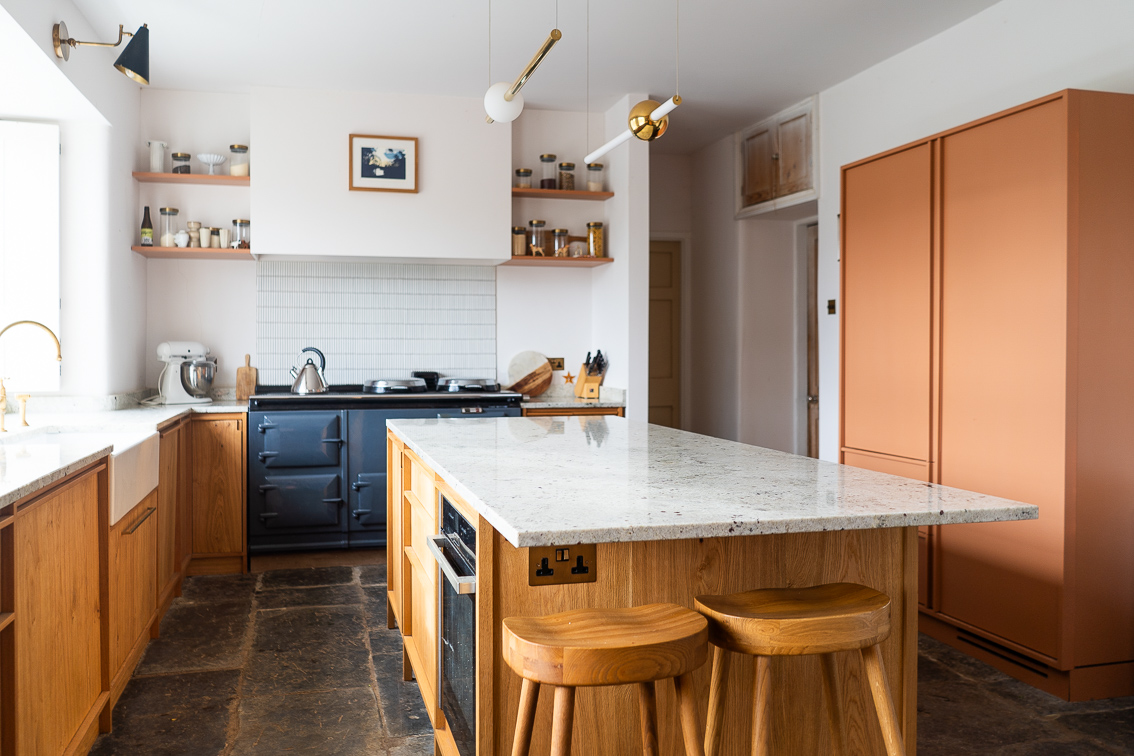
When we bought our 1840s home much of its period charm had already been stripped out. Its high ceilings and large, airy rooms remained, but molding, fireplaces, and original floors had mostly been covered over, ripped out and replaced with practical but personality-free alternatives.
I missed the molding most. I love how it's the decor equivalent of lipstick, finishing off a look with a little extra magic. But it was easy to add back in, researching the styles that were typical of when the house was built and choosing sympathetic options. My husband was cross about the lack of flagstones. Top of his wishlist, and typical of the area we were buying in and period of the property, had there been any they were now replaced with graying linoleum and tacky fake-wood floorboards.
His delight, then, when we took a jackhammer to the lino kitchen flooring and found them lurking underneath, buried under two inches of concrete, was extreme. I however was extremely annoyed, and while they're one of the first things guests remark on when they walk through the door, and I've warmed to them slightly, they're still a period detail I would have actively chosen not to have. Here's why.
The color
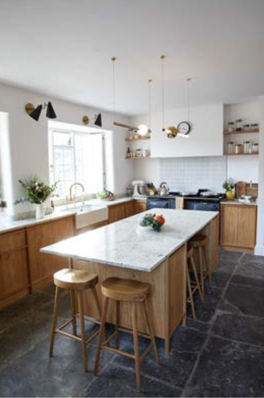
Flagstones are the dark gray of a stormy sky. The light charcoal of a moody ocean. They suck the light out of the room and draw the eye immediately to the floor. Before we found the flagstones I'd been imagining a warm oak, rich and inviting, allowing us to play with deeper colors on the kitchen cabinets and fittings. The utter and complete grayness of the flagstones felt impossible to design with, and against all my visual plans.
'Flagstones absolutely have challenges but when embraced they can be fab,' says interior designer Heather French. She recently completed a project in New Mexico with inherited flagstones and had to find a way to work with them.
'I tend to embrace any challenges in a project and try my best to turn them around and make them the star of the show,' she says, an attitude I definitely had to try to find in myself. 'In the case of flagstone you have to embrace the beige tones and layer in fabrics and pattern that compliment the space. Intend to stick with colors you find in nature. Greens, ochre, rusts.'
The uneven texture
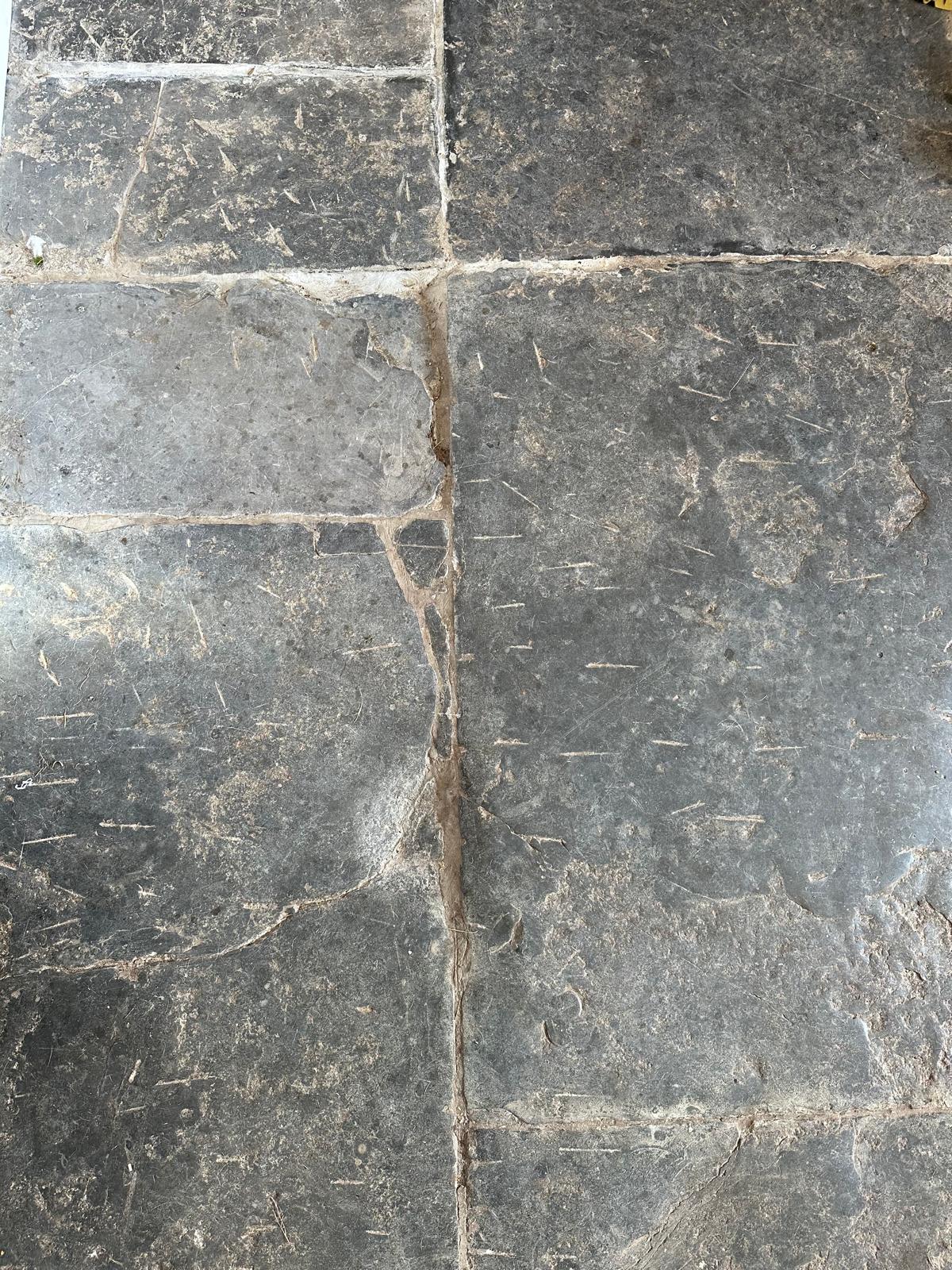
Having been laid nearly 200 years before, these flagstones are not the ones you'd choose if you were adding them in now. Dipped in places, irregularly edged with parts worn away. 'They tell the story of the home!' my husband said optimistically, while I stopped blaming the previous owners for having covered them over with smooth lino.
Design expertise in your inbox – from inspiring decorating ideas and beautiful celebrity homes to practical gardening advice and shopping round-ups.
It didn't help that our jackhammering inevitably caused more damage. The short horizontal lines you can see above are where the jackhammer met the stone as it plowed through those inches of concrete. 'They're just more of the story of the house!' my husband said again, as I dreamed of the gentle whorls of hardwood flooring.
The inability to make them look clean
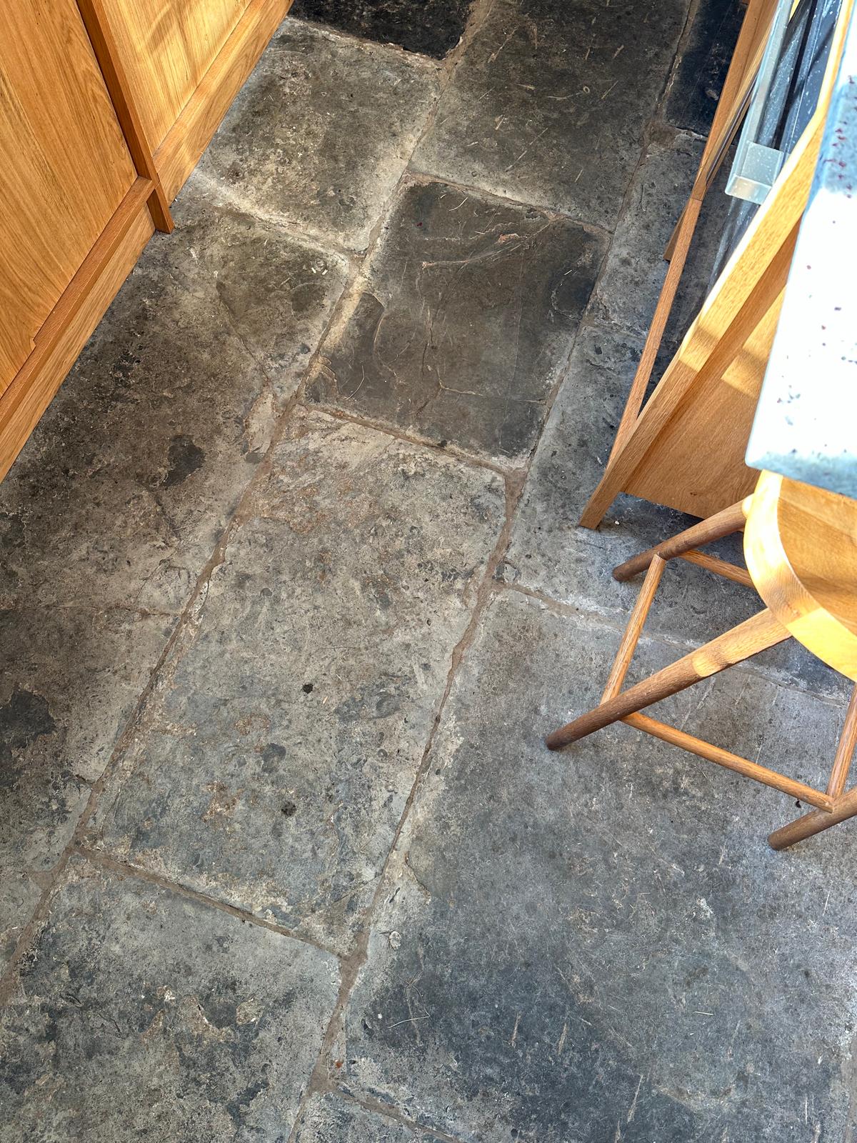
Ok, so it doesn't help that we live in a rural (muddy) area and have two dogs who come straight into the kitchen from outside, traipsing in grass, leaves, and sludge with every step they take. But even after vacuuming, mopping, and getting down on my hands and knees to soak them the stones still take on a dirty pallor, the centuries-old grouting having the same color as week-old snow.
I have ended up being happy with the design choices we made to accommodate them – using the wood I'd intended for the floor on the cabinets instead. But I'm still pretty salty that I had to, and that they always look like I'm 'letting my hygiene standards slip.' When sometimes, I'm actually not!
How to treat flagstones (whether you love or hate them)
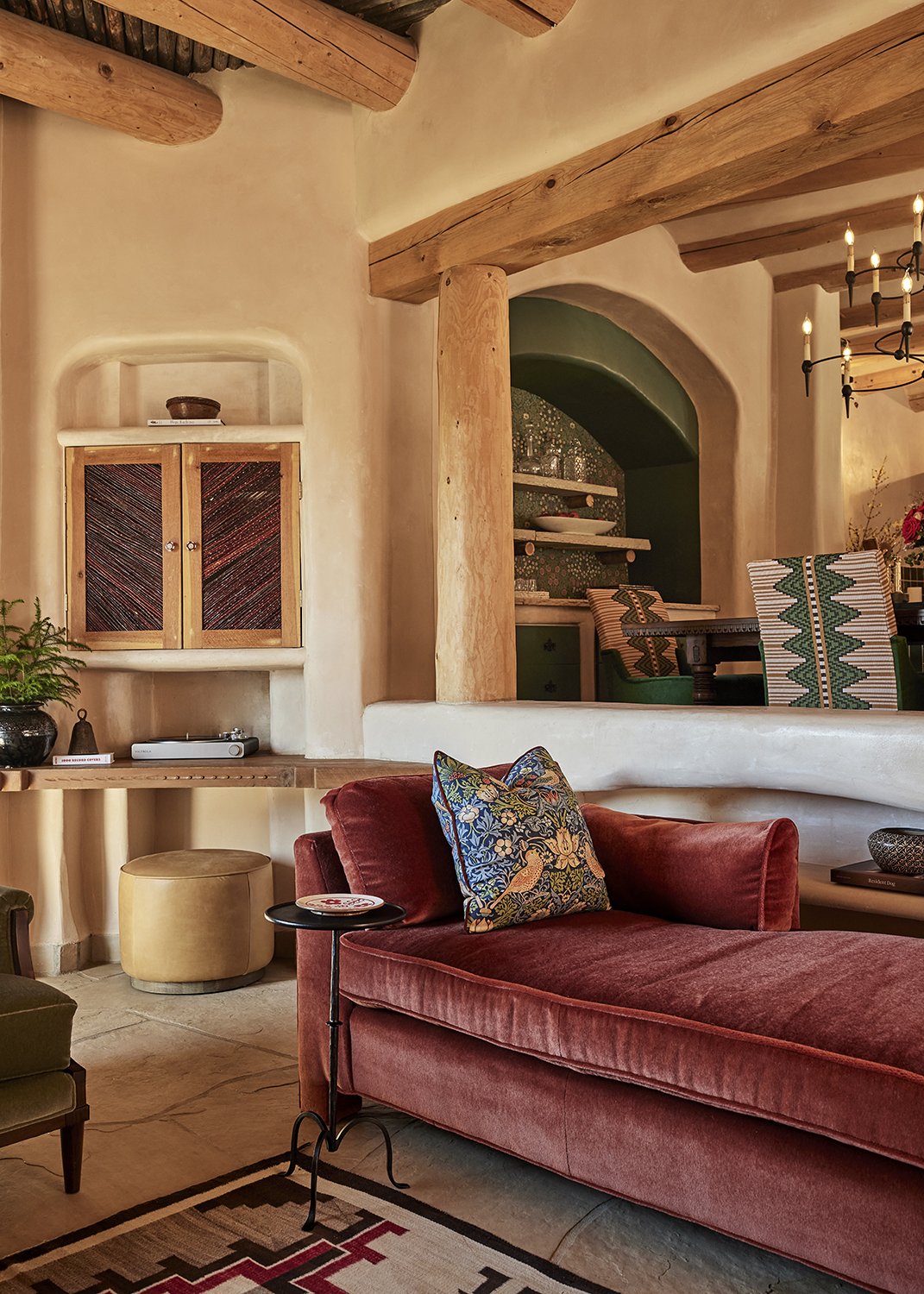
Having found it within herself to embrace flagstones in this Santa Fe project above, better than I did in my home, I asked Heather French for more advice.
'I think flagstones bring a dramatic yet relaxed vibe to a home,' she says. 'They absolutely define a project and I love the soulfulness of them. They look dramatic in a space because the earth tones tend to demand a design direction.'
'They definitely don’t define aesthetic but they do define the tones you can bring into a home to allow them to shine. While both flagstone and wood have neutral tones to them, hardwood tends to read more vibrant and reflective due to the sheen and flagstone tends to have a more serious and subdued, grounding presence,' she adds.
In this particular project, Heather used the flagstones to go in a colorful, decorative direction. 'I love to pair dark florals and large-scale geometric patterns like you would find in a centuries-old Navajo rug,' she says. 'I think the key to success with flagstone is matching the sole and authenticity the stone has. I would not try to use whites or grays, it would make the space feel sterile.'
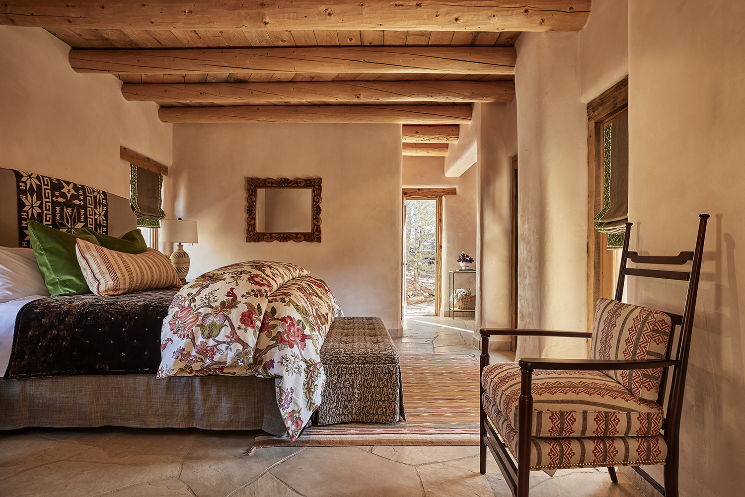
So if you find yourself with a surprise like I did – or you buy a house that has them and are wondering where to go, Heather had these final words to say.
'They were inherited in this project [above] and I was happy about it!' she says. 'Along with brick and Saltillo here in Santa Fe, flagstone is very common, so they don’t intimidate me anymore, but they used to. It wasn’t until I started embracing more traditional floors that my personal growth as a designer started to shine.'
'I’m always happy to see that a traditional floor has been kept in a home and not just tiled over with an inauthentic material like a cheap ceramic tile! I think challenging yourself to think outside of the box when you find an element in a space that the client doesn’t want to change and loves, is one of the best things you can do as a designer, especially if it’s an authentic material such as flagstone!'
Pip Rich is an interiors journalist and editor with 20 years' experience, having written for all of the UK's biggest titles. Most recently, he was the Global Editor in Chief of our sister brand, Livingetc, where he now continues in a consulting role as Executive Editor. Before that, he was acting editor of Homes & Gardens, and has held staff positions at Sunday Times Style, ELLE Decoration, Red and Grazia. He has written three books – his most recent, A New Leaf, looked at the homes of architects who had decorated with house plants. Over his career, he has interviewed pretty much every interior designer working today, soaking up their knowledge and wisdom so as to become an expert himself.

