How to embrace the trend for yellow interiors without it overwhelming your home – designer tips for an uplifting yet liveable space
The most uplifting of colors, there's much to love about yellow, but ensuring a liveable scheme is key

Design expertise in your inbox – from inspiring decorating ideas and beautiful celebrity homes to practical gardening advice and shopping round-ups.
You are now subscribed
Your newsletter sign-up was successful
Want to add more newsletters?
If you're somebody who loves bright and bold colors, then you're probably no stranger to decorating with yellow. Regarded as a happy and creative color that boosts energy, yellow has the potential to fill our homes with a welcoming feel, but it can quickly overwhelm spaces when used in excess.
Yellow comes in many forms – from rich mustards to lighter butter yellows – and we're seeing plenty of appeal for all sorts of variations of this cheery shade currently. And while it comes into its own during the summer months, we can't think of a better color to offset the dark winter months with a healthy dose of sunshine in our homes, albeit in a balanced way.
And so, you may be wondering how to use yellow without overwhelming your home. We turned to the expertise of designers, who share all their tips and tricks below. Read on to gain ideas for decorating with yellow in a stylish and liveable way.
Article continues belowHow to use yellow without overwhelming your home
'Yellow can be a vibrant and energizing color and one which is warm and welcoming, making it suitable for lots of different spaces and styles, from home offices and playrooms to kitchens and hallways, where it adds energy and life to a room,' says Ann Marie Cousins, owner of AMC Design.
'However, the stronger the yellow, the more mindful you must be in using it. In general, the stronger the shade, the less of it you need, particularly when you are just starting out on your journey to embrace color in your interiors,' says Ann Marie.
As Ann Marie suggests, some level of restraint is often needed when working with yellow room ideas to ensure a stylish and balanced look. Below, designers share specific ways of how to channel this color trend in a liveable way.
1. Use butter-yellow paints
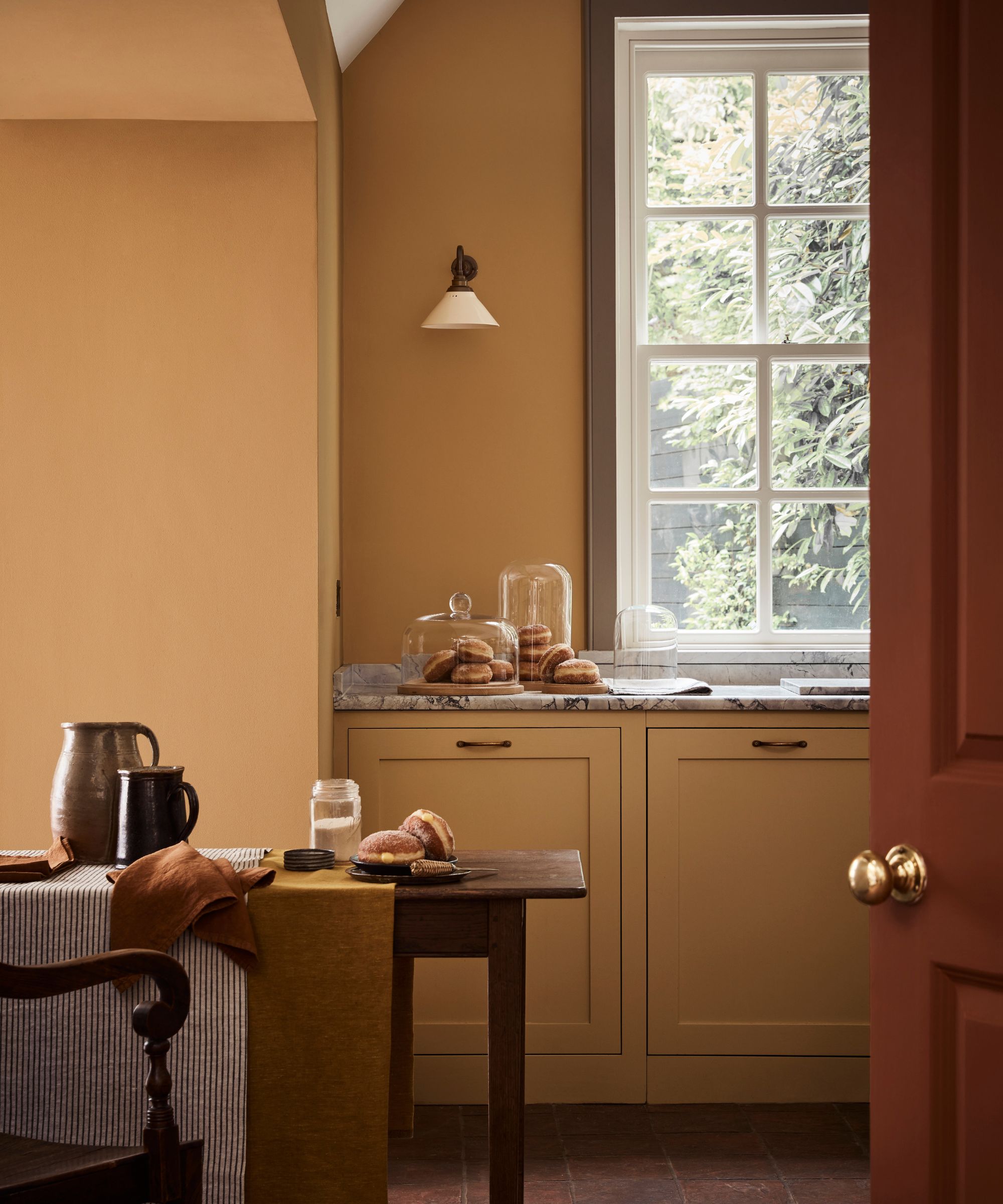
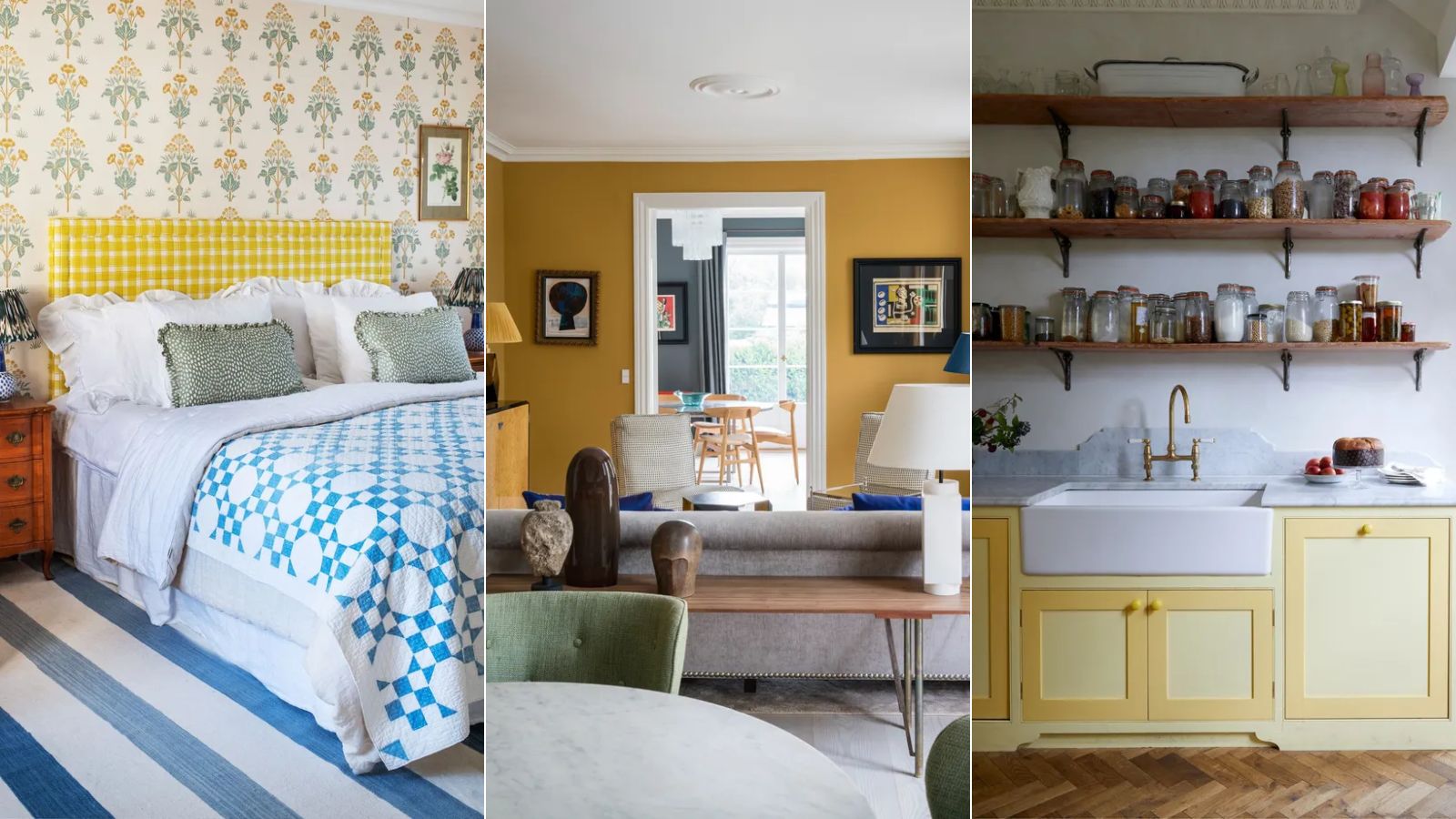
Yellow paints are amongst the bravest, and while sunshine shades can work well in certain settings that aim to feel lively, butter-yellow paints can create a more liveable feel.
Design expertise in your inbox – from inspiring decorating ideas and beautiful celebrity homes to practical gardening advice and shopping round-ups.
'I’ve found that clients either love yellow or dislike it, but even those who love it often want to avoid feeling overwhelmed by the color,' says interior designer Laura Jenkins. 'For a recent project, we chose a soft yellow cream for the walls, trim, and ceilings, and complemented it with a rich golden hue for the drapery and rugs. This approach creates the effect of a saturated color palette without making the space feel too overwhelmed by it.'
'The secret is to select a shade of yellow that doesn’t overpower the space,' agrees designer Rebecca Ward. 'Try using a buttercream hue like Benjamin Moore’s America's Heartland on the walls, which looks stunning against crisp white trim.'
2. Turn to the 'unexpected yellow' theory
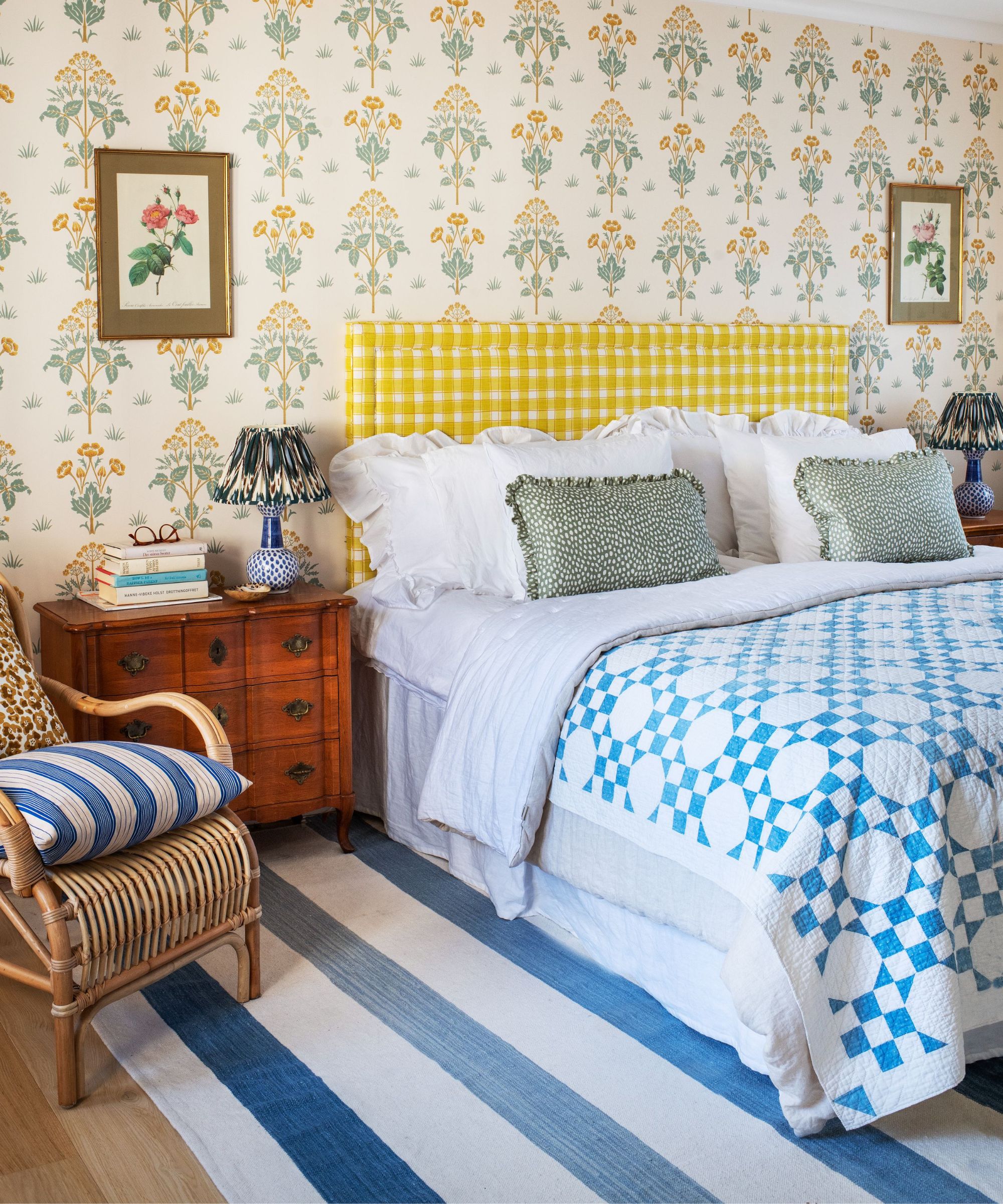
While the unexpected red theory took the interior design world by storm earlier this year, that's not to say the same concept can't work just as well with yellow. Instead of reaching for red to uplift a neutral room, consider choosing bright yellows to add an energizing dose of color, much like this headboard in this Cathy Nordström bedroom.
'Yellow is such a cheerful color and not used enough in my opinion,' says designer Prudence Bailey, founder of Prudence Home & Design. 'I love using yellow as a dramatic pop of color. It's so fun and vibrant and instantly sets a room apart from the norm.'
'Yellow pairs so well with cool colors that it can feel unexpected yet just the right touch with blues, lavenders, greens, and grays. Make sure your room has a lot of sunlight or yellow has a tendency to fall flat. It's a supercharged way to bring the sunshine inside,' adds Prudence.
By using yellow in subtle amounts through smaller decor items, rather than painting the walls, your room won't feel overwhelmed by this saturated color.
3. Use yellow in social rooms
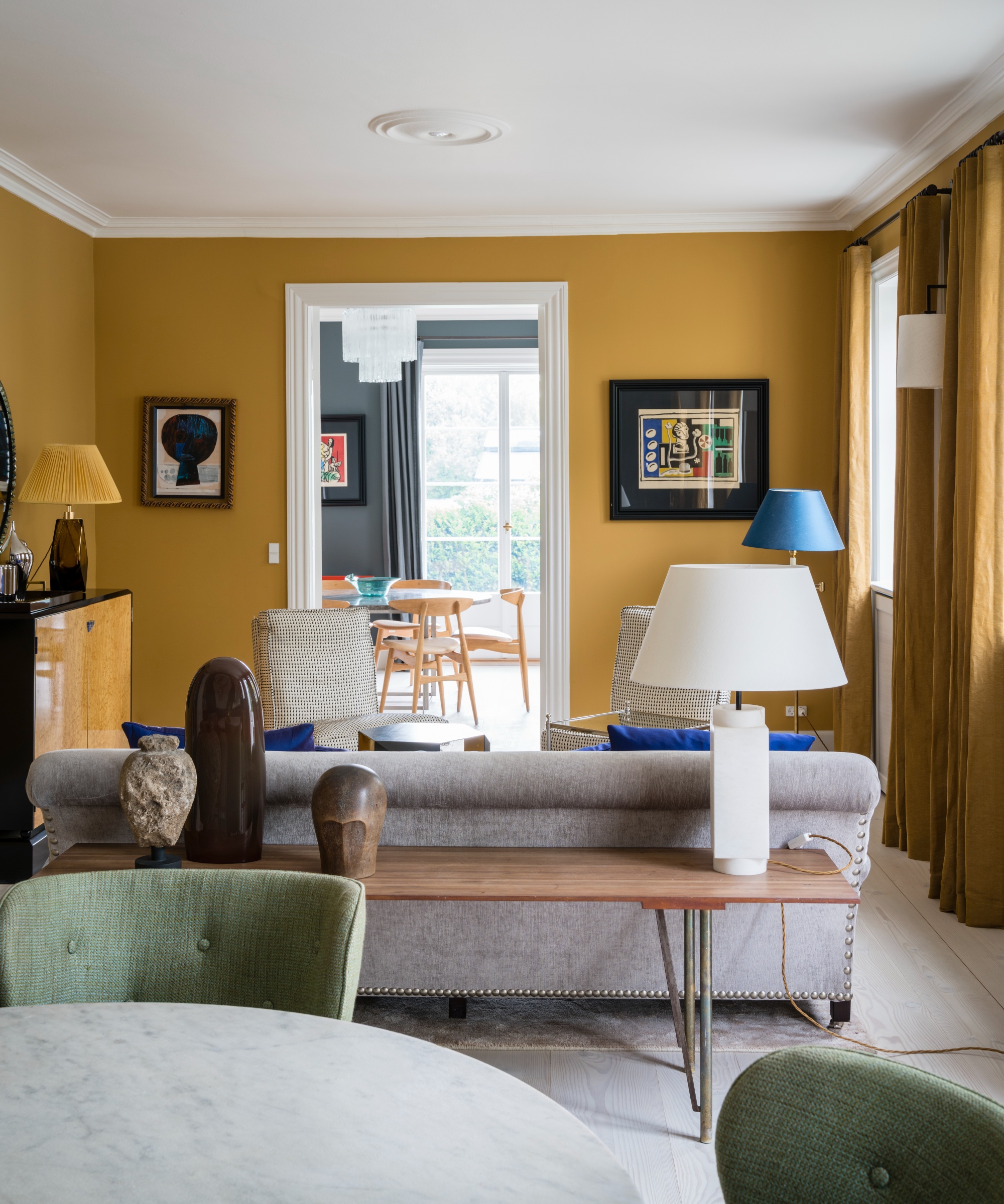
Color psychology should be an important part of the color selection process in our homes. Beyond how a color looks, colors shape how a room feels, influencing our moods and evoking certain connotations. Since yellow is known to be energizing with stimulating effects, it may be best used in social rooms where this is welcomed.
'From a neuroaesthetic viewpoint, yellow is a color that energizes and boosts mood, but it works best when it’s harmonized with more neutral, grounding tones – think a warm gray or soft white backdrop that lets yellow glow in a subtle, purposeful way,' explains designer Erica McLain, founder of McLain by Design Interiors.
'Adding small doses of yellow in areas where you need an extra boost of positivity or energy, like a kitchen or home office, lets you harness its uplifting qualities while maintaining a peaceful balance throughout the space,' Erica adds.
So, if you want rooms used for gathering such as living rooms or dining rooms to feel lively and energized, yellow can make a great choice, especially bold shades like Farrow & Ball's India Yellow which was used here. However, this color may be best avoided in rooms like bedrooms or bathrooms where a calmer, less stimulating effect is often desired.
4. Go for brown-toned yellows and pair with earthy hues
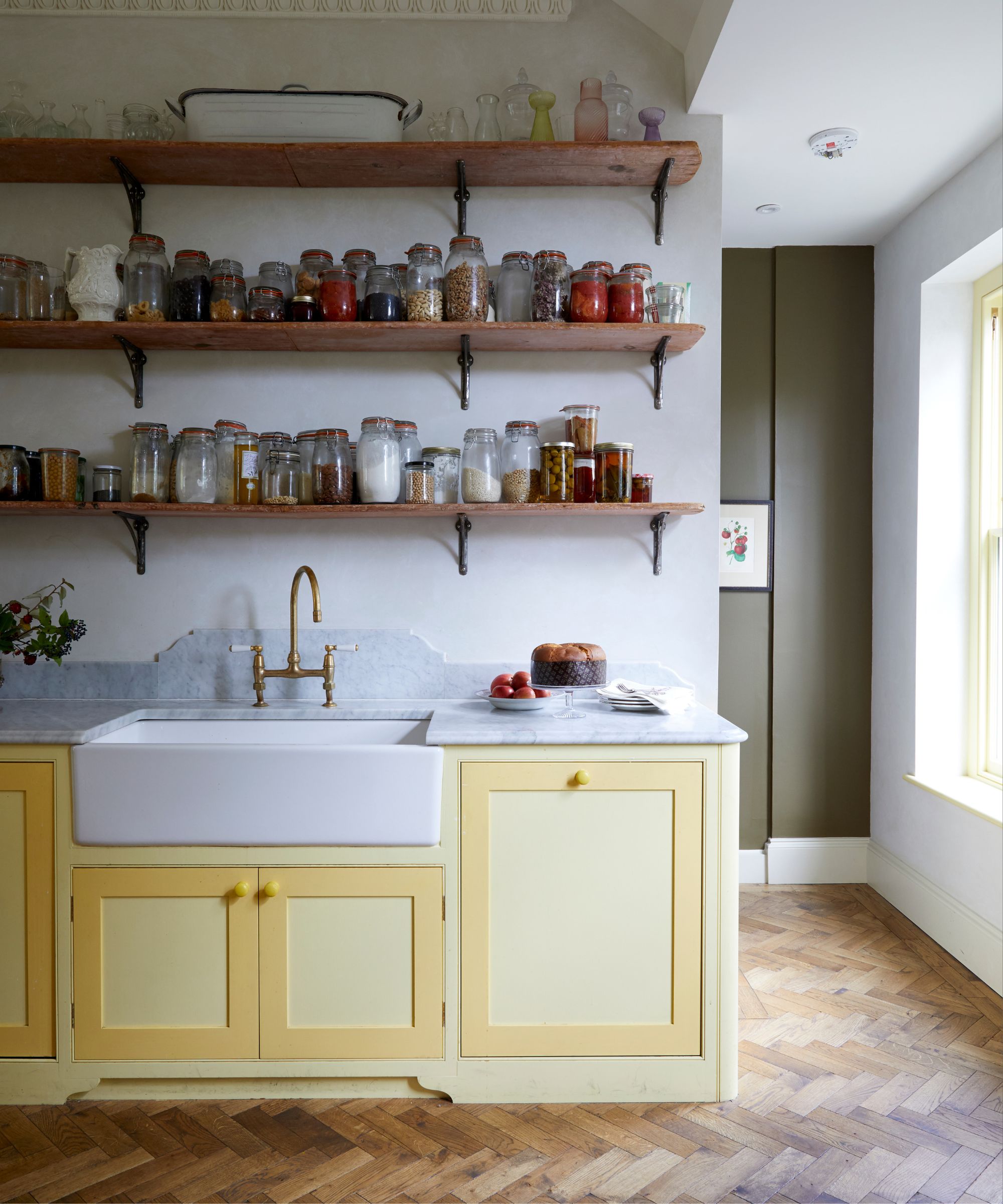
To ensure yellow maintains a liveable feel, go for brown-toned yellows that feel grounding, and pair them with other earthy shades for a cohesive look.
'We prefer to use softer, muted yellows, like buttery or mustard tones, rather than bright yellows,' says designer Cheryl Clendenon of In Detail Interiors. 'These shades feel inviting and sophisticated and are less likely to dominate the room. Pairing it with earthy tones like olive green or deep brown can add depth and balance. It also looks beautiful in textured elements like woven throws, tufted cushions, or textured vases. This approach introduces warmth and color in a more layered, nuanced way.'
Interior designer Jenny Luck also prefers incorporating brown tones when using yellow for a flattering look, adding: 'When decorating with yellow I tend to pair it back a little bit so that the overall effect isn’t too overwhelming or sickly, which can be the case if the shade is quite punchy! I tend to go for earthy, brown-based tones if I’m decorating the entire room as it’s much easier to live with a softer shade rather than the more vibrant yellow.'
5. Use bright yellow paints as a playful accent in neutral rooms
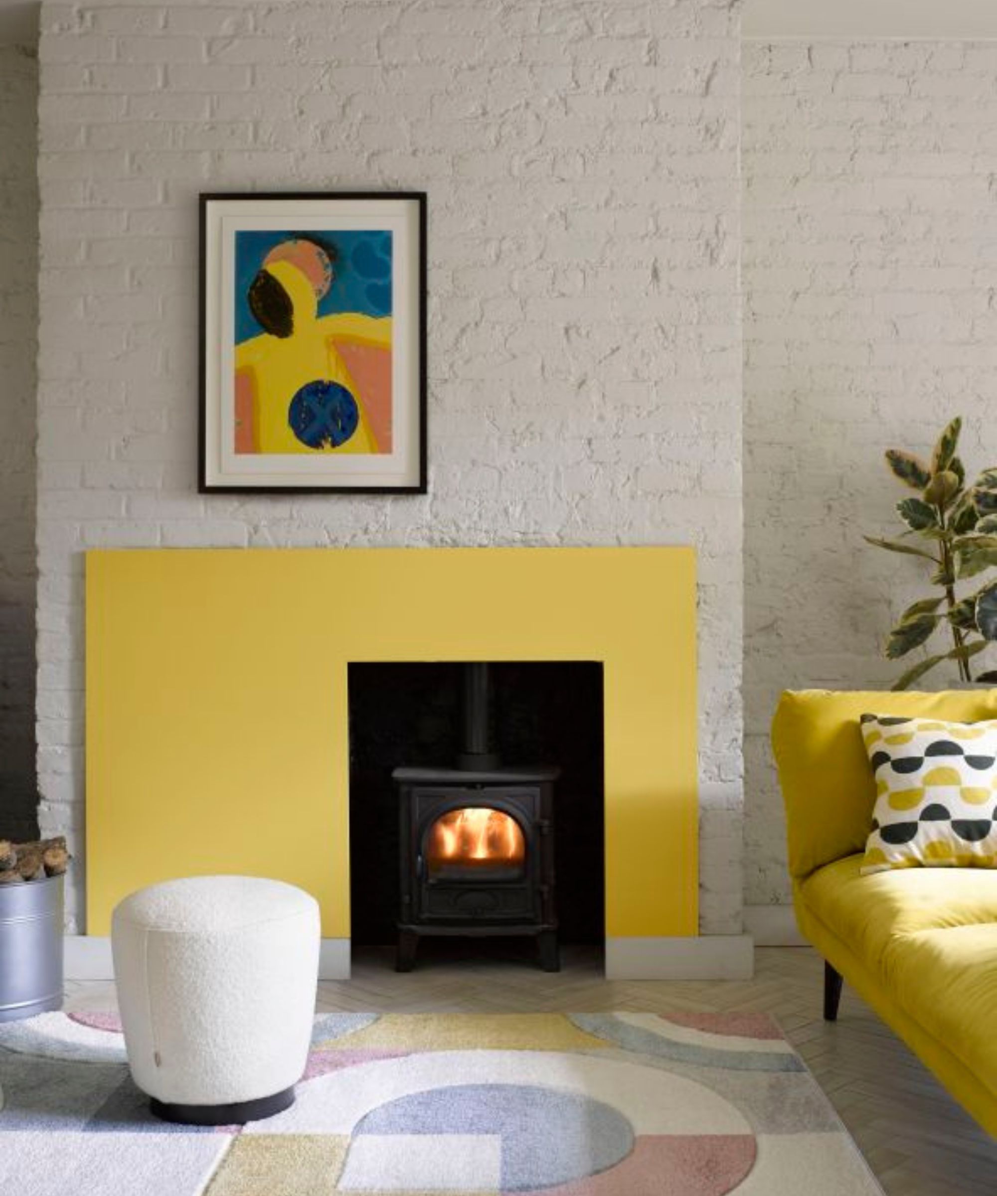
Another way to incorporate yellow without overwhelming a room is to use it as an accent color when decorating with paint. This way, the majority of your walls can maintain a more neutral hue while yellow paint adds interest to the space.
'For those not wanting to paint all four walls, try painting a particular area to create a centerpiece, from which the rest of your scheme can work around,' suggests Helen Shaw, Director of Marketing (International), Benjamin Moore.
'Frame a fireplace to turn it into a focal point ready for cozy evenings, and opt for a zingy mimosa yellow, turning a sparse cool scheme into an inviting one. Team this feature panel with a matching sofa for a coordinated feel, then layer the look with plush, tactile rugs and poufs for a super-snug retreat.
'Alternatively, paint walls in a tranquil hue that sets a restful mood then add a pop of yellow to lift the look to the next level – opt for elegant architectural elements such as the picture rail in an eye-catching hue. This, paired with matching bedding or accessories brings a professionally ‘designed’ vibe to the scheme and provides a visual anchor for the rest of the space,' says Helen.
In this living room, Benjamin Moore's Alabaster OC-129 is used across the walls, while the fireplace frame channels Sunny Afternoon 356 for a hit of color.
There's no denying the uplifting quality of yellow which can do wonders to add character to your home. By taking inspiration from the experts with these useful ideas, you can decorate with yellow without it overwhelming your home.

Emily is a freelance interior design writer based in Scotland. Prior to going freelance in the spring of 2025, Emily was Homes & Gardens’ Paint & Color Editor, covering all things color across interiors and home decor for the Homes & Gardens website. Having gained specific expertise in this area, Emily is well-versed in writing about the latest color trends and is passionate about helping homeowners understand the importance of color psychology in home design. Her own interior design style reflects the simplicity of mid-century design and she loves sourcing vintage furniture finds for her tenement flat.

