I have a tiny entryway – these are the 5 simple tips I have learned to make it a stylish and practical space
Lacking square footage in your entryway? Here's a few simple tips I have discovered after overhauling my teeny space
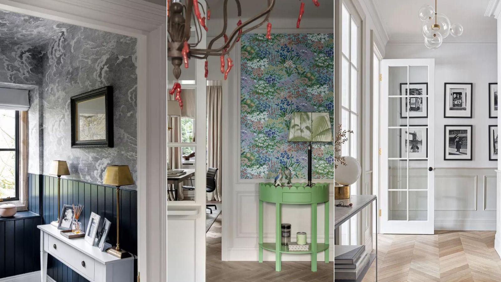
Not many of us are blessed with lofty large entryways, they tend to be the smallest room in any home, but my apartment's entryway really is as small as they come. It's more of a stepping stone into the rest of my semi-open-plan kitchen and living space. But I am proud of what I have done with this tiny entryway, and I have learned some useful tips while trying to make it as stylish and as practical a space as possible.
And even if you have a slightly larger space to work with, I believe all these tricks can, and should, still be considered in order to make an entryway feel as light and as large as possible. Nothing here is too complicated, just easy and relatively quick switches that will make the space work harder in terms of storage but also look lovely.
I used to usher guests (the two that would fit in the space that is) quickly through my small entryway, but now it's very much part of my home and is the space I have been most bold in my design decisions.
5 tips I've learned having overhauled a small entryway
Small entryways can be a joy to decorate. Mine has been my favorite room to overhaul because every switch I made had an instant effect and it's a space I got to really try out some of the advice I often give when it comes to decorating small spaces. Here's the most successful of my endeavours...
1.Blur the dimensions with wallpaper
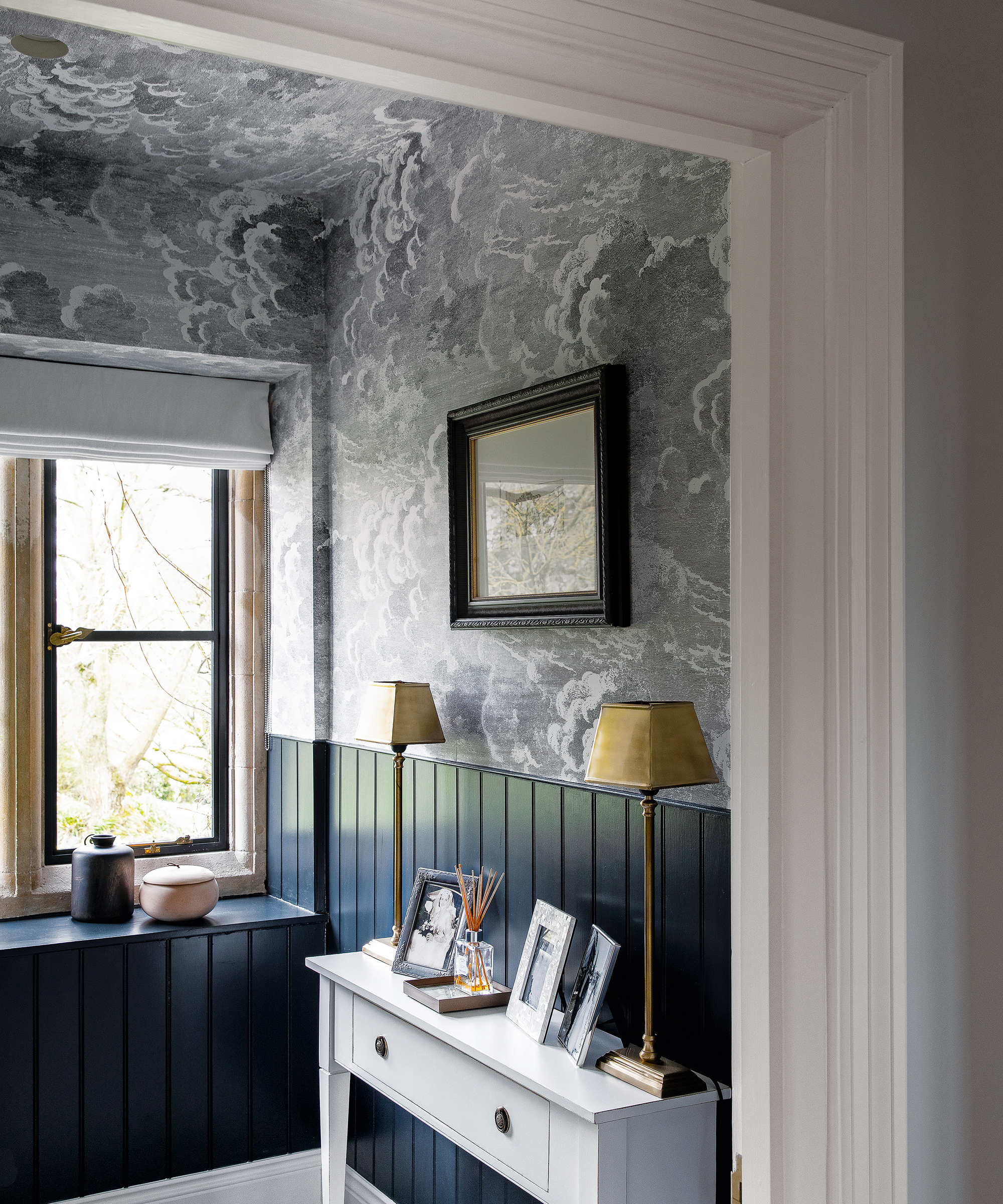
When I mention making bold decisions in my small entryway, this is what I mean. You will not find any other wallpaper in the rest of my apartment. In fact, you will find very little pattern in the rest of my apartment. But since I so often offer the advice of being braver in your smaller spaces and using an all-over pattern to make a small space feel bigger, I thought I would practice what I preach and try it for myself.
For my entryway wallpaper, I have Cole & Son's Piccadilly Seville, and surprise surprise the dark, busy pattern makes the small entryway look bigger because I have taken it all the way to the ceiling, and over the ceiling too, it feels like a much loftier space. The dark but soft black blurs the edges of the room, while the pattern distracts from the small dimensions. And of course, it looks great too. It gives the small space a big impact, which is what I want when people enter my home, especially since the adjoining spaces are kept pretty tame.
2.Keep doorways open
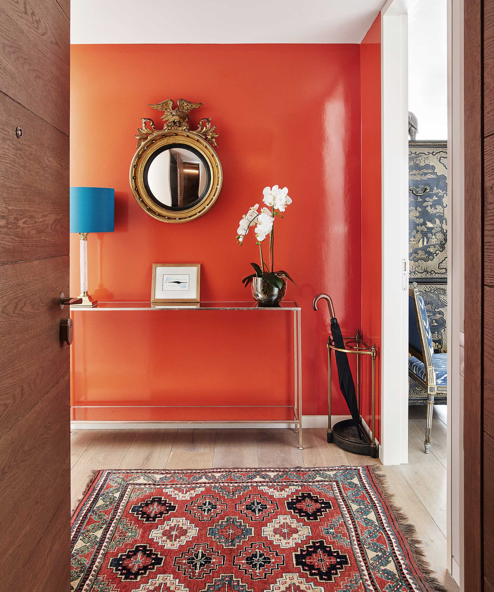
I have spoken before about the fact I don't love doors. Of course, they serve their purpose in certain spaces that need privacy, but I have found turning a doorway into an open arch that leads from my small entryway into the main rooms has really helped make it feel bigger and more connected with the rest of the space.
Plus, ditching the doors can help maximize the natural light you can bring into these usually pretty dark spaces. If you want the option of privacy, you could always switch the doors for a curtain so you can still pull that out of the way and create a seamless flow between spaces.
3. Limit your entryway furniture
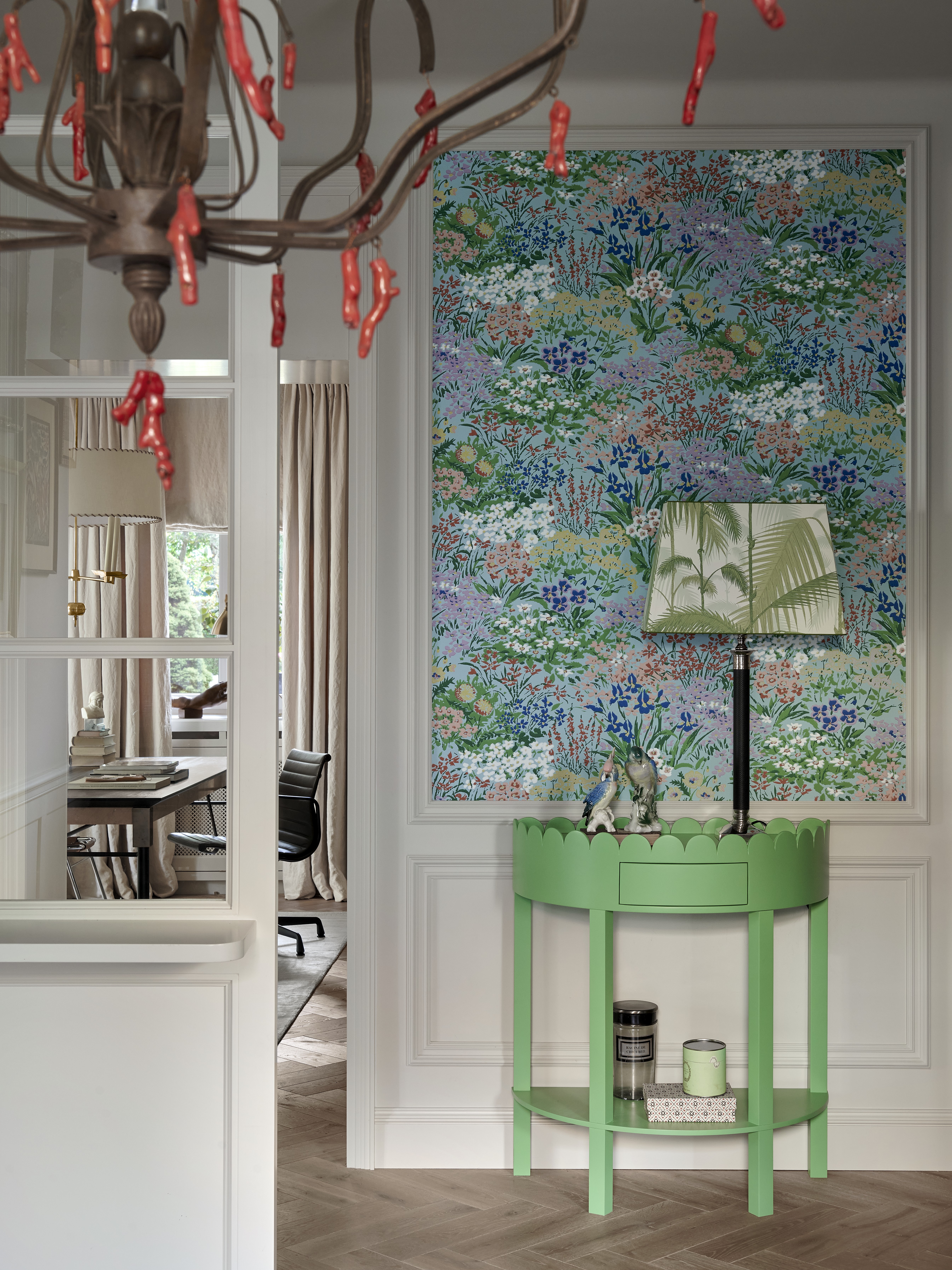
This might not be realistic for everyone, as it depends on what you need in your entryway and what your home's layout is, etc., but I have no furniture in my entryway. Entryway furniture can work hard, but when space is tight, think about what you can actually fit in and whether it will add anything to the space – both in terms of storage and in terms of style.
The one thing I could potentially have squeezed into my entryway was a narrow console. But while I love the way they can look and depending on what design you go for then can add some entryway storage too, they risk offering little more than a place to store keys and dump things as you walk through the door.
So instead of a console, I wall-mounted some chic wooden hooks, and from those hung a basket and string bag which look lovely and rustic but have also proven really useful for corralling all the clutter that entryways need to handle.
4. Hang a mirror on the right wall
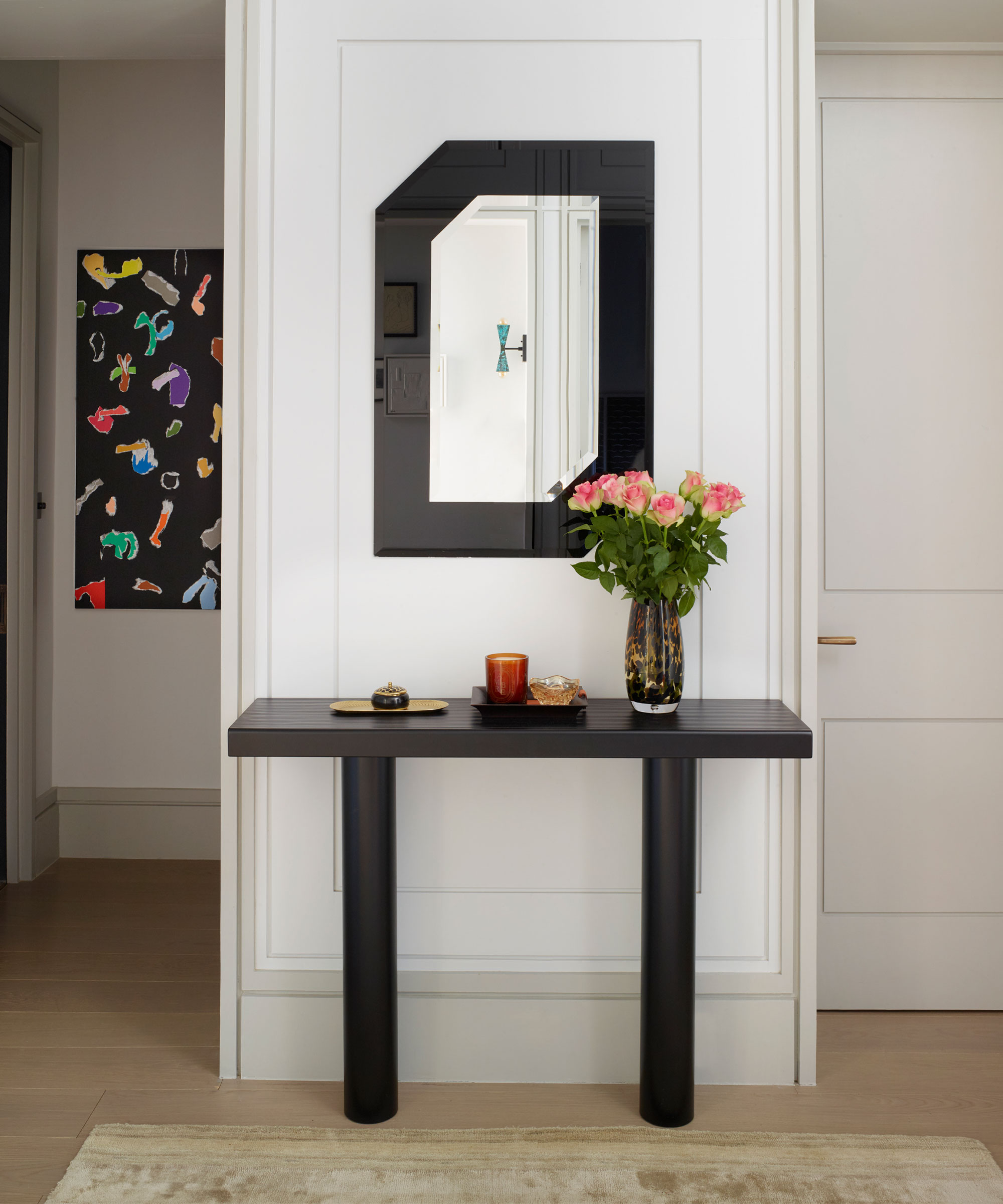
Feng Shui mirror rules often suggest you shouldn't place a mirror opposite your door, but in my small entryway that was the only wall big enough to handle a mirror. For me, it's also the best wall to help bounce more light around and expand the room.
The best position for an entryway mirror will differ from space to space but do always look for where you can use a mirror to maximize light. So look to see which wall gets the most natural light and hang your mirror there as it will help light bounce back around the space.
I also think hanging a mirror on the opposite wall to the front door can work. In my small entryway, it has meant when I open the door I am not instantly met by a solid wall just a few feet away but a reflection of the space behind me, it opens up the area and creates the instant illusion of more space.
5.Match the flooring to adjoining rooms
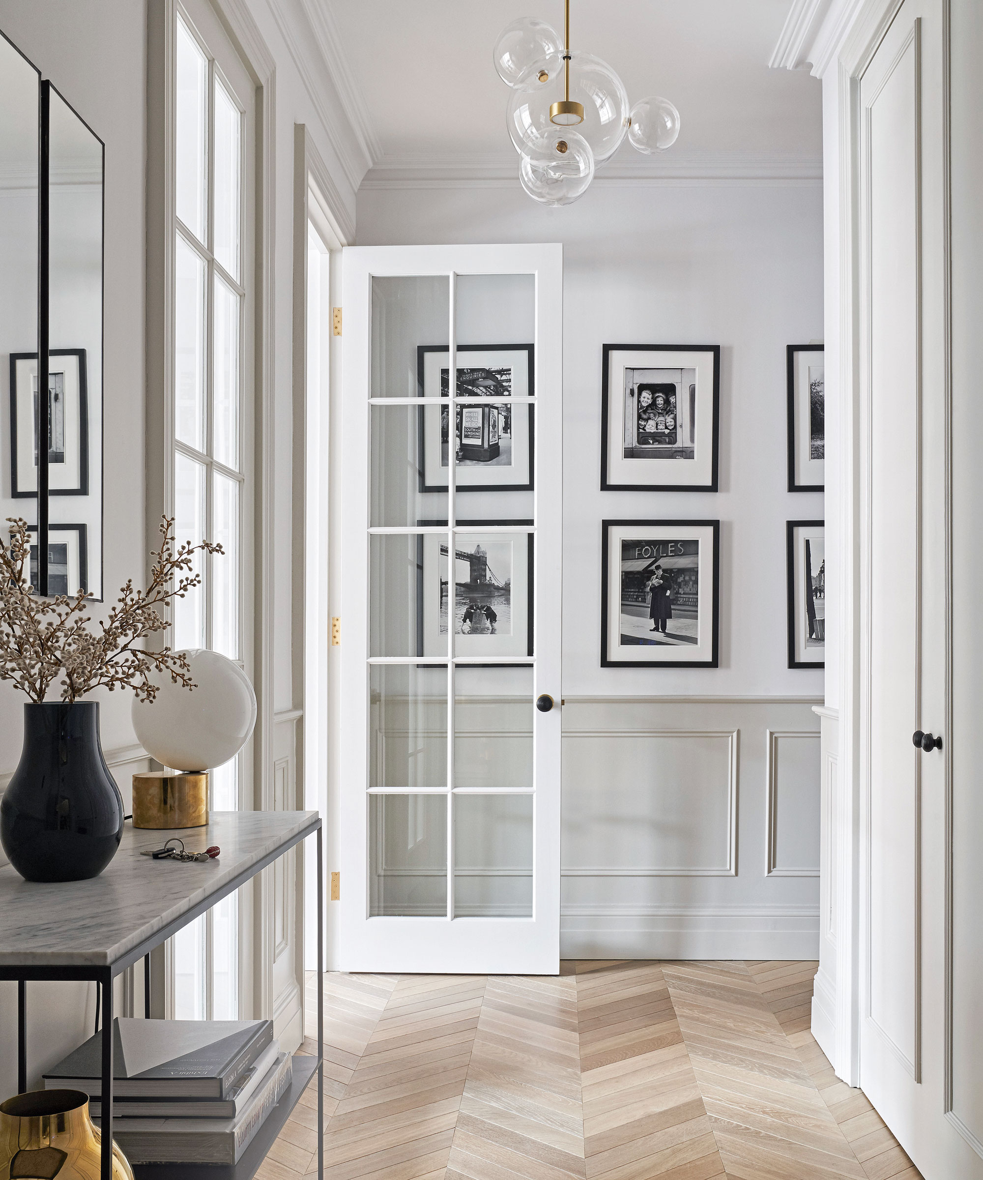
Replacing my entryway flooring was the biggest project for this space, but it made all the difference. Along with replacing the doors with archways, I ran the same flooring throughout the majority of the adjoining rooms.
Having this small square of hallway with contrasting flooring really just enhanced how limited the floor space was. It was literally a box drawn around the edges. Matching the flooring and ditching the T-bars created that seamless flow, and it allows you to 'almost' borrow space from the adjoining rooms. The entryway no longer feels like its own boxy room but part of the other, larger rooms.
FAQs
How can you arrange a small entrway?
A small entryway layout depends on the size and shape you are working with. But my top tip would be not to crowd the walls with furniture and decor and in fact keep the amount of furniture in the space to a minimum. Really consider what a piece will add to the space in terms of style and storage. These pieces need to work hard and any furniture should always be doing both.
How can you decorate a small entryway?
This depends on the impression you want to create. The entryway sets the tone of your home, but that's not to say you can't go a bit bolder in this space and experiment with pattern and color you perhaps wouldn't use elsewhere in your home.
In terms of colors to decorate with, warm neutrals will always work, but darker shades can have a similarly space-expanding effect. I find that my black and white wallpaper works because you don't get a solid, potentially quite overwhelming, wall of black, but the darker scheme still packs a punch and surprisingly creates the allusion of more space – far more so than when it was painted plain white.
The best way I think to approach a small entryway is to try and make it feel as connected and seamless with the rooms that adjoin it. Don't see it as its own, tiny awkward space, but treat it as part of the floor plan and find ways to make it easily flow into the larger areas of your home. And do be a bit bolder in your choices. The wallpaper in my entryway is the most asked-about part of my home, and despite my thinking it might end up looking a bit cave-like, it really does create the illusion of more space.
Sign up to the Homes & Gardens newsletter
Design expertise in your inbox – from inspiring decorating ideas and beautiful celebrity homes to practical gardening advice and shopping round-ups.

I am the Head of Interiors at Homes & Gardens. I started off in the world of journalism in fashion and luxury travel and then landed my first interiors role at Real Homes and have been in the world of interior design ever since. Prior to my role at H&G I was the digital editor at Livingetc, from which I took a sabbatical to travel in my self-converted van (not as glamorous as decorating a home, but very satisfying). A year later, and with lots of technical DIY lessons learned I am back to writing and editing, sometimes even from the comfort of my home on wheels.
-
 Ina Garten's storage pantry is an insightful window into all of the best cookware used by the chef – and it's easy to recreate on your kitchen shelves from $48
The beautiful dishware in The Barefoot Contessa's Hamptons pantry showcases the tools she uses most often to cook – this is exactly how you replicate it
By Sophie Edwards Published
-
 Extend the lifespan of your appliance with 5 simple but crucial washing machine maintenance tips
From cleaning the filters to keeping the door open, experts reveal the washer tips they swear by
By Andy van Terheyden Published